
Search results for "Otherwise presentation" in Home Design Ideas
 KINGDOM WOODWORKS
Collaboration with Canonbury Homes and Frank Neely Design Associates.
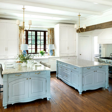
Inspiration for a timeless open concept kitchen remodel in Atlanta with beaded inset cabinets and two islands
Inspiration for a timeless open concept kitchen remodel in Atlanta with beaded inset cabinets and two islands
 STUDIO KONDE | Konrad Idaszewski Architect
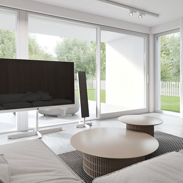
Visit our page: https://conde.pl/architekt-wnetrz-poznan/ . Techplan house interior designed by STUDIO KONDE Konrad Idaszewski Architekt, creating a sophisticated contemporary home where clean architectural lines, natural materials and carefully selected furnishings shape a comfortable everyday environment. Techplan is part of the Modelowedomy collection of three individually configurable houses, distinguished by its modern flat-roof form and an open-plan arrangement connecting the living room, dining area and kitchen. The concept creates a generous shared space in which each functional zone remains visually connected.
Soft neutral upholstery, warm timber and expansive glazing establish a calm and refined character throughout the living area. A restrained palette of cream, beige, white and natural wood is contrasted by darker furniture and a sculptural fireplace, while the generous proportions of the room allow the architecture and individual furnishings to remain clearly defined. The carefully composed interior reflects the work of an interior architect in Poznań, with emphasis on proportion, materiality and practical comfort.
A large light-beige sectional sofa forms the heart of the lounge, with its broad chaise sections and deep upholstered seats creating a generous area for relaxation. Several loose cushions and a softly textured throw add a more informal layer to the otherwise precise composition. In front of the sofa, two round coffee tables overlap slightly, combining pale smooth tops with vertically fluted cylindrical bases. Their different diameters and textured supports create a subtle sculptural arrangement against the large woven rug.
The television stands freely in front of the extensive glazing, supported by a slim white structure rather than mounted directly onto a wall. Two tall floor-standing speakers flank the screen, introducing narrow black vertical accents that contrast with the bright surroundings. The open media arrangement keeps the glazed façade unobstructed, allowing daylight and views of the garden to remain an important part of the interior.
On the opposite side of the room, a freestanding black wood-burning stove provides a strong architectural counterpoint to the light furniture. Its cylindrical flue extends vertically towards the ceiling, while the visible fire brings a warm glow into the neutral setting. Behind the stove, the wall is covered with three-dimensional white geometric panels with a faceted surface, creating a distinctive textured backdrop. Light falling across the relief produces subtle variations of shadow and gives the fireplace zone considerable visual depth.
Beneath the seating group, a large textured rug defines the lounge area and adds softness to the pale timber flooring. Its woven surface contrasts with the smooth coffee-table tops and the clean upholstery of the sofa, while the natural wood elements introduce additional warmth. The combination of tactile fabrics, ribbed furniture bases, timber and sculptural wall cladding gives the restrained colour palette a richer, layered character.
Full-height glazing stretches across the rear of the living space, opening the interior towards mature greenery, lawn and a white vertical garden fence. Natural daylight fills the room and emphasizes the generous proportions of the open-plan architecture, while the garden provides a calm green backdrop to the carefully controlled interior palette. Through the combination of flat-roof modern architecture, open living space, freestanding furniture, textured wall finishes and natural materials, Techplan presents a distinctive contemporary home created within the Modelowedomy collection by STUDIO KONDE in Poznań.
 aplusdesign
Designing the space impels a décor that needs to appeal to varied tastes. This apartment in Surat, Gujarat redefines the concept of a designer home, using color accents in otherwise light interior décor. It’s a simple functional house with all minimal requirements and less maintenance house.
As a part of interest our client was fond of paintings to be displayed so it played major role in designing aspect.
As we enter the passage area the use of wooden slatted main door with Smoke grey PU finished walls, soft finishes and clean lines dominate these, with metallic gold text ‘MODI’S” representing with iconic design symbol carved in MDF with touch of green makes it more welcoming.
Living space has an overpowering feature as the wooden cladded wall which highlights the space and marks the continuation into the dining area.
The palette of the project is simple, defining the three main elements that make it up: Italian marble flooring changing as per the functionality of the space, Ash Wood defining the objects, and grey finish.
The materials hold the space strongly with a particular color palette. On skinny metal legs, the furniture in this living room seems to be floating above the floor, bringing a sense of weightlessness to the space. This unique living space features Ash wood slatted panels on walls with a velvety finish rug matching the center table just right.
The design of the furniture in wood and metal is tradition but is executed in a modern minimalist way. The Indian swing seating makes it as divider to the space between informal seating and dining area yet comprising the space equally.
Bespoke furniture elements kept according to the client’s need.The furniture is a mix of contemporary with different design elements by our studio, which creates a classic and cozy atmosphere. The ash wood and the grey hue finish become the leaders of the colours and textures palette. The curved shaped edge ceiling designed according to functionality & also plays aesthetic role.The importance of them, almost visible from every spot.
The deep sea velvety sofa makes an argument to this palette by focusing attention to it.
A nonchalant elegance best describes the soul of the house. In order to make a dialogue between the contemporary with different textures, patterns and uniform colors have been used throughout the house.
The parallel shaped kitchen with a high spec modern technologies and artificial stone counter top with fresh furniture in white and grey and sleek open breakfast counter is designed to be a light space that beautifully blends in.
This volume integrates the access to the private area –bedroom, wash area and bathroom-, segregating this way the day area living and dining area.
The Master Bedroom layout remodeled in accordance with contemporary trends and the client’s needs. The paintings which is inspired from the well-known artist and as strong believer in vaastu by the clients it has been displayed in right position which reflects good vibes.
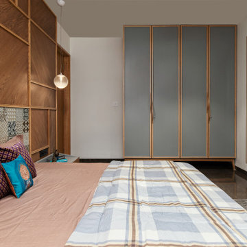
The seamless panel running through bed back having grooves on them which forms symmetrical pattern on wood. Using the same material by forming the side tables in circular pattern with round shaped metal supports.
The Son’s bedroom is integrated with closet, TV unit and dressing table. The entire ceiling is connected with wood stripes panels running on the walls which starts from main door of the room and ends on the full height closet and subdivided by lime plaster in grey with grooves on it.
The graphics now a days plays major role in every design aspect, so we tried customized different athlete position in game play captured in frames and be part of the focal point in room.
Each details speaks the entire space is crafted with a confluence of contemporary art presented in a modern palette. You’ll find them throughout the home, right from the color, furniture selection, to the wall paneling style teamed up with modern artworks and artefacts.
Each bedroom has a character of its own based on the user. This room was designed with a picturesque composition was made to create a backdrop to compliment the minimalistic furniture in entire space.
The backdrop of the bed panel is veneer cladded in frame box placed in the form of Tetris. The geometric patchwork mosaic tiles placed in between the cladding so that it’s easy to maintain.
Sleek handle details with full height closet and fine thin leg supports makes it more classic and modern.
Thus, the apartment gained a contemporary atmosphere and it is ready to receive a new lifestyle, of a new generation and new values.
Find the right local pro for your project
 CairnsCraft Design & Remodel
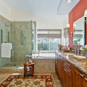
Great spacious bathroom with lot of amenities.
Photographer: Jon Upson
Large elegant master beige tile and porcelain tile drop-in bathtub photo in San Diego with an undermount sink, raised-panel cabinets, medium tone wood cabinets, granite countertops, beige walls and a two-piece toilet
Large elegant master beige tile and porcelain tile drop-in bathtub photo in San Diego with an undermount sink, raised-panel cabinets, medium tone wood cabinets, granite countertops, beige walls and a two-piece toilet
 Architect
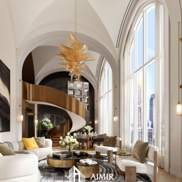
Not all architectural imagery is created equal. Some renderings look obviously computer-generated, with flat lighting and plastic-looking materials that fail to convince viewers. Others are so precise that they are indistinguishable from photographs. That second category, realistic architectural visualization rendering, has become the standard expectation for architects, developers, and marketers who need imagery capable of withstanding close scrutiny from investors, buyers, and planning authorities. As audiences grow more visually literate, the tolerance for obviously artificial, video-game-like imagery in professional presentations continues to shrink.
What Sets Realistic Visualization Apart
Realistic architectural visualization goes beyond simply modeling a building in three dimensions. It requires physically accurate lighting simulation, true-to-life material properties, and careful attention to the small imperfections that make real-world photography convincing, such as subtle reflections, ambient occlusion in corners, and natural depth of field. The goal is an image that a viewer would believe was captured by a camera on-site rather than generated by software. Achieving that level of believability typically means dozens of small adjustments layered on top of one another rather than any single dramatic setting.
Realistic Versus Stylized Rendering Approaches
Stylized or conceptual renderings still have their place, particularly in early design phases when a looser, more artistic representation helps convey mood without locking in every detail. But once a project moves toward marketing, investment, or permitting, stakeholders need to see exactly what they are getting. Realistic visualization removes ambiguity, showing true material colors, accurate proportions, and honest lighting conditions rather than idealized abstractions. Understanding which approach a project actually needs at each stage helps clients avoid paying for a level of polish that a given milestone does not yet require.
Why Realism Builds Client and Buyer Confidence
Buyers and investors are understandably skeptical of overly polished or unrealistic marketing images. When a rendering looks convincingly real, it builds trust rather than raising doubts about what the finished project will actually look like. This is especially important in real estate presales, where buyers are committing significant sums based largely on visual material rather than a finished physical space. A rendering that later turns out to have misrepresented the finished product can also create legal and reputational exposure for developers, making accuracy a genuine business risk rather than just an aesthetic preference.
The Technical Pillars Behind Every Realistic Scene
Achieving true realism depends on several technical disciplines working together: physically based rendering engines that simulate how light actually behaves, high-resolution texture libraries that replicate real materials like stone, wood, and glass, and careful camera work that mimics real photographic lenses and exposure. Post-production adds a final layer of color grading and atmospheric effects that ties everything together into a cohesive, believable image. Each of these pillars depends on the others; even flawless material work can be undermined by lighting that behaves in a physically implausible way.
Applications Across Residential, Commercial, and Institutional Projects
Realistic visualization serves a wide range of building types, from single-family homes and luxury condominiums to office towers, hotels, schools, and healthcare facilities. Each typology has its own material palette and lighting expectations, and an experienced studio adjusts its approach accordingly, whether that means warm, inviting tones for a residential lobby or crisp, professional lighting for a corporate headquarters. Institutional clients such as universities and hospitals often have additional requirements around accessibility signage and wayfinding, which need to be represented accurately alongside the architecture itself.
How AIMIR CG Delivers Photorealistic Accuracy
Our studio specializes in realistic architectural visualization rendering that holds up under close inspection. Every project moves through a disciplined pipeline of modeling, texturing, lighting, and post-production review, with artists cross-checking material references and lighting studies against real-world photography. This attention to detail is why clients consistently describe our end product as impressive and our process as easy to work with. A dedicated quality review stage before delivery catches inconsistencies that might otherwise slip through a faster, less structured pipeline.
Common Challenges in Achieving True Realism
Realistic rendering is technically demanding. Common obstacles include accurately simulating how light bounces between surfaces, matching material reflectivity to real product specifications, and avoiding the uncanny, slightly artificial look that comes from over-processed images. Overcoming these challenges requires experienced artists who understand both the science of light and the craft of photography, not just software proficiency. Rushed production schedules are often the real culprit behind unconvincing renderings, since realism typically requires several iterative passes rather than a single render.
What to Look for in a Realism-Focused Rendering Studio
When evaluating a rendering partner, review their portfolio critically. Do the images include convincing shadow detail and material variation, or do surfaces look uniformly smooth and artificial? Ask about their revision process and how closely they work with architects to source accurate material and lighting references, since realism is ultimately the product of disciplined collaboration, not a single software setting. It also helps to ask for examples of past projects in a similar building type, since a studio's strengths can vary across typologies.
Ready for Renderings That Look Real
If your project deserves imagery that can stand up to the scrutiny of investors, buyers, and planning boards, AIMIR CG is ready to help. Our team combines technical precision with artistic judgment to deliver visualization that looks and feels genuinely real. Contact us to discuss how photorealistic rendering can strengthen your next presentation or marketing campaign, and let us show you examples from projects similar to your own.
 Twelve Stones Designs, LLC
The owners of this kitchen had spent the money to upgrade the finishes in their kitchen upon building the home 12 years ago, but after living in the space for several years they realized how nonfunctional the layout really was. The (then) two preschool aged children had grown into busy, hungry teenagers with many friends who also liked to hang out at the house. So the family needed a more functional kitchen with better traffic flow, space for daily activities revolving around the kitchen at different times of day, and a kitchen that could accommodate cooking for and serving large groups. Furthermore, the dark, traditional finishes no longer reflected the homeowners’ style. They requested a brighter, more relaxed, coastal style that reflected their love of the seaside cities they like to visit.
Originally, the kitchen was U-shaped with a narrow island in the middle. The island created narrow aisles that bottle-necked at the dishwasher, refrigerator, and cooktop areas. There was a pass-through from the foyer into the kitchen, but the owners never liked that the pass-through was also located so close to the powder room. The awkward proximity was unappealing and made guests feel uncomfortable.
The kitchen’s storage was made up of lots of narrow cabinets, apothecary drawers, clipped corner units, and very few drawers. It lacked useful storage for the larger items the family used on a daily basis. And the kitchen’s only pantry was small closet that had only builder-grade, narrow shelving with no illumination to be able to see the contents inside.
Overall, the kitchen’s lighting plan was poorly executed. Only six recessed cans illuminated the entire kitchen and nook areas. The under cabinet lighting was not evenly distributed either. In fact, the builder had mis-placed the under cabinet lighting around the decorative pilasters which made for choppy, dark cubbies. Further, the builder didn’t include any lighting over the sink or the bar area, which meant whoever was doing the dishes was always in their own shadow. That, coupled with the steep overhang of the game room above made the bar area feel like a dim, cavernous space that wasn’t inviting or task oriented. The kitchen looked out into the main living space, but the raised bar and a narrow wall (which held the only large cabinet in the kitchen) created more of a barrier than a relationship to the living room or breakfast nook. In fact, one couldn’t even see the breakfast nook from the cooktop or sink areas due to its orientation. The raised bar top was too narrow to comfortably sit to either dine at or chat from due to the lack of knee space. The the homeowners confided that the kitchen felt more like a dark, dirty prison than place where the family, or their guests, wanted to gather and commune.
The clients' needs and desires were:
➢ to create a kitchen that would be a space the family loved to be in; to relate to the adjacent spaces all around, and to have better flow for entertaining large groups
➢ to remove the walls between the breakfast nook and living area and to be able to utilize the natural light from the windows in both those areas
➢ to incorporate a functional chopping block for prepping fresh food for home cooked meals, an island with a large sink and drain board, 2 pull out trash cans, and seating for at least the 2 teens to eat or do homework
➢ to design a kitchen and breakfast nook with an airy, coastal, relaxed vibe that blended with the rest of the house's coastal theme
➢ to integrate a layered lighting plan which would include ample general illumination, specific task lighting, decorative lighting, and lots of illuminated storage
➢ to design a kitchen with not only more storage for all the husband’s kitchen gadgets and collection of oils and spices, but smart storage, including a coffee/breakfast bar and a place to store and conceal the toaster oven and microwave
➢ to find a way to utilize the large open space between the kitchen, pantry area, and breakfast nook
Twelve Stones Designs achieved the owner's goals by:
➢ removing the walls between the kitchen and living room to allow the natural light to filter in from the adjacent rooms and to create a connection between the kitchen, nook, and living spaces for a sense of unity and communion
➢ removing the existing pantry and designing 3 large pantry style cabinets with LED tape lights and rollout drawers to house lots of kitchen appliances, gadgets, and tons of groceries. We also took the cabinets all the way up to the 9’ ceiling for additional storage for seasonal items and bulk storage.
➢ designing 2 islands - 1 with a gorgeous black walnut chopping block that houses a drawer for chopping and carving knives and a custom double pull out trash unit for point of use utilization - and 1 that houses the dishwasher, a large Blanco Gourmet sink with integrated drain board, woven baskets for fresh root vegetables and kitchen towels, plenty of drawer storage for kitchen items, and bar seating for up to 4 diners.
➢ closing off the space between the kitchen and the powder room to create a beautiful new private alcove for the powder room as well as adding some decorative storage. This also gave us space to include more tall storage near the new range for precision placement of the husband’s extensive oil and spice collection as well as a location for a combo-steam oven the wife wanted for baking and cooking healthy meals.
The project is enhanced functionally by:
➢ incorporated USB and standard receptacles for the kids’ laptops and phone charging in the large island
➢ designing the small island to include additional open shelving for items used on a daily basis such as a variety of bowls, plates, and colanders. This set up also works well for the husband who prefers to “plate” his dinners in restaurant-style fashion before presenting them to the table.
➢ the integration of specific storage units, such as double stacked cutlery drawers, a custom spice pull-out, a Kuerig coffee and tea pod drawer, and custom double stacked utensil drawers
➢ moving the refrigerator to the old oven location - this eliminated the bottle neck as well as created a better relationship to the eating table. It also utilizes the floor space between the pantry, nook, and kitchen
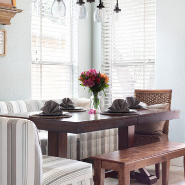
➢ creating a banquet style breakfast nook - this banquette seating not only doubles the amount of seating for large gatherings but it better utilizes the odd space between the kitchen and the previous nook area. It also helps to create a distinct pathway from the mudroom room through the pantry area, kitchen, nook, and living room.
➢ the coffee/breakfast bar area which includes the perfect location for the concealed microwave and toaster oven, convenient storage for the coffee pods and tea accoutrements. Roll-out drawers below also house the smoothie maker, hot water kettle, and a plethora of smoothie-making ingredients such as protein powders, smoothie additives, etc. Furthermore, the drawers below the Keurig house measuring utensil, cutlery, baking supplies and tupperware storage.
➢ incorporating lots of wide drawers and pullouts to accommodate large cookware.
➢ utilizing as much vertical space as possible by building storage to the ceiling which accommodates the family’s abundant amount of serving platters, baking sheets, bakeware, casserole dishes, and additional cutting boards.
The project is enhanced aesthetically by:
➢ new 5-piece Versailles pattern porcelain tile that now seamlessly joins the entire down stairs area together creating a bright, cohesiveness feeling instead of choppy separated spaces - it also adds a coastal feeling
➢ designing a cabinet to conceal the microwave and toaster oven
➢ the coastal influenced light fixtures over the nook table and island
➢ the sandy colors of the Langdon Cambria countertops. The swirling pattern and sparkling quartz pieces remind the homeowner of black-and-tan sandy beaches
➢ the striped banquet seating whose creamy white background and blue-green stripes were the inspiration for the cabinet and wall colors.
➢ All the interior doors were painted black to coordinate with the blacks and grays in the backsplash tile and countertop. This also adds a hint of tailored formality to an otherwise casual space.
➢ the use of WAC's Oculux small aperture LED units for the overhead lighting complimented with Diode LED strips for task lighting under the cabinets and inside the pantry and glass wall cabinets. All of the lighting applications are on separate dimmer switches.
Innovative uses of materials or construction methods by Realty Restoration LLC:
➢ Each 1-1/2” x 3” block of reclaimed end-grain black walnut that makes up the center island chopping block was hand milled and built in the shop. It was designed to look substantial and proportional to the surrounding elements, executed by creating the 4 inch tall top with a solid wood chamfered edge band.
➢ The metal doors on either side of the vent hood were also custom designed for this project and built in the Realty Restoration LLC shop. They are made 1x2, 11-gauge mild steel with ribbed glass. Weighing 60 lbs a piece, heavy duty cabinet hinges were added to support the weight of the door and keep them from sagging.
➢ Under-cabinet receptacles were added along the range wall in order to have a clean, uninterrupted backsplash.
Design obstacles to overcome:
➢ Because we were removing the demising walls between the kitchen and living room, we had to find a way to plumb and vent the new island. We did this by tunneling through the slab (the slab had post tension cables which prevented us from just trenching) to run a new wet vent through a nearby structural wall. We pulled the existing hot and cold lines between upper floor joists and ran them down the structural wall as well and up through a conduit in the tunnel.
➢ Since we were converting from wall overs to a gas range it allowed us to utilize the 220 feed for the wall ovens to provide a new sub panel for all the new kitchen circuits
➢ Due to framing deficiencies inherited from the original build there was a 1-1/2” differential in the floor-to-ceiling height over a 20 foot span; by utilizing the process of cutting and furring coupled with the crown moulding details on the cabinet elevations we were able to mask the problem and provide seamless transitions between the cabinet components.
Evidence of superior craftsmanship:
➢ uniquely designed, one-of-a-kind metal “X” end panels on the large island. The end panels were custom made in the Realty Restoration LLC shop and fitted to the exact dimensions of the island. The welding seams are completely indistinguishable - the posts look like they are cut from a single sheet of metal
➢ square metal posts on the small island were also custom made and designed to compliment and carry through the metal element s throughout the kitchen
➢ the beautiful, oversized end panels on the pantry cabinets which give the breakfast nook a tailored look
➢ integrating a large format 5 piece Versailles tile pattern to seamlessly flow from the existing spaces into the new kitchen space
➢ By constructing a custom cabinet that jogged around a corner we could not remodel (housing the entry way coat closet) we were able to camouflage the adjacent wall offset within the upper and lower cabinets. By designing around the existing jog in the structural walls we accomplished a few things: we were able to find the space to house, and hide, the microwave and toaster oven yet still have a clean cohesive appearance from the kitchen side. Additionally, the owners were able to keep their much needed coat closet and we didn’t have to increase the budget with unnecessary structural work.
 Complete Flooring
Chris Golden
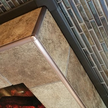
Inspiration for a transitional carpeted living room remodel in Phoenix with beige walls, a standard fireplace and a tile fireplace
Inspiration for a transitional carpeted living room remodel in Phoenix with beige walls, a standard fireplace and a tile fireplace
 Barbara Stock Interior Design
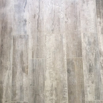
Driftwood look porcelain tile from Arena Marble and Granite, Thousand Oaks, CA
Corner shower - mid-sized coastal master white tile and subway tile porcelain tile corner shower idea in Los Angeles with shaker cabinets, white cabinets, blue walls, an undermount sink and marble countertops
Corner shower - mid-sized coastal master white tile and subway tile porcelain tile corner shower idea in Los Angeles with shaker cabinets, white cabinets, blue walls, an undermount sink and marble countertops

 Cypress Design Co.
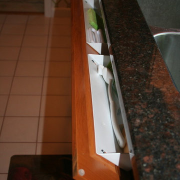
Example of a large classic l-shaped ceramic tile eat-in kitchen design in Providence with an island, raised-panel cabinets, medium tone wood cabinets, granite countertops, beige backsplash, ceramic backsplash, stainless steel appliances, an undermount sink and green walls

 RTA Cabinet Supply LLC
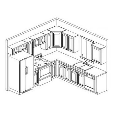
Most modern kitchens are larger than 10X10 and most 10X10 kitchens cost more than the above set because they usually include moldings, glass doors, taller wall cabinets, pantry cabinets and other items not included in the set above. Please consider 10X10 kitchen as a cost measure to get ideas on how much product line costs more or less over the other. Each kitchen is unique and usually requires custom set of cabinets.
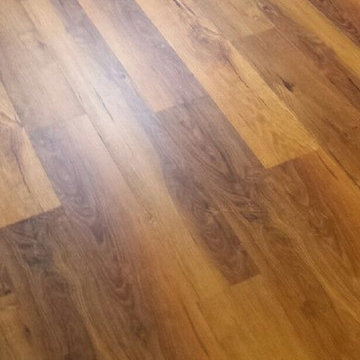
 Whitt Carpet One Floor & Home
Mannington Adura LVT Napa, color Tanin
Elegant vinyl floor bedroom photo
Elegant vinyl floor bedroom photo
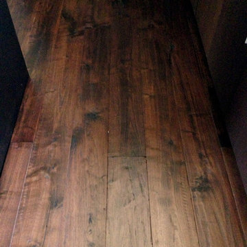

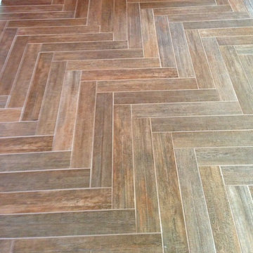
 Lodi Tile Works, Inc
Wood-look tile floor using porcelain plank tiles in a herringbone pattern.
Living room - traditional porcelain tile living room idea in Sacramento
Living room - traditional porcelain tile living room idea in Sacramento
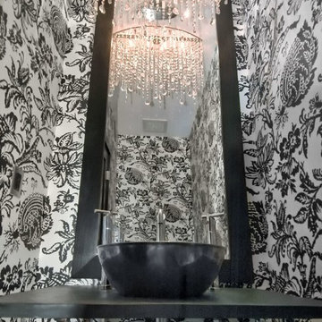
 In Your Space Interior Design
Designed By Runa Novak
In Your space Interior Design
Example of a small minimalist medium tone wood floor powder room design in Chicago with a wall-mount sink
Example of a small minimalist medium tone wood floor powder room design in Chicago with a wall-mount sink


 T.A. French - Custom Builder
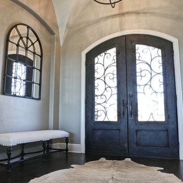
Example of a mid-sized transitional dark wood floor and brown floor double front door design in Austin with gray walls and a black front door
 MW Design Workshop
Josiah Zukowski
Staircase - mid-sized modern carpeted straight carpeted staircase idea in Portland with white walls and carpeted risers
Staircase - mid-sized modern carpeted straight carpeted staircase idea in Portland with white walls and carpeted risers
11