
Search results for "Outdated thinking" in Home Design Ideas
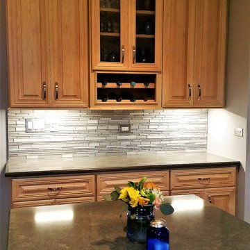
 Wave Outdoors Landscape + Design
This kitchen previously had outdated, white washed oak cabinetry. The overall layout was good, except that it didn't include an island, which the client really wanted. They didn't think there was enough space for an island but we managed to include a small island functional for food prep and counter seating. New grey porcelain floors and backsplash was the final touch.
 Designs By Mark, Inc.
Design Statement:
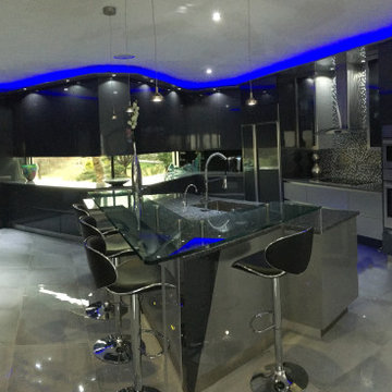
My design challenge was to create and build a new ultra modern kitchen with a futuristic flare. This state of the art kitchen was to be equipped with an ample amount of usable storage and a better view of the outside while balancing design and function.
Some of the project goals were to include the following; a multi-level island with seating for four people, dramatic use of lighting, state of the art appliances, a generous view of the outside and last but not least, to create a kitchen space that looks like no other...”The WOW Factor”.
This challenging project was a completely new design and full renovation. The existing kitchen was outdated and in desperate need help. My new design required me to remove existing walls, cabinetry, flooring, plumbing, electric…a complete demolition. My job functions were to be the interior designer, GC, electrician and a laborer.
Construction and Design
The existing kitchen had one small window in it like many kitchens. The main difficulty was…how to create more windows while gaining more cabinet storage. As a designer, our clients require us to think out of the box and give them something that they may have never dreamed of. I did just that. I created two 8’ glass backsplashes (with no visible supports) on the corner of the house. This was not easy task, engineering of massive blind headers and lam beams were used to support the load of the new floating walls. A generous amount of 48” high wall cabinets flank the new walls and appear floating in air seamlessly above the glass backsplash.
Technology and Design
The dramatic use of the latest in LED lighting was used. From color changing accent lights, high powered multi-directional spot lights, decorative soffit lights, under cabinet and above cabinet LED tape lights…all to be controlled from wall panels or mobile devises. A built-in ipad also controls not only the lighting, but a climate controlled thermostat, house wide music streaming with individually controlled zones, alarm system, video surveillance system and door bell.
Materials and design
Large amounts of glass and gloss; glass backsplash, iridescent glass tiles, raised glass island counter top, Quartz counter top with iridescent glass chips infused in it. 24” x 24” high polished porcelain tile flooring to give the appearance of water or glass. The custom cabinets are high gloss lacquer with a metallic fleck. All doors and drawers are Blum soft-close. The result is an ultra sleek and highly sophisticated design.
Appliances and design
All appliances were chosen for the ultimate in sleekness. These appliances include: a 48” built-in custom paneled subzero refrigerator/freezer, a built-in Miele dishwasher that is so quiet that it shoots a red led light on the floor to let you know that its on., a 36” Miele induction cook top and a built-in 200 bottle wine cooler. Some other cool features are the led kitchen faucet that changes color based on the water temperature. A stainless and glass wall hood with led lights. All duct work was built into the stainless steel toe kicks and grooves were cut into it to release airflow.
Photography by Mark Oser
 Advance Design Studio, Ltd.
After six years of living in their Huntley IL home, Chris and Meghan were tired of their dark, dingy, outdated kitchen and it was finally time for a long-anticipated change. “The kitchen is the place where we live, it’s where we do everything,” Meghan said. “It was important that it be a space where we wanted to be.” Meghan loves cooking and enjoys including their girls in healthy meal prepping, this led them to want a brighter, more enjoyable kitchen with increased functionality and improved storage.
For Chris especially, the laundry room was an entirely dysfunctional eyesore. “We had a washer and a dryer, but it was all kind-of cobbled together!” Chris said. “There were always laundry piles everywhere, we weren’t really sure what we wanted to do in there, but it was time for us to make a change.” The mess of the space was stressful every time they walked in the door from the garage each day. Kids’ backpacks and shoes piled up haphazardly in the makeshift boot-bench closet left the family feeling disorganized and stressed. They needed space for folding clothes and locker cubbies to help keep the family organized.
Having known Christine and Todd in the Huntley community for years, Chris and Meghan were familiar with their work. “We already trusted them personally and having seen their projects for years we knew they did top notch work. After we reviewed the initial round of designs, we knew that hiring them was definitely the right choice,” Meghan and Chris said. Although Chris had done a lot of work in their home himself, the kitchen and laundry room renovation was such a large undertaking that he didn’t want to steal time away from his family to spend what would surely be many long weekends doing the job himself. “That would not have been a wise choice for us,” Chris laughed.
“Our designer, Michelle was very, very, easy to work with; anything we wanted to see or weren’t sure about, she went above and beyond to make this easy for us. She was easy to get hold of and always quick to respond,” the couple said. Michelle pulled ideas that mirrored the couple’s taste and style and was adept at directing the couple to limited choices that didn’t overwhelm them and kept the process moving. “I have a hard time making decisions. Michelle made the decision-making process so easy. I loved how she listened to what I liked and then presented three great options for me to choose from,” Meghan said.
The main objectives for the kitchen were better storage solutions, they wanted the space to reflect their lifestyle and taste, and they wanted it to last for years with low maintenance. One of the first steps in creating a more functional kitchen was relocating the refrigerator, creating an improved workflow for the busy family.
“We didn’t know that we could even move the refrigerator to a new location where it is now, that was something that we never would have thought of,” Chris said. “The new refrigerator location makes the kitchen feel so much bigger. We didn’t add any space, but our whole kitchen with the new design just seems like it’s so much larger than before!” Meghan said.
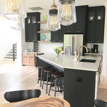
The perimeter mist colored cabinets helped warm and brighten the entire room, while the graphite colored cabinets on the island added contrast. Using this fresh, clean color palette satisfied the couple’s desire for a bright space that was the exact opposite of what they had before. Organization accessories were also added to the cabinets such as a spice drawer tray and roll outs to create hidden convenience.
“I absolutely love the hidden spices – it makes cooking so much more enjoyable!” Chris said. “And all the pull outs, and the double trash bin, who would think you could get so excited about organization!” the couple said in unison.
One thing they hated in their original kitchen was how dark the space felt. Added lighting on the ceiling with the new light fixtures combined with the lighter cabinetry colors throughout solved this problem. “Our new kitchen has this warm, almost cozy feeling that our old kitchen never had, it’s just a space that I love spending my time in now,” Meghan said. The light airy feeling was accentuated with the use of floating white shelves on either side of the decorative range hood. “We have so much cabinetry space, the new design is amazing we actually have more storage space than we will ever need,” Meghan said.
The island was extended to create more work surface and added space for stool seating. “The new island changes how we live. Now the kids can be in the kitchen with us, doing homework, eating breakfast, and the three of us have special dinners there when Chris is working late,” Meghan said.
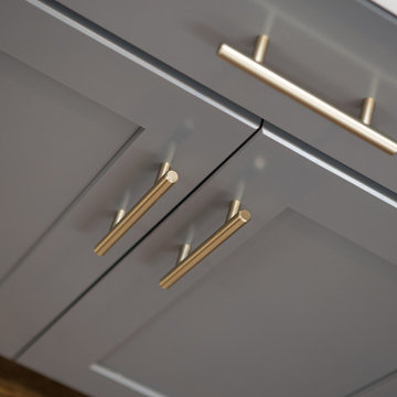
The Carrara Marmi Quartz countertops were chosen because they are, not only beautiful, but are made from hard-working material that doesn’t require maintenance. The white subway tile backsplash that wraps to the ceiling behind the focal point cooktop range/hood compliments the crisp white countertops perfectly, while brushed brass hardware and light fixtures keep the design fresh and new.
The couple had a few fears at the beginning of the project, as most homeowners do. Their biggest fear was being out of their kitchen and laundry room for an extended time. The crew made it very easy for the family to work in a limited space keeping the washer and dryer hooked up the majority of the time, and also getting appliances working with minimal downtime.
“They above and beyond accommodated us to get us through the process,” Meghan said. “They did a great job making sure we were as comfortable as possible throughout the process,” Chris added.
“Our project manager DJ did a great job. He was very good at updating us on schedule changes, getting guys in as quickly as possible. Everyone that stepped in the house was nice and did great work,” said Chris. They thought Advance’s carpenter was phenomenal and were impressed when he took a conceptual idea from a photograph and worked with designer Michelle to create a one of a kind range/hood that has become the topic of conversation with friends and family who visit the new kitchen. “He was in our house literally every day for several weeks. He was easy to work with and good at what he did,” Meghan and Chris said.
The focal point of the kitchen; a hand-crafted, custom-built ventilation hood was clad with handpicked reclaimed barnwood. Advance Design’s carpenter built the framework and the cladding to create a one-of-a-kind design element that the couple loves.
“I think it was especially fun for him to create something unique from scratch, showcasing his talent in this area,” Meghan said. “I love that my kitchen is not like everyone else’s. I got to pick out the wood on my hood and watch it being built and was able to choose what pieces of wood went where on it. It’s totally unique.”
Red Oak flooring was toothed-in throughout the kitchen and the rest of the first floor anywhere changes were made. Then the whole floor was refinished to tone down the orange undertones in the existing floor stain, ultimately changing the color complexion of the entire first floor. The result is a completely new feeling to the entire home.
Renovating the laundry room was extremely important to Meghan and Chris, but they had trouble visualizing what the possibilities were for the seemingly small space. Michelle produced beautiful 3D illustrations that helped them envision the space in a whole new way.
“I must have told Michelle 100 times that I am a visual person, seeing the designs in 3D made it so easy to make decisions and see what we could really do with our space,” Meghan said.
A dividing wall and doorway were removed between the existing laundry room and hallway formerly containing a coat closet, providing space to design specialized graphite colored cabinetry matching the kitchen island to house custom storage cubbies for each family member. Adding the tall utility cabinetry in the new laundry area helped solve the storage issue, tucking away cleaning supplies, household items, and even the cat got its own cubby.
“I love how everything is now hidden in its own space. I can’t tell you how much I hated coming home and seeing everything sitting around on counters,” Chris said.
Electrical outlets were planned for the inside of utility cabinets, so devices could charge in hidden locations. Stacking the washer and dryer allowed for wider countertop space to provide a folding area and a special space for clothes to hang. “The way I do laundry has been completely transformed! I can actually fold clothes and hang them now right out of the washer and dryer,” Meghan said.
“The end result in the kitchen and the laundry/mud room was an updated light and bright space, with a smarter work flow that better meets the needs of this family,” Michelle said.
“I would totally recommend Advance Design,” Meghan said. “Sometimes I sit and just look at my kitchen and laundry room and think ‘Wow, I can’t believe I get to live here!’ It’s an understatement to say we love our new space.”
Find the right local pro for your project
 AElise Designs LLC
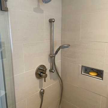
This wonderful renovation replaced an outdated (think - teal colored sinks, tub, etc.) hall bathroom into a new space that meets to needs of a multi-generational family and guests. Features include a curbless entry shower, dual vanities, no-slip matte porcelain flooring, a free standing tub, multiple layers of dimmable LED lighting, and a pocket door that eliminates door obstruction. Reinforced wall blocking was installed to allow for future additions of grab bars that might be needed. The warm beige palette features deep navy cabinetry, recycled glass countertops and shower bench seating and interesting mosaic tile accents framing the custom vanity mirrors.
 Cederberg Kitchens & Renovations
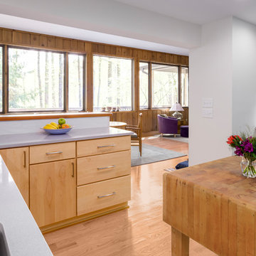
We opened the kitchen up to the living room to create a more connected & social functioning kitchen as well as creating a brighter more inviting work space which now benefits from the many large windows in the living room
 Third Generation Renovation
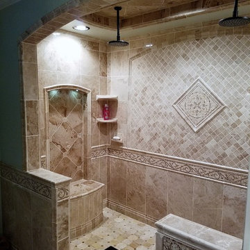
Inspiration for a huge mediterranean master beige tile and porcelain tile porcelain tile and beige floor bathroom remodel in Nashville with green walls
 Murphy Bros. Design | Build | Remodel
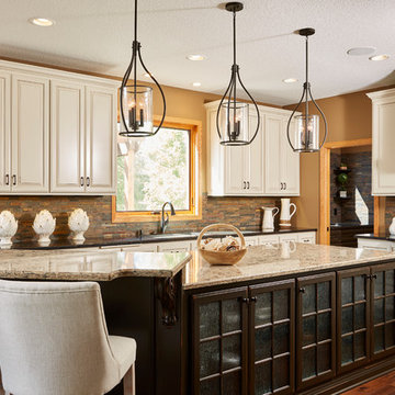
Example of a large classic medium tone wood floor kitchen design in Minneapolis with an undermount sink, raised-panel cabinets, beige cabinets, multicolored backsplash, matchstick tile backsplash, stainless steel appliances and an island


 San Luis Kitchen Co.
Surrounded by vineyards, horse ranches, and open land, the home is in a great location that is reasonably close to town while retaining a secluded air.
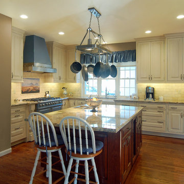
Our homeowners have enjoyed their country retreat for many years. They are blessed with a large extended family and love to host gatherings and entertain weekend guests. The only drawback to their gracious home was the drab and malfunctioning kitchen. First off, the cabinets were an out-dated whitewashed oak. Uggh! High ceilings were a plus feature that was negated by bizarrely stacked wall cabinets – making you think that maybe the original “designer” forgot about the 9 foot ceiling height. More likely, the original cabinets were stock items that didn’t come in the right size for the house. You can also see the lovely fluorescent light box tacked to the middle of the ceiling over the island. Why? Was there no thought to the style shown in the rest of the house?
Secondly, the homeowners were fighting with a poor kitchen layout. The large built-in refrigerator and separate freezer were placed right in the main traffic flow from the hall, there was not enough counter space to the right of the sink, the dishwasher was crammed right next to the fridge, and a broom closet took up prime real estate next to the cook-top. Now, remember, guests are frequent in this home and often several people were trying to use the kitchen at one time. Cross traffic and outright pile-ups were inevitable as some folks gathered veggies from the fridge to sauté at the cook-top while others were rinsing used dishes for the dishwasher and still others were taking frozen items to the prep sink and then the microwave. Don’t get me started about the trash and recycling receptacles – complete inconvenience to all!
So, our homeowners – the poor, benighted souls – were desperate for a remodel when they found San Luis Kitchen. On their first visit to our showroom, the couple fell in love with our French Country display. The display features soft white cabinets in a distressed cottage finish with a contrasting dark island and armoire; our homeowners were smitten. We knew everyone was up to the challenge and so we got right down to work.
We visited their home and measured their kitchen. While we were there, we took stock of the house’s overall style and the homeowner’s décor. We asked what they liked best about their home, what worked well and what didn’t. We found that they loved their arched passageways, the trim details on their mantle and the soft curves of the posts at their stair rail. They also showed us many photos of kitchens that they liked – both from magazines and on-line. Using this information, we went back to the office and pulled together a design.
We suggested swinging the refrigerator and freezer 90 degrees and setting them in place of the existing oven and hutch area. This brings them out of the traffic flow and into a comfortable relationship to the island counter. The fridge and freezer the homeowners chose were mismatched in width – we disguised the difference using custom detailing on the decorative panels. Deep storage cabinets above fill out the space.
Moving the fridge/freezer gained lots of luxurious counter space to the right of the new farmhouse sink. We placed the broom closet near the hall and tucked the microwave behind closed cabinet doors (which tuck away when open) to the left of it. The beautiful existing wood floor insisted that the island remain in the same location, however we replaced it with luscious cherry cabinets in an antique burnished finish. The island retained its prep sink and gained a wine refrigerator and both a trash compactor and double bin recycling cabinet. A decorative pot rack now hangs in place of the ugly old fluorescent lights.
The highlight of the new kitchen is the La Cornue range in a bright and bold blue! The homeowners traveled to a Bay area appliance showroom to see the ranges in person before purchasing to make sure that the ovens were of suitable size and that blue was truly the right color. The range was perfect, so it was purchased. The matching blue hood was created on site using a standard stainless hood as the base and painting a tapered drywall cover. To either side of the range we placed pullout base cabinets for oils and spices and such, each fronted with a turned post chosen to echo their stairway balusters. We also chose cabinet trim (crown, light rail and toe base) to harmonize with the homes existing details.
We knew for sure that the completed kitchen was a success when the happy homeowners reported to us that over Thanksgiving they had five cooks working in the space with no conflict whatsoever. That’s a true complement to our design – Thank You!
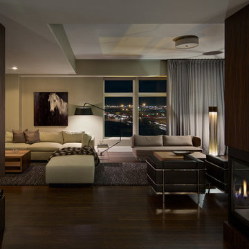
 Dado Interior Design
Location: Denver, CO, USA
THE CHALLENGE: Transform an outdated, uninspired condo into a unique, forward thinking home, while dealing with a limited capacity to remodel due to the buildings’ high-rise architectural restrictions.
THE SOLUTION: Warm wood clad walls were added throughout the home, creating architectural interest, as well as a sense of unity. Soft, textured furnishing was selected to elevate the home’s sophistication, while attention to layout and detail ensures its functionality.
Dado Interior Design
DAVID LAUER PHOTOGRAPHY
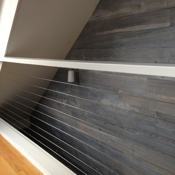
 Heirloom Design Build
Location: Rosemary Beach, Florida
Scope: This was an extremely outdated traditional home. The goal was to take a modest budget and breath life into this tired home. We wanted to give it a current feel, while also working within the exiting small footprint.
Builder: Heriloom Design Build
Architecture: Heirloom Design Build
Interior Design: Heirloom Design Build
Decorator: Heirloom Design Build
Seen here is wood paneling is part of our sustainable woods program. It is white oak from a downed tree in Atlanta, and the non VOC application is a natural mineral based liquid with a white oil rub to finish it off. Please let us know if you are interested or like the paneling! We would love to know what you think, as we are developing different samples.
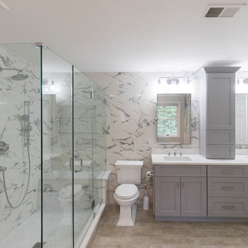

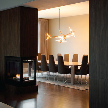 Dado Interior Design
Location: Denver, CO, USA
THE CHALLENGE: Transform an outdated, uninspired condo into a unique, forward thinking home, while dealing with a limited capacity to remodel due to the buildings’ high-rise architectural restrictions.
THE SOLUTION: Warm wood clad walls were added throughout the home, creating architectural interest, as well as a sense of unity. Soft, textured furnishing was selected to elevate the home’s sophistication, while attention to layout and detail ensures its functionality.
Dado Interior Design
DAVID LAUER PHOTOGRAPHY
 Alair Homes Plano
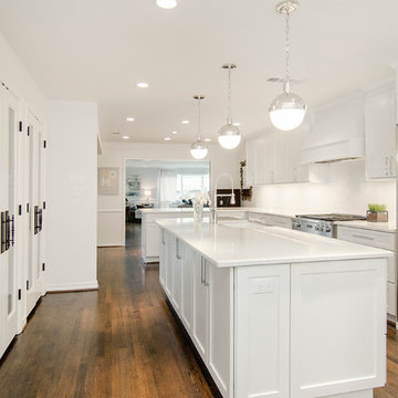
This kitchen was closed-in and outdated. Heavy wood paneling covered most walls and the pantry lacked space. After re-configuring walls to create a more open feel, we expanded the pantry to triple its original size and updated cabinets to create a chic modern space. Design | Build by Hatfield Builders & Remodelers, photography by Versatile Imaging.


 Advance Design Studio, Ltd.
Raza and Baneen purchased their home in Schaumburg IL. knowing it needed work, but they saw the incredible potential it had with its expanse of beautiful kitchen windows and spacious floor plan.
The kitchen technically functioned fine, but was desperately outdated with its honey oak cabinets and plain countertops. This family loved to cook and host parties so it was an easy decision that the kitchen remodel was the first project they needed to tackle to make their home come to life.
Baneen had very specific ideas for her new dream kitchen and had been thinking about it for over 10 years! When they met Advance Design’s Project Designer Claudia Pop, Baneen felt an instant connection.
“From the first meeting, I knew that Claudia would guide us without putting down our ideas,” Baneen said.
The couple had two fears common among remodeling home owners: Would the project be done on time? And, would the project stay on budget? Advance Design was able to alleviate their fears early on, as Claudia shared the “Common Sense Remodeling” process. Raza and Baneen absolutely loved the custom project analysis that helped them understand how a budget could be accurately predicted and then safeguarded during the design process.
“Advance Design was spot on with both the budget and the project timeframe,” Baneen said. “Overall there were no surprises, and the budget was exactly what we were quoted. The experience was phenomenal, everybody was professional, everybody was courteous, everyone was nice, everyone was friendly. It wasn't stressful for us, they still left the house in a presentable state. It wasn't like we would come home and we were bring the kids in and it was going to be hazardous."
After the relationship was cemented, Raza, Baneen and Claudia began to finalize the kitchen design. The main objective was to create a functional space for preparing meals and to create an inviting space for their family and friends to enjoy, while incorporating interesting design elements such as the iconic blue island and reclaimed Chicago brick walls. Sufficient storage space was really important to Baneen, and high quality appliances were a priority. As the overall layout was being completed, together they reviewed each cabinet to determine exactly what would be stored there.
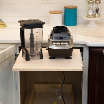
Because cooking was a high priority for this family, Claudia incorporated spice racks close to the range and included two mixer lift shelves for their larger countertop appliances.
The focal point of the kitchen is the striking blue island constructed from custom colored Dura Supreme cabinets. Designed with decorative shelving and a highly functional prep sink. The couple loves the “galley” prep sink, it adds even more functionality and significantly shortens preparation and cleaning time. This island also includes a 24" Bosch Dishwasher with matching panel to blend in.
"Aesthetically, and in terms of functionality, the island everything I imagined," Baneen said. "I love how beautiful it looks and how functional it is. It just brings everybody together."
The Praa Sands Quartz countertop with an ogee edge profile provides excellent contrast by blending it's subtle tones with the outer cabinetry. It ties the island together with the rest of the space. Overlooking the beautiful backyard through spacious windows, the crisp white farmhouse sink is something that Baneen envisioned in her kitchen for years.
Two tones of Dura Supreme Cabinetry were used throughout the rest of the kitchen. Chestnut Cherry cabinets grace the range and decorative range hood and as panels over the Wolf refrigerator and freezer. Antique White cabinets surround the perimeter, creating a warm balance that beckons guests into the softly rounded space.
Drawing the eye immediately to the custom wood hood hiding a powerful 1,500 CFM ventilation system and spectacular 60” Duel Fuel Wolf range, a creatively patterned Tessen in Café & Brine backsplash detail stands out from the white subway tile backsplash spanning the outer walls. The vibrant space reflects the lively personality of the family who now loves spending time both cooking and enjoying this kitchen as a family.
“The end result is a beautiful and extremely functional kitchen that is able to handle a growing family, lots of parties and lots of cooking,” Claudia said.
“Advance Design was wonderfully professional and a pleasure to work with. They catered to what my needs and ideas were, while skillfully guiding us to make the right choices where we seemed lost,” Baneen said.
 INSPIRED KITCHEN DESIGN
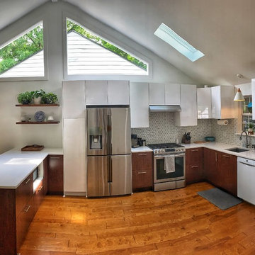
Complementing the cabinetry is quartz countertops in Super White, which were purchased from a local countertop company in Austell, GA, as well as Retro Rhombus Porcelain Mosaic Tile with Maipai Pearl Gray Grout for the backsplash and Palmetto Road River Ridge Hand Scraped Birch Sutton flooring.
All these elements are enhanced by natural light, which comes through the two expansive windows over the refrigerator and peninsula, as well as a skylight and other windows throughout.
Lindsey adds: “I love the sleek design as well as the amount of storage we have now. The hidden drawers are so cool! We had a lot of people tell us we should do an island but the peninsula really resonated with us. I think because it was such a large open space. I’m so glad we listened to our gut.”
 ASB Architecture
Bruce Bettis Photography
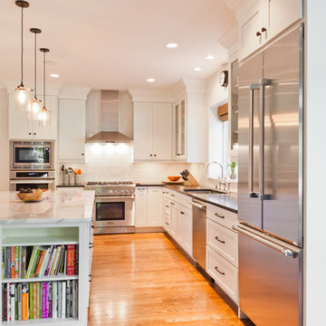
Example of a classic kitchen design in Boston with an undermount sink, shaker cabinets, white cabinets, white backsplash, subway tile backsplash and stainless steel appliances
Example of a classic kitchen design in Boston with an undermount sink, shaker cabinets, white cabinets, white backsplash, subway tile backsplash and stainless steel appliances
 TKS Design Group
Free ebook, CREATING THE IDEAL KITCHEN
Download now → http://bit.ly/idealkitchen
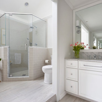
After having remodeled their kitchen, and two other baths in the home, the master bathroom was the last on the list of rooms to update for this couple. The existing bath had a small sink area with his and hers sinks and then a pocket door into the main bath which housed the tub, shower and commode. The main problem was the outdated look of the space, which was rather dark and dreary, and the giant unused whirlpool tub which took up more than its fair share of the footprint.
To brighten the space, we used a pallet of soft gray porcelain tile on the floor and ceramic subway tiles on the walls. Carrera marble and nickel plumbing brighten the room and help amplify the sunlight streaming in through the existing skylight and vaulted ceiling.
We first placed the new freestanding tub on an angle near the window so that users can take advantage of the view and light while soaking in the tub. A new, much larger shower takes up the other corner and delivers some symmetry to the room and is now a luxurious, useable and comfortable size. The commode was relocated to the right of the new shower, so it is visually tucked away. The existing opening between the sink area and the main area was widened and the door removed so that the homeowners can enjoy the light from the larger room while using the sinks each morning.
A step up into the tub/shower area provides additional interest and was a happy accident and solution required to accommodate running the plumbing through the existing floor joists. Because the existing room felt quite contemporary with the vaulted ceiling, we added a run of crown molding around the top and a chair rail to the top of the tile to provide some traditional touches to the room. We think this space is lovely, relaxing and serene and are so honored to have been chosen by these wonderful homeowners to help provide them with a relaxing master bath sanctuary!
Designer: Susan Klimala
Assistant Designer: Keri Rogers
Sponsored
Sunbury, OH

J.Holderby - Renovations
Franklin County's Leading General Contractors - 2X Best of Houzz!
 Jarrett Design
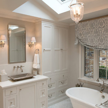
These clients win the award for ‘Most Jarrett Design Projects in One Home’! We consider ourselves extremely fortunate to have been able to work with these kind folks so consistently over the years.
The most recent project features their master bath, a room they have been wanting to tackle for many years. We think it was well worth the wait! It started off as an outdated space with an enormous platform tub open to the bedroom featuring a large round column. The open concept was inspired by island homes long ago, but it was time for some privacy. The water closet, shower and linen closet served the clients well, but the tub and vanities had to be updated with storage improvements desired. The clients also wanted to add organized spaces for clothing, shoes and handbags. Swapping the large tub for a dainty freestanding tub centered on the new window, cleared space for gorgeous his and hers vanities and armoires flanking the tub. The area where the old double vanity existed was transformed into personalized storage closets boasting beautiful custom mirrored doors. The bathroom floors and shower surround were replaced with classic white and grey materials. Handmade vessel sinks and faucets add a rich touch. Soft brass wire doors are the highlight of a freestanding custom armoire created to house handbags adding more convenient storage and beauty to the bedroom. Star sconces, bell jar fixture, wallpaper and window treatments selected by the homeowner with the help of the talented Lisa Abdalla Interiors provide the finishing traditional touches for this sanctuary.
Jacqueline Powell Photography
 Jarrett Design
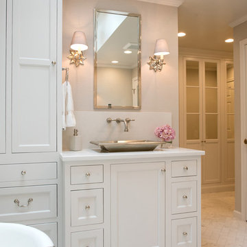
These clients win the award for ‘Most Jarrett Design Projects in One Home’! We consider ourselves extremely fortunate to have been able to work with these kind folks so consistently over the years.
The most recent project features their master bath, a room they have been wanting to tackle for many years. We think it was well worth the wait! It started off as an outdated space with an enormous platform tub open to the bedroom featuring a large round column. The open concept was inspired by island homes long ago, but it was time for some privacy. The water closet, shower and linen closet served the clients well, but the tub and vanities had to be updated with storage improvements desired. The clients also wanted to add organized spaces for clothing, shoes and handbags. Swapping the large tub for a dainty freestanding tub centered on the new window, cleared space for gorgeous his and hers vanities and armoires flanking the tub. The area where the old double vanity existed was transformed into personalized storage closets boasting beautiful custom mirrored doors. The bathroom floors and shower surround were replaced with classic white and grey materials. Handmade vessel sinks and faucets add a rich touch. Soft brass wire doors are the highlight of a freestanding custom armoire created to house handbags adding more convenient storage and beauty to the bedroom. Star sconces, bell jar fixture, wallpaper and window treatments selected by the homeowner with the help of the talented Lisa Abdalla Interiors provide the finishing traditional touches for this sanctuary.
Jacqueline Powell Photography

7