
Search results for "Outdated thinking" in Home Design Ideas
 Advance Design Studio, Ltd.
After six years of living in their Huntley IL home, Chris and Meghan were tired of their dark, dingy, outdated kitchen and it was finally time for a long-anticipated change. “The kitchen is the place where we live, it’s where we do everything,” Meghan said. “It was important that it be a space where we wanted to be.” Meghan loves cooking and enjoys including their girls in healthy meal prepping, this led them to want a brighter, more enjoyable kitchen with increased functionality and improved storage.
For Chris especially, the laundry room was an entirely dysfunctional eyesore. “We had a washer and a dryer, but it was all kind-of cobbled together!” Chris said. “There were always laundry piles everywhere, we weren’t really sure what we wanted to do in there, but it was time for us to make a change.” The mess of the space was stressful every time they walked in the door from the garage each day. Kids’ backpacks and shoes piled up haphazardly in the makeshift boot-bench closet left the family feeling disorganized and stressed. They needed space for folding clothes and locker cubbies to help keep the family organized.
Having known Christine and Todd in the Huntley community for years, Chris and Meghan were familiar with their work. “We already trusted them personally and having seen their projects for years we knew they did top notch work. After we reviewed the initial round of designs, we knew that hiring them was definitely the right choice,” Meghan and Chris said. Although Chris had done a lot of work in their home himself, the kitchen and laundry room renovation was such a large undertaking that he didn’t want to steal time away from his family to spend what would surely be many long weekends doing the job himself. “That would not have been a wise choice for us,” Chris laughed.
“Our designer, Michelle was very, very, easy to work with; anything we wanted to see or weren’t sure about, she went above and beyond to make this easy for us. She was easy to get hold of and always quick to respond,” the couple said. Michelle pulled ideas that mirrored the couple’s taste and style and was adept at directing the couple to limited choices that didn’t overwhelm them and kept the process moving. “I have a hard time making decisions. Michelle made the decision-making process so easy. I loved how she listened to what I liked and then presented three great options for me to choose from,” Meghan said.
The main objectives for the kitchen were better storage solutions, they wanted the space to reflect their lifestyle and taste, and they wanted it to last for years with low maintenance. One of the first steps in creating a more functional kitchen was relocating the refrigerator, creating an improved workflow for the busy family.
“We didn’t know that we could even move the refrigerator to a new location where it is now, that was something that we never would have thought of,” Chris said. “The new refrigerator location makes the kitchen feel so much bigger. We didn’t add any space, but our whole kitchen with the new design just seems like it’s so much larger than before!” Meghan said.
The perimeter mist colored cabinets helped warm and brighten the entire room, while the graphite colored cabinets on the island added contrast. Using this fresh, clean color palette satisfied the couple’s desire for a bright space that was the exact opposite of what they had before. Organization accessories were also added to the cabinets such as a spice drawer tray and roll outs to create hidden convenience.
“I absolutely love the hidden spices – it makes cooking so much more enjoyable!” Chris said. “And all the pull outs, and the double trash bin, who would think you could get so excited about organization!” the couple said in unison.
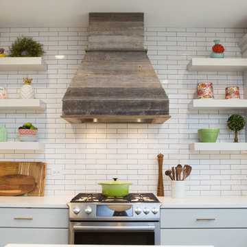
One thing they hated in their original kitchen was how dark the space felt. Added lighting on the ceiling with the new light fixtures combined with the lighter cabinetry colors throughout solved this problem. “Our new kitchen has this warm, almost cozy feeling that our old kitchen never had, it’s just a space that I love spending my time in now,” Meghan said. The light airy feeling was accentuated with the use of floating white shelves on either side of the decorative range hood. “We have so much cabinetry space, the new design is amazing we actually have more storage space than we will ever need,” Meghan said.
The island was extended to create more work surface and added space for stool seating. “The new island changes how we live. Now the kids can be in the kitchen with us, doing homework, eating breakfast, and the three of us have special dinners there when Chris is working late,” Meghan said.
The Carrara Marmi Quartz countertops were chosen because they are, not only beautiful, but are made from hard-working material that doesn’t require maintenance. The white subway tile backsplash that wraps to the ceiling behind the focal point cooktop range/hood compliments the crisp white countertops perfectly, while brushed brass hardware and light fixtures keep the design fresh and new.
The couple had a few fears at the beginning of the project, as most homeowners do. Their biggest fear was being out of their kitchen and laundry room for an extended time. The crew made it very easy for the family to work in a limited space keeping the washer and dryer hooked up the majority of the time, and also getting appliances working with minimal downtime.
“They above and beyond accommodated us to get us through the process,” Meghan said. “They did a great job making sure we were as comfortable as possible throughout the process,” Chris added.
“Our project manager DJ did a great job. He was very good at updating us on schedule changes, getting guys in as quickly as possible. Everyone that stepped in the house was nice and did great work,” said Chris. They thought Advance’s carpenter was phenomenal and were impressed when he took a conceptual idea from a photograph and worked with designer Michelle to create a one of a kind range/hood that has become the topic of conversation with friends and family who visit the new kitchen. “He was in our house literally every day for several weeks. He was easy to work with and good at what he did,” Meghan and Chris said.
The focal point of the kitchen; a hand-crafted, custom-built ventilation hood was clad with handpicked reclaimed barnwood. Advance Design’s carpenter built the framework and the cladding to create a one-of-a-kind design element that the couple loves.
“I think it was especially fun for him to create something unique from scratch, showcasing his talent in this area,” Meghan said. “I love that my kitchen is not like everyone else’s. I got to pick out the wood on my hood and watch it being built and was able to choose what pieces of wood went where on it. It’s totally unique.”
Red Oak flooring was toothed-in throughout the kitchen and the rest of the first floor anywhere changes were made. Then the whole floor was refinished to tone down the orange undertones in the existing floor stain, ultimately changing the color complexion of the entire first floor. The result is a completely new feeling to the entire home.
Renovating the laundry room was extremely important to Meghan and Chris, but they had trouble visualizing what the possibilities were for the seemingly small space. Michelle produced beautiful 3D illustrations that helped them envision the space in a whole new way.
“I must have told Michelle 100 times that I am a visual person, seeing the designs in 3D made it so easy to make decisions and see what we could really do with our space,” Meghan said.
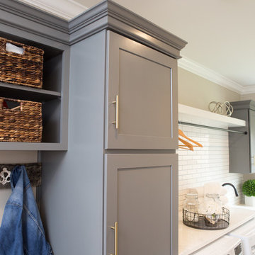
A dividing wall and doorway were removed between the existing laundry room and hallway formerly containing a coat closet, providing space to design specialized graphite colored cabinetry matching the kitchen island to house custom storage cubbies for each family member. Adding the tall utility cabinetry in the new laundry area helped solve the storage issue, tucking away cleaning supplies, household items, and even the cat got its own cubby.
“I love how everything is now hidden in its own space. I can’t tell you how much I hated coming home and seeing everything sitting around on counters,” Chris said.
Electrical outlets were planned for the inside of utility cabinets, so devices could charge in hidden locations. Stacking the washer and dryer allowed for wider countertop space to provide a folding area and a special space for clothes to hang. “The way I do laundry has been completely transformed! I can actually fold clothes and hang them now right out of the washer and dryer,” Meghan said.
“The end result in the kitchen and the laundry/mud room was an updated light and bright space, with a smarter work flow that better meets the needs of this family,” Michelle said.
“I would totally recommend Advance Design,” Meghan said. “Sometimes I sit and just look at my kitchen and laundry room and think ‘Wow, I can’t believe I get to live here!’ It’s an understatement to say we love our new space.”
 S-Squared // Architecture + Interiors + Landscape
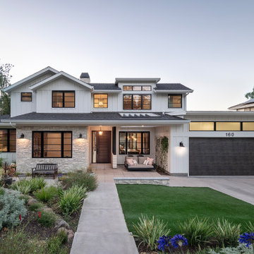
front elevation
Example of a cottage exterior home design in San Francisco
Example of a cottage exterior home design in San Francisco
 place architecture:design
Tom Holdsworth Photography
Our clients wanted to create a room that would bring them closer to the outdoors; a room filled with natural lighting; and a venue to spotlight a modern fireplace.
Early in the design process, our clients wanted to replace their existing, outdated, and rundown screen porch, but instead decided to build an all-season sun room. The space was intended as a quiet place to read, relax, and enjoy the view.
The sunroom addition extends from the existing house and is nestled into its heavily wooded surroundings. The roof of the new structure reaches toward the sky, enabling additional light and views.
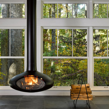
The floor-to-ceiling magnum double-hung windows with transoms, occupy the rear and side-walls. The original brick, on the fourth wall remains exposed; and provides a perfect complement to the French doors that open to the dining room and create an optimum configuration for cross-ventilation.
To continue the design philosophy for this addition place seamlessly merged natural finishes from the interior to the exterior. The Brazilian black slate, on the sunroom floor, extends to the outdoor terrace; and the stained tongue and groove, installed on the ceiling, continues through to the exterior soffit.
The room's main attraction is the suspended metal fireplace; an authentic wood-burning heat source. Its shape is a modern orb with a commanding presence. Positioned at the center of the room, toward the rear, the orb adds to the majestic interior-exterior experience.
This is the client's third project with place architecture: design. Each endeavor has been a wonderful collaboration to successfully bring this 1960s ranch-house into twenty-first century living.
Find the right local pro for your project
 Advance Design Studio, Ltd.
After six years of living in their Huntley IL home, Chris and Meghan were tired of their dark, dingy, outdated kitchen and it was finally time for a long-anticipated change. “The kitchen is the place where we live, it’s where we do everything,” Meghan said. “It was important that it be a space where we wanted to be.” Meghan loves cooking and enjoys including their girls in healthy meal prepping, this led them to want a brighter, more enjoyable kitchen with increased functionality and improved storage.
For Chris especially, the laundry room was an entirely dysfunctional eyesore. “We had a washer and a dryer, but it was all kind-of cobbled together!” Chris said. “There were always laundry piles everywhere, we weren’t really sure what we wanted to do in there, but it was time for us to make a change.” The mess of the space was stressful every time they walked in the door from the garage each day. Kids’ backpacks and shoes piled up haphazardly in the makeshift boot-bench closet left the family feeling disorganized and stressed. They needed space for folding clothes and locker cubbies to help keep the family organized.
Having known Christine and Todd in the Huntley community for years, Chris and Meghan were familiar with their work. “We already trusted them personally and having seen their projects for years we knew they did top notch work. After we reviewed the initial round of designs, we knew that hiring them was definitely the right choice,” Meghan and Chris said. Although Chris had done a lot of work in their home himself, the kitchen and laundry room renovation was such a large undertaking that he didn’t want to steal time away from his family to spend what would surely be many long weekends doing the job himself. “That would not have been a wise choice for us,” Chris laughed.
“Our designer, Michelle was very, very, easy to work with; anything we wanted to see or weren’t sure about, she went above and beyond to make this easy for us. She was easy to get hold of and always quick to respond,” the couple said. Michelle pulled ideas that mirrored the couple’s taste and style and was adept at directing the couple to limited choices that didn’t overwhelm them and kept the process moving. “I have a hard time making decisions. Michelle made the decision-making process so easy. I loved how she listened to what I liked and then presented three great options for me to choose from,” Meghan said.
The main objectives for the kitchen were better storage solutions, they wanted the space to reflect their lifestyle and taste, and they wanted it to last for years with low maintenance. One of the first steps in creating a more functional kitchen was relocating the refrigerator, creating an improved workflow for the busy family.
“We didn’t know that we could even move the refrigerator to a new location where it is now, that was something that we never would have thought of,” Chris said. “The new refrigerator location makes the kitchen feel so much bigger. We didn’t add any space, but our whole kitchen with the new design just seems like it’s so much larger than before!” Meghan said.
The perimeter mist colored cabinets helped warm and brighten the entire room, while the graphite colored cabinets on the island added contrast. Using this fresh, clean color palette satisfied the couple’s desire for a bright space that was the exact opposite of what they had before. Organization accessories were also added to the cabinets such as a spice drawer tray and roll outs to create hidden convenience.
“I absolutely love the hidden spices – it makes cooking so much more enjoyable!” Chris said. “And all the pull outs, and the double trash bin, who would think you could get so excited about organization!” the couple said in unison.
One thing they hated in their original kitchen was how dark the space felt. Added lighting on the ceiling with the new light fixtures combined with the lighter cabinetry colors throughout solved this problem. “Our new kitchen has this warm, almost cozy feeling that our old kitchen never had, it’s just a space that I love spending my time in now,” Meghan said. The light airy feeling was accentuated with the use of floating white shelves on either side of the decorative range hood. “We have so much cabinetry space, the new design is amazing we actually have more storage space than we will ever need,” Meghan said.
The island was extended to create more work surface and added space for stool seating. “The new island changes how we live. Now the kids can be in the kitchen with us, doing homework, eating breakfast, and the three of us have special dinners there when Chris is working late,” Meghan said.
The Carrara Marmi Quartz countertops were chosen because they are, not only beautiful, but are made from hard-working material that doesn’t require maintenance. The white subway tile backsplash that wraps to the ceiling behind the focal point cooktop range/hood compliments the crisp white countertops perfectly, while brushed brass hardware and light fixtures keep the design fresh and new.
The couple had a few fears at the beginning of the project, as most homeowners do. Their biggest fear was being out of their kitchen and laundry room for an extended time. The crew made it very easy for the family to work in a limited space keeping the washer and dryer hooked up the majority of the time, and also getting appliances working with minimal downtime.
“They above and beyond accommodated us to get us through the process,” Meghan said. “They did a great job making sure we were as comfortable as possible throughout the process,” Chris added.
“Our project manager DJ did a great job. He was very good at updating us on schedule changes, getting guys in as quickly as possible. Everyone that stepped in the house was nice and did great work,” said Chris. They thought Advance’s carpenter was phenomenal and were impressed when he took a conceptual idea from a photograph and worked with designer Michelle to create a one of a kind range/hood that has become the topic of conversation with friends and family who visit the new kitchen. “He was in our house literally every day for several weeks. He was easy to work with and good at what he did,” Meghan and Chris said.
The focal point of the kitchen; a hand-crafted, custom-built ventilation hood was clad with handpicked reclaimed barnwood. Advance Design’s carpenter built the framework and the cladding to create a one-of-a-kind design element that the couple loves.
“I think it was especially fun for him to create something unique from scratch, showcasing his talent in this area,” Meghan said. “I love that my kitchen is not like everyone else’s. I got to pick out the wood on my hood and watch it being built and was able to choose what pieces of wood went where on it. It’s totally unique.”
Red Oak flooring was toothed-in throughout the kitchen and the rest of the first floor anywhere changes were made. Then the whole floor was refinished to tone down the orange undertones in the existing floor stain, ultimately changing the color complexion of the entire first floor. The result is a completely new feeling to the entire home.
Renovating the laundry room was extremely important to Meghan and Chris, but they had trouble visualizing what the possibilities were for the seemingly small space. Michelle produced beautiful 3D illustrations that helped them envision the space in a whole new way.
“I must have told Michelle 100 times that I am a visual person, seeing the designs in 3D made it so easy to make decisions and see what we could really do with our space,” Meghan said.
A dividing wall and doorway were removed between the existing laundry room and hallway formerly containing a coat closet, providing space to design specialized graphite colored cabinetry matching the kitchen island to house custom storage cubbies for each family member. Adding the tall utility cabinetry in the new laundry area helped solve the storage issue, tucking away cleaning supplies, household items, and even the cat got its own cubby.
“I love how everything is now hidden in its own space. I can’t tell you how much I hated coming home and seeing everything sitting around on counters,” Chris said.
Electrical outlets were planned for the inside of utility cabinets, so devices could charge in hidden locations. Stacking the washer and dryer allowed for wider countertop space to provide a folding area and a special space for clothes to hang. “The way I do laundry has been completely transformed! I can actually fold clothes and hang them now right out of the washer and dryer,” Meghan said.
“The end result in the kitchen and the laundry/mud room was an updated light and bright space, with a smarter work flow that better meets the needs of this family,” Michelle said.
“I would totally recommend Advance Design,” Meghan said. “Sometimes I sit and just look at my kitchen and laundry room and think ‘Wow, I can’t believe I get to live here!’ It’s an understatement to say we love our new space.”
 Mosaik Design & Remodeling
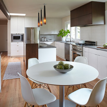
This outdated Mid Century ranch built in late 1950’s was in serious need of an update. Our clients wanted a fresh contemporary feel that was simple in design and reflected the original Mid Century feel of the home.
The new frosted Plexiglas railing allows the now open staircase and modern pendant to become part of the small dining area. White painted cabinetry with slab doors and minimal pulls add a lighter component and balance out the dark walnut cabinetry. The (3) built-in charging drawers, Legrand retractable outlets and a single door hood that opens with a light touch add a "cool" functional vibe to the space.,
Gray quartz countertops and a rectilinear white tile backsplash add serenity and tie in the stainless appliances giving the kitchen a modern feel.
A wood waterfall countertop detail on the back of the island adds interest to the space and is anchored by the unique handblown wave glass pendants in a soft grey color.
The new exposed support is both dramatic and functional in that it hides a support post in open bookcase cabinet.
Wendi Nordeck Photography
 Advance Design Studio, Ltd.
After six years of living in their Huntley IL home, Chris and Meghan were tired of their dark, dingy, outdated kitchen and it was finally time for a long-anticipated change. “The kitchen is the place where we live, it’s where we do everything,” Meghan said. “It was important that it be a space where we wanted to be.” Meghan loves cooking and enjoys including their girls in healthy meal prepping, this led them to want a brighter, more enjoyable kitchen with increased functionality and improved storage.
For Chris especially, the laundry room was an entirely dysfunctional eyesore. “We had a washer and a dryer, but it was all kind-of cobbled together!” Chris said. “There were always laundry piles everywhere, we weren’t really sure what we wanted to do in there, but it was time for us to make a change.” The mess of the space was stressful every time they walked in the door from the garage each day. Kids’ backpacks and shoes piled up haphazardly in the makeshift boot-bench closet left the family feeling disorganized and stressed. They needed space for folding clothes and locker cubbies to help keep the family organized.
Having known Christine and Todd in the Huntley community for years, Chris and Meghan were familiar with their work. “We already trusted them personally and having seen their projects for years we knew they did top notch work. After we reviewed the initial round of designs, we knew that hiring them was definitely the right choice,” Meghan and Chris said. Although Chris had done a lot of work in their home himself, the kitchen and laundry room renovation was such a large undertaking that he didn’t want to steal time away from his family to spend what would surely be many long weekends doing the job himself. “That would not have been a wise choice for us,” Chris laughed.
“Our designer, Michelle was very, very, easy to work with; anything we wanted to see or weren’t sure about, she went above and beyond to make this easy for us. She was easy to get hold of and always quick to respond,” the couple said. Michelle pulled ideas that mirrored the couple’s taste and style and was adept at directing the couple to limited choices that didn’t overwhelm them and kept the process moving. “I have a hard time making decisions. Michelle made the decision-making process so easy. I loved how she listened to what I liked and then presented three great options for me to choose from,” Meghan said.
The main objectives for the kitchen were better storage solutions, they wanted the space to reflect their lifestyle and taste, and they wanted it to last for years with low maintenance. One of the first steps in creating a more functional kitchen was relocating the refrigerator, creating an improved workflow for the busy family.
“We didn’t know that we could even move the refrigerator to a new location where it is now, that was something that we never would have thought of,” Chris said. “The new refrigerator location makes the kitchen feel so much bigger. We didn’t add any space, but our whole kitchen with the new design just seems like it’s so much larger than before!” Meghan said.
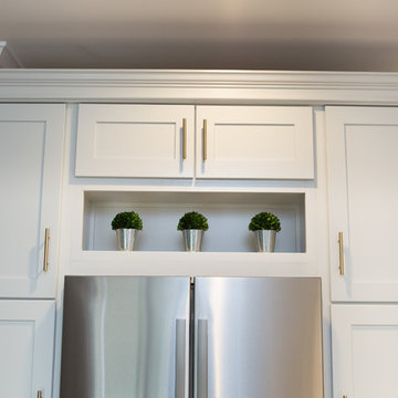
The perimeter mist colored cabinets helped warm and brighten the entire room, while the graphite colored cabinets on the island added contrast. Using this fresh, clean color palette satisfied the couple’s desire for a bright space that was the exact opposite of what they had before. Organization accessories were also added to the cabinets such as a spice drawer tray and roll outs to create hidden convenience.
“I absolutely love the hidden spices – it makes cooking so much more enjoyable!” Chris said. “And all the pull outs, and the double trash bin, who would think you could get so excited about organization!” the couple said in unison.
One thing they hated in their original kitchen was how dark the space felt. Added lighting on the ceiling with the new light fixtures combined with the lighter cabinetry colors throughout solved this problem. “Our new kitchen has this warm, almost cozy feeling that our old kitchen never had, it’s just a space that I love spending my time in now,” Meghan said. The light airy feeling was accentuated with the use of floating white shelves on either side of the decorative range hood. “We have so much cabinetry space, the new design is amazing we actually have more storage space than we will ever need,” Meghan said.
The island was extended to create more work surface and added space for stool seating. “The new island changes how we live. Now the kids can be in the kitchen with us, doing homework, eating breakfast, and the three of us have special dinners there when Chris is working late,” Meghan said.
The Carrara Marmi Quartz countertops were chosen because they are, not only beautiful, but are made from hard-working material that doesn’t require maintenance. The white subway tile backsplash that wraps to the ceiling behind the focal point cooktop range/hood compliments the crisp white countertops perfectly, while brushed brass hardware and light fixtures keep the design fresh and new.
The couple had a few fears at the beginning of the project, as most homeowners do. Their biggest fear was being out of their kitchen and laundry room for an extended time. The crew made it very easy for the family to work in a limited space keeping the washer and dryer hooked up the majority of the time, and also getting appliances working with minimal downtime.
“They above and beyond accommodated us to get us through the process,” Meghan said. “They did a great job making sure we were as comfortable as possible throughout the process,” Chris added.
“Our project manager DJ did a great job. He was very good at updating us on schedule changes, getting guys in as quickly as possible. Everyone that stepped in the house was nice and did great work,” said Chris. They thought Advance’s carpenter was phenomenal and were impressed when he took a conceptual idea from a photograph and worked with designer Michelle to create a one of a kind range/hood that has become the topic of conversation with friends and family who visit the new kitchen. “He was in our house literally every day for several weeks. He was easy to work with and good at what he did,” Meghan and Chris said.
The focal point of the kitchen; a hand-crafted, custom-built ventilation hood was clad with handpicked reclaimed barnwood. Advance Design’s carpenter built the framework and the cladding to create a one-of-a-kind design element that the couple loves.
“I think it was especially fun for him to create something unique from scratch, showcasing his talent in this area,” Meghan said. “I love that my kitchen is not like everyone else’s. I got to pick out the wood on my hood and watch it being built and was able to choose what pieces of wood went where on it. It’s totally unique.”
Red Oak flooring was toothed-in throughout the kitchen and the rest of the first floor anywhere changes were made. Then the whole floor was refinished to tone down the orange undertones in the existing floor stain, ultimately changing the color complexion of the entire first floor. The result is a completely new feeling to the entire home.
Renovating the laundry room was extremely important to Meghan and Chris, but they had trouble visualizing what the possibilities were for the seemingly small space. Michelle produced beautiful 3D illustrations that helped them envision the space in a whole new way.
“I must have told Michelle 100 times that I am a visual person, seeing the designs in 3D made it so easy to make decisions and see what we could really do with our space,” Meghan said.
A dividing wall and doorway were removed between the existing laundry room and hallway formerly containing a coat closet, providing space to design specialized graphite colored cabinetry matching the kitchen island to house custom storage cubbies for each family member. Adding the tall utility cabinetry in the new laundry area helped solve the storage issue, tucking away cleaning supplies, household items, and even the cat got its own cubby.
“I love how everything is now hidden in its own space. I can’t tell you how much I hated coming home and seeing everything sitting around on counters,” Chris said.
Electrical outlets were planned for the inside of utility cabinets, so devices could charge in hidden locations. Stacking the washer and dryer allowed for wider countertop space to provide a folding area and a special space for clothes to hang. “The way I do laundry has been completely transformed! I can actually fold clothes and hang them now right out of the washer and dryer,” Meghan said.
“The end result in the kitchen and the laundry/mud room was an updated light and bright space, with a smarter work flow that better meets the needs of this family,” Michelle said.
“I would totally recommend Advance Design,” Meghan said. “Sometimes I sit and just look at my kitchen and laundry room and think ‘Wow, I can’t believe I get to live here!’ It’s an understatement to say we love our new space.”
 Alair Homes Plano
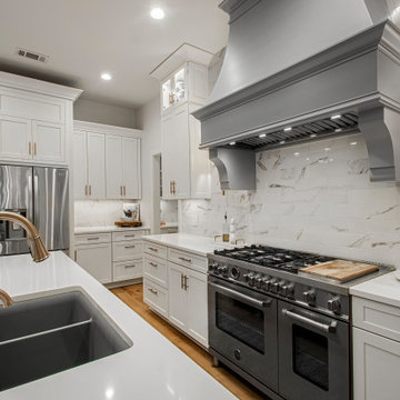
Our clients came to us wanting to maximize the space they had. They were not planning on moving anytime soon, as they loved their neighborhood. They wanted to renovate the front of their house, which included the front atrium, living room, kitchen, and powder bath. They hated their kitchen because it was completely closed off, had low ceilings, was dark and outdated, not to mention the floors were different in each of these rooms! The pantry was in the breakfast area and the kitchen table became a junk catcher, being the first thing you see when coming in from the garage/laundry room. In their living room, they wanted the spaces on either side of the fireplace to be symmetrical, whether that be bookshelves, a wet bar or closed off. Both parents are working professionals with no time and/or desire to design, create and figure this out on their own. They needed help figuring out how to reconfigure their current space in order to maximize what they already had, as they could not see an obvious solution. They could not envision how it would look so the fact that our designers were able to show them their new kitchen in 3D was pertinent.
We removed the pass-through windows that surrounded the atrium and front dining room, as well as the entire kitchen wall, completely opening up those two rooms. We removed a hall that used to lead between the kitchen and the living room since it was a complete waste of space! The ceilings were raised to 10’ in the kitchen and we were able to leave the skylight, letting in that natural light they wanted. We were able to give them a much larger pantry with tons of shelving and increase the size of their laundry room by utilizing the space of their old breakfast nook.
We relocated the door to the garage into their new elongated laundry room, built a wet bar across from their new larger pantry (with a pocket door) and the flow and functionality of these new spaces is just perfect! All new Waypoint cabinets were installed one two main kitchen surrounding walls painted Linen. Calacatta Bianco Polished Porcelain Tile 4x12 was used for the backsplash. A large eat-at island was installed, painted Stone, where the family can now gather for homework, meals, and mingling. The soft champagne bronze hardware and accent lighting really give this white and gray kitchen a soft classic look.
In the living room, we removed the built-in bookshelves to the left of the fireplace and closed off the wet-bar on the other side, giving them more space in their master suite. White Oak wood flooring, stained Putney, was installed throughout the entire new space, giving it the continuity they were looking for.
In the guest bathroom, Carrara white herringbone marble mosaic 12x12 tile was used on the shower floor and niche, while basic marble Bianco polished 12x24 porcelain tile was used on the walls. Luxart polished chrome traditional hardware gives this timeless bathroom the perfect shine.
Our clients are so happy with the new functionality and look of their space. It has definitely changed their lives in a way they could have never imagined!


 General Assembly
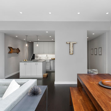
GA was hired to renovate this outdated apartment. We reorganized the kitchen into a more efficient layout and opened up the space as much as possible to the living room. We put in new dark wood flooring through out, and contrasted that with light gray walls. New recessed lighting throughout helps to define the different spaces.
© Devon Banks
 Lincoln Lighthill Architect
Lincoln Lighthill Architect employed several discrete updates that collectively transform this existing row house.
At the heart of the home, a section of floor was removed at the top level to open up the existing stair and allow light from a new skylight to penetrate deep into the home. The stair itself received a new maple guardrail and planter, with a Fiddle-leaf fig tree growing up through the opening towards the skylight.
On the top living level, an awkwardly located entrance to a full bathroom directly off the main stair was moved around the corner and out of the way by removing a little used tub from the bathroom, as well as an outdated heater in the back corner. This created a more discrete entrance to the existing, now half-bath, and opened up a space for a wall of pantry cabinets with built-in refrigerator, and an office nook at the rear of the house with a huge new awning window to let in light and air.
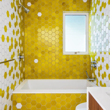
Downstairs, the two existing bathrooms were reconfigured and recreated as dedicated master and kids baths. The kids bath uses yellow and white hexagonal Heath tile to create a pixelated celebration of color. The master bath, hidden behind a flush wall of walnut cabinetry, utilizes another Heath tile color to create a calming retreat.
Throughout the home, walnut thin-ply cabinetry creates a strong contrast to the existing maple flooring, while the exposed blond edges of the material tie the two together. Rounded edges on integral pulls and door edges create pinstripe detailing that adds richness and a sense of playfulness to the design.
This project was featured by Houzz: https://tinyurl.com/stn2hcze
 NKBA Texas Gulf Coast
SLEEK CONTEMPORARY
Micqui McGowen, Kitchen & Bath Concepts
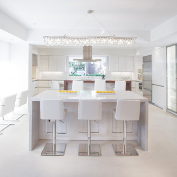
Challenge: Redesign the kitchen area for the original owner who built this home in the early 1970’s. Our design challenge was to create a completely new space that was functional, beautiful and much more open.
The original kitchen, storage and utility spaces were outdated and very chopped up with a mechanical closet placed in the middle of the space located directly in front of the only large window in the room.
We relocated the mechanical closet and the utility room to the back of the space with a Butler’s Pantry separating the two. The original large window is now revealed with a new lowered eating bar and a second island centered on it, featuring a dramatic linear light fixture above. We enlarged the window over the main kitchen sink for more light and created a new window to the right of the sink with a view towards the pool.
The main cooking area of the kitchen features a large island with elevated walnut seating bar and 36” gas cooktop. A full 36” Built-in Refrigerator is located in the Kitchen with an additional Sub-Zero Refrigerator and Freezer located in the Butler’s Pantry.
Result: Client’s Dream Kitchen Realized.

 Dado Interior Design
Location: Denver, CO, USA
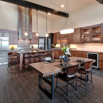
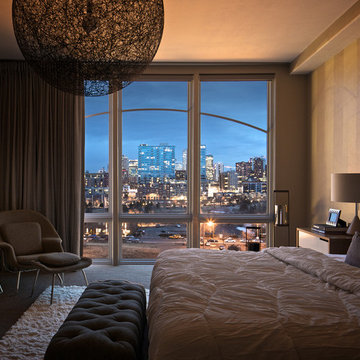
THE CHALLENGE: Transform an outdated, uninspired condo into a unique, forward thinking home, while dealing with a limited capacity to remodel due to the buildings’ high-rise architectural restrictions.
THE SOLUTION: Warm wood clad walls were added throughout the home, creating architectural interest, as well as a sense of unity. Soft, textured furnishing was selected to elevate the home’s sophistication, while attention to layout and detail ensures its functionality.
Dado Interior Design
DAVID LAUER PHOTOGRAPHY
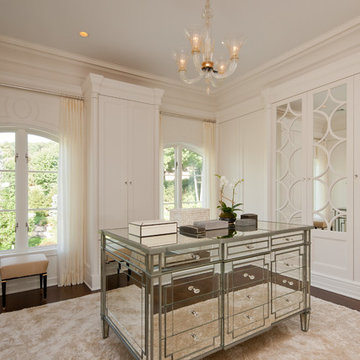
 Jack Levy Design
Inspiration for a timeless women's dressing room remodel in New York with white cabinets


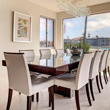
 Cantoni Irvine
Designed By: Sarah Buehlman
Marc and Mandy Maister were clients and fans of Cantoni before they purchased this harbor home on Balboa Island. The South African natives originally met designer Sarah Buehlman and Cantoni’s Founder and CEO Michael Wilkov at a storewide sale, and quickly established a relationship as they bought furnishings for their primary residence in Newport Beach.
So, when the couple decided to invest in this gorgeous second home, in one of the ritziest enclaves in North America, they sought Sarah’s help in transforming the outdated 1960’s residence into a modern marvel. “It’s now the ultimate beach house,” says Sarah, “and finished in Cantoni from top to bottom—including new custom cabinetry installed throughout.”
But let’s back up. This project began when Mandy contacted Sarah in the midst of the remodel process (in December 2010), asking if she could come take a look and help with the overall design.
“The plans were being drawn up with an architect, and they opted not to move anything major. Instead, they updated everything—as in the small carpeted staircase that became a gorgeous glass and metal sculpture,” Sarah explains. She took photographs and measurements, and then set to work creating the scaled renderings. “Marc and Mandy were drawn to the One and Only Collection. It features a high-gloss brown and white color scheme which served as inspiration for the project,” says Sarah.
Primary pieces in the expansive living area include the Mondrian leather sectional, the Involution sculpture, and a pair of Vladimir Kagan Corkscrew swivel chairs. The Maisters needed a place to house all their electronics but didn’t want a typical entertainment center. The One and Only buffet was actually modified by our skilled shop technicians, in our distribution center, so it could accommodate all the couple’s media equipment. “These artisans are another one of our hidden strengths—in addition to the design tools, inventory and extensive resources we have to get a job done,” adds Sarah. Marc and Mandy also fell in love with the exotic Makassar ebony wood in the Ritz Collection, which Sarah combined in the master bedroom with the Ravenna double chaise to provide an extra place to sit and enjoy the beautiful harbor views.
Beyond new furnishings, the Maisters also decided to completely redo their kitchen. And though Marc and Mandy did not have a chance to actually see our kitchen displays, having worked with Sarah over the years, they had immense trust in our commitment to craftsmanship and quality. In fact, they opted for new cabinetry in four bathrooms as well as the laundry room based on our 3D renderings and lacquer samples alone—without ever opening a drawer. “Their trust in my expertise and Cantoni’s reputation were a major deciding factor,” says Sarah.
This plush second home, complete with a private boat dock right out back, counts as one of Sarah’s proudest accomplishments. “These long-time clients are great. They love Cantoni and appreciate high quality Italian furnishings in particular. The home is so gorgeous that once you are inside and open the Nano doors, you simply don’t want to leave.” The job took almost two years to complete, but everyone seems quite happy with the results, proving that large or small—and in cases necessitating a quick turnaround or execution of a long-term vision—Cantoni has the resources to come through for all clients.

 New Blue Construction
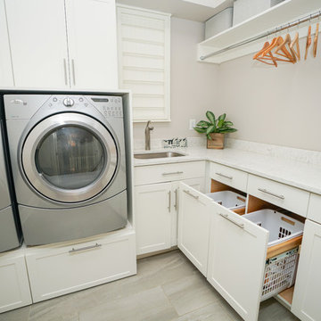
New custom cabinetry and marble surfaces turned an outdated laundry room into a thing of beauty and function.
Photos: Christian Stewart Photography
Dedicated laundry room - mid-sized victorian l-shaped ceramic tile and gray floor dedicated laundry room idea in Other with an undermount sink, recessed-panel cabinets, white cabinets, marble countertops, gray walls and a side-by-side washer/dryer
Dedicated laundry room - mid-sized victorian l-shaped ceramic tile and gray floor dedicated laundry room idea in Other with an undermount sink, recessed-panel cabinets, white cabinets, marble countertops, gray walls and a side-by-side washer/dryer
 Arbogast Custom Homes
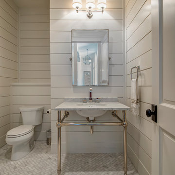
Design guiding principles include using a minimalist approach to give this home an organic and modern character. The floor plan compliments the needs of a growing family and the professional telecommuter. Sitting atop a ridge in Belvedere, this home provides miles of hill country views combined with a lot adorned with massive live oaks. The outdoor diving pool brings a splash of comfort on a hot summers day.
Sponsored
Sunbury, OH

J.Holderby - Renovations
Franklin County's Leading General Contractors - 2X Best of Houzz!
 JRP Design & Remodel
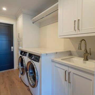
Our client's Tudor-style home felt outdated. She was anxious to be rid of the warm antiquated tones and to introduce new elements of interest while keeping resale value in mind. It was at a Boys & Girls Club luncheon that she met Justin and Lori through a four-time repeat client sitting at the same table. For her, reputation was a key factor in choosing a design-build firm. She needed someone she could trust to help design her vision. Together, JRP and our client solidified a plan for a sweeping home remodel that included a bright palette of neutrals and knocking down walls to create an open-concept first floor.
Now updated and expanded, the home has great circulation space for entertaining. The grand entryway, once partitioned by a wall, now bespeaks the spaciousness of the home. An eye catching chandelier floats above the spacious entryway. High ceilings and pale neutral colors make the home luminous. Medium oak hardwood floors throughout add a gentle warmth to the crisp palette. Originally U-shaped and closed, the kitchen is now as beautiful as it is functional. A grand island with luxurious Calacatta quartz spilling across the counter and twin candelabra pendants above the kitchen island bring the room to life. Frameless, two-tone cabinets set against ceramic rhomboid tiles convey effortless style. Just off the second-floor master bedroom is an elevated nook with soaring ceilings and a sunlit rotunda glowing in natural light. The redesigned master bath features a free-standing soaking tub offset by a striking statement wall. Marble-inspired quartz in the shower creates a sense of breezy movement and soften the space. Removing several walls, modern finishes, and the open concept creates a relaxing and timeless vibe. Each part of the house feels light as air. After a breathtaking renovation, this home reflects transitional design at its best.
PROJECT DETAILS:
•Style: Transitional
•Countertops: Vadara Quartz, Calacatta Blanco
•Cabinets: (Dewils) Frameless Recessed Panel Cabinets, Maple - Painted White / Kitchen Island: Stained Cacao
•Hardware/Plumbing Fixture Finish: Polished Nickel, Chrome
•Lighting Fixtures: Chandelier, Candelabra (in kitchen), Sconces
•Flooring:
oMedium Oak Hardwood Flooring with Oil Finish
oBath #1, Floors / Master WC: 12x24 “marble inspired” Porcelain Tiles (color: Venato Gold Matte)
oBath #2 & #3 Floors: Ceramic/Porcelain Woodgrain Tile
•Tile/Backsplash: Ceramic Rhomboid Tiles – Finish: Crackle
•Paint Colors: White/Light Grey neutrals
•Other Details: (1) Freestanding Soaking Tub (2) Elevated Nook off Master Bedroom
Photographer: J.R. Maddox
 Manor Design, Eva Puterbaugh Interior Designer
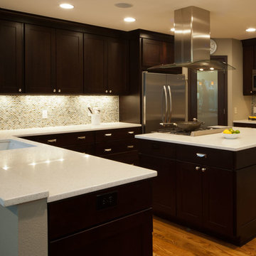
This kitchen is a layout that makes every space usable. The smaller island has seating, storage and the cook top. This area was formerly an outdated space with poor use of cabinets and pantry.
 Kala Interior Design
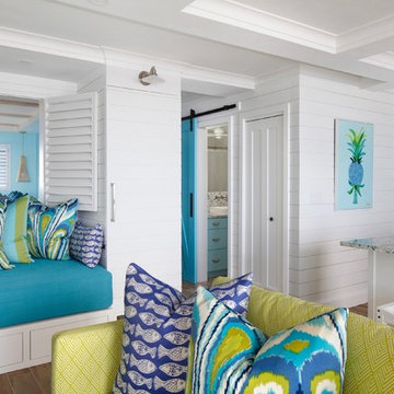
The breathtaking ocean views influenced the dramatic redesign of this water-front Poipu condo. The outdated condo was completely remodeled to allow full appreciation of the surrounding views, bring in a fresh new color palette, and modernize and update everything from the electrical wiring to the new luxury bath towels. The clients wanted the condo to feel “fun, happy, and cheerful,” and to stand apart from the typical vacation rental on Kauai. They wanted to turn this condo into the ultimate “beach house” that felt just as luxurious as the gorgeous natural surroundings.
Fresh white ship-lap walls set the backdrop for this modern beach style, which is further enhanced with bold stripes, natural textures, and ocean-themed decor. The palette of cobalt, aqua and lichen green is fresh and vibrant against the neutral backdrop. Trina Turk’s “Peacock Print” was the inspiration fabric for the living and dining room. The print is so lively, colorful, and modern, and was the perfect place to start.
Every custom detail was thoughtfully chosen to bring a sense of luxury and originality to the space. While some elements are whimsical, such as the playful octopus art & fish-themed fabric, other elements are sophisticated and classic, to help keep the design grounded.
Special features include a custom-made “Moroccan Fish Scale” tile backsplash in the kitchen, crushed marble counter tops with oyster shells and float glass, and blue glass pendant lights, reminiscent of water bubbles.
4