
Search results for "Outdated thinking" in Home Design Ideas
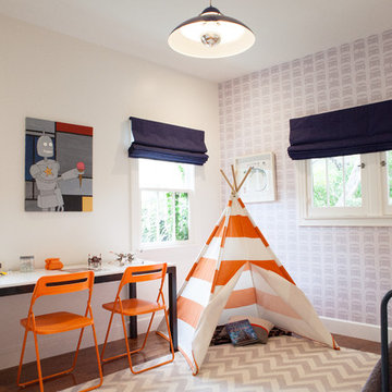
 Joy Street Design
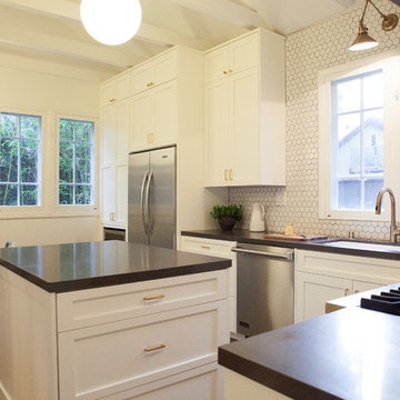
As a recently purchased home, our clients quickly decided they needed to make some major adjustments. The home was pretty outdated and didn’t speak to the young family’s unique style, but we wanted to keep the welcoming character of this Mediterranean bungalow in tact. The classic white kitchen with a new layout is the perfect backdrop for the family. Brass accents add a touch of luster throughout and modernizes the fixtures and hardware.
While the main common areas feature neutral color palettes, we quickly gave each room a burst of energy through bright accent colors and patterned textiles. The kids’ rooms are the most playful, showcasing bold wallcoverings, bright tones, and even a teepee tent reading nook.
Designed by Joy Street Design serving Oakland, Berkeley, San Francisco, and the whole of the East Bay.
For more about Joy Street Design, click here: https://www.joystreetdesign.com/
To learn more about this project, click here: https://www.joystreetdesign.com/portfolio/gower-street
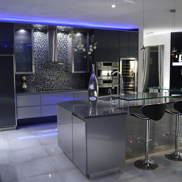
 Designs By Mark, Inc.
Design Statement:
My design challenge was to create and build a new ultra modern kitchen with a futuristic flare. This state of the art kitchen was to be equipped with an ample amount of usable storage and a better view of the outside while balancing design and function.
Some of the project goals were to include the following; a multi-level island with seating for four people, dramatic use of lighting, state of the art appliances, a generous view of the outside and last but not least, to create a kitchen space that looks like no other...”The WOW Factor”.
This challenging project was a completely new design and full renovation. The existing kitchen was outdated and in desperate need help. My new design required me to remove existing walls, cabinetry, flooring, plumbing, electric…a complete demolition. My job functions were to be the interior designer, GC, electrician and a laborer.
Construction and Design
The existing kitchen had one small window in it like many kitchens. The main difficulty was…how to create more windows while gaining more cabinet storage. As a designer, our clients require us to think out of the box and give them something that they may have never dreamed of. I did just that. I created two 8’ glass backsplashes (with no visible supports) on the corner of the house. This was not easy task, engineering of massive blind headers and lam beams were used to support the load of the new floating walls. A generous amount of 48” high wall cabinets flank the new walls and appear floating in air seamlessly above the glass backsplash.
Technology and Design
The dramatic use of the latest in LED lighting was used. From color changing accent lights, high powered multi-directional spot lights, decorative soffit lights, under cabinet and above cabinet LED tape lights…all to be controlled from wall panels or mobile devises. A built-in ipad also controls not only the lighting, but a climate controlled thermostat, house wide music streaming with individually controlled zones, alarm system, video surveillance system and door bell.
Materials and design
Large amounts of glass and gloss; glass backsplash, iridescent glass tiles, raised glass island counter top, Quartz counter top with iridescent glass chips infused in it. 24” x 24” high polished porcelain tile flooring to give the appearance of water or glass. The custom cabinets are high gloss lacquer with a metallic fleck. All doors and drawers are Blum soft-close. The result is an ultra sleek and highly sophisticated design.
Appliances and design
All appliances were chosen for the ultimate in sleekness. These appliances include: a 48” built-in custom paneled subzero refrigerator/freezer, a built-in Miele dishwasher that is so quiet that it shoots a red led light on the floor to let you know that its on., a 36” Miele induction cook top and a built-in 200 bottle wine cooler. Some other cool features are the led kitchen faucet that changes color based on the water temperature. A stainless and glass wall hood with led lights. All duct work was built into the stainless steel toe kicks and grooves were cut into it to release airflow.
Photography by Mark Oser
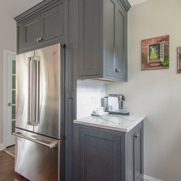
 Kowalske Kitchen & Bath
Kowalske Kitchen & Bath transformed this 1940s Delafield cape cod into a stunning home full of charm. We worked with the homeowner from concept through completion, ensuring every detail of the interior and exterior was perfect!
The goal was to restore the historic beauty of this home. Interior renovations included the kitchen, two full bathrooms, and cosmetic updates to the bedrooms and breezeway. We added character with glass interior door knobs, three-panel doors, mouldings, etched custom lighting and refinishing the original hardwood floors.
The center of this home is the incredible kitchen. The original space had soffits, outdated cabinets, laminate counters and was closed off from the dining room with a peninsula. The new space was opened into the dining room to allow for an island with more counter space and seating. The highlights include quartzite counters, a farmhouse sink, a subway tile backsplash, custom inset cabinets, mullion glass doors and beadboard wainscoting.
The two full bathrooms are full of character – carrara marble basketweave flooring, beadboard, custom cabinetry, quartzite counters and custom lighting. The walk-in showers feature subway tile, Kohler fixtures and custom glass doors.
The exterior of the home was updated to give it an authentic European cottage feel. We gave the garage a new look with carriage style custom doors to match the new trim and siding. We also updated the exterior doors and added a set of french doors near the deck. Other updates included new front steps, decking, lannon stone pathway, custom lighting and ornate iron railings.
This Nagawicka Lake home will be enjoyed by the family for many years.
Find the right local pro for your project
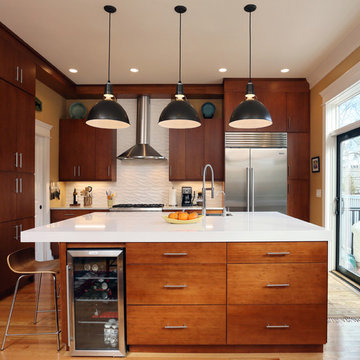
 New England Design & Construction
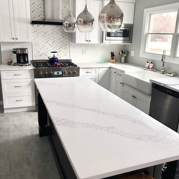
In this major kitchen remodel, we switched the locations of a half bath and a kitchen pantry, and gave an outdated and poorly laid out kitchen a total upgrade, including creating a better work triangle for people who actually cook in their kitchens. A spare, modern aesthetic was used with warm wood tones to offset the white counters.
Photos by Jay Groccia at OnSite Studios
 Gr8 Kitchens
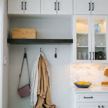
On this project we ripped out an old an outdated 90's dark brown kitchen and finished out the space with all new white cabinets, dark gray island and bar area. Jenn Air appliances were used on this project, along with Fabulous cabinetry, Kohler plumbing fixtures and durable flooring and counter top materials to guarantee many years of enjoyment for these happy homeowners.
 TVL Creative Ltd.
Our clients had just recently closed on their new house in Stapleton and were excited to transform it into their perfect forever home. They wanted to remodel the entire first floor to create a more open floor plan and develop a smoother flow through the house that better fit the needs of their family. The original layout consisted of several small rooms that just weren’t very functional, so we decided to remove the walls that were breaking up the space and restructure the first floor to create a wonderfully open feel.
After removing the existing walls, we rearranged their spaces to give them an office at the front of the house, a large living room, and a large dining room that connects seamlessly with the kitchen. We also wanted to center the foyer in the home and allow more light to travel through the first floor, so we replaced their existing doors with beautiful custom sliding doors to the back yard and a gorgeous walnut door with side lights to greet guests at the front of their home.
Living Room
Our clients wanted a living room that could accommodate an inviting sectional, a baby grand piano, and plenty of space for family game nights. So, we transformed what had been a small office and sitting room into a large open living room with custom wood columns. We wanted to avoid making the home feel too vast and monumental, so we designed custom beams and columns to define spaces and to make the house feel like a home. Aesthetically we wanted their home to be soft and inviting, so we utilized a neutral color palette with occasional accents of muted blues and greens.
Dining Room
Our clients were also looking for a large dining room that was open to the rest of the home and perfect for big family gatherings. So, we removed what had been a small family room and eat-in dining area to create a spacious dining room with a fireplace and bar. We added custom cabinetry to the bar area with open shelving for displaying and designed a custom surround for their fireplace that ties in with the wood work we designed for their living room. We brought in the tones and materiality from the kitchen to unite the spaces and added a mixed metal light fixture to bring the space together
Kitchen
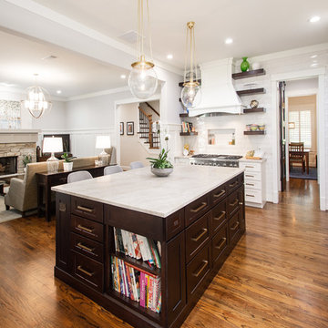
We wanted the kitchen to be a real show stopper and carry through the calm muted tones we were utilizing throughout their home. We reoriented the kitchen to allow for a big beautiful custom island and to give us the opportunity for a focal wall with cooktop and range hood. Their custom island was perfectly complimented with a dramatic quartz counter top and oversized pendants making it the real center of their home. Since they enter the kitchen first when coming from their detached garage, we included a small mud-room area right by the back door to catch everyone’s coats and shoes as they come in. We also created a new walk-in pantry with plenty of open storage and a fun chalkboard door for writing notes, recipes, and grocery lists.
Office
We transformed the original dining room into a handsome office at the front of the house. We designed custom walnut built-ins to house all of their books, and added glass french doors to give them a bit of privacy without making the space too closed off. We painted the room a deep muted blue to create a glimpse of rich color through the french doors
Powder Room
The powder room is a wonderful play on textures. We used a neutral palette with contrasting tones to create dramatic moments in this little space with accents of brushed gold.
Master Bathroom
The existing master bathroom had an awkward layout and outdated finishes, so we redesigned the space to create a clean layout with a dream worthy shower. We continued to use neutral tones that tie in with the rest of the home, but had fun playing with tile textures and patterns to create an eye-catching vanity. The wood-look tile planks along the floor provide a soft backdrop for their new free-standing bathtub and contrast beautifully with the deep ash finish on the cabinetry.
 Alair Homes Plano
This project is a Houzz Kitchen of the Week! Click below to read the full story!
https://www.houzz.com/ideabooks/116547325/list/kitchen-of-the-week-better-brighter-and-no-longer-basic
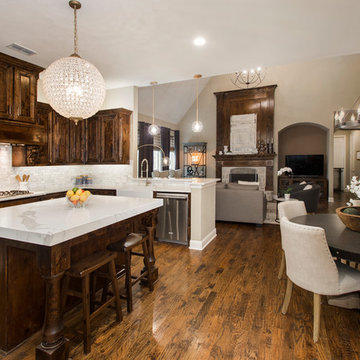
Our clients came to us wanting an elegant and functional kitchen and brighter living room. Their kitchen was dark and inefficient. The cabinets felt cluttered and the storage was there, but not functional for this family. They wanted all new finishes; especially new cabinets, but the floors were going to stay and be refinished. No wall relocation was needed but adding a door into the dining room to block the view from the front into the kitchen was discussed. They wanted to bring in more light somehow and preferably natural light. There was an unused sink in the butler’s pantry that they wanted capped, giving them more space and organized storage was a must! In their living room, they love their fireplace because it reminds her of her home in Colorado, so that definitely had to stay but everything else was left to the designers.
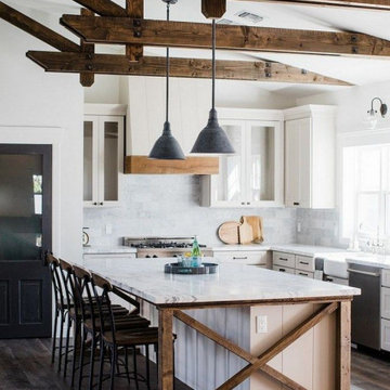
After all decisions were made, this gorgeous kitchen and living space came to life! It is bright, open and airy, just like our clients wanted. Soft White Shiloh cabinetry was installed with a contrasting Cocoa island. Honed Levantina Taj Mahal quartzite was a beautiful countertop for this space. Bedrosians Grace 4”x 12” wall tile in Panna was the backsplash throughout the kitchen. The stove wall is flanked with dark wooden shelves on either side of vent-a-hood creating a feature area to the cook area. A beautiful maple barn door with seeded baroque tempered glass inserts was installed to close off the pantry and giving them more room than a traditional door. The original wainscoting remained in the kitchen and living areas but was modified in the kitchen where the cabinets were slightly extended and painted white throughout. LED tape lighting was installed under the cabinets, LED lighting was also added to the top of the upper glass cabinets, in addition to the grow lights installed for their herbs. All of the light fixtures were updated to a timeless classic look and feel. Imbrie articulating wall sconces were installed over the kitchen window/sink and in the butler’s pantry and aged brass Hood classic globe pendants were hung over the island, really drawing your attention to the kitchen. The Alturas fixture from SeaGull Lighing now hangs in the center of the living room, where there was once an outdated ceiling fan. In the living room, the walls were painted white, while leaving the wood and stone fireplace, as requested, leaving an absolutely amazing contrast!
Design/Remodel by Hatfield Builders & Remodelers | Photography by Versatile Imaging

 Alair Homes Plano
Our clients house was built in 2012, so it was not that outdated, it was just dark. The clients wanted to lighten the kitchen and create something that was their own, using more unique products. The master bath needed to be updated and they wanted the upstairs game room to be more functional for their family.
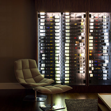
The original kitchen was very dark and all brown. The cabinets were stained dark brown, the countertops were a dark brown and black granite, with a beige backsplash. We kept the dark cabinets but lightened everything else. A new translucent frosted glass pantry door was installed to soften the feel of the kitchen. The main architecture in the kitchen stayed the same but the clients wanted to change the coffee bar into a wine bar, so we removed the upper cabinet door above a small cabinet and installed two X-style wine storage shelves instead. An undermount farm sink was installed with a 23” tall main faucet for more functionality. We replaced the chandelier over the island with a beautiful Arhaus Poppy large antique brass chandelier. Two new pendants were installed over the sink from West Elm with a much more modern feel than before, not to mention much brighter. The once dark backsplash was now a bright ocean honed marble mosaic 2”x4” a top the QM Calacatta Miel quartz countertops. We installed undercabinet lighting and added over-cabinet LED tape strip lighting to add even more light into the kitchen.
We basically gutted the Master bathroom and started from scratch. We demoed the shower walls, ceiling over tub/shower, demoed the countertops, plumbing fixtures, shutters over the tub and the wall tile and flooring. We reframed the vaulted ceiling over the shower and added an access panel in the water closet for a digital shower valve. A raised platform was added under the tub/shower for a shower slope to existing drain. The shower floor was Carrara Herringbone tile, accented with Bianco Venatino Honed marble and Metro White glossy ceramic 4”x16” tile on the walls. We then added a bench and a Kohler 8” rain showerhead to finish off the shower. The walk-in shower was sectioned off with a frameless clear anti-spot treated glass. The tub was not important to the clients, although they wanted to keep one for resale value. A Japanese soaker tub was installed, which the kids love! To finish off the master bath, the walls were painted with SW Agreeable Gray and the existing cabinets were painted SW Mega Greige for an updated look. Four Pottery Barn Mercer wall sconces were added between the new beautiful Distressed Silver leaf mirrors instead of the three existing over-mirror vanity bars that were originally there. QM Calacatta Miel countertops were installed which definitely brightened up the room!
Originally, the upstairs game room had nothing but a built-in bar in one corner. The clients wanted this to be more of a media room but still wanted to have a kitchenette upstairs. We had to remove the original plumbing and electrical and move it to where the new cabinets were. We installed 16’ of cabinets between the windows on one wall. Plank and Mill reclaimed barn wood plank veneers were used on the accent wall in between the cabinets as a backing for the wall mounted TV above the QM Calacatta Miel countertops. A kitchenette was installed to one end, housing a sink and a beverage fridge, so the clients can still have the best of both worlds. LED tape lighting was added above the cabinets for additional lighting. The clients love their updated rooms and feel that house really works for their family now.
Design/Remodel by Hatfield Builders & Remodelers | Photography by Versatile Imaging
 Dado Interior Design
Location: Denver, CO, USA
THE CHALLENGE: Transform an outdated, uninspired condo into a unique, forward thinking home, while dealing with a limited capacity to remodel due to the buildings’ high-rise architectural restrictions.
THE SOLUTION: Warm wood clad walls were added throughout the home, creating architectural interest, as well as a sense of unity. Soft, textured furnishing was selected to elevate the home’s sophistication, while attention to layout and detail ensures its functionality.
Dado Interior Design
DAVID LAUER PHOTOGRAPHY
 Advance Design Studio, Ltd.
After six years of living in their Huntley IL home, Chris and Meghan were tired of their dark, dingy, outdated kitchen and it was finally time for a long-anticipated change. “The kitchen is the place where we live, it’s where we do everything,” Meghan said. “It was important that it be a space where we wanted to be.” Meghan loves cooking and enjoys including their girls in healthy meal prepping, this led them to want a brighter, more enjoyable kitchen with increased functionality and improved storage.
For Chris especially, the laundry room was an entirely dysfunctional eyesore. “We had a washer and a dryer, but it was all kind-of cobbled together!” Chris said. “There were always laundry piles everywhere, we weren’t really sure what we wanted to do in there, but it was time for us to make a change.” The mess of the space was stressful every time they walked in the door from the garage each day. Kids’ backpacks and shoes piled up haphazardly in the makeshift boot-bench closet left the family feeling disorganized and stressed. They needed space for folding clothes and locker cubbies to help keep the family organized.
Having known Christine and Todd in the Huntley community for years, Chris and Meghan were familiar with their work. “We already trusted them personally and having seen their projects for years we knew they did top notch work. After we reviewed the initial round of designs, we knew that hiring them was definitely the right choice,” Meghan and Chris said. Although Chris had done a lot of work in their home himself, the kitchen and laundry room renovation was such a large undertaking that he didn’t want to steal time away from his family to spend what would surely be many long weekends doing the job himself. “That would not have been a wise choice for us,” Chris laughed.
“Our designer, Michelle was very, very, easy to work with; anything we wanted to see or weren’t sure about, she went above and beyond to make this easy for us. She was easy to get hold of and always quick to respond,” the couple said. Michelle pulled ideas that mirrored the couple’s taste and style and was adept at directing the couple to limited choices that didn’t overwhelm them and kept the process moving. “I have a hard time making decisions. Michelle made the decision-making process so easy. I loved how she listened to what I liked and then presented three great options for me to choose from,” Meghan said.
The main objectives for the kitchen were better storage solutions, they wanted the space to reflect their lifestyle and taste, and they wanted it to last for years with low maintenance. One of the first steps in creating a more functional kitchen was relocating the refrigerator, creating an improved workflow for the busy family.
“We didn’t know that we could even move the refrigerator to a new location where it is now, that was something that we never would have thought of,” Chris said. “The new refrigerator location makes the kitchen feel so much bigger. We didn’t add any space, but our whole kitchen with the new design just seems like it’s so much larger than before!” Meghan said.
The perimeter mist colored cabinets helped warm and brighten the entire room, while the graphite colored cabinets on the island added contrast. Using this fresh, clean color palette satisfied the couple’s desire for a bright space that was the exact opposite of what they had before. Organization accessories were also added to the cabinets such as a spice drawer tray and roll outs to create hidden convenience.
“I absolutely love the hidden spices – it makes cooking so much more enjoyable!” Chris said. “And all the pull outs, and the double trash bin, who would think you could get so excited about organization!” the couple said in unison.
One thing they hated in their original kitchen was how dark the space felt. Added lighting on the ceiling with the new light fixtures combined with the lighter cabinetry colors throughout solved this problem. “Our new kitchen has this warm, almost cozy feeling that our old kitchen never had, it’s just a space that I love spending my time in now,” Meghan said. The light airy feeling was accentuated with the use of floating white shelves on either side of the decorative range hood. “We have so much cabinetry space, the new design is amazing we actually have more storage space than we will ever need,” Meghan said.
The island was extended to create more work surface and added space for stool seating. “The new island changes how we live. Now the kids can be in the kitchen with us, doing homework, eating breakfast, and the three of us have special dinners there when Chris is working late,” Meghan said.
The Carrara Marmi Quartz countertops were chosen because they are, not only beautiful, but are made from hard-working material that doesn’t require maintenance. The white subway tile backsplash that wraps to the ceiling behind the focal point cooktop range/hood compliments the crisp white countertops perfectly, while brushed brass hardware and light fixtures keep the design fresh and new.
The couple had a few fears at the beginning of the project, as most homeowners do. Their biggest fear was being out of their kitchen and laundry room for an extended time. The crew made it very easy for the family to work in a limited space keeping the washer and dryer hooked up the majority of the time, and also getting appliances working with minimal downtime.
“They above and beyond accommodated us to get us through the process,” Meghan said. “They did a great job making sure we were as comfortable as possible throughout the process,” Chris added.
“Our project manager DJ did a great job. He was very good at updating us on schedule changes, getting guys in as quickly as possible. Everyone that stepped in the house was nice and did great work,” said Chris. They thought Advance’s carpenter was phenomenal and were impressed when he took a conceptual idea from a photograph and worked with designer Michelle to create a one of a kind range/hood that has become the topic of conversation with friends and family who visit the new kitchen. “He was in our house literally every day for several weeks. He was easy to work with and good at what he did,” Meghan and Chris said.
The focal point of the kitchen; a hand-crafted, custom-built ventilation hood was clad with handpicked reclaimed barnwood. Advance Design’s carpenter built the framework and the cladding to create a one-of-a-kind design element that the couple loves.
“I think it was especially fun for him to create something unique from scratch, showcasing his talent in this area,” Meghan said. “I love that my kitchen is not like everyone else’s. I got to pick out the wood on my hood and watch it being built and was able to choose what pieces of wood went where on it. It’s totally unique.”
Red Oak flooring was toothed-in throughout the kitchen and the rest of the first floor anywhere changes were made. Then the whole floor was refinished to tone down the orange undertones in the existing floor stain, ultimately changing the color complexion of the entire first floor. The result is a completely new feeling to the entire home.
Renovating the laundry room was extremely important to Meghan and Chris, but they had trouble visualizing what the possibilities were for the seemingly small space. Michelle produced beautiful 3D illustrations that helped them envision the space in a whole new way.
“I must have told Michelle 100 times that I am a visual person, seeing the designs in 3D made it so easy to make decisions and see what we could really do with our space,” Meghan said.
A dividing wall and doorway were removed between the existing laundry room and hallway formerly containing a coat closet, providing space to design specialized graphite colored cabinetry matching the kitchen island to house custom storage cubbies for each family member. Adding the tall utility cabinetry in the new laundry area helped solve the storage issue, tucking away cleaning supplies, household items, and even the cat got its own cubby.
“I love how everything is now hidden in its own space. I can’t tell you how much I hated coming home and seeing everything sitting around on counters,” Chris said.
Electrical outlets were planned for the inside of utility cabinets, so devices could charge in hidden locations. Stacking the washer and dryer allowed for wider countertop space to provide a folding area and a special space for clothes to hang. “The way I do laundry has been completely transformed! I can actually fold clothes and hang them now right out of the washer and dryer,” Meghan said.
“The end result in the kitchen and the laundry/mud room was an updated light and bright space, with a smarter work flow that better meets the needs of this family,” Michelle said.
“I would totally recommend Advance Design,” Meghan said. “Sometimes I sit and just look at my kitchen and laundry room and think ‘Wow, I can’t believe I get to live here!’ It’s an understatement to say we love our new space.”
 Alair Homes Plano
Our clients came to us after recently purchasing this 1967 home in the lovely Spring Creek neighborhood. They originally considered adding on to the master bedroom or possibly putting an addition above the garage. After all considerations, they decided to work within the existing sq. ft. of the home. They wanted to update their kitchen, they needed to add an office, as she works from home and they wanted consistent flooring throughout the front of the house. They had a small galley kitchen that you could enter from the front formal living/dining room or from the other end but it was completely closed off to the main living area, other than a small window. They really wanted to open it up but worried it might be too opened up. In addition to adding new ceiling height cabinets, they wanted to completely gut this outdated kitchen and start over with a cleaner, simpler looking kitchen. They had trouble envisioning what their space would look like opened up, so using our technology and being able to show them a rendering and being able to do a virtual walk-through, really helped them see their future.
We demoed the entire kitchen and all of the flooring throughout the kitchen, family room, living room and formal living room. We removed most of the wall that closed off the kitchen to the living room, with the exception of the half wall that became part of the new island. The doorway that used to go between the formal dining and kitchen was closed off, creating more kitchen wall space and allowing an office to be added at the back of the formal dining that could be closed off, when needed.
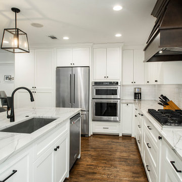
White Chandler cabinets were installed with beautiful Macaubus Giotto Quartzite countertops. Our clients chose to install a spice pull out and utensil caddy pull out on either side of the oven and a tray pull out for cookie sheets, as well. A wooden vent-hood was also built by Chandler, creating a nice contrast to the white cabinets. Matte black Stanton pulls and Elara knobs were installed coordinating with the Forge Industrial Pendant Island lights and the Doster Dome kitchen table pendant. A Kohler vault Smart Divide®top-/under-mount double-equal bowl kitchen sink was installed in the island with a Kohler Simplice kitchen faucet, also in matte black. Detailed posts were added to each corner on the back side of the island, giving it a more custom finished look. In the formal dining room, a 4-light Forge Industrial Island Light was installed, which coordinated with the two pendant lights above the island. Adjacent to the living room was an office/wet bar area, leading to the back porch. We replaced the existing wet bar with a new cabinet and countertop and faucet, matching the kitchen and installed a wine refrigerator, too. Hardwood floors were installed throughout the entire front of the house, tying it all together. Recessed lighting was installed throughout the dining room, living room and kitchen, really giving the space some much needed light. A fresh coat of paint to top it all off really brightened up the space and gave our clients exactly what they were wanting.
 Lisa Tharp Design
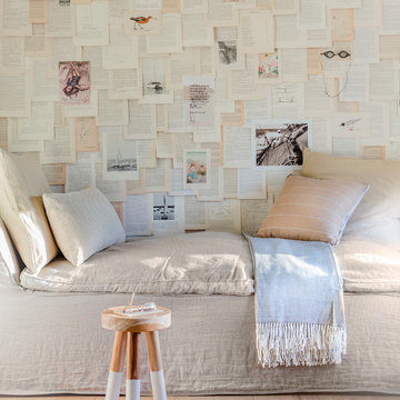
Vintage book pages, post cards and ephemera paper the daybed alcove in the upstairs family room. Interior architecture and design by Lisa Tharp. Photo: Michael J. Lee
 Advance Design Studio, Ltd.
After six years of living in their Huntley IL home, Chris and Meghan were tired of their dark, dingy, outdated kitchen and it was finally time for a long-anticipated change. “The kitchen is the place where we live, it’s where we do everything,” Meghan said. “It was important that it be a space where we wanted to be.” Meghan loves cooking and enjoys including their girls in healthy meal prepping, this led them to want a brighter, more enjoyable kitchen with increased functionality and improved storage.
For Chris especially, the laundry room was an entirely dysfunctional eyesore. “We had a washer and a dryer, but it was all kind-of cobbled together!” Chris said. “There were always laundry piles everywhere, we weren’t really sure what we wanted to do in there, but it was time for us to make a change.” The mess of the space was stressful every time they walked in the door from the garage each day. Kids’ backpacks and shoes piled up haphazardly in the makeshift boot-bench closet left the family feeling disorganized and stressed. They needed space for folding clothes and locker cubbies to help keep the family organized.
Having known Christine and Todd in the Huntley community for years, Chris and Meghan were familiar with their work. “We already trusted them personally and having seen their projects for years we knew they did top notch work. After we reviewed the initial round of designs, we knew that hiring them was definitely the right choice,” Meghan and Chris said. Although Chris had done a lot of work in their home himself, the kitchen and laundry room renovation was such a large undertaking that he didn’t want to steal time away from his family to spend what would surely be many long weekends doing the job himself. “That would not have been a wise choice for us,” Chris laughed.
“Our designer, Michelle was very, very, easy to work with; anything we wanted to see or weren’t sure about, she went above and beyond to make this easy for us. She was easy to get hold of and always quick to respond,” the couple said. Michelle pulled ideas that mirrored the couple’s taste and style and was adept at directing the couple to limited choices that didn’t overwhelm them and kept the process moving. “I have a hard time making decisions. Michelle made the decision-making process so easy. I loved how she listened to what I liked and then presented three great options for me to choose from,” Meghan said.
The main objectives for the kitchen were better storage solutions, they wanted the space to reflect their lifestyle and taste, and they wanted it to last for years with low maintenance. One of the first steps in creating a more functional kitchen was relocating the refrigerator, creating an improved workflow for the busy family.
“We didn’t know that we could even move the refrigerator to a new location where it is now, that was something that we never would have thought of,” Chris said. “The new refrigerator location makes the kitchen feel so much bigger. We didn’t add any space, but our whole kitchen with the new design just seems like it’s so much larger than before!” Meghan said.
The perimeter mist colored cabinets helped warm and brighten the entire room, while the graphite colored cabinets on the island added contrast. Using this fresh, clean color palette satisfied the couple’s desire for a bright space that was the exact opposite of what they had before. Organization accessories were also added to the cabinets such as a spice drawer tray and roll outs to create hidden convenience.
“I absolutely love the hidden spices – it makes cooking so much more enjoyable!” Chris said. “And all the pull outs, and the double trash bin, who would think you could get so excited about organization!” the couple said in unison.
One thing they hated in their original kitchen was how dark the space felt. Added lighting on the ceiling with the new light fixtures combined with the lighter cabinetry colors throughout solved this problem. “Our new kitchen has this warm, almost cozy feeling that our old kitchen never had, it’s just a space that I love spending my time in now,” Meghan said. The light airy feeling was accentuated with the use of floating white shelves on either side of the decorative range hood. “We have so much cabinetry space, the new design is amazing we actually have more storage space than we will ever need,” Meghan said.
The island was extended to create more work surface and added space for stool seating. “The new island changes how we live. Now the kids can be in the kitchen with us, doing homework, eating breakfast, and the three of us have special dinners there when Chris is working late,” Meghan said.
The Carrara Marmi Quartz countertops were chosen because they are, not only beautiful, but are made from hard-working material that doesn’t require maintenance. The white subway tile backsplash that wraps to the ceiling behind the focal point cooktop range/hood compliments the crisp white countertops perfectly, while brushed brass hardware and light fixtures keep the design fresh and new.
The couple had a few fears at the beginning of the project, as most homeowners do. Their biggest fear was being out of their kitchen and laundry room for an extended time. The crew made it very easy for the family to work in a limited space keeping the washer and dryer hooked up the majority of the time, and also getting appliances working with minimal downtime.
“They above and beyond accommodated us to get us through the process,” Meghan said. “They did a great job making sure we were as comfortable as possible throughout the process,” Chris added.
“Our project manager DJ did a great job. He was very good at updating us on schedule changes, getting guys in as quickly as possible. Everyone that stepped in the house was nice and did great work,” said Chris. They thought Advance’s carpenter was phenomenal and were impressed when he took a conceptual idea from a photograph and worked with designer Michelle to create a one of a kind range/hood that has become the topic of conversation with friends and family who visit the new kitchen. “He was in our house literally every day for several weeks. He was easy to work with and good at what he did,” Meghan and Chris said.
The focal point of the kitchen; a hand-crafted, custom-built ventilation hood was clad with handpicked reclaimed barnwood. Advance Design’s carpenter built the framework and the cladding to create a one-of-a-kind design element that the couple loves.
“I think it was especially fun for him to create something unique from scratch, showcasing his talent in this area,” Meghan said. “I love that my kitchen is not like everyone else’s. I got to pick out the wood on my hood and watch it being built and was able to choose what pieces of wood went where on it. It’s totally unique.”
Red Oak flooring was toothed-in throughout the kitchen and the rest of the first floor anywhere changes were made. Then the whole floor was refinished to tone down the orange undertones in the existing floor stain, ultimately changing the color complexion of the entire first floor. The result is a completely new feeling to the entire home.
Renovating the laundry room was extremely important to Meghan and Chris, but they had trouble visualizing what the possibilities were for the seemingly small space. Michelle produced beautiful 3D illustrations that helped them envision the space in a whole new way.
“I must have told Michelle 100 times that I am a visual person, seeing the designs in 3D made it so easy to make decisions and see what we could really do with our space,” Meghan said.
A dividing wall and doorway were removed between the existing laundry room and hallway formerly containing a coat closet, providing space to design specialized graphite colored cabinetry matching the kitchen island to house custom storage cubbies for each family member. Adding the tall utility cabinetry in the new laundry area helped solve the storage issue, tucking away cleaning supplies, household items, and even the cat got its own cubby.
“I love how everything is now hidden in its own space. I can’t tell you how much I hated coming home and seeing everything sitting around on counters,” Chris said.
Electrical outlets were planned for the inside of utility cabinets, so devices could charge in hidden locations. Stacking the washer and dryer allowed for wider countertop space to provide a folding area and a special space for clothes to hang. “The way I do laundry has been completely transformed! I can actually fold clothes and hang them now right out of the washer and dryer,” Meghan said.
“The end result in the kitchen and the laundry/mud room was an updated light and bright space, with a smarter work flow that better meets the needs of this family,” Michelle said.
“I would totally recommend Advance Design,” Meghan said. “Sometimes I sit and just look at my kitchen and laundry room and think ‘Wow, I can’t believe I get to live here!’ It’s an understatement to say we love our new space.”


 San Luis Kitchen Co.
So to begin, we start with an existing kitchen that is outdated and just too neutral for the homeowners. They wanted unity and drama in their space, not mundane confusion! Mismatched appliances – white refrigerator, stainless range, black dishwasher – give a disjointed and unplanned vibe to the room and are crammed together in less than half of the available kitchen space. The beautiful wood floor extends throughout the house, but in the kitchen it falls flat – as the medium gold cabinets and almond tile counters provide no contrast and no interest.
A bank of floor to ceiling cabinets separates the dining area from the kitchen, confining the space in both rooms. Note the massive blank end of the cabinets – in desperation to reduce the scale of this monolith, the homeowners decorated it with a clock and small nick-knacks, but it didn’t help. This is not a welcoming entrance to the kitchen. On the dining side, there is a hutch (with mirrored back), which ostensibly could serve as a buffet, however it is inconvenient to the prep area of the kitchen as it is tucked behind the tall pantry cabinets. And on the opposite wall is a separate wet bar which could serve more conveniently with a more unified kitchen and dining space.
You would think that the large pantry cabinets would be a plus in a kitchen, however their placement and the deep fixed shelves belie any positive contribution.
The looming wall of cabinetry confines the space and is a claustrophobe’s nightmare. Then note the clutter and chaos of storing small food items (normally most of your daily supplies don’t come in giant bulk quantities and sizes) on deep fixed shelves. Nothing really fits and canned goods become lost behind cereal boxes while baking supplies are piled on top of the snacks!
The decision to remodel – the lady of the house wanted her kitchen to reflect the couples’ modern lifestyle. They are passionate people who love to entertain their friends and family – they need an open and accessible space that is both dramatic in bearing and easy to use on a daily basis.
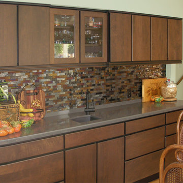
San Luis Kitchen began design by helping the homeowners choose a style and color scheme for their kitchen. The decision was made – a slab style cabinet door in a “Dark Lager” stain on maple wood. Because the homeowners did not want handles on their cabinets, we used a face frame cabinet construction to allow for “finger-pull” opening of the doors and drawers. The face frame is colored black as a contrast to the doors for a bold finish. Dark gray engineered-quartz counters and full height backsplash complete the picture.
Kitchen layout and design is next. The sink remains at the corner window with the dishwasher moved to the left wall – giving space for a 36” range-top and dramatic 42” rectilinear hood. The refrigerator remains in place but is replaced with a black model. The cabinet above it is now 24” deep for a custom look and a built-in microwave/oven combo are placed to the right. Simple-line contemporary trim and uniform black and stainless modern appliances reinforce the linear aesthetic created by the doorstyle and face frame detailing.
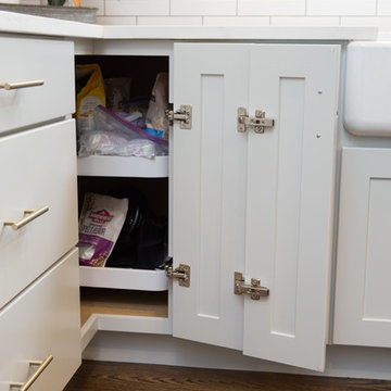
In place of the pantry, San Luis Kitchen designed a true buffet – accessible from both kitchen and dining sides. The storage needs are met by upper cabinets, base corner swing-out shelves and drawers, and a tall (adjustable) roll-out shelf unit on the dining side. We added an end wall (with niches) and extended the cabinetry and counter beyond as a welcome to the kitchen. In the dining room glass doors for display items grace the buffet. The wet bar is now visually and functionally joined to the kitchen – matching cabinetry and the more open overall plan tie everything together as a whole.
Now in their new kitchen, the homeowners can prepare, serve, and enjoy a meal with their guests. The mosaic glass backsplash used at the bar adds pizzazz for fun gatherings and an evening’s entertainment.
Wood-Mode Fine Custom Cabinetry: Brookhaven's Fairfield
 TKS Design Group
Free ebook, CREATING THE IDEAL KITCHEN
Download now → http://bit.ly/idealkitchen
After having remodeled their kitchen, and two other baths in the home, the master bathroom was the last on the list of rooms to update for this couple. The existing bath had a small sink area with his and hers sinks and then a pocket door into the main bath which housed the tub, shower and commode. The main problem was the outdated look of the space, which was rather dark and dreary, and the giant unused whirlpool tub which took up more than its fair share of the footprint.
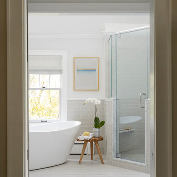
To brighten the space, we used a pallet of soft gray porcelain tile on the floor and ceramic subway tiles on the walls. Carrera marble and nickel plumbing brighten the room and help amplify the sunlight streaming in through the existing skylight and vaulted ceiling.
We first placed the new freestanding tub on an angle near the window so that users can take advantage of the view and light while soaking in the tub. A new, much larger shower takes up the other corner and delivers some symmetry to the room and is now a luxurious, useable and comfortable size. The commode was relocated to the right of the new shower, so it is visually tucked away. The existing opening between the sink area and the main area was widened and the door removed so that the homeowners can enjoy the light from the larger room while using the sinks each morning.
A step up into the tub/shower area provides additional interest and was a happy accident and solution required to accommodate running the plumbing through the existing floor joists. Because the existing room felt quite contemporary with the vaulted ceiling, we added a run of crown molding around the top and a chair rail to the top of the tile to provide some traditional touches to the room. We think this space is lovely, relaxing and serene and are so honored to have been chosen by these wonderful homeowners to help provide them with a relaxing master bath sanctuary!
Designer: Susan Klimala
Assistant Designer: Keri Rogers
 Joy Street Design
As a recently purchased home, our clients quickly decided they needed to make some major adjustments. The home was pretty outdated and didn’t speak to the young family’s unique style, but we wanted to keep the welcoming character of this Mediterranean bungalow in tact. The classic white kitchen with a new layout is the perfect backdrop for the family. Brass accents add a touch of luster throughout and modernizes the fixtures and hardware.
While the main common areas feature neutral color palettes, we quickly gave each room a burst of energy through bright accent colors and patterned textiles. The kids’ rooms are the most playful, showcasing bold wallcoverings, bright tones, and even a teepee tent reading nook.
Designed by Joy Street Design serving Oakland, Berkeley, San Francisco, and the whole of the East Bay.
For more about Joy Street Design, click here: https://www.joystreetdesign.com/
To learn more about this project, click here: https://www.joystreetdesign.com/portfolio/gower-street
 Jarrett Design
These clients win the award for ‘Most Jarrett Design Projects in One Home’! We consider ourselves extremely fortunate to have been able to work with these kind folks so consistently over the years.
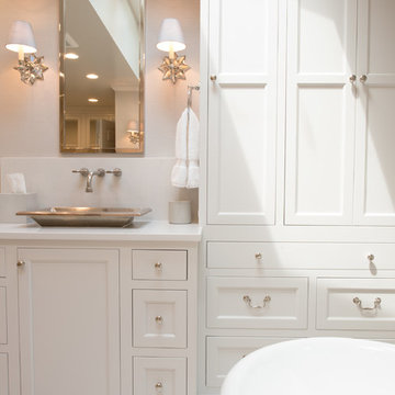
The most recent project features their master bath, a room they have been wanting to tackle for many years. We think it was well worth the wait! It started off as an outdated space with an enormous platform tub open to the bedroom featuring a large round column. The open concept was inspired by island homes long ago, but it was time for some privacy. The water closet, shower and linen closet served the clients well, but the tub and vanities had to be updated with storage improvements desired. The clients also wanted to add organized spaces for clothing, shoes and handbags. Swapping the large tub for a dainty freestanding tub centered on the new window, cleared space for gorgeous his and hers vanities and armoires flanking the tub. The area where the old double vanity existed was transformed into personalized storage closets boasting beautiful custom mirrored doors. The bathroom floors and shower surround were replaced with classic white and grey materials. Handmade vessel sinks and faucets add a rich touch. Soft brass wire doors are the highlight of a freestanding custom armoire created to house handbags adding more convenient storage and beauty to the bedroom. Star sconces, bell jar fixture, wallpaper and window treatments selected by the homeowner with the help of the talented Lisa Abdalla Interiors provide the finishing traditional touches for this sanctuary.
Jacqueline Powell Photography
Sponsored
Sunbury, OH

J.Holderby - Renovations
Franklin County's Leading General Contractors - 2X Best of Houzz!
 Advance Design Studio, Ltd.
After six years of living in their Huntley IL home, Chris and Meghan were tired of their dark, dingy, outdated kitchen and it was finally time for a long-anticipated change. “The kitchen is the place where we live, it’s where we do everything,” Meghan said. “It was important that it be a space where we wanted to be.” Meghan loves cooking and enjoys including their girls in healthy meal prepping, this led them to want a brighter, more enjoyable kitchen with increased functionality and improved storage.
For Chris especially, the laundry room was an entirely dysfunctional eyesore. “We had a washer and a dryer, but it was all kind-of cobbled together!” Chris said. “There were always laundry piles everywhere, we weren’t really sure what we wanted to do in there, but it was time for us to make a change.” The mess of the space was stressful every time they walked in the door from the garage each day. Kids’ backpacks and shoes piled up haphazardly in the makeshift boot-bench closet left the family feeling disorganized and stressed. They needed space for folding clothes and locker cubbies to help keep the family organized.
Having known Christine and Todd in the Huntley community for years, Chris and Meghan were familiar with their work. “We already trusted them personally and having seen their projects for years we knew they did top notch work. After we reviewed the initial round of designs, we knew that hiring them was definitely the right choice,” Meghan and Chris said. Although Chris had done a lot of work in their home himself, the kitchen and laundry room renovation was such a large undertaking that he didn’t want to steal time away from his family to spend what would surely be many long weekends doing the job himself. “That would not have been a wise choice for us,” Chris laughed.
“Our designer, Michelle was very, very, easy to work with; anything we wanted to see or weren’t sure about, she went above and beyond to make this easy for us. She was easy to get hold of and always quick to respond,” the couple said. Michelle pulled ideas that mirrored the couple’s taste and style and was adept at directing the couple to limited choices that didn’t overwhelm them and kept the process moving. “I have a hard time making decisions. Michelle made the decision-making process so easy. I loved how she listened to what I liked and then presented three great options for me to choose from,” Meghan said.
The main objectives for the kitchen were better storage solutions, they wanted the space to reflect their lifestyle and taste, and they wanted it to last for years with low maintenance. One of the first steps in creating a more functional kitchen was relocating the refrigerator, creating an improved workflow for the busy family.
“We didn’t know that we could even move the refrigerator to a new location where it is now, that was something that we never would have thought of,” Chris said. “The new refrigerator location makes the kitchen feel so much bigger. We didn’t add any space, but our whole kitchen with the new design just seems like it’s so much larger than before!” Meghan said.
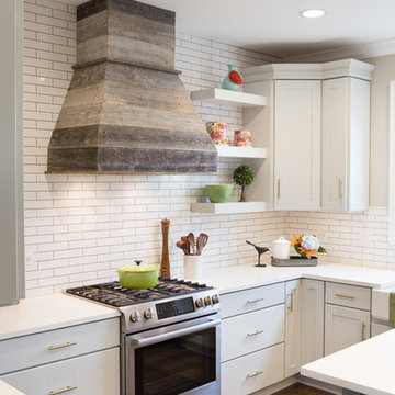
The perimeter mist colored cabinets helped warm and brighten the entire room, while the graphite colored cabinets on the island added contrast. Using this fresh, clean color palette satisfied the couple’s desire for a bright space that was the exact opposite of what they had before. Organization accessories were also added to the cabinets such as a spice drawer tray and roll outs to create hidden convenience.
“I absolutely love the hidden spices – it makes cooking so much more enjoyable!” Chris said. “And all the pull outs, and the double trash bin, who would think you could get so excited about organization!” the couple said in unison.
One thing they hated in their original kitchen was how dark the space felt. Added lighting on the ceiling with the new light fixtures combined with the lighter cabinetry colors throughout solved this problem. “Our new kitchen has this warm, almost cozy feeling that our old kitchen never had, it’s just a space that I love spending my time in now,” Meghan said. The light airy feeling was accentuated with the use of floating white shelves on either side of the decorative range hood. “We have so much cabinetry space, the new design is amazing we actually have more storage space than we will ever need,” Meghan said.
The island was extended to create more work surface and added space for stool seating. “The new island changes how we live. Now the kids can be in the kitchen with us, doing homework, eating breakfast, and the three of us have special dinners there when Chris is working late,” Meghan said.
The Carrara Marmi Quartz countertops were chosen because they are, not only beautiful, but are made from hard-working material that doesn’t require maintenance. The white subway tile backsplash that wraps to the ceiling behind the focal point cooktop range/hood compliments the crisp white countertops perfectly, while brushed brass hardware and light fixtures keep the design fresh and new.
The couple had a few fears at the beginning of the project, as most homeowners do. Their biggest fear was being out of their kitchen and laundry room for an extended time. The crew made it very easy for the family to work in a limited space keeping the washer and dryer hooked up the majority of the time, and also getting appliances working with minimal downtime.
“They above and beyond accommodated us to get us through the process,” Meghan said. “They did a great job making sure we were as comfortable as possible throughout the process,” Chris added.
“Our project manager DJ did a great job. He was very good at updating us on schedule changes, getting guys in as quickly as possible. Everyone that stepped in the house was nice and did great work,” said Chris. They thought Advance’s carpenter was phenomenal and were impressed when he took a conceptual idea from a photograph and worked with designer Michelle to create a one of a kind range/hood that has become the topic of conversation with friends and family who visit the new kitchen. “He was in our house literally every day for several weeks. He was easy to work with and good at what he did,” Meghan and Chris said.
The focal point of the kitchen; a hand-crafted, custom-built ventilation hood was clad with handpicked reclaimed barnwood. Advance Design’s carpenter built the framework and the cladding to create a one-of-a-kind design element that the couple loves.
“I think it was especially fun for him to create something unique from scratch, showcasing his talent in this area,” Meghan said. “I love that my kitchen is not like everyone else’s. I got to pick out the wood on my hood and watch it being built and was able to choose what pieces of wood went where on it. It’s totally unique.”
Red Oak flooring was toothed-in throughout the kitchen and the rest of the first floor anywhere changes were made. Then the whole floor was refinished to tone down the orange undertones in the existing floor stain, ultimately changing the color complexion of the entire first floor. The result is a completely new feeling to the entire home.
Renovating the laundry room was extremely important to Meghan and Chris, but they had trouble visualizing what the possibilities were for the seemingly small space. Michelle produced beautiful 3D illustrations that helped them envision the space in a whole new way.
“I must have told Michelle 100 times that I am a visual person, seeing the designs in 3D made it so easy to make decisions and see what we could really do with our space,” Meghan said.
A dividing wall and doorway were removed between the existing laundry room and hallway formerly containing a coat closet, providing space to design specialized graphite colored cabinetry matching the kitchen island to house custom storage cubbies for each family member. Adding the tall utility cabinetry in the new laundry area helped solve the storage issue, tucking away cleaning supplies, household items, and even the cat got its own cubby.
“I love how everything is now hidden in its own space. I can’t tell you how much I hated coming home and seeing everything sitting around on counters,” Chris said.
Electrical outlets were planned for the inside of utility cabinets, so devices could charge in hidden locations. Stacking the washer and dryer allowed for wider countertop space to provide a folding area and a special space for clothes to hang. “The way I do laundry has been completely transformed! I can actually fold clothes and hang them now right out of the washer and dryer,” Meghan said.
“The end result in the kitchen and the laundry/mud room was an updated light and bright space, with a smarter work flow that better meets the needs of this family,” Michelle said.
“I would totally recommend Advance Design,” Meghan said. “Sometimes I sit and just look at my kitchen and laundry room and think ‘Wow, I can’t believe I get to live here!’ It’s an understatement to say we love our new space.”
 Penterman Kitchens
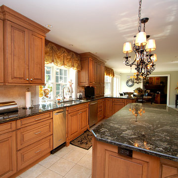
Can you believe this kitchen is almost 8 years old? Wood-Mode Custom cabinetry’s Brookhaven line has held up beautifully with their Winfield Raised panel doors in driftwood with espresso glaze finish. This Wall Township New Jersey kitchen is still as beautiful as it once was when we installed it in 2008!
 Advance Design Studio, Ltd.
After six years of living in their Huntley IL home, Chris and Meghan were tired of their dark, dingy, outdated kitchen and it was finally time for a long-anticipated change. “The kitchen is the place where we live, it’s where we do everything,” Meghan said. “It was important that it be a space where we wanted to be.” Meghan loves cooking and enjoys including their girls in healthy meal prepping, this led them to want a brighter, more enjoyable kitchen with increased functionality and improved storage.
For Chris especially, the laundry room was an entirely dysfunctional eyesore. “We had a washer and a dryer, but it was all kind-of cobbled together!” Chris said. “There were always laundry piles everywhere, we weren’t really sure what we wanted to do in there, but it was time for us to make a change.” The mess of the space was stressful every time they walked in the door from the garage each day. Kids’ backpacks and shoes piled up haphazardly in the makeshift boot-bench closet left the family feeling disorganized and stressed. They needed space for folding clothes and locker cubbies to help keep the family organized.
Having known Christine and Todd in the Huntley community for years, Chris and Meghan were familiar with their work. “We already trusted them personally and having seen their projects for years we knew they did top notch work. After we reviewed the initial round of designs, we knew that hiring them was definitely the right choice,” Meghan and Chris said. Although Chris had done a lot of work in their home himself, the kitchen and laundry room renovation was such a large undertaking that he didn’t want to steal time away from his family to spend what would surely be many long weekends doing the job himself. “That would not have been a wise choice for us,” Chris laughed.
“Our designer, Michelle was very, very, easy to work with; anything we wanted to see or weren’t sure about, she went above and beyond to make this easy for us. She was easy to get hold of and always quick to respond,” the couple said. Michelle pulled ideas that mirrored the couple’s taste and style and was adept at directing the couple to limited choices that didn’t overwhelm them and kept the process moving. “I have a hard time making decisions. Michelle made the decision-making process so easy. I loved how she listened to what I liked and then presented three great options for me to choose from,” Meghan said.
The main objectives for the kitchen were better storage solutions, they wanted the space to reflect their lifestyle and taste, and they wanted it to last for years with low maintenance. One of the first steps in creating a more functional kitchen was relocating the refrigerator, creating an improved workflow for the busy family.
“We didn’t know that we could even move the refrigerator to a new location where it is now, that was something that we never would have thought of,” Chris said. “The new refrigerator location makes the kitchen feel so much bigger. We didn’t add any space, but our whole kitchen with the new design just seems like it’s so much larger than before!” Meghan said.
The perimeter mist colored cabinets helped warm and brighten the entire room, while the graphite colored cabinets on the island added contrast. Using this fresh, clean color palette satisfied the couple’s desire for a bright space that was the exact opposite of what they had before. Organization accessories were also added to the cabinets such as a spice drawer tray and roll outs to create hidden convenience.
“I absolutely love the hidden spices – it makes cooking so much more enjoyable!” Chris said. “And all the pull outs, and the double trash bin, who would think you could get so excited about organization!” the couple said in unison.
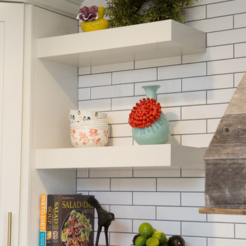
One thing they hated in their original kitchen was how dark the space felt. Added lighting on the ceiling with the new light fixtures combined with the lighter cabinetry colors throughout solved this problem. “Our new kitchen has this warm, almost cozy feeling that our old kitchen never had, it’s just a space that I love spending my time in now,” Meghan said. The light airy feeling was accentuated with the use of floating white shelves on either side of the decorative range hood. “We have so much cabinetry space, the new design is amazing we actually have more storage space than we will ever need,” Meghan said.
The island was extended to create more work surface and added space for stool seating. “The new island changes how we live. Now the kids can be in the kitchen with us, doing homework, eating breakfast, and the three of us have special dinners there when Chris is working late,” Meghan said.
The Carrara Marmi Quartz countertops were chosen because they are, not only beautiful, but are made from hard-working material that doesn’t require maintenance. The white subway tile backsplash that wraps to the ceiling behind the focal point cooktop range/hood compliments the crisp white countertops perfectly, while brushed brass hardware and light fixtures keep the design fresh and new.
The couple had a few fears at the beginning of the project, as most homeowners do. Their biggest fear was being out of their kitchen and laundry room for an extended time. The crew made it very easy for the family to work in a limited space keeping the washer and dryer hooked up the majority of the time, and also getting appliances working with minimal downtime.
“They above and beyond accommodated us to get us through the process,” Meghan said. “They did a great job making sure we were as comfortable as possible throughout the process,” Chris added.
“Our project manager DJ did a great job. He was very good at updating us on schedule changes, getting guys in as quickly as possible. Everyone that stepped in the house was nice and did great work,” said Chris. They thought Advance’s carpenter was phenomenal and were impressed when he took a conceptual idea from a photograph and worked with designer Michelle to create a one of a kind range/hood that has become the topic of conversation with friends and family who visit the new kitchen. “He was in our house literally every day for several weeks. He was easy to work with and good at what he did,” Meghan and Chris said.
The focal point of the kitchen; a hand-crafted, custom-built ventilation hood was clad with handpicked reclaimed barnwood. Advance Design’s carpenter built the framework and the cladding to create a one-of-a-kind design element that the couple loves.
“I think it was especially fun for him to create something unique from scratch, showcasing his talent in this area,” Meghan said. “I love that my kitchen is not like everyone else’s. I got to pick out the wood on my hood and watch it being built and was able to choose what pieces of wood went where on it. It’s totally unique.”
Red Oak flooring was toothed-in throughout the kitchen and the rest of the first floor anywhere changes were made. Then the whole floor was refinished to tone down the orange undertones in the existing floor stain, ultimately changing the color complexion of the entire first floor. The result is a completely new feeling to the entire home.
Renovating the laundry room was extremely important to Meghan and Chris, but they had trouble visualizing what the possibilities were for the seemingly small space. Michelle produced beautiful 3D illustrations that helped them envision the space in a whole new way.
“I must have told Michelle 100 times that I am a visual person, seeing the designs in 3D made it so easy to make decisions and see what we could really do with our space,” Meghan said.
A dividing wall and doorway were removed between the existing laundry room and hallway formerly containing a coat closet, providing space to design specialized graphite colored cabinetry matching the kitchen island to house custom storage cubbies for each family member. Adding the tall utility cabinetry in the new laundry area helped solve the storage issue, tucking away cleaning supplies, household items, and even the cat got its own cubby.
“I love how everything is now hidden in its own space. I can’t tell you how much I hated coming home and seeing everything sitting around on counters,” Chris said.
Electrical outlets were planned for the inside of utility cabinets, so devices could charge in hidden locations. Stacking the washer and dryer allowed for wider countertop space to provide a folding area and a special space for clothes to hang. “The way I do laundry has been completely transformed! I can actually fold clothes and hang them now right out of the washer and dryer,” Meghan said.
“The end result in the kitchen and the laundry/mud room was an updated light and bright space, with a smarter work flow that better meets the needs of this family,” Michelle said.
“I would totally recommend Advance Design,” Meghan said. “Sometimes I sit and just look at my kitchen and laundry room and think ‘Wow, I can’t believe I get to live here!’ It’s an understatement to say we love our new space.”
5