
Search results for "Outdated" in Home Design Ideas

 Green Apple Design
Kitchen Tile - I have been wanting to do a grey grout with these glossy 3x6's for forever! I loved how this turned out and how lovely it ties in with the granite. Which is Bianco Romano! Another love of mine.


 Simply Baths & Kitchens
When designer Rachel Peterson of Simply Baths, Inc. first met this young, stylish couple at their house they had a small handful of items they knew they really wanted in their master bathroom: a freestanding tub, a chandelier, a larger shower and more counter space. But the truth was, the bath needed a major face-lift. The space was outdated and lacked personality. It certainly didn't reflect the homeowners and their elegant aesthetic. The combination of stone and wood tiles lends just enough of a rustic flair to bring a little bit of the outdoors in and while helping to balance some of the feminine elements in the room with simple masculine touches.
Featuring Dura Supreme Cabinetry.
Find the right local pro for your project

 User
UserAn outdated guest bathroom got a face-lift by adding timeless features like White Thassos Herringbone marble floor tile and a provincial style vanity. Decked out in head to toe KOHLER fixtures, this bathroom is both gorgeous and functional.
Designer: Sarah Goesling
Photographer: Bruce Starrenburg

 Carpet Hut by McDrake
Luxury Vinyl Plank Flooring - MultiCore in color Appalachian Style Number MC-348
Example of a mid-sized classic u-shaped vinyl floor eat-in kitchen design in San Diego with an undermount sink, flat-panel cabinets, yellow cabinets, granite countertops, white backsplash, black appliances and an island
Example of a mid-sized classic u-shaped vinyl floor eat-in kitchen design in San Diego with an undermount sink, flat-panel cabinets, yellow cabinets, granite countertops, white backsplash, black appliances and an island
 Simply Baths & Kitchens
When designer Rachel Peterson of Simply Baths, Inc. first met this young, stylish couple at their house they had a small handful of items they knew they really wanted in their master bathroom: a freestanding tub, a chandelier, a larger shower and more counter space. But the truth was, the bath needed a major face-lift. The space was outdated and lacked personality. It certainly didn't reflect the homeowners and their elegant aesthetic. The combination of stone and wood tiles lends just enough of a rustic flair to bring a little bit of the outdoors in and while helping to balance some of the feminine elements in the room with simple masculine touches.
Featuring Dura Supreme Cabinetry.

 The Cabinet Store + Culina Design
Over the course of six weeks we took their home from slightly outdated to stylishly modern. We began our work in the kitchen. Their existing space included oak raised panel cabinets and laminate countertops. We identified two problems right off the bat. First, the kitchen was home to an unfortunately placed island that broke up the room and made for horrible traffic flow. Second, the family was “oaked out,” with obviously dated oak cabinets abounding. The homeowners also requested that their countertops be replaced with a durable and low-maintenance material.
To begin, we replaced the island and created a peninsula to open up the kitchen. We upgraded the cabinets with Showplace Wood cherry cabinets in a truffle finish that matched the home’s entertainment center in the adjacent living room. Next, we replaced the family’s door with a Showplace Wood Concord style for a more modern feel. Finally, we swapped the existing laminate counters with Cambria natural quartz countertops in the Canterbury finish for a beautiful, maintenance free work surface.
Moving into the laundry room, we installed matching cabinets in this space as well. Last but not least, we installed new Wilsonart HD countertops and a Swanstone sink. With the remodel complete, we checked in with our homeowners and are happy to report pleased customers all around!

 Clear Home Design
what a game room! check out the dark walnut herringbone floor with the matching dark walnut U shaped bar. the red mohair velvet barstools punch color to lighten the dramatic darkness. tom Dixon pendant lighting hangs from the high ceiling.

 Jack Calderone
This bedroom and full bathroom are part of an adventuresome project my wife and I embarked upon to create a complete apartment in the basement of our townhouse. We designed a floor plan that creatively and efficiently used all of the 385-square-foot-space, without sacrificing beauty, comfort or function – and all without breaking the bank! To maximize our budget, we did the work ourselves and added everything from thrift store finds to DIY wall art to bring it all together.
A partial double closet bar adds a little extra space while still leaving room for longer hanging clothes.

 Maraya Interior Design
Creamy white painted cabinetry with glaze coat. Porcelain Versaille pattern floor. Spanish tile backsplash.
White! White painted cabinetry with white granite counters, and stone look tiles are featured in this Farmhouse Spanish / Moorish / Andalusian / kitchen. For the family's kids and all of their friends, a large island with wrought iron pendants and chandeliers. Maraya Interior Design created a new kitchen out of an old outdated space using white tile backsplashes and finding new porcelain tiles to match the old.
Project Location: Thousand Oaks, California. Project designed by Maraya Interior Design. From their beautiful resort town of Ojai, they serve clients in Montecito, Hope Ranch, Malibu, Westlake and Calabasas, across the tri-county areas of Santa Barbara, Ventura and Los Angeles, south to Hidden Hills- north through Solvang and more.

 HDR Remodeling Inc.
We came up with a modified floor plan that relocated the toilet and opened up the space. The tile work also makes the space feel more formal and exotic.
http://www.treve.com
HDR Remodeling Inc. specializes in classic East Bay homes. Whole-house remodels, kitchen and bathroom remodeling, garage and basement conversions are our specialties. Our start-to-finish process -- from design concept to permit-ready plans to production -- will guide you along the way to make sure your project is completed on time and on budget and take the uncertainty and stress out of remodeling your home. Our philosophy -- and passion -- is to help our clients make their remodeling dreams come true.
 Lincoln Lighthill Architect
Lincoln Lighthill Architect employed several discrete updates that collectively transform this existing row house.
At the heart of the home, a section of floor was removed at the top level to open up the existing stair and allow light from a new skylight to penetrate deep into the home. The stair itself received a new maple guardrail and planter, with a Fiddle-leaf fig tree growing up through the opening towards the skylight.
On the top living level, an awkwardly located entrance to a full bathroom directly off the main stair was moved around the corner and out of the way by removing a little used tub from the bathroom, as well as an outdated heater in the back corner. This created a more discrete entrance to the existing, now half-bath, and opened up a space for a wall of pantry cabinets with built-in refrigerator, and an office nook at the rear of the house with a huge new awning window to let in light and air.
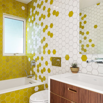
Downstairs, the two existing bathrooms were reconfigured and recreated as dedicated master and kids baths. The kids bath uses yellow and white hexagonal Heath tile to create a pixelated celebration of color. The master bath, hidden behind a flush wall of walnut cabinetry, utilizes another Heath tile color to create a calming retreat.
Throughout the home, walnut thin-ply cabinetry creates a strong contrast to the existing maple flooring, while the exposed blond edges of the material tie the two together. Rounded edges on integral pulls and door edges create pinstripe detailing that adds richness and a sense of playfulness to the design.
This project was featured by Houzz: https://tinyurl.com/stn2hcze
 Lundin Architects LLC
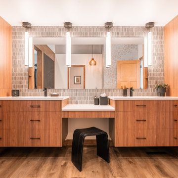
An under used whirlpool tub and inefficient layout were rectified by removing the tub and outdated glass block shower to create a generous walk-in shower area and dual vanity with built ins for storage. Woods and textured materials add warmth and sophistication to the space.


 Advance Design Studio, Ltd.
After six years of living in their Huntley IL home, Chris and Meghan were tired of their dark, dingy, outdated kitchen and it was finally time for a long-anticipated change. “The kitchen is the place where we live, it’s where we do everything,” Meghan said. “It was important that it be a space where we wanted to be.” Meghan loves cooking and enjoys including their girls in healthy meal prepping, this led them to want a brighter, more enjoyable kitchen with increased functionality and improved storage.
For Chris especially, the laundry room was an entirely dysfunctional eyesore. “We had a washer and a dryer, but it was all kind-of cobbled together!” Chris said. “There were always laundry piles everywhere, we weren’t really sure what we wanted to do in there, but it was time for us to make a change.” The mess of the space was stressful every time they walked in the door from the garage each day. Kids’ backpacks and shoes piled up haphazardly in the makeshift boot-bench closet left the family feeling disorganized and stressed. They needed space for folding clothes and locker cubbies to help keep the family organized.
Having known Christine and Todd in the Huntley community for years, Chris and Meghan were familiar with their work. “We already trusted them personally and having seen their projects for years we knew they did top notch work. After we reviewed the initial round of designs, we knew that hiring them was definitely the right choice,” Meghan and Chris said. Although Chris had done a lot of work in their home himself, the kitchen and laundry room renovation was such a large undertaking that he didn’t want to steal time away from his family to spend what would surely be many long weekends doing the job himself. “That would not have been a wise choice for us,” Chris laughed.
“Our designer, Michelle was very, very, easy to work with; anything we wanted to see or weren’t sure about, she went above and beyond to make this easy for us. She was easy to get hold of and always quick to respond,” the couple said. Michelle pulled ideas that mirrored the couple’s taste and style and was adept at directing the couple to limited choices that didn’t overwhelm them and kept the process moving. “I have a hard time making decisions. Michelle made the decision-making process so easy. I loved how she listened to what I liked and then presented three great options for me to choose from,” Meghan said.
The main objectives for the kitchen were better storage solutions, they wanted the space to reflect their lifestyle and taste, and they wanted it to last for years with low maintenance. One of the first steps in creating a more functional kitchen was relocating the refrigerator, creating an improved workflow for the busy family.
“We didn’t know that we could even move the refrigerator to a new location where it is now, that was something that we never would have thought of,” Chris said. “The new refrigerator location makes the kitchen feel so much bigger. We didn’t add any space, but our whole kitchen with the new design just seems like it’s so much larger than before!” Meghan said.
The perimeter mist colored cabinets helped warm and brighten the entire room, while the graphite colored cabinets on the island added contrast. Using this fresh, clean color palette satisfied the couple’s desire for a bright space that was the exact opposite of what they had before. Organization accessories were also added to the cabinets such as a spice drawer tray and roll outs to create hidden convenience.
“I absolutely love the hidden spices – it makes cooking so much more enjoyable!” Chris said. “And all the pull outs, and the double trash bin, who would think you could get so excited about organization!” the couple said in unison.
One thing they hated in their original kitchen was how dark the space felt. Added lighting on the ceiling with the new light fixtures combined with the lighter cabinetry colors throughout solved this problem. “Our new kitchen has this warm, almost cozy feeling that our old kitchen never had, it’s just a space that I love spending my time in now,” Meghan said. The light airy feeling was accentuated with the use of floating white shelves on either side of the decorative range hood. “We have so much cabinetry space, the new design is amazing we actually have more storage space than we will ever need,” Meghan said.
The island was extended to create more work surface and added space for stool seating. “The new island changes how we live. Now the kids can be in the kitchen with us, doing homework, eating breakfast, and the three of us have special dinners there when Chris is working late,” Meghan said.
The Carrara Marmi Quartz countertops were chosen because they are, not only beautiful, but are made from hard-working material that doesn’t require maintenance. The white subway tile backsplash that wraps to the ceiling behind the focal point cooktop range/hood compliments the crisp white countertops perfectly, while brushed brass hardware and light fixtures keep the design fresh and new.
The couple had a few fears at the beginning of the project, as most homeowners do. Their biggest fear was being out of their kitchen and laundry room for an extended time. The crew made it very easy for the family to work in a limited space keeping the washer and dryer hooked up the majority of the time, and also getting appliances working with minimal downtime.
“They above and beyond accommodated us to get us through the process,” Meghan said. “They did a great job making sure we were as comfortable as possible throughout the process,” Chris added.
“Our project manager DJ did a great job. He was very good at updating us on schedule changes, getting guys in as quickly as possible. Everyone that stepped in the house was nice and did great work,” said Chris. They thought Advance’s carpenter was phenomenal and were impressed when he took a conceptual idea from a photograph and worked with designer Michelle to create a one of a kind range/hood that has become the topic of conversation with friends and family who visit the new kitchen. “He was in our house literally every day for several weeks. He was easy to work with and good at what he did,” Meghan and Chris said.
The focal point of the kitchen; a hand-crafted, custom-built ventilation hood was clad with handpicked reclaimed barnwood. Advance Design’s carpenter built the framework and the cladding to create a one-of-a-kind design element that the couple loves.
“I think it was especially fun for him to create something unique from scratch, showcasing his talent in this area,” Meghan said. “I love that my kitchen is not like everyone else’s. I got to pick out the wood on my hood and watch it being built and was able to choose what pieces of wood went where on it. It’s totally unique.”
Red Oak flooring was toothed-in throughout the kitchen and the rest of the first floor anywhere changes were made. Then the whole floor was refinished to tone down the orange undertones in the existing floor stain, ultimately changing the color complexion of the entire first floor. The result is a completely new feeling to the entire home.
Renovating the laundry room was extremely important to Meghan and Chris, but they had trouble visualizing what the possibilities were for the seemingly small space. Michelle produced beautiful 3D illustrations that helped them envision the space in a whole new way.
“I must have told Michelle 100 times that I am a visual person, seeing the designs in 3D made it so easy to make decisions and see what we could really do with our space,” Meghan said.
A dividing wall and doorway were removed between the existing laundry room and hallway formerly containing a coat closet, providing space to design specialized graphite colored cabinetry matching the kitchen island to house custom storage cubbies for each family member. Adding the tall utility cabinetry in the new laundry area helped solve the storage issue, tucking away cleaning supplies, household items, and even the cat got its own cubby.
“I love how everything is now hidden in its own space. I can’t tell you how much I hated coming home and seeing everything sitting around on counters,” Chris said.
Electrical outlets were planned for the inside of utility cabinets, so devices could charge in hidden locations. Stacking the washer and dryer allowed for wider countertop space to provide a folding area and a special space for clothes to hang. “The way I do laundry has been completely transformed! I can actually fold clothes and hang them now right out of the washer and dryer,” Meghan said.
“The end result in the kitchen and the laundry/mud room was an updated light and bright space, with a smarter work flow that better meets the needs of this family,” Michelle said.
“I would totally recommend Advance Design,” Meghan said. “Sometimes I sit and just look at my kitchen and laundry room and think ‘Wow, I can’t believe I get to live here!’ It’s an understatement to say we love our new space.”

 Dado Interior Design
Location: Denver, CO, USA
THE CHALLENGE: Transform an outdated, uninspired condo into a unique, forward thinking home, while dealing with a limited capacity to remodel due to the buildings’ high-rise architectural restrictions.
THE SOLUTION: Warm wood clad walls were added throughout the home, creating architectural interest, as well as a sense of unity. Soft, textured furnishing was selected to elevate the home’s sophistication, while attention to layout and detail ensures its functionality.
Dado Interior Design
DAVID LAUER PHOTOGRAPHY

 Kustom Home Design
We transformed an outdated, lack luster beach house on Fripp Island into a coastal retreat complete with southern charm and bright personality. The main living space was opened up to allow for a charming kitchen with open shelving, white painted ship lap, a large inviting island and sleek stainless steel appliances. Nautical details are woven throughout adding to the charisma and simplistic beauty of this coastal home. New dark hardwood floors contrast with the soft white walls and cabinetry, while also coordinating with the dark window sashes and mullions. The new open plan allows an abundance of natural light to wash through the interior space with ease. Tropical vegetation form beautiful views and welcome visitors like an old friend to the grand front stairway. The play between dark and light continues on the exterior with crisp contrast balanced by soft hues and warm stains. What was once nothing more than a shelter, is now a retreat worthy of the paradise that envelops it.

Mid-sized elegant u-shaped porcelain tile open concept kitchen photo in Phoenix with a double-bowl sink, raised-panel cabinets, dark wood cabinets, granite countertops, beige backsplash, stone tile backsplash, stainless steel appliances and an island

 Designers Point
This kitchen is the centerpiece of this great room. The architecture gives a visual separation of spaces without closing off the room.
Photos by Thomas Miller


44