
Search results for "Outdated" in Home Design Ideas

 Renovations Group Inc
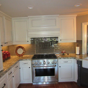
Our homeowner had dreamt about one day redoing her beyond outdated kitchen since they day her husband carried her over the threshold. Vinyl flooring used for a backsplash, dingy carpeting, laminate with no sheen left to speak of and mismatched cabinetry…. it was time to make it happen. A year’s worth of planning later, her time capsule became one dreamy kitchen.
Functionality reigns supreme in this small, but efficient kitchen where every cabinet has a story to tell and a place to store it. Countertop space to the right of the stove was an added necessity for function and safety. The raised snack bar is perfect for day to day meals and the lowered countertop was a must for this petite baker. A new lighting plan includes recessed lights, under-cabinet and accent lights, while new lighting fixtures reflect the client’s sense of style. Dingy brick patterned carpet was removed making way for new hardwood floors toothed in from the dining room.
An airy palette gained some weight with the use of larger details; the oversized hood, beefy turned posts, prominent apron front sink and a grouping of tall cabinets on the refrigerator wall. Glass cabinet fronts, shiny beveled subway tile, and granite countertops allow light to dance around the space.
Zachary Seib Photography


 Alair Homes Plano
Our clients came to us wanting to maximize the space they had. They were not planning on moving anytime soon, as they loved their neighborhood. They wanted to renovate the front of their house, which included the front atrium, living room, kitchen, and powder bath. They hated their kitchen because it was completely closed off, had low ceilings, was dark and outdated, not to mention the floors were different in each of these rooms! The pantry was in the breakfast area and the kitchen table became a junk catcher, being the first thing you see when coming in from the garage/laundry room. In their living room, they wanted the spaces on either side of the fireplace to be symmetrical, whether that be bookshelves, a wet bar or closed off. Both parents are working professionals with no time and/or desire to design, create and figure this out on their own. They needed help figuring out how to reconfigure their current space in order to maximize what they already had, as they could not see an obvious solution. They could not envision how it would look so the fact that our designers were able to show them their new kitchen in 3D was pertinent.
We removed the pass-through windows that surrounded the atrium and front dining room, as well as the entire kitchen wall, completely opening up those two rooms. We removed a hall that used to lead between the kitchen and the living room since it was a complete waste of space! The ceilings were raised to 10’ in the kitchen and we were able to leave the skylight, letting in that natural light they wanted. We were able to give them a much larger pantry with tons of shelving and increase the size of their laundry room by utilizing the space of their old breakfast nook.
We relocated the door to the garage into their new elongated laundry room, built a wet bar across from their new larger pantry (with a pocket door) and the flow and functionality of these new spaces is just perfect! All new Waypoint cabinets were installed one two main kitchen surrounding walls painted Linen. Calacatta Bianco Polished Porcelain Tile 4x12 was used for the backsplash. A large eat-at island was installed, painted Stone, where the family can now gather for homework, meals, and mingling. The soft champagne bronze hardware and accent lighting really give this white and gray kitchen a soft classic look.
In the living room, we removed the built-in bookshelves to the left of the fireplace and closed off the wet-bar on the other side, giving them more space in their master suite. White Oak wood flooring, stained Putney, was installed throughout the entire new space, giving it the continuity they were looking for.
In the guest bathroom, Carrara white herringbone marble mosaic 12x12 tile was used on the shower floor and niche, while basic marble Bianco polished 12x24 porcelain tile was used on the walls. Luxart polished chrome traditional hardware gives this timeless bathroom the perfect shine.
Our clients are so happy with the new functionality and look of their space. It has definitely changed their lives in a way they could have never imagined!
Find the right local pro for your project

 TVL Creative Ltd.
Our clients had just recently closed on their new house in Stapleton and were excited to transform it into their perfect forever home. They wanted to remodel the entire first floor to create a more open floor plan and develop a smoother flow through the house that better fit the needs of their family. The original layout consisted of several small rooms that just weren’t very functional, so we decided to remove the walls that were breaking up the space and restructure the first floor to create a wonderfully open feel.
After removing the existing walls, we rearranged their spaces to give them an office at the front of the house, a large living room, and a large dining room that connects seamlessly with the kitchen. We also wanted to center the foyer in the home and allow more light to travel through the first floor, so we replaced their existing doors with beautiful custom sliding doors to the back yard and a gorgeous walnut door with side lights to greet guests at the front of their home.
Living Room
Our clients wanted a living room that could accommodate an inviting sectional, a baby grand piano, and plenty of space for family game nights. So, we transformed what had been a small office and sitting room into a large open living room with custom wood columns. We wanted to avoid making the home feel too vast and monumental, so we designed custom beams and columns to define spaces and to make the house feel like a home. Aesthetically we wanted their home to be soft and inviting, so we utilized a neutral color palette with occasional accents of muted blues and greens.
Dining Room
Our clients were also looking for a large dining room that was open to the rest of the home and perfect for big family gatherings. So, we removed what had been a small family room and eat-in dining area to create a spacious dining room with a fireplace and bar. We added custom cabinetry to the bar area with open shelving for displaying and designed a custom surround for their fireplace that ties in with the wood work we designed for their living room. We brought in the tones and materiality from the kitchen to unite the spaces and added a mixed metal light fixture to bring the space together
Kitchen
We wanted the kitchen to be a real show stopper and carry through the calm muted tones we were utilizing throughout their home. We reoriented the kitchen to allow for a big beautiful custom island and to give us the opportunity for a focal wall with cooktop and range hood. Their custom island was perfectly complimented with a dramatic quartz counter top and oversized pendants making it the real center of their home. Since they enter the kitchen first when coming from their detached garage, we included a small mud-room area right by the back door to catch everyone’s coats and shoes as they come in. We also created a new walk-in pantry with plenty of open storage and a fun chalkboard door for writing notes, recipes, and grocery lists.
Office
We transformed the original dining room into a handsome office at the front of the house. We designed custom walnut built-ins to house all of their books, and added glass french doors to give them a bit of privacy without making the space too closed off. We painted the room a deep muted blue to create a glimpse of rich color through the french doors
Powder Room
The powder room is a wonderful play on textures. We used a neutral palette with contrasting tones to create dramatic moments in this little space with accents of brushed gold.
Master Bathroom
The existing master bathroom had an awkward layout and outdated finishes, so we redesigned the space to create a clean layout with a dream worthy shower. We continued to use neutral tones that tie in with the rest of the home, but had fun playing with tile textures and patterns to create an eye-catching vanity. The wood-look tile planks along the floor provide a soft backdrop for their new free-standing bathtub and contrast beautifully with the deep ash finish on the cabinetry.

 Chester County Kitchen & Bath
We remodeled this outdated bathroom transforming it into a new bathroom paradise. The new barrier free walk-in shower is a great new focal point. The tile design and installation are awesome. The porcelain tiles do a great job mimicking true marble without the downsides of natural stone. The simple lines to the new Fieldstone cabinetry in Inset construction with the Charlaine door style In Dove painted finish pop against the new blue painted walls. Nu heat under tile heated floors and new heated towel bars make sure your nice and warm when getting in and out of the shower. The shower bench seat and new vanity countertop are MSI Quartz in Calacatta Classique match the shower tiles seamlessly. The single glass panel in the shower prevents water from going outside the shower without detracting from the large open feel of the bathroom.

 Mosaik Design & Remodeling
This outdated Mid Century ranch built in late 1950’s was in serious need of an update. Our clients wanted a fresh contemporary feel that was simple in design and reflected the original Mid Century feel of the home.
The new frosted Plexiglas railing allows the now open staircase and modern pendant to become part of the small dining area. White painted cabinetry with slab doors and minimal pulls add a lighter component and balance out the dark walnut cabinetry. The (3) built-in charging drawers, Legrand retractable outlets and a single door hood that opens with a light touch add a "cool" functional vibe to the space.,
Gray quartz countertops and a rectilinear white tile backsplash add serenity and tie in the stainless appliances giving the kitchen a modern feel.
A wood waterfall countertop detail on the back of the island adds interest to the space and is anchored by the unique handblown wave glass pendants in a soft grey color.
The new exposed support is both dramatic and functional in that it hides a support post in open bookcase cabinet.
Wendi Nordeck Photography

 Bay Stone Depot
Example of a mid-sized transitional master beige tile, brown tile and porcelain tile ceramic tile freestanding bathtub design in San Francisco with recessed-panel cabinets, dark wood cabinets, a one-piece toilet, brown walls, an undermount sink and solid surface countertops
 Kitchen & Bath Concepts of Pittsburgh
Craig Thompson Photography
Small trendy gender-neutral light wood floor and gray floor home design photo with flat-panel cabinets and medium tone wood cabinets
Small trendy gender-neutral light wood floor and gray floor home design photo with flat-panel cabinets and medium tone wood cabinets

 Odell Construction Inc.
This Avon Lake master bathroom remodel is located in the heart of Cleveland's West side. The original outdated bathroom was completely gutted and transformed in to an updated traditional space with a tile corner shower, dark hardwood floors, distressed cabinets, and many more beautiful amenities.

 Synonymous
An outdated 1920's bathroom in Bayside Queens was turned into a refreshed, classic and timeless space that utilized the very limited space to its maximum capacity. The cabinets were once outdated and a dark brown that made the space look even smaller. Now, they are a bright white, accompanied by white subway tile, a light quartzite countertop and polished chrome hardware throughout. What made all the difference was the use of the tiny hex tile floors. We were also diligent to keep the shower enclosure a clear glass and stainless steel.
 TVL Creative Ltd.
Our clients had just recently closed on their new house in Stapleton and were excited to transform it into their perfect forever home. They wanted to remodel the entire first floor to create a more open floor plan and develop a smoother flow through the house that better fit the needs of their family. The original layout consisted of several small rooms that just weren’t very functional, so we decided to remove the walls that were breaking up the space and restructure the first floor to create a wonderfully open feel.
After removing the existing walls, we rearranged their spaces to give them an office at the front of the house, a large living room, and a large dining room that connects seamlessly with the kitchen. We also wanted to center the foyer in the home and allow more light to travel through the first floor, so we replaced their existing doors with beautiful custom sliding doors to the back yard and a gorgeous walnut door with side lights to greet guests at the front of their home.
Living Room
Our clients wanted a living room that could accommodate an inviting sectional, a baby grand piano, and plenty of space for family game nights. So, we transformed what had been a small office and sitting room into a large open living room with custom wood columns. We wanted to avoid making the home feel too vast and monumental, so we designed custom beams and columns to define spaces and to make the house feel like a home. Aesthetically we wanted their home to be soft and inviting, so we utilized a neutral color palette with occasional accents of muted blues and greens.
Dining Room
Our clients were also looking for a large dining room that was open to the rest of the home and perfect for big family gatherings. So, we removed what had been a small family room and eat-in dining area to create a spacious dining room with a fireplace and bar. We added custom cabinetry to the bar area with open shelving for displaying and designed a custom surround for their fireplace that ties in with the wood work we designed for their living room. We brought in the tones and materiality from the kitchen to unite the spaces and added a mixed metal light fixture to bring the space together
Kitchen
We wanted the kitchen to be a real show stopper and carry through the calm muted tones we were utilizing throughout their home. We reoriented the kitchen to allow for a big beautiful custom island and to give us the opportunity for a focal wall with cooktop and range hood. Their custom island was perfectly complimented with a dramatic quartz counter top and oversized pendants making it the real center of their home. Since they enter the kitchen first when coming from their detached garage, we included a small mud-room area right by the back door to catch everyone’s coats and shoes as they come in. We also created a new walk-in pantry with plenty of open storage and a fun chalkboard door for writing notes, recipes, and grocery lists.
Office
We transformed the original dining room into a handsome office at the front of the house. We designed custom walnut built-ins to house all of their books, and added glass french doors to give them a bit of privacy without making the space too closed off. We painted the room a deep muted blue to create a glimpse of rich color through the french doors
Powder Room
The powder room is a wonderful play on textures. We used a neutral palette with contrasting tones to create dramatic moments in this little space with accents of brushed gold.
Master Bathroom
The existing master bathroom had an awkward layout and outdated finishes, so we redesigned the space to create a clean layout with a dream worthy shower. We continued to use neutral tones that tie in with the rest of the home, but had fun playing with tile textures and patterns to create an eye-catching vanity. The wood-look tile planks along the floor provide a soft backdrop for their new free-standing bathtub and contrast beautifully with the deep ash finish on the cabinetry.

 Dado Interior Design
Location: Denver, CO, USA
THE CHALLENGE: Transform an outdated, uninspired condo into a unique, forward thinking home, while dealing with a limited capacity to remodel due to the buildings’ high-rise architectural restrictions.
THE SOLUTION: Warm wood clad walls were added throughout the home, creating architectural interest, as well as a sense of unity. Soft, textured furnishing was selected to elevate the home’s sophistication, while attention to layout and detail ensures its functionality.
Dado Interior Design
DAVID LAUER PHOTOGRAPHY
 Odell Construction Inc.
This Avon Lake master bathroom remodel is located in the heart of Cleveland's West side. The original outdated bathroom was completely gutted and transformed in to an updated traditional space with a tile corner shower, dark hardwood floors, distressed cabinets, and many more beautiful amenities.

 Kustom Home Design
We transformed an outdated, lack luster beach house on Fripp Island into a coastal retreat complete with southern charm and bright personality. The main living space was opened up to allow for a charming kitchen with open shelving, white painted ship lap, a large inviting island and sleek stainless steel appliances. Nautical details are woven throughout adding to the charisma and simplistic beauty of this coastal home. New dark hardwood floors contrast with the soft white walls and cabinetry, while also coordinating with the dark window sashes and mullions. The new open plan allows an abundance of natural light to wash through the interior space with ease. Tropical vegetation form beautiful views and welcome visitors like an old friend to the grand front stairway. The play between dark and light continues on the exterior with crisp contrast balanced by soft hues and warm stains. What was once nothing more than a shelter, is now a retreat worthy of the paradise that envelops it.

 Floor Coverings International of East Lake
Example of a large classic hallway design in Tampa with yellow walls


 Robert H. Delafield, Inc.
This Master Bathroom renovation included removing outdated fixtures and finishes, relocating the shower and tub, and creating a lighter brighter space. Tongue and Groove 1" x 6" V joint pine planks were applied to the walls and ceilings and painted white.
Schluter tile backer and linear drain were used in the curb-less shower.
Rainhead shower, and bath fixtures in Moen oil rubbed bronze finish.


 DANIELLE Interior Design & Decor
Just because this white kitchen is small it still packs a punch. This "U shaped" Kitchen doesn't have any room for mistakes. Using a farmhouse sink, garden window, and a drawer dishwasher we maximized the space to its fullest potential. The Cambria Quartz countertops and marble mosaic backsplash keeps the tiny kitchen feeling light and open.
Designer completed by Danielle Perkins of Danielle Interior Design and Decor.
Maximizing the space you live in with Storage, Style and Function.
Photography by Taylor Abeel Photography.
45