
Search results for "Overwhelms" in Home Design Ideas
 Everything Home
Our clients approached us nearly two years ago seeking professional guidance amid the overwhelming selection process and challenges in visualizing the final outcome of their Kokomo, IN, new build construction. The final result is a warm, sophisticated sanctuary that effortlessly embodies comfort and elegance.
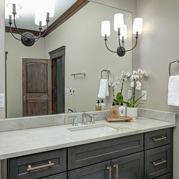
In this bathroom, a large vanity with a matching expansive mirror sets a functional yet elegant tone. Wall sconces provide gentle illumination, enhancing the overall ambience. The designated shower area adds a touch of practical luxury.
...
Project completed by Wendy Langston's Everything Home interior design firm, which serves Carmel, Zionsville, Fishers, Westfield, Noblesville, and Indianapolis.
For more about Everything Home, see here: https://everythinghomedesigns.com/
To learn more about this project, see here: https://everythinghomedesigns.com/portfolio/kokomo-luxury-home-interior-design/
 Capital Kitchen & Bath
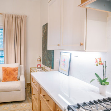
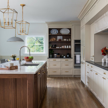
What started as a kitchen design naturally flowed into the sitting area, dining room, and foyer, creating a warm and welcoming home. With the lower cabinets warm wood tone and creamy white upper cabinets, this kitchen is light and open without being overwhelming. Instead, it feels organic and balanced. This design is inviting with layered spaces that feel elevated but still livable.
 Successful Staging/Bobbie McGrath
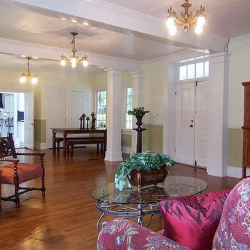
Historic homes are filled with incredible details which should not be overwhelmed by the Staging. In this case, there was a careful selection of homeowners items and pieces brought in especially for the Staging. Honoring the history of the home while showing how you can live in the house comfortably is the goal! Bobbie McGrath/Successful Staging
Find the right local pro for your project
 J. Francis Company LLC
About:
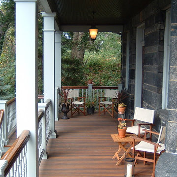
Abandoned two years ago by a previous contractor, and overwhelmed by the challenges associated with building an updated porch respectful to this Queen Anne style home, J. Francis Company, LLC was referred to the customer by Maynes & Associates, Architects. Perched at the highest point on the North Side with a panoramic view is where Deb Mortillaro and Mike Gonze make their residence. Owners of the famous Dreadnought Wines and Palate Partners in the Strip District of Pittsburgh, Deb & Mike wanted a porch to use for entertaining & wine tasting parties. Design features include reuse of original porch footers, mahogany tongue & groove flooring, a railing system that compliments the original design yet complies with the code and features a clear coated Cyprus top rail. The original porch columns were most likely stone bases with wood posts that have been replaced with columns to enhance the updated look. The curved corner has been reproduced including a custom-built curved handrail. The whole porch comes together, tying in the red mahogany floor, Cyprus handrail, and stained bead board ceiling. The finished result is a breathtakingly beautiful wrap-around porch with ample room for guests and entertaining.
Testimonial:
"Our beloved porch had been taken down to be rebuilt for two years before we met the great folks at J. Francis Company. We knew this porch had great potential and all it would take was the right people to make it happen - ones with vision and great craftsmanship. In conjunction with our architect, Greg Maynes, Dave Myers of J. Francis Company guided this project along with tremendous skill and patience. His creative suggestions and practical thought made the process painless and exciting. The head carpenter JK was a marvel and added touches that made a spectacular difference.
We use our home and especially this porch to entertain both clients and friends throughout the year. They all have been anxiously waiting to hear that it is done. A pleasant surprise will be theirs when they arrive."
 Cheng Design
Fu-Tung Cheng / Cheng Design
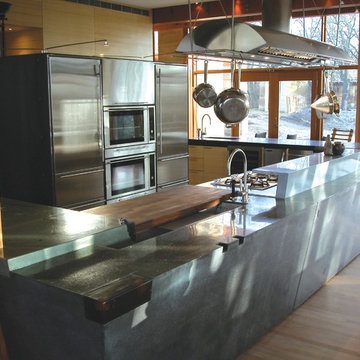
• View of Concrete Island Cooktop, Integral Concrete Sink and Cheng Tidan Custom Hood, Meteor Vineyards Kitchen
This kitchen by Cheng Design is located within a massive, 12,000 sq. ft. rammed earth home anchoring a working Napa County, California vineyard. Commissioned to create a sculptural yet functional cooking space expressing art and utility, the design approach was to create a monolith — a unified kitchen space of simple low walls and concrete countertops, seamless cabinetry details and hardware, and a clever orchestration of gourmet appliances to echo the mass of the house and anchor the overwhelming space.
Photography: Matthew Millman
 Quarry Mill
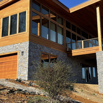
The Quarry Mill's Augusta grey and earth tone natural ledgestone thin veneer pairs with natural wood to juxtapose a timeless feel to the modern architecture of this beautiful home. Augusta is a grey and earth tone real stone veneer in the ledgestone style. The thin stone is a blend of split face and bedface pieces excavated from a single quarry. The split face pieces are the gray interior part of the stone, whereas, the browns and tan pieces come from the bedface that has been exposed to the elements for millenia. Augusta falls into the ledgestone style due to the smaller heights of the individual pieces. Although it makes for a more labor-intensive installation, Augusta looks wonderful with a drystack tight fit installation. The stone showcases the right balance of subtle color variation to look visually appealing but not overwhelming or busy.
 Alair Homes Plano
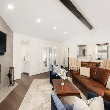
We loved updating this 1977 house giving our clients a more transitional kitchen, living room and powder bath. Our clients are very busy and didn’t want too many options. Our designers narrowed down their selections and gave them just enough options to choose from without being overwhelming.
In the kitchen, we replaced the cabinetry without changing the locations of the walls, doors openings or windows. All finished were replaced with beautiful cabinets, counter tops, sink, back splash and faucet hardware.
In the Master bathroom, we added all new finishes. There are two closets in the bathroom that did not change but everything else did. We.added pocket doors to the bedroom, where there were no doors before. Our clients wanted taller 36” height cabinets and a seated makeup vanity, so we were able to accommodate those requests without any problems. We added new lighting, mirrors, counter top and all new plumbing fixtures in addition to removing the soffits over the vanities and the shower, really opening up the space and giving it a new modern look. They had also been living with the cold and hot water reversed in the shower, so we also fixed that for them!
In their living room, they wanted to update the dark paneling, remove the large stone from the curved fireplace wall and they wanted a new mantel. We flattened the wall, added a TV niche above fireplace and moved the cable connections, so they have exactly what they wanted. We left the wood paneling on the walls but painted them a light color to brighten up the room.
There was a small wet bar between the living room and their family room. They liked the bar area but didn’t feel that they needed the sink, so we removed and capped the water lines and gave the bar an updated look by adding new counter tops and shelving. They had some previous water damage to their floors, so the wood flooring was replaced throughout the den and all connecting areas, making the transition from one room to the other completely seamless. In the end, the clients love their new space and are able to really enjoy their updated home and now plan stay there for a little longer!
Design/Remodel by Hatfield Builders & Remodelers | Photography by Versatile Imaging
Less
 Endless Ideas Interiors Inc.
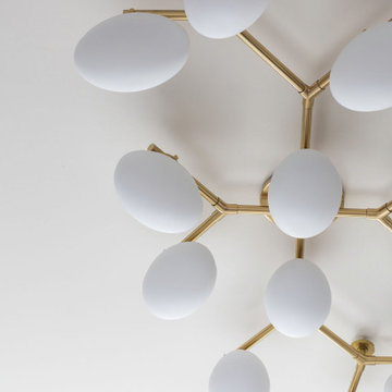
Throughout the room, touches of gold and champagne bring a soft shimmer to the space without overwhelming the soothing palette. The sculptural bench at the foot of the bed features striking metal legs, complementing the detailing on the chair and light fixtures.
 Completely Personal Homes LLC
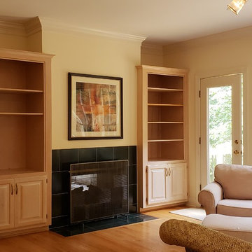
Before photo of fireplace. Surround looks unfinished and flanking cabinetry overwhelm the center. Clear glass on door offers no privacy and drains energy away from fireplace wall
 MAKHNO studio
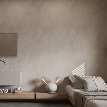
Embracing a minimalist aesthetic with a warm and neutral palette, this bedroom design combines functionality with a serene and uncluttered style. The clean lines of the floating bed and side table exude modern simplicity, while the textured walls add depth and character to the space. Accents like the sculptural table lamp and the subtle artwork complement the room's contemporary feel without overwhelming the senses.
 Eggers Architecture, Inc.
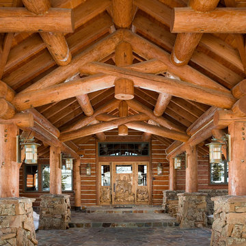
Exterior of log and stone vacation home in Yellowstone Club, Montana. Full log porte couchere with hand carved wood entry door.
Large mountain style three-story wood exterior home photo in Denver with a hip roof
Large mountain style three-story wood exterior home photo in Denver with a hip roof
 Stella Ludwig Interiors,LLC
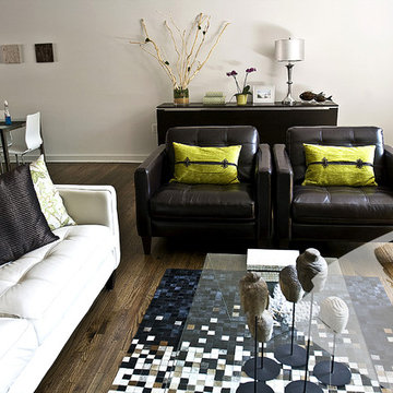
Every element was carefully selected to not only create a minimalist color palette that gave a nod to nature, but to also create different textures for the space. The coffee table with its wicker weave, the heads on the glass center coffee table, the geometric carpet that shifted from small, white squares to brown and navy blue color domination, green throw pillows with lace elements to the selection of plant arrangements. Carefully chosen textures and colors in design elements can be key in celebrating a space and not overwhelm them.
 Sweet Smiling Landscape Design
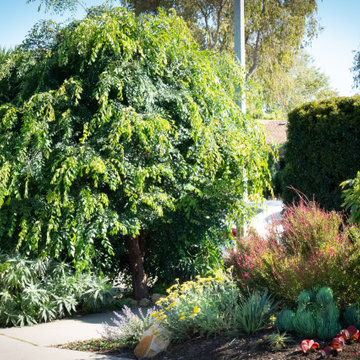
These clients bought a Mid-century house with a vintage landscape that left something to be desired. Both the clients as well as myself have a great appreciation for midcentury design and its clean lines but the majority of the landscapes found in Mid-century housing developments across America miss the mark when it comes to more current sensibilities. The midcentury American philosophy was that man should exert dominance over the land and that hedge trimmers and lawn mowers are mans best friends.
Today more enlighten landscape designers strive to create landscapes that work with nature and not dominate it. In this project we did just that. These home owners loved the view of the mountains from their back yard in Santa Barbara, the way the warm colored sand stone boulders peak through muted greens of the Chaparral. We designed this landscape to be of its place. Sourcing local sandstone boulders like to ones found in the mountains behind the house we used then to build a low retaining wall. By breaking the sloping land into two flatter sections we are able to slow down the speed at which water evacuates the property giving it a chance to soak into the soil. This allows the landscape to work like a natural mini water shed, keeping the storm drains and then the oceans overwhelmed with polluted water and providing more water to the plants with less irrigation.
When it came to the plants, the clients wanted low water color and texture. To celebrate the fact that the house is located in Santa Barbara county we wanted to incorporate the muted green tones, with pops of colorful foliage. Using a mix of course lots of California native plants and Mediterranean adapted plants we created a plant plate that is beautiful, low maintenance and flutters with native fauna such as bird, and butterflies and bees.
 ChoiceDek
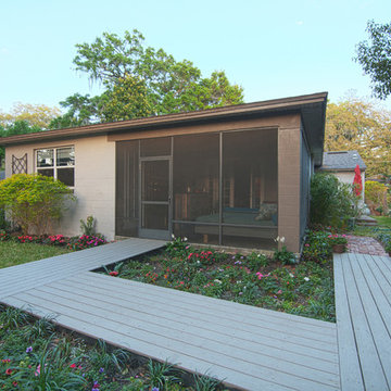
If you have a room like this in your home, your backyard space does not have to overwhelm it. With simple lines and design, your brand-new outdoor space can complement the rooms you already have.
ChoiceDek Composite Decking
Photo by Chad Baumer
www.cbaumer.com
 Century Stair Company
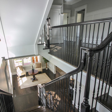
This four-level staircase commands attention from the moment you enter. Serving as the architectural centerpiece of the home, its open design works in harmony with strategic window placement to allow natural light to cascade down through all four levels of living space.
The design makes bold use of contrast. The dark risers against light treads create visual drama, while wrought iron round balusters paired with painted wooden rails and newels ground the staircase in timeless elegance. The result is a semi-floating effect that feels both substantial and airy, anchoring the entrance without overwhelming it.
1976-2026 © Century Stair Company
 TEW Design Studio
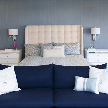
In this project we tackled a huge master bedroom and a breakfast nook. We wanted the spaces to be serene yet have a little bit of glam to go with the clients style. A more muted color pallet of whites, grays, and blues was the perfect way to bring color without being overwhelming.
Photo Credit: Allie Mullin

 Henne Creative LLC
Where Modern Serenity Meets Sculptural Design
Designed by HENNE CREATIVE
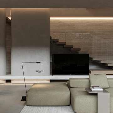
Nestled along the tranquil shoreline of Malibu, this private residence completed in 2025 is a testament to the harmony between contemporary architecture and coastal calm. Designed by HENNE CREATIVE, the space offers a deeply intentional experience that celebrates stillness, light, and form.
The open plan layout embraces clarity and cohesion, allowing natural light to flow freely throughout. Every detail is curated to reflect quiet sophistication: soft geometries, a neutral color palette, and tactile materials work in seamless concert. From floor to ceiling, natural stone textures and warm wood tones build a calm visual rhythm across the space.
The living area features a sculptural modular sofa that invites conversation while anchoring the spatial narrative. Behind it, a floating staircase highlighted by integrated linear lighting becomes an architectural statement, elegantly connecting levels without visual clutter.
The kitchen and dining space are understated yet refined. Handleless cabinetry blends into the background, while the island serves as a clean centerpiece. A custom dining chair with textured upholstery offers a subtle sculptural moment at the table one of the project’s signature design notes.
Design Language:
Minimalist, tactile, and serene with a focus on volume, light, and material honesty.
Material Palette:
Travertine inspired surfaces, natural oak, boucle and linen textiles.
Lighting:
Embedded linear LEDs and minimalist pendant lighting accentuate the architecture without overwhelming it.
This home is not merely a living space; it’s a spatial philosophy an invitation to slow down, to live intentionally, and to feel grounded in simplicity. At HENNE CREATIVE, we design spaces to be felt, not just seen and Malibu House is one of our purest expressions of that vision.
 Advance Design Studio, Ltd.
After six years of living in their Huntley IL home, Chris and Meghan were tired of their dark, dingy, outdated kitchen and it was finally time for a long-anticipated change. “The kitchen is the place where we live, it’s where we do everything,” Meghan said. “It was important that it be a space where we wanted to be.” Meghan loves cooking and enjoys including their girls in healthy meal prepping, this led them to want a brighter, more enjoyable kitchen with increased functionality and improved storage.
For Chris especially, the laundry room was an entirely dysfunctional eyesore. “We had a washer and a dryer, but it was all kind-of cobbled together!” Chris said. “There were always laundry piles everywhere, we weren’t really sure what we wanted to do in there, but it was time for us to make a change.” The mess of the space was stressful every time they walked in the door from the garage each day. Kids’ backpacks and shoes piled up haphazardly in the makeshift boot-bench closet left the family feeling disorganized and stressed. They needed space for folding clothes and locker cubbies to help keep the family organized.
Having known Christine and Todd in the Huntley community for years, Chris and Meghan were familiar with their work. “We already trusted them personally and having seen their projects for years we knew they did top notch work. After we reviewed the initial round of designs, we knew that hiring them was definitely the right choice,” Meghan and Chris said. Although Chris had done a lot of work in their home himself, the kitchen and laundry room renovation was such a large undertaking that he didn’t want to steal time away from his family to spend what would surely be many long weekends doing the job himself. “That would not have been a wise choice for us,” Chris laughed.
“Our designer, Michelle was very, very, easy to work with; anything we wanted to see or weren’t sure about, she went above and beyond to make this easy for us. She was easy to get hold of and always quick to respond,” the couple said. Michelle pulled ideas that mirrored the couple’s taste and style and was adept at directing the couple to limited choices that didn’t overwhelm them and kept the process moving. “I have a hard time making decisions. Michelle made the decision-making process so easy. I loved how she listened to what I liked and then presented three great options for me to choose from,” Meghan said.
The main objectives for the kitchen were better storage solutions, they wanted the space to reflect their lifestyle and taste, and they wanted it to last for years with low maintenance. One of the first steps in creating a more functional kitchen was relocating the refrigerator, creating an improved workflow for the busy family.
“We didn’t know that we could even move the refrigerator to a new location where it is now, that was something that we never would have thought of,” Chris said. “The new refrigerator location makes the kitchen feel so much bigger. We didn’t add any space, but our whole kitchen with the new design just seems like it’s so much larger than before!” Meghan said.
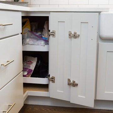
The perimeter mist colored cabinets helped warm and brighten the entire room, while the graphite colored cabinets on the island added contrast. Using this fresh, clean color palette satisfied the couple’s desire for a bright space that was the exact opposite of what they had before. Organization accessories were also added to the cabinets such as a spice drawer tray and roll outs to create hidden convenience.
“I absolutely love the hidden spices – it makes cooking so much more enjoyable!” Chris said. “And all the pull outs, and the double trash bin, who would think you could get so excited about organization!” the couple said in unison.
One thing they hated in their original kitchen was how dark the space felt. Added lighting on the ceiling with the new light fixtures combined with the lighter cabinetry colors throughout solved this problem. “Our new kitchen has this warm, almost cozy feeling that our old kitchen never had, it’s just a space that I love spending my time in now,” Meghan said. The light airy feeling was accentuated with the use of floating white shelves on either side of the decorative range hood. “We have so much cabinetry space, the new design is amazing we actually have more storage space than we will ever need,” Meghan said.
The island was extended to create more work surface and added space for stool seating. “The new island changes how we live. Now the kids can be in the kitchen with us, doing homework, eating breakfast, and the three of us have special dinners there when Chris is working late,” Meghan said.
The Carrara Marmi Quartz countertops were chosen because they are, not only beautiful, but are made from hard-working material that doesn’t require maintenance. The white subway tile backsplash that wraps to the ceiling behind the focal point cooktop range/hood compliments the crisp white countertops perfectly, while brushed brass hardware and light fixtures keep the design fresh and new.
The couple had a few fears at the beginning of the project, as most homeowners do. Their biggest fear was being out of their kitchen and laundry room for an extended time. The crew made it very easy for the family to work in a limited space keeping the washer and dryer hooked up the majority of the time, and also getting appliances working with minimal downtime.
“They above and beyond accommodated us to get us through the process,” Meghan said. “They did a great job making sure we were as comfortable as possible throughout the process,” Chris added.
“Our project manager DJ did a great job. He was very good at updating us on schedule changes, getting guys in as quickly as possible. Everyone that stepped in the house was nice and did great work,” said Chris. They thought Advance’s carpenter was phenomenal and were impressed when he took a conceptual idea from a photograph and worked with designer Michelle to create a one of a kind range/hood that has become the topic of conversation with friends and family who visit the new kitchen. “He was in our house literally every day for several weeks. He was easy to work with and good at what he did,” Meghan and Chris said.
The focal point of the kitchen; a hand-crafted, custom-built ventilation hood was clad with handpicked reclaimed barnwood. Advance Design’s carpenter built the framework and the cladding to create a one-of-a-kind design element that the couple loves.
“I think it was especially fun for him to create something unique from scratch, showcasing his talent in this area,” Meghan said. “I love that my kitchen is not like everyone else’s. I got to pick out the wood on my hood and watch it being built and was able to choose what pieces of wood went where on it. It’s totally unique.”
Red Oak flooring was toothed-in throughout the kitchen and the rest of the first floor anywhere changes were made. Then the whole floor was refinished to tone down the orange undertones in the existing floor stain, ultimately changing the color complexion of the entire first floor. The result is a completely new feeling to the entire home.
Renovating the laundry room was extremely important to Meghan and Chris, but they had trouble visualizing what the possibilities were for the seemingly small space. Michelle produced beautiful 3D illustrations that helped them envision the space in a whole new way.
“I must have told Michelle 100 times that I am a visual person, seeing the designs in 3D made it so easy to make decisions and see what we could really do with our space,” Meghan said.
A dividing wall and doorway were removed between the existing laundry room and hallway formerly containing a coat closet, providing space to design specialized graphite colored cabinetry matching the kitchen island to house custom storage cubbies for each family member. Adding the tall utility cabinetry in the new laundry area helped solve the storage issue, tucking away cleaning supplies, household items, and even the cat got its own cubby.
“I love how everything is now hidden in its own space. I can’t tell you how much I hated coming home and seeing everything sitting around on counters,” Chris said.
Electrical outlets were planned for the inside of utility cabinets, so devices could charge in hidden locations. Stacking the washer and dryer allowed for wider countertop space to provide a folding area and a special space for clothes to hang. “The way I do laundry has been completely transformed! I can actually fold clothes and hang them now right out of the washer and dryer,” Meghan said.
“The end result in the kitchen and the laundry/mud room was an updated light and bright space, with a smarter work flow that better meets the needs of this family,” Michelle said.
“I would totally recommend Advance Design,” Meghan said. “Sometimes I sit and just look at my kitchen and laundry room and think ‘Wow, I can’t believe I get to live here!’ It’s an understatement to say we love our new space.”
 Design Vision Studio
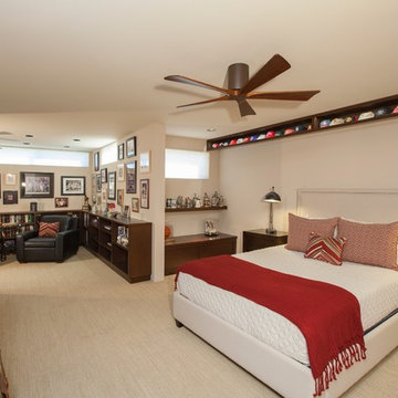
This large guest bedroom suite showcases the not so subtle differences between clutter and collection. After sitting in boxes for years, a lifetime of sports memorabilia are utilized to give this wonderful room a story to tell.
We designed custom built-in cabinetry to display the amazing treasures of authentic steins and family photos amongst sports nostalgia, books, trophies, autographed caps, bats and balls. This "man cave" living space fits perfectly into this contemporary home and gives our client reason to smile.
As you can see, the entry, formal dining room, wet bar, and master bedroom also share an intentional and tailored design aesthetic. The design trick is not to "over-decorate" and edit your collection so that it does not overwhelm the space.
Our client told us "your team should be very proud of the incredible home that you created for this old sports fan. Thank you for making it all happen."
104