
Search results for "Overwhelms" in Home Design Ideas
 LCA LUXURY DECOR
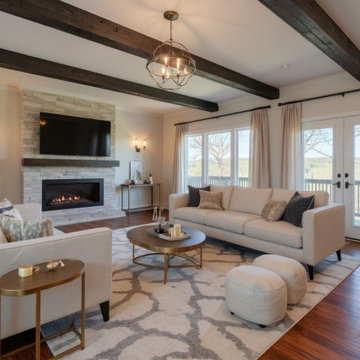
Cozy Neutral Base: The soft cream sofas and ottomans create a calm, welcoming foundation perfect for family living.
Layered Luxury Textures: A patterned area rug, plush pillows, and fabric drapery add dimension while keeping the look family-friendly.
Sophisticated Accents: Gold and bronze tones in the side tables and lighting provide subtle glamour without overwhelming the space.
Architectural Warmth: Exposed dark wood beams paired with the stone fireplace bring natural character and timeless elegance.
Balanced Function + Style: The layout invites conversation and relaxation while maintaining a polished, elevated look.
 MIREWORKS
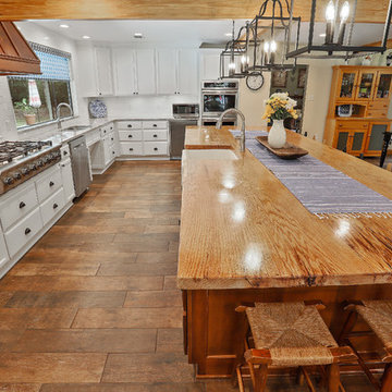
Something that has resplendence is gorgeous in a grand and brilliant way. We were asked to design a kitchen that looked beautiful, accommodated large family gatherings, functioned as a cooks' kitchen should, and met a very real need for accessibility. Larger than normal space between cabinets was needed for wheel chair accessibility, as well as sinks that allow for roll up use. This design was accomplished by taking in the original carport, which had been replaced prior by a larger parking space (which can be seen through the windows in the keeping area). By adding white cabinetry to brighten the space, a warm and welcoming feel was achieved without overwhelming the pallet with dark stains. The results speak for themselves.
 Katie Hutchison Studio
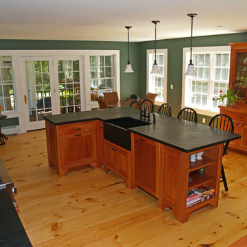
With two small children and a third on the way, the owners of an original eighteenth century Cape were quickly out-growing it, but they had no desire to move away from the Cape Cod home and location they loved. They simply needed a reconfigured layout and more space. Their goals included repurposing some existing rooms, adding a new kitchen/family area plus screen porch on the first level, and creating a master suite and roof deck with an outdoor shower on the second level, connected by a new stair.
Our challenge was to improve the flow between existing spaces, and design the two-story addition without overwhelming the pint-sized original Cape. We took advantage of the lower grade at the rear of the property to step the first floor of the addition down two steps from the existing main level. This allowed us to align the second floor in the addition with the existing second floor, while gaining ceiling height in the new first-floor kitchen/family area. We composed a cross-gabled form for the addition to improve the second floor headroom, while maintaining the existing eave line. We then extended some existing shed dormers to gain headroom and enhance function. We also expanded the outdoor living area with privacy walls along the roof deck.
New, larger, double–hung windows that match the lite configuration of the existing windows, along with new side-wall shingles and trim which resemble the existing exterior treatment help to tie the new addition to the old Cape. Though there’s no mistaking the new for the old, the two are simpatico.
Katie Hutchison Studio collaborated with Geoffrey Koper Architect of Yarmouth Port, Mass. on the Yarmouth Port Antique Cape Renovation and Addition. Kitchen fit-out and interior finishes, fixtures, and furnishings by others.
photo by Katie Hutchison
Find the right local pro for your project
 Lux Interiors & Landscape Design Co
Pompano Beach Oceanfront Condo
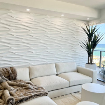
A refined coastal residence designed to balance modern sophistication with effortless livability. This Pompano Beach condo was reimagined as a serene, high-end retreat—where clean architectural lines, curated textures, and natural light work together to create a cohesive, elevated experience.
The main living space features a sculptural approach to design, anchored by a custom textured feature wall that adds depth without overwhelming the palette. Soft neutrals and layered materials—plush upholstery, dimensional rugs, and warm wood tones—create a calming foundation, while statement lighting introduces a bold, artistic edge.
In the dining area, tailored seating and a modern chandelier bring intimacy and structure, seamlessly connecting to the kitchen beyond. Every element was selected to feel intentional yet effortless.
The bedrooms continue the story with a more dramatic tone—contrasting light and dark palettes, integrated millwork, and ambient lighting that enhances both comfort and visual impact. Each space is designed to feel like a private suite, blending luxury with relaxation.
Stepping outside, the oceanfront terrace becomes an extension of the interior—featuring lounge seating positioned to capture expansive water views and golden-hour light. The result is a seamless indoor-outdoor flow that defines true South Florida living.
Every detail in this home was carefully considered—from material selections to spatial balance—creating a polished, livable luxury environment tailored to the client’s lifestyle.
 Century Stair Company
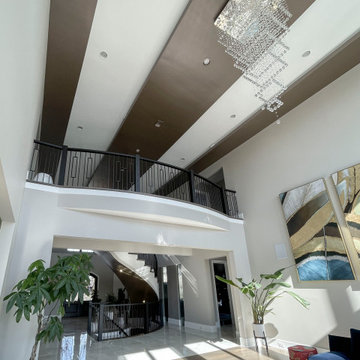
Rising through the heart of the main foyer, this curved staircase is striking. Dark-stained oak treads with square noses create a substantial foundation, anchored by bold, black-painted square newels. A modern metal balustrade completes the design, adding sleek contemporary edge to the elegant curve. The freestanding nature of stair allows the staircase to command attention without overwhelming the interiors. The result is a staircase that balances presence and refinement.
1976-2026 © Century Stair Company
 Century Stair Company
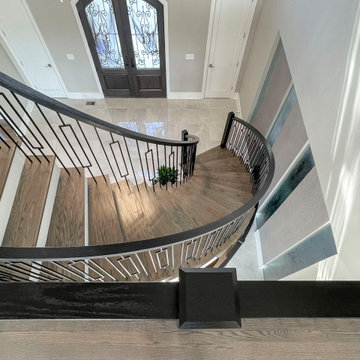
Rising through the heart of the main foyer, this curved staircase is striking. Dark-stained oak treads with square noses create a substantial foundation, anchored by bold, black-painted square newels. A modern metal balustrade completes the design, adding sleek contemporary edge to the elegant curve. The freestanding nature of stair allows the staircase to command attention without overwhelming the interiors. The result is a staircase that balances presence and refinement.
1976-2026 © Century Stair Company
 Outdoor Lighting Perspectives
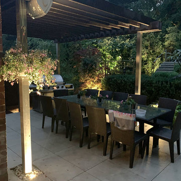
Outdoor lighting project for a client in Toronto with a multi-level back yard patio and pool area. A simply delightful yard perfect for both entertaining and relaxing. The infinity pool is a show stopper even in a yard filled with many other incredible design elements.
Our lighting design focus was to highlight the interesting textures and spaces without overwhelming the area or making gatherers feel on display.
 Mobi Cabinets
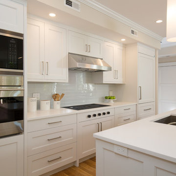
With only one wall in the kitchen for cabinetry, the space was tight to fit everything a homeowner would need. By placing the sink in the island, we opened up more room on the wall side for countertop work space. Double ovens are balanced on the other side by a panel ready fridge that was built to look like a cabinet. Since the space was small, Alan did not want to overwhelm the wall with the stainless steel that would take away the view from the cabinets. The cooktop was given storage below for even more useful space. No inch was left unused.
 3SI Design
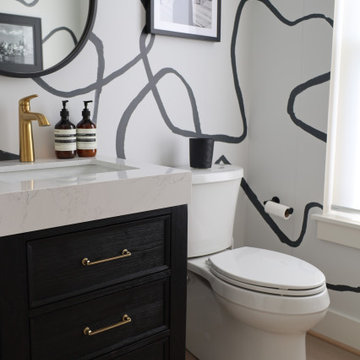
This powder bathroom is a bold, high-impact space that proves small rooms can carry big personality. The custom abstract wallpaper sets the tone immediately — an organic, hand-drawn pattern in deep charcoal sweeps across crisp white walls, creating movement and visual interest without overwhelming the space.
The black and brass accents layer in warmth and sophistication. A matte black oval mirror softens the strong linear pattern of the wallpaper, while the brass faucet and hardware introduce a refined contrast that feels intentional and elevated. The modern black-and-white sconce adds a sculptural moment above the mirror, tying the palette together seamlessly.
The vanity keeps the look grounded with its dark finish and clean lines, balanced by a bright quartz countertop that keeps the room feeling fresh and airy. Minimal styling — amber glass soap bottles, a simple framed black-and-white print, and a sleek black toilet paper holder — allows the design elements to breathe without clutter.
Overall, the space feels modern, curated, and slightly dramatic — the perfect statement powder bath that leaves a lasting impression on guests while still feeling timeless and polished.
 MAC Renovations and Design
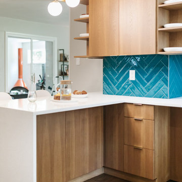
Not every home can handle teal—but this one absolutely owns it. What could have felt bold instead became the defining feature of a kitchen full of personality, warmth, and confidence.
Rooted in a mid-century modern aesthetic that aligns seamlessly with the rest of the home, the design embraces clean lines, thoughtful restraint, and intentional details. Minimal gold hardware delicately cuffs the edges of the slab cabinet doors and drawers, adding just enough contrast to elevate the sleek, streamlined look without overwhelming it.
While the renovation remained within the existing footprint, one strategic change made a significant impact—introducing an additional entrance from the front door. This simple move opened up the entire first floor, creating a natural connection between spaces and improving the overall flow of the home.
123
With space at a premium, custom cabinetry became essential. Every inch was maximized with purpose—from a narrow pull-out spice rack to a fully concealed dishwasher, and stretching cabinetry to the ceiling —proving that highly functional design can still feel clean and effortless.
And then there are the details that bring it all together. A matte white faucet offers an unexpected, sculptural moment that feels both modern and refined. Overhead, a custom linear light fixture anchors the space, adding a tailored element that the homeowner truly fell in love with.
The result is a kitchen that feels cohesive, efficient, and uniquely personal—proof that great design isn’t about more space, but about making every inch count.
The result is a space that feels both expressive and efficient, all while remaining timelessly classy. Every material choice brings personality, warmth, and cohesion to the room.
 Red House Remodeling
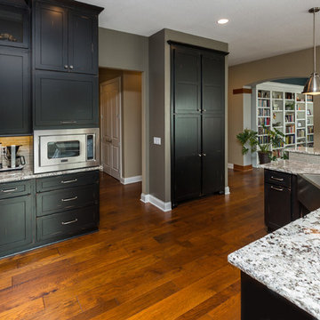
While this home was just two years old, the homeowners decided to proceed with a remodel to upgrade the basic builder kitchen as soon as possible to enjoy for many years in their “forever home.” The objectives of the kitchen remodel were to: personalize the aesthetic, incorporate commercial appliances and higher end cabinet options, replace the closet style pantry with cabinetry, increase storage, and upgrade the fireplace. Since the overall footprint of the existing kitchen was remaining close to the existing, the solution was all about the details. We assembled the right combination of design elements, like lighting and plenty of glass cabinet doors, so the black cabinets would not overwhelm the open space. The result? A gorgeous kitchen that is completely personalized to the homeowners and their lifestyle.

 Creative Edge Landscapes
A large pond provides a natural accent to any backyard and a definite draw for guests. Adding features like this metal bird water fountain on the edge the pond helps keep it from becoming overwhelming.
 ANGEL ADVANCED TECHNOLOGIES - Electrical
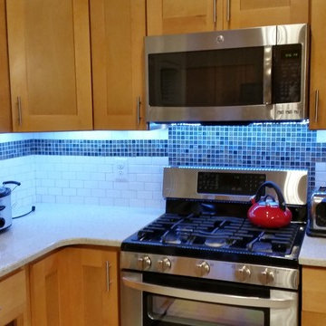
We used an Led Product with a dimmer.
The client loves the contrast in color illuminating the back-splash. Also it has been said that the dimmed version is very elegant.
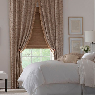
 Gallery Of Shades
At Gallery of Shades, we provide high quality and stylish window coverings for any room. Our philosophy is simple and that is to provide our clients with the best products and services at a fair price in order to enrich their home environment. We have been servicing Scottsdale and its surrounding areas for over 25 years.
We have a large selection of window treatments including shutters, blinds, shades, screens, draperies and even tints. Regardless of the windows size or shape, you can rest assured Gallery of Shades has the perfect solution for them. Our design consultants will help you to select the right window covering for any room by bringing the showroom to you. This enables you to get the right look, feel and functionality in your window treatments, and beautify your space while protecting it from the harsh Arizona sun.
Our products are guaranteed for a lifetime. At Gallery of Shades, our top priority is giving our customers more value than they expect. This is measured by price, performance, quality, features and services rendered. This goal is the core of our beliefs and guides us in everything we do. We know making decisions in your home can sometimes be overwhelming so we do our best to make your window covering experience a positive one that you won’t forget.
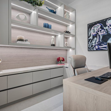
 Patricia Borja Interiors
This feminine office is designed to feel soft, elevated, and intentionally calm while still remaining functional. Light, airy finishes are paired with gentle curves and refined detailing, creating a sense of ease and sophistication. Subtle textures and warm undertones add depth without overwhelming the space, resulting in a workspace that feels both graceful and inspiring, with a quiet sense of luxury.
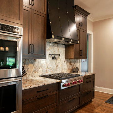
 Hermitage Kitchen Gallery LLC
This sophisticated kitchen embraces the beauty of restraint, where thoughtful details, natural materials, and carefully balanced proportions create a space that feels both elevated and inviting. A generous central island anchors the room, providing ample workspace, storage, and a comfortable gathering place for everyday living and entertaining.
Custom cabinetry gives the kitchen a tailored, furniture-like presence, while warm wood tones and expressive natural stone introduce texture and movement. Layered lighting and refined architectural details add depth without overwhelming the clean, cohesive design.
Function was considered just as carefully as aesthetics. Efficient work zones, abundant storage, generous preparation surfaces, and open sightlines allow the kitchen to perform beautifully while remaining connected to the surrounding living spaces.
Rather than relying on a single statement feature, the design draws its character from the relationship between materials, craftsmanship, proportion, and subtle detailing. The result is a warm, timeless kitchen with a sense of quiet luxury—sophisticated enough for entertaining, yet comfortable enough for everyday life.
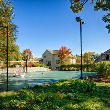
 Ground One Landscape Design + Build
This visually simple, modern solution is unique within its suburban context, and gives this family the custom landscape of their dreams. The homeowners’ wish list included a modern design and clearly defined spaces: a larger dining patio, firepit patio, hot tub, and a 4-season sport court (which gets flooded for ice hockey in the winter).
Circulation and screening were key in Ground One’s landscape design. A sport court could overwhelm the entire backyard, so it was raised three feet above the primary backyard to physically separate different spaces, and minimize its visual impact. Rectangular bluestone in a running bond pattern was used in all the gathering spaces (dining, firepit, hot tub). Bluestone walls reinforce a simple material palette.
A larger dining patio was installed near the house for greater entertaining flexibility. Plank paver paths connect to a private hot tub area and allow kids to don hockey gear and enter the sport court without messing up the house. The firepit patio is at the back of the property, nestled into the existing hillside under a large oak and below the sport court terrace.
Plantings reinforce the geometry of each gathering space, provide focal points, and create layers of screening and separation from any given vantage point. Hardy species were selected for their low-maintenance requirements and various seasons of interest. Landscape lighting was incorporated to provide way finding between the patios, accent various hardscape elements, and highlight the trees.
 Century Stair Company
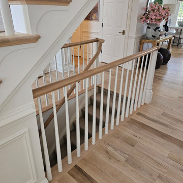
This rail remodel brings fresh feel to this Virginia home through traditional materials and clean design. A white oak handrail paired with classic white balusters complements the home's bright, open layout while adding refined detail. Natural light from large windows highlights the craftsmanship of the new rail system. The remodel transforms what was once dated into a polished focal point that enhances the space without overwhelming it.
1976-2026 © Century Stair Company

 Gayler Design Build
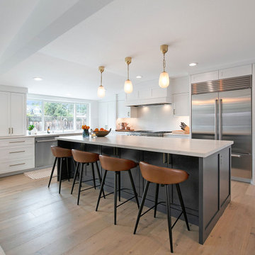
The use of lighter tones for the wood floors enlarges the home visually. Pops of navy blue, brass hardware, and leathered quartzite give the open living space a modern, upscale look that is chic enough to command attention yet understated enough not to overwhelm.
The kitchen was designed with full-length semi-custom white shaker style cabinetry, leathered quartzite countertops, a large navy-blue island with seating for four, high-end Wolf appliances, and pendant lighting.
136