
Search results for "People decide" in Home Design Ideas

 FMSProjects, Inc.
Latch hardware in upper cabinets.
Inspiration for a mid-sized craftsman u-shaped medium tone wood floor eat-in kitchen remodel in San Francisco with a single-bowl sink, shaker cabinets, white cabinets, quartz countertops, green backsplash, ceramic backsplash, stainless steel appliances and a peninsula
Inspiration for a mid-sized craftsman u-shaped medium tone wood floor eat-in kitchen remodel in San Francisco with a single-bowl sink, shaker cabinets, white cabinets, quartz countertops, green backsplash, ceramic backsplash, stainless steel appliances and a peninsula

 Dianne Davant and Associates
Master Bedroom with Red Bed Frame and custom drapery and bedding.
Bedroom - traditional master light wood floor bedroom idea in Charlotte
Bedroom - traditional master light wood floor bedroom idea in Charlotte


Find the right local pro for your project
 User
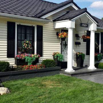
Every home improvement project can feel like going into battle, but the sweet taste of victory is enough to make it worthwhile. If you ever feel intimidated by homes and gardens in magazines, don’t fret – you can turn your home into a beautiful beacon with easy curb appeal updates! Kevin and Annette Klingel are some of our favorite weekend warriors, and their latest project proves that anything is possible when it comes to dressing up your front garden. The Klingels recently gave their home and front garden a major renovation and entered their photos in the Window Box Contest. When we saw the gorgeous before and after pictures, we knew we had to get the inside scoop on their process and uncover their best curb appeal ideas.
Curb Appeal – Before and After
Before the renovation, the Klingels had a charming South Bend, Indiana rambler that was tidy and traditional, if a little unassuming. Deciding it was time for a much-needed update, the Klingels replaced their old green roof with a black barrel roof to match the style of their home. They also made a needed replacement and changed out the sidewalk and front stoop to a new version in classic black.
After those dramatic changes, the Klingels just couldn’t stop! Loving the contrast between the new black roof and stoop and their cream house, they painted their shutters black. And here’s where we come in – Annette wanted to incorporate her love of flowers into the new home design and found the perfect planters and window boxes to match the shutters. They purchased ten black window boxes in a classic and chic design to put around their outside windows. The Klingels also used tall black planters around the entrance to the house. The window boxes and planters each received the same plant treatment – red, yellow, and orange impatiens with flowing ferns for a bright punch of color. Paired with hanging baskets and a few other accents, the Klingels house is now a masterpiece.
From Drab to Fab
The Klingels love their warm and inviting new front entrance, and the neighbors do too. Instead of getting overlooked, their house now stands out and is the star of their busy street, where it is seen by lots of people everyday. They have received tons of compliments about their new look – a crisp and clean front garden that stays true to the style of the home and neighborhood.
The Klingels’ curb appeal update wasn’t without its challenges, but the end product is amazing, and as Annette says, definitely worth the time. The Klingels recommend starting with the necessary replacements and finding beautiful matching pieces to add curb appeal. With a little patience, elbow grease, and the help of a great garden supply store like Hooks & Lattice, you too can have the home of your dreams.
Photos: Kevin & Annette Klingel

 Thompson Remodeling
Our clients had lovingly cared for their home for 16 years. In this small home, space was at a premium and the couple wanted to update this poorly functioning kitchen to match the rest of their Arts & Crafts style home.
Key requirements of this kitchen remodel design included:
- Improved lighting
- Better traffic pattern
- More storage
- Incorporating the Pewabic tile the clients loved
IMPROVED LIGHTING
A new lighting plan for the kitchen included:
- Three pendants over the new island
- Pendant lighting over the sink
- Recessed lights throughout
- Under cabinet lighting
BETTER TRAFFIC PATTERN
The refrigerator was moved from the main walkway to a perimeter wall. Its new location creates one point in the now smaller working triangle.
Prep space was previously scarce and the new island allows two to work in the kitchen without one getting trapped in the corner.
MORE STORAGE
A new island supplies storage that was non-existent before and it creates a place for people to sit and connect.
Although we replaced a slider with a door, we added a pantry cabinet which was also new storage the kitchen did not previously have.
Bulkheads were removed allowing cabinets to extend to the ceiling.
INCORPORATING PEWABIC TILE
Pewabic tile is handcrafted stoneware clay tile that is made in Detroit with a history dating back to 1903. Our clients fell in love with this tile years ago and used it on the landing of their staircase and wanted to incorporate it into the kitchen design.
We decided to let this gorgeous tile take center stage by creating an eye-catching backsplash. The flooring also incorporates details that connect back to the Pewabic tiles used on the walls.
OVERALL RESULTS
The remodeled kitchen has improved the feel of the whole first floor. A clear pathway runs from the living room through the kitchen and from the kitchen into the dining room. A new island supplies much-needed storage and provides a place for people to eat casual meals and hang out. The new lighting plan brightened not only the kitchen, but also the adjacent rooms. Now, with the kitchen completed, the whole house has a cohesive Arts & Crafts aesthetic – Mission Accomplished!
“The kitchen design is everything we hoped it would be. It’s a reflection of our tastes – it’s us. Our designer really understood what we liked and how to make the kitchen fit with the look of the rest of the house.”
“What do we love? Lighting, lighting, lighting! The Pewabic backsplash! The storage additions. The overall look – it’s new, but it looks & feels like it could have been original to the house.”
– Homeowner

 TKS Design Group
Free ebook, Creating the Ideal Kitchen. DOWNLOAD NOW
This client wanted a complete update of their kitchen and came to us with several objectives. They wanted a larger island and easier access to the dining room. They also wanted to eliminate the existing cooktop location from the island and make the island larger. Because the existing space was not able to accommodate all those requests, we decided to eliminate the breakfast area and incorporate that space into the kitchen. By eliminating an existing bay window and making the kitchen sink window larger, we were able to make the new layout work without sacrificing any natural light. A French door to the newly added and adjoining sunroom and casual outdoor dining spot still allows for multiple dining options. And by enlarging the opening to the dining room, it allows for easier access to this space on a daily basis versus for special occasions only.
The client already had a large desk in the kitchen and spends a lot of time at this area. We were able to make the new desk even larger by moving the refrigerator to another area. The refrigerator is covered in decorative panels so that it blends nicely into the furniture look of the room. The larger island can now seat several people comfortably.
The room’s traditional feel was achieved by providing different finishes on the perimeter, island and desk cabinetry. Handmade gray backsplash tile, a combination of soapstone and Carrera marble give the space a classic appeal. Details provide interest – custom glass mullions, decorative wood hood and bronze hardware give the space character and charm.
Designed by: Susan Klimala, CKD, CBD
Interior Design by: Rachel Alcorn
Architect: Rick Rearick
Contractor: KJN Renovations
Photography by: Mike Kaskel
For more information on kitchen and bath design ideas go to: www.kitchenstudio-ge.com

 Shirl Ames
If your family is like most American families, the kitchen is the heart of your home. It is where you gather for meals, to do homework, meet with friends, and, of course, sneak a midnight snack! Knowing that the kitchen is the center of your home, is the overall style what you want when entertaining? If the answer is no, but you don’t have the funds to do a complete renovation, you may be considering painting the kitchen cabinets. Here are three of the top benefits of making this choice.
A Face-Lift – Kitchen cabinets are most likely one of the first things people notice when they enter a kitchen, as they take up a majority of the wall space. So if they are drab, dated, worn, or darker than you prefer, you may want to consider brightening up your kitchen with a professional painting of not only the wall surfaces but also the kitchen cabinets. If your cabinets are in fairly good condition, there really is no need to replace, but rather have the experts bring back the shine and new look to your kitchen through paint.
Economical – Having a team of professionals remove, clean, sand, and paint your cabinet doors and the surrounding woodwork can be much more cost effective than a complete replacement of the cabinets. The average cost of revitalizing cabinets by painting is a fraction of the cost of both the labor and materials needed to replace the existing cabinets.
Time and Convenience – Not only is the cost a factor when deciding whether to replace or rejuvenate your cabinets, but time and convenience should be considered as well. For most contractors, gutting and replacing cabinets will take approximately 3-6 weeks and will mean losing your kitchen during that time. In a fraction of the time, usually less than a week, your kitchen can look like new with a paint color that you have chosen.
Sponsored
Columbus, OH

Hope Restoration & General Contracting
Columbus Design-Build, Kitchen & Bath Remodeling, Historic Renovations

 River Valley Landscapes
The property is one of the original farm houses located on the main street of a small town. It has been in the family for many years and our client just inherited the property. They were trying to have balance of preserving the old while realizing modern day living has its benefits too. The house had a large addition added using mostly old style materials, but designed with function and modern day luxuries. Our goal was to carry that theme to the outside.
Our first problem we had to address was how to transition between the first floor elevation changes. The lower room was the husband’s office. He stated in the future he may have clients over and it would be nice to have an area to sit outside. The wife’s main concern was to renew the four corner garden. She also felt it was very important to be able to see it from the kitchen area. Finally there was an old wishing well stuck right outside the kitchen. They both felt it would be neat to be able to incorporate this in some how. They wanted a patio area with a built in grill to accommodate there family and friends. They also wanted to keep a large play area for the kids.
We were able to pull this off successfully. We addressed the first issue by having a small lower level flagstone area. This area is large enough for 1 to 2 people to sit comfortably. It also provides a transition from his office to the larger patio area. We installed a simple small gravel sitting area opposite of the main patio. This provides our client a secluded place to relax or do business. Mrs.... told me she is amazed how much her and her husband enjoys this area. It is so peaceful looking at the small creek over a glass of wine.
We built a natural limestone retaining wall to create the patio terrace. The stone was chosen to extend the houses architectural elements into the landscape. Irregular broken flagstone was used to give it a more casual feel. We installed three Serviceberries into the patio terrace to replace some trees that were taken down during the remodeling. She was very concern that they would block the view of the four corner garden. We new they were crucial to nestle in the terrace, so we placed them for a couple days for her to decide. Fortunately she agreed they not only kept the view open, but helped frame the garden.
The four corner garden was designed to be viewed from afar and experienced up close. We wanted the space to have some formal structure while keeping with the casual farm house feel. Another natural limestone retaining wall was created. This leveled the garden terrace and helped associate it with the rest of the property. The four corner garden is nestled into the existing woods edge. This provides three distinct experiences to entering the garden; a more formal from the driveway, an open feel from the lower lawn, and a more natural / casual experience from the wooded area. The Plymouth brown gravel was used for the center of the garden. This helped highlight the stone post that was found during construction. The gravel also brings the sense of sound into the garden space. Lamb’s ear was chosen as a fun way to get kids interest in horticulture.
The balance of using the new to create the old feel is what makes this project a success. The property has already hosted a local historical society event and won an award for its preservation efforts. When Mrs.... can’t find her husband, she knows he is either reading the newspaper by the grill or resting in the hammock along the wood’s path.
 Thompson Remodeling
Our clients had lovingly cared for their home for 16 years. In this small home, space was at a premium and the couple wanted to update this poorly functioning kitchen to match the rest of their Arts & Crafts style home.
Key requirements of this kitchen remodel design included:
- Improved lighting
- Better traffic pattern
- More storage
- Incorporating the Pewabic tile the clients loved
IMPROVED LIGHTING
A new lighting plan for the kitchen included:
- Three pendants over the new island
- Pendant lighting over the sink
- Recessed lights throughout
- Under cabinet lighting
BETTER TRAFFIC PATTERN
The refrigerator was moved from the main walkway to a perimeter wall. Its new location creates one point in the now smaller working triangle.
Prep space was previously scarce and the new island allows two to work in the kitchen without one getting trapped in the corner.
MORE STORAGE
A new island supplies storage that was non-existent before and it creates a place for people to sit and connect.
Although we replaced a slider with a door, we added a pantry cabinet which was also new storage the kitchen did not previously have.
Bulkheads were removed allowing cabinets to extend to the ceiling.
INCORPORATING PEWABIC TILE
Pewabic tile is handcrafted stoneware clay tile that is made in Detroit with a history dating back to 1903. Our clients fell in love with this tile years ago and used it on the landing of their staircase and wanted to incorporate it into the kitchen design.
We decided to let this gorgeous tile take center stage by creating an eye-catching backsplash. The flooring also incorporates details that connect back to the Pewabic tiles used on the walls.
OVERALL RESULTS
The remodeled kitchen has improved the feel of the whole first floor. A clear pathway runs from the living room through the kitchen and from the kitchen into the dining room. A new island supplies much-needed storage and provides a place for people to eat casual meals and hang out. The new lighting plan brightened not only the kitchen, but also the adjacent rooms. Now, with the kitchen completed, the whole house has a cohesive Arts & Crafts aesthetic – Mission Accomplished!
“The kitchen design is everything we hoped it would be. It’s a reflection of our tastes – it’s us. Our designer really understood what we liked and how to make the kitchen fit with the look of the rest of the house.”
“What do we love? Lighting, lighting, lighting! The Pewabic backsplash! The storage additions. The overall look – it’s new, but it looks & feels like it could have been original to the house.”
– Homeowner
 Thompson Remodeling
Our clients had lovingly cared for their home for 16 years. In this small home, space was at a premium and the couple wanted to update this poorly functioning kitchen to match the rest of their Arts & Crafts style home.
Key requirements of this kitchen remodel design included:
- Improved lighting
- Better traffic pattern
- More storage
- Incorporating the Pewabic tile the clients loved
IMPROVED LIGHTING
A new lighting plan for the kitchen included:
- Three pendants over the new island
- Pendant lighting over the sink
- Recessed lights throughout
- Under cabinet lighting
BETTER TRAFFIC PATTERN
The refrigerator was moved from the main walkway to a perimeter wall. Its new location creates one point in the now smaller working triangle.
Prep space was previously scarce and the new island allows two to work in the kitchen without one getting trapped in the corner.
MORE STORAGE
A new island supplies storage that was non-existent before and it creates a place for people to sit and connect.
Although we replaced a slider with a door, we added a pantry cabinet which was also new storage the kitchen did not previously have.
Bulkheads were removed allowing cabinets to extend to the ceiling.
INCORPORATING PEWABIC TILE
Pewabic tile is handcrafted stoneware clay tile that is made in Detroit with a history dating back to 1903. Our clients fell in love with this tile years ago and used it on the landing of their staircase and wanted to incorporate it into the kitchen design.
We decided to let this gorgeous tile take center stage by creating an eye-catching backsplash. The flooring also incorporates details that connect back to the Pewabic tiles used on the walls.
OVERALL RESULTS
The remodeled kitchen has improved the feel of the whole first floor. A clear pathway runs from the living room through the kitchen and from the kitchen into the dining room. A new island supplies much-needed storage and provides a place for people to eat casual meals and hang out. The new lighting plan brightened not only the kitchen, but also the adjacent rooms. Now, with the kitchen completed, the whole house has a cohesive Arts & Crafts aesthetic – Mission Accomplished!
“The kitchen design is everything we hoped it would be. It’s a reflection of our tastes – it’s us. Our designer really understood what we liked and how to make the kitchen fit with the look of the rest of the house.”
“What do we love? Lighting, lighting, lighting! The Pewabic backsplash! The storage additions. The overall look – it’s new, but it looks & feels like it could have been original to the house.”
– Homeowner
 TKS Design Group
Free ebook, Creating the Ideal Kitchen. DOWNLOAD NOW
This client wanted a complete update of their kitchen and came to us with several objectives. They wanted a larger island and easier access to the dining room. They also wanted to eliminate the existing cooktop location from the island and make the island larger. Because the existing space was not able to accommodate all those requests, we decided to eliminate the breakfast area and incorporate that space into the kitchen. By eliminating an existing bay window and making the kitchen sink window larger, we were able to make the new layout work without sacrificing any natural light. A French door to the newly added and adjoining sunroom and casual outdoor dining spot still allows for multiple dining options. And by enlarging the opening to the dining room, it allows for easier access to this space on a daily basis versus for special occasions only.
The client already had a large desk in the kitchen and spends a lot of time at this area. We were able to make the new desk even larger by moving the refrigerator to another area. The refrigerator is covered in decorative panels so that it blends nicely into the furniture look of the room. The larger island can now seat several people comfortably.
The room’s traditional feel was achieved by providing different finishes on the perimeter, island and desk cabinetry. Handmade gray backsplash tile, a combination of soapstone and Carrera marble give the space a classic appeal. Details provide interest – custom glass mullions, decorative wood hood and bronze hardware give the space character and charm.
Designed by: Susan Klimala, CKD, CBD
Interior Design by: Rachel Alcorn
Architect: Rick Rearick
Contractor: KJN Renovations
Photography by: Mike Kaskel
For more information on kitchen and bath design ideas go to: www.kitchenstudio-ge.com
 Thompson Remodeling
Our clients had lovingly cared for their home for 16 years. In this small home, space was at a premium and the couple wanted to update this poorly functioning kitchen to match the rest of their Arts & Crafts style home.
Key requirements of this kitchen remodel design included:
- Improved lighting
- Better traffic pattern
- More storage
- Incorporating the Pewabic tile the clients loved
IMPROVED LIGHTING
A new lighting plan for the kitchen included:
- Three pendants over the new island
- Pendant lighting over the sink
- Recessed lights throughout
- Under cabinet lighting
BETTER TRAFFIC PATTERN
The refrigerator was moved from the main walkway to a perimeter wall. Its new location creates one point in the now smaller working triangle.
Prep space was previously scarce and the new island allows two to work in the kitchen without one getting trapped in the corner.
MORE STORAGE
A new island supplies storage that was non-existent before and it creates a place for people to sit and connect.
Although we replaced a slider with a door, we added a pantry cabinet which was also new storage the kitchen did not previously have.
Bulkheads were removed allowing cabinets to extend to the ceiling.
INCORPORATING PEWABIC TILE
Pewabic tile is handcrafted stoneware clay tile that is made in Detroit with a history dating back to 1903. Our clients fell in love with this tile years ago and used it on the landing of their staircase and wanted to incorporate it into the kitchen design.
We decided to let this gorgeous tile take center stage by creating an eye-catching backsplash. The flooring also incorporates details that connect back to the Pewabic tiles used on the walls.
OVERALL RESULTS
The remodeled kitchen has improved the feel of the whole first floor. A clear pathway runs from the living room through the kitchen and from the kitchen into the dining room. A new island supplies much-needed storage and provides a place for people to eat casual meals and hang out. The new lighting plan brightened not only the kitchen, but also the adjacent rooms. Now, with the kitchen completed, the whole house has a cohesive Arts & Crafts aesthetic – Mission Accomplished!
“The kitchen design is everything we hoped it would be. It’s a reflection of our tastes – it’s us. Our designer really understood what we liked and how to make the kitchen fit with the look of the rest of the house.”
“What do we love? Lighting, lighting, lighting! The Pewabic backsplash! The storage additions. The overall look – it’s new, but it looks & feels like it could have been original to the house.”
– Homeowner
 Thompson Remodeling
Our clients had lovingly cared for their home for 16 years. In this small home, space was at a premium and the couple wanted to update this poorly functioning kitchen to match the rest of their Arts & Crafts style home.
Key requirements of this kitchen remodel design included:
- Improved lighting
- Better traffic pattern
- More storage
- Incorporating the Pewabic tile the clients loved
IMPROVED LIGHTING
A new lighting plan for the kitchen included:
- Three pendants over the new island
- Pendant lighting over the sink
- Recessed lights throughout
- Under cabinet lighting
BETTER TRAFFIC PATTERN
The refrigerator was moved from the main walkway to a perimeter wall. Its new location creates one point in the now smaller working triangle.
Prep space was previously scarce and the new island allows two to work in the kitchen without one getting trapped in the corner.
MORE STORAGE
A new island supplies storage that was non-existent before and it creates a place for people to sit and connect.
Although we replaced a slider with a door, we added a pantry cabinet which was also new storage the kitchen did not previously have.
Bulkheads were removed allowing cabinets to extend to the ceiling.
INCORPORATING PEWABIC TILE
Pewabic tile is handcrafted stoneware clay tile that is made in Detroit with a history dating back to 1903. Our clients fell in love with this tile years ago and used it on the landing of their staircase and wanted to incorporate it into the kitchen design.
We decided to let this gorgeous tile take center stage by creating an eye-catching backsplash. The flooring also incorporates details that connect back to the Pewabic tiles used on the walls.
OVERALL RESULTS
The remodeled kitchen has improved the feel of the whole first floor. A clear pathway runs from the living room through the kitchen and from the kitchen into the dining room. A new island supplies much-needed storage and provides a place for people to eat casual meals and hang out. The new lighting plan brightened not only the kitchen, but also the adjacent rooms. Now, with the kitchen completed, the whole house has a cohesive Arts & Crafts aesthetic – Mission Accomplished!
“The kitchen design is everything we hoped it would be. It’s a reflection of our tastes – it’s us. Our designer really understood what we liked and how to make the kitchen fit with the look of the rest of the house.”
“What do we love? Lighting, lighting, lighting! The Pewabic backsplash! The storage additions. The overall look – it’s new, but it looks & feels like it could have been original to the house.”
– Homeowner
Sponsored
Columbus, OH

Wannemacher Interiors
Customized Award-Winning Interior Design Solutions in Franklin Cnty OH
 Thompson Remodeling
Our clients had lovingly cared for their home for 16 years. In this small home, space was at a premium and the couple wanted to update this poorly functioning kitchen to match the rest of their Arts & Crafts style home.
Key requirements of this kitchen remodel design included:
- Improved lighting
- Better traffic pattern
- More storage
- Incorporating the Pewabic tile the clients loved
IMPROVED LIGHTING
A new lighting plan for the kitchen included:
- Three pendants over the new island
- Pendant lighting over the sink
- Recessed lights throughout
- Under cabinet lighting
BETTER TRAFFIC PATTERN
The refrigerator was moved from the main walkway to a perimeter wall. Its new location creates one point in the now smaller working triangle.
Prep space was previously scarce and the new island allows two to work in the kitchen without one getting trapped in the corner.
MORE STORAGE
A new island supplies storage that was non-existent before and it creates a place for people to sit and connect.
Although we replaced a slider with a door, we added a pantry cabinet which was also new storage the kitchen did not previously have.
Bulkheads were removed allowing cabinets to extend to the ceiling.
INCORPORATING PEWABIC TILE
Pewabic tile is handcrafted stoneware clay tile that is made in Detroit with a history dating back to 1903. Our clients fell in love with this tile years ago and used it on the landing of their staircase and wanted to incorporate it into the kitchen design.
We decided to let this gorgeous tile take center stage by creating an eye-catching backsplash. The flooring also incorporates details that connect back to the Pewabic tiles used on the walls.
OVERALL RESULTS
The remodeled kitchen has improved the feel of the whole first floor. A clear pathway runs from the living room through the kitchen and from the kitchen into the dining room. A new island supplies much-needed storage and provides a place for people to eat casual meals and hang out. The new lighting plan brightened not only the kitchen, but also the adjacent rooms. Now, with the kitchen completed, the whole house has a cohesive Arts & Crafts aesthetic – Mission Accomplished!
“The kitchen design is everything we hoped it would be. It’s a reflection of our tastes – it’s us. Our designer really understood what we liked and how to make the kitchen fit with the look of the rest of the house.”
“What do we love? Lighting, lighting, lighting! The Pewabic backsplash! The storage additions. The overall look – it’s new, but it looks & feels like it could have been original to the house.”
– Homeowner
 Thompson Remodeling
Our clients had lovingly cared for their home for 16 years. In this small home, space was at a premium and the couple wanted to update this poorly functioning kitchen to match the rest of their Arts & Crafts style home.
Key requirements of this kitchen remodel design included:
- Improved lighting
- Better traffic pattern
- More storage
- Incorporating the Pewabic tile the clients loved
IMPROVED LIGHTING
A new lighting plan for the kitchen included:
- Three pendants over the new island
- Pendant lighting over the sink
- Recessed lights throughout
- Under cabinet lighting
BETTER TRAFFIC PATTERN
The refrigerator was moved from the main walkway to a perimeter wall. Its new location creates one point in the now smaller working triangle.
Prep space was previously scarce and the new island allows two to work in the kitchen without one getting trapped in the corner.
MORE STORAGE
A new island supplies storage that was non-existent before and it creates a place for people to sit and connect.
Although we replaced a slider with a door, we added a pantry cabinet which was also new storage the kitchen did not previously have.
Bulkheads were removed allowing cabinets to extend to the ceiling.
INCORPORATING PEWABIC TILE
Pewabic tile is handcrafted stoneware clay tile that is made in Detroit with a history dating back to 1903. Our clients fell in love with this tile years ago and used it on the landing of their staircase and wanted to incorporate it into the kitchen design.
We decided to let this gorgeous tile take center stage by creating an eye-catching backsplash. The flooring also incorporates details that connect back to the Pewabic tiles used on the walls.
OVERALL RESULTS
The remodeled kitchen has improved the feel of the whole first floor. A clear pathway runs from the living room through the kitchen and from the kitchen into the dining room. A new island supplies much-needed storage and provides a place for people to eat casual meals and hang out. The new lighting plan brightened not only the kitchen, but also the adjacent rooms. Now, with the kitchen completed, the whole house has a cohesive Arts & Crafts aesthetic – Mission Accomplished!
“The kitchen design is everything we hoped it would be. It’s a reflection of our tastes – it’s us. Our designer really understood what we liked and how to make the kitchen fit with the look of the rest of the house.”
“What do we love? Lighting, lighting, lighting! The Pewabic backsplash! The storage additions. The overall look – it’s new, but it looks & feels like it could have been original to the house.”
– Homeowner
 User
Every home improvement project can feel like going into battle, but the sweet taste of victory is enough to make it worthwhile. If you ever feel intimidated by homes and gardens in magazines, don’t fret – you can turn your home into a beautiful beacon with easy curb appeal updates! Kevin and Annette Klingel are some of our favorite weekend warriors, and their latest project proves that anything is possible when it comes to dressing up your front garden. The Klingels recently gave their home and front garden a major renovation and entered their photos in the Window Box Contest. When we saw the gorgeous before and after pictures, we knew we had to get the inside scoop on their process and uncover their best curb appeal ideas.
Curb Appeal – Before and After
Before the renovation, the Klingels had a charming South Bend, Indiana rambler that was tidy and traditional, if a little unassuming. Deciding it was time for a much-needed update, the Klingels replaced their old green roof with a black barrel roof to match the style of their home. They also made a needed replacement and changed out the sidewalk and front stoop to a new version in classic black.
After those dramatic changes, the Klingels just couldn’t stop! Loving the contrast between the new black roof and stoop and their cream house, they painted their shutters black. And here’s where we come in – Annette wanted to incorporate her love of flowers into the new home design and found the perfect planters and window boxes to match the shutters. They purchased ten black window boxes in a classic and chic design to put around their outside windows. The Klingels also used tall black planters around the entrance to the house. The window boxes and planters each received the same plant treatment – red, yellow, and orange impatiens with flowing ferns for a bright punch of color. Paired with hanging baskets and a few other accents, the Klingels house is now a masterpiece.
From Drab to Fab
The Klingels love their warm and inviting new front entrance, and the neighbors do too. Instead of getting overlooked, their house now stands out and is the star of their busy street, where it is seen by lots of people everyday. They have received tons of compliments about their new look – a crisp and clean front garden that stays true to the style of the home and neighborhood.
The Klingels’ curb appeal update wasn’t without its challenges, but the end product is amazing, and as Annette says, definitely worth the time. The Klingels recommend starting with the necessary replacements and finding beautiful matching pieces to add curb appeal. With a little patience, elbow grease, and the help of a great garden supply store like Hooks & Lattice, you too can have the home of your dreams.
Photos: Kevin & Annette Klingel

Sponsored
Columbus, OH
Wannemacher Interiors
Customized Award-Winning Interior Design Solutions in Franklin Cnty OH

 Progressive Design Build
Challenge:
When our clients decided to do a major renovation on their home, they were looking for a more modern, transitional design with additional cabinetry for storage, new appliances and hardwood flooring. They also wanted to create an open, more cohesive kitchen/dining/living area.
The existing kitchen had dated finishes, a non-functional layout and was closed off from the living area by a large partition wall.
Solution:
To ensure a smooth renovation process, a lot of time and effort went into the planning phase.
The existing hardwood floors throughout the home were removed in certain areas and laced in with new material. Once installed, all floors were sanded and multi-coated with tint and sealer to achieve a weathered look. All rooms were also repainted to complement the newly remodeled kitchen/dining/living area and the refinished wood floors.
The kitchen was modernized and opened up to give the family a more functional living space. It was designed with white Dura Supreme cabinetry and Weathered Oak finished floors, creating a sophisticated contrast and an open, airy feel. By adding a large center kitchen island we created a comfortable sitting area for people to gather while the family entertained or cooked. The refrigerator was disguised using custom cabinet appliance panels, effectively integrating it with the cabinetry wall for a unified look.
In the master bathroom, Progressive Design Build added a curbless, walk-in shower with a half-inch clear glass partition, separating it from the new undermount tub and Quartz tub deck. White Dura Supreme cabinetry was paired with Quartz countertops, and two towers were added for additional storage. A honed marble accent band was used throughout the room to tie it all together.
Results:
The clients were very pleased with the new layout of the kitchen/dining/living area and the master bathroom, particularly all of the final finishes that completed the look and feel they were looking for.

 Tiffany Brooks, HGTV Host & Interior Designer
Inquire About Our Design Services
When we first started talking in the spring of 2015, I was impressed. She was witty, realistic, and understood that as much as she loves my shows on HGTV, design does not does not happen in 43 minutes! She told me about her space, and how she felt that her bedroom seemed “blah” to her. She had no retreat. Molly desperately longed for a place that she could spend time in, read in, play in and above all, relax in.
What we did:
Many people are terrified of hiring a designer. Rightfully so, they are investing a pretty penny in their homes. They want to make sure that everything, down to the last floral arrangement, is to their liking, because they will have to live it (and pay for it). Unfortunately, a client can unintentionally stifle a designer’s creativity through micro-management. This can produce lackluster results and ultimately cause more time (and money) to be spent on a project than is really necessary.
With Molly, that was never an issue. Before she even showed me the room in question, she said that I could have full creative license to do what I needed to do to her bedroom. SAY WHAAH!?
With Molly giving me complete creative freedom, I planned everything out and got down to business. The result: Bite-your-bottom-lip sexy. I don’t get jealous of too many of my clients’ spaces, but this one still takes my breath away every time I look at the pics!
The craziest part was that by adding more furniture, it actually made the space feel larger.
Molly and her husband Patrick loved the finished space, and promised me I will be back to finish the rest of the house!
Here’s the highlights of the rest of the project:
I came up with a space plan with three options.
Next, we reviewed mood boards and fabric schemes that would work for both Molly and her hubby Patrick.
We started with the bed. My goal was to add edge to its otherwise traditional style.
We decided to spice things up by painting the trim work in the room black.
We built in layers of lighting with dimmers. In a bedroom everything should be on dimmers, right? Right.
We designed and customized bedding, chairs and window treatments.
Together with Molly, we selected the most perfect wallpaper. This geometric “grasscloth” adds so much depth and dimension that was just missing before.
What I love:
That light fixture. I mean it is really, really amazing in person.
The porcupine mirror. This thing came packaged like it was the hope diamond, and everyone was terrified to handle it. But it really became a highlight of the room.
 Thompson Remodeling
Our clients had lovingly cared for their home for 16 years. In this small home, space was at a premium and the couple wanted to update this poorly functioning kitchen to match the rest of their Arts & Crafts style home.
Key requirements of this kitchen remodel design included:
- Improved lighting
- Better traffic pattern
- More storage
- Incorporating the Pewabic tile the clients loved
IMPROVED LIGHTING
A new lighting plan for the kitchen included:
- Three pendants over the new island
- Pendant lighting over the sink
- Recessed lights throughout
- Under cabinet lighting
BETTER TRAFFIC PATTERN
The refrigerator was moved from the main walkway to a perimeter wall. Its new location creates one point in the now smaller working triangle.
Prep space was previously scarce and the new island allows two to work in the kitchen without one getting trapped in the corner.
MORE STORAGE
A new island supplies storage that was non-existent before and it creates a place for people to sit and connect.
Although we replaced a slider with a door, we added a pantry cabinet which was also new storage the kitchen did not previously have.
Bulkheads were removed allowing cabinets to extend to the ceiling.
INCORPORATING PEWABIC TILE
Pewabic tile is handcrafted stoneware clay tile that is made in Detroit with a history dating back to 1903. Our clients fell in love with this tile years ago and used it on the landing of their staircase and wanted to incorporate it into the kitchen design.
We decided to let this gorgeous tile take center stage by creating an eye-catching backsplash. The flooring also incorporates details that connect back to the Pewabic tiles used on the walls.
OVERALL RESULTS
The remodeled kitchen has improved the feel of the whole first floor. A clear pathway runs from the living room through the kitchen and from the kitchen into the dining room. A new island supplies much-needed storage and provides a place for people to eat casual meals and hang out. The new lighting plan brightened not only the kitchen, but also the adjacent rooms. Now, with the kitchen completed, the whole house has a cohesive Arts & Crafts aesthetic – Mission Accomplished!
“The kitchen design is everything we hoped it would be. It’s a reflection of our tastes – it’s us. Our designer really understood what we liked and how to make the kitchen fit with the look of the rest of the house.”
“What do we love? Lighting, lighting, lighting! The Pewabic backsplash! The storage additions. The overall look – it’s new, but it looks & feels like it could have been original to the house.”
– Homeowner
32