
Search results for "People utilize" in Home Design Ideas
 Progressive Design Build
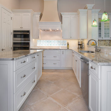
Home is where the heart is for the Paskus family. That is why an open, inviting area was at the heart of their kitchen remodel—fit for entertaining large groups of people. Only limited by the family’s need to keep the existing floor tile, Progressive Design Build utilized the existing footprint of the kitchen, but gave the space a much more open, airy feeling by removing a large bank of upper cabinets that divided the space.
We satisfied our client’s need for entertaining family and friends by incorporated a dry bar into the kitchen design that also included a wine fridge.
The open floor plan required a natural, blended transition between the kitchen and the living area. We used matching granite countertops, subway tile, and glass upper cabinets with under cabinet lighting. In the main kitchen, white subway tile was installed as a backsplash throughout the kitchen, extending to the island under the hi-top counter. Finished end panels on the cabinets were also used to give the kitchen a finished look.
A decorative hood became the focal point in the room, not only creating much-needed ventilation, but also a balance to the space. The hood was trimmed out with matching white cabinet trim materials and decorative porcelain tile crown molding and accent bands. For improved functionality, Progressive Design Build added a pop mixer tray in one of the island base cabinets.
As a result, the updated finishes and improved functionality in the cabinetry achieved all of the family’s goals in the kitchen while creating a large, beautiful space for entertaining guests.
 M Campbell Creative
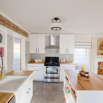
For designers their personal home says a lot about them. This is my kitchen.
I like using recycled and found elements in unexpected ways. The kitchen island was built from a TV stand, legs from a side table, and hardwood flooring. The rustic sign was made from a piece of plywood that I found in my carport. The fireplace insert is made from plywood, insulation, and some cabinetry samples that I had.
The goal is always to have the design reflect the people who occupy the space. My father-in-law's guitars line the wall, my great grand father's ox sits on the shelf, and words that my grandma always said to me as she gave me a hug hang above the door.
This is my home.
 TVL Creative Ltd.
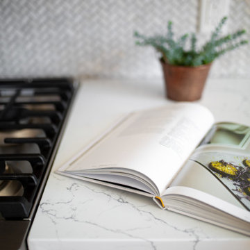
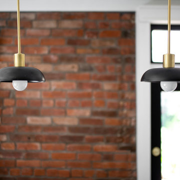
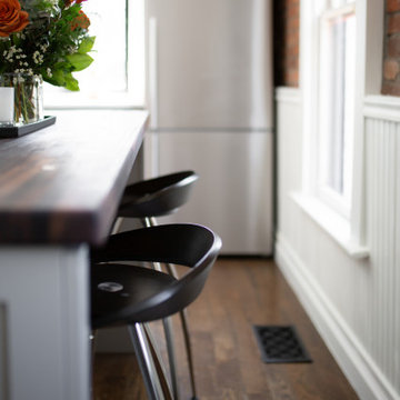
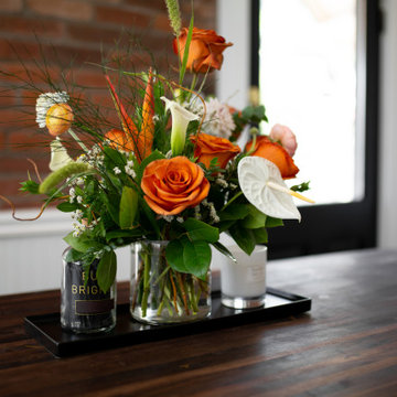
With a baby on the way and old cabinets falling apart at the seams, a kitchen remodel was the number one priority for our clients in their charming, historic Denver home. It was essential to make the kitchen feel more spacious and open, while still maintaining it’s original footprint and privacy from the rest of the house. Cabinets on three out of four walls caved into the center of the kitchen, making it feel small and difficult for even two people to be moving about! By eliminating cabinetry on the west wall, we were able to not only make the kitchen feel bigger and brighter, but we also revealed the characteristic exposed brick that was hiding behind a string of cabinets! The brick wall adds so much character and, paired with the wainscoting, is a beautiful nod to the home’s historic charm. As passionate cooks and hosts, it was crucial for our clients to have an island to utilize the counter space for prepping food and having a place for friends or family to sit and chat while they cooked a meal. Small but mighty, the island is the center of attention with a beautiful black walnut butcher block countertop, cabinets for storage, and seating for three! Our favorite feature in this kitchen sits just above the gas range; the custom wood surround on the range hood was handcrafted onsite as the final finishing touch. The elements of the natural wood, soft French grey cabinets, satin brass hardware and intricate marble herringbone backsplash all come together on this one wall, giving you a moment of cohesive glee. We are thrilled with the transformation, and our clients are elated to have a beautiful new kitchen for their new, growing family.
Find the right local pro for your project
 TVL Creative Ltd.
With a baby on the way and old cabinets falling apart at the seams, a kitchen remodel was the number one priority for our clients in their charming, historic Denver home. It was essential to make the kitchen feel more spacious and open, while still maintaining it’s original footprint and privacy from the rest of the house. Cabinets on three out of four walls caved into the center of the kitchen, making it feel small and difficult for even two people to be moving about! By eliminating cabinetry on the west wall, we were able to not only make the kitchen feel bigger and brighter, but we also revealed the characteristic exposed brick that was hiding behind a string of cabinets! The brick wall adds so much character and, paired with the wainscoting, is a beautiful nod to the home’s historic charm. As passionate cooks and hosts, it was crucial for our clients to have an island to utilize the counter space for prepping food and having a place for friends or family to sit and chat while they cooked a meal. Small but mighty, the island is the center of attention with a beautiful black walnut butcher block countertop, cabinets for storage, and seating for three! Our favorite feature in this kitchen sits just above the gas range; the custom wood surround on the range hood was handcrafted onsite as the final finishing touch. The elements of the natural wood, soft French grey cabinets, satin brass hardware and intricate marble herringbone backsplash all come together on this one wall, giving you a moment of cohesive glee. We are thrilled with the transformation, and our clients are elated to have a beautiful new kitchen for their new, growing family.
 TVL Creative Ltd.
With a baby on the way and old cabinets falling apart at the seams, a kitchen remodel was the number one priority for our clients in their charming, historic Denver home. It was essential to make the kitchen feel more spacious and open, while still maintaining it’s original footprint and privacy from the rest of the house. Cabinets on three out of four walls caved into the center of the kitchen, making it feel small and difficult for even two people to be moving about! By eliminating cabinetry on the west wall, we were able to not only make the kitchen feel bigger and brighter, but we also revealed the characteristic exposed brick that was hiding behind a string of cabinets! The brick wall adds so much character and, paired with the wainscoting, is a beautiful nod to the home’s historic charm. As passionate cooks and hosts, it was crucial for our clients to have an island to utilize the counter space for prepping food and having a place for friends or family to sit and chat while they cooked a meal. Small but mighty, the island is the center of attention with a beautiful black walnut butcher block countertop, cabinets for storage, and seating for three! Our favorite feature in this kitchen sits just above the gas range; the custom wood surround on the range hood was handcrafted onsite as the final finishing touch. The elements of the natural wood, soft French grey cabinets, satin brass hardware and intricate marble herringbone backsplash all come together on this one wall, giving you a moment of cohesive glee. We are thrilled with the transformation, and our clients are elated to have a beautiful new kitchen for their new, growing family.
 TVL Creative Ltd.
With a baby on the way and old cabinets falling apart at the seams, a kitchen remodel was the number one priority for our clients in their charming, historic Denver home. It was essential to make the kitchen feel more spacious and open, while still maintaining it’s original footprint and privacy from the rest of the house. Cabinets on three out of four walls caved into the center of the kitchen, making it feel small and difficult for even two people to be moving about! By eliminating cabinetry on the west wall, we were able to not only make the kitchen feel bigger and brighter, but we also revealed the characteristic exposed brick that was hiding behind a string of cabinets! The brick wall adds so much character and, paired with the wainscoting, is a beautiful nod to the home’s historic charm. As passionate cooks and hosts, it was crucial for our clients to have an island to utilize the counter space for prepping food and having a place for friends or family to sit and chat while they cooked a meal. Small but mighty, the island is the center of attention with a beautiful black walnut butcher block countertop, cabinets for storage, and seating for three! Our favorite feature in this kitchen sits just above the gas range; the custom wood surround on the range hood was handcrafted onsite as the final finishing touch. The elements of the natural wood, soft French grey cabinets, satin brass hardware and intricate marble herringbone backsplash all come together on this one wall, giving you a moment of cohesive glee. We are thrilled with the transformation, and our clients are elated to have a beautiful new kitchen for their new, growing family.
 Saikley Architects
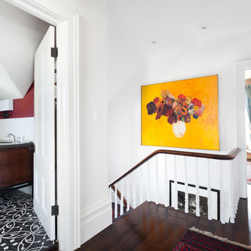
This beautiful 1881 Alameda Victorian cottage, wonderfully embodying the Transitional Gothic-Eastlake era, had most of its original features intact. Our clients, one of whom is a painter, wanted to preserve the beauty of the historic home while modernizing its flow and function.
From several small rooms, we created a bright, open artist’s studio. We dug out the basement for a large workshop, extending a new run of stair in keeping with the existing original staircase. While keeping the bones of the house intact, we combined small spaces into large rooms, closed off doorways that were in awkward places, removed unused chimneys, changed the circulation through the house for ease and good sightlines, and made new high doorways that work gracefully with the eleven foot high ceilings. We removed inconsistent picture railings to give wall space for the clients’ art collection and to enhance the height of the rooms. From a poorly laid out kitchen and adjunct utility rooms, we made a large kitchen and family room with nine-foot-high glass doors to a new large deck. A tall wood screen at one end of the deck, fire pit, and seating give the sense of an outdoor room, overlooking the owners’ intensively planted garden. A previous mismatched addition at the side of the house was removed and a cozy outdoor living space made where morning light is received. The original house was segmented into small spaces; the new open design lends itself to the clients’ lifestyle of entertaining groups of people, working from home, and enjoying indoor-outdoor living.
Photography by Kurt Manley.
https://saikleyarchitects.com/portfolio/artists-victorian/

Sponsored
Columbus, OH

Wannemacher Interiors
Customized Award-Winning Interior Design Solutions in Franklin Cnty OH
 RHEINZINK
Photos images: Courtesy of the Homeowners
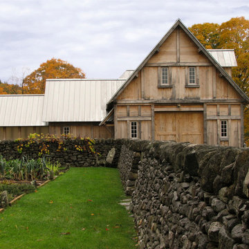
At the end of a dirt road in southern Vermont is a stunning timber and stone residence designed to resemble a small medieval Anglo-Norman manor house originally constructed in the 16th century. According to the owners, a husband and wife with a keen interest in both ancient and modern architecture, the 5,000 sq. ft. home was built slowly over eleven years by highly skilled craftsmen in order to complete all of the authentic hand-planed interior details. The craftsmen then spent an additional two years building the adjacent “ancient“ barn. “We always knew we wanted to take down a delapidated 19th-century hay barn and replace it with something of the period of the house,“ the husband said.
The owners designed the barn and began to consider zinc for the roof after looking at northern European architecture and discovering that zinc has been used extensively in Europe for 300 years. Approximately 4,200 sq. ft. of RHEINZINK prePATINA bright rolled Double Lock Standing Seam Roof Panels were utilized to roof the white oak structure. The bright rolled material was selected deliberately in order to achieve the “naturally aged look“ that the owners were seeking. “It’s gone almost immediately to a soft grey which is what we hoped would happen. As the years go by, the color of the weathering white oak and the aging zinc will come together in a dusty grey. Seeing this building in the fog five years from now will feel like seeing a 500-year-old ghost barn floating in the hills of Vermont.“
Installation of the RHEINZINK panels was done by Cold Hollow Contracting, Burlington, VT. “These folks had serious zinc-roofing experience and were clearly the most craft-oriented of all the roofers we met with,“ according to the husband.
The main focus was getting an “old look“ as quickly as possible, said Tim Heaghney, co-owner of Cold Hollow Contracting. “That’s really what makes the bright rolled so special—it ages quickly. We fabricated the 28 ft. panels on site and did the flashing fabrication in our shop. Many of the normal sheet metal skills apply to the zinc although we relied heavily on the RHEINZINK installation manual as well as personal support from their technical people. We used a radius cut and fold at the eve termination as opposed to the typical detail used in steel and copper where it‘s just cut at the 90 for the drip edge. The roof was steep but we do a lot of steeples and domes so we’re comfortable working at heights.“
The installers also utilized RHEINZINK’s AIR-Z structured underlayment to provide an air-gap behind the zinc.
The RHEINZINK distributor on the project was Beacon Sales, Shelburne, VT
 TVL Creative Ltd.
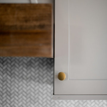
With a baby on the way and old cabinets falling apart at the seams, a kitchen remodel was the number one priority for our clients in their charming, historic Denver home. It was essential to make the kitchen feel more spacious and open, while still maintaining it’s original footprint and privacy from the rest of the house. Cabinets on three out of four walls caved into the center of the kitchen, making it feel small and difficult for even two people to be moving about! By eliminating cabinetry on the west wall, we were able to not only make the kitchen feel bigger and brighter, but we also revealed the characteristic exposed brick that was hiding behind a string of cabinets! The brick wall adds so much character and, paired with the wainscoting, is a beautiful nod to the home’s historic charm. As passionate cooks and hosts, it was crucial for our clients to have an island to utilize the counter space for prepping food and having a place for friends or family to sit and chat while they cooked a meal. Small but mighty, the island is the center of attention with a beautiful black walnut butcher block countertop, cabinets for storage, and seating for three! Our favorite feature in this kitchen sits just above the gas range; the custom wood surround on the range hood was handcrafted onsite as the final finishing touch. The elements of the natural wood, soft French grey cabinets, satin brass hardware and intricate marble herringbone backsplash all come together on this one wall, giving you a moment of cohesive glee. We are thrilled with the transformation, and our clients are elated to have a beautiful new kitchen for their new, growing family.
 Progressive Design Build
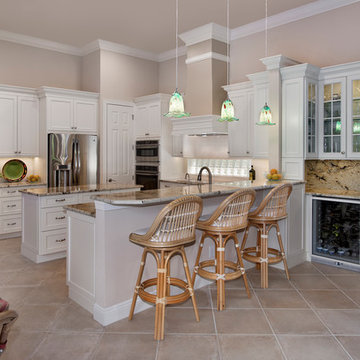
Home is where the heart is for the Paskus family. That is why an open, inviting area was at the heart of their kitchen remodel—fit for entertaining large groups of people. Only limited by the family’s need to keep the existing floor tile, Progressive Design Build utilized the existing footprint of the kitchen, but gave the space a much more open, airy feeling by removing a large bank of upper cabinets that divided the space.
We satisfied our client’s need for entertaining family and friends by incorporated a dry bar into the kitchen design that also included a wine fridge.
The open floor plan required a natural, blended transition between the kitchen and the living area. We used matching granite countertops, subway tile, and glass upper cabinets with under cabinet lighting. In the main kitchen, white subway tile was installed as a backsplash throughout the kitchen, extending to the island under the hi-top counter. Finished end panels on the cabinets were also used to give the kitchen a finished look.
A decorative hood became the focal point in the room, not only creating much-needed ventilation, but also a balance to the space. The hood was trimmed out with matching white cabinet trim materials and decorative porcelain tile crown molding and accent bands. For improved functionality, Progressive Design Build added a pop mixer tray in one of the island base cabinets.
As a result, the updated finishes and improved functionality in the cabinetry achieved all of the family’s goals in the kitchen while creating a large, beautiful space for entertaining guests.
 Saikley Architects
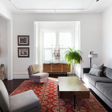
This beautiful 1881 Alameda Victorian cottage, wonderfully embodying the Transitional Gothic-Eastlake era, had most of its original features intact. Our clients, one of whom is a painter, wanted to preserve the beauty of the historic home while modernizing its flow and function.
From several small rooms, we created a bright, open artist’s studio. We dug out the basement for a large workshop, extending a new run of stair in keeping with the existing original staircase. While keeping the bones of the house intact, we combined small spaces into large rooms, closed off doorways that were in awkward places, removed unused chimneys, changed the circulation through the house for ease and good sightlines, and made new high doorways that work gracefully with the eleven foot high ceilings. We removed inconsistent picture railings to give wall space for the clients’ art collection and to enhance the height of the rooms. From a poorly laid out kitchen and adjunct utility rooms, we made a large kitchen and family room with nine-foot-high glass doors to a new large deck. A tall wood screen at one end of the deck, fire pit, and seating give the sense of an outdoor room, overlooking the owners’ intensively planted garden. A previous mismatched addition at the side of the house was removed and a cozy outdoor living space made where morning light is received. The original house was segmented into small spaces; the new open design lends itself to the clients’ lifestyle of entertaining groups of people, working from home, and enjoying indoor-outdoor living.
Photography by Kurt Manley.
https://saikleyarchitects.com/portfolio/artists-victorian/
 TKS Design Group
Free ebook, Creating the Ideal Kitchen. DOWNLOAD NOW
The Klimala’s and their three kids are no strangers to moving, this being their fifth house in the same town over the 20-year period they have lived there. “It must be the 7-year itch, because every seven years, we seem to find ourselves antsy for a new project or a new environment. I think part of it is being a designer, I see my own taste evolve and I want my environment to reflect that. Having easy access to wonderful tradesmen and a knowledge of the process makes it that much easier”.
This time, Klimala’s fell in love with a somewhat unlikely candidate. The 1950’s ranch turned cape cod was a bit of a mutt, but it’s location 5 minutes from their design studio and backing up to the high school where their kids can roll out of bed and walk to school, coupled with the charm of its location on a private road and lush landscaping made it an appealing choice for them.
“The bones of the house were really charming. It was typical 1,500 square foot ranch that at some point someone added a second floor to. Its sloped roofline and dormered bedrooms gave it some charm.” With the help of architect Maureen McHugh, Klimala’s gutted and reworked the layout to make the house work for them. An open concept kitchen and dining room allows for more frequent casual family dinners and dinner parties that linger. A dingy 3-season room off the back of the original house was insulated, given a vaulted ceiling with skylights and now opens up to the kitchen. This room now houses an 8’ raw edge white oak dining table and functions as an informal dining room. “One of the challenges with these mid-century homes is the 8’ ceilings. I had to have at least one room that had a higher ceiling so that’s how we did it” states Klimala.
The kitchen features a 10’ island which houses a 5’0” Galley Sink. The Galley features two faucets, and double tiered rail system to which accessories such as cutting boards and stainless steel bowls can be added for ease of cooking. Across from the large sink is an induction cooktop. “My two teen daughters and I enjoy cooking, and the Galley and induction cooktop make it so easy.” A wall of tall cabinets features a full size refrigerator, freezer, double oven and built in coffeemaker. The area on the opposite end of the kitchen features a pantry with mirrored glass doors and a beverage center below.
The rest of the first floor features an entry way, a living room with views to the front yard’s lush landscaping, a family room where the family hangs out to watch TV, a back entry from the garage with a laundry room and mudroom area, one of the home’s four bedrooms and a full bath. There is a double sided fireplace between the family room and living room. The home features pops of color from the living room’s peach grass cloth to purple painted wall in the family room. “I’m definitely a traditionalist at heart but because of the home’s Midcentury roots, I wanted to incorporate some of those elements into the furniture, lighting and accessories which also ended up being really fun. We are not formal people so I wanted a house that my kids would enjoy, have their friends over and feel comfortable.”
The second floor houses the master bedroom suite, two of the kids’ bedrooms and a back room nicknamed “the library” because it has turned into a quiet get away area where the girls can study or take a break from the rest of the family. The area was originally unfinished attic, and because the home was short on closet space, this Jack and Jill area off the girls’ bedrooms houses two large walk-in closets and a small sitting area with a makeup vanity. “The girls really wanted to keep the exposed brick of the fireplace that runs up the through the space, so that’s what we did, and I think they feel like they are in their own little loft space in the city when they are up there” says Klimala.
Designed by: Susan Klimala, CKD, CBD
Photography by: Carlos Vergara
For more information on kitchen and bath design ideas go to: www.kitchenstudio-ge.com
 TVL Creative Ltd.
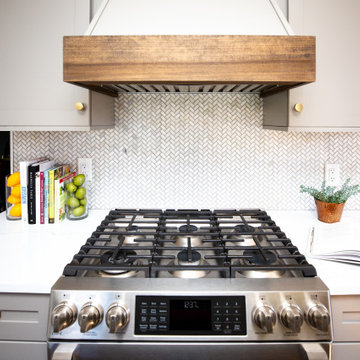
With a baby on the way and old cabinets falling apart at the seams, a kitchen remodel was the number one priority for our clients in their charming, historic Denver home. It was essential to make the kitchen feel more spacious and open, while still maintaining it’s original footprint and privacy from the rest of the house. Cabinets on three out of four walls caved into the center of the kitchen, making it feel small and difficult for even two people to be moving about! By eliminating cabinetry on the west wall, we were able to not only make the kitchen feel bigger and brighter, but we also revealed the characteristic exposed brick that was hiding behind a string of cabinets! The brick wall adds so much character and, paired with the wainscoting, is a beautiful nod to the home’s historic charm. As passionate cooks and hosts, it was crucial for our clients to have an island to utilize the counter space for prepping food and having a place for friends or family to sit and chat while they cooked a meal. Small but mighty, the island is the center of attention with a beautiful black walnut butcher block countertop, cabinets for storage, and seating for three! Our favorite feature in this kitchen sits just above the gas range; the custom wood surround on the range hood was handcrafted onsite as the final finishing touch. The elements of the natural wood, soft French grey cabinets, satin brass hardware and intricate marble herringbone backsplash all come together on this one wall, giving you a moment of cohesive glee. We are thrilled with the transformation, and our clients are elated to have a beautiful new kitchen for their new, growing family.

Sponsored
Columbus, OH
Wannemacher Interiors
Customized Award-Winning Interior Design Solutions in Franklin Cnty OH
 Backyard X-Scapes Inc.
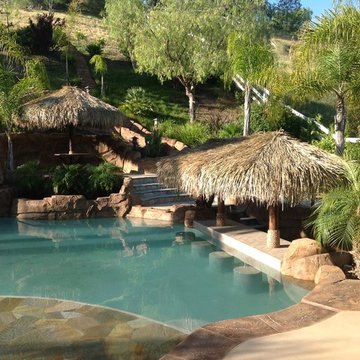
Custom thatched Palapas designed into this tropical backyard theme with white picket fence. Single pole utilized 11' Diameter woven Mexican Rain Cape Thatch and the two post constructed from 14" diameter rain capes on both ends and runner rolls on the straight roof dimensions.
 McCabe By Design LLC
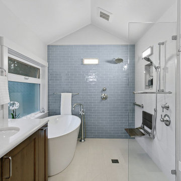
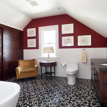
This bathroom was designed for two professionals who dedicate themselves to the health and wellness of others. The objective of the project was to be able to practice for themselves, what they preach to their patients.
The original 90” x 162” primary bathroom had so many pain points (would you to look at a toilet when taking a relaxing bath?), that it should have been an easy task to meet their needs and desires, but it was anything but due to structural issues with the home. Several design layouts were considered before it was concluded that the only approach to check the ‘needs’ boxes was to flip the primary fixtures in the room from one end of this long, narrow bathroom to the other and incorporating a wet room.
The needs list included a soaking tub, a spacious shower that accommodated dual showering on business workday morning, more counter space, a bidet toilet, more storage, better lighting, better heat and humidity control, a soothing color pallet and privacy from the neighbors.
An air jet soaking tub (motor concealed in the nearby vented base cabinet) under a new window with privacy glass on the bottom and a clear glass awning window on top checked two boxes. The center drain for the bathing features provides space for two people to shower simultaneously while highlighting the soothing color pallet from every view point in the room. The integrated bidet toilet is an affordable luxury that delivers health and wellness multiples times in a day. The expanded vanity optimized storage while providing more, clutter free countertop space. Utilizing a variety of lighting types, with dimmers, provides the right illumination for every bathroom activity. Lastly, the in-floor heat, toe-kick heater and relocated bathroom exhaust fan over the shower help maintain a consistently comfortable temperature and humidity level in this bathroom transformation.
 Saikley Architects
This beautiful 1881 Alameda Victorian cottage, wonderfully embodying the Transitional Gothic-Eastlake era, had most of its original features intact. Our clients, one of whom is a painter, wanted to preserve the beauty of the historic home while modernizing its flow and function.
From several small rooms, we created a bright, open artist’s studio. We dug out the basement for a large workshop, extending a new run of stair in keeping with the existing original staircase. While keeping the bones of the house intact, we combined small spaces into large rooms, closed off doorways that were in awkward places, removed unused chimneys, changed the circulation through the house for ease and good sightlines, and made new high doorways that work gracefully with the eleven foot high ceilings. We removed inconsistent picture railings to give wall space for the clients’ art collection and to enhance the height of the rooms. From a poorly laid out kitchen and adjunct utility rooms, we made a large kitchen and family room with nine-foot-high glass doors to a new large deck. A tall wood screen at one end of the deck, fire pit, and seating give the sense of an outdoor room, overlooking the owners’ intensively planted garden. A previous mismatched addition at the side of the house was removed and a cozy outdoor living space made where morning light is received. The original house was segmented into small spaces; the new open design lends itself to the clients’ lifestyle of entertaining groups of people, working from home, and enjoying indoor-outdoor living.
Photography by Kurt Manley.
https://saikleyarchitects.com/portfolio/artists-victorian/
 Michael Nash Design, Build & Homes
2010 NATIONAL NARI REGIONAL AWARD WINNER
Project Scope
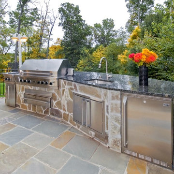
The owners of this 7,000 square foot colonial in Oakton, Virginia, were seeking a multi-level Mediterranean-style indoor/outdoor living space off the back of their home. They turned to Michael Nash Design, Build & Homes for a design solution that would include a stone patio, a second-story deck, a screened-in porch and linking staircases.
While the structure was designed primarily for family dining and entertaining, it also had to accommodate periodic social gatherings of one hundred guests or more. To meet these needs, the project would include a fully-equipped outdoor kitchen, several serving counters with permanent refrigeration, and well-delineated socializing and dining zones.
The existing home’s setting offered several impressive assets the new outdoor living area was designed to exploit. The sprawling acreage features old stand trees, wooded paths and a private lake. Beautifully landscaped, it unfolds as an idyllic panorama that naturally draws people to the outdoors.
Challenges
Since the rear elevation was situated on a slope that drops away from the house, the Michael Nash team had to raise the grade two feet within in a 2,000 square foot area extending out from the back of the house. Infrastructure plans also called for a sophisticated drainage system that had to accommodate a whole series of water “runoff” considerations to be integrated into the decking itself. Excavation included constructing retaining walls to bolster the elevated grade—which also had to support a concrete slab, the primary foundation for the entire complex.
Solutions
The ground level decking consists of a 2,000 square foot flagstone patio level with the home’s lower level doors. There is a decorative water fountain mid-patio—an ornate collectible acquired in Florida. Food preparation is concentrated within a specially designed semi-circular wall that creates an “outdoor kitchen” equipped with a 60” Viking barbecue grill, a prep sink, a warming drawer, refrigerator and appropriate storage. There is a granite surfaced dining counter with seating for eight.
Wrought iron railing and approximately 20 decorative columns (some encasing steel vertical supports) are incorporated into the design scheme. Many of the columns house accent lights.
The top level—supported by horizontal steel beams– is a 2,500 square foot deck constructed entirely of Trex decking. The open air decking is, again, directly accessible from rooms on the second level of the house including the kitchen, sunroom and family room.
The platform’s most prominent feature is a U-shaped “kitchenette” with cedar shake shingle roofing. Like its counterpart one level below, the facility is equipped with grill, refrigerator and stainless steel cabinetry.
One portion of the deck has been allocated for a 16’ x 16’ octagonal screened-in porch crowned by a pair of 2’ x 4’ skylights. The porch can be accessed from the home’s conservatory via a set of French doors. With its mosaic tile flooring, stained cedar panel ceiling and honed granite counters, the interior is elegant and calming. Hand-painted stenciling and a wall-mounted water feature provide distinctive detailing.
Finally, the design introduced elements to highlight and reinforce an awareness of the lovely bucolic setting. Fountains and water features combined with textured surfaces and mosaic tiling and backsplashes to present a villa-like ambiance well-suited to the Virginia countryside.

Sponsored
Sunbury, OH

J.Holderby - Renovations
Franklin County's Leading General Contractors - 2X Best of Houzz!
 Kitchen Design Concepts
With a little bit of love, you can transform your kitchen into a space you love to spend time in! Many people are so used to their surroundings that we don’t realize what a little bit of paint and new finishes can do to change a room. That’s exactly the case of this kitchen. Actually, the cabinetry was already refinished prior to us coming into the picture, our clients couldn’t wait! So, we had the opportunity to incorporate those finishing touches to really seal the deal of this space. Today, this kitchen is up-to-date and classic. It really will stand the test of time! To learn more about this space, continue reading below:
Cabinets
The cabinetry was already refinished prior to us doing our magic. But we love how the crisp and clean finishes of the cabinetry pairs so well with the new finishes and materials we incorporated. To elevate the cabinetry, we embellished the doors and drawers with 5 inch “Emerald” hardware from Top Knobs (TK288BSN).
Countertops
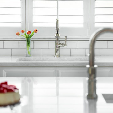
At first glance, you may have noticed we incorporated beautiful marble countertops to this space. So, what if we told you those countertops are not made of marble? Actually, not even close! These countertops are a beautiful 3cm Cambria quartz in the finish “Ironsbridge”. The specs of grey and veining in the countertops might have fooled you! We love the way it looks in this space.
Backsplash
Subway tiles have been around a long time. Still, we love the classic look of subway tile and our clients are always requesting it! A simple way to add interested to subway tile is to utilize tile with beveling, create a contrasting pattern, and add contrasting grout color, as we have done here. Here we have utilized a 3×6 Daltile Rittenhouse Square with beveled edges as the main tile. Then, over the range, we have framed the tile and changed the pattern to herringbone to add some pop!
Fixtures
The fixtures of this space are classically styled as well. From Blanco, we have the main sink in a Precis Super Single Bowl in White paired with an Atura kitchen faucet with pull-down spray in stainless steel. Then on the island, we have a Precis Medium Bowl in White and an Atura Pulldown bar faucet in stainless steel, also from Blanco.
 Saikley Architects
This beautiful 1881 Alameda Victorian cottage, wonderfully embodying the Transitional Gothic-Eastlake era, had most of its original features intact. Our clients, one of whom is a painter, wanted to preserve the beauty of the historic home while modernizing its flow and function.
From several small rooms, we created a bright, open artist’s studio. We dug out the basement for a large workshop, extending a new run of stair in keeping with the existing original staircase. While keeping the bones of the house intact, we combined small spaces into large rooms, closed off doorways that were in awkward places, removed unused chimneys, changed the circulation through the house for ease and good sightlines, and made new high doorways that work gracefully with the eleven foot high ceilings. We removed inconsistent picture railings to give wall space for the clients’ art collection and to enhance the height of the rooms. From a poorly laid out kitchen and adjunct utility rooms, we made a large kitchen and family room with nine-foot-high glass doors to a new large deck. A tall wood screen at one end of the deck, fire pit, and seating give the sense of an outdoor room, overlooking the owners’ intensively planted garden. A previous mismatched addition at the side of the house was removed and a cozy outdoor living space made where morning light is received. The original house was segmented into small spaces; the new open design lends itself to the clients’ lifestyle of entertaining groups of people, working from home, and enjoying indoor-outdoor living.
Photography by Kurt Manley.
https://saikleyarchitects.com/portfolio/artists-victorian/
 Teakwoodcentral
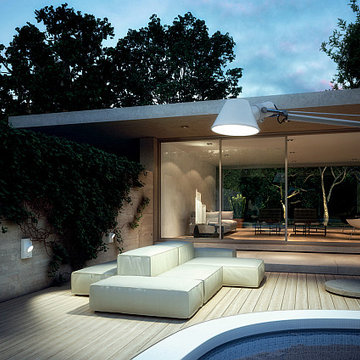
Light fixture with direct emission, with fluorescent sources
• Available with base or fixed support (pivot) made up of mass-coloured concrete
• Diffuser in mass-pigmented polypropylene, screen in light-diffusing silkscreened methacrylate, reflector in painted aluminum
• Mobile-arm structure in extruded EN-AW-6060 aluminum with bright anodizing treat¬ment
• Polished-painted articulations in die-cast EN-AB 46100 aluminum
• Adjustment system in AISI 316 stainless steel
• Silicone seal gaskets
• Suitable for watertight connection
• Electronic ballast
• c.UL.us listed
Lead time: 2 - 4 weeks
Lamping explanation:
INC = incandescent FLU = fluorescent HAL = 120V halogen LV HAL = 12V halogen
MH = metal halide SBF = self-ballasted fluorescent LED = light emitting diode
All lamps are included with the fixtures
Artemide's design and research team focuses on developing quality and long-lasting products.
Utilization of recyclable materials is high priority in our process of conceiving new design.
80% of our lights are energy efficient fluorescent or LED lighting.
But what's more green than having a beautifully crafted light that continues to function well and looks stunning decades from now
The Artemide light has never been solely a function of seeing, or an opportunity for formal experimentation with lamps as objects. For more than forty years, Artemide has aimed to propose light as a companion to people, as a source of physical pleasure and mental comfort. Artemide has done so, with different work groups, searching through the whole design process, starting with a declaration of values - The human light.
Beyond the definition, the human light is intelligent light. A light that knows it has to relate to people, accompanying them in their daily activities. That is why Artemide's attention today is concentrated on the concept of the context of life, understood as a specific microenvironment in which an event occurs where one or more persons are the protagonist, every context of life can be associated with different light contexts, or the different atmospheres of light characterized by the activities that, at various moments of the day, have us as protagonists, starting from these contexts and the lighting conditions that characterize them, Artemide proposes products capable of meeting people's multiple needs and offering the light performance characteristics most suited to each moment of life, it is light that is flexible and adaptable, which produces the optimum visual precision, and consumes the minimum environmental resources, it is Artemide light.
The Artemide group, founded by Ernesto Gismondi in 1959, today operates throughout the world, with 16 subsidiaries and affiliated companies, and 35 exclusive distributors. They have production centers in Italy, France, Germany, the USA, Hungary and the Czech Republic. In a policy aimed at satisfying all lighting needs, the Artemide group has recently acquired companies that reinforce its position as a world leader and further diversifies the offerings. For contexts of life, Artemide offers not only lamps for moments of relaxation at home, but also large sophisticated installations for lighting public and private professional activities.
Technological and productive expertise is achieved through research and development centers, with the product planning and engineering section, laboratories for technical conformity and self-certification tests, and production units equipped with avant-garde processes. A production structure that can offer expertise in the processing of traditional materials such as glass, as well as the capacity for innovation with recently introduced materials such as titanium. Lighting performance characteristics extend from a light with atmosphere, variable, colored, to the most precise of lights for community environments. The vast range of options reflects the commitment of the whole organization to provide a product guaranteed by the Artemide brand, throughout the world, with an image that is strong and consistent - That of a leader in the lighting industry.
Rezek, an Artemide brand, with product development and manufacturing in the United States. Founded by designer Ron Rezek in 1978, the Rezek company has gained strong recognition and appreciation among the architectural and interior design community for the distinctly creative design and quality construction of its American made lighting products for residential and commercial applications.
41