
Search results for "Pertinent" in Home Design Ideas
 Alair Homes Frisco
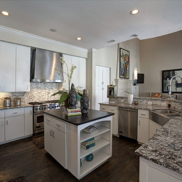
This kitchen has beautiful hardwood floors, granite on countertops and island. The glass mosaic tile backsplash complements the stainless steel appliances, while the tubular pendant lighting and recessed can lighting keeps the kitchen warm and inviting.
 Peltier Interiors
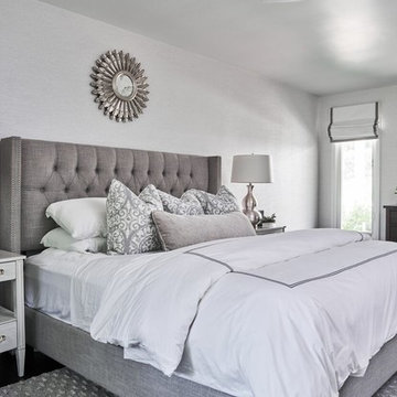
The neutral colored bedsheets and wall colors in this gorgeous transitional style modern ranch bedroom make for an extremely calming and tranquil environment. The small but significant traces of silver in the lamps on the nightstands, the decorative mirror above the headboard, and the clear light fixtures mounted on the walls are pertinent to the ambience of the room and complete the cool-toned atmosphere of the transitional home. The detailed atmosphere is attributed to the most minor details as small as the outside mount roman shades and the adorable plants included on the dresser.
 Weiss Alexander Design Group
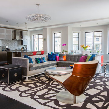
This colorful and eclectic contemporary Living Room serves as a multi functional living space for relaxing and entertaining. The plain white walls contrasted by black interior window frames serves as a blank canvas to the custom designed free form area rug by stark. The contemporary soft grey velvet sectional by Jonathan Adler is brought to life by vibrant jewel toned patterned pillows by Osbourne and Little. The white leather swivel chair is backed by walnut veneer and is juxtaposed by an organic bean shaped cocktail table.
Find the right local pro for your project
 Lindsay Heitlauf-Ferguson Sotheby's Int'l Realty
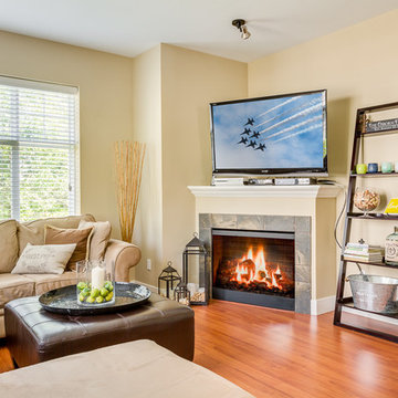
Example of a classic medium tone wood floor family room design in Seattle with beige walls, a corner fireplace, a tile fireplace and a corner tv


 Handy Hero Inc
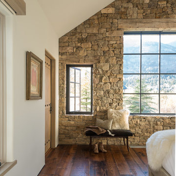
Our client is one of the founding members of a local brewery. It seemed only pertinent that when finishing their basement, we'd use a whiskey barrel from the local brewery that was used to make a special release brew! The barrel was used and rusted when we received it, we cleaned and finished it and purchased hand-forged copper sink and faucet from Premier Copper Products.


 Anita Buchheim Interiors
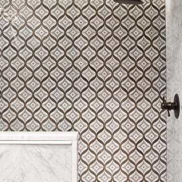
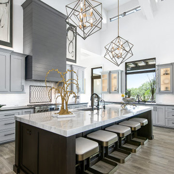
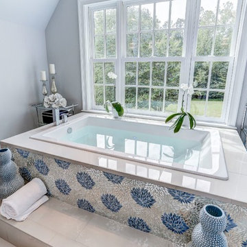
The key to finishing off any good design is to coordinate your accessories, art, towels or whatever is pertinent and personal that you may want to display.
 Masterworks Window Fashions & Design, LLC
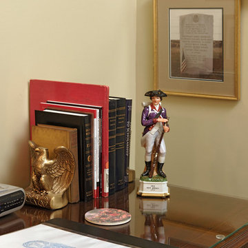
In each room, a guest book was created, with information about the history represented in the space, as well as helpful guest information such as emergency numbers, transportation, and nearby restaurants. Coasters pertinent to the history of each room were located and purchased, and each room has a unique statue of a 3rd New Jersey (New Jersey Blues) soldier. The coaster shown features Molly Pitcher. Eagle bookends hold books about the history of the battle commemorated in the space, as well as the history of the Society of the Cincinnati in New Jersey. Bob Narod, Photographer. Design by Linda H. Bassert, Masterworks Window Fashions & Design, LLC.
 Encore Interior Designs
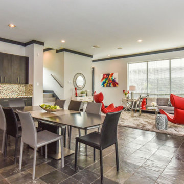
Example of a mid-sized trendy porcelain tile and black floor great room design in Houston with gray walls and no fireplace
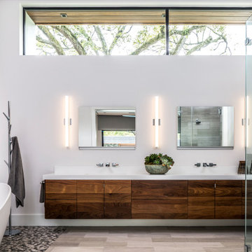
Freestanding bathtub - contemporary master multicolored tile and pebble tile pebble tile floor and multicolored floor freestanding bathtub idea in Houston with flat-panel cabinets, dark wood cabinets, white walls, white countertops and a hinged shower door
 Alair Homes Plano
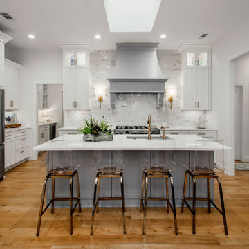
Our clients came to us wanting to maximize the space they had. They were not planning on moving anytime soon, as they loved their neighborhood. They wanted to renovate the front of their house, which included the front atrium, living room, kitchen, and powder bath. They hated their kitchen because it was completely closed off, had low ceilings, was dark and outdated, not to mention the floors were different in each of these rooms! The pantry was in the breakfast area and the kitchen table became a junk catcher, being the first thing you see when coming in from the garage/laundry room. In their living room, they wanted the spaces on either side of the fireplace to be symmetrical, whether that be bookshelves, a wet bar or closed off. Both parents are working professionals with no time and/or desire to design, create and figure this out on their own. They needed help figuring out how to reconfigure their current space in order to maximize what they already had, as they could not see an obvious solution. They could not envision how it would look so the fact that our designers were able to show them their new kitchen in 3D was pertinent.
We removed the pass-through windows that surrounded the atrium and front dining room, as well as the entire kitchen wall, completely opening up those two rooms. We removed a hall that used to lead between the kitchen and the living room since it was a complete waste of space! The ceilings were raised to 10’ in the kitchen and we were able to leave the skylight, letting in that natural light they wanted. We were able to give them a much larger pantry with tons of shelving and increase the size of their laundry room by utilizing the space of their old breakfast nook.
We relocated the door to the garage into their new elongated laundry room, built a wet bar across from their new larger pantry (with a pocket door) and the flow and functionality of these new spaces is just perfect! All new Waypoint cabinets were installed one two main kitchen surrounding walls painted Linen. Calacatta Bianco Polished Porcelain Tile 4x12 was used for the backsplash. A large eat-at island was installed, painted Stone, where the family can now gather for homework, meals, and mingling. The soft champagne bronze hardware and accent lighting really give this white and gray kitchen a soft classic look.
In the living room, we removed the built-in bookshelves to the left of the fireplace and closed off the wet-bar on the other side, giving them more space in their master suite. White Oak wood flooring, stained Putney, was installed throughout the entire new space, giving it the continuity they were looking for.
In the guest bathroom, Carrara white herringbone marble mosaic 12x12 tile was used on the shower floor and niche, while basic marble Bianco polished 12x24 porcelain tile was used on the walls. Luxart polished chrome traditional hardware gives this timeless bathroom the perfect shine.
Our clients are so happy with the new functionality and look of their space. It has definitely changed their lives in a way they could have never imagined!
 Vision Design
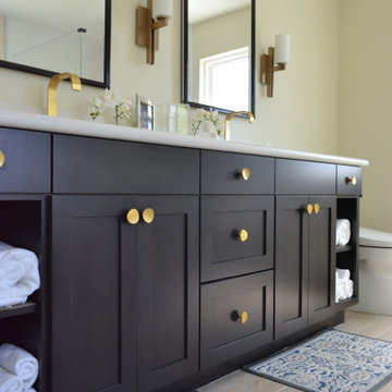
The expanded public space holds a generous kitchen, dining area and living space. A partition provides privacy for the entry. The re-arranged master suite has a generous walk in closet, bath with soaking tub and double vanity as well as a generous open feeling stall shower. There is a new laundry closet inside and a generous kids bath with seated area for doing hair.

 User
User
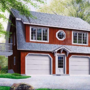
Country house plan - 23-441 from Houseplans.com
Questions? Call us at 1-800-913-2350
Photographs may show modified designs. All images are copyrighted.
Plan 23-441
992 sq ft
2 beds
1.50 baths
28' wide
28' deep
×
Plans
Main Floor Plan
Reverse
Upper Floor Plan
Reverse
Lower Floor Plan
Reverse
Specifications
Plan Styles
Country
Farmhouse
Exterior Wall Framing
Framing
2"x6"
Bedroom Features
Main Floor Bed Bath
Area
Main Floor Sq Ft
896 sq ft
Total Sq Ft
992 sq ft
Garage Sq Ft
800 sq ft
Lower Floor Sq Ft
96 sq ft
Garage
Garage Under
Basic Features
Baths
1.50
Garage Stalls
2
Stories
2
Bedrooms
2
Potential Bedrooms
0
Dimension
Depth
28'
Width
28'
Designer Notes
Included
EXTERIOR ELEVATIONS: Detailed drawings showing how the house will look from each elevation once it is built.
FLOOR PLANS: These drawings will show each level of the house, indicating the dimensions of each room, the location of walls, windows, stairs, structure to hold the possible floor above and basic electrical layout.
FOUNDATION PLAN: This fully detailed drawing is showing all pertinent notes, the dimensions, height and thickness of the poured foundation. Structure to hold the floor above is also shown. Most plans come with a full basement, unless otherwise specified.
CROSS SECTION: These construction drawings will show you sections of the house as it cuts through the length and depth indicating the height and details for each volume.
ROOF PLAN: This layout will help you understand the structure of the roofing system and the location of each of the main trusses.
TRUSS DIAGRAM: General layout and truss diagram that you can bring to a local manufacturer or simply to help the builder with his structure.
CONSTRUCTION DETAILS: wall sections and stair section: In these pages you will get general construction details and staircase section to conform with up to date ways of building and regulations.
Pricing
Plan Set
Price
5 Copy Set
$755.00
8 Copy Set
$780.00
PDF Set
$935.00
Reproducible Set
$935.00
CAD Set
$1
 Alair Homes Plano
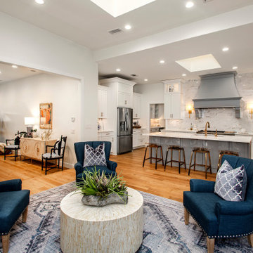
Our clients came to us wanting to maximize the space they had. They were not planning on moving anytime soon, as they loved their neighborhood. They wanted to renovate the front of their house, which included the front atrium, living room, kitchen, and powder bath. They hated their kitchen because it was completely closed off, had low ceilings, was dark and outdated, not to mention the floors were different in each of these rooms! The pantry was in the breakfast area and the kitchen table became a junk catcher, being the first thing you see when coming in from the garage/laundry room. In their living room, they wanted the spaces on either side of the fireplace to be symmetrical, whether that be bookshelves, a wet bar or closed off. Both parents are working professionals with no time and/or desire to design, create and figure this out on their own. They needed help figuring out how to reconfigure their current space in order to maximize what they already had, as they could not see an obvious solution. They could not envision how it would look so the fact that our designers were able to show them their new kitchen in 3D was pertinent.
We removed the pass-through windows that surrounded the atrium and front dining room, as well as the entire kitchen wall, completely opening up those two rooms. We removed a hall that used to lead between the kitchen and the living room since it was a complete waste of space! The ceilings were raised to 10’ in the kitchen and we were able to leave the skylight, letting in that natural light they wanted. We were able to give them a much larger pantry with tons of shelving and increase the size of their laundry room by utilizing the space of their old breakfast nook.
We relocated the door to the garage into their new elongated laundry room, built a wet bar across from their new larger pantry (with a pocket door) and the flow and functionality of these new spaces is just perfect! All new Waypoint cabinets were installed one two main kitchen surrounding walls painted Linen. Calacatta Bianco Polished Porcelain Tile 4x12 was used for the backsplash. A large eat-at island was installed, painted Stone, where the family can now gather for homework, meals, and mingling. The soft champagne bronze hardware and accent lighting really give this white and gray kitchen a soft classic look.
In the living room, we removed the built-in bookshelves to the left of the fireplace and closed off the wet-bar on the other side, giving them more space in their master suite. White Oak wood flooring, stained Putney, was installed throughout the entire new space, giving it the continuity they were looking for.
In the guest bathroom, Carrara white herringbone marble mosaic 12x12 tile was used on the shower floor and niche, while basic marble Bianco polished 12x24 porcelain tile was used on the walls. Luxart polished chrome traditional hardware gives this timeless bathroom the perfect shine.
Our clients are so happy with the new functionality and look of their space. It has definitely changed their lives in a way they could have never imagined!
 CairnsCraft Design & Remodel
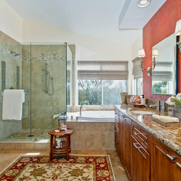
Great spacious bathroom with lot of amenities.
Photographer: Jon Upson
Large elegant master beige tile and porcelain tile drop-in bathtub photo in San Diego with an undermount sink, raised-panel cabinets, medium tone wood cabinets, granite countertops, beige walls and a two-piece toilet
Large elegant master beige tile and porcelain tile drop-in bathtub photo in San Diego with an undermount sink, raised-panel cabinets, medium tone wood cabinets, granite countertops, beige walls and a two-piece toilet
 Alair Homes Plano
Our clients came to us wanting to maximize the space they had. They were not planning on moving anytime soon, as they loved their neighborhood. They wanted to renovate the front of their house, which included the front atrium, living room, kitchen, and powder bath. They hated their kitchen because it was completely closed off, had low ceilings, was dark and outdated, not to mention the floors were different in each of these rooms! The pantry was in the breakfast area and the kitchen table became a junk catcher, being the first thing you see when coming in from the garage/laundry room. In their living room, they wanted the spaces on either side of the fireplace to be symmetrical, whether that be bookshelves, a wet bar or closed off. Both parents are working professionals with no time and/or desire to design, create and figure this out on their own. They needed help figuring out how to reconfigure their current space in order to maximize what they already had, as they could not see an obvious solution. They could not envision how it would look so the fact that our designers were able to show them their new kitchen in 3D was pertinent.
We removed the pass-through windows that surrounded the atrium and front dining room, as well as the entire kitchen wall, completely opening up those two rooms. We removed a hall that used to lead between the kitchen and the living room since it was a complete waste of space! The ceilings were raised to 10’ in the kitchen and we were able to leave the skylight, letting in that natural light they wanted. We were able to give them a much larger pantry with tons of shelving and increase the size of their laundry room by utilizing the space of their old breakfast nook.
We relocated the door to the garage into their new elongated laundry room, built a wet bar across from their new larger pantry (with a pocket door) and the flow and functionality of these new spaces is just perfect! All new Waypoint cabinets were installed one two main kitchen surrounding walls painted Linen. Calacatta Bianco Polished Porcelain Tile 4x12 was used for the backsplash. A large eat-at island was installed, painted Stone, where the family can now gather for homework, meals, and mingling. The soft champagne bronze hardware and accent lighting really give this white and gray kitchen a soft classic look.
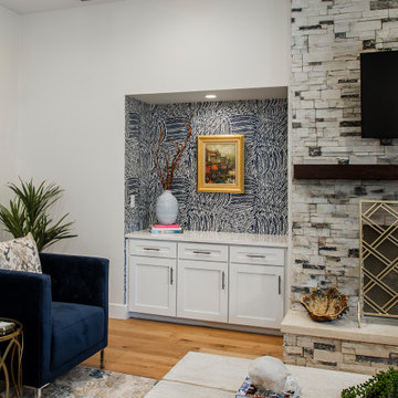
In the living room, we removed the built-in bookshelves to the left of the fireplace and closed off the wet-bar on the other side, giving them more space in their master suite. White Oak wood flooring, stained Putney, was installed throughout the entire new space, giving it the continuity they were looking for.
In the guest bathroom, Carrara white herringbone marble mosaic 12x12 tile was used on the shower floor and niche, while basic marble Bianco polished 12x24 porcelain tile was used on the walls. Luxart polished chrome traditional hardware gives this timeless bathroom the perfect shine.
Our clients are so happy with the new functionality and look of their space. It has definitely changed their lives in a way they could have never imagined!
14