
Search results for "Physical add" in Home Design Ideas
 RAJ Kitchen and Bath, LLC
**Check out the video of this transformation on our website**
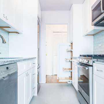
This small kitchen was way too small for this 2 bedrooms, 2 bathrooms apartment. Not only was it a very small kitchen, but the physical location of it made it very difficult to make it any bigger. There wasn't much that could have been done without incurring astronomical cost, which would get little or no return on the investment. The client wanted a kitchen that can be optimized in its current location to add a ton of value for resale.
This was difficult to do, because there was no moving of any mechanical around in the kitchen and even if we wanted to, the management of the building would not allow. For those of you who live in condos, co-ops or apartment building, you know how difficult it is to rework these foot prints. When we showed up, we saw the problems, but we also saw a huge opportunity where we can achieve those goals in the small space. This was accomplished by making some key changes and to incorporate some new things that was not possible when this kitchen was built years ago.
The crucial part of the design that would drive the entire new layout, was selecting the only appliance; that was the Refrigerator. Once we nailed down that refrigerator, we then proceeded to design the kitchen around it. We moved it to the other side of the wall where the sink was so that we can tap into the water line from the sink plumbing. It was crucial that it stays exactly 24" deep, not an inch more because we had to keep the entry as open as possible. Also, it was going to be directly in front of another big storage unit - The pantry. It is not ideal in most cases, but we needed the rest of the space to ramp up the design and open feel towards the side where all of the activities would take place, which happend to be the dining room and the view.
Once all that was figured out, we re-positioned the sink, dishwasher and the range and proceeded to wrap the cabinets around the columns to integrate them into the space. Thirty- six inches cabinets height was used so that they can be installed higher towards the ceiling height to give more room rather than the standard 18" required height between the counter tops. This was done to make the room feel a lot bigger than it really was. Not to mention, we also didn't want the faucet to be buried under the cabinets so that was also a necessary design detail for the space.
We then lowered both knee walls so that the counter top can sit on top of them, by removing that stop point that would have otherwise defined the kitchen area. This allowed us to pick up that extra footprint into the room for added prep space and enabled us to create the illusion of a kitchen that is looking longer than it really is. Every inch mattered when designing this kitchen and we made a conscious decision to use every one of that inch.
White cabinets were selected to do just what white cabinets are design to do; make a small or dark room appear bigger, brighter and more open. In this kitchen, this was amplified the more because of the kitchen location. It was perfect! We knew we did justice to the space because while we were there taking some photos, a few potential buyers walked in and went straight for the kitchen! They said its design just to fit the apartment.
Pantry roll out shelving, Double recycle bin, fancy handles, LED lighting, Quartz counter top, beautiful backslash tiles and grey linen floors finished off the kitchen which looked over a beautiful view of the George Washington Bridge from the top of this lovely 4th floor apartment.
Credit to Masterpiece Tile and Marble (Annmarie on the selection of Tiles and countertop and Val on the Construction to complete this project).
Davor Kokic Photography
 Joy Street Design
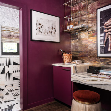
Our Oakland studio went ultra bold with the design of the guest suite at the Kips Bay Designer Showhouse. We chose the theme of a harmonious union of the physical and virtual universe through thoughtful, curated design. We used a dichromatic color theme in the bedroom to create a soothing sanctuary. Luxurious bedding, stylish fabrics, and soft velvet window treatments add a distinctive touch. In the bathroom, we added the classic black and white color theme with stylish tiles and attractive fixtures, creating a beautiful, bold contrast. The whole project emphasizes the past-meets-present-meets-future concept resulting in our most daring design yet!
---Designed by Oakland interior design studio Joy Street Design. Serving Alameda, Berkeley, Orinda, Walnut Creek, Piedmont, and San Francisco.
For more about Joy Street Design, click here:
https://www.joystreetdesign.com/
To learn more about this project, click here:
https://www.joystreetdesign.com/portfolio/kips-bay-showhouse-guest-suite
 Serapool Porselen
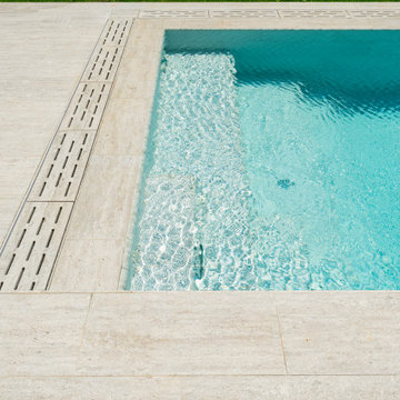
Located in Bitez, this villa pool project merges the clean lines of contemporary architecture with Serapool’s refined design language. The Snow White Series, with its pure white tones, brings freshness and optical spaciousness to the space while creating a natural ambiance that integrates seamlessly with the water’s clarity. The Silver Traverten porcelain anti-slip terrace tiles add a luxurious touch to the landscaping with their sophisticated stone texture. With a water absorption rate below 0.5%, the products offer long-lasting durability and demonstrate strong resistance to UV rays and chemicals. The PTV ≥ 45° slip resistance ensures enhanced safety in wet areas. All these details provide more than just swimming comfort—they create a complete sense of luxury, visual harmony, and physical safety within the living space.
Find the right local pro for your project
 SHANDRIKA'S REAL ESTATE, STAGING & INTERIOR DESIGN
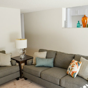
This is a Home Staging Project. Not a full Interior Design Project. The purpose of staging is to showcase a properties physical traits and not detract from them. With staging "less is more". The goal is to add softness and color and a warm environment with out a lot of clutter.
Photo credit: Vanessa Cruz
 Montana Timber Products
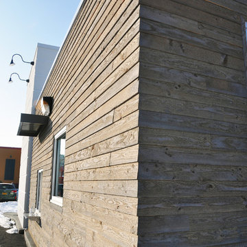
Where: Idaho
What: Commercial
Product: AquaFir™ Slate Grey
Solution: Horizontal Square Edge Lap, Circle Sawn texture
Nothing gets you up in the morning like a good cup of coffee, and nothing is more inviting than the clean, crisp look of Montana Timber Products' AquaFir™ natural wood siding.
Black Rock Coffee Bar of Boise, Idaho offers both: outstanding aesthetics and a fine cup of joe.
-
A clean, crisp professional look enhanced by Montana Timber Products' AquaFir™ siding.
-
AquaFir™ is Montana Timber Products' outstanding rustic natural wood siding, a reclaimed barn wood alternative that is milled from new, rough stock, kiln dried, chemical free wood.
AquaFir™ uses a semi-transparent stain and intentionally incorporates the random wood grains and variable natural wood tones into the finish to give it a unique and beautiful look.
The result is that AquaFir™ is an aesthetically beautiful rustic wood siding, an authentic reclaimed barn wood, and can be used as other reclaimed lumber alternatives.
Typically less expensive than antique reclaimed barn wood, AquaFir™ offers uncompromising rustic wood beauty.
-
The warm, inviting texture of Circle Sawn on Douglas fir is an AquaFir™ hallmark.
-
A custom millwork shop, Montana Timber Products offers many options to the customer's delight.
Circle Sawn and Wire Brushed are Montana Timber Products' common cedar siding texturizing options.
The Circle Sawn texture commonly seen on rustic reclaimed barn wood is created from the large circular saw blades used in more traditional milling practices.
The Wire Brushed option adds physical and aesthetic depth to the wood grain.
In addition to the aesthetic beauty added from the texturing process, greater surface area is created, which allows the Seal-Once, 100% NO VOC waterproofer to more effectively penetrate the wood.
Guaranteed for ten years, Seal-Once prevents water ingress and is safe for exterior and interior use, children and pets.
-
Square edge lap horizontal installation provides pleasant contrasts with light and shadow.
-
If the environmentally friendly and the renewable aspect of natural wood siding is important to you, be sure to do your homework when choosing your siding, interior accents, trim, timbers, or other wood siding products. Some companies choose to use degenerative chemicals to achieve the desired look and texture of rustic wood siding. This is not the case with Montana Timber Products.
Vintage wood, reclaimed barn wood and reclaimed barn wood alternatives are very popular building materials due to their aesthetic beauty, traditional look, and chemical free finish.
 RAJ Kitchen and Bath, LLC
**Check out the video of this transformation on our website**
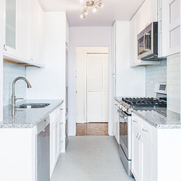
This small kitchen was way too small for this 2 bedrooms, 2 bathrooms apartment. Not only was it a very small kitchen, but the physical location of it made it very difficult to make it any bigger. There wasn't much that could have been done without incurring astronomical cost, which would get little or no return on the investment. The client wanted a kitchen that can be optimized in its current location to add a ton of value for resale.
This was difficult to do, because there was no moving of any mechanical around in the kitchen and even if we wanted to, the management of the building would not allow. For those of you who live in condos, co-ops or apartment building, you know how difficult it is to rework these foot prints. When we showed up, we saw the problems, but we also saw a huge opportunity where we can achieve those goals in the small space. This was accomplished by making some key changes and to incorporate some new things that was not possible when this kitchen was built years ago.
The crucial part of the design that would drive the entire new layout, was selecting the only appliance; that was the Refrigerator. Once we nailed down that refrigerator, we then proceeded to design the kitchen around it. We moved it to the other side of the wall where the sink was so that we can tap into the water line from the sink plumbing. It was crucial that it stays exactly 24" deep, not an inch more because we had to keep the entry as open as possible. Also, it was going to be directly in front of another big storage unit - The pantry. It is not ideal in most cases, but we needed the rest of the space to ramp up the design and open feel towards the side where all of the activities would take place, which happend to be the dining room and the view.
Once all that was figured out, we re-positioned the sink, dishwasher and the range and proceeded to wrap the cabinets around the columns to integrate them into the space. Thirty- six inches cabinets height was used so that they can be installed higher towards the ceiling height to give more room rather than the standard 18" required height between the counter tops. This was done to make the room feel a lot bigger than it really was. Not to mention, we also didn't want the faucet to be buried under the cabinets so that was also a necessary design detail for the space.
We then lowered both knee walls so that the counter top can sit on top of them, by removing that stop point that would have otherwise defined the kitchen area. This allowed us to pick up that extra footprint into the room for added prep space and enabled us to create the illusion of a kitchen that is looking longer than it really is. Every inch mattered when designing this kitchen and we made a conscious decision to use every one of that inch.
White cabinets were selected to do just what white cabinets are design to do; make a small or dark room appear bigger, brighter and more open. In this kitchen, this was amplified the more because of the kitchen location. It was perfect! We knew we did justice to the space because while we were there taking some photos, a few potential buyers walked in and went straight for the kitchen! They said its design just to fit the apartment.
Pantry roll out shelving, Double recycle bin, fancy handles, LED lighting, Quartz counter top, beautiful backslash tiles and grey linen floors finished off the kitchen which looked over a beautiful view of the George Washington Bridge from the top of this lovely 4th floor apartment.
Credit to Masterpiece Tile and Marble (Annmarie on the selection of Tiles and countertop and Val on the Construction to complete this project).
Davor Kokic Photography
 LBK Design Build
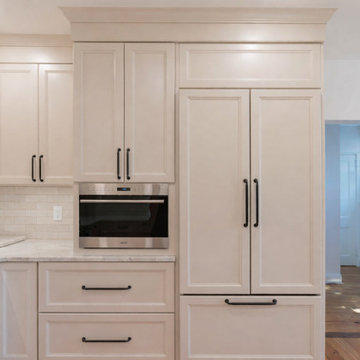
This kitchen was reimagined to improve flow, increase usable storage, and create a cleaner, more cohesive layout while maintaining the existing footprint. The original space felt segmented with a closed-off pantry, heavy stone elements, and inconsistent cabinetry that limited function. The new design removes visual and physical barriers, introduces a more efficient working layout, and incorporates a warm, neutral palette with layered textures. A mix of painted cabinetry, natural wood tones, and copper accents creates contrast while still feeling cohesive. The addition of a peninsula adds prep space and casual seating, while improved lighting and a taller window bring more light into the space.

 Margot Designs
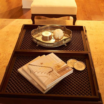
The lattice work on the trays of this unique coffee table offer texture and style to this seating area. The petite chair adds the extra seating without taking much physical space.
 Guchi Interior Design
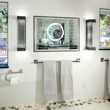
Beautiful Seamless Curbless shower with custom built in bidet/lounger. His and Her Luxury Bathing in this wet room environment. Linear slot drain, Danver Stainless Steel powder coated cabinetry, oversized Kohler sink with touchless faucet. Water proof wall sconces to add ambient lighting while lounging in this bathing suite. Upscale Quart countertops with waterfall side. Support bars in various styles including drop down for ease of use. Custom built shampoo niches - luxury at every angle with ease of use for all family members both able bodies and those with physical challenges. Respect and Beauty abound!
 Century Stair Company
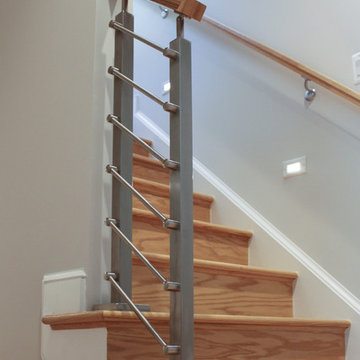
The modern staircase in this 4 level elegant townhouse allows light to disperse nicely inside the spacious open floor plan. The balustrade’s design elements (fusion of metal and wood) that owners chose to compliment their gleaming hardwood floors and stunning kitchen, not only adds a sleek and solid physical dimension, it also makes this vertical space a very attractive focal point that invites them and their guests to go up and down their beautifully decorated home. Also featured in this home is a sophisticated 20ft long sliding glass cabinet with walnut casework and stainless steel accents crafted by The Proper Carpenter; http://www.thepropercarpenter.com. With a growing team of creative designers, skilled craftsmen, and latest technology, Century Stair Company continues building strong relationships with Washington DC top builders and architectural firms.CSC 1976-2020 © Century Stair Company ® All rights reserved.
 RAJ Kitchen and Bath, LLC
**Check out the video of this transformation on our website**
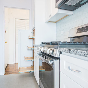
This small kitchen was way too small for this 2 bedrooms, 2 bathrooms apartment. Not only was it a very small kitchen, but the physical location of it made it very difficult to make it any bigger. There wasn't much that could have been done without incurring astronomical cost, which would get little or no return on the investment. The client wanted a kitchen that can be optimized in its current location to add a ton of value for resale.
This was difficult to do, because there was no moving of any mechanical around in the kitchen and even if we wanted to, the management of the building would not allow. For those of you who live in condos, co-ops or apartment building, you know how difficult it is to rework these foot prints. When we showed up, we saw the problems, but we also saw a huge opportunity where we can achieve those goals in the small space. This was accomplished by making some key changes and to incorporate some new things that was not possible when this kitchen was built years ago.
The crucial part of the design that would drive the entire new layout, was selecting the only appliance; that was the Refrigerator. Once we nailed down that refrigerator, we then proceeded to design the kitchen around it. We moved it to the other side of the wall where the sink was so that we can tap into the water line from the sink plumbing. It was crucial that it stays exactly 24" deep, not an inch more because we had to keep the entry as open as possible. Also, it was going to be directly in front of another big storage unit - The pantry. It is not ideal in most cases, but we needed the rest of the space to ramp up the design and open feel towards the side where all of the activities would take place, which happend to be the dining room and the view.
Once all that was figured out, we re-positioned the sink, dishwasher and the range and proceeded to wrap the cabinets around the columns to integrate them into the space. Thirty- six inches cabinets height was used so that they can be installed higher towards the ceiling height to give more room rather than the standard 18" required height between the counter tops. This was done to make the room feel a lot bigger than it really was. Not to mention, we also didn't want the faucet to be buried under the cabinets so that was also a necessary design detail for the space.
We then lowered both knee walls so that the counter top can sit on top of them, by removing that stop point that would have otherwise defined the kitchen area. This allowed us to pick up that extra footprint into the room for added prep space and enabled us to create the illusion of a kitchen that is looking longer than it really is. Every inch mattered when designing this kitchen and we made a conscious decision to use every one of that inch.
White cabinets were selected to do just what white cabinets are design to do; make a small or dark room appear bigger, brighter and more open. In this kitchen, this was amplified the more because of the kitchen location. It was perfect! We knew we did justice to the space because while we were there taking some photos, a few potential buyers walked in and went straight for the kitchen! They said its design just to fit the apartment.
Pantry roll out shelving, Double recycle bin, fancy handles, LED lighting, Quartz counter top, beautiful backslash tiles and grey linen floors finished off the kitchen which looked over a beautiful view of the George Washington Bridge from the top of this lovely 4th floor apartment.
Credit to Masterpiece Tile and Marble (Annmarie on the selection of Tiles and countertop and Val on the Construction to complete this project).
Davor Kokic Photography
 Kashmir Fine Arts & Crafts
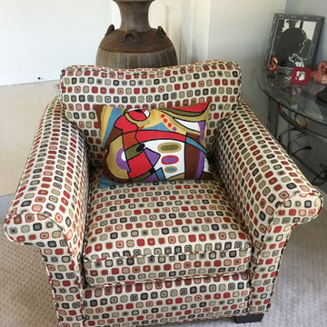
This decorative Cushion Cover Abstract Musical throw pillow cover has beautiful colors and design hand embroidered in lively reds, blues, and refreshing purple tones. Swirls of colorful chain stitch embroidery hand woven from soft Kashmiri Art Silk adds a dazzling sheen to the creation. In the abstract style of Wassily Kandinsky the eye-popping color and pattern of this creation is just what the designer ordered to create a fiery focal point in your decor. This accent pillow cover has beautiful color combination of orange, red, green and brown colors uniquely hand embroidered into various abstract forms and elementsThese modern pillow covers are handcrafted by Kashmiri artisans, and are of the finest chain-stitch embroidery in the world.Created of soft Kashmir wool over cotton, this all-natural cover makes an enduring impression.
Composition: 70% Wool, 30% Cotton
Size: 14 x 20 (35cm x 51cm)
Backing: Canvas (See Last Picture)
Pillow Insert not Included (Only Cover is on Sale)
Hand embroidered in Village Cottage Units
A close-up view of this abstract pillow cover allows you to see the amazing chain-stitch embroidery work of master artisans who have practiced this art their entire lives.This abstract decorative pillow cover could grace the cabin of your boat or the chair in your solarium and yet be equally as comfortable in your den. The eye-popping color and pattern of this modern throw pillow is just what the designer ordered to create a fiery focal point in your decor. Perfect wherever you need a splash of color, this art work pillow creation is as durable as it is beautiful. Easy to care for, this cushion cover could spark up an old throw pillow or grace a new pillow form. Kandinsky conveyed profound spirituality and inner human emotion through a visual language of abstract forms and colors that transcended cultural and physical boundaries. He used interrelation between color and form to create an aesthetic experience that engaged the sight, sound, and emotions of the viewer. Kandinsky viewed music as the most transcendent form of non-objective art musicians could evoke images in listeners‚ minds merely with sounds. He crafted spiritually rich paintings that alluded to sounds and emotions through sensations. Modern Artist Wassily Kandinsky used the form of concentric circles to portray the soul. Rendered here as chain stitch embroidery in art silk, this cushion cover can create a new personality for any room in which you choose to use it.
 Jacobson Construction
“If everyone is moving forward together,
then success takes care of itself.”
- Henry Ford
It’s no secret that one big reason for Jacobson Construction’s success is because of our people. I’ve always hired the best people who work together as a team while respecting our customers. These are real professionals who work together and get the job done.
Sean, our project leader, has been with me since 1995, and my electrician has been with me even longer. Many of my current staff have been with me for over 15 years. I am fortunate to have these skilled professionals working with me.
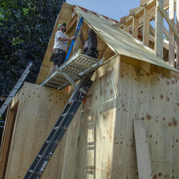
The addition is coming along. There’s a hole in the kitchen where there used to be a supporting wall. Framing’s done in the basement, and a gas fireplace is ready to be installed. The second-floor dormers are framed, and all of our windows have been delivered.
Now that it’s taking shape, looks like one of our new favorite spaces will be the new second-floor bedroom. Because it’s adjacent to the master suite it could make an ideal nursery and add value to my home.
Paying for things you can’t see is hard. For example, putting on a new roof is expensive, and because you can’t see it this seems like an even bigger expense.
What you can’t see on this addition is how much effort is made in securely tying the addition to the existing home – originally built in 1936.
We needed to support part of the old roof and all the new roof with stacked support posts. To do that we installed 3 stacked posts to carry the load from new footings in the basement to the beam three stories up.
The red marked beam in the photo at the top of the page is supported by footings three stories below, halfway into the existing home.
We also physically connected the new addition with beams that extend halfway into the current home.

 Signal House
Remarkable Condo Transformation at Grand Preserve
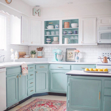
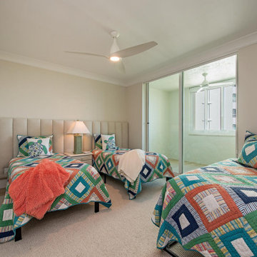
Welcome to our latest project reveal: the stunning transformation of a 2,885 SF luxury condo. Join us as we take you on a room-by-room tour of this beautiful space and share the before and after moments that will leave you speechless. From a completely upgraded kitchen to a luxurious master bathroom, the results of our redesign have created an elegant, comfortable, and inviting living space that perfectly blends style and functionality. Let's dive in and explore the meticulous details of this awe-inspiring transformation.
Reworked Front Entryway:
A first impression sets the tone for the overall experience, and that is precisely what we aimed to achieve with the front entryway. We reconfigured this area to make it more welcoming and functional, adding stylish yet practical elements that would make any guest feel instantly at home. By removing a large, outdated built-in console, we gave this space an instant refresh and created a more visually harmonious entryway.
Completely Upgraded Kitchen:
The heart of every home is the kitchen, and this luxury condo got the full treatment. We replaced the old cabinetry with new, contemporary flat front cabinets, and installed white quartz countertops that ooze elegance. The addition of a new white beauty quartz island provides ample space for meal prep or casual dining, while the custom tile backsplash adds a stunning visual element. As the cherry on top, we installed top-of-the-line appliances for the ultimate cooking experience.
Open Floor Plan:
To create a more open and inviting living space, we removed the wall between the morning room and dining room. This smart design move allowed natural light to flow through the entire space, making it feel even larger and more welcoming. By connecting these two areas visually and physically, we created the perfect setting for entertaining guests or enjoying a cozy night in.
Master Bedroom Makeover:
The master bedroom needed a breath of fresh air, and that's exactly what it got. We removed the dated carpeting and replaced it with new, elegant flooring that gives the room a more sophisticated and polished appearance. In this sanctuary, you can now enjoy a soothing and tranquil retreat away from everyday life.
Master Bath Overhaul:
A complete overhaul was in order for the master bathroom, and we went all out to create a spa-like oasis. The once-cramped space was opened up, and new, stunning flooring was installed. We added custom cabinetry for optimal storage and organization, and topped them with gorgeous new white quartz countertops. The shower was upgraded with elegant tile and the addition of a practical yet luxurious shower seat.
New Exterior Sliding doors:
Last but not least, we made a significant improvement to the exterior of the luxury condo by adding new, high-quality sliding doors. These not only enhance the condo's aesthetic appeal but also create a seamless indoor-outdoor living experience by providing easy access to a breathtaking outdoor space.
This remarkable luxury condo transformation attests to the positive impact of thoughtful design and expert craftsmanship. Every detail of the project reflects our dedication to delivering a comfortable and stylish haven for our clients. The end result? A 2,885 SF wonderland that elevates everyday living and provides the perfect backdrop for making memories that will last a lifetime. We hope this transformation inspires you to reimagine your own living spaces and create the sanctuary you've been dreaming of.
About Grand Preserve
Nestled in the picturesque city of Naples, Florida lies the Grand Preserve, an exquisite residential community that offers its residents an unparalleled level of luxury and comfort. Located just moments away from the breathtaking Vanderbilt Beach, the Grand Preserve immerses its residents in an environment of natural beauty, with stunning sunsets, rolling waves, and stretches of pristine sands that seem to stretch out to infinity. With unrivaled amenities and world-class services, the Grand Preserve is the ideal place for those who appreciate the finer things in life and expect nothing but the best. Whether you are a sunseeker, a beachcomber, or a nature lover, the Grand Preserve is the ultimate destination for those who want to experience the very best of Florida living.
Home Builders in Naples Florida For 30+ Years
Naples, Florida has long been a destination for those seeking luxury living in paradise. And when it comes to finding the perfect home to fit that lifestyle, you want to trust the experts – and that's where home builders with decades of experience come in. With over 30 years of building homes in Naples, Signal House has an unmatched knowledge of the local real estate market and a keen eye for design that perfectly complements the Florida lifestyle. From breathtaking waterfront properties to custom-built estates, we have the experience and expertise to bring your dream home to life. So why settle for a cookie-cutter house when you can have a custom-built masterpiece in the Sunshine State?
Explore more about this transformative project and take a guided video tour on our website. Click here for an immersive experience you won't want to pass up: https://www.signalhousebuilders.com/portfolio/grand-preserve-condo-remodel
 Montana Timber Products
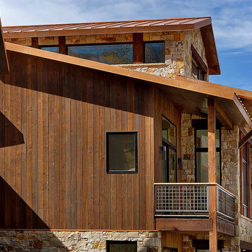
Complimenting the beautiful Colorado fall colors, this Montana Timber Products home features prefinished ranchwood™ Tackroom, Circle Sawn texture as a vertical installation.
-
The beautiful ranchwood Tackroom color, along with the vertical installation and stone work, combine for a painter's pleasure with the fall birch colors.
-
Our flagship product, ranchwood™ is Montana Timber Products' chemical free, kiln dried, alternative milled rough stock wood.
As an ideal reclaimed lumber alternative, the aesthetically pleasing rustic barn wood ranchwood™ is the result of an environmentally safe production process.
Offering uncompromising natural, rustic beauty, ranchwood™ is typically less expensive than antique reclaimed barnwood.
-
Combined textures solidify into a beautiful rustic brew.
-
A custom millwork shop, Montana Timber Products offers many options to the customer's delight.
Circle Sawn and Wire Brushed are Montana Timber Products' common cedar siding texturizing options.
The Circle Sawn texture commonly seen on rustic reclaimed barn wood is created from the large circular saw blades used in more traditional milling practices.
The Wire Brushed option adds physical and aesthetic depth to the wood grain.
In addition to the aesthetic beauty added from the texturing process, greater surface area is created, which allows the Seal-Once, 100% NO VOC waterproofer to more effectively penetrate the wood.
Guarneteed for ten years, Seal-Once prevents water ingress and is safe for exterior and interior use, children and pets.
-
Sophistication is no stranger to rustic application if done properly, as seen here with distinct lines and harmonious collaboration of wood and stone.
-
If the environment is important to you, Montana Timber Products natural wood siding, trim, flooring, interior accents, timbers, beams -- all of our wood products -- do not use degenerative chemicals as some other companies do to achieve desired effects.
Reclaimed wood, barn wood alternatives, and faux vintage wood are popular building materials further exemplified by Montana Timber Products environmentally friendly manufacturing technique.
 Bell+Associates Architecture Inc.
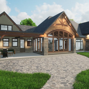
Our clients love to entertain family and friends at their Westmeath riverfront property and their new custom home was designed with their lifestyle and vision in mind every step of the way. These renderings were presented during the Design Development phase and a few changes were made during the permit/construction drawings phase.
The main-level kitchen, dining room, and great room are open-concept and flow seamlessly into the screened porch through patio doors and onto the covered deck and open patio. The vaulted ceilings in the great room and screened porch further enhance the openness of the space. Every room facing the river has floor-to-ceiling windows for optimal enjoyment of the beautiful view. A stone wood-burning fireplace in the great room and a propane fireplace in the screened porch bring both visual and physical warmth to the rooms.
Locating the primary bedroom suite on the main floor provides everything they need on the ground level when our clients are not entertaining guests. Along with the spacious ensuite bathroom and walk-in closet, the suite is adjacent to a home gym and the laundry room. A coffered ceiling detail over the bed adds an airiness to the spacious room.
Off the oversized 2-car garage are the main floor mechanical room, a mudroom with a walk-in closet, and a second covered entry for easy access from the exterior. The powder room is conveniently located between the garage entry and the kitchen. Over the garage—accessible via a staircase from the house and private from the rest of the home—is a loft area to be finished in the future.
Upstairs, family and friends will have their own private accommodations, with two bedrooms, a den/office, and a large bathroom. Another mechanical room provides heating and cooling for the second level.
To be built using a slab-on-grade foundation with radiant in-floor heating and A/C, the home will provide a comfortable environment year around.
 Signal House
Remarkable Condo Transformation at Grand Preserve
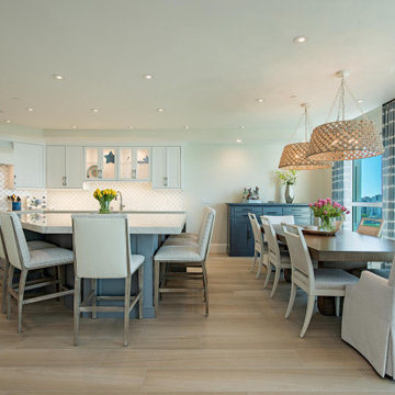
Welcome to our latest project reveal: the stunning transformation of a 2,885 SF luxury condo. Join us as we take you on a room-by-room tour of this beautiful space and share the before and after moments that will leave you speechless. From a completely upgraded kitchen to a luxurious master bathroom, the results of our redesign have created an elegant, comfortable, and inviting living space that perfectly blends style and functionality. Let's dive in and explore the meticulous details of this awe-inspiring transformation.
Reworked Front Entryway:
A first impression sets the tone for the overall experience, and that is precisely what we aimed to achieve with the front entryway. We reconfigured this area to make it more welcoming and functional, adding stylish yet practical elements that would make any guest feel instantly at home. By removing a large, outdated built-in console, we gave this space an instant refresh and created a more visually harmonious entryway.
Completely Upgraded Kitchen:
The heart of every home is the kitchen, and this luxury condo got the full treatment. We replaced the old cabinetry with new, contemporary flat front cabinets, and installed white quartz countertops that ooze elegance. The addition of a new white beauty quartz island provides ample space for meal prep or casual dining, while the custom tile backsplash adds a stunning visual element. As the cherry on top, we installed top-of-the-line appliances for the ultimate cooking experience.
Open Floor Plan:
To create a more open and inviting living space, we removed the wall between the morning room and dining room. This smart design move allowed natural light to flow through the entire space, making it feel even larger and more welcoming. By connecting these two areas visually and physically, we created the perfect setting for entertaining guests or enjoying a cozy night in.
Master Bedroom Makeover:
The master bedroom needed a breath of fresh air, and that's exactly what it got. We removed the dated carpeting and replaced it with new, elegant flooring that gives the room a more sophisticated and polished appearance. In this sanctuary, you can now enjoy a soothing and tranquil retreat away from everyday life.
Master Bath Overhaul:
A complete overhaul was in order for the master bathroom, and we went all out to create a spa-like oasis. The once-cramped space was opened up, and new, stunning flooring was installed. We added custom cabinetry for optimal storage and organization, and topped them with gorgeous new white quartz countertops. The shower was upgraded with elegant tile and the addition of a practical yet luxurious shower seat.
New Exterior Sliding doors:
Last but not least, we made a significant improvement to the exterior of the luxury condo by adding new, high-quality sliding doors. These not only enhance the condo's aesthetic appeal but also create a seamless indoor-outdoor living experience by providing easy access to a breathtaking outdoor space.
This remarkable luxury condo transformation attests to the positive impact of thoughtful design and expert craftsmanship. Every detail of the project reflects our dedication to delivering a comfortable and stylish haven for our clients. The end result? A 2,885 SF wonderland that elevates everyday living and provides the perfect backdrop for making memories that will last a lifetime. We hope this transformation inspires you to reimagine your own living spaces and create the sanctuary you've been dreaming of.
About Grand Preserve
Nestled in the picturesque city of Naples, Florida lies the Grand Preserve, an exquisite residential community that offers its residents an unparalleled level of luxury and comfort. Located just moments away from the breathtaking Vanderbilt Beach, the Grand Preserve immerses its residents in an environment of natural beauty, with stunning sunsets, rolling waves, and stretches of pristine sands that seem to stretch out to infinity. With unrivaled amenities and world-class services, the Grand Preserve is the ideal place for those who appreciate the finer things in life and expect nothing but the best. Whether you are a sunseeker, a beachcomber, or a nature lover, the Grand Preserve is the ultimate destination for those who want to experience the very best of Florida living.
Home Builders in Naples Florida For 30+ Years
Naples, Florida has long been a destination for those seeking luxury living in paradise. And when it comes to finding the perfect home to fit that lifestyle, you want to trust the experts – and that's where home builders with decades of experience come in. With over 30 years of building homes in Naples, Signal House has an unmatched knowledge of the local real estate market and a keen eye for design that perfectly complements the Florida lifestyle. From breathtaking waterfront properties to custom-built estates, we have the experience and expertise to bring your dream home to life. So why settle for a cookie-cutter house when you can have a custom-built masterpiece in the Sunshine State?
Explore more about this transformative project and take a guided video tour on our website. Click here for an immersive experience you won't want to pass up: https://www.signalhousebuilders.com/portfolio/grand-preserve-condo-remodel


 RAJ Kitchen and Bath, LLC
**Check out the video of this transformation on our website**
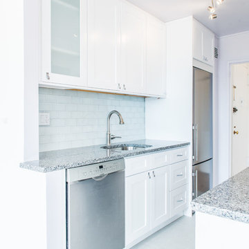
This small kitchen was way too small for this 2 bedrooms, 2 bathrooms apartment. Not only was it a very small kitchen, but the physical location of it made it very difficult to make it any bigger. There wasn't much that could have been done without incurring astronomical cost, which would get little or no return on the investment. The client wanted a kitchen that can be optimized in its current location to add a ton of value for resale.
This was difficult to do, because there was no moving of any mechanical around in the kitchen and even if we wanted to, the management of the building would not allow. For those of you who live in condos, co-ops or apartment building, you know how difficult it is to rework these foot prints. When we showed up, we saw the problems, but we also saw a huge opportunity where we can achieve those goals in the small space. This was accomplished by making some key changes and to incorporate some new things that was not possible when this kitchen was built years ago.
The crucial part of the design that would drive the entire new layout, was selecting the only appliance; that was the Refrigerator. Once we nailed down that refrigerator, we then proceeded to design the kitchen around it. We moved it to the other side of the wall where the sink was so that we can tap into the water line from the sink plumbing. It was crucial that it stays exactly 24" deep, not an inch more because we had to keep the entry as open as possible. Also, it was going to be directly in front of another big storage unit - The pantry. It is not ideal in most cases, but we needed the rest of the space to ramp up the design and open feel towards the side where all of the activities would take place, which happend to be the dining room and the view.
Once all that was figured out, we re-positioned the sink, dishwasher and the range and proceeded to wrap the cabinets around the columns to integrate them into the space. Thirty- six inches cabinets height was used so that they can be installed higher towards the ceiling height to give more room rather than the standard 18" required height between the counter tops. This was done to make the room feel a lot bigger than it really was. Not to mention, we also didn't want the faucet to be buried under the cabinets so that was also a necessary design detail for the space.
We then lowered both knee walls so that the counter top can sit on top of them, by removing that stop point that would have otherwise defined the kitchen area. This allowed us to pick up that extra footprint into the room for added prep space and enabled us to create the illusion of a kitchen that is looking longer than it really is. Every inch mattered when designing this kitchen and we made a conscious decision to use every one of that inch.
White cabinets were selected to do just what white cabinets are design to do; make a small or dark room appear bigger, brighter and more open. In this kitchen, this was amplified the more because of the kitchen location. It was perfect! We knew we did justice to the space because while we were there taking some photos, a few potential buyers walked in and went straight for the kitchen! They said its design just to fit the apartment.
Pantry roll out shelving, Double recycle bin, fancy handles, LED lighting, Quartz counter top, beautiful backslash tiles and grey linen floors finished off the kitchen which looked over a beautiful view of the George Washington Bridge from the top of this lovely 4th floor apartment.
Credit to Masterpiece Tile and Marble (Annmarie on the selection of Tiles and countertop and Val on the Construction to complete this project).
Davor Kokic Photography
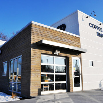 Montana Timber Products
Where: Idaho
What: Commercial
Product: AquaFir™ Slate Grey
Solution: Horizontal Square Edge Lap, Circle Sawn texture
Nothing gets you up in the morning like a good cup of coffee, and nothing is more inviting than the clean, crisp look of Montana Timber Products' AquaFir™ natural wood siding.
Black Rock Coffee Bar of Boise, Idaho offers both: outstanding aesthetics and a fine cup of joe.
-
A clean, crisp professional look enhanced by Montana Timber Products' AquaFir™ siding.
-
AquaFir™ is Montana Timber Products' outstanding rustic natural wood siding, a reclaimed barn wood alternative that is milled from new, rough stock, kiln dried, chemical free wood.
AquaFir™ uses a semi-transparent stain and intentionally incorporates the random wood grains and variable natural wood tones into the finish to give it a unique and beautiful look.
The result is that AquaFir™ is an aesthetically beautiful rustic wood siding, an authentic reclaimed barn wood, and can be used as other reclaimed lumber alternatives.
Typically less expensive than antique reclaimed barn wood, AquaFir™ offers uncompromising rustic wood beauty.
-
The warm, inviting texture of Circle Sawn on Douglas fir is an AquaFir™ hallmark.
-
A custom millwork shop, Montana Timber Products offers many options to the customer's delight.
Circle Sawn and Wire Brushed are Montana Timber Products' common cedar siding texturizing options.
The Circle Sawn texture commonly seen on rustic reclaimed barn wood is created from the large circular saw blades used in more traditional milling practices.
The Wire Brushed option adds physical and aesthetic depth to the wood grain.
In addition to the aesthetic beauty added from the texturing process, greater surface area is created, which allows the Seal-Once, 100% NO VOC waterproofer to more effectively penetrate the wood.
Guaranteed for ten years, Seal-Once prevents water ingress and is safe for exterior and interior use, children and pets.
-
Square edge lap horizontal installation provides pleasant contrasts with light and shadow.
-
If the environmentally friendly and the renewable aspect of natural wood siding is important to you, be sure to do your homework when choosing your siding, interior accents, trim, timbers, or other wood siding products. Some companies choose to use degenerative chemicals to achieve the desired look and texture of rustic wood siding. This is not the case with Montana Timber Products.
Vintage wood, reclaimed barn wood and reclaimed barn wood alternatives are very popular building materials due to their aesthetic beauty, traditional look, and chemical free finish.
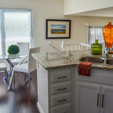 SHANDRIKA'S REAL ESTATE, STAGING & INTERIOR DESIGN
This is a Home Staging Project. Not a full Interior Design Project. The purpose of staging is to showcase a properties physical traits and not detract from them. With staging "less is more". The goal is to add softness and color and a warm environment with out a lot of clutter.
Photo credit: Vanessa Cruz
13