
Search results for "Physical add" in Home Design Ideas
 JoJo Wong Design and Build
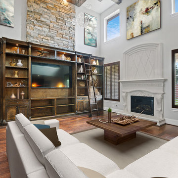
If you've ever taken a road trip that meandered through the countryside you've probably noticed that simple house sitting at the end of a dirt road. It looks cozy and has a rustic charm that reminds us of a more straightforward way of living. A warm, cozy fire on a chilly fall evening, or sitting on the farmers' porch enjoying a cold iced tea at the end of a long summer day.
Today, as more of us are beginning to appreciate the warmth of that rustic setting, one design style is rapidly growing in popularity. Known as “Modern Rustic” it provides homeowners with the warm, natural, and inviting style of that rural farmhouse, along with the clean, simple lines of modern design.
One of the characteristics of the Modern Rustic design aesthetic is that is evidenced by both the physical rooms, as well as in individual pieces of furniture within the space. The primary design components of this style are the warmth of natural materials and the texture those material provide.
Exposed wood and stone or brick are often used to add character and the appearance of warmth to the aesthetic. These are textures typically found in old hand-built country homes, as these were the building materials available at the time. Woolen objects like rugs and blankets are used as décor to add warm textures to the space. Modern Rustic also uses smooth textures, for example, counter and chairs surfaces and cabinetry. These are the textures that provide the clean and modern feel.
Shape and architecture play a significant role in the overall design environment. Natural elements like stones and wood are typically rough and asymmetrical in their natural state. A Modern Rustic design combines these natural shapes like tree branches, antlers and river stones with rectangles, spheres, and sharp angles. Think Cathedral ceilings, large prominent stairs, huge natural beams, and beautiful stone fireplaces.
I am extremely proud of this project and we finish right on time before the couple get married. Contact @jojowongdesign for next gigs. @ Houston, Texas
 Designs by BSB
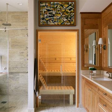
The linen closet from the hallway and bathroom was removed and the vanity area was decreased to allow room for an intimate-sized sauna.
• This change also gave room for a larger shower area
o Superior main showerhead
o Rain head from ceiling
o Hand-held shower for seated comfort
o Independent volume controls for multiple users/functions o Grab bars to aid for stability and seated functions
o Teak bench to add warmth and ability to sit while bathing
• Curbless entry and sliding door system delivers ease of access in the event of any physical limitations.
• Cherry cabinetry and vein-cut travertine chosen for warmth and organic qualities – creating a natural spa-like atmosphere.
• The bright characteristics of the Nordic white spruce sauna contrast for appreciated cleanliness.
• Ease of access for any physical limitations with new curb-less shower entry & sliding enclosure
• Additional storage designed with elegance in mind
o Recessed medicine cabinets into custom wainscot surround
o Custom-designed makeup vanity with a tip-up top for easy access and a mirror
o Vanities include pullouts for hair appliances and small toiletries
 Bradford Associates, LLC
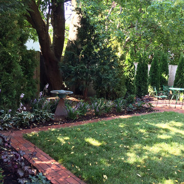
A brick border adds beautiful detail to the gardens and ties back visually and physically to the brick patio.
Design ideas for a small traditional shade backyard brick landscaping in Providence for summer.
Design ideas for a small traditional shade backyard brick landscaping in Providence for summer.
Find the right local pro for your project
 decor8, LLC
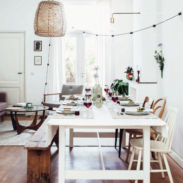
Photographer Holly Marder, Stylists: Holly Becker, Leslie Shewring \ Homeowner: Holly Marder
Mountain style dining room photo in Boston
Mountain style dining room photo in Boston
 Stebnitz Builders, Inc.
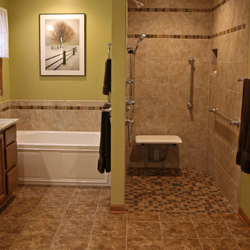
In every project we complete, design, form, function and safety are all important aspects to a successful space plan.
For these homeowners, it was an absolute must. The family had some unique needs that needed to be addressed. As physical abilities continued to change, the accessibility and safety in their master bathroom was a significant concern.
The layout of the bathroom was the first to change. We swapped places with the tub and vanity to give better access to both. A beautiful chrome grab bar was added along with matching towel bar and towel ring.
The vanity was changed out and now featured an angled cut-out for easy access for a wheelchair to pull completely up to the sink while protecting knees and legs from exposed plumbing and looking gorgeous doing it.
The toilet came out of the corner and we eliminated the privacy wall, giving it far easier access with a wheelchair. The original toilet was in great shape and we were able to reuse it. But now, it is equipped with much-needed chrome grab bars for added safety and convenience.
The shower was moved and reconstructed to allow for a larger walk-in tile shower with stylish chrome grab bars, an adjustable handheld showerhead and a comfortable fold-down shower bench – proving a bathroom can (and should) be functionally safe AND aesthetically beautiful at the same time.
 AHG Interiors
Thinking outside the box
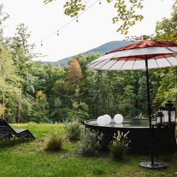
Perched on a hilltop in the Catskills, this sleek 1960s A-frame is right at home among pointed firs and
mountain peaks.
An unfussy, but elegant design with modern shapes, furnishings, and material finishes both softens and enhances the home’s architecture and natural surroundings, bringing light and airiness to every room.
A clever peekaboo aesthetic enlivens many of the home’s new design elements―invisible touches of lucite, accented brass surfaces, oversized mirrors, and windows and glass partitions in the spa bathrooms, which give you all the comfort of a high-end hotel, and the feeling that you’re showering in nature.
Downstairs ample seating and a wet bar―a nod to your parents’ 70s basement―make a perfect space for entertaining. Step outside onto the spacious deck, fire up the grill, and enjoy the gorgeous mountain views.
Stonework, scattered like breadcrumbs around the 5-acre property, leads you to several lounging nooks, where you can stretch out with a book or take a soak in the hot tub.
Every thoughtful detail adds softness and magic to this forest home.
 JoJo Wong Design and Build
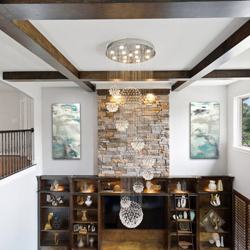
If you've ever taken a road trip that meandered through the countryside you've probably noticed that simple house sitting at the end of a dirt road. It looks cozy and has a rustic charm that reminds us of a more straightforward way of living. A warm, cozy fire on a chilly fall evening, or sitting on the farmers' porch enjoying a cold iced tea at the end of a long summer day.
Today, as more of us are beginning to appreciate the warmth of that rustic setting, one design style is rapidly growing in popularity. Known as “Modern Rustic” it provides homeowners with the warm, natural, and inviting style of that rural farmhouse, along with the clean, simple lines of modern design.
One of the characteristics of the Modern Rustic design aesthetic is that is evidenced by both the physical rooms, as well as in individual pieces of furniture within the space. The primary design components of this style are the warmth of natural materials and the texture those material provide.
Exposed wood and stone or brick are often used to add character and the appearance of warmth to the aesthetic. These are textures typically found in old hand-built country homes, as these were the building materials available at the time. Woolen objects like rugs and blankets are used as décor to add warm textures to the space. Modern Rustic also uses smooth textures, for example, counter and chairs surfaces and cabinetry. These are the textures that provide the clean and modern feel.
Shape and architecture play a significant role in the overall design environment. Natural elements like stones and wood are typically rough and asymmetrical in their natural state. A Modern Rustic design combines these natural shapes like tree branches, antlers and river stones with rectangles, spheres, and sharp angles. Think Cathedral ceilings, large prominent stairs, huge natural beams, and beautiful stone fireplaces.
I am extremely proud of this project and we finish right on time before the couple get married. Contact @jojowongdesign for next gigs. @ Houston, Texas


 Donald Lococo Architects
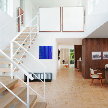
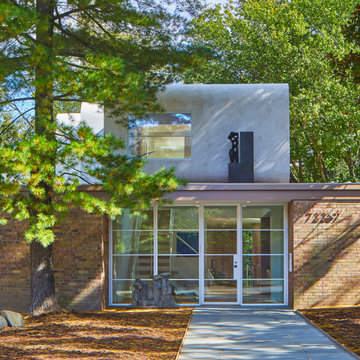
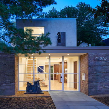
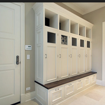
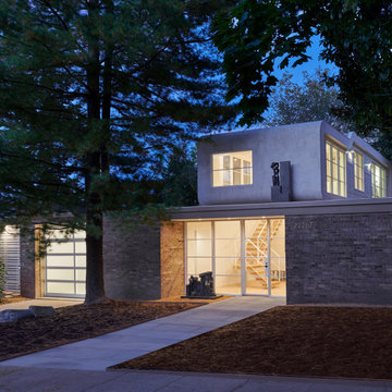
Designed in 1970 for an art collector, the existing referenced 70’s architectural principles. With its cadence of ‘70’s brick masses punctuated by a garage and a 4-foot-deep entrance recess. This recess, however, didn’t convey to the interior, which was occupied by disjointed service spaces. To solve, service spaces are moved and reorganized in open void in the garage. (See plan) This also organized the home: Service & utility on the left, reception central, and communal living spaces on the right.
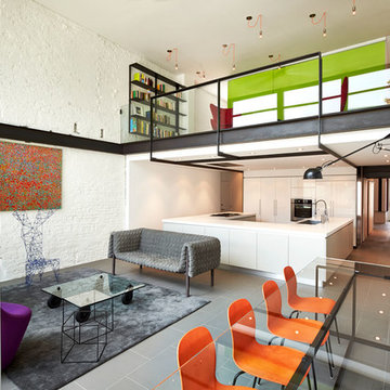
To maintain clarity of the simple one-story 70’s composition, the second story add is recessive. A flex-studio/extra bedroom and office are designed ensuite creating a slender form and orienting them front to back and setting it back allows the add recede. Curves create a definite departure from the 70s home and by detailing it to "hover like a thought" above the first-floor roof and mentally removable sympathetic add.Existing unrelenting interior walls and a windowless entry, although ideal for fine art was unconducive for the young family of three. Added glass at the front recess welcomes light view and the removal of interior walls not only liberate rooms to communicate with each other but also reinform the cleared central entry space as a hub.
Even though the renovation reinforms its relationship with art, the joy and appreciation of art was not dismissed. A metal sculpture lost in the corner of the south side yard bumps the sculpture at the front entrance to the kitchen terrace over an added pedestal. (See plans) Since the roof couldn’t be railed without compromising the one-story '70s composition, the sculpture garden remains physically inaccessible however mirrors flanking the chimney allow the sculptures to be appreciated in three dimensions. The mirrors also afford privacy from the adjacent Tudor's large master bedroom addition 16-feet away.
 Donald Lococo Architects
Designed in 1970 for an art collector, the existing referenced 70’s architectural principles. With its cadence of ‘70’s brick masses punctuated by a garage and a 4-foot-deep entrance recess. This recess, however, didn’t convey to the interior, which was occupied by disjointed service spaces. To solve, service spaces are moved and reorganized in open void in the garage. (See plan) This also organized the home: Service & utility on the left, reception central, and communal living spaces on the right.
To maintain clarity of the simple one-story 70’s composition, the second story add is recessive. A flex-studio/extra bedroom and office are designed ensuite creating a slender form and orienting them front to back and setting it back allows the add recede. Curves create a definite departure from the 70s home and by detailing it to "hover like a thought" above the first-floor roof and mentally removable sympathetic add.Existing unrelenting interior walls and a windowless entry, although ideal for fine art was unconducive for the young family of three. Added glass at the front recess welcomes light view and the removal of interior walls not only liberate rooms to communicate with each other but also reinform the cleared central entry space as a hub.
Even though the renovation reinforms its relationship with art, the joy and appreciation of art was not dismissed. A metal sculpture lost in the corner of the south side yard bumps the sculpture at the front entrance to the kitchen terrace over an added pedestal. (See plans) Since the roof couldn’t be railed without compromising the one-story '70s composition, the sculpture garden remains physically inaccessible however mirrors flanking the chimney allow the sculptures to be appreciated in three dimensions. The mirrors also afford privacy from the adjacent Tudor's large master bedroom addition 16-feet away.
 Montana Timber Products
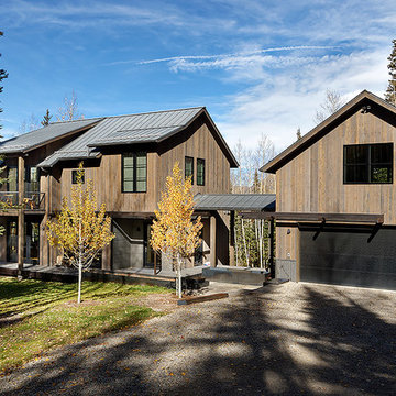
Where: Colorado
What: Residential
Product: ranchwood™ color: Southern
Solution: Wire Brushed, Shiplap, fascia, soffit
This Colorado home feature's Montana Timber Products prefinished rustic ranchwood™ siding, featuring Wire Brushed texture in the color Southern, applied as fascia and soffit.
ranchwood™ is Montana Timber Products' flagship rustic natural wood siding, a reclaimed barn wood alternative that is milled from new, rough stock, kiln dried, chemical free wood.
ranchwood™ is put through a texturizing and coloring process that creates aesthetically beautiful rustic wood siding and authentic reclaimed barn wood and reclaimed lumber alternatives.
Typically less expensive than authentic reclaimed barn wood, ranchwood™ offers uncompromising rustic wood beauty.
Circle Sawn and Wire Brushed are Montana Timber Products' common cedar siding texturizing options.
The Circle Sawn texture commonly seen on rustic reclaimed barn wood is created from the large circular saw blades used in more traditional milling practices.
The Wire Brushed option adds physical and aesthetic depth to the wood grain.
In addition to the aesthetic beauty added from the texturing process, greater surface area is created, which allows the Seal-Once, a 100% NO VOC waterproofer with a 10 year limited warranty against water ingress and safe for interior and exterior use, pets and children.
If environmentally friendly and the renewable aspect of natural wood siding is important to you, be sure to do your homework when choosing your siding, flooring, interior accents, trim, beams, timbers, or other wood siding products. Some companies choose to use degenerative chemicals to achieve the desired look and texture of rustic wood siding. This is not the case with Montana Timber Products.
Vintage wood, reclaimed barn wood and reclaimed barn wood alternatives are very popular building materials due to their aesthetic beauty, traditional look, and chemical free finish.
 Craig O'Connell Architecture
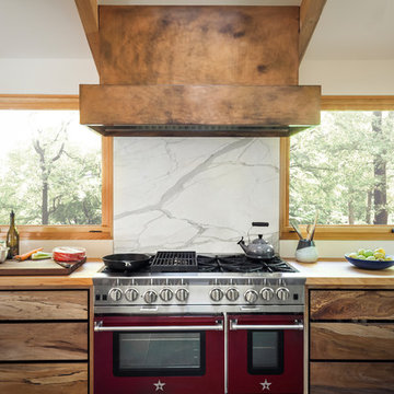
Unique features of this chef's kitchen include a Blue Star stove, Italian marble backsplash and custom copper hood.
Kitchen - mid-century modern kitchen idea in San Francisco with flat-panel cabinets, medium tone wood cabinets, wood countertops, marble backsplash and beige countertops
Kitchen - mid-century modern kitchen idea in San Francisco with flat-panel cabinets, medium tone wood cabinets, wood countertops, marble backsplash and beige countertops
 Suhr Interior Design
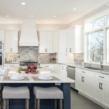
Open kitchen design with white shaker cabinets and a large custom Island. The 12x24 gray floor tile ties in with the stone backsplash and quartz countertop. The navy/blue island anchors the kitchen and adds some needed color.
- Shot by Matt Kocourek
 Signal House
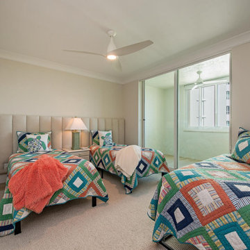
Remarkable Condo Transformation at Grand Preserve
Welcome to our latest project reveal: the stunning transformation of a 2,885 SF luxury condo. Join us as we take you on a room-by-room tour of this beautiful space and share the before and after moments that will leave you speechless. From a completely upgraded kitchen to a luxurious master bathroom, the results of our redesign have created an elegant, comfortable, and inviting living space that perfectly blends style and functionality. Let's dive in and explore the meticulous details of this awe-inspiring transformation.
Reworked Front Entryway:
A first impression sets the tone for the overall experience, and that is precisely what we aimed to achieve with the front entryway. We reconfigured this area to make it more welcoming and functional, adding stylish yet practical elements that would make any guest feel instantly at home. By removing a large, outdated built-in console, we gave this space an instant refresh and created a more visually harmonious entryway.
Completely Upgraded Kitchen:
The heart of every home is the kitchen, and this luxury condo got the full treatment. We replaced the old cabinetry with new, contemporary flat front cabinets, and installed white quartz countertops that ooze elegance. The addition of a new white beauty quartz island provides ample space for meal prep or casual dining, while the custom tile backsplash adds a stunning visual element. As the cherry on top, we installed top-of-the-line appliances for the ultimate cooking experience.
Open Floor Plan:
To create a more open and inviting living space, we removed the wall between the morning room and dining room. This smart design move allowed natural light to flow through the entire space, making it feel even larger and more welcoming. By connecting these two areas visually and physically, we created the perfect setting for entertaining guests or enjoying a cozy night in.
Master Bedroom Makeover:
The master bedroom needed a breath of fresh air, and that's exactly what it got. We removed the dated carpeting and replaced it with new, elegant flooring that gives the room a more sophisticated and polished appearance. In this sanctuary, you can now enjoy a soothing and tranquil retreat away from everyday life.
Master Bath Overhaul:
A complete overhaul was in order for the master bathroom, and we went all out to create a spa-like oasis. The once-cramped space was opened up, and new, stunning flooring was installed. We added custom cabinetry for optimal storage and organization, and topped them with gorgeous new white quartz countertops. The shower was upgraded with elegant tile and the addition of a practical yet luxurious shower seat.
New Exterior Sliding doors:
Last but not least, we made a significant improvement to the exterior of the luxury condo by adding new, high-quality sliding doors. These not only enhance the condo's aesthetic appeal but also create a seamless indoor-outdoor living experience by providing easy access to a breathtaking outdoor space.
This remarkable luxury condo transformation attests to the positive impact of thoughtful design and expert craftsmanship. Every detail of the project reflects our dedication to delivering a comfortable and stylish haven for our clients. The end result? A 2,885 SF wonderland that elevates everyday living and provides the perfect backdrop for making memories that will last a lifetime. We hope this transformation inspires you to reimagine your own living spaces and create the sanctuary you've been dreaming of.
About Grand Preserve
Nestled in the picturesque city of Naples, Florida lies the Grand Preserve, an exquisite residential community that offers its residents an unparalleled level of luxury and comfort. Located just moments away from the breathtaking Vanderbilt Beach, the Grand Preserve immerses its residents in an environment of natural beauty, with stunning sunsets, rolling waves, and stretches of pristine sands that seem to stretch out to infinity. With unrivaled amenities and world-class services, the Grand Preserve is the ideal place for those who appreciate the finer things in life and expect nothing but the best. Whether you are a sunseeker, a beachcomber, or a nature lover, the Grand Preserve is the ultimate destination for those who want to experience the very best of Florida living.
Home Builders in Naples Florida For 30+ Years
Naples, Florida has long been a destination for those seeking luxury living in paradise. And when it comes to finding the perfect home to fit that lifestyle, you want to trust the experts – and that's where home builders with decades of experience come in. With over 30 years of building homes in Naples, Signal House has an unmatched knowledge of the local real estate market and a keen eye for design that perfectly complements the Florida lifestyle. From breathtaking waterfront properties to custom-built estates, we have the experience and expertise to bring your dream home to life. So why settle for a cookie-cutter house when you can have a custom-built masterpiece in the Sunshine State?
Explore more about this transformative project and take a guided video tour on our website. Click here for an immersive experience you won't want to pass up: https://www.signalhousebuilders.com/portfolio/grand-preserve-condo-remodel

 dRemodeling Design-Build
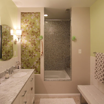
This master suite underwent a major transformation and the biggest part of that (literally and physically) was removing the large Jacuzzi tub sitting in the middle of the room. By reorienting the tub along the width of the room, it opened up the center of the space for a large modern double vanity. The shower combined with the tub feature into a nook that was bedecked in a beautiful shell mosaic. The mosaic lined all the interior walls including a built in shelving area, bench, and custom wall.
Easily the most special feature in this space is the resin panels that had been inserted into two partials walls positioned on opposite sides of the room. A mod floral pattern in a subdued lime green compliment the shell tiles and allows light to diffuse into the tub area. The opposite side provides a bit of privacy for the privy, and balances the composition as a whole. The white double vanity with a Carrera marble top and classic chrome fixtures adds a touch of class to the contemporary space. The ceramic wood plank floor tiles in a white washed finish add aesthetic warmth underfoot. Kiwi green walls sit above a staggered white subway tile wainscot that wraps around the perimeter, with a cool gray paint surround the resin panels.
A unique and fun space, our design team had a blast creating this design with the homeowner.
 Donald Lococo Architects
Designed in 1970 for an art collector, the existing referenced 70’s architectural principles. With its cadence of ‘70’s brick masses punctuated by a garage and a 4-foot-deep entrance recess. This recess, however, didn’t convey to the interior, which was occupied by disjointed service spaces. To solve, service spaces are moved and reorganized in open void in the garage. (See plan) This also organized the home: Service & utility on the left, reception central, and communal living spaces on the right.
To maintain clarity of the simple one-story 70’s composition, the second story add is recessive. A flex-studio/extra bedroom and office are designed ensuite creating a slender form and orienting them front to back and setting it back allows the add recede. Curves create a definite departure from the 70s home and by detailing it to "hover like a thought" above the first-floor roof and mentally removable sympathetic add.Existing unrelenting interior walls and a windowless entry, although ideal for fine art was unconducive for the young family of three. Added glass at the front recess welcomes light view and the removal of interior walls not only liberate rooms to communicate with each other but also reinform the cleared central entry space as a hub.
Even though the renovation reinforms its relationship with art, the joy and appreciation of art was not dismissed. A metal sculpture lost in the corner of the south side yard bumps the sculpture at the front entrance to the kitchen terrace over an added pedestal. (See plans) Since the roof couldn’t be railed without compromising the one-story '70s composition, the sculpture garden remains physically inaccessible however mirrors flanking the chimney allow the sculptures to be appreciated in three dimensions. The mirrors also afford privacy from the adjacent Tudor's large master bedroom addition 16-feet away.
 Donald Lococo Architects
Designed in 1970 for an art collector, the existing referenced 70’s architectural principles. With its cadence of ‘70’s brick masses punctuated by a garage and a 4-foot-deep entrance recess. This recess, however, didn’t convey to the interior, which was occupied by disjointed service spaces. To solve, service spaces are moved and reorganized in open void in the garage. (See plan) This also organized the home: Service & utility on the left, reception central, and communal living spaces on the right.
To maintain clarity of the simple one-story 70’s composition, the second story add is recessive. A flex-studio/extra bedroom and office are designed ensuite creating a slender form and orienting them front to back and setting it back allows the add recede. Curves create a definite departure from the 70s home and by detailing it to "hover like a thought" above the first-floor roof and mentally removable sympathetic add.Existing unrelenting interior walls and a windowless entry, although ideal for fine art was unconducive for the young family of three. Added glass at the front recess welcomes light view and the removal of interior walls not only liberate rooms to communicate with each other but also reinform the cleared central entry space as a hub.
Even though the renovation reinforms its relationship with art, the joy and appreciation of art was not dismissed. A metal sculpture lost in the corner of the south side yard bumps the sculpture at the front entrance to the kitchen terrace over an added pedestal. (See plans) Since the roof couldn’t be railed without compromising the one-story '70s composition, the sculpture garden remains physically inaccessible however mirrors flanking the chimney allow the sculptures to be appreciated in three dimensions. The mirrors also afford privacy from the adjacent Tudor's large master bedroom addition 16-feet away.

 Southern Living Plant Collection
Attractive yellow-gold leaf margins and silvery new growth highlight Olive Martini when used as a hedge or as a specimen plant. Similar to ‘Gilt Edge’ but more stable, Olive Martini is the perfect hedge and/or barrier plant in mild climates.
FEATURES
Bloom/Feature Green leaves lined with gold
Plant Type Shrubs
Evergreen or Deciduous Evergreen
USDA Zones 6, 7, 8, 9
Zone Detail Hardy to -10° F
Key Features Silvery new growth
Use Hedge, specimen or barrier plant
Exposure Full sun
Bloom Season N/A
Dimension 10-15' H x 10-15' W
Growth Rate Spreading habit
CARE
Water Regular water once established
Soil Type Well-drained garden soil
Fertilizer
Pruning Prune as desired
PLANTING INSTRUCTIONS
• water before planting
• plant in full sun to part shade
• dig hole 2X the width of pot,
• backfill and plant 1”-2” above soil level
• water and add more soil if needed
• mulch around plants


 Donald Lococo Architects
Designed in 1970 for an art collector, the existing referenced 70’s architectural principles. With its cadence of ‘70’s brick masses punctuated by a garage and a 4-foot-deep entrance recess. This recess, however, didn’t convey to the interior, which was occupied by disjointed service spaces. To solve, service spaces are moved and reorganized in open void in the garage. (See plan) This also organized the home: Service & utility on the left, reception central, and communal living spaces on the right.
To maintain clarity of the simple one-story 70’s composition, the second story add is recessive. A flex-studio/extra bedroom and office are designed ensuite creating a slender form and orienting them front to back and setting it back allows the add recede. Curves create a definite departure from the 70s home and by detailing it to "hover like a thought" above the first-floor roof and mentally removable sympathetic add.Existing unrelenting interior walls and a windowless entry, although ideal for fine art was unconducive for the young family of three. Added glass at the front recess welcomes light view and the removal of interior walls not only liberate rooms to communicate with each other but also reinform the cleared central entry space as a hub.
Even though the renovation reinforms its relationship with art, the joy and appreciation of art was not dismissed. A metal sculpture lost in the corner of the south side yard bumps the sculpture at the front entrance to the kitchen terrace over an added pedestal. (See plans) Since the roof couldn’t be railed without compromising the one-story '70s composition, the sculpture garden remains physically inaccessible however mirrors flanking the chimney allow the sculptures to be appreciated in three dimensions. The mirrors also afford privacy from the adjacent Tudor's large master bedroom addition 16-feet away.
 Designs by BSB
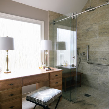
The linen closet from the hallway and bathroom was removed and the vanity area was decreased to allow room for an intimate-sized sauna.
• This change also gave room for a larger shower area
o Superior main showerhead
o Rain head from ceiling
o Hand-held shower for seated comfort
o Independent volume controls for multiple users/functions o Grab bars to aid for stability and seated functions
o Teak bench to add warmth and ability to sit while bathing
• Curbless entry and sliding door system delivers ease of access in the event of any physical limitations.
• Cherry cabinetry and vein-cut travertine chosen for warmth and organic qualities – creating a natural spa-like atmosphere.
• The bright characteristics of the Nordic white spruce sauna contrast for appreciated cleanliness.
• Ease of access for any physical limitations with new curb-less shower entry & sliding enclosure
• Additional storage designed with elegance in mind
o Recessed medicine cabinets into custom wainscot surround
o Custom-designed makeup vanity with a tip-up top for easy access and a mirror
o Vanities include pullouts for hair appliances and small toiletries
6