
Search results for "Physical add" in Home Design Ideas
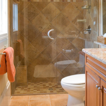
 Canyon Kitchen and Bath
Inspiration for a large timeless master beige tile and stone tile ceramic tile and beige floor bathroom remodel in Salt Lake City with raised-panel cabinets, medium tone wood cabinets, a one-piece toilet, white walls, a drop-in sink and granite countertops
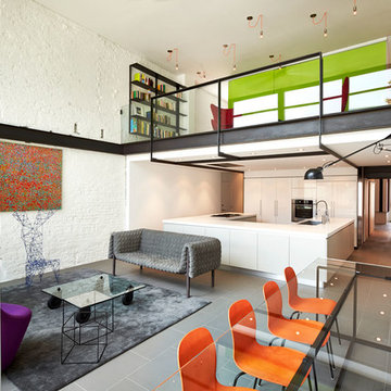

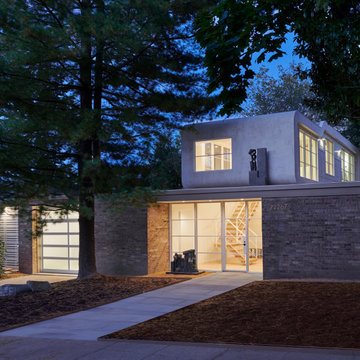
 Donald Lococo Architects
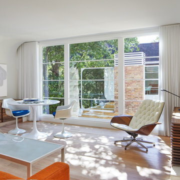
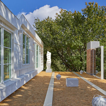
Designed in 1970 for an art collector, the existing referenced 70’s architectural principles. With its cadence of ‘70’s brick masses punctuated by a garage and a 4-foot-deep entrance recess. This recess, however, didn’t convey to the interior, which was occupied by disjointed service spaces. To solve, service spaces are moved and reorganized in open void in the garage. (See plan) This also organized the home: Service & utility on the left, reception central, and communal living spaces on the right.
To maintain clarity of the simple one-story 70’s composition, the second story add is recessive. A flex-studio/extra bedroom and office are designed ensuite creating a slender form and orienting them front to back and setting it back allows the add recede. Curves create a definite departure from the 70s home and by detailing it to "hover like a thought" above the first-floor roof and mentally removable sympathetic add.Existing unrelenting interior walls and a windowless entry, although ideal for fine art was unconducive for the young family of three. Added glass at the front recess welcomes light view and the removal of interior walls not only liberate rooms to communicate with each other but also reinform the cleared central entry space as a hub.
Even though the renovation reinforms its relationship with art, the joy and appreciation of art was not dismissed. A metal sculpture lost in the corner of the south side yard bumps the sculpture at the front entrance to the kitchen terrace over an added pedestal. (See plans) Since the roof couldn’t be railed without compromising the one-story '70s composition, the sculpture garden remains physically inaccessible however mirrors flanking the chimney allow the sculptures to be appreciated in three dimensions. The mirrors also afford privacy from the adjacent Tudor's large master bedroom addition 16-feet away.
Find the right local pro for your project
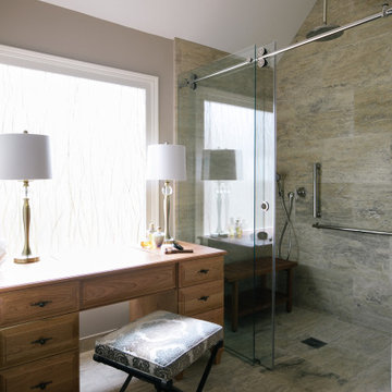
 Designs by BSB
The linen closet from the hallway and bathroom was removed and the vanity area was decreased to allow room for an intimate-sized sauna.
• This change also gave room for a larger shower area
o Superior main showerhead
o Rain head from ceiling
o Hand-held shower for seated comfort
o Independent volume controls for multiple users/functions o Grab bars to aid for stability and seated functions
o Teak bench to add warmth and ability to sit while bathing
• Curbless entry and sliding door system delivers ease of access in the event of any physical limitations.
• Cherry cabinetry and vein-cut travertine chosen for warmth and organic qualities – creating a natural spa-like atmosphere.
• The bright characteristics of the Nordic white spruce sauna contrast for appreciated cleanliness.
• Ease of access for any physical limitations with new curb-less shower entry & sliding enclosure
• Additional storage designed with elegance in mind
o Recessed medicine cabinets into custom wainscot surround
o Custom-designed makeup vanity with a tip-up top for easy access and a mirror
o Vanities include pullouts for hair appliances and small toiletries
 Donald Lococo Architects
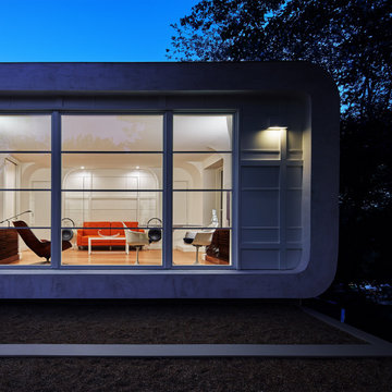
Designed in 1970 for an art collector, the existing referenced 70’s architectural principles. With its cadence of ‘70’s brick masses punctuated by a garage and a 4-foot-deep entrance recess. This recess, however, didn’t convey to the interior, which was occupied by disjointed service spaces. To solve, service spaces are moved and reorganized in open void in the garage. (See plan) This also organized the home: Service & utility on the left, reception central, and communal living spaces on the right.
To maintain clarity of the simple one-story 70’s composition, the second story add is recessive. A flex-studio/extra bedroom and office are designed ensuite creating a slender form and orienting them front to back and setting it back allows the add recede. Curves create a definite departure from the 70s home and by detailing it to "hover like a thought" above the first-floor roof and mentally removable sympathetic add.Existing unrelenting interior walls and a windowless entry, although ideal for fine art was unconducive for the young family of three. Added glass at the front recess welcomes light view and the removal of interior walls not only liberate rooms to communicate with each other but also reinform the cleared central entry space as a hub.
Even though the renovation reinforms its relationship with art, the joy and appreciation of art was not dismissed. A metal sculpture lost in the corner of the south side yard bumps the sculpture at the front entrance to the kitchen terrace over an added pedestal. (See plans) Since the roof couldn’t be railed without compromising the one-story '70s composition, the sculpture garden remains physically inaccessible however mirrors flanking the chimney allow the sculptures to be appreciated in three dimensions. The mirrors also afford privacy from the adjacent Tudor's large master bedroom addition 16-feet away.
 Donald Lococo Architects
Designed in 1970 for an art collector, the existing referenced 70’s architectural principles. With its cadence of ‘70’s brick masses punctuated by a garage and a 4-foot-deep entrance recess. This recess, however, didn’t convey to the interior, which was occupied by disjointed service spaces. To solve, service spaces are moved and reorganized in open void in the garage. (See plan) This also organized the home: Service & utility on the left, reception central, and communal living spaces on the right.
To maintain clarity of the simple one-story 70’s composition, the second story add is recessive. A flex-studio/extra bedroom and office are designed ensuite creating a slender form and orienting them front to back and setting it back allows the add recede. Curves create a definite departure from the 70s home and by detailing it to "hover like a thought" above the first-floor roof and mentally removable sympathetic add.Existing unrelenting interior walls and a windowless entry, although ideal for fine art was unconducive for the young family of three. Added glass at the front recess welcomes light view and the removal of interior walls not only liberate rooms to communicate with each other but also reinform the cleared central entry space as a hub.
Even though the renovation reinforms its relationship with art, the joy and appreciation of art was not dismissed. A metal sculpture lost in the corner of the south side yard bumps the sculpture at the front entrance to the kitchen terrace over an added pedestal. (See plans) Since the roof couldn’t be railed without compromising the one-story '70s composition, the sculpture garden remains physically inaccessible however mirrors flanking the chimney allow the sculptures to be appreciated in three dimensions. The mirrors also afford privacy from the adjacent Tudor's large master bedroom addition 16-feet away.
 Erik Hagen, Architect
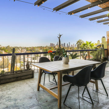
The million dollar view. Bringing the inside out to this spacious 200 SF patio deck. Second living room and dining room in one. Best to fill up with as many plants as possible. Add a water feature for white noise from the street below and the neighbors above. A little lattice to add more separation to the adjacent neighbors. The trellis above can hold typical canvas or cloth sails. Be sure to ask the HOA for permission before physically attaching anything to the structure.


 dRemodeling Design-Build
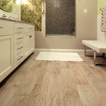
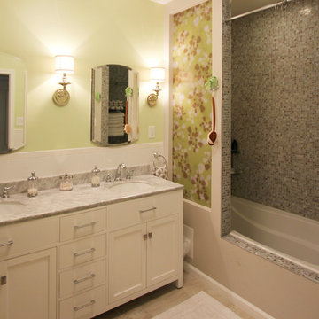
This master suite underwent a major transformation and the biggest part of that (literally and physically) was removing the large Jacuzzi tub sitting in the middle of the room. By reorienting the tub along the width of the room, it opened up the center of the space for a large modern double vanity. The shower combined with the tub feature into a nook that was bedecked in a beautiful shell mosaic. The mosaic lined all the interior walls including a built in shelving area, bench, and custom wall.
Easily the most special feature in this space is the resin panels that had been inserted into two partials walls positioned on opposite sides of the room. A mod floral pattern in a subdued lime green compliment the shell tiles and allows light to diffuse into the tub area. The opposite side provides a bit of privacy for the privy, and balances the composition as a whole. The white double vanity with a Carrera marble top and classic chrome fixtures adds a touch of class to the contemporary space. The ceramic wood plank floor tiles in a white washed finish add aesthetic warmth underfoot. Kiwi green walls sit above a staggered white subway tile wainscot that wraps around the perimeter, with a cool gray paint surround the resin panels.
A unique and fun space, our design team had a blast creating this design with the homeowner.
 dRemodeling Design-Build
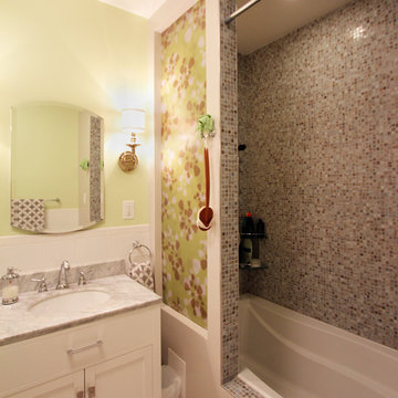
This master suite underwent a major transformation and the biggest part of that (literally and physically) was removing the large Jacuzzi tub sitting in the middle of the room. By reorienting the tub along the width of the room, it opened up the center of the space for a large modern double vanity. The shower combined with the tub feature into a nook that was bedecked in a beautiful shell mosaic. The mosaic lined all the interior walls including a built in shelving area, bench, and custom wall.
Easily the most special feature in this space is the resin panels that had been inserted into two partials walls positioned on opposite sides of the room. A mod floral pattern in a subdued lime green compliment the shell tiles and allows light to diffuse into the tub area. The opposite side provides a bit of privacy for the privy, and balances the composition as a whole. The white double vanity with a Carrera marble top and classic chrome fixtures adds a touch of class to the contemporary space. The ceramic wood plank floor tiles in a white washed finish add aesthetic warmth underfoot. Kiwi green walls sit above a staggered white subway tile wainscot that wraps around the perimeter, with a cool gray paint surround the resin panels.
A unique and fun space, our design team had a blast creating this design with the homeowner.
 Donald Lococo Architects
Designed in 1970 for an art collector, the existing referenced 70’s architectural principles. With its cadence of ‘70’s brick masses punctuated by a garage and a 4-foot-deep entrance recess. This recess, however, didn’t convey to the interior, which was occupied by disjointed service spaces. To solve, service spaces are moved and reorganized in open void in the garage. (See plan) This also organized the home: Service & utility on the left, reception central, and communal living spaces on the right.
To maintain clarity of the simple one-story 70’s composition, the second story add is recessive. A flex-studio/extra bedroom and office are designed ensuite creating a slender form and orienting them front to back and setting it back allows the add recede. Curves create a definite departure from the 70s home and by detailing it to "hover like a thought" above the first-floor roof and mentally removable sympathetic add.Existing unrelenting interior walls and a windowless entry, although ideal for fine art was unconducive for the young family of three. Added glass at the front recess welcomes light view and the removal of interior walls not only liberate rooms to communicate with each other but also reinform the cleared central entry space as a hub.
Even though the renovation reinforms its relationship with art, the joy and appreciation of art was not dismissed. A metal sculpture lost in the corner of the south side yard bumps the sculpture at the front entrance to the kitchen terrace over an added pedestal. (See plans) Since the roof couldn’t be railed without compromising the one-story '70s composition, the sculpture garden remains physically inaccessible however mirrors flanking the chimney allow the sculptures to be appreciated in three dimensions. The mirrors also afford privacy from the adjacent Tudor's large master bedroom addition 16-feet away.
 dRemodeling Design-Build
This master suite underwent a major transformation and the biggest part of that (literally and physically) was removing the large Jacuzzi tub sitting in the middle of the room. By reorienting the tub along the width of the room, it opened up the center of the space for a large modern double vanity. The shower combined with the tub feature into a nook that was bedecked in a beautiful shell mosaic. The mosaic lined all the interior walls including a built in shelving area, bench, and custom wall.
Easily the most special feature in this space is the resin panels that had been inserted into two partials walls positioned on opposite sides of the room. A mod floral pattern in a subdued lime green compliment the shell tiles and allows light to diffuse into the tub area. The opposite side provides a bit of privacy for the privy, and balances the composition as a whole. The white double vanity with a Carrera marble top and classic chrome fixtures adds a touch of class to the contemporary space. The ceramic wood plank floor tiles in a white washed finish add aesthetic warmth underfoot. Kiwi green walls sit above a staggered white subway tile wainscot that wraps around the perimeter, with a cool gray paint surround the resin panels.
A unique and fun space, our design team had a blast creating this design with the homeowner.
 Kenihan Development
Charmaine David
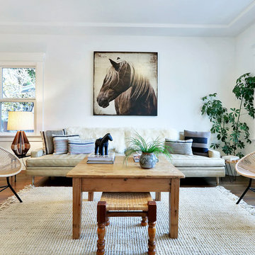
Example of a transitional living room design in Los Angeles with white walls
Example of a transitional living room design in Los Angeles with white walls
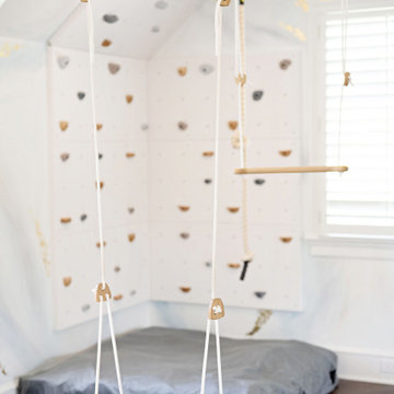
 Wild Child
This indoor gym playroom is the ultimate family hangout, designed for staying active, healthy, and having fun together—especially for their tween daughter! With monkey bars, a climbing wall, swings, a punching bag, a yoga area, and even a Peloton, everyone gets their workout in. The calming neutral color palette creates a relaxing vibe, while organic wooden elements like climbing holds and Scandinavian wooden swings add a natural touch. Not only does this space support physical fitness, but it helps the daughter build strength, endurance, and grit—plus a real sense of accomplishment. It’s the perfect spot for the whole family to create lifelong healthy habits, all while having a blast!

 Donald Lococo Architects
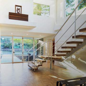
Designed in 1970 for an art collector, the existing referenced 70’s architectural principles. With its cadence of ‘70’s brick masses punctuated by a garage and a 4-foot-deep entrance recess. This recess, however, didn’t convey to the interior, which was occupied by disjointed service spaces. To solve, service spaces are moved and reorganized in open void in the garage. (See plan) This also organized the home: Service & utility on the left, reception central, and communal living spaces on the right.
To maintain clarity of the simple one-story 70’s composition, the second story add is recessive. A flex-studio/extra bedroom and office are designed ensuite creating a slender form and orienting them front to back and setting it back allows the add recede. Curves create a definite departure from the 70s home and by detailing it to "hover like a thought" above the first-floor roof and mentally removable sympathetic add.Existing unrelenting interior walls and a windowless entry, although ideal for fine art was unconducive for the young family of three. Added glass at the front recess welcomes light view and the removal of interior walls not only liberate rooms to communicate with each other but also reinform the cleared central entry space as a hub.
Even though the renovation reinforms its relationship with art, the joy and appreciation of art was not dismissed. A metal sculpture lost in the corner of the south side yard bumps the sculpture at the front entrance to the kitchen terrace over an added pedestal. (See plans) Since the roof couldn’t be railed without compromising the one-story '70s composition, the sculpture garden remains physically inaccessible however mirrors flanking the chimney allow the sculptures to be appreciated in three dimensions. The mirrors also afford privacy from the adjacent Tudor's large master bedroom addition 16-feet away.
 dRemodeling Design-Build
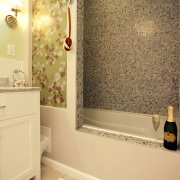
This master suite underwent a major transformation and the biggest part of that (literally and physically) was removing the large Jacuzzi tub sitting in the middle of the room. By reorienting the tub along the width of the room, it opened up the center of the space for a large modern double vanity. The shower combined with the tub feature into a nook that was bedecked in a beautiful shell mosaic. The mosaic lined all the interior walls including a built in shelving area, bench, and custom wall.
Easily the most special feature in this space is the resin panels that had been inserted into two partials walls positioned on opposite sides of the room. A mod floral pattern in a subdued lime green compliment the shell tiles and allows light to diffuse into the tub area. The opposite side provides a bit of privacy for the privy, and balances the composition as a whole. The white double vanity with a Carrera marble top and classic chrome fixtures adds a touch of class to the contemporary space. The ceramic wood plank floor tiles in a white washed finish add aesthetic warmth underfoot. Kiwi green walls sit above a staggered white subway tile wainscot that wraps around the perimeter, with a cool gray paint surround the resin panels.
A unique and fun space, our design team had a blast creating this design with the homeowner.
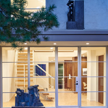 Donald Lococo Architects
Designed in 1970 for an art collector, the existing referenced 70’s architectural principles. With its cadence of ‘70’s brick masses punctuated by a garage and a 4-foot-deep entrance recess. This recess, however, didn’t convey to the interior, which was occupied by disjointed service spaces. To solve, service spaces are moved and reorganized in open void in the garage. (See plan) This also organized the home: Service & utility on the left, reception central, and communal living spaces on the right.
To maintain clarity of the simple one-story 70’s composition, the second story add is recessive. A flex-studio/extra bedroom and office are designed ensuite creating a slender form and orienting them front to back and setting it back allows the add recede. Curves create a definite departure from the 70s home and by detailing it to "hover like a thought" above the first-floor roof and mentally removable sympathetic add.Existing unrelenting interior walls and a windowless entry, although ideal for fine art was unconducive for the young family of three. Added glass at the front recess welcomes light view and the removal of interior walls not only liberate rooms to communicate with each other but also reinform the cleared central entry space as a hub.
Even though the renovation reinforms its relationship with art, the joy and appreciation of art was not dismissed. A metal sculpture lost in the corner of the south side yard bumps the sculpture at the front entrance to the kitchen terrace over an added pedestal. (See plans) Since the roof couldn’t be railed without compromising the one-story '70s composition, the sculpture garden remains physically inaccessible however mirrors flanking the chimney allow the sculptures to be appreciated in three dimensions. The mirrors also afford privacy from the adjacent Tudor's large master bedroom addition 16-feet away.
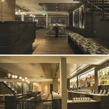
 AIA Pittsburgh
INTERIOR ARCHITECTURE: Certificate of Merit
PROJECT: Altius
CLIENT: B DeFrancis
ARCHITECTURE FIRM: Bucco Architecture
ENGINEERS: Watson Engineers; Claitman Engineering Associates, Inc.
CONTRACTORS: RJS Construction
PHOTOGRAPHER: Walsh Photography
DESCRIPTION: Altius sits on the crest of Grandview Avenue and embraces its physical position to inspire the design, striving to create an ‘elevated’ experience. Spatially, that means creating a directional pull to the view with a series of elements: hostess station, open stair, communal tables, and bar are all positioned perpendicular to the windows to allow guests to move through the space with a continual connection to the expanse of windows.
JURY COMMENTS: This restaurant is really beautifully detailed with very rich materials. We especially appreciate that the detailing did not stop before it made it into the washrooms. The minimalist approach to these details adds a richness that will be appreciated more with each visit.

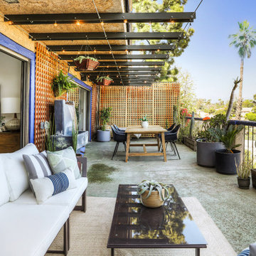 Erik Hagen, Architect
The million dollar view. Bringing the inside out to this spacious 200 SF patio deck. Second living room and dining room in one. Best to fill up with as many plants as possible. Add a water feature for white noise from the street below and the neighbors above. A little lattice to add more separation to the adjacent neighbors. The trellis above can hold typical canvas or cloth sails. Be sure to ask the HOA for permission before physically attaching anything to the structure.
 Pearl Remodeling
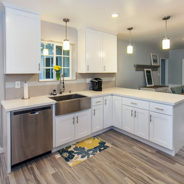
Mid-sized trendy l-shaped porcelain tile open concept kitchen photo in Los Angeles with a farmhouse sink, shaker cabinets, white cabinets, quartz countertops, gray backsplash, glass tile backsplash, stainless steel appliances and a peninsula
 Big Rock Landscaping
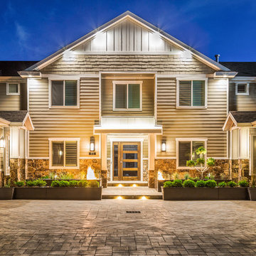
This outdoor lighting adds a welcoming ambiance to the home. With the combination of the fire features at the front door to add warmth both visually and physically.
7