
Search results for "Physical beauty" in Home Design Ideas

 Joy Street Design
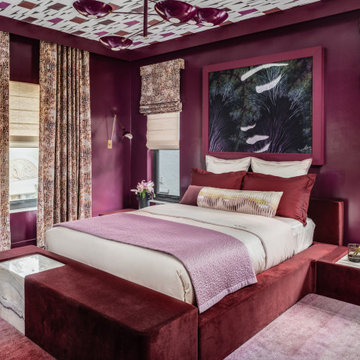
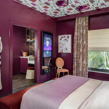
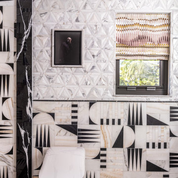
Our Oakland studio went ultra bold with the design of the guest suite at the Kips Bay Designer Showhouse. We chose the theme of a harmonious union of the physical and virtual universe through thoughtful, curated design. We used a dichromatic color theme in the bedroom to create a soothing sanctuary. Luxurious bedding, stylish fabrics, and soft velvet window treatments add a distinctive touch. In the bathroom, we added the classic black and white color theme with stylish tiles and attractive fixtures, creating a beautiful, bold contrast. The whole project emphasizes the past-meets-present-meets-future concept resulting in our most daring design yet!
---Designed by Oakland interior design studio Joy Street Design. Serving Alameda, Berkeley, Orinda, Walnut Creek, Piedmont, and San Francisco.
For more about Joy Street Design, click here:
https://www.joystreetdesign.com/
To learn more about this project, click here:
https://www.joystreetdesign.com/portfolio/kips-bay-showhouse-guest-suite
 McCabe By Design LLC
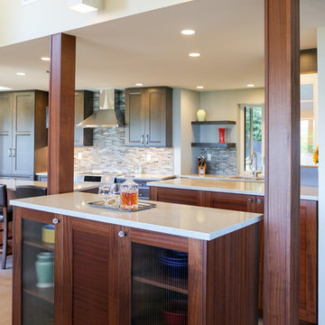
A Sapele buffet with wine storage (on the back side to protect the wine from UV damage) provides a physical separation between the kitchen and the dining area while maintaining access to the beautiful view beyond the dining room. The furniture piece buffet is supported by bunn feet and is accented with ribbed glass. The wall sconces above the buffet have been painted to match the wall and provide both up and down lighting. To provide continuity to the support post, each post was wrapped in Sapele stained to match the cabinetry.
WestSound Home & Garden magazine
Find the right local pro for your project
 Joy Street Design
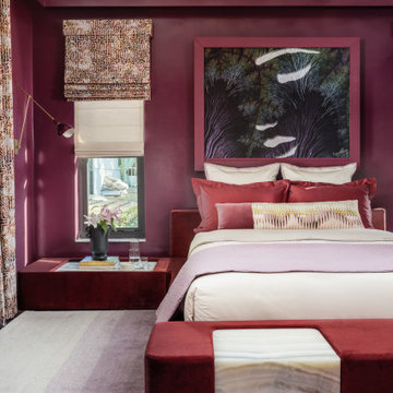
Our Oakland studio went ultra bold with the design of the guest suite at the Kips Bay Designer Showhouse. We chose the theme of a harmonious union of the physical and virtual universe through thoughtful, curated design. We used a dichromatic color theme in the bedroom to create a soothing sanctuary. Luxurious bedding, stylish fabrics, and soft velvet window treatments add a distinctive touch. In the bathroom, we added the classic black and white color theme with stylish tiles and attractive fixtures, creating a beautiful, bold contrast. The whole project emphasizes the past-meets-present-meets-future concept resulting in our most daring design yet!
---Designed by Oakland interior design studio Joy Street Design. Serving Alameda, Berkeley, Orinda, Walnut Creek, Piedmont, and San Francisco.
For more about Joy Street Design, click here:
https://www.joystreetdesign.com/
To learn more about this project, click here:
https://www.joystreetdesign.com/portfolio/kips-bay-showhouse-guest-suite
 Joy Street Design
Our Oakland studio went ultra bold with the design of the guest suite at the Kips Bay Designer Showhouse. We chose the theme of a harmonious union of the physical and virtual universe through thoughtful, curated design. We used a dichromatic color theme in the bedroom to create a soothing sanctuary. Luxurious bedding, stylish fabrics, and soft velvet window treatments add a distinctive touch. In the bathroom, we added the classic black and white color theme with stylish tiles and attractive fixtures, creating a beautiful, bold contrast. The whole project emphasizes the past-meets-present-meets-future concept resulting in our most daring design yet!
---Designed by Oakland interior design studio Joy Street Design. Serving Alameda, Berkeley, Orinda, Walnut Creek, Piedmont, and San Francisco.
For more about Joy Street Design, click here:
https://www.joystreetdesign.com/
To learn more about this project, click here:
https://www.joystreetdesign.com/portfolio/kips-bay-showhouse-guest-suite
 Joy Street Design
Our Oakland studio went ultra bold with the design of the guest suite at the Kips Bay Designer Showhouse. We chose the theme of a harmonious union of the physical and virtual universe through thoughtful, curated design. We used a dichromatic color theme in the bedroom to create a soothing sanctuary. Luxurious bedding, stylish fabrics, and soft velvet window treatments add a distinctive touch. In the bathroom, we added the classic black and white color theme with stylish tiles and attractive fixtures, creating a beautiful, bold contrast. The whole project emphasizes the past-meets-present-meets-future concept resulting in our most daring design yet!
---Designed by Oakland interior design studio Joy Street Design. Serving Alameda, Berkeley, Orinda, Walnut Creek, Piedmont, and San Francisco.
For more about Joy Street Design, click here:
https://www.joystreetdesign.com/
To learn more about this project, click here:
https://www.joystreetdesign.com/portfolio/kips-bay-showhouse-guest-suite
 Stebnitz Builders, Inc.
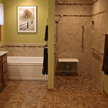
In every project we complete, design, form, function and safety are all important aspects to a successful space plan.
For these homeowners, it was an absolute must. The family had some unique needs that needed to be addressed. As physical abilities continued to change, the accessibility and safety in their master bathroom was a significant concern.
The layout of the bathroom was the first to change. We swapped places with the tub and vanity to give better access to both. A beautiful chrome grab bar was added along with matching towel bar and towel ring.
The vanity was changed out and now featured an angled cut-out for easy access for a wheelchair to pull completely up to the sink while protecting knees and legs from exposed plumbing and looking gorgeous doing it.
The toilet came out of the corner and we eliminated the privacy wall, giving it far easier access with a wheelchair. The original toilet was in great shape and we were able to reuse it. But now, it is equipped with much-needed chrome grab bars for added safety and convenience.
The shower was moved and reconstructed to allow for a larger walk-in tile shower with stylish chrome grab bars, an adjustable handheld showerhead and a comfortable fold-down shower bench – proving a bathroom can (and should) be functionally safe AND aesthetically beautiful at the same time.
Sponsored
Columbus, OH

Structural Remodeling
Franklin County's Heavy Timber Specialists | Best of Houzz 2020!
 Sakura Group
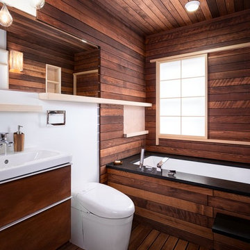
Mid-sized zen dark wood floor and brown floor bathroom photo in Portland with flat-panel cabinets, dark wood cabinets, an undermount tub, a wall-mount toilet, white walls and an integrated sink
 VESTA
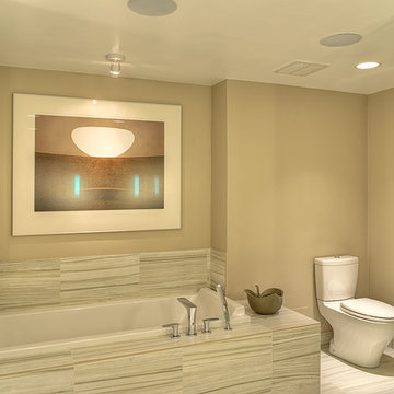
VESTAThis highrise apartment had been designed and beautifully appointed back in the early 90’s but was desperate for an update. This Master Bath had an awkward angled shower with an enclosed toilet room that made it feel small and cramped.
By eliminating the toilet room and squaring off the shower for a larger footprint, we gained physical space. The sleek modern design was enhanced by using a single large format tile type throughout. The Duravit soaking tub has a “reading shelf” built into the side of the plinth facing the toilet - necessary, yet hidden. The tub was designed to be a feature as you walk into the room – allowing the homeowner to feature a favorite piece of art.
 Joy Street Design
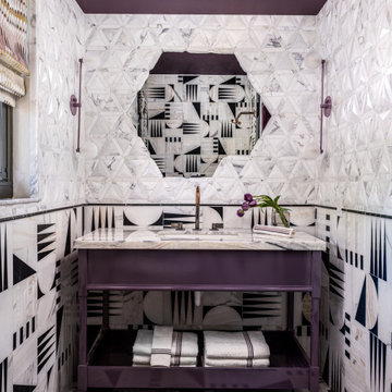
Our Oakland studio went ultra bold with the design of the guest suite at the Kips Bay Designer Showhouse. We chose the theme of a harmonious union of the physical and virtual universe through thoughtful, curated design. We used a dichromatic color theme in the bedroom to create a soothing sanctuary. Luxurious bedding, stylish fabrics, and soft velvet window treatments add a distinctive touch. In the bathroom, we added the classic black and white color theme with stylish tiles and attractive fixtures, creating a beautiful, bold contrast. The whole project emphasizes the past-meets-present-meets-future concept resulting in our most daring design yet!
---Designed by Oakland interior design studio Joy Street Design. Serving Alameda, Berkeley, Orinda, Walnut Creek, Piedmont, and San Francisco.
For more about Joy Street Design, click here:
https://www.joystreetdesign.com/
To learn more about this project, click here:
https://www.joystreetdesign.com/portfolio/kips-bay-showhouse-guest-suite
 Debbie Davis CMKBD
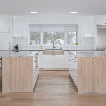
Part of a complete home renovation in an aging Mid-Century Bow Mar home, this expansive kitchen is visually and physically the home's centerpiece. I used two large seating areas attached to opposing half-circle islands to create a functional and comfortable family space, as well as house a microwave drawer and induction cooktop.
The high-gloss white wall cabinetry, paired with oak base cabinetry is Bauformat, German designed and manufactured. The subtle contrast between the flooring and base cabinetry, paired with Mid Century inspired matte-white large-format wall tile keeps the whole space light and airy. Natural light is ample from the window over the sink to the large sliding doors and light tubes in the ceiling.
Tim Gormley, TG Image
 Flavin Architects
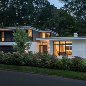
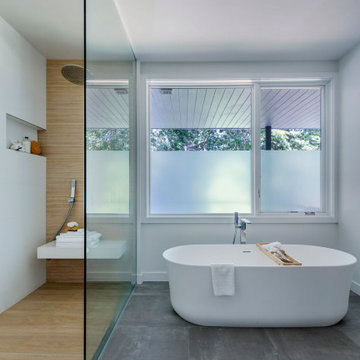
Our clients wanted to replace an existing suburban home with a modern house at the same Lexington address where they had lived for years. The structure the clients envisioned would complement their lives and integrate the interior of the home with the natural environment of their generous property. The sleek, angular home is still a respectful neighbor, especially in the evening, when warm light emanates from the expansive transparencies used to open the house to its surroundings. The home re-envisions the suburban neighborhood in which it stands, balancing relationship to the neighborhood with an updated aesthetic.
The floor plan is arranged in a “T” shape which includes a two-story wing consisting of individual studies and bedrooms and a single-story common area. The two-story section is arranged with great fluidity between interior and exterior spaces and features generous exterior balconies. A staircase beautifully encased in glass stands as the linchpin between the two areas. The spacious, single-story common area extends from the stairwell and includes a living room and kitchen. A recessed wooden ceiling defines the living room area within the open plan space.
Separating common from private spaces has served our clients well. As luck would have it, construction on the house was just finishing up as we entered the Covid lockdown of 2020. Since the studies in the two-story wing were physically and acoustically separate, zoom calls for work could carry on uninterrupted while life happened in the kitchen and living room spaces. The expansive panes of glass, outdoor balconies, and a broad deck along the living room provided our clients with a structured sense of continuity in their lives without compromising their commitment to aesthetically smart and beautiful design.
 Nakamoto Forestry
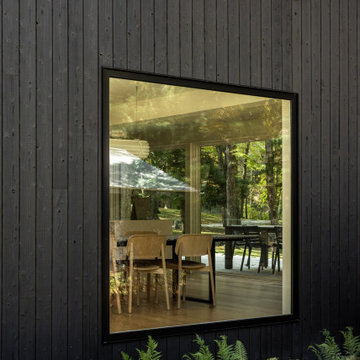
(via VonDalwig) An existing 1967 complex of three buildings and a pool situated on 13 acres of meadows and wetlands was previously renovated and 2009. The main house was extended and a pool added in that renovation but the addition and pool felt more like a detached limb than an integrated part to the house and the plan adjustments and facade work did little to take advantage of the beautiful property and surroundings. Our approach was to allow the parts – the buildings, the landscape, the pool – to unfold and connect to the whole both inside and out, spatially and programmatically – and to establish relationships between spaces that builds a ‘stage’ allowing a programmatic ‘dance’ for the owners to visually and physically connect to the beautiful exterior setting. We reconfigured the floor plan and exterior openings, directing it towards views and created an exterior pergola that include, rather than exclude, the guest studio while also fulfilling the town pool regulations. The outcome is a subtle framing of multiple platforms that connects in and out.

 Outdoor Lighting Design by Preferred Properties
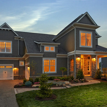
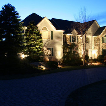
Landscape Lighting Beams off these Evergreens from the Street. Its a Beautiful Setting Summer, Winter and Fall both Day and Night. Spring is Gorgeous too when the Evergreens push new fuzzy growth of the needles. The Lighting is definitely a challenge because the fixtures need to be set back farther away from the Trees than sometimes permits. Here the ideal distance away for optimal placement is dead smack in the middle of the driveway bringing about some onsite placement and finish pointing to create a contrasting and complementing scene. Cross Lighting is suited best otherwise the shape of the evergreens will seem physically disfigured at night. Some combination of all the lighting strategies will yield the most optimal scene to look at creating great interest against all the Planters up against the towering home.
 CITYDESKSTUDIO, Inc.
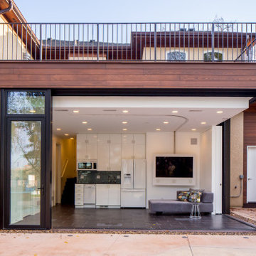
A family that spends a lot of time in and around their beautiful saltwater pool, did not have a place in their home that provided them a visual or physical connection. They also lacked any storage for all their pool “stuff”. With small children and a love for entertaining, they needed a room that served and supported their watery lifestyle. We took over an empty and unused notch along the back of the house adjacent to the pool patio to create a new bright and airy pool house.
The new out building attempts to unify 4 areas; an existing deck, an upper master bedroom balcony, a lower lawn, and the pool itself, and provide the missing storage. By locating the pool house at the juxtaposition of these areas, the new room was able to provide a new expanded rooftop balcony for the master, anchor and define the dining and barbeque deck, extend and connect to the pool and patio, and create a new access to integrate the lower lawn – and carve out the much needed storage for the variety of pool toys and equipment.
The building itself is 400 sf with bath, laundry, storage, mechanical, kitchen, and living. A single new secure connection is made into the house through the existing mudroom. Clad with crisply detailed ship lap cedar, it draws on the existing material palate of the house and nods to the boat aesthetic in expression and efficiency. With pocketing glass walls the pool house is both the utility building needed, and an expansion of the vibrant pool scene itself, inside and outside, along the poolside.
Photographer: Brandon Stengelwww.farmkidstudios.com
Location: Edina, MN
Completed: 2013
Project Team:
Ben Awes AIA, Principal-In-Charge
Bob Ganser AIA
Christian Dean AIA
Nate Dodge
 Flavin Architects
Our clients wanted to replace an existing suburban home with a modern house at the same Lexington address where they had lived for years. The structure the clients envisioned would complement their lives and integrate the interior of the home with the natural environment of their generous property. The sleek, angular home is still a respectful neighbor, especially in the evening, when warm light emanates from the expansive transparencies used to open the house to its surroundings. The home re-envisions the suburban neighborhood in which it stands, balancing relationship to the neighborhood with an updated aesthetic.
The floor plan is arranged in a “T” shape which includes a two-story wing consisting of individual studies and bedrooms and a single-story common area. The two-story section is arranged with great fluidity between interior and exterior spaces and features generous exterior balconies. A staircase beautifully encased in glass stands as the linchpin between the two areas. The spacious, single-story common area extends from the stairwell and includes a living room and kitchen. A recessed wooden ceiling defines the living room area within the open plan space.
Separating common from private spaces has served our clients well. As luck would have it, construction on the house was just finishing up as we entered the Covid lockdown of 2020. Since the studies in the two-story wing were physically and acoustically separate, zoom calls for work could carry on uninterrupted while life happened in the kitchen and living room spaces. The expansive panes of glass, outdoor balconies, and a broad deck along the living room provided our clients with a structured sense of continuity in their lives without compromising their commitment to aesthetically smart and beautiful design.
 Joy Street Design
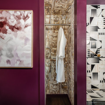
Our Oakland studio went ultra bold with the design of the guest suite at the Kips Bay Designer Showhouse. We chose the theme of a harmonious union of the physical and virtual universe through thoughtful, curated design. We used a dichromatic color theme in the bedroom to create a soothing sanctuary. Luxurious bedding, stylish fabrics, and soft velvet window treatments add a distinctive touch. In the bathroom, we added the classic black and white color theme with stylish tiles and attractive fixtures, creating a beautiful, bold contrast. The whole project emphasizes the past-meets-present-meets-future concept resulting in our most daring design yet!
---Designed by Oakland interior design studio Joy Street Design. Serving Alameda, Berkeley, Orinda, Walnut Creek, Piedmont, and San Francisco.
For more about Joy Street Design, click here:
https://www.joystreetdesign.com/
To learn more about this project, click here:
https://www.joystreetdesign.com/portfolio/kips-bay-showhouse-guest-suite
Sponsored
Columbus, OH
Structural Remodeling
Franklin County's Heavy Timber Specialists | Best of Houzz 2020!
 Joy Street Design
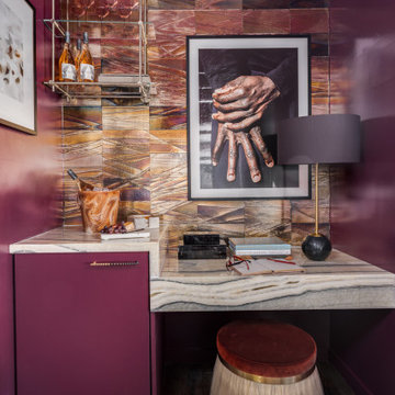
Our Oakland studio went ultra bold with the design of the guest suite at the Kips Bay Designer Showhouse. We chose the theme of a harmonious union of the physical and virtual universe through thoughtful, curated design. We used a dichromatic color theme in the bedroom to create a soothing sanctuary. Luxurious bedding, stylish fabrics, and soft velvet window treatments add a distinctive touch. In the bathroom, we added the classic black and white color theme with stylish tiles and attractive fixtures, creating a beautiful, bold contrast. The whole project emphasizes the past-meets-present-meets-future concept resulting in our most daring design yet!
---Designed by Oakland interior design studio Joy Street Design. Serving Alameda, Berkeley, Orinda, Walnut Creek, Piedmont, and San Francisco.
For more about Joy Street Design, click here:
https://www.joystreetdesign.com/
To learn more about this project, click here:
https://www.joystreetdesign.com/portfolio/kips-bay-showhouse-guest-suite
 Nakamoto Forestry
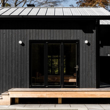
(via VonDalwig) An existing 1967 complex of three buildings and a pool situated on 13 acres of meadows and wetlands was previously renovated and 2009. The main house was extended and a pool added in that renovation but the addition and pool felt more like a detached limb than an integrated part to the house and the plan adjustments and facade work did little to take advantage of the beautiful property and surroundings. Our approach was to allow the parts – the buildings, the landscape, the pool – to unfold and connect to the whole both inside and out, spatially and programmatically – and to establish relationships between spaces that builds a ‘stage’ allowing a programmatic ‘dance’ for the owners to visually and physically connect to the beautiful exterior setting. We reconfigured the floor plan and exterior openings, directing it towards views and created an exterior pergola that include, rather than exclude, the guest studio while also fulfilling the town pool regulations. The outcome is a subtle framing of multiple platforms that connects in and out.

 Hold It Contemporary Home
Diffrient World is Humanscale's first foray into all-mesh task seating. Designer Niels Diffrient wanted to create the most minimal, full-function task chair ever made. With an innovative tri-panel mesh backrest that provides custom back and lumbar support and a lightweight design, Diffrient World is, like all of Humanscale’s products, simple, beautiful and functional. The design eliminates the need for traditional mechanisms, instead using the laws of physics and the sitter’s body weight to offer perfect recline for each individual sitter. Diffrient World offers the ultimate user-friendly sitting experience.
Float is a revolutionary standing office desk that brings effortless operation to traditional sit-stand products. Ease of use is at the heart of Float, as it seamlessly adjusts between sitting and standing postures without interrupting workflow. With a minimal aesthetic, Float complements traditional offices and home workspaces.
Using a patented counterbalance mechanism that replaces older technology, Float encourages an active workspace by allowing the user to move effortlessly from sit to stand positions. Float is also available in an electric option.
16