
Search results for "Physical beauty" in Home Design Ideas
 R Designs, LLC.
Brynn Burns Photography
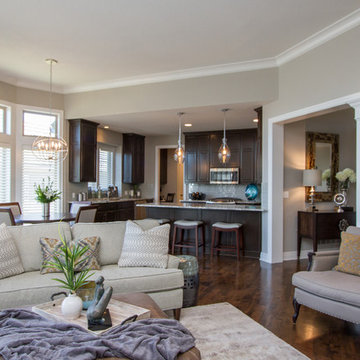
Inspiration for a mid-sized transitional open concept and formal medium tone wood floor living room remodel in Kansas City with gray walls, no tv, a standard fireplace and a stone fireplace
Inspiration for a mid-sized transitional open concept and formal medium tone wood floor living room remodel in Kansas City with gray walls, no tv, a standard fireplace and a stone fireplace
 Nakamoto Forestry
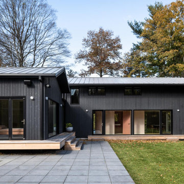
(via VonDalwig) An existing 1967 complex of three buildings and a pool situated on 13 acres of meadows and wetlands was previously renovated and 2009. The main house was extended and a pool added in that renovation but the addition and pool felt more like a detached limb than an integrated part to the house and the plan adjustments and facade work did little to take advantage of the beautiful property and surroundings. Our approach was to allow the parts – the buildings, the landscape, the pool – to unfold and connect to the whole both inside and out, spatially and programmatically – and to establish relationships between spaces that builds a ‘stage’ allowing a programmatic ‘dance’ for the owners to visually and physically connect to the beautiful exterior setting. We reconfigured the floor plan and exterior openings, directing it towards views and created an exterior pergola that include, rather than exclude, the guest studio while also fulfilling the town pool regulations. The outcome is a subtle framing of multiple platforms that connects in and out.
 Joy Street Design
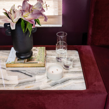
Our Oakland studio went ultra bold with the design of the guest suite at the Kips Bay Designer Showhouse. We chose the theme of a harmonious union of the physical and virtual universe through thoughtful, curated design. We used a dichromatic color theme in the bedroom to create a soothing sanctuary. Luxurious bedding, stylish fabrics, and soft velvet window treatments add a distinctive touch. In the bathroom, we added the classic black and white color theme with stylish tiles and attractive fixtures, creating a beautiful, bold contrast. The whole project emphasizes the past-meets-present-meets-future concept resulting in our most daring design yet!
---Designed by Oakland interior design studio Joy Street Design. Serving Alameda, Berkeley, Orinda, Walnut Creek, Piedmont, and San Francisco.
For more about Joy Street Design, click here:
https://www.joystreetdesign.com/
To learn more about this project, click here:
https://www.joystreetdesign.com/portfolio/kips-bay-showhouse-guest-suite
Find the right local pro for your project
 Flavin Architects
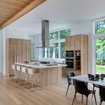
Our clients wanted to replace an existing suburban home with a modern house at the same Lexington address where they had lived for years. The structure the clients envisioned would complement their lives and integrate the interior of the home with the natural environment of their generous property. The sleek, angular home is still a respectful neighbor, especially in the evening, when warm light emanates from the expansive transparencies used to open the house to its surroundings. The home re-envisions the suburban neighborhood in which it stands, balancing relationship to the neighborhood with an updated aesthetic.
The floor plan is arranged in a “T” shape which includes a two-story wing consisting of individual studies and bedrooms and a single-story common area. The two-story section is arranged with great fluidity between interior and exterior spaces and features generous exterior balconies. A staircase beautifully encased in glass stands as the linchpin between the two areas. The spacious, single-story common area extends from the stairwell and includes a living room and kitchen. A recessed wooden ceiling defines the living room area within the open plan space.
Separating common from private spaces has served our clients well. As luck would have it, construction on the house was just finishing up as we entered the Covid lockdown of 2020. Since the studies in the two-story wing were physically and acoustically separate, zoom calls for work could carry on uninterrupted while life happened in the kitchen and living room spaces. The expansive panes of glass, outdoor balconies, and a broad deck along the living room provided our clients with a structured sense of continuity in their lives without compromising their commitment to aesthetically smart and beautiful design.
 Joy Street Design
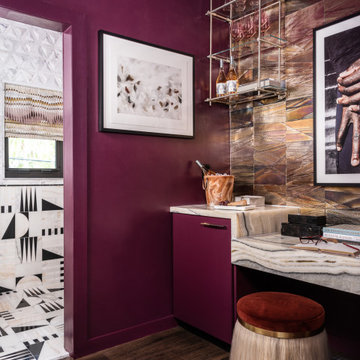
Our Oakland studio went ultra bold with the design of the guest suite at the Kips Bay Designer Showhouse. We chose the theme of a harmonious union of the physical and virtual universe through thoughtful, curated design. We used a dichromatic color theme in the bedroom to create a soothing sanctuary. Luxurious bedding, stylish fabrics, and soft velvet window treatments add a distinctive touch. In the bathroom, we added the classic black and white color theme with stylish tiles and attractive fixtures, creating a beautiful, bold contrast. The whole project emphasizes the past-meets-present-meets-future concept resulting in our most daring design yet!
---Designed by Oakland interior design studio Joy Street Design. Serving Alameda, Berkeley, Orinda, Walnut Creek, Piedmont, and San Francisco.
For more about Joy Street Design, click here:
https://www.joystreetdesign.com/
To learn more about this project, click here:
https://www.joystreetdesign.com/portfolio/kips-bay-showhouse-guest-suite
 Flavin Architects
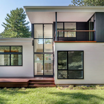
Our clients wanted to replace an existing suburban home with a modern house at the same Lexington address where they had lived for years. The structure the clients envisioned would complement their lives and integrate the interior of the home with the natural environment of their generous property. The sleek, angular home is still a respectful neighbor, especially in the evening, when warm light emanates from the expansive transparencies used to open the house to its surroundings. The home re-envisions the suburban neighborhood in which it stands, balancing relationship to the neighborhood with an updated aesthetic.
The floor plan is arranged in a “T” shape which includes a two-story wing consisting of individual studies and bedrooms and a single-story common area. The two-story section is arranged with great fluidity between interior and exterior spaces and features generous exterior balconies. A staircase beautifully encased in glass stands as the linchpin between the two areas. The spacious, single-story common area extends from the stairwell and includes a living room and kitchen. A recessed wooden ceiling defines the living room area within the open plan space.
Separating common from private spaces has served our clients well. As luck would have it, construction on the house was just finishing up as we entered the Covid lockdown of 2020. Since the studies in the two-story wing were physically and acoustically separate, zoom calls for work could carry on uninterrupted while life happened in the kitchen and living room spaces. The expansive panes of glass, outdoor balconies, and a broad deck along the living room provided our clients with a structured sense of continuity in their lives without compromising their commitment to aesthetically smart and beautiful design.
 Flavin Architects
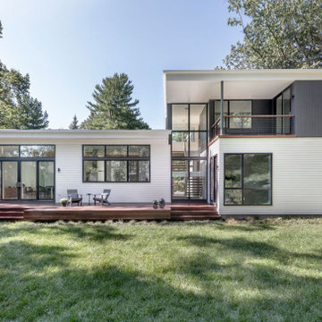
Our clients wanted to replace an existing suburban home with a modern house at the same Lexington address where they had lived for years. The structure the clients envisioned would complement their lives and integrate the interior of the home with the natural environment of their generous property. The sleek, angular home is still a respectful neighbor, especially in the evening, when warm light emanates from the expansive transparencies used to open the house to its surroundings. The home re-envisions the suburban neighborhood in which it stands, balancing relationship to the neighborhood with an updated aesthetic.
The floor plan is arranged in a “T” shape which includes a two-story wing consisting of individual studies and bedrooms and a single-story common area. The two-story section is arranged with great fluidity between interior and exterior spaces and features generous exterior balconies. A staircase beautifully encased in glass stands as the linchpin between the two areas. The spacious, single-story common area extends from the stairwell and includes a living room and kitchen. A recessed wooden ceiling defines the living room area within the open plan space.
Separating common from private spaces has served our clients well. As luck would have it, construction on the house was just finishing up as we entered the Covid lockdown of 2020. Since the studies in the two-story wing were physically and acoustically separate, zoom calls for work could carry on uninterrupted while life happened in the kitchen and living room spaces. The expansive panes of glass, outdoor balconies, and a broad deck along the living room provided our clients with a structured sense of continuity in their lives without compromising their commitment to aesthetically smart and beautiful design.

 Flavin Architects
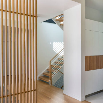
Our clients wanted to replace an existing suburban home with a modern house at the same Lexington address where they had lived for years. The structure the clients envisioned would complement their lives and integrate the interior of the home with the natural environment of their generous property. The sleek, angular home is still a respectful neighbor, especially in the evening, when warm light emanates from the expansive transparencies used to open the house to its surroundings. The home re-envisions the suburban neighborhood in which it stands, balancing relationship to the neighborhood with an updated aesthetic.
The floor plan is arranged in a “T” shape which includes a two-story wing consisting of individual studies and bedrooms and a single-story common area. The two-story section is arranged with great fluidity between interior and exterior spaces and features generous exterior balconies. A staircase beautifully encased in glass stands as the linchpin between the two areas. The spacious, single-story common area extends from the stairwell and includes a living room and kitchen. A recessed wooden ceiling defines the living room area within the open plan space.
Separating common from private spaces has served our clients well. As luck would have it, construction on the house was just finishing up as we entered the Covid lockdown of 2020. Since the studies in the two-story wing were physically and acoustically separate, zoom calls for work could carry on uninterrupted while life happened in the kitchen and living room spaces. The expansive panes of glass, outdoor balconies, and a broad deck along the living room provided our clients with a structured sense of continuity in their lives without compromising their commitment to aesthetically smart and beautiful design.
 Montana Timber Products
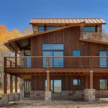
Complimenting the beautiful Colorado fall colors, this Montana Timber Products home features prefinished ranchwood™ Tackroom, Circle Sawn texture as a vertical installation.
-
The beautiful ranchwood Tackroom color, along with the vertical installation and stone work, combine for a painter's pleasure with the fall birch colors.
-
Our flagship product, ranchwood™ is Montana Timber Products' chemical free, kiln dried, alternative milled rough stock wood.
As an ideal reclaimed lumber alternative, the aesthetically pleasing rustic barn wood ranchwood™ is the result of an environmentally safe production process.
Offering uncompromising natural, rustic beauty, ranchwood™ is typically less expensive than antique reclaimed barnwood.
-
Combined textures solidify into a beautiful rustic brew.
-
A custom millwork shop, Montana Timber Products offers many options to the customer's delight.
Circle Sawn and Wire Brushed are Montana Timber Products' common cedar siding texturizing options.
The Circle Sawn texture commonly seen on rustic reclaimed barn wood is created from the large circular saw blades used in more traditional milling practices.
The Wire Brushed option adds physical and aesthetic depth to the wood grain.
In addition to the aesthetic beauty added from the texturing process, greater surface area is created, which allows the Seal-Once, 100% NO VOC waterproofer to more effectively penetrate the wood.
Guarneteed for ten years, Seal-Once prevents water ingress and is safe for exterior and interior use, children and pets.
-
Sophistication is no stranger to rustic application if done properly, as seen here with distinct lines and harmonious collaboration of wood and stone.
-
If the environment is important to you, Montana Timber Products natural wood siding, trim, flooring, interior accents, timbers, beams -- all of our wood products -- do not use degenerative chemicals as some other companies do to achieve desired effects.
Reclaimed wood, barn wood alternatives, and faux vintage wood are popular building materials further exemplified by Montana Timber Products environmentally friendly manufacturing technique.
 Nakamoto Forestry
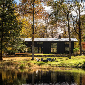
(via VonDalwig) An existing 1967 complex of three buildings and a pool situated on 13 acres of meadows and wetlands was previously renovated and 2009. The main house was extended and a pool added in that renovation but the addition and pool felt more like a detached limb than an integrated part to the house and the plan adjustments and facade work did little to take advantage of the beautiful property and surroundings. Our approach was to allow the parts – the buildings, the landscape, the pool – to unfold and connect to the whole both inside and out, spatially and programmatically – and to establish relationships between spaces that builds a ‘stage’ allowing a programmatic ‘dance’ for the owners to visually and physically connect to the beautiful exterior setting. We reconfigured the floor plan and exterior openings, directing it towards views and created an exterior pergola that include, rather than exclude, the guest studio while also fulfilling the town pool regulations. The outcome is a subtle framing of multiple platforms that connects in and out.
 Flavin Architects
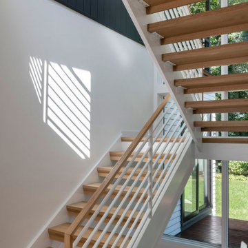
Our clients wanted to replace an existing suburban home with a modern house at the same Lexington address where they had lived for years. The structure the clients envisioned would complement their lives and integrate the interior of the home with the natural environment of their generous property. The sleek, angular home is still a respectful neighbor, especially in the evening, when warm light emanates from the expansive transparencies used to open the house to its surroundings. The home re-envisions the suburban neighborhood in which it stands, balancing relationship to the neighborhood with an updated aesthetic.
The floor plan is arranged in a “T” shape which includes a two-story wing consisting of individual studies and bedrooms and a single-story common area. The two-story section is arranged with great fluidity between interior and exterior spaces and features generous exterior balconies. A staircase beautifully encased in glass stands as the linchpin between the two areas. The spacious, single-story common area extends from the stairwell and includes a living room and kitchen. A recessed wooden ceiling defines the living room area within the open plan space.
Separating common from private spaces has served our clients well. As luck would have it, construction on the house was just finishing up as we entered the Covid lockdown of 2020. Since the studies in the two-story wing were physically and acoustically separate, zoom calls for work could carry on uninterrupted while life happened in the kitchen and living room spaces. The expansive panes of glass, outdoor balconies, and a broad deck along the living room provided our clients with a structured sense of continuity in their lives without compromising their commitment to aesthetically smart and beautiful design.

 Specialty Gardens
Bam! Full color flower garden. Plants include Zinnia 'Profusion' series - orange, cherry, & yellow. Agastache 'Purple Haze', Echinacea 'Hot Papaya', Monarda 'Raspberry Wine', Argyranthemum 'Butterfly', Nicotiana sylvestris.
Paul Kiefer / Specialty Gardens LLC, Grand Haven, MI
 Flavin Architects
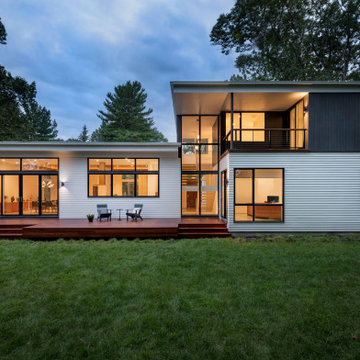
Our clients wanted to replace an existing suburban home with a modern house at the same Lexington address where they had lived for years. The structure the clients envisioned would complement their lives and integrate the interior of the home with the natural environment of their generous property. The sleek, angular home is still a respectful neighbor, especially in the evening, when warm light emanates from the expansive transparencies used to open the house to its surroundings. The home re-envisions the suburban neighborhood in which it stands, balancing relationship to the neighborhood with an updated aesthetic.
The floor plan is arranged in a “T” shape which includes a two-story wing consisting of individual studies and bedrooms and a single-story common area. The two-story section is arranged with great fluidity between interior and exterior spaces and features generous exterior balconies. A staircase beautifully encased in glass stands as the linchpin between the two areas. The spacious, single-story common area extends from the stairwell and includes a living room and kitchen. A recessed wooden ceiling defines the living room area within the open plan space.
Separating common from private spaces has served our clients well. As luck would have it, construction on the house was just finishing up as we entered the Covid lockdown of 2020. Since the studies in the two-story wing were physically and acoustically separate, zoom calls for work could carry on uninterrupted while life happened in the kitchen and living room spaces. The expansive panes of glass, outdoor balconies, and a broad deck along the living room provided our clients with a structured sense of continuity in their lives without compromising their commitment to aesthetically smart and beautiful design.
 Stebnitz Builders, Inc.
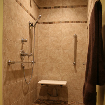
In every project we complete, design, form, function and safety are all important aspects to a successful space plan.
For these homeowners, it was an absolute must. The family had some unique needs that needed to be addressed. As physical abilities continued to change, the accessibility and safety in their master bathroom was a significant concern.
The layout of the bathroom was the first to change. We swapped places with the tub and vanity to give better access to both. A beautiful chrome grab bar was added along with matching towel bar and towel ring.
The vanity was changed out and now featured an angled cut-out for easy access for a wheelchair to pull completely up to the sink while protecting knees and legs from exposed plumbing and looking gorgeous doing it.
The toilet came out of the corner and we eliminated the privacy wall, giving it far easier access with a wheelchair. The original toilet was in great shape and we were able to reuse it. But now, it is equipped with much-needed chrome grab bars for added safety and convenience.
The shower was moved and reconstructed to allow for a larger walk-in tile shower with stylish chrome grab bars, an adjustable handheld showerhead and a comfortable fold-down shower bench – proving a bathroom can (and should) be functionally safe AND aesthetically beautiful at the same time.
 Lauren Levant
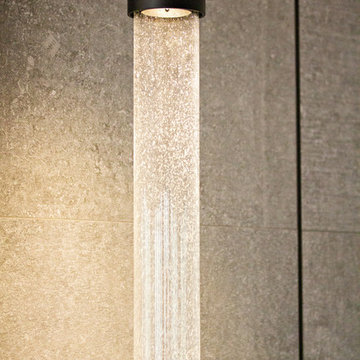
Large trendy master gray tile gray floor and concrete floor double shower photo with flat-panel cabinets, medium tone wood cabinets, a one-piece toilet, gray walls, a vessel sink, a hinged shower door, black countertops and concrete countertops
 Gong Glass Works
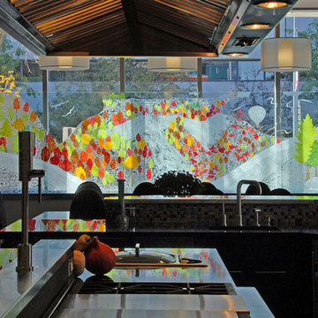
A neglected commercial building was transformed into a multi-level living space with the street level purposed for entertaining. "Our Special Place" is a creative solution to the need for privacy and desire for beauty in an urban domicile. This design maintains a visual connection to the outdoor environment and urban activity. The design provides a meaningful memory for the residents while providing a vision of nature and beauty for both owners and the public. In harmony with urban life, ever-changing daylight and artificial light bring a dynamic range of character to the design at all times of the day.
A twenty-five foot curtain wall divided pedestrian and vehicular traffic physically and visually from the large dining room of a new street level urban home. It was important not to close the residence off from city living, or to loose the daylight filtering through the curtain wall. The primary goal was to provide privacy from the public while still retaining a view of the sky, weather and activity on the street. It was also important to mantain the legibility of the design throughout the day and night. With a close up view from the inside, one can see through tiny untreated areas to see street activity. A close up view looking in from the outside is not possible due to buttresses from the street level. A clean frameless installation with low maintenance was also required.
 Nakamoto Forestry
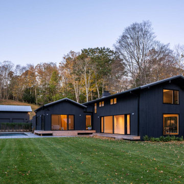
(via VonDalwig) An existing 1967 complex of three buildings and a pool situated on 13 acres of meadows and wetlands was previously renovated and 2009. The main house was extended and a pool added in that renovation but the addition and pool felt more like a detached limb than an integrated part to the house and the plan adjustments and facade work did little to take advantage of the beautiful property and surroundings. Our approach was to allow the parts – the buildings, the landscape, the pool – to unfold and connect to the whole both inside and out, spatially and programmatically – and to establish relationships between spaces that builds a ‘stage’ allowing a programmatic ‘dance’ for the owners to visually and physically connect to the beautiful exterior setting. We reconfigured the floor plan and exterior openings, directing it towards views and created an exterior pergola that include, rather than exclude, the guest studio while also fulfilling the town pool regulations. The outcome is a subtle framing of multiple platforms that connects in and out.

 Dion Designs
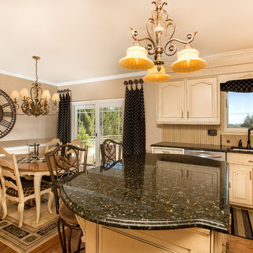
Kitchen update/redesign. The goal with this kitchen was to unite both rooms, visually heighten the ceilings and to make the room feel inviting, interesting and larger. We accomplished this by neutralizing the walls and ceilings in both rooms. The original soffits were reduced and pushed back to the cabinets, trimmed and painted to match the cabinets and new can lights were placed in the ceiling. The before photo of the kitchen shows a hint of what the old soffits looked like. They originally extended about a foot beyond and in front of the cabinets. The original soffits were housing can lights. Because they lights were physically lower than the ceiling, the ceiling height felt right on top of you. By pushing back the soffits and installing the lights into the ceiling the room now feels much bigger and taller. We added visual weight and interest to the eat-in area and balanced both rooms. The beautiful outdoors is now framed with new sliding doors which replaced the bay window in the before shot. Using a dark color to frame the outside of the sliding doors lengthens the room and draws interest and visual weight to the eat-in side of the Kitchen. This kitchen and owner were truly a delight to work with.
Gary G. Schempp www.garygschempp.com
 Stebnitz Builders, Inc.
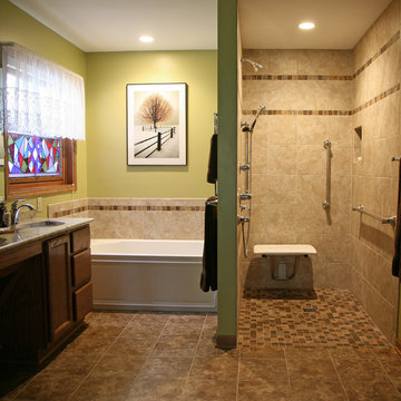
In every project we complete, design, form, function and safety are all important aspects to a successful space plan.
For these homeowners, it was an absolute must. The family had some unique needs that needed to be addressed. As physical abilities continued to change, the accessibility and safety in their master bathroom was a significant concern.
The layout of the bathroom was the first to change. We swapped places with the tub and vanity to give better access to both. A beautiful chrome grab bar was added along with matching towel bar and towel ring.
The vanity was changed out and now featured an angled cut-out for easy access for a wheelchair to pull completely up to the sink while protecting knees and legs from exposed plumbing and looking gorgeous doing it.
The toilet came out of the corner and we eliminated the privacy wall, giving it far easier access with a wheelchair. The original toilet was in great shape and we were able to reuse it. But now, it is equipped with much-needed chrome grab bars for added safety and convenience.
The shower was moved and reconstructed to allow for a larger walk-in tile shower with stylish chrome grab bars, an adjustable handheld showerhead and a comfortable fold-down shower bench – proving a bathroom can (and should) be functionally safe AND aesthetically beautiful at the same time.
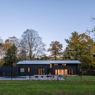 Nakamoto Forestry
(via VonDalwig) An existing 1967 complex of three buildings and a pool situated on 13 acres of meadows and wetlands was previously renovated and 2009. The main house was extended and a pool added in that renovation but the addition and pool felt more like a detached limb than an integrated part to the house and the plan adjustments and facade work did little to take advantage of the beautiful property and surroundings. Our approach was to allow the parts – the buildings, the landscape, the pool – to unfold and connect to the whole both inside and out, spatially and programmatically – and to establish relationships between spaces that builds a ‘stage’ allowing a programmatic ‘dance’ for the owners to visually and physically connect to the beautiful exterior setting. We reconfigured the floor plan and exterior openings, directing it towards views and created an exterior pergola that include, rather than exclude, the guest studio while also fulfilling the town pool regulations. The outcome is a subtle framing of multiple platforms that connects in and out.
17