
Search results for "Physical surface" in Home Design Ideas
 Fiorito Interior Design
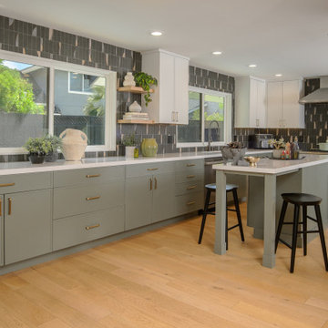
When I began this kitchen project, the space was constrained by an awkward peninsula and a dropped ceiling that compressed the room both physically and visually. Fluorescent fixtures sat behind a plastic diffuser, and the refrigerator was wedged beside the range, leaving the kitchen feeling crowded while also making poor use of the available space. The transformation began by taking things away. The dropped ceiling was removed, the fluorescent tubes went with it, and the room suddenly gained height and light. The peninsula was removed too, opening the floor plan and allowing the cabinetry to continue down an adjacent wall and incorporate a second window. What had been a small, enclosed kitchen became a generous working space with room for a slim, functional L-shaped island, additional cabinetry and, perhaps most importantly, a much more natural relationship between the different parts of the kitchen.
The palette is quiet, but there is a lot happening within it. Soft sage cabinetry grounds the room, while warm white upper cabinets and pantry cabinetry lift the space. A pure white quartz countertop provides a crisp surface against the cabinetry, and soft brass hardware adds just enough warmth. The new Sub Zero refrigerator was given its own wall, beside a full pantry, freeing the range wall to become a strong focal point. A Monogram range now sits centered beneath an angular stainless-steel Zephyr hood, framed by the kitchen's most distinctive element: a graphite backsplash made from WOW Design's Pottery tile. Inspired by Japanese handmade ceramics, the tiles have a wonderfully tactile, imperfect character. Most are deep graphite, but here and there the surface breaks into strokes of camel, dusty peach and deep blue-gunmetal glaze. There is an almost painterly quality to the way those colors move across the wall, giving the kitchen something that is difficult to achieve with a more uniform material—the feeling that someone actually made it.
The rest of the room was designed around that same balance of simplicity and warmth. New pale oak flooring runs throughout the ground floor, bringing a natural material and a soft golden tone beneath the cooler sage and graphite. Floating oak shelves flank the windows and provide a home for plants, ceramics and a few favorite objects, while another pair of shelves beside the refrigerator creates a small landing place for the things that inevitably arrive with you at the end of the day—keys, mail, bags and whatever else happens to be in your hands. The island occupies a surprisingly small footprint, yet its L-shaped form provides both additional work surface and seating without interrupting the flow of the room. A deep sink with an integrated cutting board and roll-up drying rack, a commercial-style faucet and under-cabinet LED lighting bring the practical details up to the same level of thoughtfulness as the larger design decisions. In the end, the renovation did more than just enlarge the kitchen; it created a space that feels calm, contemporary, warm, and a little unexpected … and, most importantly, we created a kitchen that finally makes sense for the way my clients live.
AFTER photos: Bernardo Grijalva
 Fiorito Interior Design
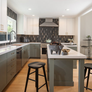
When I began this kitchen project, the space was constrained by an awkward peninsula and a dropped ceiling that compressed the room both physically and visually. Fluorescent fixtures sat behind a plastic diffuser, and the refrigerator was wedged beside the range, leaving the kitchen feeling crowded while also making poor use of the available space. The transformation began by taking things away. The dropped ceiling was removed, the fluorescent tubes went with it, and the room suddenly gained height and light. The peninsula was removed too, opening the floor plan and allowing the cabinetry to continue down an adjacent wall and incorporate a second window. What had been a small, enclosed kitchen became a generous working space with room for a slim, functional L-shaped island, additional cabinetry and, perhaps most importantly, a much more natural relationship between the different parts of the kitchen.
The palette is quiet, but there is a lot happening within it. Soft sage cabinetry grounds the room, while warm white upper cabinets and pantry cabinetry lift the space. A pure white quartz countertop provides a crisp surface against the cabinetry, and soft brass hardware adds just enough warmth. The new Sub Zero refrigerator was given its own wall, beside a full pantry, freeing the range wall to become a strong focal point. A Monogram range now sits centered beneath an angular stainless-steel Zephyr hood, framed by the kitchen's most distinctive element: a graphite backsplash made from WOW Design's Pottery tile. Inspired by Japanese handmade ceramics, the tiles have a wonderfully tactile, imperfect character. Most are deep graphite, but here and there the surface breaks into strokes of camel, dusty peach and deep blue-gunmetal glaze. There is an almost painterly quality to the way those colors move across the wall, giving the kitchen something that is difficult to achieve with a more uniform material—the feeling that someone actually made it.
The rest of the room was designed around that same balance of simplicity and warmth. New pale oak flooring runs throughout the ground floor, bringing a natural material and a soft golden tone beneath the cooler sage and graphite. Floating oak shelves flank the windows and provide a home for plants, ceramics and a few favorite objects, while another pair of shelves beside the refrigerator creates a small landing place for the things that inevitably arrive with you at the end of the day—keys, mail, bags and whatever else happens to be in your hands. The island occupies a surprisingly small footprint, yet its L-shaped form provides both additional work surface and seating without interrupting the flow of the room. A deep sink with an integrated cutting board and roll-up drying rack, a commercial-style faucet and under-cabinet LED lighting bring the practical details up to the same level of thoughtfulness as the larger design decisions. In the end, the renovation did more than just enlarge the kitchen; it created a space that feels calm, contemporary, warm, and a little unexpected … and, most importantly, we created a kitchen that finally makes sense for the way my clients live.
AFTER photos: Bernardo Grijalva

 Natural Stone Institute
Tucker Design Awards celebrate the innovation and vision that designers bring to their projects through the specification and use of natural stone materials. For members of the Natural Stone Institute, acknowledgment as a contributor to a Tucker Design Awards winning project is a genuine tribute to their traditional values, physicality of work, and dedication to precise specifications required in the realization of such accomplished architectural design.
Landscape Architect
Design Workshop, Aspen, CO
Landscape Contractor/
Installer
Landscape Workshop, Carbondale, CO
Stone Installer
JD Masonry, Arvada, CO
Stone Suppliers
Coldspring, Cold Spring, MN
Gallegos Corporation, Vail, CO
Through a collective dialogue between landscape, architecture and interior design, a new vision reimagines the disturbed site into a livable landscape, emblematic of our American West. The residence – an ensemble of structures designed in a modern ranch vernacular – is effortlessly unified through layered, interconnected outdoor gathering spaces and regional materials that elaborates upon the experience of moving between structures, heightening and renewing one’s sense of place. Upon entering the courtyard, one is immediately aware of seamless and unfolding relationships between architecture and landscape through a sophisticated, regional palette of natural stone, water, and plants. Set upon architectural focal points, two perpendicular sandstone paths descend into the space and converge upon a monolithic, hand-carved granite fountain. The design of the fountain is purposefully quiet, both in its detailing and operation. The feature includes a recessed interior, allowing water to become still before it reaches the surface, with lightly cleft sides, allowing the water to delicately bounce as it descends into the geometric lower granite basin. The landscape architect’s selection of various stone material extends the tones of the home’s granite walls and contextual surroundings into the garden, but also be detailed in a manner that balances rural and modern qualities. The majority of the paving is constructed of rectilinear gray sandstone with a natural finish and snapped edges, laid in a staggered running bond organization. Throughout the garden, thoughtful attention was also given to the configuration and layout of terraces, pathways, and steps. In doing so, this ensured that the edges of the terrace and its interface to other elements were designed so that no “leftover” stone paver pieces would be found. Within the central courtyard, split-faced stone stairs descend into a rectilinear plinth of lawn, punctuated by a carved granite fire pit. Leveraging the property’s existing topographic relief, a shallow infinity-edge dipping pool abstracts the transparent and cavity-like pools found throughout the Rocky Mountains. The design purposefully achieves the illusion of a larger water feature with the distant pond and offers a refreshing recreational element. Containing the infinity edge, a designed granite escarpment emerges from the meadow, juxtaposing the geometric water feature and providing informal seating ledges. The site’s prior use required the landscape architect to incorporate a highly technical and complex sub-surface structural system. The initial geotechnical report identified the building envelopes rested on 12 feet of man-placed fill. Assuming a 1 percent settlement, the team faced concerns that the terraces would settle up to 12 inches. In response, a grid of structural micro-piles provides the necessary foundation for the construction of terraces immediately outside of the architecture, under the water features and site walls. The solution enabled the crisp detailing and design resolution of the architectural structures to seamlessly connect with the horizontal stone terraces.
Find the right local pro for your project
 Fiorito Interior Design
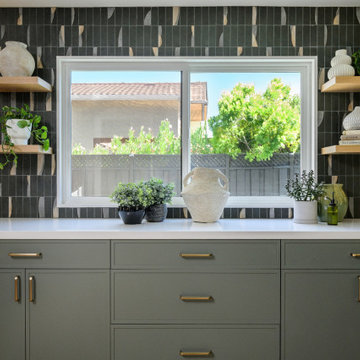
When I began this kitchen project, the space was constrained by an awkward peninsula and a dropped ceiling that compressed the room both physically and visually. Fluorescent fixtures sat behind a plastic diffuser, and the refrigerator was wedged beside the range, leaving the kitchen feeling crowded while also making poor use of the available space. The transformation began by taking things away. The dropped ceiling was removed, the fluorescent tubes went with it, and the room suddenly gained height and light. The peninsula was removed too, opening the floor plan and allowing the cabinetry to continue down an adjacent wall and incorporate a second window. What had been a small, enclosed kitchen became a generous working space with room for a slim, functional L-shaped island, additional cabinetry and, perhaps most importantly, a much more natural relationship between the different parts of the kitchen.
The palette is quiet, but there is a lot happening within it. Soft sage cabinetry grounds the room, while warm white upper cabinets and pantry cabinetry lift the space. A pure white quartz countertop provides a crisp surface against the cabinetry, and soft brass hardware adds just enough warmth. The new Sub Zero refrigerator was given its own wall, beside a full pantry, freeing the range wall to become a strong focal point. A Monogram range now sits centered beneath an angular stainless-steel Zephyr hood, framed by the kitchen's most distinctive element: a graphite backsplash made from WOW Design's Pottery tile. Inspired by Japanese handmade ceramics, the tiles have a wonderfully tactile, imperfect character. Most are deep graphite, but here and there the surface breaks into strokes of camel, dusty peach and deep blue-gunmetal glaze. There is an almost painterly quality to the way those colors move across the wall, giving the kitchen something that is difficult to achieve with a more uniform material—the feeling that someone actually made it.
The rest of the room was designed around that same balance of simplicity and warmth. New pale oak flooring runs throughout the ground floor, bringing a natural material and a soft golden tone beneath the cooler sage and graphite. Floating oak shelves flank the windows and provide a home for plants, ceramics and a few favorite objects, while another pair of shelves beside the refrigerator creates a small landing place for the things that inevitably arrive with you at the end of the day—keys, mail, bags and whatever else happens to be in your hands. The island occupies a surprisingly small footprint, yet its L-shaped form provides both additional work surface and seating without interrupting the flow of the room. A deep sink with an integrated cutting board and roll-up drying rack, a commercial-style faucet and under-cabinet LED lighting bring the practical details up to the same level of thoughtfulness as the larger design decisions. In the end, the renovation did more than just enlarge the kitchen; it created a space that feels calm, contemporary, warm, and a little unexpected … and, most importantly, we created a kitchen that finally makes sense for the way my clients live.
AFTER photos: Bernardo Grijalva
 Fiorito Interior Design
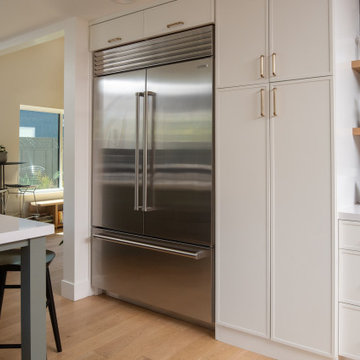
When I began this kitchen project, the space was constrained by an awkward peninsula and a dropped ceiling that compressed the room both physically and visually. Fluorescent fixtures sat behind a plastic diffuser, and the refrigerator was wedged beside the range, leaving the kitchen feeling crowded while also making poor use of the available space. The transformation began by taking things away. The dropped ceiling was removed, the fluorescent tubes went with it, and the room suddenly gained height and light. The peninsula was removed too, opening the floor plan and allowing the cabinetry to continue down an adjacent wall and incorporate a second window. What had been a small, enclosed kitchen became a generous working space with room for a slim, functional L-shaped island, additional cabinetry and, perhaps most importantly, a much more natural relationship between the different parts of the kitchen.
The palette is quiet, but there is a lot happening within it. Soft sage cabinetry grounds the room, while warm white upper cabinets and pantry cabinetry lift the space. A pure white quartz countertop provides a crisp surface against the cabinetry, and soft brass hardware adds just enough warmth. The new Sub Zero refrigerator was given its own wall, beside a full pantry, freeing the range wall to become a strong focal point. A Monogram range now sits centered beneath an angular stainless-steel Zephyr hood, framed by the kitchen's most distinctive element: a graphite backsplash made from WOW Design's Pottery tile. Inspired by Japanese handmade ceramics, the tiles have a wonderfully tactile, imperfect character. Most are deep graphite, but here and there the surface breaks into strokes of camel, dusty peach and deep blue-gunmetal glaze. There is an almost painterly quality to the way those colors move across the wall, giving the kitchen something that is difficult to achieve with a more uniform material—the feeling that someone actually made it.
The rest of the room was designed around that same balance of simplicity and warmth. New pale oak flooring runs throughout the ground floor, bringing a natural material and a soft golden tone beneath the cooler sage and graphite. Floating oak shelves flank the windows and provide a home for plants, ceramics and a few favorite objects, while another pair of shelves beside the refrigerator creates a small landing place for the things that inevitably arrive with you at the end of the day—keys, mail, bags and whatever else happens to be in your hands. The island occupies a surprisingly small footprint, yet its L-shaped form provides both additional work surface and seating without interrupting the flow of the room. A deep sink with an integrated cutting board and roll-up drying rack, a commercial-style faucet and under-cabinet LED lighting bring the practical details up to the same level of thoughtfulness as the larger design decisions. In the end, the renovation did more than just enlarge the kitchen; it created a space that feels calm, contemporary, warm, and a little unexpected … and, most importantly, we created a kitchen that finally makes sense for the way my clients live.
AFTER photos: Bernardo Grijalva
 Fiorito Interior Design
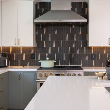
When I began this kitchen project, the space was constrained by an awkward peninsula and a dropped ceiling that compressed the room both physically and visually. Fluorescent fixtures sat behind a plastic diffuser, and the refrigerator was wedged beside the range, leaving the kitchen feeling crowded while also making poor use of the available space. The transformation began by taking things away. The dropped ceiling was removed, the fluorescent tubes went with it, and the room suddenly gained height and light. The peninsula was removed too, opening the floor plan and allowing the cabinetry to continue down an adjacent wall and incorporate a second window. What had been a small, enclosed kitchen became a generous working space with room for a slim, functional L-shaped island, additional cabinetry and, perhaps most importantly, a much more natural relationship between the different parts of the kitchen.
The palette is quiet, but there is a lot happening within it. Soft sage cabinetry grounds the room, while warm white upper cabinets and pantry cabinetry lift the space. A pure white quartz countertop provides a crisp surface against the cabinetry, and soft brass hardware adds just enough warmth. The new Sub Zero refrigerator was given its own wall, beside a full pantry, freeing the range wall to become a strong focal point. A Monogram range now sits centered beneath an angular stainless-steel Zephyr hood, framed by the kitchen's most distinctive element: a graphite backsplash made from WOW Design's Pottery tile. Inspired by Japanese handmade ceramics, the tiles have a wonderfully tactile, imperfect character. Most are deep graphite, but here and there the surface breaks into strokes of camel, dusty peach and deep blue-gunmetal glaze. There is an almost painterly quality to the way those colors move across the wall, giving the kitchen something that is difficult to achieve with a more uniform material—the feeling that someone actually made it.
The rest of the room was designed around that same balance of simplicity and warmth. New pale oak flooring runs throughout the ground floor, bringing a natural material and a soft golden tone beneath the cooler sage and graphite. Floating oak shelves flank the windows and provide a home for plants, ceramics and a few favorite objects, while another pair of shelves beside the refrigerator creates a small landing place for the things that inevitably arrive with you at the end of the day—keys, mail, bags and whatever else happens to be in your hands. The island occupies a surprisingly small footprint, yet its L-shaped form provides both additional work surface and seating without interrupting the flow of the room. A deep sink with an integrated cutting board and roll-up drying rack, a commercial-style faucet and under-cabinet LED lighting bring the practical details up to the same level of thoughtfulness as the larger design decisions. In the end, the renovation did more than just enlarge the kitchen; it created a space that feels calm, contemporary, warm, and a little unexpected … and, most importantly, we created a kitchen that finally makes sense for the way my clients live.
AFTER photos: Bernardo Grijalva

 Montana Timber Products
Complimenting the beautiful Colorado fall colors, this Montana Timber Products home features prefinished ranchwood™ Tackroom, Circle Sawn texture as a vertical installation.
-
The beautiful ranchwood Tackroom color, along with the vertical installation and stone work, combine for a painter's pleasure with the fall birch colors.
-
Our flagship product, ranchwood™ is Montana Timber Products' chemical free, kiln dried, alternative milled rough stock wood.
As an ideal reclaimed lumber alternative, the aesthetically pleasing rustic barn wood ranchwood™ is the result of an environmentally safe production process.
Offering uncompromising natural, rustic beauty, ranchwood™ is typically less expensive than antique reclaimed barnwood.
-
Combined textures solidify into a beautiful rustic brew.
-
A custom millwork shop, Montana Timber Products offers many options to the customer's delight.
Circle Sawn and Wire Brushed are Montana Timber Products' common cedar siding texturizing options.
The Circle Sawn texture commonly seen on rustic reclaimed barn wood is created from the large circular saw blades used in more traditional milling practices.
The Wire Brushed option adds physical and aesthetic depth to the wood grain.
In addition to the aesthetic beauty added from the texturing process, greater surface area is created, which allows the Seal-Once, 100% NO VOC waterproofer to more effectively penetrate the wood.
Guarneteed for ten years, Seal-Once prevents water ingress and is safe for exterior and interior use, children and pets.
-
Sophistication is no stranger to rustic application if done properly, as seen here with distinct lines and harmonious collaboration of wood and stone.
-
If the environment is important to you, Montana Timber Products natural wood siding, trim, flooring, interior accents, timbers, beams -- all of our wood products -- do not use degenerative chemicals as some other companies do to achieve desired effects.
Reclaimed wood, barn wood alternatives, and faux vintage wood are popular building materials further exemplified by Montana Timber Products environmentally friendly manufacturing technique.

 Fiorito Interior Design
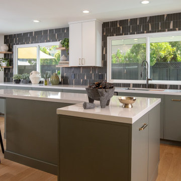
When I began this kitchen project, the space was constrained by an awkward peninsula and a dropped ceiling that compressed the room both physically and visually. Fluorescent fixtures sat behind a plastic diffuser, and the refrigerator was wedged beside the range, leaving the kitchen feeling crowded while also making poor use of the available space. The transformation began by taking things away. The dropped ceiling was removed, the fluorescent tubes went with it, and the room suddenly gained height and light. The peninsula was removed too, opening the floor plan and allowing the cabinetry to continue down an adjacent wall and incorporate a second window. What had been a small, enclosed kitchen became a generous working space with room for a slim, functional L-shaped island, additional cabinetry and, perhaps most importantly, a much more natural relationship between the different parts of the kitchen.
The palette is quiet, but there is a lot happening within it. Soft sage cabinetry grounds the room, while warm white upper cabinets and pantry cabinetry lift the space. A pure white quartz countertop provides a crisp surface against the cabinetry, and soft brass hardware adds just enough warmth. The new Sub Zero refrigerator was given its own wall, beside a full pantry, freeing the range wall to become a strong focal point. A Monogram range now sits centered beneath an angular stainless-steel Zephyr hood, framed by the kitchen's most distinctive element: a graphite backsplash made from WOW Design's Pottery tile. Inspired by Japanese handmade ceramics, the tiles have a wonderfully tactile, imperfect character. Most are deep graphite, but here and there the surface breaks into strokes of camel, dusty peach and deep blue-gunmetal glaze. There is an almost painterly quality to the way those colors move across the wall, giving the kitchen something that is difficult to achieve with a more uniform material—the feeling that someone actually made it.
The rest of the room was designed around that same balance of simplicity and warmth. New pale oak flooring runs throughout the ground floor, bringing a natural material and a soft golden tone beneath the cooler sage and graphite. Floating oak shelves flank the windows and provide a home for plants, ceramics and a few favorite objects, while another pair of shelves beside the refrigerator creates a small landing place for the things that inevitably arrive with you at the end of the day—keys, mail, bags and whatever else happens to be in your hands. The island occupies a surprisingly small footprint, yet its L-shaped form provides both additional work surface and seating without interrupting the flow of the room. A deep sink with an integrated cutting board and roll-up drying rack, a commercial-style faucet and under-cabinet LED lighting bring the practical details up to the same level of thoughtfulness as the larger design decisions. In the end, the renovation did more than just enlarge the kitchen; it created a space that feels calm, contemporary, warm, and a little unexpected … and, most importantly, we created a kitchen that finally makes sense for the way my clients live.
AFTER photos: Bernardo Grijalva
 Fiorito Interior Design
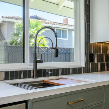
When I began this kitchen project, the space was constrained by an awkward peninsula and a dropped ceiling that compressed the room both physically and visually. Fluorescent fixtures sat behind a plastic diffuser, and the refrigerator was wedged beside the range, leaving the kitchen feeling crowded while also making poor use of the available space. The transformation began by taking things away. The dropped ceiling was removed, the fluorescent tubes went with it, and the room suddenly gained height and light. The peninsula was removed too, opening the floor plan and allowing the cabinetry to continue down an adjacent wall and incorporate a second window. What had been a small, enclosed kitchen became a generous working space with room for a slim, functional L-shaped island, additional cabinetry and, perhaps most importantly, a much more natural relationship between the different parts of the kitchen.
The palette is quiet, but there is a lot happening within it. Soft sage cabinetry grounds the room, while warm white upper cabinets and pantry cabinetry lift the space. A pure white quartz countertop provides a crisp surface against the cabinetry, and soft brass hardware adds just enough warmth. The new Sub Zero refrigerator was given its own wall, beside a full pantry, freeing the range wall to become a strong focal point. A Monogram range now sits centered beneath an angular stainless-steel Zephyr hood, framed by the kitchen's most distinctive element: a graphite backsplash made from WOW Design's Pottery tile. Inspired by Japanese handmade ceramics, the tiles have a wonderfully tactile, imperfect character. Most are deep graphite, but here and there the surface breaks into strokes of camel, dusty peach and deep blue-gunmetal glaze. There is an almost painterly quality to the way those colors move across the wall, giving the kitchen something that is difficult to achieve with a more uniform material—the feeling that someone actually made it.
The rest of the room was designed around that same balance of simplicity and warmth. New pale oak flooring runs throughout the ground floor, bringing a natural material and a soft golden tone beneath the cooler sage and graphite. Floating oak shelves flank the windows and provide a home for plants, ceramics and a few favorite objects, while another pair of shelves beside the refrigerator creates a small landing place for the things that inevitably arrive with you at the end of the day—keys, mail, bags and whatever else happens to be in your hands. The island occupies a surprisingly small footprint, yet its L-shaped form provides both additional work surface and seating without interrupting the flow of the room. A deep sink with an integrated cutting board and roll-up drying rack, a commercial-style faucet and under-cabinet LED lighting bring the practical details up to the same level of thoughtfulness as the larger design decisions. In the end, the renovation did more than just enlarge the kitchen; it created a space that feels calm, contemporary, warm, and a little unexpected … and, most importantly, we created a kitchen that finally makes sense for the way my clients live.
AFTER photos: Bernardo Grijalva
 Fiorito Interior Design
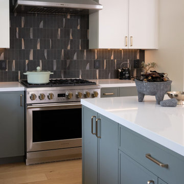
When I began this kitchen project, the space was constrained by an awkward peninsula and a dropped ceiling that compressed the room both physically and visually. Fluorescent fixtures sat behind a plastic diffuser, and the refrigerator was wedged beside the range, leaving the kitchen feeling crowded while also making poor use of the available space. The transformation began by taking things away. The dropped ceiling was removed, the fluorescent tubes went with it, and the room suddenly gained height and light. The peninsula was removed too, opening the floor plan and allowing the cabinetry to continue down an adjacent wall and incorporate a second window. What had been a small, enclosed kitchen became a generous working space with room for a slim, functional L-shaped island, additional cabinetry and, perhaps most importantly, a much more natural relationship between the different parts of the kitchen.
The palette is quiet, but there is a lot happening within it. Soft sage cabinetry grounds the room, while warm white upper cabinets and pantry cabinetry lift the space. A pure white quartz countertop provides a crisp surface against the cabinetry, and soft brass hardware adds just enough warmth. The new Sub Zero refrigerator was given its own wall, beside a full pantry, freeing the range wall to become a strong focal point. A Monogram range now sits centered beneath an angular stainless-steel Zephyr hood, framed by the kitchen's most distinctive element: a graphite backsplash made from WOW Design's Pottery tile. Inspired by Japanese handmade ceramics, the tiles have a wonderfully tactile, imperfect character. Most are deep graphite, but here and there the surface breaks into strokes of camel, dusty peach and deep blue-gunmetal glaze. There is an almost painterly quality to the way those colors move across the wall, giving the kitchen something that is difficult to achieve with a more uniform material—the feeling that someone actually made it.
The rest of the room was designed around that same balance of simplicity and warmth. New pale oak flooring runs throughout the ground floor, bringing a natural material and a soft golden tone beneath the cooler sage and graphite. Floating oak shelves flank the windows and provide a home for plants, ceramics and a few favorite objects, while another pair of shelves beside the refrigerator creates a small landing place for the things that inevitably arrive with you at the end of the day—keys, mail, bags and whatever else happens to be in your hands. The island occupies a surprisingly small footprint, yet its L-shaped form provides both additional work surface and seating without interrupting the flow of the room. A deep sink with an integrated cutting board and roll-up drying rack, a commercial-style faucet and under-cabinet LED lighting bring the practical details up to the same level of thoughtfulness as the larger design decisions. In the end, the renovation did more than just enlarge the kitchen; it created a space that feels calm, contemporary, warm, and a little unexpected … and, most importantly, we created a kitchen that finally makes sense for the way my clients live.
AFTER photos: Bernardo Grijalva
 Tile Doctor Ltd
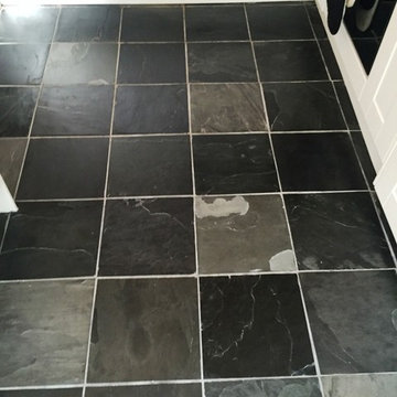
These Slate kitchen floor tiles at a property in Oxford were in good physical condition, but had become dull over time due to heavy usage, and upon close inspection the grout was stained. The customer contacted me as she was keen to get the tiles back to looking their best. This would require a thorough clean and the application of a fresh sealer.
While Slate floor tiles are reputed to be hard wearing and damage resistant – and are therefore a popular choice for high traffic areas like kitchens – this does not exclude them from needing regular maintenance.
To begin, I mixed a strong solution of Tile Doctor Pro Clean and water. Pro-Clean is a versatile cleaner that when used in a weak dilution can be used as a regular cleaner for most types of natural stone floor, including more sensitive stones such as Limestone and Marble.
The cleaning was then spread across the surface area of the floor, and left it to dwell for ten minutes to allow the solution to seep into the pores of the stone and lift the ingrained dirt to the surface. Pro-Clean in a strong dilution also functions as a stripping product, meaning it works to strip away any old and ineffectual sealer.
I then scrubbed the solution into the floor using a stiff scrubbing brush, paying particular attention to the grout in order to break down the visible staining. The tiles and grout lines came up really well during the cleaning process – this became clear once I had rinsed the floor and removed the residue using a wet vacuum.
With the customer eager to have the job completed quickly, I installed portable room dryers and utilised a heat gun to dry the floor, allowing me to seal it on the same day.
Once I had ensured the floor was completely dry, I commenced the sealing process by firstly applying a coat of Tile Doctor Stone Oil, a product which is designed to bring out all of the natural dark shades in the Slate.
When this was dry, I applied a single coat of Tile Doctor Colour Grow. This is an impregnating sealer, meaning that it soaks into pores of the stone to provide durable protection from within against ingrained dirt and stains. Colour Grow also enhances the natural colours in the stone even further.
The customer was amazed by just how big a difference could be made to the tiles in the space of just a day. Although the tiles were generally in very good nick, my main task was to be liven them up – judging by the before and after photos, I think this was achieved. And, now that they have been treated to a fresh seal, the tiles will be prevented from quickly becoming dull again.
Barry Woodward
Oxfordshire Tile Doctor
 Natural Stone Institute
Tucker Design Awards celebrate the innovation and vision that designers bring to their projects through the specification and use of natural stone materials. For members of the Natural Stone Institute, acknowledgement as a contributor to a Tucker Design Awards winning project is a genuine tribute to their traditional values, physicality of work and dedication to precise specifications required in the realization of such accomplished architectural design.
Landscape Architect
Design Workshop, Aspen, CO
Architect
Poss Architecture, Aspen, CO
Landscape Contractor
Landscape Workshop, Carbondale, CO
Stone Supplier/Installer
Gallegos Corporation, Wolcott, CO
Stone Quarry
Arkins Park Stone, Loveland, CO
Within walled boundaries, Woody Creek Garden embraces its high alpine environment through explorations of stone and water that serve as unifying elements of form in the design of the various outdoor spaces. Through striking and distinctively detailed stonework, water is portrayed in its various states and forms – atmospheric mist, single rivulets, cascades, and still pools. Two courtyards interlink the residence allowing each room to enjoy the visual landscape. In the entrance courtyard, the sound from a carved 24”x 24” cut-granite fountain reverberates throughout the walled space. Placed for gathering and quiet contemplation, a pin-wheel arrangement of sculptural, granite slabs provide a honed surface for sitting while providing year-round interest. Each stone was individually specified with intentionally spaced core fractures, utilizing the extraction method to serve as sculpted details. Large sandstone pavers, set in sand and cut in an irregular, but geometric fashion bring a sense of modernity to the space. Throughout the property, stone detailing seek to heighten one’s experience of the landscape and views. Upon the home’s entry, an 18” rectilinear cut in the freestanding stone wall frames a distant peak, creating a singular reference to the outside world in this encased space. Emerging from the center of an organically-shaped carved sandstone slab, water is carried along a narrow 2” runnel sandstone cap, disappearing into the framed horizon. This glimpse to the west is the only opening in the tightly enclosed courtyard. From its opposite aspect, the feature creates a welcoming gesture at the home’s front entrance. The slender rivulet of water trickles from the sandstone slab above onto a honed granite plane, set within a sandstone terrace In contrast, a second promontory courtyard commands a strong presence over its alpine setting, leaving the steeply sloping site undisturbed. A 12’x 40’ reflecting pool – a thin sheet of water over honed black granite – captures the form and silence of the everchanging natural environment on its taut surface. Along its edge, water flows over a ½” radius edge, disappearing into a recirculating slot. Commissioned by Italian artist Bruno Romeda, a bronze sculpture rests upon an elevated granite plinth. Along its western edge, designers crafted a two-tiered, infinity edge detail. In the first vertical drop, water flows between the pool and perimeter stone walls, landing onto an intermediate bench, while the second drop introduces a chamfered edge, allowing water to embrace the vertical relief without splashing. Sandstone terraces provide continuous access to the various landscape features of the garden. At the base of the battered perimeter walls, a sandstone path leads to a fire pit, encircled by lichen-covered boulders. Along the courtyard’s eastern perimeter, water appears to emerge from the hillside, fracturing and falling against the irregular vertical stone wall, melting in a curtain-like formation behind the spa. The colors, distinctive detailing and striking stonework were selected based on their appropriateness to the context. From above, a rectilinear pool lies behind the wall, silently mirroring the sky above and offering no ostensible connection to the structure or to its source.
 Natural Stone Institute
Tucker Design Awards celebrate the innovation and vision that designers bring to their projects through the specification and use of natural stone materials. For members of the Natural Stone Institute, acknowledgment as a contributor to a Tucker Design Awards winning project is a genuine tribute to their traditional values, physicality of work, and dedication to precise specifications required in the realization of such accomplished architectural design.
Landscape Architect
Design Workshop, Aspen, CO
Landscape Contractor/
Installer
Landscape Workshop, Carbondale, CO
Stone Installer
JD Masonry, Arvada, CO
Stone Suppliers
Coldspring, Cold Spring, MN
Gallegos Corporation, Vail, CO
Through a collective dialogue between landscape, architecture and interior design, a new vision reimagines the disturbed site into a livable landscape, emblematic of our American West. The residence – an ensemble of structures designed in a modern ranch vernacular – is effortlessly unified through layered, interconnected outdoor gathering spaces and regional materials that elaborates upon the experience of moving between structures, heightening and renewing one’s sense of place. Upon entering the courtyard, one is immediately aware of seamless and unfolding relationships between architecture and landscape through a sophisticated, regional palette of natural stone, water, and plants. Set upon architectural focal points, two perpendicular sandstone paths descend into the space and converge upon a monolithic, hand-carved granite fountain. The design of the fountain is purposefully quiet, both in its detailing and operation. The feature includes a recessed interior, allowing water to become still before it reaches the surface, with lightly cleft sides, allowing the water to delicately bounce as it descends into the geometric lower granite basin. The landscape architect’s selection of various stone material extends the tones of the home’s granite walls and contextual surroundings into the garden, but also be detailed in a manner that balances rural and modern qualities. The majority of the paving is constructed of rectilinear gray sandstone with a natural finish and snapped edges, laid in a staggered running bond organization. Throughout the garden, thoughtful attention was also given to the configuration and layout of terraces, pathways, and steps. In doing so, this ensured that the edges of the terrace and its interface to other elements were designed so that no “leftover” stone paver pieces would be found. Within the central courtyard, split-faced stone stairs descend into a rectilinear plinth of lawn, punctuated by a carved granite fire pit. Leveraging the property’s existing topographic relief, a shallow infinity-edge dipping pool abstracts the transparent and cavity-like pools found throughout the Rocky Mountains. The design purposefully achieves the illusion of a larger water feature with the distant pond and offers a refreshing recreational element. Containing the infinity edge, a designed granite escarpment emerges from the meadow, juxtaposing the geometric water feature and providing informal seating ledges. The site’s prior use required the landscape architect to incorporate a highly technical and complex sub-surface structural system. The initial geotechnical report identified the building envelopes rested on 12 feet of man-placed fill. Assuming a 1 percent settlement, the team faced concerns that the terraces would settle up to 12 inches. In response, a grid of structural micro-piles provides the necessary foundation for the construction of terraces immediately outside of the architecture, under the water features and site walls. The solution enabled the crisp detailing and design resolution of the architectural structures to seamlessly connect with the horizontal stone terraces.
Sponsored
Columbus, OH

Hope Restoration & General Contracting
Columbus Design-Build, Kitchen & Bath Remodeling, Historic Renovations
 Montana Timber Products
here: Colorado
What: Residential
Product: ranchwood™ color: Southern
Solution: Wire Brushed, Shiplap, fascia, soffit
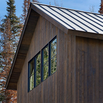
This Colorado home feature's Montana Timber Products prefinished rustic ranchwood™ siding, featuring Wire Brushed texture in the color Southern, applied as fascia and soffit.
ranchwood™ is Montana Timber Products' flagship rustic natural wood siding, a reclaimed barn wood alternative that is milled from new, rough stock, kiln dried, chemical free wood.
ranchwood™ is put through a texturizing and coloring process that creates aesthetically beautiful rustic wood siding and authentic reclaimed barn wood and reclaimed lumber alternatives.
Typically less expensive than authentic reclaimed barn wood, ranchwood™ offers uncompromising rustic wood beauty.
Circle Sawn and Wire Brushed are Montana Timber Products' common cedar siding texturizing options.
The Circle Sawn texture commonly seen on rustic reclaimed barn wood is created from the large circular saw blades used in more traditional milling practices.
The Wire Brushed option adds physical and aesthetic depth to the wood grain.
In addition to the aesthetic beauty added from the texturing process, greater surface area is created, which allows the Seal-Once, a 100% NO VOC waterproofer with a 10 year limited warranty against water ingress and safe for interior and exterior use, pets and children.
If environmentally friendly and the renewable aspect of natural wood siding is important to you, be sure to do your homework when choosing your siding, flooring, interior accents, trim, beams, timbers, or other wood siding products. Some companies choose to use degenerative chemicals to achieve the desired look and texture of rustic wood siding. This is not the case with Montana Timber Products.
Vintage wood, reclaimed barn wood and reclaimed barn wood alternatives are very popular building materials due to their aesthetic beauty, traditional look, and chemical free finish.
 Montana Timber Products
This Colorado home feature's Montana Timber Products prefinished ranchwood™ natural rustic siding, as epitomized by this charming residence.
-
Montana Timber Products' flagship product, ranchwood™, is a reclaimed barnwood alternative milled from new, kiln dried, chemical free, rough stock wood.
Put through a colorizing and texturizing process, ranchwood™ is an aesthetically pleasing authentic reclaimed barn wood, rustic wood siding.
ranchwood™ offers uncompromising rustic wood beauty typically less expensive than antique reclaimed barnwood.
-
Montana Timber Products is a custom millwork shop as shown with this application of a vertically installed shiplap milled with a 1/4" reveal. This reveal creates nice shadow lines and a multi-dimensional aesthetic to the finish of this siding.
Wire Brushed and Circle Sawn are Montana Timber Products typical texturizing options. Circle Sawn texture seen on Montana Timber Products natural wood siding is created by large circular saw blades used in more traditional milling practices. Added physical and aesthetic depth to the wood grain is available as the Wire Brushed option.
Greater surface area is added during the texturizing process, allowing Seal-Once, 100% NO VOC waterfproofer to more effectively penetrate the wood.
Seal-Once is guaranteed for ten years from water ingress and is safe for exterior and interior use, pets and children.
-
Montana Timber Products does not use degenerative chemicals like some companies do to achieve texture and color. Environmentally responsible, Montana Timber Products produces wood siding, interior accents, flooring, reclaimed wood, beams, barn wood alternatives with environmentally friendly manufacturing techniques.
 Montana Timber Products
This featured project utilizes Montana Timber Products' ranchwood™ reclaimed barn wood alternative siding, our flagship product. ranchwood™ is a reclaimed barn wood alternative that it is milled from new, rough stock, kiln dried, chemical free wood.
ranchwood™ is put through a texturizing and coloring process to create the aesthetic beauty of rustic wood siding. Authentic reclaimed barn wood and reclaimed barn wood alternatives are both great choices for your next home project.
Typically less expensive than authentic reclaimed barn wood, ranchwood™ offers an uncompromising rustic wood beauty.
Vintage wood, reclaimed barn wood and reclaimed barn wood alternatives are very popular building materials due to their aesthetic beauty, traditional look, and chemical free finish.
If the environmentally friendly aspect of natural wood siding is important to you, be sure to do your homework when choosing your siding, interior accents, trim, timbers, or other wood siding products. Some companies choose to use degenerative chemicals to achieve the desired look and texture of rustic wood siding. This is not the case with Montana Timber Products.
Montana Timber Product's most commonly seen rustic siding texture options are Circle Sawn and Wire Brushed.
The Circle Sawn texture commonly seen on rustic reclaimed barn wood is created from the large circular saw blades used in more traditional milling practices. The Wire Brushed option, like the Circle Sawn, adds physical and aesthetic depth to the wood grain. In addition to the aesthetic beauty added from the texturing process, greater surface area is created, which allows the Seal-Once, 100% NO VOC waterproofer to more effectively penetrate the wood.
Whether you are looking for siding, beams, flooring, or interior accents, Montana Timber Products offers a solution for your rustic needs. All Montana Timber Products’ prefinished wood siding utilizes Seal-Once, a 100% NO VOC waterproofer with a 10 year limited warranty against water ingress.
 Montana Timber Products
This featured project utilizes Montana Timber Products' ranchwood™ reclaimed barn wood alternative siding, our flagship product. ranchwood™ is a reclaimed barn wood alternative that it is milled from new, rough stock, kiln dried, chemical free wood.
ranchwood™ is put through a texturizing and coloring process to create the aesthetic beauty of rustic wood siding. Authentic reclaimed barn wood and reclaimed barn wood alternatives are both great choices for your next home project.
Typically less expensive than authentic reclaimed barn wood, ranchwood™ offers an uncompromising rustic wood beauty.
Vintage wood, reclaimed barn wood and reclaimed barn wood alternatives are very popular building materials due to their aesthetic beauty, traditional look, and chemical free finish.
If the environmentally friendly aspect of natural wood siding is important to you, be sure to do your homework when choosing your siding, interior accents, trim, timbers, or other wood siding products. Some companies choose to use degenerative chemicals to achieve the desired look and texture of rustic wood siding. This is not the case with Montana Timber Products.
Montana Timber Product's most commonly seen rustic siding texture options are Circle Sawn and Wire Brushed.
The Circle Sawn texture commonly seen on rustic reclaimed barn wood is created from the large circular saw blades used in more traditional milling practices. The Wire Brushed option, like the Circle Sawn, adds physical and aesthetic depth to the wood grain. In addition to the aesthetic beauty added from the texturing process, greater surface area is created, which allows the Seal-Once, 100% NO VOC waterproofer to more effectively penetrate the wood.
Whether you are looking for siding, beams, flooring, or interior accents, Montana Timber Products offers a solution for your rustic needs. All Montana Timber Products’ prefinished wood siding utilizes Seal-Once, a 100% NO VOC waterproofer with a 10 year limited warranty against water ingress.
Sponsored
Columbus, OH
Hope Restoration & General Contracting
Columbus Design-Build, Kitchen & Bath Remodeling, Historic Renovations
 Montana Timber Products
This featured project utilizes Montana Timber Products' ranchwood™ reclaimed barn wood alternative siding, our flagship product. ranchwood™ is a reclaimed barn wood alternative that it is milled from new, rough stock, kiln dried, chemical free wood.
ranchwood™ is put through a texturizing and coloring process to create the aesthetic beauty of rustic wood siding. Authentic reclaimed barn wood and reclaimed barn wood alternatives are both great choices for your next home project.
Typically less expensive than authentic reclaimed barn wood, ranchwood™ offers an uncompromising rustic wood beauty.
Vintage wood, reclaimed barn wood and reclaimed barn wood alternatives are very popular building materials due to their aesthetic beauty, traditional look, and chemical free finish.
If the environmentally friendly aspect of natural wood siding is important to you, be sure to do your homework when choosing your siding, interior accents, trim, timbers, or other wood siding products. Some companies choose to use degenerative chemicals to achieve the desired look and texture of rustic wood siding. This is not the case with Montana Timber Products.
Montana Timber Product's most commonly seen rustic siding texture options are Circle Sawn and Wire Brushed.
The Circle Sawn texture commonly seen on rustic reclaimed barn wood is created from the large circular saw blades used in more traditional milling practices. The Wire Brushed option, like the Circle Sawn, adds physical and aesthetic depth to the wood grain. In addition to the aesthetic beauty added from the texturing process, greater surface area is created, which allows the Seal-Once, 100% NO VOC waterproofer to more effectively penetrate the wood.
Whether you are looking for siding, beams, flooring, or interior accents, Montana Timber Products offers a solution for your rustic needs. All Montana Timber Products’ prefinished wood siding utilizes Seal-Once, a 100% NO VOC waterproofer with a 10 year limited warranty against water ingress.

 Alykhan Velji Design
Inspiration for a contemporary gray floor bathroom remodel in Calgary with flat-panel cabinets, white cabinets, white walls, an undermount sink and white countertops
 Montana Timber Products
This Colorado home feature's Montana Timber Products prefinished ranchwood™ natural rustic siding, as epitomized by this charming residence.
-
Montana Timber Products' flagship product, ranchwood™, is a reclaimed barnwood alternative milled from new, kiln dried, chemical free, rough stock wood.
Put through a colorizing and texturizing process, ranchwood™ is an aesthetically pleasing authentic reclaimed barn wood, rustic wood siding.
ranchwood™ offers uncompromising rustic wood beauty typically less expensive than antique reclaimed barnwood.
-
Montana Timber Products is a custom millwork shop as shown with this application of a vertically installed shiplap milled with a 1/4" reveal. This reveal creates nice shadow lines and a multi-dimensional aesthetic to the finish of this siding.
Wire Brushed and Circle Sawn are Montana Timber Products typical texturizing options. Circle Sawn texture seen on Montana Timber Products natural wood siding is created by large circular saw blades used in more traditional milling practices. Added physical and aesthetic depth to the wood grain is available as the Wire Brushed option.
Greater surface area is added during the texturizing process, allowing Seal-Once, 100% NO VOC waterfproofer to more effectively penetrate the wood.
Seal-Once is guaranteed for ten years from water ingress and is safe for exterior and interior use, pets and children.
-
Montana Timber Products does not use degenerative chemicals like some companies do to achieve texture and color. Environmentally responsible, Montana Timber Products produces wood siding, interior accents, flooring, reclaimed wood, beams, barn wood alternatives with environmentally friendly manufacturing techniques.
7