
Search results for "Physically habit forming" in Home Design Ideas


 Advance Design Studio, Ltd.
Curtis and Peggy had been thinking of a kitchen remodel for quite some time, but they knew their house would have a unique set of challenges. Their older Victorian house was built in 1891. The kitchen cabinetry was original, and they wanted to keep the authenticity of their period home while adding modern comforts that would improve their quality of life.
A friend recommended Advance Design Studio for their exceptional experience and quality of work. After meeting with designer Michelle Lecinski at Advance Design, they were confident they could partner with Advance to accomplish the unique kitchen renovation they’d been talking about for years. “We wanted to do the kitchen for a long, long time,” Curtis said. “(We asked ourselves) what are we actually going to do? How are we going to do this? And who are we going to find to do exactly what we want?”
The goal for the project was to keep the home renovation and new kitchen feeling authentic to the time in which it was built. They desperately wanted the modern comforts that come with a larger refrigerator and the dishwasher that they never had! The old home was also a bit drafty so adding a fireplace, wall insulation and new windows became a priority. They very much wanted to create a comfortable hearth room adjacent to the kitchen, complete with old world brick.
The original cabinetry had to go to make way for beautiful new kitchen cabinetry that appears as if it was a hundred years old, but with all the benefits of cutting-edge storage, self-closing drawers, and a brand-new look. “We just wanted to keep it old looking, but with some modern updates,” Peggy said.
Dura Supreme Highland Cabinets with a Heritage Old World Painted Finish replaced the original 1891 cabinets. The hand-applied careful rubbed-off detailing makes these exquisite cabinets look as if they came from a far-gone era. Despite the small size of the kitchen, Peggy, Curtis and Michelle utilized every inch with custom cabinet sizes to increase storage capacity. The custom cabinets allowed for the addition of a 24” Fisher Paykel dishwasher with a concealing Dura Supreme door panel. Michelle was also able to work into the new design a larger 30” Fisher Paykel French refrigerator. “We made every ¼ inch count in this small space,” designer Michelle said. “Having the ability to custom size the cabinetry was the only way to achieve this.”
“The kitchen essentially was designed around the Heartland Vintage range and oven,” says Michelle. A classic appliance that combines nostalgic beauty and craftsmanship for modern cooking, with nickel plated trim and elegantly shaped handles and legs; the not to miss range is a striking focal point of the entire room and an engaging conversation piece.
Granite countertops in Kodiak Satin with subtle veining kept with the old-world style. The delicate porcelain La Vie Crackle Sonoma tile kitchen backsplash compliments the home’s style perfectly. A handcrafted passthrough designed to show off Peggy’s fine china was custom built by project carpenters Justin Davis and Jeff Dallain to physically and visually open the space. Additional storage was created in the custom panty room with Latte Edinburg cabinets, hand-made weathered wood shelving with authentic black iron brackets, and an intricate tin copper ceiling.
Peggy and Curtis loved the idea of adding a Vermont stove to make the hearth-room not only functional, but a truly beckoning place to be. A stunning Bordeaux red Vermont Castings Stove with crisp black ventilation was chosen and combined with the authentic reclaimed Chicago brick wall. Advance’s talented carpenters custom-built elegant weathered shelves to house family memorabilia, installed carefully chosen barn sconces, and made the hearth room an inviting place to relax with a cup of coffee and a good book.
“Peggy and Curtis’ project was so much fun to work on. Creating a space that looks and feels like it always belonged in this beautiful old Victorian home is a designer’s dream. To see the delight in their faces when they saw the design details coming together truly made it worth the time and effort that went into making the very compact kitchen space work”, said Michelle. “The result is an amazing custom kitchen, packed with functionality in every inch, nook and cranny!” exclaims Michelle.
The renovation didn’t end with the kitchen. New Pella windows were added to help lessen the drafts. The removal of the original windows and trim necessitated the re-creation of hand-made corbels and trim details no longer available today. The talented carpenter team came to the rescue, crafting new pieces and masterfully finishing them as if they were always there. New custom gutters were formed and installed with a front entry rework necessary to accommodate the changes.
The whole house functions better, but it still feels like the original 1891 home. “From start to finish it’s just a much better space than we used to have,” Peggy said. “Jeff and Justin were amazing.” Curtis added; “We were lucky to find Advance Design, because they really came through for us. I loved that they had everything in house, anything you needed to have done, they could do it”.
Find the right local pro for your project
 Dwellify
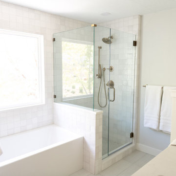
In this primary bathroom remodel, a once uninspiring space was completely transformed into a fresh and modern bathroom that excelled in both aesthetics and functionality. To achieve this, the room was opened up by removing parts of the walls surrounding the shower and toilet. The introduction of a half pony wall struck a perfect balance, offering privacy while allowing light to flow freely throughout the room. Unique and stylish tiles were meticulously chosen for the shower and bathtub, injecting a sense of intentionality into the overall design. A beautiful new vanity became the centerpiece, complemented by a large mirror and new vanity lighting to complete the look. The addition of gold fixtures throughout the room added a touch of luxury, elevating the bathroom into a space that marries both form and function seamlessly.



 safe ZOnea
Maintaining a pest-free home requires attention throughout the year. Seasonal changes affect pest behavior, and understanding these patterns can save homeowners from costly damage and health hazards. In this guide, we will explore practical strategies for spring pest prevention tips, ensuring your property stays protected through every season. From spotting early signs to implementing proactive measures, these steps empower homeowners to take control before infestations occur.
Understanding Seasonal Pest Patterns
Pests adapt to changing weather, and knowing their patterns helps prevent infestations effectively.
Spring: Awakening Pests
Spring signals the end of winter dormancy for many pests. Rodents, ants, and termites start seeking food and warmth. Effective spring pest prevention tips include:
● Cleaning gutters and removing debris
● Sealing cracks and gaps in exterior walls
● Inspecting wood piles and compost areas
● Monitoring early signs of termite activity
Pro Tip: Conduct a termite inspection or a professional evaluation to catch infestations early before they spread.
Summer: Peak Pest Season
Warm temperatures accelerate pest breeding cycles. For a comprehensive summer pest prevention guide:
● Maintain lawns and trim vegetation away from homes
● Check window and door screens for tears
● Store food in sealed containers
● Inspect water sources that attract mosquitoes
Do You Know? Mosquitoes can lay eggs in a teaspoon of water. Eliminating stagnant water is crucial to reducing their population.
Fall: Preparing for Winter
As temperatures drop, pests search for warm indoor spaces. Key actions include:
● Inspecting for winter rodent entry points
● Sealing attic vents, crawl spaces, and foundation gaps
● Cleaning storage areas to minimize hiding spots
● Checking chimney and fireplace openings
Quick Fact: Rodents can enter homes through openings as small as ¼ inch.
Seasonal Pest Checklist for Homeowners
Creating a structured seasonal pest checklist simplifies preventive measures and ensures nothing is overlooked.
Season
Key Actions
Spring
Inspect for termites, seal exterior gaps, clean gutters, and check compost
Summer
Repair screens, trim vegetation, remove standing water, and secure food
Fall
Seal entry points, inspect attic/crawlspace, clear debris, and prepare storage
Winter
Monitor indoor activity, keep firewood away from walls, and maintain traps
Inspection & Maintenance Tips
● Schedule annual pest inspections by professional Virginia pest control consultation to detect hidden problems
● Keep a log of pest sightings and treatment dates
● Regularly replace weather stripping and caulk cracks
Note: Even small preventive steps, when consistently applied, drastically reduce infestations.
Common Pests and Their Seasonal Behaviors
Understanding how different pests behave each season helps homeowners take timely action to protect their property.
● Ants and Termites: Ants emerge in spring seeking food, while termites become active and can damage wood unnoticed. Early detection is critical.
● Rodents and Mice: Fall and winter increase rodent intrusions. Block all entry points and keep food sealed.
● Mosquitoes and Flies: Summer creates the ideal breeding environment for mosquitoes. Eliminate standing water and use physical barriers like nets.
● Spiders and Other Insects: Seasonal shifts cause spiders to move indoors. Regular vacuuming and decluttering reduce hiding spots.
Eco-Friendly Prevention Methods
● Use natural repellents like peppermint oil or diatomaceous earth
● Encourage beneficial insects, such as ladybugs, to reduce pest populations
● Plant pest-deterring plants near home boundaries, like marigolds or lavender
Integrated Pest Management (IPM)
Adopt an IPM approach by combining physical barriers, monitoring, and environmentally safe treatments. This minimizes chemical use while maintaining a pest-free home.
Quote: “Prevention is the most effective form of pest control.” – National Pest Management Association
Seasonal Pest Prevention Tools
● Snap traps and humane rodent traps
● Sticky traps for insects
● Outdoor perimeter sprays (eco-friendly)
● Moisture meters to detect early termite or mold problems
Pro Tip: Keep tools organized and accessible to act quickly when pest activity is noticed.
Planning: Annual Pest Calendar
Month
Recommended Action
March-April
Spring pest prevention tips: Inspect, seal, clean gutters
June-July
Summer pest prevention guide: Screens, standing water, food storage
September
Seasonal pest checklist: Seal entries, declutter, prep storage
November
Winter rodent entry points: Monitor indoors, maintain traps
Key Takeaways
● Seasonal awareness prevents infestations and property damage
● Consistent inspections and maintenance are essential
● Simple eco-friendly measures can significantly reduce pests
● Use a structured checklist and calendar for effective prevention
Conclusion
Homeowners who stay proactive and follow spring pest prevention tips, along with year-round monitoring, ensure their properties remain safe and comfortable. Using a summer pest prevention guide, checking winter rodent entry points, and maintaining a seasonal pest checklist ensure your home remains safe and comfortable. Remember to combine inspections, physical barriers, and environmentally friendly methods for the best results.
FAQs
Q1: How often should I perform a termite inspection?
A1: Conduct inspections annually, especially in spring, to detect early signs of termite activity and prevent extensive damage.
Q2: Can pests enter my home during winter?
A2: Yes, rodents and insects seek warmth and shelter indoors. Sealing entry points and monitoring for activity is crucial.
Q3: What is the most effective eco-friendly method for pest prevention?
A3: Using natural repellents, encouraging beneficial insects, and eliminating water sources effectively reduces pest populations without chemicals.
Ensure your home is ready for every season. Schedule a professional Virginia pest control consultation or a termite inspection in Suffolk, VA, today and stay ahead of potential infestations.



Sponsored
Westerville, OH

Custom Home Works
Franklin County's Award-Winning Design, Build and Remodeling Expert

 Linebox Studio
L'histoire
Le parc McKellar d'Ottawa, développé dans les années 50, a émergé en tant que banlieue proche très recherchée avec des arbres matures, des espaces verts et un mélange plaisant mais éclectique de maisons à 2 étages principalement. Le mandat pour la résidence de la rue Wavell était de remplacer quelques maisons de longue date, mais problématiques structurellement, par une nouvelle conception reflétant l'individualité des maisons du voisinage sans toutefois y provoquer un choc majeur. Cohérente avec l'approche de Linebox, la nouvelle maison se concentre moins sur le fait d'être un objet architectural unique que de respecter son contexte; répondant pleinement aux besoins et désirs de vie de ses habitants.
Les clients, habitant des "nids vides", avec un goût pour la conception cool et une vive perception de l'espace, appréciaient l'importance de l'ouverture et de la lumière naturelle. De plus, étant donné les fréquents dîners ou soupers, le coeur de la résidence doit donc être la cuisine. Par conséquent, une série intégrée de volumes animés entoure un intérieur qui est sculpté à la fois verticalement et horizontalement. En dehors d'un couloir d'entrée et d'un vestibule très fonctionnels nichés le long du mur sud et allant de l'entrée à la porte arrière, le 1er étage reste complètement ouvert. Cette ouverture assure un plein engagement entre le chef au travail et les invités, avec comme seul intermédiaire une grande île recouverte de béton avec des planches à découper en bois intégrées. Cette cuisine très bien équipée se tient sous un généreux bureau-mezzanine ouvert juste au-dessus alors que le volumineux salon de 2 étages est surmonté d'un puits de lumière.
L'architecture, a déclaré le grand concepteur suisse Le Corbusier, est " un assemblage de formes dans la lumière" et, à la résidence Wavell, la lumière naturelle joue un rôle vital. Une grande fenêtre du côté est de la rue accueille à la fois le soleil du matin et assure que la maison présente une ouverture à la communauté. Le jour passant, les hautes fenêtres sur le mur nord de 2 étages permettent l'intimité tout en taquinant dans la lumière fraiche du nord agrémentée de la lumière naturelle du puits de lumière. Une grande fenêtre côté ouest donnant sur le jardin prend la responsabilité d'attraper la lumière tardive de l'après-midi et celle du soir. Par temps chaud, une terrasse sur le toit, accessible par un escalier fermé séparant la chambre principale du loft, est le refuge parfait pour se détendre lorsque le crépuscule tombe.
Il y a une fantaisie décontractée à la fois dans l'intérieur fluide et baigné de lumière de Wavell et son approche robuste de la rue. Vu de cette dernière, la hauteur et la largeur de la maison s'insèrent respectueusement dans le voisinage. En revanche, une toiture plate et un mélange espiègle de lignes verticales et horizontales de volumes de cèdre teint et non teint établit clairement sa propre identité moderniste.

 Envision Web
Stuart Wade, Envision Virtual Tours
The second-largest and most developed of Georgia's barrier islands, St. Simons is approximately twelve miles long and nearly three miles wide at its widest stretch (roughly the size of Manhattan Island in New York). The island is located in Glynn County on Georgia's coast and lies east of Brunswick (the seat of Glynn County), south of Little St. Simons Island and the Hampton River, and north of Jekyll Island. The resort community of Sea Island is separated from St. Simons on the east by the Black Banks River. Known for its oak tree canopies and historic landmarks, St. Simons is both a tourist destination and, according to the 2010 U.S. census, home to 12,743 residents.
Early History
The earliest
St. Simons Island Village
record of human habitation on the island dates to the Late Archaic Period, about 5,000 to 3,000 years ago. Remnants of shell rings left behind by Native Americans from this era survive on many of the barrier islands, including St. Simons. Centuries later, during the period known by historians as the chiefdom era, the Guale Indians established a chiefdom centered on St. Catherines Island and used St. Simons as their hunting and fishing grounds. By 1500 the Guale had established a permanent village of about 200 people on St. Simons, which they called Guadalquini.
Beginning in 1568, the Spanish attempted to create missions along the Georgia coast. Catholic missions were the primary means by which Georgia's indigenous Native American chiefdoms were assimilated into the Spanish colonial system along the northern frontier of greater Spanish Florida. In the 1600s St. Simons became home to two Spanish missions: San Buenaventura de Guadalquini, on the southern tip of the island, and Santo Domingo de Asao (or Asajo), on the northern tip. Located on the inland side of the island were the pagan refugee villages of San Simón, the island's namesake, and Ocotonico. In 1684 pirate raids left the missions and villages largely abandoned.
Colonial History
As
Fort Frederica
early as 1670, with Great Britain's establishment of the colony of Carolina and its expansion into Georgia territory, Spanish rule was threatened by the English. The Georgia coast was considered "debatable land" by England and Spain, even though Spain had fully retreated from St. Simons by 1702. Thirty-one years later General James Edward Oglethorpe founded the English settlement of Savannah. In 1736 he established Fort Frederica, named after the heir to the British throne, Frederick Louis, prince of Wales, on the west side of St. Simons Island to protect Savannah and the Carolinas from the Spanish threat.
Between 1736 and 1749 Fort Frederica was the hub of British military operations along the Georgia frontier. A town of the same name grew up around the fort and was of great importance to the new colony. By 1740 Frederica's population was 1,000. In 1736 the congregation of what would become Christ Church was organized within Fort Frederica as a mission of the Church of England. Charles Wesley led the first services. In 1742 Britain's decisive victory over Spain in the Battle of Bloody Marsh, during the War of Jenkins' Ear, ended the Spanish threat to the Georgia coast. When the British regimen disbanded in 1749, most of the townspeople relocated to the mainland. Fort Frederica went into decline and, except for a short time of prosperity during the 1760s and 1770s under the leadership of merchant James Spalding, never fully recovered. Today the historic citadel's tabby ruins are maintained by the National Park Service.
Plantation Era
By the start of the American Revolution (1775-83), Fort Frederica was obsolete, and St. Simons was left largely uninhabited as most of its residents joined the patriot army. Besides hosting a small Georgia naval victory on the Fort Frederica River, providing guns from its famous fort for use at Fort Morris in Sunbury, and serving as an arena for pillaging by privateers and British soldiers, the island played almost no role in the war.
Following the war, many of the townspeople, their businesses destroyed, turned to agriculture. The island was transformed into fourteen cotton plantations after acres of live oak trees were cleared for farm land and used for building American warships, including the famous USS Constitution, or "Old Ironsides." Although rice was the predominant crop along the neighboring Altamaha River, St. Simons was known for its production of long-staple cotton, which soon came to be known as Sea Island cotton.
Between
Ebos Landing
the 1780s and the outbreak of the Civil War (1861-65), St. Simons's plantation culture flourished. The saline atmosphere and the availability of cheap slave labor proved an ideal combination for the cultivation of Sea Island cotton. In 1803 a group of Ebo slaves who survived the Middle Passage and arrived on the west side of St. Simons staged a rebellion and drowned themselves. The sacred site is known today as Ebos Landing.
One of the largest owners of land and slaves on St. Simons was Pierce Butler, master of Hampton Point Plantation, located on the northern end of the island. By 1793 Butler owned more than 500 slaves, who cultivated 800 acres of cotton on St. Simons and 300 acres of rice on Butler's Island in the Altamaha River delta. Butler's grandson, Pierce Mease Butler, who at the age of sixteen inherited a share of his grandfather's estate in 1826, was responsible for the largest sale of human beings in the history of the United States: in 1859, to restore his squandered fortune, he sold 429 slaves in Savannah for more than $300,000. The British actress and writer Fanny Kemble, whose tumultuous marriage to Pierce ended in divorce in 1849, published an eyewitness account of the evils of slavery on St. Simons in her book Journal of a Residence on a Georgian Plantation in 1838-1839 (1863).
Another
Retreat Plantation
large owner of land and slaves on St. Simons was Major William Page, a friend and employee of Pierce Butler Sr. Before purchasing Retreat Plantation on the southwestern tip of the island in 1804, Page managed the Hampton plantation and Butler's Island. Upon Page's death in 1827, Thomas Butler King inherited the land together with his wife, Page's daughter, Anna Matilda Page King. King expanded his father-in-law's planting empire on St. Simons as well as on the mainland, and by 1835 Retreat Plantation alone was home to as many as 355 slaves.
The center of life during the island's plantation era was Christ Church, Frederica. Organized in 1807 by a group of island planters, the Episcopal church is the second oldest in the Diocese of Georgia. Embargoes imposed by the War of 1812 (1812-15) prevented the parishioners from building a church structure, so they worshiped in the home of John Beck, which stood on the site of Oglethorpe's only St. Simons residence, Orange Hall.
The first Christ Church building, finished on the present site in 1820, was ruined by occupying Union troops during the Civil War. In 1884 the Reverend Anson Dodge Jr. rebuilt the church as a memorial to his first wife, Ellen. The cruciform building with a trussed gothic roof and stained-glass windows remains active today as Christ Church.
Civil War and Beyond
The
St. Simons Island Lighthouse
outbreak of the Civil War in 1861 put a sudden end to St. Simons's lucrative plantation era. In January of that year, Confederate troops were stationed at the south end of the island to guard the entrance to Brunswick Harbor. Slaves from Retreat Plantation, owned by Thomas Butler King, built earthworks and batteries. Plantation residents were scattered—the men joined the Confederate army and their families moved to the mainland. Cannon fire was heard on the island in December 1861, and Confederate troops retreated in February 1862, after dynamiting the lighthouse to keep its beacon from aiding Union troops. Soon thereafter, Union troops occupied the island, which was used as a camp for freed slaves. By August 1862 more than 500 former slaves lived on St. Simons, including Susie King Taylor, who organized a school for freed slave children. But in November the ex-slaves were taken to Hilton Head, South Carolina, and Fernandina, Florida, leaving the island abandoned.
After the Civil War the island never returned to its status as an agricultural community. The plantations lay dormant because there were no slaves to work the fields. After Union general William T. Sherman's January 1865 Special Field Order No. 15 —a demand that former plantations be divided and distributed to former slaves—was overturned by U.S. president Andrew Johnson less than a year later, freedmen and women were forced to work as sharecroppers on the small farms that dotted the land previously occupied by the sprawling plantations.
By
St. Simons Lumber Mills
1870 real economic recovery began with the reestablishment of the timber industry. Norman Dodge and Titus G. Meigs of New York set up lumber mill operations at Gascoigne Bluff, formerly Hamilton Plantation. The lumber mills provided welcome employment for both blacks and whites and also provided mail and passenger boats to the mainland. Such water traffic, together with the construction of a new lighthouse in 1872, designed by architect Charles B. Cluskey, marked the beginning of St. Simons's tourism industry. The keeper of the lighthouse created a small amusement park, which drew many visitors, as did the seemingly miraculous light that traveled from the top of the lighthouse tower to the bottom. The island became a summer retreat for families from the mainland, particularly from Baxley, Brunswick, and Waycross.
The island's resort industry was thriving by the 1880s. Beachfront structures, such as a new pier and grand hotel, were built on the southeastern end of the island and could be accessed by ferry. Around this time wealthy northerners began vacationing on the island.
Twentieth Century
The
St. Simons Island Pier and Village
opening in 1924 of the Brunswick–St. Simons Highway, today known as the Torras Causeway, was a milestone in the development of resorts in the area. St. Simons's beaches were now easily accessible to locals and tourists alike. More than 5,000 automobiles took the short drive from Brunswick to St. Simons via the causeway on its opening day, paving the way for convenient residential and resort development.
In 1926 automotive pioneer Howard Coffin of Detroit, Michigan, bought large tracts of land on St. Simons, including the former Retreat Plantation, and constructed a golf course, yacht club, paved roads, and a residential subdivision. Although the causeway had brought large numbers of summer people to the island, St. Simons remained a small community with only a few hundred permanent residents until the 1940s.
The
St. Simons Island
outbreak of World War II (1941-45) brought more visitors and residents to St. Simons. Troops stationed at Jacksonville, Florida; Savannah; and nearby Camp Stewart took weekend vacations on the island, and a new naval air base and radar school became home to even more officers and soldiers. The increased wartime population brought the island its first public school. With a major shipyard for the production of Liberty ships in nearby Brunswick, the waters of St. Simons became active with German U-boats. In April 1942, just off the coast, the Texas Company oil tanker S. S. Oklahoma and the S. S. Esso Baton Rouge were torpedoed by the Germans, bringing the war very close to home for island residents.
Due in large part to the military's improvement of the island's infrastructure during the war, development on the island boomed in the 1950s and 1960s. More permanent homes and subdivisions were built, and the island was no longer just a summer resort but also a thriving community. In 1950 the Methodist conference and retreat center Epworth by the Sea opened on Gascoigne Bluff. In 1961 novelist Eugenia Price visited St. Simons and began work on her first works of fiction, known as the St. Simons Trilogy. Inspired by real events on the island, Price's trilogy renewed interest in the history of Georgia's coast, and the novelist herself relocated to the island in 1965 and lived there for thirty-one years. St. Simons is also home to contemporary Georgia writer Tina McElroy Ansa.
Since
Epworth by the Sea
1980 St. Simons's population has doubled. The island's continued status as a vacation destination and its ongoing development boom have put historic landmarks and natural areas at risk. While such landmarks as the Fort Frederica ruins and the Battle of Bloody Marsh site are preserved and maintained by the National Park Service, and while the historic lighthouse is maintained by the Coastal Georgia Historical Society, historic Ebos Landing has been taken over by a sewage treatment plant.
Several coastal organizations have formed in recent years to save natural areas on the island. The St. Simons Land Trust, for example, has received donations of large tracts of land and plans to protect property in the island's three traditional African American neighborhoods. Despite its rapid growth and development, St. Simons remains one of the most beautiful and important islands on the Georgia coast.


 Tile Doctor Ltd
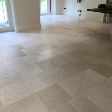
Our client had inherited this Travertine floor when purchasing in a lovely street in Walton-On-Thames, close by was the River Thames which runs all the way into London. The new owners were unhappy with the floor in that it did not look very clean, and they were keen to get this rectified. I arranged a site visit to survey the floor and see what could be done to restore its appearance.
The floor itself was in good physical condition, however, it was apparent from the level of dirt ingrained in the stone that it had not been maintained very well by the previous owner. I carried out a small test clean which came out well and they could see straight away what the floor should look really like! They were happy with my renovation quote and we agreed a mutually convenient time where I could work in relation to the COVID guidelines.
The Travertine floor was scrubbed using a mixture of Tile Doctor Pro Clean and Remove and Go. These are heavy duty cleaning products designed for use on tile and stone can be combined to form a powerful cleaning/stripping solution which is left to dwell on the floor surface. After a short while the solution was worked into the stone using a rotary machine fitted with a black scrubbing pad.
This cleaning recipe works extremely well breaking down dirt, stains, and grease in the stone. Following a machine scrub and a more manual hand scrub of the grout lines, we then pressure rinsed the soil away and then it was extracted using an industrial wet vacuum. In a couple of areas, it was necessary to repeat the process to ensure it was completely clean. Once we were satisfied that the stone was fresh and clean, the floor was left to dry off overnight, so it would be ready for sealing the following day.
After drying overnight, the floor was checked with a damp meter to make sure it was dry. Once reassured I started with the application of the fresh sealer to the floor using Tile Doctor Colour Grow Sealer which is a colour enhancing sealer that works from within by soaking into the pores of the stone. Several coats were applied allowing each one to dry before applying the next. This sealer does not provide a glossy finish, just a nice natural sheen. This brought back the contrast and natural colours in the stone, whilst adding protection to stone for many years to come.
The client was very happy with the work we carried out, the floor had come up much better than they had expected, and it really made a difference to the lovely kitchen space. The floor looked like new. I recommended the regular use of Tile Doctor Stone Soap for future cleaning which will keep the floor in great condition and ensure the longevity of the newly applied sealant.
Jonathan Oldham
South Middlesex Tile Doctor
 RWH Architect PLLC
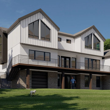
Residing on the shores of Canobie Lake, this custom-designed lakefront home represents a refined balance between architectural precision, site constraints, and the Client’s vision for everyday living and entertaining. Situated on a compact 0.62-acre sloped lot, the project presented a clear and demanding challenge: every room in the home was required to capture a meaningful view of the lake.
RWH Architect addressed this challenge by carefully angling the home’s footprint to maximize the site’s 130 feet of waterfront while framing expansive views of sunsets and seasonal fireworks. The resulting form embraces the slope of the land, allowing the architecture to step naturally with the terrain while opening interior spaces toward the water. This strategic orientation ensured that no space felt disconnected from the lake, transforming the view into a defining architectural element rather than an afterthought.
Designed with entertaining at its core, the home features open-concept living spaces that flow effortlessly toward the shoreline. The kitchen anchors the main living level with top-of-the-line appliances and generous workspace, supporting both daily use and large gatherings. A sleek linear propane fireplace defines the living room seating area, adding warmth without interrupting sightlines to the water beyond. Large expanses of glass dissolve the boundary between indoors and out, guiding guests toward uninterrupted lake views from nearly every vantage point.
The first-floor primary suite is conceived as a private retreat, combining comfort and luxury with direct visual and physical connections to the lake. Expansive glass doors open toward the shoreline, while the suite includes a walk-in closet, a spa-inspired bathroom with walk-in shower, and a double vanity, all oriented to maintain a sense of calm and retreat.
On the second floor, guest bedrooms continue the home’s commitment to water-focused design, each offering panoramic lake views. Two full bathrooms and a welcoming den create flexible spaces for family and guests, reinforcing the home’s role as both a personal residence and a destination for gathering.
A two-car garage provides protected parking and ample storage for lake equipment, completing a design that is both elegant and highly functional. Through thoughtful planning and a deep understanding of the site, RWH Architect transformed a challenging footprint into a cohesive lakefront home where architecture, landscape, and lifestyle are seamlessly aligned.


Sponsored
Westerville, OH
Custom Home Works
Franklin County's Award-Winning Design, Build and Remodeling Expert


 AFFD Design Firm
GAO Zhiqiang: Exploring the infinite possibilities beyond boundaries - Space Emotion Design Series - Vniau Office
The essence of space design is to pay attention to people’s emotional needs, especially in office designs.
Vniau office is designed by GAO Zhiqiang, a space emotion designer. He created an extremely comfortable and inclusive office space by modern design tech-niques, combined with technology, history and humanities.
/ Explore /
Infinite possibilities beyond boundaries
A humanistic caring, warm and emotional design work, under the continuous changes of social forms, evolves into a space in accordance with the develop-ment of the current era, which is the most solid response from the designer to the space.
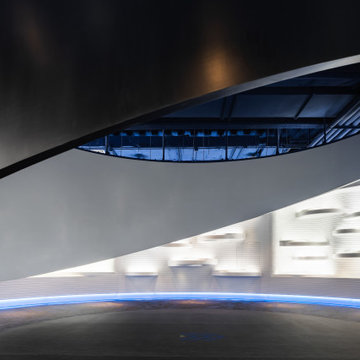
This open space makes you feel like entering into a movie scene. Large areas of black and white contrast, and smooth lines create a powerful aura. However, soft lights bring back a romantic atmosphere. The space is highlighted by vir-tuality and reality.
The development of modern technology diversified people’s cognition and iden-tification of space dimension. The designer tries to break the inherent bound-ary consciousness among technology, humanities and nature by comfortable and efficient spatial perception.
Wandering between virtual and real, light and shadow, the space presents a fu-ture sense through symbols. It shows a bold, free, open, lush, and new office format.
"Compared with technology, we pay more attention to people's emotions and feelings. We have always been advocating using the most common materials to create different spaces, and the key is depended on design." Said designer GAO Zhiqiang.
Therefore, when it came to the selection of materials, pureness presents in-finity, simplicity creates richness. Bright green brings cheerfulness, and the exposed ceiling and cloud-like chandeliers create a natural and agile visual perception. The combination of dynamic and stillness embodies the concentra-tion of the designer.
As the previous office was in Chinese style with redwood furniture, in order to have good effect of the overall space, the designer discussed with the own-er repeatedly, strive to change into a modern style, which matches more with their products, clients, competitors, brand culture and temperament of the of-fice, younger staff, etc., in the end, this design shows up.
This is a ring-shaped office space with same walls and same core tubes, which make people easily disoriented. By the principle of 5 elements - metal, wood, water, fire and earth, the designer placed the reception and exhibition room in the middle, and painted in yellow, corresponding to central earth.
According to this principle, the R & D department on the east side is decorat-ed in green, corresponding to wood, also, the market and finance department on the south side is orange, corresponding to fire. Service department on the west is white color representing metal, CEO and QC office on the north side is given black color, representing water. 5 directions are painted in 5 colors, which make people clearly distinguish departments and directions.
The building wall of the void area has a huge sloped beam, which causes poor visual experience. To solve this problem, the designer creates a magnificent X-shaped style by making use of the original beam structure. Its perforated sides and the luminous aluminum plates are very sci-fi, showing a similar vision of X-Men headquarters.
The interaction, communication and intersection among people are the key points of designing moving lines. Their optimization brings closer collaboration among departments,shorten the distance that people have to walk in the space, such as in conference rooms, negotiation rooms, recreation area, water bar, reception area.
Reasonable moving lines make discussion and communication between people, de-partments, and customers more efficient. At the same time, different spaces create different atmospheres and emotions, relax, or serious, or leisurable, etc., so as to meet needs of different moments.
In addition, the designer GAO Zhiqiang said, "We want to create a feeling of flowing clouds. Lights and curves create moving lines, and give a sense of freedom."
To remove the shackles of traditional office designs, and give a space infi-nite vitality is not just a change in form, it is more about 'people' them-selves. Here, everyone has a very large degree of freedom, and they can feel the infinite possibilities of future. Initiative and creativity are stimulated at the same time. Once people create the environment, areas interact with each other, and the power of design emerges.
Soft curve is a visual expression of tolerance and infinite possibilities. The spatial layout breaks isolation and shortens the distance of human hearts. High efficiency while no boundaries, and everywhere has space for independent thinking and solitude. The space respects each individual and can also unit as a whole.
Gaudi, the most famous Spanish architect, once said that straight lines belong to human, and curves belong to the God. It is probably that the curves give birth to too many wonderful changes. In this space, the curves are formed smoothly, either on the ground or ceiling, or a room, a partition.
"Spatial emotion design" advocates bringing human attributes to spatial func-tions. By designing and shaping the space, people are able to work in the best state of physiological and psychological emotions. Therefore, AFFD is trying their best to create comfortable working environments for employees, to ensure efficient work, as well as physical and mental health of staff.
 Fiorito Interior Design
When I began this kitchen project, the space was constrained by an awkward peninsula and a dropped ceiling that compressed the room both physically and visually. Fluorescent fixtures sat behind a plastic diffuser, and the refrigerator was wedged beside the range, leaving the kitchen feeling crowded while also making poor use of the available space. The transformation began by taking things away. The dropped ceiling was removed, the fluorescent tubes went with it, and the room suddenly gained height and light. The peninsula was removed too, opening the floor plan and allowing the cabinetry to continue down an adjacent wall and incorporate a second window. What had been a small, enclosed kitchen became a generous working space with room for a slim, functional L-shaped island, additional cabinetry and, perhaps most importantly, a much more natural relationship between the different parts of the kitchen.
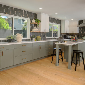
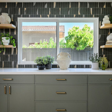
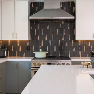
The palette is quiet, but there is a lot happening within it. Soft sage cabinetry grounds the room, while warm white upper cabinets and pantry cabinetry lift the space. A pure white quartz countertop provides a crisp surface against the cabinetry, and soft brass hardware adds just enough warmth. The new Sub Zero refrigerator was given its own wall, beside a full pantry, freeing the range wall to become a strong focal point. A Monogram range now sits centered beneath an angular stainless-steel Zephyr hood, framed by the kitchen's most distinctive element: a graphite backsplash made from WOW Design's Pottery tile. Inspired by Japanese handmade ceramics, the tiles have a wonderfully tactile, imperfect character. Most are deep graphite, but here and there the surface breaks into strokes of camel, dusty peach and deep blue-gunmetal glaze. There is an almost painterly quality to the way those colors move across the wall, giving the kitchen something that is difficult to achieve with a more uniform material—the feeling that someone actually made it.
The rest of the room was designed around that same balance of simplicity and warmth. New pale oak flooring runs throughout the ground floor, bringing a natural material and a soft golden tone beneath the cooler sage and graphite. Floating oak shelves flank the windows and provide a home for plants, ceramics and a few favorite objects, while another pair of shelves beside the refrigerator creates a small landing place for the things that inevitably arrive with you at the end of the day—keys, mail, bags and whatever else happens to be in your hands. The island occupies a surprisingly small footprint, yet its L-shaped form provides both additional work surface and seating without interrupting the flow of the room. A deep sink with an integrated cutting board and roll-up drying rack, a commercial-style faucet and under-cabinet LED lighting bring the practical details up to the same level of thoughtfulness as the larger design decisions. In the end, the renovation did more than just enlarge the kitchen; it created a space that feels calm, contemporary, warm, and a little unexpected … and, most importantly, we created a kitchen that finally makes sense for the way my clients live.
AFTER photos: Bernardo Grijalva
 Fiorito Interior Design
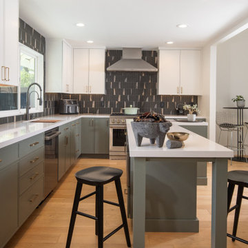
When I began this kitchen project, the space was constrained by an awkward peninsula and a dropped ceiling that compressed the room both physically and visually. Fluorescent fixtures sat behind a plastic diffuser, and the refrigerator was wedged beside the range, leaving the kitchen feeling crowded while also making poor use of the available space. The transformation began by taking things away. The dropped ceiling was removed, the fluorescent tubes went with it, and the room suddenly gained height and light. The peninsula was removed too, opening the floor plan and allowing the cabinetry to continue down an adjacent wall and incorporate a second window. What had been a small, enclosed kitchen became a generous working space with room for a slim, functional L-shaped island, additional cabinetry and, perhaps most importantly, a much more natural relationship between the different parts of the kitchen.
The palette is quiet, but there is a lot happening within it. Soft sage cabinetry grounds the room, while warm white upper cabinets and pantry cabinetry lift the space. A pure white quartz countertop provides a crisp surface against the cabinetry, and soft brass hardware adds just enough warmth. The new Sub Zero refrigerator was given its own wall, beside a full pantry, freeing the range wall to become a strong focal point. A Monogram range now sits centered beneath an angular stainless-steel Zephyr hood, framed by the kitchen's most distinctive element: a graphite backsplash made from WOW Design's Pottery tile. Inspired by Japanese handmade ceramics, the tiles have a wonderfully tactile, imperfect character. Most are deep graphite, but here and there the surface breaks into strokes of camel, dusty peach and deep blue-gunmetal glaze. There is an almost painterly quality to the way those colors move across the wall, giving the kitchen something that is difficult to achieve with a more uniform material—the feeling that someone actually made it.
The rest of the room was designed around that same balance of simplicity and warmth. New pale oak flooring runs throughout the ground floor, bringing a natural material and a soft golden tone beneath the cooler sage and graphite. Floating oak shelves flank the windows and provide a home for plants, ceramics and a few favorite objects, while another pair of shelves beside the refrigerator creates a small landing place for the things that inevitably arrive with you at the end of the day—keys, mail, bags and whatever else happens to be in your hands. The island occupies a surprisingly small footprint, yet its L-shaped form provides both additional work surface and seating without interrupting the flow of the room. A deep sink with an integrated cutting board and roll-up drying rack, a commercial-style faucet and under-cabinet LED lighting bring the practical details up to the same level of thoughtfulness as the larger design decisions. In the end, the renovation did more than just enlarge the kitchen; it created a space that feels calm, contemporary, warm, and a little unexpected … and, most importantly, we created a kitchen that finally makes sense for the way my clients live.
AFTER photos: Bernardo Grijalva
 Fiorito Interior Design
When I began this kitchen project, the space was constrained by an awkward peninsula and a dropped ceiling that compressed the room both physically and visually. Fluorescent fixtures sat behind a plastic diffuser, and the refrigerator was wedged beside the range, leaving the kitchen feeling crowded while also making poor use of the available space. The transformation began by taking things away. The dropped ceiling was removed, the fluorescent tubes went with it, and the room suddenly gained height and light. The peninsula was removed too, opening the floor plan and allowing the cabinetry to continue down an adjacent wall and incorporate a second window. What had been a small, enclosed kitchen became a generous working space with room for a slim, functional L-shaped island, additional cabinetry and, perhaps most importantly, a much more natural relationship between the different parts of the kitchen.
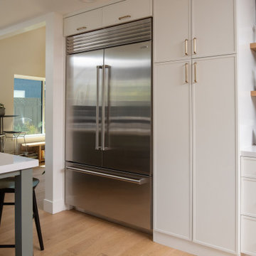
The palette is quiet, but there is a lot happening within it. Soft sage cabinetry grounds the room, while warm white upper cabinets and pantry cabinetry lift the space. A pure white quartz countertop provides a crisp surface against the cabinetry, and soft brass hardware adds just enough warmth. The new Sub Zero refrigerator was given its own wall, beside a full pantry, freeing the range wall to become a strong focal point. A Monogram range now sits centered beneath an angular stainless-steel Zephyr hood, framed by the kitchen's most distinctive element: a graphite backsplash made from WOW Design's Pottery tile. Inspired by Japanese handmade ceramics, the tiles have a wonderfully tactile, imperfect character. Most are deep graphite, but here and there the surface breaks into strokes of camel, dusty peach and deep blue-gunmetal glaze. There is an almost painterly quality to the way those colors move across the wall, giving the kitchen something that is difficult to achieve with a more uniform material—the feeling that someone actually made it.
The rest of the room was designed around that same balance of simplicity and warmth. New pale oak flooring runs throughout the ground floor, bringing a natural material and a soft golden tone beneath the cooler sage and graphite. Floating oak shelves flank the windows and provide a home for plants, ceramics and a few favorite objects, while another pair of shelves beside the refrigerator creates a small landing place for the things that inevitably arrive with you at the end of the day—keys, mail, bags and whatever else happens to be in your hands. The island occupies a surprisingly small footprint, yet its L-shaped form provides both additional work surface and seating without interrupting the flow of the room. A deep sink with an integrated cutting board and roll-up drying rack, a commercial-style faucet and under-cabinet LED lighting bring the practical details up to the same level of thoughtfulness as the larger design decisions. In the end, the renovation did more than just enlarge the kitchen; it created a space that feels calm, contemporary, warm, and a little unexpected … and, most importantly, we created a kitchen that finally makes sense for the way my clients live.
AFTER photos: Bernardo Grijalva
 Fiorito Interior Design
When I began this kitchen project, the space was constrained by an awkward peninsula and a dropped ceiling that compressed the room both physically and visually. Fluorescent fixtures sat behind a plastic diffuser, and the refrigerator was wedged beside the range, leaving the kitchen feeling crowded while also making poor use of the available space. The transformation began by taking things away. The dropped ceiling was removed, the fluorescent tubes went with it, and the room suddenly gained height and light. The peninsula was removed too, opening the floor plan and allowing the cabinetry to continue down an adjacent wall and incorporate a second window. What had been a small, enclosed kitchen became a generous working space with room for a slim, functional L-shaped island, additional cabinetry and, perhaps most importantly, a much more natural relationship between the different parts of the kitchen.
The palette is quiet, but there is a lot happening within it. Soft sage cabinetry grounds the room, while warm white upper cabinets and pantry cabinetry lift the space. A pure white quartz countertop provides a crisp surface against the cabinetry, and soft brass hardware adds just enough warmth. The new Sub Zero refrigerator was given its own wall, beside a full pantry, freeing the range wall to become a strong focal point. A Monogram range now sits centered beneath an angular stainless-steel Zephyr hood, framed by the kitchen's most distinctive element: a graphite backsplash made from WOW Design's Pottery tile. Inspired by Japanese handmade ceramics, the tiles have a wonderfully tactile, imperfect character. Most are deep graphite, but here and there the surface breaks into strokes of camel, dusty peach and deep blue-gunmetal glaze. There is an almost painterly quality to the way those colors move across the wall, giving the kitchen something that is difficult to achieve with a more uniform material—the feeling that someone actually made it.
The rest of the room was designed around that same balance of simplicity and warmth. New pale oak flooring runs throughout the ground floor, bringing a natural material and a soft golden tone beneath the cooler sage and graphite. Floating oak shelves flank the windows and provide a home for plants, ceramics and a few favorite objects, while another pair of shelves beside the refrigerator creates a small landing place for the things that inevitably arrive with you at the end of the day—keys, mail, bags and whatever else happens to be in your hands. The island occupies a surprisingly small footprint, yet its L-shaped form provides both additional work surface and seating without interrupting the flow of the room. A deep sink with an integrated cutting board and roll-up drying rack, a commercial-style faucet and under-cabinet LED lighting bring the practical details up to the same level of thoughtfulness as the larger design decisions. In the end, the renovation did more than just enlarge the kitchen; it created a space that feels calm, contemporary, warm, and a little unexpected … and, most importantly, we created a kitchen that finally makes sense for the way my clients live.
AFTER photos: Bernardo Grijalva
 Fiorito Interior Design
When I began this kitchen project, the space was constrained by an awkward peninsula and a dropped ceiling that compressed the room both physically and visually. Fluorescent fixtures sat behind a plastic diffuser, and the refrigerator was wedged beside the range, leaving the kitchen feeling crowded while also making poor use of the available space. The transformation began by taking things away. The dropped ceiling was removed, the fluorescent tubes went with it, and the room suddenly gained height and light. The peninsula was removed too, opening the floor plan and allowing the cabinetry to continue down an adjacent wall and incorporate a second window. What had been a small, enclosed kitchen became a generous working space with room for a slim, functional L-shaped island, additional cabinetry and, perhaps most importantly, a much more natural relationship between the different parts of the kitchen.
The palette is quiet, but there is a lot happening within it. Soft sage cabinetry grounds the room, while warm white upper cabinets and pantry cabinetry lift the space. A pure white quartz countertop provides a crisp surface against the cabinetry, and soft brass hardware adds just enough warmth. The new Sub Zero refrigerator was given its own wall, beside a full pantry, freeing the range wall to become a strong focal point. A Monogram range now sits centered beneath an angular stainless-steel Zephyr hood, framed by the kitchen's most distinctive element: a graphite backsplash made from WOW Design's Pottery tile. Inspired by Japanese handmade ceramics, the tiles have a wonderfully tactile, imperfect character. Most are deep graphite, but here and there the surface breaks into strokes of camel, dusty peach and deep blue-gunmetal glaze. There is an almost painterly quality to the way those colors move across the wall, giving the kitchen something that is difficult to achieve with a more uniform material—the feeling that someone actually made it.
The rest of the room was designed around that same balance of simplicity and warmth. New pale oak flooring runs throughout the ground floor, bringing a natural material and a soft golden tone beneath the cooler sage and graphite. Floating oak shelves flank the windows and provide a home for plants, ceramics and a few favorite objects, while another pair of shelves beside the refrigerator creates a small landing place for the things that inevitably arrive with you at the end of the day—keys, mail, bags and whatever else happens to be in your hands. The island occupies a surprisingly small footprint, yet its L-shaped form provides both additional work surface and seating without interrupting the flow of the room. A deep sink with an integrated cutting board and roll-up drying rack, a commercial-style faucet and under-cabinet LED lighting bring the practical details up to the same level of thoughtfulness as the larger design decisions. In the end, the renovation did more than just enlarge the kitchen; it created a space that feels calm, contemporary, warm, and a little unexpected … and, most importantly, we created a kitchen that finally makes sense for the way my clients live.
AFTER photos: Bernardo Grijalva
22