
Search results for "Piece problem" in Home Design Ideas
 Gregg Lipton
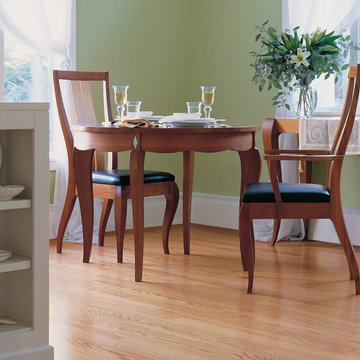
Solid Cherry wood and stainless steel top panel set into a solid Cherry edgeband. Available with or without the scalloped apron detail. Available in round, rectangle, oval, and extension tables.
 TrueMark Repair
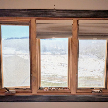
At TrueMark, we specialize in the 'final 10%' that makes a home both beautiful and efficient. This client had new windows installed, but the original trim was reused, leaving raw openings exposed and creating significant gaps that allowed cool air to leak into the home.
We provided a complete solution by custom-fabricating new wood trim to perfectly bridge the gaps. Each piece was hand-stained in-house by TrueMark to match the home's aesthetic before being precision-installed for a seamless, draft-free finish. This project highlights our shift toward high-end, custom trim and window solutions that solve both aesthetic and functional problems.
 GMI Design Group
Breezy Coastal-Inspired Hearth Room
Sustainable, natural, wholly engaging, and a showcase for their cultural pieces and art was the concept for this home. The couple wanted to use sustainable and environmentally friendly products throughout their home as much as possible.
Being from both California and Florida, they wanted a coastal influence that didn’t look contrived or over-stylized in a Midwestern home. Also, they desired a serene, peaceful space where all senses were engaged. Incorporating the Feng Shui elements of wood, fire, earth, metal and water in color, texture and product choice was used in this design.
A problem area with the original room was a large, blocky oak fireplace. The top half was removed and the hearth was painted white, opening up the space considerably. The back wall was painted a serene blue as an accent.
An overall neutral palette of taupe, blues and grey balanced the wood tones found in the flooring and teak accents the couple acquired on their travels. We recovered their existing love seat with taupe diamond-stripe cotton in a slipcover style, adding to the casual atmosphere of a beach house. Organic cotton, hand-blocked pillows with red cherry blossoms provide a pop of color to the seating. A swivel rocker gives flexibility to multiple focal points and conversation.
The 100% hemp rug has a turquoise oversized damask print and is a plush anchor to the hearth setting. A long grey-washed rattan bench serves as a cocktail table and woven Roman shades provide needed contrast to the back wall. A distressed, reclaimed bench sits below bold art as a bright accent area to an overall neutral space.
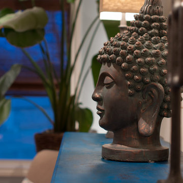
The centerpiece of the room is a large cerulean blue buffet with fretwork & glass doors. A large Buddha head serves as a meditative focal point with Asian-inspired art and lighting.
Julie Austin Photography
Find the right local pro for your project
 Design Vision Studio
Raychelle Devilla Photography -
When we met these wonderful Palm Springs clients, they were overwhelmed with the task of downsizing their vast collection of fine art, antiques, and sculptures. The problem was it was an amazing collection so the task was not easy. What do we keep? What do we let go? Lockwood Interiors to the rescue! We realized that to really showcase these beautiful pieces, we needed to pick and choose the right ones and ensure they were showcased properly.
Lighting was improved throughout the home. We installed and updated recessed lights and cabinet lighting. Outdated ceiling fans and chandeliers were replaced. The walls were painted with a warm, soft ivory color and the moldings, door and windows also were given a complimentary fresh coat of paint. The overall impact was a clean bright room.
We replaced the outdated oak front doors with modern glass doors. The fireplace received a facelift with new tile, a custom mantle and crushed glass to replace the old fake logs. Custom draperies frame the views. The dining room was brought to life with recycled magazine grass cloth wallpaper on the ceiling, new red leather upholstery on the chairs, and a custom red paint treatment on the new chandelier to tie it all together. (The chandelier was actually powder-coated at an auto paint shop!)
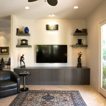
Underutilized hall coat closets were removed and transformed with custom cabinetry to create art niches. We also designed a custom built-in media cabinet with "breathing room" to display more of their treasures. The new furniture was intentionally selected with modern lines to give the rooms layers and texture.
Our clients (and all of their friends) are amazed at the total transformation of this home and with how well it "fits" them. We love the results too. This home now tells a story through their beautiful life-long collections. The design may have a gallery look but the feeling is all comfort and style.
 Allison Smith Design
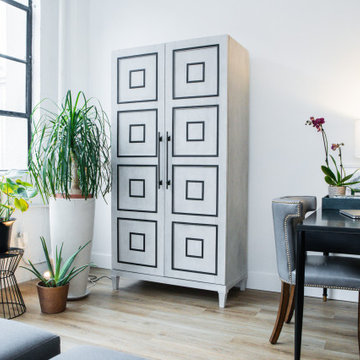
In the bedroom, we built the perfect bed: layers of cozy fabrics, textures and colors. With so many neutrals everywhere you look, these fun colors are some eye candy! We took the no storage “problem” as an opportunity to include a fun statement piece with the armoire.
 Reico Kitchen & Bath
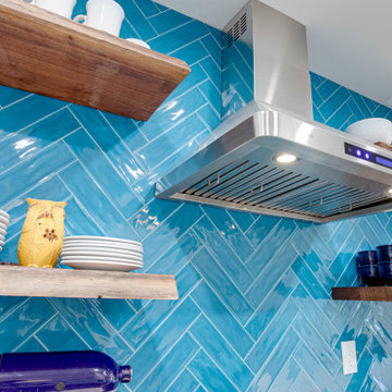
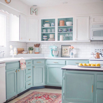
Designed by Akram Aljahmi of Reico Kitchen & Bath in King of Prussia, PA in collaboration with Property Remodeling Group, this transitional inspired kitchen design features white and grey finishes complemented by a bold splash of blue tile.
The kitchen design features Merillat Classic kitchen cabinets in Portrait door style with 5 piece drawer head in 2 finishes. The wall cabinets features a painted white Cotton finish and the base cabinets feature a painted grey Graphite finish. Kitchen countertops are engineered quartz in the color Carrera Marmi from Q by MSI. The kitchen also features a stunning blue herringbone tile back splash with 3x10 tiles.
According to the client, "Akram solved a fundamental function problem that I could not see a solution for. His re-imagining of how the main floor of our home could function was a dramatic shift that I can't wait to experience as part of day-to-day life. Really appreciate his space plan and layout, as well as his support selecting finishes. Akram and team were great to work with!".
Photos courtesy of BTW Images LLC.
 GT Construction Supply, Inc.
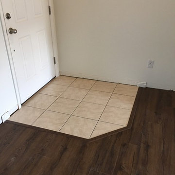
Want to keep the tile in front of the door? No problem. We have the transitions pieces that match the flooring perfectly.
Inspiration for a timeless entryway remodel in Salt Lake City
Inspiration for a timeless entryway remodel in Salt Lake City
Sponsored
Sunbury, OH

J.Holderby - Renovations
Franklin County's Leading General Contractors - 2X Best of Houzz!
 Advance Design Studio, Ltd.
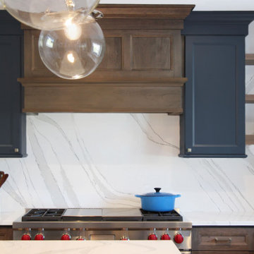
Our clients in Tower Lakes, IL, needed more storage and functionality from their kitchen. They were primarily focused on finding the right combination of cabinets, shelves, and drawers that fit all their cookware, flatware, and appliances. They wanted a brighter, bigger space with a natural cooking flow and plenty of storage. Soffits and crown molding needed to be removed to make the kitchen feel larger. Redesign elements included: relocating the fridge, adding a baking station and coffee bar, and placing the microwave in the kitchen island.
Advance Design Studio’s Claudia Pop offered functional, creative, and unique solutions to the homeowners’ problems. Our clients wanted a unique kitchen that was not completely white, a balance of design and function. Claudia offered functional, creative, and unique solutions to Chad and Karen’s kitchen design challenges. The first thing to go was soffits. Today, most kitchens can benefit from the added height and space; removing soffits is nearly always step one. Steely gray-blue was the color of choice for a freshly unique look bringing a sophisticated-looking space to wrap around the fresh new kitchen. Cherry cabinetry in a true brown stain compliments the stormy accents with sharp contrasting white Cambria quartz top balancing out the space with a dramatic flair.
“We wanted something unique and special in this space, something none of the neighbors would have,” said Claudia.
The dramatic veined Cambria countertops continue upward into a backsplash behind three complimentary open shelves. These countertops provide visual texture and movement in the kitchen. The kitchen includes two larder cabinets for both the coffee bar and baking station. The kitchen is now functional and unique in design.
“When we design a new kitchen space, as designers, we are always looking for ways to balance interesting design elements with practical functionality,” Claudia said. “This kitchen’s new design is not only way more functional but is stunning in a way a piece of art can catch one’s attention.”
Decorative mullions with mirrored inserts sit atop dual sentinel pantries flanking the new refrigerator, while a 48″ dual fuel Wolf range replaced the island cooktop and double oven. The new microwave is cleverly hidden within the island, eliminating the cluttered counter and attention-grabbing wall of stainless steel from the previous space.
The family room was completely renovated, including a beautifully functional entertainment bar with the same combination of woods and stone as the kitchen and coffee bar. Mesh inserts instead of plain glass add visual texture while revealing pristine glassware. Handcrafted built-ins surround the fireplace.
The beautiful and efficient design created by designer Claudia transitioned directly to the installation team seamlessly, much like the basement project experience Chad and Karen enjoyed previously.
“We definitely will and have recommended Advance Design Studio to friends who are looking to embark on a project small or large,” Karen said.
“Everything that was designed and built exactly how we envisioned it, and we are really enjoying it to its full potential,” Karen said.
Our award-winning design team would love to create a beautiful, functional, and spacious place for you and your family. With our “Common Sense Remodeling” approach, the process of renovating your home has never been easier. Contact us today at 847-665-1711 or schedule an appointment.
 Arhist
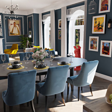
Key Needs: The clients want to combine modern and traditional design elements to create a cohesive and visually striking living space.
Key Problems: The challenge was to find a balance between the two styles and to ensure that they complemented each other without clashing.
Workflow: The design team carefully selected furnishings, fabrics, and decor accents that bridged the gap between modern and traditional styles. They also focused on creating a harmonious color scheme that tied the different design elements together.
Result: The final design seamlessly integrated modern and traditional pieces to create a unique and personalized living space that reflected the clients' tastes and preferences.
Experience the revolution in interior design creation with Arhist.com Check it out now and get a 14-day free trial to see for yourself!
 Pritzkat & Johnson Architects
Peter McMenamin
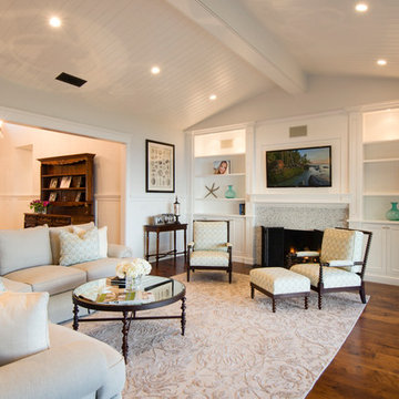
Inspiration for a timeless living room remodel in Los Angeles
Inspiration for a timeless living room remodel in Los Angeles
 Advance Design Studio, Ltd.
Our clients in Tower Lakes, IL, needed more storage and functionality from their kitchen. They were primarily focused on finding the right combination of cabinets, shelves, and drawers that fit all their cookware, flatware, and appliances. They wanted a brighter, bigger space with a natural cooking flow and plenty of storage. Soffits and crown molding needed to be removed to make the kitchen feel larger. Redesign elements included: relocating the fridge, adding a baking station and coffee bar, and placing the microwave in the kitchen island.
Advance Design Studio’s Claudia Pop offered functional, creative, and unique solutions to the homeowners’ problems. Our clients wanted a unique kitchen that was not completely white, a balance of design and function. Claudia offered functional, creative, and unique solutions to Chad and Karen’s kitchen design challenges. The first thing to go was soffits. Today, most kitchens can benefit from the added height and space; removing soffits is nearly always step one. Steely gray-blue was the color of choice for a freshly unique look bringing a sophisticated-looking space to wrap around the fresh new kitchen. Cherry cabinetry in a true brown stain compliments the stormy accents with sharp contrasting white Cambria quartz top balancing out the space with a dramatic flair.
“We wanted something unique and special in this space, something none of the neighbors would have,” said Claudia.
The dramatic veined Cambria countertops continue upward into a backsplash behind three complimentary open shelves. These countertops provide visual texture and movement in the kitchen. The kitchen includes two larder cabinets for both the coffee bar and baking station. The kitchen is now functional and unique in design.
“When we design a new kitchen space, as designers, we are always looking for ways to balance interesting design elements with practical functionality,” Claudia said. “This kitchen’s new design is not only way more functional but is stunning in a way a piece of art can catch one’s attention.”
Decorative mullions with mirrored inserts sit atop dual sentinel pantries flanking the new refrigerator, while a 48″ dual fuel Wolf range replaced the island cooktop and double oven. The new microwave is cleverly hidden within the island, eliminating the cluttered counter and attention-grabbing wall of stainless steel from the previous space.
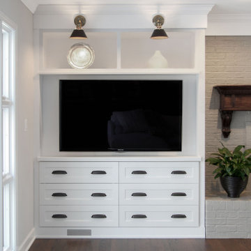
The family room was completely renovated, including a beautifully functional entertainment bar with the same combination of woods and stone as the kitchen and coffee bar. Mesh inserts instead of plain glass add visual texture while revealing pristine glassware. Handcrafted built-ins surround the fireplace.
The beautiful and efficient design created by designer Claudia transitioned directly to the installation team seamlessly, much like the basement project experience Chad and Karen enjoyed previously.
“We definitely will and have recommended Advance Design Studio to friends who are looking to embark on a project small or large,” Karen said.
“Everything that was designed and built exactly how we envisioned it, and we are really enjoying it to its full potential,” Karen said.
Our award-winning design team would love to create a beautiful, functional, and spacious place for you and your family. With our “Common Sense Remodeling” approach, the process of renovating your home has never been easier. Contact us today at 847-665-1711 or schedule an appointment.
 Natural Stone Institute
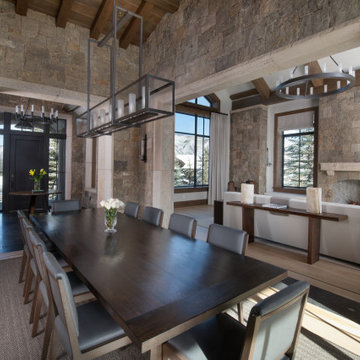
Gallegos was contacted by a client about a project where stone was not just to be an accent material, but the main visual and perceived structural element to create a timeless architectural composition. To further the endeavor: all veneers and dimension stone must be locally sourced and sustainably quarried. The design called for a moss rock veneer with cut stone trim. Sourcing the sandstone moss rock was simple because there were several local quarries to use. The problem
was with the trim pieces.
Gallegos selected Colorado Buff sandstone for the trim since the buff body was a good contrast to the moss rock and it is a stone that can be cut to size. One main concern with any sedimentary stone is hitting what is known as a “dry” layer in the ledge. This is an area in the stone between sedimentary layers that has not solidified or cemented. It is still granular and can lead to future stone failure as water penetrates these layers and creates freeze/thaw issues. To avoid this, they used
an epoxy injected into the dry layers to help solidify the material and prevent any future failures.
The client also wanted sustainable materials for their countertops and bathrooms. Many of the interior stones were either reclaimed materials or were sourced from Colorado quarries – Calacatta Lincoln was used extensively.
Gallegos sourced tiles from reclamation projects in Europe and Asia for use in the master bath and front entry areas. For many of the countertops, the owner’s interior designer spent hours looking through remnants and applied several throughout the residence.
Willow Court is a spectacular and dramatic nod to stone masonry, something the owner, architect, and builder can be proud of and, for the most part, was built with the environment in mind.
 Paul Lopa Designs
See what our client say about Paul Lopa Designs:
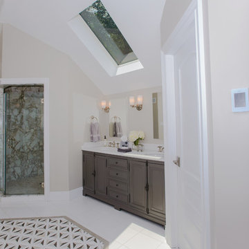
We hired Paul Lopa to remodel our master bathroom. During the project, we increased the work to include upgrading all moldings and replaced all interior doors including our front door. We are very pleased with his work. There were no hidden costs, he followed through on every last detail and did so in a timely manner.
He guided us toward materials that were of a higher quality to prevent problems down the road. His team was respectful of our home and did their best to protect our belongings from the renovation destruction. We will definitely hire Paul Lopa again for future renovations.
Haw, Ron

 Abigail Shea Interiors
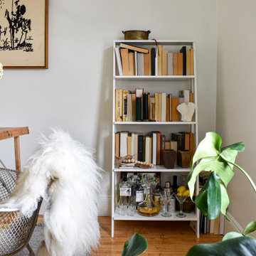
I had a blast working on this personal project. My partner, Alex, is working from home and I needed a space where I could be creative but also put in the hard work. We had 100sf, a budget of "as-cheap-as-possible," and tons of rental restrictions--but good design always starts with a little problem solving, right?
I infused the space with lots of neutral colors and tons of texture to keep it warm. I threw in my favorite vintage pieces, a big oversized paper lantern, and a bookshelf bar for some soul. & just like that, it's our favorite spot in town.
 Lori Jolin Design, LLC.
Sutter Photographers
The Hardware Studio - hardware
Martinwood Cabinetry - millwork
Studio GlassWorks - glass countertop
Window Design Center - awning window
Nonn's Showplace - quartz, granite countertops
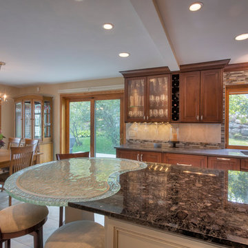
• The most difficult part of the project was figuring out all the technical details to install the glass counter-top, which would weigh about 300 pounds!
• One goal was to avoid seeing the cabinet supports through the glass. The glass itself proposed problems because it had a wavy texture and separate confetti glass that could be added to the bottom. Therefore, we needed to add something below it.
• A combination of a darker cherry and some painted cabinets with a cherry glaze look nice with their Oak trim throughout the home.
• A glass cabinet was added on the other side of the ceiling soffit to make it convenient for entertaining guests and close to their dining. It also made use of an empty wasted space.
• LED strip lighting was installed on a triangle piece of wood inside the glass cabinet that shined onto the glassware inside the cabinets.
• The lighting subcontractor also installed LED lighting between the glass holders for the wine glasses, so the light would shine through the wine glasses.
• The lighting in the new cabinet creates a nice ambiance in the evening.
• The kitchen was designed so everything has a home: spices, oils, knives, cookie sheets, awkward utensils, silverware, tupperware, trash receptacles, and a “stash spot” for when guests come over. Large pull-out drawers are great for pans and lids particularly on the back side (bottom of picture) of the island.
 Traditions In Tile At Brier Creek
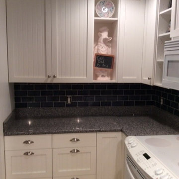
The owners wanted something different than a grey or white subway tile backsplash. She liked the idea of the brick pattern. Pratt and Larson had the perfect glaze for her. W96 is a crackle glaze. Glazed edges were also used instead of a trim piece. That is part of the beauty of Pratt and Larson. Made to order with very specific requests are no problem! Traditions in Tile is the exclusive Pratt and Larson distributor in the greater Triangle area.
 KEYWAY INC
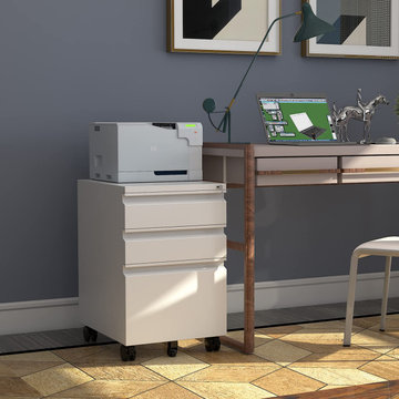
【Efficient Storage】: 3 spacious drawers with removable pencil trays and adjustable hanging bars can hold letter, legal, and A4 size hanging files. Two shallow drawers are perfect for stationery.
【Easy Mobility】: With 2 lockable casters, 2 x 360° swivel casters, and 1 anti-tilt wheel, you can move it easily and safely. The center support wheel prevents tipping.
【Secure Locking】: A lock at the top of our file cabinet locks all three drawers, keeping your sensitive documents safe from prying eyes. Two keys are provided.
【Sturdy & Durable】: Made of solid steel and powder-coated for scratch and stain resistance, this cabinet can hold up to 330 pounds. Its heavy-duty structure and humanized design ensure a long lifespan.
【Easy Assembly & Customer Service】: Our Full-Assembled Metal File Cabinet comes with 5 pieces of wheels. If you encounter any problems, contact us anytime for a solution.
Sponsored
Columbus, OH

Wannemacher Interiors
Customized Award-Winning Interior Design Solutions in Franklin Cnty OH
 User
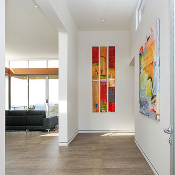
UserThis hillside home in Piedmont, CA was remodeled to change the style from a 1940's rancher with eight foot ceilings and dark interiors, into a modern geometric composition with vast white interiors for casual living and generous daylighting for displaying the artist-owner's works.
In a city known for rigorous and difficult design review, an addition, two variances, and a full stylistic change were unanimously approved on the first round. All sloped roofs and attics were eliminated and replaced by a series of stacked and overlapping flat roofs. This made the house taller on the inside and shorter on the outside, which helped earn design review cooperation in the community. Windows were concentrated toward the rear yard views or moved up high on the side walls for daylight and privacy, benefitting the owners as well as the neighbors.
At the start, the owner husband was so enthusiastic and engaged in transforming his house into something modern that he presented the architect with a scaled foamcore model, rather than the usual magazine clippings and wish list. He participated in the design decisions throughout the process. The owner wife is the artist who did all the artwork in the house. She had been craving a display space with large walls and good natural light. Both of them loved the location and great views.
The project was an opportunity to transform the style of an older traditional home into a modern one, while solving numerous problems. By rebuilding the 1800 ft2 top of the 3-story home it was possible to change the style of the whole building, since the lower floors were a neutral base, and also to change the lifestyle of the owners, who wanted to move their master suite upstairs and live primarily on the top floor as empty nesters.
Going into the project, the architect knew there were multiple encroachments into the setbacks and potential privacy issues with close by neighbors. He approached this as a complex puzzle made up of architectural and political pieces which all had to fit together elegantly. It took many careful moves, small and large, to arrive at a serene and cohesive result that tied old and new together seamlessly.
The design-build contractor worked closely with the owners and handled all of the construction phase documents and design adjustments, adding ideas of their own to make the project really sing.
The project was a collaboration in three acts. The owner had a strong design concept from the start. The architect developed it into a realistic project and garnered the design approvals. Then the contractor executed brilliantly.
 Artisan Kitchen & Bath GC License #107583
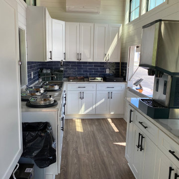
The Tiny Farmhouse Kitchen is by far one of the most complex, rewarding, and unforgettable projects we’ve ever completed. Designed to be fully mobile and 100% solar-powered, this one-of-a-kind kitchen on wheels pushed our creativity, craftsmanship, and problem-solving skills to new heights. Every time we transported it through town, it turned heads—people would literally stop in their tracks just to get a closer look.
Building a fully functional commercial kitchen in such a small footprint required precision in every detail. We carefully selected each piece of equipment to minimize electrical draw, including a commercial refrigerator and four recessed induction food warmers—all powered entirely by solar energy. Onboard water storage, filtration, and gray water management were meticulously engineered to maximize both functionality and space.
The Tiny Farmhouse Kitchen features:
• Custom handcrafted cabinetry
• Granite countertops
• Vaulted ceilings with dimmable LED lighting
• A full POS system with a built-in Wi-Fi hotspot
• A gas-shock lift service window with a live-edge oak flip-down counter, finished with crystal-clear epoxy for a stunning, natural look
Every inch of this mobile kitchen was designed for both beauty and efficiency, blending farmhouse charm with modern utility. It’s a project we are immensely proud of—and one that perfectly captures the spirit of what we do at Artisan Kitchen & Bath: bringing bold ideas to life with craftsmanship, innovation, and heart.
 Truitt and White Window and Door Showroom
This hillside home in Piedmont, CA was remodeled to change the style from a 1940's rancher with eight foot ceilings and dark interiors, into a modern geometric composition with vast white interiors for casual living and generous daylighting for displaying the artist-owner's works.
In a city known for rigorous and difficult design review, an addition, two variances, and a full stylistic change were unanimously approved on the first round. All sloped roofs and attics were eliminated and replaced by a series of stacked and overlapping flat roofs. This made the house taller on the inside and shorter on the outside, which helped earn design review cooperation in the community. Windows were concentrated toward the rear yard views or moved up high on the side walls for daylight and privacy, benefitting the owners as well as the neighbors.
At the start, the owner husband was so enthusiastic and engaged in transforming his house into something modern that he presented the architect with a scaled foamcore model, rather than the usual magazine clippings and wish list. He participated in the design decisions throughout the process. The owner wife is the artist who did all the artwork in the house. She had been craving a display space with large walls and good natural light. Both of them loved the location and great views.
The project was an opportunity to transform the style of an older traditional home into a modern one, while solving numerous problems. By rebuilding the 1800 ft2 top of the 3-story home it was possible to change the style of the whole building, since the lower floors were a neutral base, and also to change the lifestyle of the owners, who wanted to move their master suite upstairs and live primarily on the top floor as empty nesters.
Going into the project, the architect knew there were multiple encroachments into the setbacks and potential privacy issues with close by neighbors. He approached this as a complex puzzle made up of architectural and political pieces which all had to fit together elegantly. It took many careful moves, small and large, to arrive at a serene and cohesive result that tied old and new together seamlessly.
The design-build contractor worked closely with the owners and handled all of the construction phase documents and design adjustments, adding ideas of their own to make the project really sing.
The project was a collaboration in three acts. The owner had a strong design concept from the start. The architect developed it into a realistic project and garnered the design approvals. Then the contractor executed brilliantly
51