
Search results for "Poor black" in Home Design Ideas
 Seifert Construction
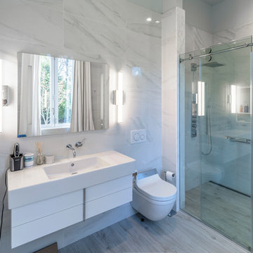
Inspiration for a small modern 3/4 black and white tile, multicolored tile and matchstick tile porcelain tile and gray floor walk-in shower remodel in New York with flat-panel cabinets, white cabinets, a bidet, multicolored walls, an integrated sink, solid surface countertops and white countertops
 Scenic Interiors, LLC
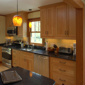
We completely remodeled an outdated, poorly designed kitchen that was separated from the rest of the house by a narrow doorway. We opened the wall to the dining room and framed it with an oak archway. We transformed the space with an open, timeless design that incorporates a counter-height eating and work area, cherry inset door shaker-style cabinets, increased counter work area made from Cambria quartz tops, and solid oak moldings that echo the style of the 1920's bungalow. Some of the original wood moldings were re-used to case the new energy efficient window.
 Guided Home Design
Joe Cotitta
Epic Photography
joecotitta@cox.net:
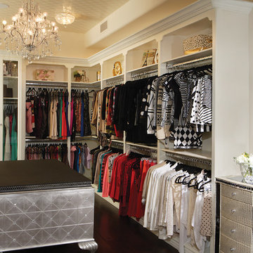
Walk-in closet - large traditional women's dark wood floor walk-in closet idea in Phoenix with open cabinets and white cabinets
Walk-in closet - large traditional women's dark wood floor walk-in closet idea in Phoenix with open cabinets and white cabinets
Find the right local pro for your project
 Advance Design Studio, Ltd.
The major kitchen renovation of this old country farmhouse was a task of love, one that had been planned for many years by these Barrington seasoned homeowners. After interviewing no less than five companies, the homeowners chose the design team at Advance Design Studio to make the transformation they had long planned for.
“They had an understanding of the right design for the space almost from the instant they walked in the room”, says Sharon Scott of the design team of Nicole Ryan at Todd Jurs at Advance Design Studio. “They were the only designers who laid out ideas in the first meeting at the house that we really loved”, she says. “It was obvious that they understood the house, and understood us - and from then on the decision to hire them literally made itself”.
The original kitchen had a dividing “wall” of cabinetry…that made the rather large space seem very small, and cut off the kitchen from the eating area that has a beautiful garden view completely hidden from the main kitchen. Circulation was poor, leaving family members on top of one another when entertaining family and friends.
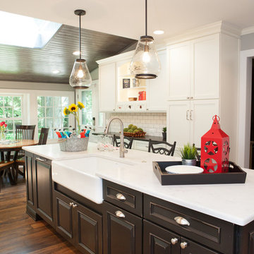
The new kitchen design nearly doubles the kitchen size within the original space; opening it up completely and enjoying an expansive island containing a new Kohler Whitehaven Smart Divide farm sink, a dishwasher, and pull out double trash receptacle. The great new gathering space accommodates four pull out stools beckoning grandchildren and friends alike. Removing the range from the island and relocating it to create a dramatic “feature” wall, completely out of the way of guests; it is now crowned with a beautiful completely customized wood hood designed to ventilate much more efficiently than the original island range containing a limited downdraft system.
The much more efficient use of the space after removing a pantry closet made way for a fully functional “tall wall” housing a double oven and refrigerator, out of the way of guests. Removing the restrictive cabinetry wall now allowed for an expansive floor to ceiling pantry cabinet with full extension pull out shelving, and an elegant display area complete with a beautiful furniture detailed buffet.
Fitting perfectly into the farmhouse charm of the old estate, Medallion Silver Lancaster cabinetry was chosen in a soft white Maple Divinity paint finish lining the perimeter. The stunning island hints to this old home’s past with Medallion Gold’s Maple Devonshire style graced with a Carriage Black Heirloom painted finish. The rubbed off black paint finish reveals the soft wood tones beneath, mimicking furniture you’d see in your grandmother’s home that has lovingly been polished for years to reveal a soft, subtly rubbed-off sheen.
Counter tops reverse contrast with perimeter tops of black “Raven” granite possessing a subtle honed finish, and a shift to Quartz Difinity Viareggio - resembling white Carrera marble on the island. A simple herringbone detail completes the decorative range wall, and subtle porcelain subway tiles grace the backsplash throughout.
The design is finished off with crisp Thermador and Bosch stainless steel appliances, and bright brushed cup pull and handle combination hardware. A pull down Kohler Bellaria faucet makes cleanup a breeze, and soft under-cabinet LED lighting throughout makes every work surface shine softly, and highlights the cabinetry display area with grace.
One special detail was created to make the dramatic ceiling transition to a vaulted area above the breakfast nook extra special. A tongue and groove solid wood ceiling was hung above, and a subtle greenish-grey distressed paint finish was hand developed on site by the talented crew, complementing the new kitchen with a completely unique surface that appears as if it’s been there for many, many years. It’s just one standout feature in the amazing new space that is sure to be in every conversation as newcomers enjoy the newest best hangout in this old home renewed!
After 30 years of renovating homes, this now content homeowner sips a cup of tea enjoying her new garden view, and reminisces projects of past – and lastly reports their experience with Advance Design Studio culminating with their amazing new kitchen to be the most enjoyable and satisfying home experience yet.
Designer: Nicole Ryan
Photographer: Joe Nowak
 L/L Design - Build - Furnish
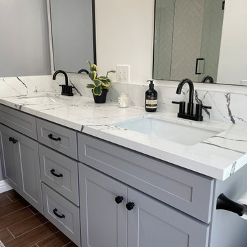
Sometimes the cost of painting an existing vanity vs. a new vanity isn't only the cost of the labor, fixing the old doors, the inside shelves were in poor condition, and the overall space the vanity provided was sub par...so we did replace the vanity and they have so much more functioning space. We did however paint the linen cabinet and the adjoining wall, and it really makes it look built it. I think this transformation is a home run!!!
 Living with Lolo
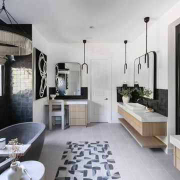
Bathroom in Desert Escape |
Room Type:
Full Home Remodel + Furnishing (4 Bedroom, 5 Bath, 3,627 sq ft residence).
Project Name:
Desert Escape Design.
Key Feature:
A complete home refurnishing and remodel including the master bathroom, powder room, and fireplace, designed to deliver striking wow factor while maintaining the warmth of a serene desert retreat.
Challenge:
The previous designer’s work was poor quality, and remodeling only the primary suite would have created a noticeable disconnect with the rest of the home.
Solution:
The clients chose to fully refurnish the entire home and remodel the master bathroom, powder room, and fireplace to create a cohesive, elevated design throughout.
Materials:
Lighting: Visual Comfort, Circa Lighting, Hammerton Studio.
Rugs: Jaipur.
Art: Leftbank.
Mirrors: Four Hands.
Wallpaper: Arte, Elitis.
Furniture: Four Hands, Moss Studio, Dovetail, Bernhardt, Noir, Arteriors, CFC.
Budget:
$100K-$250K |
Timeline:
Completed August 202
 Nautilus Architects
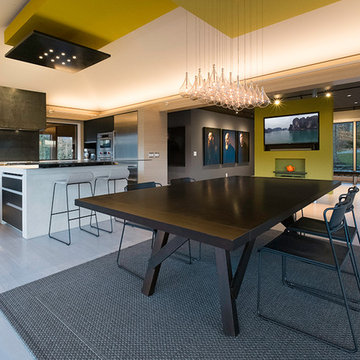
Located on a marsh in the upper reaches of the Lieutenant River in Old Lyme, the existing house was well-sited and well-built, but the design failed to exploit the views and more importantly was a confused combination of contemporary and traditional elements. The new homeowners, a successful businesswoman and an accomplished artist and photographer, were interested in creating a fully-contemporary environment to open up space, connect indoors with outdoors, display artwork and showcase the husband’s distinctive photographs.
One glaring deficiency was the curb appeal and approach sequence: the grade sloped down and the path to the house followed, but this led to an uncomfortable dip and abrupt rise to the front door. By creating a virtual “moat,” occupied by a grid of raised-bed grasses contained in aluminum-clad boxes, and spanning the moat with an ipe bridge, the approach becomes level and engaging. The façade of the existing house was blank and bland, and with no cover. Adding a deep overhang with a wide porch creates a welcoming, covered condition, accentuated by a 6’ wide pivoting front door that feels more like a moving piece of wall.
Another deficiency was the connection to the outdoors. By adding glass to the front and back of the house, and removing interior walls selectively, the house takes on a diaphanous quality that allows one to see through to the marsh beyond, even when in the driveway. The raised-bed grasses act as abstract, geometric versions of the marsh beyond. A large, pyramidal skylight establishes a spatial hierarchy around which the rooms revolve.
The house featured several tray-ceilinged spaces – living room, kitchen, and master bedroom – that were poorly-proportioned and with panels at the top that resembled inset flat panel doors. The solution was to use a different strategy for each: the bedroom turns the ceiling into an eggshell through the use of a creative trim detail; the living room has an oversized sculptural, backlit lighting element; and the kitchen has a collage of painted rectangular forms that support or include lighting pieces.
A palette of concrete, blackened steel, stainless steel and colors carefully chosen by homeowner and architect create an interior and exterior environment punctuated by moments that are as artistic as the featured works in the black-ceilinged gallery.
Sponsored
Fredericksburg, OH

High Point Cabinets
Columbus' Experienced Custom Cabinet Builder | 4x Best of Houzz Winner
 Nautilus Architects
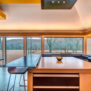
Located on a marsh in the upper reaches of the Lieutenant River in Old Lyme, the existing house was well-sited and well-built, but the design failed to exploit the views and more importantly was a confused combination of contemporary and traditional elements. The new homeowners, a successful businesswoman and an accomplished artist and photographer, were interested in creating a fully-contemporary environment to open up space, connect indoors with outdoors, display artwork and showcase the husband’s distinctive photographs.
One glaring deficiency was the curb appeal and approach sequence: the grade sloped down and the path to the house followed, but this led to an uncomfortable dip and abrupt rise to the front door. By creating a virtual “moat,” occupied by a grid of raised-bed grasses contained in aluminum-clad boxes, and spanning the moat with an ipe bridge, the approach becomes level and engaging. The façade of the existing house was blank and bland, and with no cover. Adding a deep overhang with a wide porch creates a welcoming, covered condition, accentuated by a 6’ wide pivoting front door that feels more like a moving piece of wall.
Another deficiency was the connection to the outdoors. By adding glass to the front and back of the house, and removing interior walls selectively, the house takes on a diaphanous quality that allows one to see through to the marsh beyond, even when in the driveway. The raised-bed grasses act as abstract, geometric versions of the marsh beyond. A large, pyramidal skylight establishes a spatial hierarchy around which the rooms revolve.
The house featured several tray-ceilinged spaces – living room, kitchen, and master bedroom – that were poorly-proportioned and with panels at the top that resembled inset flat panel doors. The solution was to use a different strategy for each: the bedroom turns the ceiling into an eggshell through the use of a creative trim detail; the living room has an oversized sculptural, backlit lighting element; and the kitchen has a collage of painted rectangular forms that support or include lighting pieces.
A palette of concrete, blackened steel, stainless steel and colors carefully chosen by homeowner and architect create an interior and exterior environment punctuated by moments that are as artistic as the featured works in the black-ceilinged gallery.
 Nautilus Architects
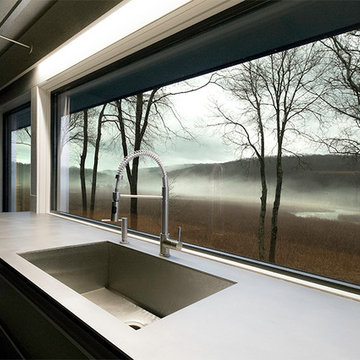
Located on a marsh in the upper reaches of the Lieutenant River in Old Lyme, the existing house was well-sited and well-built, but the design failed to exploit the views and more importantly was a confused combination of contemporary and traditional elements. The new homeowners, a successful businesswoman and an accomplished artist and photographer, were interested in creating a fully-contemporary environment to open up space, connect indoors with outdoors, display artwork and showcase the husband’s distinctive photographs.
One glaring deficiency was the curb appeal and approach sequence: the grade sloped down and the path to the house followed, but this led to an uncomfortable dip and abrupt rise to the front door. By creating a virtual “moat,” occupied by a grid of raised-bed grasses contained in aluminum-clad boxes, and spanning the moat with an ipe bridge, the approach becomes level and engaging. The façade of the existing house was blank and bland, and with no cover. Adding a deep overhang with a wide porch creates a welcoming, covered condition, accentuated by a 6’ wide pivoting front door that feels more like a moving piece of wall.
Another deficiency was the connection to the outdoors. By adding glass to the front and back of the house, and removing interior walls selectively, the house takes on a diaphanous quality that allows one to see through to the marsh beyond, even when in the driveway. The raised-bed grasses act as abstract, geometric versions of the marsh beyond. A large, pyramidal skylight establishes a spatial hierarchy around which the rooms revolve.
The house featured several tray-ceilinged spaces – living room, kitchen, and master bedroom – that were poorly-proportioned and with panels at the top that resembled inset flat panel doors. The solution was to use a different strategy for each: the bedroom turns the ceiling into an eggshell through the use of a creative trim detail; the living room has an oversized sculptural, backlit lighting element; and the kitchen has a collage of painted rectangular forms that support or include lighting pieces.
A palette of concrete, blackened steel, stainless steel and colors carefully chosen by homeowner and architect create an interior and exterior environment punctuated by moments that are as artistic as the featured works in the black-ceilinged gallery.
 Nautilus Architects
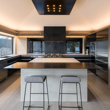
Located on a marsh in the upper reaches of the Lieutenant River in Old Lyme, the existing house was well-sited and well-built, but the design failed to exploit the views and more importantly was a confused combination of contemporary and traditional elements. The new homeowners, a successful businesswoman and an accomplished artist and photographer, were interested in creating a fully-contemporary environment to open up space, connect indoors with outdoors, display artwork and showcase the husband’s distinctive photographs.
One glaring deficiency was the curb appeal and approach sequence: the grade sloped down and the path to the house followed, but this led to an uncomfortable dip and abrupt rise to the front door. By creating a virtual “moat,” occupied by a grid of raised-bed grasses contained in aluminum-clad boxes, and spanning the moat with an ipe bridge, the approach becomes level and engaging. The façade of the existing house was blank and bland, and with no cover. Adding a deep overhang with a wide porch creates a welcoming, covered condition, accentuated by a 6’ wide pivoting front door that feels more like a moving piece of wall.
Another deficiency was the connection to the outdoors. By adding glass to the front and back of the house, and removing interior walls selectively, the house takes on a diaphanous quality that allows one to see through to the marsh beyond, even when in the driveway. The raised-bed grasses act as abstract, geometric versions of the marsh beyond. A large, pyramidal skylight establishes a spatial hierarchy around which the rooms revolve.
The house featured several tray-ceilinged spaces – living room, kitchen, and master bedroom – that were poorly-proportioned and with panels at the top that resembled inset flat panel doors. The solution was to use a different strategy for each: the bedroom turns the ceiling into an eggshell through the use of a creative trim detail; the living room has an oversized sculptural, backlit lighting element; and the kitchen has a collage of painted rectangular forms that support or include lighting pieces.
A palette of concrete, blackened steel, stainless steel and colors carefully chosen by homeowner and architect create an interior and exterior environment punctuated by moments that are as artistic as the featured works in the black-ceilinged gallery.
 Nautilus Architects
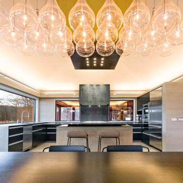
Located on a marsh in the upper reaches of the Lieutenant River in Old Lyme, the existing house was well-sited and well-built, but the design failed to exploit the views and more importantly was a confused combination of contemporary and traditional elements. The new homeowners, a successful businesswoman and an accomplished artist and photographer, were interested in creating a fully-contemporary environment to open up space, connect indoors with outdoors, display artwork and showcase the husband’s distinctive photographs.
One glaring deficiency was the curb appeal and approach sequence: the grade sloped down and the path to the house followed, but this led to an uncomfortable dip and abrupt rise to the front door. By creating a virtual “moat,” occupied by a grid of raised-bed grasses contained in aluminum-clad boxes, and spanning the moat with an ipe bridge, the approach becomes level and engaging. The façade of the existing house was blank and bland, and with no cover. Adding a deep overhang with a wide porch creates a welcoming, covered condition, accentuated by a 6’ wide pivoting front door that feels more like a moving piece of wall.
Another deficiency was the connection to the outdoors. By adding glass to the front and back of the house, and removing interior walls selectively, the house takes on a diaphanous quality that allows one to see through to the marsh beyond, even when in the driveway. The raised-bed grasses act as abstract, geometric versions of the marsh beyond. A large, pyramidal skylight establishes a spatial hierarchy around which the rooms revolve.
The house featured several tray-ceilinged spaces – living room, kitchen, and master bedroom – that were poorly-proportioned and with panels at the top that resembled inset flat panel doors. The solution was to use a different strategy for each: the bedroom turns the ceiling into an eggshell through the use of a creative trim detail; the living room has an oversized sculptural, backlit lighting element; and the kitchen has a collage of painted rectangular forms that support or include lighting pieces.
A palette of concrete, blackened steel, stainless steel and colors carefully chosen by homeowner and architect create an interior and exterior environment punctuated by moments that are as artistic as the featured works in the black-ceilinged gallery.
 L/L Design - Build - Furnish
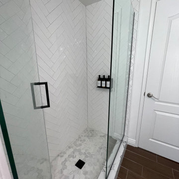
Sometimes the cost of painting an existing vanity vs. a new vanity isn't only the cost of the labor, fixing the old doors, the inside shelves were in poor condition, and the overall space the vanity provided was sub par...so we did replace the vanity and they have so much more functioning space. We did however paint the linen cabinet and the adjoining wall, and it really makes it look built it. I think this transformation is a home run!!!
 L/L Design - Build - Furnish
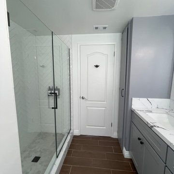
Sometimes the cost of painting an existing vanity vs. a new vanity isn't only the cost of the labor, fixing the old doors, the inside shelves were in poor condition, and the overall space the vanity provided was sub par...so we did replace the vanity and they have so much more functioning space. We did however paint the linen cabinet and the adjoining wall, and it really makes it look built it. I think this transformation is a home run!!!

 L/L Design - Build - Furnish
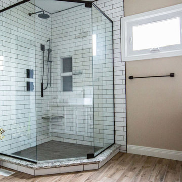
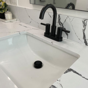
Sometimes the cost of painting an existing vanity vs. a new vanity isn't only the cost of the labor, fixing the old doors, the inside shelves were in poor condition, and the overall space the vanity provided was sub par...so we did replace the vanity and they have so much more functioning space. We did however paint the linen cabinet and the adjoining wall, and it really makes it look built it. I think this transformation is a home run!!!
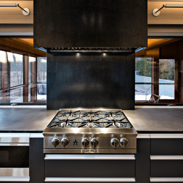 Nautilus Architects
Located on a marsh in the upper reaches of the Lieutenant River in Old Lyme, the existing house was well-sited and well-built, but the design failed to exploit the views and more importantly was a confused combination of contemporary and traditional elements. The new homeowners, a successful businesswoman and an accomplished artist and photographer, were interested in creating a fully-contemporary environment to open up space, connect indoors with outdoors, display artwork and showcase the husband’s distinctive photographs.
One glaring deficiency was the curb appeal and approach sequence: the grade sloped down and the path to the house followed, but this led to an uncomfortable dip and abrupt rise to the front door. By creating a virtual “moat,” occupied by a grid of raised-bed grasses contained in aluminum-clad boxes, and spanning the moat with an ipe bridge, the approach becomes level and engaging. The façade of the existing house was blank and bland, and with no cover. Adding a deep overhang with a wide porch creates a welcoming, covered condition, accentuated by a 6’ wide pivoting front door that feels more like a moving piece of wall.
Another deficiency was the connection to the outdoors. By adding glass to the front and back of the house, and removing interior walls selectively, the house takes on a diaphanous quality that allows one to see through to the marsh beyond, even when in the driveway. The raised-bed grasses act as abstract, geometric versions of the marsh beyond. A large, pyramidal skylight establishes a spatial hierarchy around which the rooms revolve.
The house featured several tray-ceilinged spaces – living room, kitchen, and master bedroom – that were poorly-proportioned and with panels at the top that resembled inset flat panel doors. The solution was to use a different strategy for each: the bedroom turns the ceiling into an eggshell through the use of a creative trim detail; the living room has an oversized sculptural, backlit lighting element; and the kitchen has a collage of painted rectangular forms that support or include lighting pieces.
A palette of concrete, blackened steel, stainless steel and colors carefully chosen by homeowner and architect create an interior and exterior environment punctuated by moments that are as artistic as the featured works in the black-ceilinged gallery.
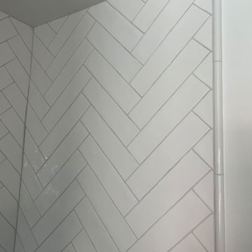 L/L Design - Build - Furnish
Sometimes the cost of painting an existing vanity vs. a new vanity isn't only the cost of the labor, fixing the old doors, the inside shelves were in poor condition, and the overall space the vanity provided was sub par...so we did replace the vanity and they have so much more functioning space. We did however paint the linen cabinet and the adjoining wall, and it really makes it look built it. I think this transformation is a home run!!!
 The Design House
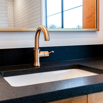
his Flower Mound bathroom remodel is a masterclass in texture and contrast. We moved away from standard polished surfaces to create a vanity that feels as good as it looks. The star is the Leathered Absolute Black Granite. This "leathering" process creates a matte, textured finish that is incredibly tactile and, unlike polished black stone, hides fingerprints and water spots perfectly.
The "Operator" Execution:
The Texture: Most fabricators struggle with leathered finishes because they can't hide poor cuts with polish. Because we own Stonemeyer Granite, we precision-cut this slab to ensure the textured edge profile was consistent and smooth to the touch.
The "Mixed Metals": We paired the matte black stone with a stunning Brushed Gold Single-Hole Faucet. The contrast between the rugged stone and the refined metal creates a "Modern Industrial" look that is timeless, not trendy.
The Splash: We installed a matching 4-Inch Granite Backsplash to keep the look cohesive and protect the drywall. Notice how the texture runs continuously from the deck up the splash—a detail only a custom shop gets right.
The Reflection: In the mirror, you can see the White Subway Tile on the opposite wall, keeping the room bright despite the dark vanity top.
Materials Used:
Countertop: Absolute Black Granite (Leathered Finish)
Faucet: Brushed Gold / Champagne Bronze [Modern Cylinder Style]
Sink: Rectangular White Undermount
Mirror: Gold Metal Frame
If you want a modern bathroom renovation in Flower Mound that features custom textured stone and designer finishes, contact The Design House today.
Sponsored
Fredericksburg, OH
High Point Cabinets
Columbus' Experienced Custom Cabinet Builder | 4x Best of Houzz Winner
 L/L Design - Build - Furnish
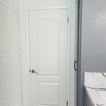
Sometimes the cost of painting an existing vanity vs. a new vanity isn't only the cost of the labor, fixing the old doors, the inside shelves were in poor condition, and the overall space the vanity provided was sub par...so we did replace the vanity and they have so much more functioning space. We did however paint the linen cabinet and the adjoining wall, and it really makes it look built it. I think this transformation is a home run!!!
 Nautilus Architects
Located on a marsh in the upper reaches of the Lieutenant River in Old Lyme, the existing house was well-sited and well-built, but the design failed to exploit the views and more importantly was a confused combination of contemporary and traditional elements. The new homeowners, a successful businesswoman and an accomplished artist and photographer, were interested in creating a fully-contemporary environment to open up space, connect indoors with outdoors, display artwork and showcase the husband’s distinctive photographs.
One glaring deficiency was the curb appeal and approach sequence: the grade sloped down and the path to the house followed, but this led to an uncomfortable dip and abrupt rise to the front door. By creating a virtual “moat,” occupied by a grid of raised-bed grasses contained in aluminum-clad boxes, and spanning the moat with an ipe bridge, the approach becomes level and engaging. The façade of the existing house was blank and bland, and with no cover. Adding a deep overhang with a wide porch creates a welcoming, covered condition, accentuated by a 6’ wide pivoting front door that feels more like a moving piece of wall.
Another deficiency was the connection to the outdoors. By adding glass to the front and back of the house, and removing interior walls selectively, the house takes on a diaphanous quality that allows one to see through to the marsh beyond, even when in the driveway. The raised-bed grasses act as abstract, geometric versions of the marsh beyond. A large, pyramidal skylight establishes a spatial hierarchy around which the rooms revolve.
The house featured several tray-ceilinged spaces – living room, kitchen, and master bedroom – that were poorly-proportioned and with panels at the top that resembled inset flat panel doors. The solution was to use a different strategy for each: the bedroom turns the ceiling into an eggshell through the use of a creative trim detail; the living room has an oversized sculptural, backlit lighting element; and the kitchen has a collage of painted rectangular forms that support or include lighting pieces.
A palette of concrete, blackened steel, stainless steel and colors carefully chosen by homeowner and architect create an interior and exterior environment punctuated by moments that are as artistic as the featured works in the black-ceilinged gallery.
 LVX Painting
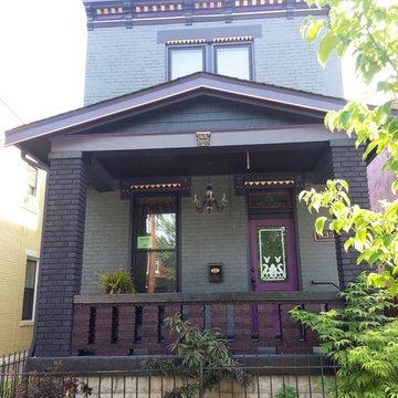
In a neighborhood of 3-story Italianate houses called “Mansion Hill” by the locals, the new homeowners of this 2-story brick home called to say that they wanted to have the stand-out house on the block. The house, originally known as the Kirker-Fischer House had history, an elegant interior and a rather plain exterior, compared with many of its neighbors.
The homeowners also said that they envisioned an all-black house. Fortunately they are not only bold, but have great taste, demonstrated by immediately approving a new color palette. The palette has lots of deep gray, dark purple tones and five different blacks, highlighted with metallic copper.
The house had been poorly maintained and quickly-rehabbed more than once. The carved stone details were filled in with several layers of old paint. The most recent repaint was fairly fresh, but in some places was barely attached to the brick substrate.
Lots of old paint was hand-scraped from brick walls and both stone and wood trim. The trim was sanded smooth and some mortar was replaced in the brick. Material-specific primers were used on all bare surfaces.
The details in the wood window trim were so badly scarred that it was impossible to bring them back, so we clad them with new poplar molding. Other carpentry projects included some minor repairs to the fascia boards plus a line of trim on the front porch roof to add another copper highlight to a very plain area.
After all this preparation and repair, the highly-detailed plan for painting took another two weeks. Meticulous attention was paid to the surfaces to accent each level and maximize the amount of visible detail.
The top coats were Sherwin-Williams Emerald along with some Resilience. The project took a 3-person crew three weeks to finish. We knew right away that this was the project we were submitting for American Painting Contractor magazine’s Top Job Award, and we’re very pleased that APC recognized the Kirker-Fischer House as a winner in the category of restoration.
7