
Search results for "Poor colors" in Home Design Ideas
 STUDIO NINE & CO.
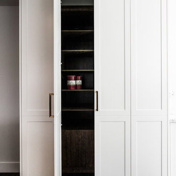
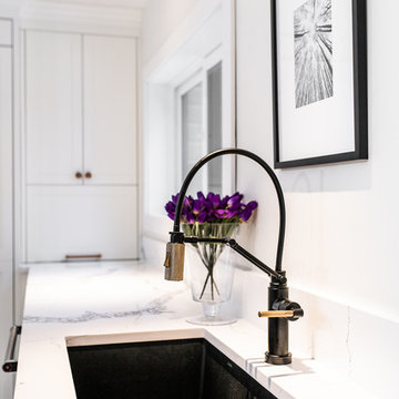
When this family of 7 bought their home, they came to us and said "We want a purple kitchen!". Naturally we jumped at the opportunity to create something outside of the box. With 5 young children, functionality and storage was imperative. We designed the kitchen to accommodate our client's lifestyle and busy household. It houses, 3 floor to ceiling storage compartments, each with its own individual function. First, the "Chef's Pantry", complete with top to bottom pullouts. Secondly, the "Breakfast Pantry", that houses everyday appliances, dinner ware, breakfast cereals and spreads. Finally, the once closet, converted 'Walk In Pantry". The oak frame around the range was specifically designed to allow for quick & easy access to everyday cooking essentials, and serve as a focal point in the space. Additional accessories included in the design were a double garbage pull out bin, retractable shelf for smaller, yet heavy appliances, Tupperware organizer, 2 spice pulls, and 2 Le Mans corner organizers. We opted for bespoke cabinetry, with an HDF painted & and oak construction, paired with purple and champagne bronze accents to tie it all together. Overall, this once dull and poorly organized kitchen is now the embodiment of bright, bold and beautiful, offering this colorful family comfort and convenience as they live life as an expression of their values.
 TVL Creative Ltd.
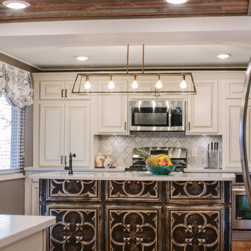
This challenging kitchen came our way at the same time as another similarly located Centennial kitchen. It was apparent that both houses had been built by the same builder: tight space, low ceilings, awkward arrangement, and poor building materials. Our client here is a single mother of three boys with an incredibly demanding work life. Once finally home at the end of a busy day, our client was virtually unable to use her kitchen. Cabinet doors were falling off, limited storage and workspace offered her little opportunity to cook and prep for her children, and the dark and low ceiling created an atmosphere that can only be described as depressing. Our client is also from Louisiana and has always dreamed of a kitchen that reminds her of home warmth and hospitality. Our goal was not only to expand functional storage and workspace, but bring in the southern NOLA appeal that reminds our client so much of home. To do this, we removed the wall between the formal dining room and kitchen to create an extended kitchen that runs the full length of both spaces. The back wall of what used to be the dining room is now the cooking zone for our client: we've relocated her range and microwave, and have created an island full of storage where her children can sit and socialize. We've also lifted up the low ceiling to create a tray ceiling that we have finished with ghostwood. The cabinetry is an off-white color with a hazelnut glaze that offers a more traditional, warm appearance. The island and mini work nook feature dramatic, handmade tin ceiling tiles for a dramatic texture and color. We've finished the space with functional quartz countertops and an arabesque two-toned marble backspalsh. The sinks, faucets and hardware are all in a matte black finish that offer a dramatic pop throughout the space. Little touches of Parisian flair add to this Cajun-French aesthetic and we are so thrilled with the final result!
 Granit Architects + Interiors
We are delighted to have completed the radical transformation of a tired detached property in South Croydon.
When they appointed Granit, our clients were living in the property which had previously been divided into a number of flats.
The historic sub-division had resulted in an extremely poor use of space with redundant staircases, kitchens and bathrooms throughout.
Our clients sought to reconfigure the property back into a single dwelling for his growing family.
Our client had an eye for design and was keen to balance contemporary design whilst maintaining as much of the character of the original house.
Maximising natural light, space and establishing a visual and physical connection were also key drivers for the design. Owing to the size of the property, it became apparent that reconfiguration rather than extension provided the solution to meet the brief.
A metal clad ‘intervention’ was introduced to the rear facade. This created a strong horizontal element creating a visual balance with the vertical nature of the three storey gable.
The metal cladding specified echoed the colour of the red brick string courses tying old with new. Slender frame sliding doors provide access and views of the large garden.
The central circulation space was transformed by the introduction of a double height glazed slot wrapping up the rear facade and onto the roof. This allows daylight to permeate into the heart of the otherwise dark deep floor plan. The staircase was reconfigured into a series of landings looking down over the main void space below and out towards the tree canopies at the rear of the garden.
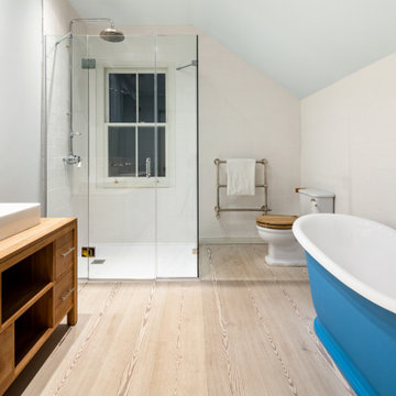
The introduction of double pocket doors throughout the ground floor creates a series of interconnected spaces and the whitewashed Larch flooring flows seamlessly from room to room. A bold palette of colours and materials lends character and texture throughout the property.
The end result is a spacious yet cosy environment for the family to inhabit for years to come.
Find the right local pro for your project
 Crystal Kitchen + Bath
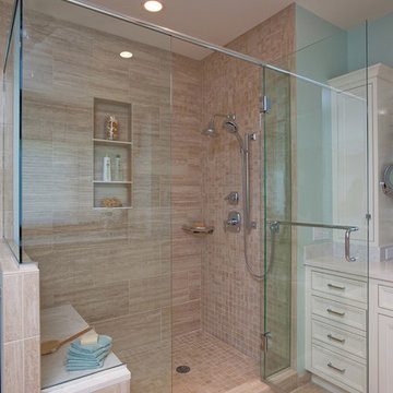
This Master Bathroom was a good size and had a beautiful view of the river, but was poorly laid out. The carpeted floor needed to go and a layout where the shower door didn’t collide with someone at the vanity was needed. The client requested that we stay within the basic footprint and keep the toilet in the same place.
The new layout incorporates a large shower with bench seat, two vanities with generous floor space and lots of storage. The inspiration for the bathroom was the soft green paint color. This soothing color coordinates with the pleated window valance, travertine tiles, white cabinets and quartz counter tops. All together, they create a relaxing, spacious room to begin and end the day in.
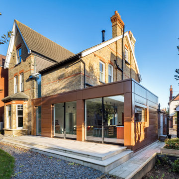 Granit Architects + Interiors
We are delighted to have completed the radical transformation of a tired detached property in South Croydon.
When they appointed Granit, our clients were living in the property which had previously been divided into a number of flats.
The historic sub-division had resulted in an extremely poor use of space with redundant staircases, kitchens and bathrooms throughout.
Our clients sought to reconfigure the property back into a single dwelling for his growing family.
Our client had an eye for design and was keen to balance contemporary design whilst maintaining as much of the character of the original house.
Maximising natural light, space and establishing a visual and physical connection were also key drivers for the design. Owing to the size of the property, it became apparent that reconfiguration rather than extension provided the solution to meet the brief.
A metal clad ‘intervention’ was introduced to the rear facade. This created a strong horizontal element creating a visual balance with the vertical nature of the three storey gable.
The metal cladding specified echoed the colour of the red brick string courses tying old with new. Slender frame sliding doors provide access and views of the large garden.
The central circulation space was transformed by the introduction of a double height glazed slot wrapping up the rear facade and onto the roof. This allows daylight to permeate into the heart of the otherwise dark deep floor plan. The staircase was reconfigured into a series of landings looking down over the main void space below and out towards the tree canopies at the rear of the garden.
The introduction of double pocket doors throughout the ground floor creates a series of interconnected spaces and the whitewashed Larch flooring flows seamlessly from room to room. A bold palette of colours and materials lends character and texture throughout the property.
The end result is a spacious yet cosy environment for the family to inhabit for years to come.
 TVL Creative Ltd.
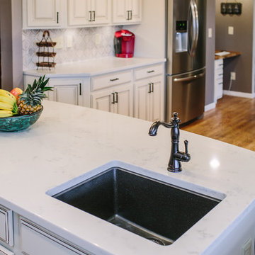
This challenging kitchen came our way at the same time as another similarly located Centennial kitchen. It was apparent that both houses had been built by the same builder: tight space, low ceilings, awkward arrangement, and poor building materials. Our client here is a single mother of three boys with an incredibly demanding work life. Once finally home at the end of a busy day, our client was virtually unable to use her kitchen. Cabinet doors were falling off, limited storage and workspace offered her little opportunity to cook and prep for her children, and the dark and low ceiling created an atmosphere that can only be described as depressing. Our client is also from Louisiana and has always dreamed of a kitchen that reminds her of home warmth and hospitality. Our goal was not only to expand functional storage and workspace, but bring in the southern NOLA appeal that reminds our client so much of home. To do this, we removed the wall between the formal dining room and kitchen to create an extended kitchen that runs the full length of both spaces. The back wall of what used to be the dining room is now the cooking zone for our client: we've relocated her range and microwave, and have created an island full of storage where her children can sit and socialize. We've also lifted up the low ceiling to create a tray ceiling that we have finished with ghostwood. The cabinetry is an off-white color with a hazelnut glaze that offers a more traditional, warm appearance. The island and mini work nook feature dramatic, handmade tin ceiling tiles for a dramatic texture and color. We've finished the space with functional quartz countertops and an arabesque two-toned marble backspalsh. The sinks, faucets and hardware are all in a matte black finish that offer a dramatic pop throughout the space. Little touches of Parisian flair add to this Cajun-French aesthetic and we are so thrilled with the final result!
 TOC design & construction inc.
Designed by: TOC design - Tania Scardellato
Construction by : TOC design & Construction inc.
Pictures by: Mathieu Laflamme
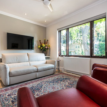
Patricia and David came to me with a dilemma, they could not sell their small home situated In the heart of Westmount. The ground floor was poorly divided, the kitchen was so small and closed in, every room on the ground floor felt like a small cave. So they made the right decision and turned to professionals.
When I first spoke with Patricia over the phone I immediately had great feeling about her and her lovely husband David.
This couple knew what they wanted, they were well informed and opened to ideas and suggestions.
I came up with 3 preliminaries and from there designed a forth. Once they saw my Renderings I could see that spark in their eyes, That’s when I knew that we were all on the same page.
The architectural drawings where completed as well as the millwork shop drawings.
The estimates where accurate and all materials choices fit perfectly with their style.
We began Construction mid February . Patricia and David left for Florida but I did not want to leave them with any surprises during the construction stage, We Skyped every week and although we had some structural, electrical and plumbing issues. The project advanced nicely. As the weeks came to an end I could see How happy they were.
WE completed this extensive renovation in 8 weeks on time and under budget.
A+ to the TOC design & Construction inc. team
Once Patricia and David settled into their new space and after I staged it for them, I asked, “ so are you still planning on moving?” to no surprise they are staying and loving there new renovated ground floor.

 Deck and Patio Company "Outdoor Living Experts"
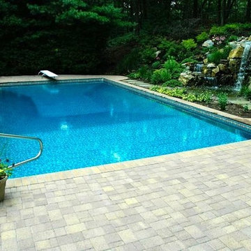
With the slope stabilized, our team addressed pool renovation. After draining the pool and removing the original liner, a poorly built concrete block wall was uncovered.
The solution was to straighten the wall and fill the block in with concrete and steel rebars for strength. New vinyl covered stairs were then added, as well as new pipes, returns, skimmers, pump, filter and new liner was installed.
After this, the pool was carefully backfilled and tamped. We compacted the soil back around the pool in three-inch lifts to allow for the immediate installation of new pavers around the pool.
This compacting process is not done by many contractors. The idea is that using compacted soil the base will not settle, so you don’t have to wait to install a patio around a new pool. Many contractors still install concrete slabs under their patio. In our experience we find this does not work well. Settling still occurs under the slab allowing the patio to crack or settle.
After the base materials were finished, we installed chestnut-hued durable pavers from Cambridge (Sahara). These particular pavers have little or no color fade and the random design pattern adds interest to the patio. The pavers’ protective coating means these clients will have a clean-lined modern look. Even after being subjected to snow plowing, de-icing salts and normal wear, they will keep their color and beautiful appearance.
 STUDIO NINE & CO.
When this family of 7 bought their home, they came to us and said "We want a purple kitchen!". Naturally we jumped at the opportunity to create something outside of the box. With 5 young children, functionality and storage was imperative. We designed the kitchen to accommodate our client's lifestyle and busy household. It houses, 3 floor to ceiling storage compartments, each with its own individual function. First, the "Chef's Pantry", complete with top to bottom pullouts. Secondly, the "Breakfast Pantry", that houses everyday appliances, dinner ware, breakfast cereals and spreads. Finally, the once closet, converted 'Walk In Pantry". The oak frame around the range was specifically designed to allow for quick & easy access to everyday cooking essentials, and serve as a focal point in the space. Additional accessories included in the design were a double garbage pull out bin, retractable shelf for smaller, yet heavy appliances, Tupperware organizer, 2 spice pulls, and 2 Le Mans corner organizers. We opted for bespoke cabinetry, with an HDF painted & and oak construction, paired with purple and champagne bronze accents to tie it all together. Overall, this once dull and poorly organized kitchen is now the embodiment of bright, bold and beautiful, offering this colorful family comfort and convenience as they live life as an expression of their values.
 Sosna Inc
After serving as a rental for some time, this home was ready to be reclaimed by its owner and her son.
Gutting “back to the studs” was an understatement for this one. This transformation involved replanning everything; including the roof, the HVAC system, the entire plumbing system, and relocating the side entrance and staircase to the back of the house. Only the subfloors, the exterior framing structure, and the brick remains from this original 1940’s-built bungalow.
When we’re renovating an old structure, we’re bound to find some surprises. This renovation did not disappoint! From basement to roof, we found more than a few, shall we say, potentially catastrophic surprises along the way.
Let’s start with the basement. The homeowner wanted to update the basement and make it a usable living space for her adult son as well as a spa with a sauna for her. This required bringing the 6 foot ceiling height up to code at 7 feet. To do this, we had to re-think the HVAC system that was in the basement ceiling. When we opened up the basement ceiling to remove the HVAC supply and return trunks, we discovered asbestos! The asbestos had to be removed before we could dismantle and remove the HVAC system.
For the main floor, when we were replanning the existing 2-bedroom layout to create two master bedrooms each with their own ensuites, we looked at the possibility of removing the main load-bearing wall. But our investigations led to the discovery that the load bearing wall was not lined up with the roof or the basement load points, so the load of the house was not continuous throughout. This was a disaster waiting to happen. And as we found out, this lack of alignment was causing major issues with the roof when we went to replace the shingles. We discovered portions of the roof truss in very poor condition, literally moments away from giving out. These were replaced and other truss components were fortified before we went on to re-shingle the roof and replace all the soffits and eavestroughs.
Once the structural and space planning elements were sorted out, we could turn our focus to helping this homeowner select the finishes she and her son wanted for their new spaces. She wanted white all the way, and he wanted bold colours. You will see these color choices reflected in their private bathrooms as well as in the upper kitchen and living area that she will mostly use, and the basement entertainment area that he will mostly use.
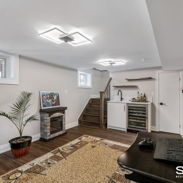
To round out the personalization of this made-new-again home, we converted the basement into an entertainment center with a bar for her son, and a sauna and third full bathroom with a jacuzzi tub for a spa-like feel for her.
Without having to build from scratch, this homeowner got the custom home of her dreams.
While you “can’t teach an old dog new tricks”, the sky’s the limit on how you can transform an old home into the home of your dreams. When your “old dog” needs some new tricks, we are the Renovator You Can Count On.
 Michael Nash Design, Build & Homes
Starting Each Day Clean and Refreshed In This Classically-Modern, Marble Masterpiece
In 1985, the previous owner of the house had added an addition of which part included a 17 feet by 13 feet space off the master bedroom for both a master bath and walk-in closet. Irrespective of the dated red carpet that blanketed the entire bathroom of this 1964 colonial in Annandale, VA, the combination bathroom/closet space had its other oddities, primarily in that there was no shower. The current homeowners -- a family of five, who has been in the home for 7 years, was tired of going down the hall to use the kids’ bathroom to take a shower before work. The renovation that they have created now is a bright and luxurious space that one could bask in all day. They used this bathroom renovation opportunity to total remake the layout and function of this essential room that sets the tone for the day ahead.
Prior to the renovation, the existing bathroom oddly had two entrances, a typical one off of the master bedroom, but another straight off the upstairs hallway. As the toilet was out in the open in the previous design, ensuring that this second door was closed when company was in town was essential and a nuisance. As you entered the room, situated below the arc window, a large soaking tub that was covered on three sides with wooden steps dominated the room from the corner it projected. A relatively small 42” single bowl sink did not leave much space for his and hers toiletries, and there was no other linen closet or cabinetry for storage in the bathroom. The 8 foot by 5 foot closet with accordion doors had poorly laid out rungs not letting the storage space to be fully utilized. At over 220 square feet, the room did offer considerable space to work with, yet the existing layout, which even included a partition wall behind the vanity, felt cramped and dysfunctional.
The homeowners wished to create a classic yet modern, private, deluxe bathroom that would better integrate into their master suite and enable them to start and end each day in a luxurious way. They wanted to maintain having a soaking tub, add in a large shower, have an enclosed commode, expand to include double sinks, and add more storage for toiletries and linens. We worked with the customer to develop a creative design with extensive plumbing rework that accomplished all these needs and more.
The first order of business was to gut out all the carpet, tub, cabinetry, and non-load bearing partition walls. The new tub would be generally in the same location, but as the previous walk-in closet would be repurposed for the commode and the walk-in shower additional water lines, plumbing, and draining needed to be added; fortunately the room below is the garage, which enabled the team to frame out some bulkheads to accomplish this complex plumbing. Following the framing, including walling up the second entrance to the bathroom, adding in a pocket door for the commode, and creating the shape of the new shower, the team also laid down the wiring for one of the luxuries of this room – heated flooring. A glossy percaline boarder, and two-inch hexagon shape percaline tiles cover the entire floor, making it much easier and cleaner than the previous carpet.
Marble look tile is predominant throughout the bathroom as despite the angled frameless glass door, the entire shower is covered in 18 inch polished marble look tiles. The shower coats the user in water from either the overhead rain head, large main showerhead and/or the hand held sprayer. Over 7 feet of white Italian Statuetto marble countertop, enable the couple to have two sink bowls and plenty of room on each side. The bowls are exposed in this stainless steel console sink design which required the team to ensure that the exposed plumbing looked pristine, and painting the bottom of the porcelain bowl to match the coloring.
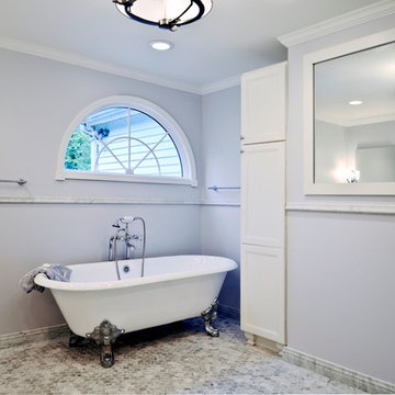
The white cast-iron 72-inch Cecilia claw-foot soaking tub and its chrome lion’s paws complement that other chrome and white used throughout the room. A tall, almost floor-to-ceiling linen closet finished in arctic white is nestled in the corner near the tub, enabling ample storage of towels, etc. Other cabinetry includes an 18 inch-wide vanity with decorative footing is centered between the two sinks, and a 27 inch wall mounted cabinet with shelf is above the Kohler Devonshire elongated toilet.
Billowing cloud colored grey blue paint was a great choice for this room to pick up on the veining in the marble. Mirrored medicine chests, a chandelier, wall sconces, and overhead recessed lighting also were incorporated into the design and function of the new room.
The artful combination of classic design from material choices, such as free-standing Victorian claw-foot tub along with the modern design as seen in the angled shower, frameless medicine cabinet mirrors, and frosted glass pocket door on the commode, make this bathroom quite a masterpiece.
The clients are enjoying having their private space and not having the use the kids’ bathroom anymore.
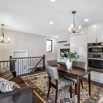 Sosna Inc
After serving as a rental for some time, this home was ready to be reclaimed by its owner and her son.
Gutting “back to the studs” was an understatement for this one. This transformation involved replanning everything; including the roof, the HVAC system, the entire plumbing system, and relocating the side entrance and staircase to the back of the house. Only the subfloors, the exterior framing structure, and the brick remains from this original 1940’s-built bungalow.
When we’re renovating an old structure, we’re bound to find some surprises. This renovation did not disappoint! From basement to roof, we found more than a few, shall we say, potentially catastrophic surprises along the way.
Let’s start with the basement. The homeowner wanted to update the basement and make it a usable living space for her adult son as well as a spa with a sauna for her. This required bringing the 6 foot ceiling height up to code at 7 feet. To do this, we had to re-think the HVAC system that was in the basement ceiling. When we opened up the basement ceiling to remove the HVAC supply and return trunks, we discovered asbestos! The asbestos had to be removed before we could dismantle and remove the HVAC system.
For the main floor, when we were replanning the existing 2-bedroom layout to create two master bedrooms each with their own ensuites, we looked at the possibility of removing the main load-bearing wall. But our investigations led to the discovery that the load bearing wall was not lined up with the roof or the basement load points, so the load of the house was not continuous throughout. This was a disaster waiting to happen. And as we found out, this lack of alignment was causing major issues with the roof when we went to replace the shingles. We discovered portions of the roof truss in very poor condition, literally moments away from giving out. These were replaced and other truss components were fortified before we went on to re-shingle the roof and replace all the soffits and eavestroughs.
Once the structural and space planning elements were sorted out, we could turn our focus to helping this homeowner select the finishes she and her son wanted for their new spaces. She wanted white all the way, and he wanted bold colours. You will see these color choices reflected in their private bathrooms as well as in the upper kitchen and living area that she will mostly use, and the basement entertainment area that he will mostly use.
To round out the personalization of this made-new-again home, we converted the basement into an entertainment center with a bar for her son, and a sauna and third full bathroom with a jacuzzi tub for a spa-like feel for her.
Without having to build from scratch, this homeowner got the custom home of her dreams.
While you “can’t teach an old dog new tricks”, the sky’s the limit on how you can transform an old home into the home of your dreams. When your “old dog” needs some new tricks, we are the Renovator You Can Count On.
 Advance Design Studio, Ltd.
Bud Kane has remodeled nearly every room in his own home over many years. Now reaching his 70’s, he contemplated heading up a major kitchen and laundry room renovation himself, planning on doing the carpentry work with his own hands. “I was not convinced I would ever meet anyone who could do it as well as I could do it myself”, said Bud. Ruth and Bud spent 5 years visiting kitchen firms and interviewing designers. They couldn’t however bring themselves to pull the trigger on the project, until they met Advance Design Studio in 2015.
“No one understood what I wanted”, said Ruth. She was continually frustrated by experiences with designers who weren’t hearing what was important to her. “Everyone kept designing my kitchen with what they thought it should look like; I couldn’t find anyone who would listen to me”!
When they met designer Scott Christensen from Advance Design Studio, they liked him right away. He listened to Ruth and designed a kitchen that she loved, all the while interjecting years of wisdom and design expertise that Ruth appreciated. “The finished product is better than I expected”, says Ruth. “I respected Scott’s opinions and together we created the perfect place for me to bake with my grandkids and truly enjoy the kitchen and laundry room I’ve been dreaming of for many years!”
The kitchen transformation began with removing the home’s soffits, and extending new painted maple cabinetry to the ceiling with the addition of an elegant crown molding. Ruth’s new Vita Mix holds a coveted place on her counter, and adjustments were planned to size the cabinets in conjunction with the under cabinet decorative light molding to fit this appliance just right. “This one small detail was really important to me”, says Ruth smiling. An elegant new island replaced the original island, complete with room for 3 stools where her grandchildren will sit to make home-made pasta every Thanksgiving, and cookies at Christmas time. “Traditions are very important in my family, and making my kitchen work to suit cherished activities with my family was the number one reason this renovation was so desired”, replied Ruth when asked about the island.
A picture perfect new tea station replaced a cluttered unused desk area, creating a wonderful place to prepare hot drinks for sipping any season of the year while overlooking the couple’s wonderfully manicured gardens from the lovely 3 season’s room just off the kitchen. The soft sage island bead panel detail was repeated on the backsplash, replicating the feel of a fine old piece of furniture.
The biggest problem with the laundry room was 3 doors, one from the garage, one from the closet, and one to the hallway. “Scott designed a pocket door, and oh what a dream it is now to bring groceries in from the garage!” exclaims Bud who grew to disdain this task! Doing laundry is now a breeze in this attractive new space that doubles as a wonderful pantry for the kitchen with room to store food items that didn’t have a home in the poorly designed original space.
New Hickory distressed wood flooring was laid both in the kitchen and leading to the hall foyer. Soft gray wood-replicating porcelain was placed in the laundry area, making for an easily cleanable surface for what doubles as a mud room from the garage. Creamy tumbled marble graces an unobtrusive backsplash spilling onto shiny granite counter tops in a rich earthy pattern of fall colors that mimic colors throughout the home. Advance is known details that included custom crafted furniture toe kicks, luxurious crown moldings, and beaded under cabinet moldings. The kitchen is complete with a glass display cabinet showing Ruth’s treasured china tea collection.
Early on, it was initially only their intention of purchasing cabinets for the new design. They were so impressed however with Advance Design’s complete program for budgeting, design, installation and management that it became clear to them both that they wanted Advance to handle the entire project from start to finish. “After seeing the quality work they did, coupled with the in-house team completely dedicated to our satisfaction, it became apparent there was no other choice but to hire them to handle everything. And we’re so glad we did, we have not one regret”, says Bud.
“The attention to detail by the carpentry crew more than satisfied my perfectionist expectations of the finished carpentry,” exclaimed Bud. “Every one of Advance Design’s people we encountered from design through construction was wonderful. We’ve never met a group of people so dedicated to making sure we were happy with every single detail, and every single part of this experience”, said Ruth and Bud.
Designer: Scott Christensen
Photographer: Joe Nowak
Sponsored
Westerville, OH

Custom Home Works
Franklin County's Award-Winning Design, Build and Remodeling Expert
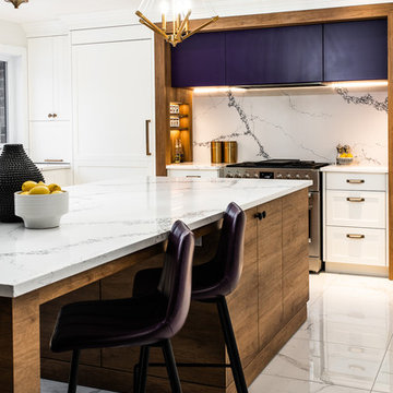 STUDIO NINE & CO.
When this family of 7 bought their home, they came to us and said "We want a purple kitchen!". Naturally we jumped at the opportunity to create something outside of the box. With 5 young children, functionality and storage was imperative. We designed the kitchen to accommodate our client's lifestyle and busy household. It houses, 3 floor to ceiling storage compartments, each with its own individual function. First, the "Chef's Pantry", complete with top to bottom pullouts. Secondly, the "Breakfast Pantry", that houses everyday appliances, dinner ware, breakfast cereals and spreads. Finally, the once closet, converted 'Walk In Pantry". The oak frame around the range was specifically designed to allow for quick & easy access to everyday cooking essentials, and serve as a focal point in the space. Additional accessories included in the design were a double garbage pull out bin, retractable shelf for smaller, yet heavy appliances, Tupperware organizer, 2 spice pulls, and 2 Le Mans corner organizers. We opted for bespoke cabinetry, with an HDF painted & and oak construction, paired with purple and champagne bronze accents to tie it all together. Overall, this once dull and poorly organized kitchen is now the embodiment of bright, bold and beautiful, offering this colorful family comfort and convenience as they live life as an expression of their values.
 Deck and Patio Company "Outdoor Living Experts"
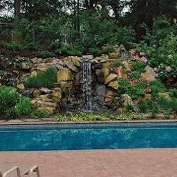
Once the stream and waterfall was complete, the next step was pressing the boulders into the surrounding slope to continue the natural presence of large boulders. Then the landscape crew installed natural woodland planting to tie in with the tall oaks adding color and evergreen shrubs to ensure year-round color.
Once the slope was stabilized, it was time for the pool renovation. After draining the pool and removing the liner, a poorly built concrete block wall was uncovered where we straighten the wall and filled the block in with concrete and steal rebar for strength. New vinyl covered stairs were added, plus new pipes, returns, skimmers, pump, filter and a new liner.
Cambridge Sahara Chestnut pavers were used to create a dramatic pool/patio area.
www.deckandpatio.com
 Tile Doctor Ltd
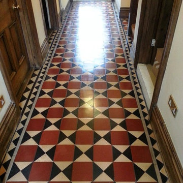
Recently I was contacted by a man in the town of Bedford who was worried that he had damaged his Victorian tiled hallway as a result of dragging a piano across the floor. I went round to the property to get a better look at the problem and, on closer inspection, realised that the tiles were actually fine; however, the piano had torn through the old surface seal.
The 150-year old tiles, dating back – as the name suggests – to the reign of Queen Victoria, had been poorly sealed and additionally had not been maintained correctly with the appropriate cleaning products. I was commissioned to remove the old sealer, clean and re-seal in order to restore this fantastic floor to its former glory.
My first task was to mix a solution of Tile Doctor Pro-Clean and water, which was then spread across the floor. Pro-Clean is a high alkaline cleaner which also contains stripping properties and this helped to break down the old, damaged sealer. The solution was left to dwell for approximately 20 minutes, giving it time to seep into the stone to get underneath, and lift out, any ingrained dirt. Pro-Clean was worked into the tiles using a heavy low speed rotary machine fitted with a black pad.
Once cleaned and stripped, we rinsed the floor using plain, clean water to neutralise the high alkaline Pro-Clean and the removed the resulting slurry using a wet-vac machine.
At this point I noticed that the white/magnolia tiles were particularly well worn and still very dirty and in need of further cleaning. Around this time Tile Doctor had also been discussing the successful use of Burnishing Pads (normally used on polished stone) on Victorian Tiles so I hand burnished the most stained tiles with a small 6 inch diamond encrusted burnishing pad with a little water to help lubricate the process. Following this, I rinsed the entire floor once again.
After leaving the floor to dry for four days, I returned to the house to seal the tiles opting to apply a single coat of Tile Doctor Colour Grow impregnating sealer first followed up with four coats of Tile Doctor Seal & Go. This combination of sealers provides a durable internal and surface stain protection whilst lifting the colours and adding a nice subtle sheen finish.
Once dried and cured, the floor was buffed using micro-fibre clothes to further enhance the appearance of the tiles further. My client was very pleased with the results, and couldn’t believe it was possible to get a floor that was so old appear brand new! The floor will dull with wear so I advised my client on the benefits of a regular maintenance plan going forward to ensure this great flooring feature remains in top condition.
Andrew Evans
Bedfordshire Tile Doctor
 Paintzen, Inc.
For many, professional interior design is a luxury. Whether your home’s design project is large or small, having the ability to transform your house, apartment or condo into a beautiful, unique space is a wonderful opportunity for self-expression. Even if it is a just simple accent wall painted in a color that speaks to you, or a complete renovation of your cabinets to achieve the kitchen of your dreams, interior design allows you to create an environment that is both personal and comfortable.
That is exactly how interior designer and founder of Design Exchange Sean Carlson Perry feels about what he does for a living. “The reason that I love designing spaces, and value the impact of space design on people, is the way the spaces make us feel, the visceral appeal of good design. Good design should stimulate the senses and generate an emotionally engaging experience. As a designer, I get to massage and sculpt people’s experience of space!” Perry shared with us.
In late 2017, the Paintzen team connected with Perry regarding a very special design project he was working on. Design Exchange was renovating, redesigning and re-furnishing The Ali Forney Center. The Ali Forney Center, based in New York City, is the largest and most comprehensive organization dedicated to housing homeless LGBTQ youth. Nearly 40% of the homeless youth population is LGBTQ. Homeless LGBTQ youth are eight times more likely to experience violence, discrimination, and suicide. AFC houses 124 youths each night and provides services to over 1,400 homeless young people per year.
Although the organization does an incredible job to provide safety and shelter to homeless youth, Perry and his team felt the space itself could use some updating and could feel more welcoming. Rooms were dark, cold, and lacked proper storage. Furniture was in poor shape and didn’t work. The rooms were being under-utilized; overall, there was so much more that could be done within the walls of the AFC that could be improved using interior design & paint!
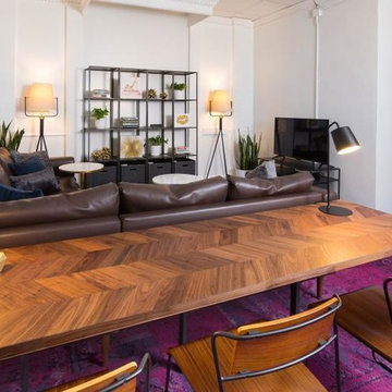
We at Paintzen were excited to partner with Design Exchange to do our part in this transformation. The dark, paneled walls were re-painted white. This entirely opened up the space, making it brighter, warmer and more welcoming. The white walls also served as a much better backdrop for smart lighting, as well as for the furniture, wall decor, and new flooring. Beyond painting, Perry and his team used FLOR carpet tiles for durability in a bright Fuchsia shade for a pop of color. They created a more functional layout to maximize the space and make better use of its architectural details and added new furniture including lamps, tables, throws, a sofa, a TV and a Roku to make the space beautiful, and even fun.
“Design increases connection and community,” Perry told us. “When we revamp a shelter space, history tells us that the residents spend more time in the space, more time with their peers, building connections and community; a greater sense of home.” Perry’s goal was to create an environment that set its residents up for success by improving their quality of life, outlook and self-esteem.
“This isn’t extreme home makeover (although I wish I had that budget!). It’s about improving the aesthetics of the space to create a better environment and experience for people who are going through challenging times. I’ve been lucky enough to have an amount of work that allows me to donate a portion of profits to Design Exchange Projects.”
Sean Carlson Perry founded Design Exchange as a way to use his talent, passion, and skills to help those who are struggling, or in a place of immediate need. He was searching to bring deeper meaning and a humanitarian component to his work. Perry has worked with clients in New York, San Francisco, and Los Angeles. “Good design—functionally, aesthetically and ergonomically—promotes a better quality of life.” This is a mantra that describes why Perry does what he does through Design Exchange, working to help the underserved of New York City and other cities across the country.
“I grew up gay in Nebraska, and have gone through some hard times when I was younger, but I can’t imagine going through what these kids go through – rejection from family, being kicked out of the house for being who they are, homeless and having nowhere else to turn,” said Perry. “Luckily, there is The Ali Forney Center. Doing these projects for AFC strikes close to home for me, so they are extra special and close to my heart.”
Sponsored
Westerville, OH
Custom Home Works
Franklin County's Award-Winning Design, Build and Remodeling Expert
 TVL Creative Ltd.
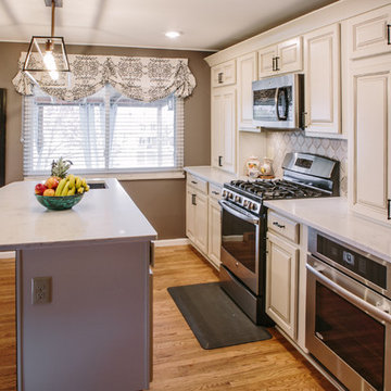
This challenging kitchen came our way at the same time as another similarly located Centennial kitchen. It was apparent that both houses had been built by the same builder: tight space, low ceilings, awkward arrangement, and poor building materials. Our client here is a single mother of three boys with an incredibly demanding work life. Once finally home at the end of a busy day, our client was virtually unable to use her kitchen. Cabinet doors were falling off, limited storage and workspace offered her little opportunity to cook and prep for her children, and the dark and low ceiling created an atmosphere that can only be described as depressing. Our client is also from Louisiana and has always dreamed of a kitchen that reminds her of home warmth and hospitality. Our goal was not only to expand functional storage and workspace, but bring in the southern NOLA appeal that reminds our client so much of home. To do this, we removed the wall between the formal dining room and kitchen to create an extended kitchen that runs the full length of both spaces. The back wall of what used to be the dining room is now the cooking zone for our client: we've relocated her range and microwave, and have created an island full of storage where her children can sit and socialize. We've also lifted up the low ceiling to create a tray ceiling that we have finished with ghostwood. The cabinetry is an off-white color with a hazelnut glaze that offers a more traditional, warm appearance. The island and mini work nook feature dramatic, handmade tin ceiling tiles for a dramatic texture and color. We've finished the space with functional quartz countertops and an arabesque two-toned marble backspalsh. The sinks, faucets and hardware are all in a matte black finish that offer a dramatic pop throughout the space. Little touches of Parisian flair add to this Cajun-French aesthetic and we are so thrilled with the final result!
 Sosna Inc
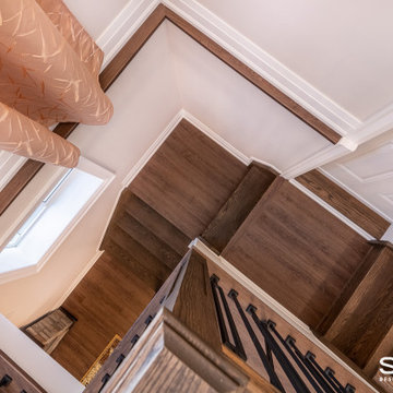
After serving as a rental for some time, this home was ready to be reclaimed by its owner and her son.
Gutting “back to the studs” was an understatement for this one. This transformation involved replanning everything; including the roof, the HVAC system, the entire plumbing system, and relocating the side entrance and staircase to the back of the house. Only the subfloors, the exterior framing structure, and the brick remains from this original 1940’s-built bungalow.
When we’re renovating an old structure, we’re bound to find some surprises. This renovation did not disappoint! From basement to roof, we found more than a few, shall we say, potentially catastrophic surprises along the way.
Let’s start with the basement. The homeowner wanted to update the basement and make it a usable living space for her adult son as well as a spa with a sauna for her. This required bringing the 6 foot ceiling height up to code at 7 feet. To do this, we had to re-think the HVAC system that was in the basement ceiling. When we opened up the basement ceiling to remove the HVAC supply and return trunks, we discovered asbestos! The asbestos had to be removed before we could dismantle and remove the HVAC system.
For the main floor, when we were replanning the existing 2-bedroom layout to create two master bedrooms each with their own ensuites, we looked at the possibility of removing the main load-bearing wall. But our investigations led to the discovery that the load bearing wall was not lined up with the roof or the basement load points, so the load of the house was not continuous throughout. This was a disaster waiting to happen. And as we found out, this lack of alignment was causing major issues with the roof when we went to replace the shingles. We discovered portions of the roof truss in very poor condition, literally moments away from giving out. These were replaced and other truss components were fortified before we went on to re-shingle the roof and replace all the soffits and eavestroughs.
Once the structural and space planning elements were sorted out, we could turn our focus to helping this homeowner select the finishes she and her son wanted for their new spaces. She wanted white all the way, and he wanted bold colours. You will see these color choices reflected in their private bathrooms as well as in the upper kitchen and living area that she will mostly use, and the basement entertainment area that he will mostly use.
To round out the personalization of this made-new-again home, we converted the basement into an entertainment center with a bar for her son, and a sauna and third full bathroom with a jacuzzi tub for a spa-like feel for her.
Without having to build from scratch, this homeowner got the custom home of her dreams.
While you “can’t teach an old dog new tricks”, the sky’s the limit on how you can transform an old home into the home of your dreams. When your “old dog” needs some new tricks, we are the Renovator You Can Count On.
 TVL Creative Ltd.
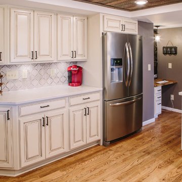
This challenging kitchen came our way at the same time as another similarly located Centennial kitchen. It was apparent that both houses had been built by the same builder: tight space, low ceilings, awkward arrangement, and poor building materials. Our client here is a single mother of three boys with an incredibly demanding work life. Once finally home at the end of a busy day, our client was virtually unable to use her kitchen. Cabinet doors were falling off, limited storage and workspace offered her little opportunity to cook and prep for her children, and the dark and low ceiling created an atmosphere that can only be described as depressing. Our client is also from Louisiana and has always dreamed of a kitchen that reminds her of home warmth and hospitality. Our goal was not only to expand functional storage and workspace, but bring in the southern NOLA appeal that reminds our client so much of home. To do this, we removed the wall between the formal dining room and kitchen to create an extended kitchen that runs the full length of both spaces. The back wall of what used to be the dining room is now the cooking zone for our client: we've relocated her range and microwave, and have created an island full of storage where her children can sit and socialize. We've also lifted up the low ceiling to create a tray ceiling that we have finished with ghostwood. The cabinetry is an off-white color with a hazelnut glaze that offers a more traditional, warm appearance. The island and mini work nook feature dramatic, handmade tin ceiling tiles for a dramatic texture and color. We've finished the space with functional quartz countertops and an arabesque two-toned marble backspalsh. The sinks, faucets and hardware are all in a matte black finish that offer a dramatic pop throughout the space. Little touches of Parisian flair add to this Cajun-French aesthetic and we are so thrilled with the final result!
22