
Search results for "Poor colors" in Home Design Ideas
 Advance Design Studio, Ltd.
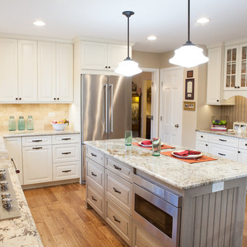
Bud Kane has remodeled nearly every room in his own home over many years. Now reaching his 70’s, he contemplated heading up a major kitchen and laundry room renovation himself, planning on doing the carpentry work with his own hands. “I was not convinced I would ever meet anyone who could do it as well as I could do it myself”, said Bud. Ruth and Bud spent 5 years visiting kitchen firms and interviewing designers. They couldn’t however bring themselves to pull the trigger on the project, until they met Advance Design Studio in 2015.
“No one understood what I wanted”, said Ruth. She was continually frustrated by experiences with designers who weren’t hearing what was important to her. “Everyone kept designing my kitchen with what they thought it should look like; I couldn’t find anyone who would listen to me”!
When they met designer Scott Christensen from Advance Design Studio, they liked him right away. He listened to Ruth and designed a kitchen that she loved, all the while interjecting years of wisdom and design expertise that Ruth appreciated. “The finished product is better than I expected”, says Ruth. “I respected Scott’s opinions and together we created the perfect place for me to bake with my grandkids and truly enjoy the kitchen and laundry room I’ve been dreaming of for many years!”
The kitchen transformation began with removing the home’s soffits, and extending new painted maple cabinetry to the ceiling with the addition of an elegant crown molding. Ruth’s new Vita Mix holds a coveted place on her counter, and adjustments were planned to size the cabinets in conjunction with the under cabinet decorative light molding to fit this appliance just right. “This one small detail was really important to me”, says Ruth smiling. An elegant new island replaced the original island, complete with room for 3 stools where her grandchildren will sit to make home-made pasta every Thanksgiving, and cookies at Christmas time. “Traditions are very important in my family, and making my kitchen work to suit cherished activities with my family was the number one reason this renovation was so desired”, replied Ruth when asked about the island.
A picture perfect new tea station replaced a cluttered unused desk area, creating a wonderful place to prepare hot drinks for sipping any season of the year while overlooking the couple’s wonderfully manicured gardens from the lovely 3 season’s room just off the kitchen. The soft sage island bead panel detail was repeated on the backsplash, replicating the feel of a fine old piece of furniture.
The biggest problem with the laundry room was 3 doors, one from the garage, one from the closet, and one to the hallway. “Scott designed a pocket door, and oh what a dream it is now to bring groceries in from the garage!” exclaims Bud who grew to disdain this task! Doing laundry is now a breeze in this attractive new space that doubles as a wonderful pantry for the kitchen with room to store food items that didn’t have a home in the poorly designed original space.
New Hickory distressed wood flooring was laid both in the kitchen and leading to the hall foyer. Soft gray wood-replicating porcelain was placed in the laundry area, making for an easily cleanable surface for what doubles as a mud room from the garage. Creamy tumbled marble graces an unobtrusive backsplash spilling onto shiny granite counter tops in a rich earthy pattern of fall colors that mimic colors throughout the home. Advance is known details that included custom crafted furniture toe kicks, luxurious crown moldings, and beaded under cabinet moldings. The kitchen is complete with a glass display cabinet showing Ruth’s treasured china tea collection.
Early on, it was initially only their intention of purchasing cabinets for the new design. They were so impressed however with Advance Design’s complete program for budgeting, design, installation and management that it became clear to them both that they wanted Advance to handle the entire project from start to finish. “After seeing the quality work they did, coupled with the in-house team completely dedicated to our satisfaction, it became apparent there was no other choice but to hire them to handle everything. And we’re so glad we did, we have not one regret”, says Bud.
“The attention to detail by the carpentry crew more than satisfied my perfectionist expectations of the finished carpentry,” exclaimed Bud. “Every one of Advance Design’s people we encountered from design through construction was wonderful. We’ve never met a group of people so dedicated to making sure we were happy with every single detail, and every single part of this experience”, said Ruth and Bud.
Designer: Scott Christensen
Photographer: Joe Nowak
 Designs By Gia Interior Design and Renovation
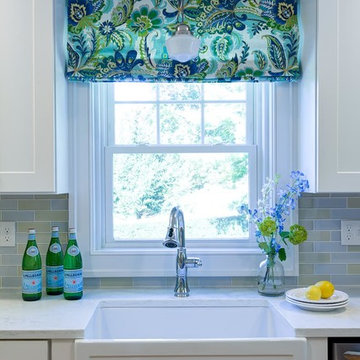
In this recent kitchen design and renovation project, these long time clients came to me originally, several years ago to start discussing the design of their kitchen. At that time, the kitchen in this 1800’s home included a kitchen that had been poorly remodeled in the 1980’s, so the kitchen had already lost most of it’s original charm. I created a design plan creating a beautiful large kitchen expanding the space into the adjacent rooms. My clients loved this design plan, but other home issues took precedence, so after a few additional years, my clients were now ready to start their kitchen project.
Their overall goals for the property did change since we first looked at this project, my clients decided that they did not want to enlarge or expand the small kitchen by opening it up to the adjacent rooms. So, I went back to the drawing board to create a kitchen in the existing kitchen space that fulfilled their new goals and created a beautiful functional space within the existing kitchen space. This new design, like my former design, honored this home’s traditional architecture, but added a light, fresh feel to the space using updated colors and material selections. This design consisted of additional storage and cabinetry, additional countertop space, and a small space to sit. We added new cabinetry, appliances, electrical, plumbing, beautiful quartz countertops, glass backsplash tile, traditional lighting fixtures, and finished everything off using beautiful classic hardware elements.
My clients are now in love with this new renovated kitchen space. It contains many of the elements of a much larger kitchen, and melds beautifully with the rest of the house which we have also designed renovated over the last few years. Finally my client’s get to enjoy their new kitchen space as much as they enjoy the rest of this beautiful home!
 GH Wood Design
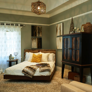
The Carriage House Guest Suite in the 2015 Pasadena Showcase House for the Arts reflects a mix of midcentury modern and rustic influences.
Bedroom - small mid-century modern guest carpeted and beige floor bedroom idea in Los Angeles with gray walls and no fireplace
Bedroom - small mid-century modern guest carpeted and beige floor bedroom idea in Los Angeles with gray walls and no fireplace
Find the right local pro for your project
 Corinthian Fine Homes
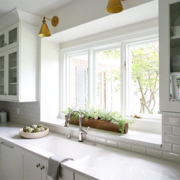
Our busy young homeowners were looking to move back to Indianapolis and considered building new, but they fell in love with the great bones of this Coppergate home. The home reflected different times and different lifestyles and had become poorly suited to contemporary living. We worked with Stacy Thompson of Compass Design for the design and finishing touches on this renovation. The makeover included improving the awkwardness of the front entrance into the dining room, lightening up the staircase with new spindles, treads and a brighter color scheme in the hall. New carpet and hardwoods throughout brought an enhanced consistency through the first floor. We were able to take two separate rooms and create one large sunroom with walls of windows and beautiful natural light to abound, with a custom designed fireplace. The downstairs powder received a much-needed makeover incorporating elegant transitional plumbing and lighting fixtures. In addition, we did a complete top-to-bottom makeover of the kitchen, including custom cabinetry, new appliances and plumbing and lighting fixtures. Soft gray tile and modern quartz countertops bring a clean, bright space for this family to enjoy. This delightful home, with its clean spaces and durable surfaces is a textbook example of how to take a solid but dull abode and turn it into a dream home for a young family.
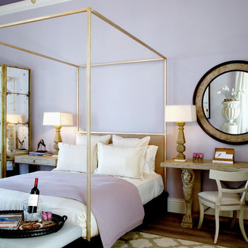
 Frances Herrera Interior Design
This guest house and courtyard was part of the 2014 Designer Show House in Lighthouse Point, Florida benefitting Food for the Poor.
My vision was a space that allowed guests to be transported, which is why I selected the guesthouse and courtyard. With careful attention to every detail, I created a modern sanctuary filled with exquisite, unique pieces that revive the spirit and inspire curiosity. It's a space where guests will feel transported with exotic elegance and leave invigorated.
 H2D Architecture + Design
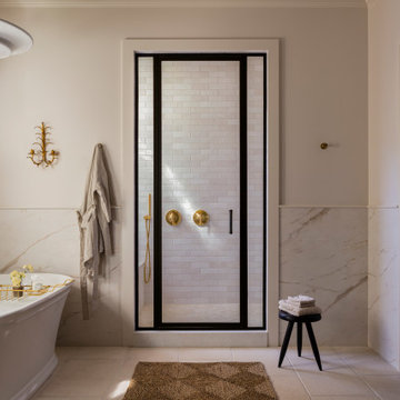
H2D Architecture + Design developed a comprehensive vision for the renovation of this Bellevue residence, creating a cohesive master plan that can be implemented in phased construction to align with the homeowners' priorities, budget, and timeline. The first phase reimagined the primary suite, including a redesigned bathroom, reconfigured closet and bedroom. Strategic space planning enhanced the functionality and flow of each space while creating a serene, spa-inspired retreat tailored to the homeowners' lifestyle. Future phases will transform the home's main living areas through a complete reconfiguration of the kitchen, dining room, entry, and living room. The design will improve circulation, increase functionality, and create light-filled, beautifully connected spaces.
Architecture: H2D Architecture + Design
www.h2darchitects.com
Interiors: Kat Lawton Interiors
Photos by: John Granen
 LVX Painting
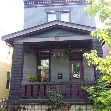
In a neighborhood of 3-story Italianate houses called “Mansion Hill” by the locals, the new homeowners of this 2-story brick home called to say that they wanted to have the stand-out house on the block. The house, originally known as the Kirker-Fischer House had history, an elegant interior and a rather plain exterior, compared with many of its neighbors.
The homeowners also said that they envisioned an all-black house. Fortunately they are not only bold, but have great taste, demonstrated by immediately approving a new color palette. The palette has lots of deep gray, dark purple tones and five different blacks, highlighted with metallic copper.
The house had been poorly maintained and quickly-rehabbed more than once. The carved stone details were filled in with several layers of old paint. The most recent repaint was fairly fresh, but in some places was barely attached to the brick substrate.
Lots of old paint was hand-scraped from brick walls and both stone and wood trim. The trim was sanded smooth and some mortar was replaced in the brick. Material-specific primers were used on all bare surfaces.
The details in the wood window trim were so badly scarred that it was impossible to bring them back, so we clad them with new poplar molding. Other carpentry projects included some minor repairs to the fascia boards plus a line of trim on the front porch roof to add another copper highlight to a very plain area.
After all this preparation and repair, the highly-detailed plan for painting took another two weeks. Meticulous attention was paid to the surfaces to accent each level and maximize the amount of visible detail.
The top coats were Sherwin-Williams Emerald along with some Resilience. The project took a 3-person crew three weeks to finish. We knew right away that this was the project we were submitting for American Painting Contractor magazine’s Top Job Award, and we’re very pleased that APC recognized the Kirker-Fischer House as a winner in the category of restoration.

Sponsored
Fredericksburg, OH

High Point Cabinets
Columbus' Experienced Custom Cabinet Builder | 4x Best of Houzz Winner
 Designs By Gia Interior Design and Renovation
In this recent kitchen design and renovation project, these long time clients came to me originally, several years ago to start discussing the design of their kitchen. At that time, the kitchen in this 1800’s home included a kitchen that had been poorly remodeled in the 1980’s, so the kitchen had already lost most of it’s original charm. I created a design plan creating a beautiful large kitchen expanding the space into the adjacent rooms. My clients loved this design plan, but other home issues took precedence, so after a few additional years, my clients were now ready to start their kitchen project.
Their overall goals for the property did change since we first looked at this project, my clients decided that they did not want to enlarge or expand the small kitchen by opening it up to the adjacent rooms. So, I went back to the drawing board to create a kitchen in the existing kitchen space that fulfilled their new goals and created a beautiful functional space within the existing kitchen space. This new design, like my former design, honored this home’s traditional architecture, but added a light, fresh feel to the space using updated colors and material selections. This design consisted of additional storage and cabinetry, additional countertop space, and a small space to sit. We added new cabinetry, appliances, electrical, plumbing, beautiful quartz countertops, glass backsplash tile, traditional lighting fixtures, and finished everything off using beautiful classic hardware elements.
My clients are now in love with this new renovated kitchen space. It contains many of the elements of a much larger kitchen, and melds beautifully with the rest of the house which we have also designed renovated over the last few years. Finally my client’s get to enjoy their new kitchen space as much as they enjoy the rest of this beautiful home!
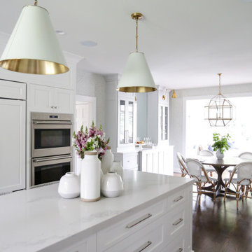 Corinthian Fine Homes
Our busy young homeowners were looking to move back to Indianapolis and considered building new, but they fell in love with the great bones of this Coppergate home. The home reflected different times and different lifestyles and had become poorly suited to contemporary living. We worked with Stacy Thompson of Compass Design for the design and finishing touches on this renovation. The makeover included improving the awkwardness of the front entrance into the dining room, lightening up the staircase with new spindles, treads and a brighter color scheme in the hall. New carpet and hardwoods throughout brought an enhanced consistency through the first floor. We were able to take two separate rooms and create one large sunroom with walls of windows and beautiful natural light to abound, with a custom designed fireplace. The downstairs powder received a much-needed makeover incorporating elegant transitional plumbing and lighting fixtures. In addition, we did a complete top-to-bottom makeover of the kitchen, including custom cabinetry, new appliances and plumbing and lighting fixtures. Soft gray tile and modern quartz countertops bring a clean, bright space for this family to enjoy. This delightful home, with its clean spaces and durable surfaces is a textbook example of how to take a solid but dull abode and turn it into a dream home for a young family.

 WINN Design+Build
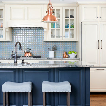
Open concept kitchen - mid-sized traditional single-wall dark wood floor open concept kitchen idea in DC Metro with a farmhouse sink, raised-panel cabinets, blue backsplash, paneled appliances, an island, white cabinets, granite countertops and ceramic backsplash
 Milgard Windows & Doors
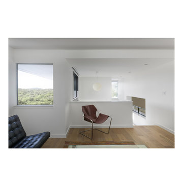
The Kiguchi family moved into their Austin, Texas home in 1994. Built in the 1980’s as part of a neighborhood development, they happily raised their family here but longed for something more contemporary. Once they became empty nesters, they decided it was time for a major remodel. After spending many years visiting Austin AIA Home Tours that highlight contemporary residential architecture, they had a lot of ideas and in 2013 were ready to interview architects and get their renovation underway.
The project turned into a major remodel due to an unstable foundation. Architects Ben Arbib and Ed Hughey, of Arbib Hughey Design were hired to solve the structural issue and look for inspiration in the bones of the house, which sat on top of a hillside and was surrounded by great views.
Unfortunately, with the old floor plan, the beautiful views were hidden by small windows that were poorly placed. In order to bring more natural light into the house the window sizes and configurations had to be addressed, all while keeping in mind the homeowners desire for a modern look and feel.
To achieve a more contemporary and sophisticated front of house, a new entry was designed that included removing a two-story bay window and porch. The entrance of the home also became more integrated with the landscape creating a template for new foliage to be planted. Older exterior materials were updated to incorporate a more muted palette of colors with a metal roof, dark grey siding in the back and white stucco in the front. Deep eaves were added over many of the new large windows for clean lines and sun protection.
“Inside it was about opening up the floor plan, expanding the views throughout the house, and updating the material palette to get a modern look that was also warm and inviting,” said Ben from Arbib Hughey Design. “Prior to the remodel, the house had the typical separation of rooms. We removed the walls between them and changed all of the windows to Milgard Thermally Improved Aluminum to connect the inside with the outside. No matter where you are you get nice views and natural light.”
The architects wanted to create some drama, which they accomplished with the window placement and opening up the interior floor plan to an open concept approach. Cabinetry was used to help delineate intimate spaces. To add warmth to an all-white living room, white-washed oak wood floors were installed and pine planks were used around the fireplace. The large windows served as artwork bringing the color of nature into the space.
An octagon shaped, elevated dining room, (named “the turret”), had a big impact on the design of the house. They architects rounded the corners and added larger window openings overlooking a new sunken garden. The great room was also softened by rounding out the corners and that circular theme continued throughout the house, being picked up in skylight wells and kitchen cabinetry. A staircase leading to a catwalk was added and the result was a two-story window wall that flooded the home with natural light.
When asked why Milgard® Thermally Improved Aluminum windows were selected, the architectural team listed many reasons:
1) Aesthetics: “We liked the slim profiles and narrow sightlines. The window frames never get in the way of the view and that was important to us. They also have a very contemporary look that went well with our design.”
2) Options: “We liked that we could get large sliding doors that matched the windows, giving us a very cohesive look and feel throughout the project.”
3) Cost Effective: “Milgard windows are affordable. You get a good product at a good price.”
4) Custom Sizes: “Milgard windows are customizable, which allowed us to get the right window for each location.”
Ready to take on your own traditional to modern home remodeling project? Arbib Hughey Design advises, “Work with a good architect. That means picking a team that is creative, communicative, listens well and is responsive. We think it’s important for an architect to listen to their clients and give them something they want, not something the architect thinks they should have. At the same time you want an architect who is willing and able to think outside the box and offer up design options that you may not have considered. Design is about a lot of back and forth, trying out ideas, getting feedback and trying again.”
The home was completely transformed into a unique, contemporary house perfectly integrated with its site. Internally the home has a natural flow for the occupants and externally it is integrated with the surroundings taking advantage of great natural light. As a side note, it was highly praised as part of the Austin AIA homes tour.

Sponsored
Columbus, OH

Wannemacher Interiors
Customized Award-Winning Interior Design Solutions in Franklin Cnty OH
 User
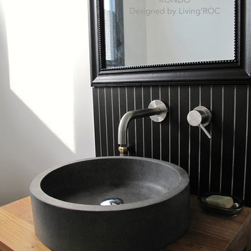
UserReference: BB507-US
Model: RONDO
Color: Concrete gray
Shape: round
Finish: honed inside and outside
US Dimensions: 16 x 4-1/3"
US Drain size: standard hole size (1.5")
Material- Basalt-Andesite
RONDO is a 15-3/4" x 4-1/3" round Concrete gray Andesite (basalt) vessel sink, genuine stone made for bathroom decoration. Our products cannot be compared to poor quality plastic, often overpriced vessel sinks. RONDO pure and sleek lines will give a cool and chic look to your bathroom with its gray tones reminder of the concrete color fashionable for the bathroom decor.
 Advance Design Studio, Ltd.
See "5-Year Kitchen in Elgin" for the kitchen featured in this description.
Bud Kane has remodeled nearly every room in his own home over many years. Now reaching his 70’s, he contemplated heading up a major kitchen and laundry room renovation himself, planning on doing the carpentry work with his own hands. “I was not convinced I would ever meet anyone who could do it as well as I could do it myself”, said Bud. Ruth and Bud spent 5 years visiting kitchen firms and interviewing designers. They couldn’t however bring themselves to pull the trigger on the project, until they met Advance Design Studio in 2015.
“No one understood what I wanted”, said Ruth. She was continually frustrated by experiences with designers who weren’t hearing what was important to her. “Everyone kept designing my kitchen with what they thought it should look like; I couldn’t find anyone who would listen to me”!
When they met designer Scott Christensen from Advance Design Studio, they liked him right away. He listened to Ruth and designed a kitchen that she loved, all the while interjecting years of wisdom and design expertise that Ruth appreciated. “The finished product is better than I expected”, says Ruth. “I respected Scott’s opinions and together we created the perfect place for me to bake with my grandkids and truly enjoy the kitchen and laundry room I’ve been dreaming of for many years!”
The kitchen transformation began with removing the home’s soffits, and extending new painted maple cabinetry to the ceiling with the addition of an elegant crown molding. Ruth’s new Vita Mix holds a coveted place on her counter, and adjustments were planned to size the cabinets in conjunction with the under cabinet decorative light molding to fit this appliance just right. “This one small detail was really important to me”, says Ruth smiling. An elegant new island replaced the original island, complete with room for 3 stools where her grandchildren will sit to make home-made pasta every Thanksgiving, and cookies at Christmas time. “Traditions are very important in my family, and making my kitchen work to suit cherished activities with my family was the number one reason this renovation was so desired”, replied Ruth when asked about the island.
A picture perfect new tea station replaced a cluttered unused desk area, creating a wonderful place to prepare hot drinks for sipping any season of the year while overlooking the couple’s wonderfully manicured gardens from the lovely 3 season’s room just off the kitchen. The soft sage island bead panel detail was repeated on the backsplash, replicating the feel of a fine old piece of furniture.
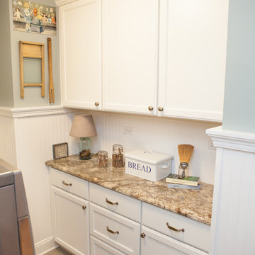
The biggest problem with the laundry room was 3 doors, one from the garage, one from the closet, and one to the hallway. “Scott designed a pocket door, and oh what a dream it is now to bring groceries in from the garage!” exclaims Bud who grew to disdain this task! Doing laundry is now a breeze in this attractive new space that doubles as a wonderful pantry for the kitchen with room to store food items that didn’t have a home in the poorly designed original space.
New Hickory distressed wood flooring was laid both in the kitchen and leading to the hall foyer. Soft gray wood-replicating porcelain was placed in the laundry area, making for an easily cleanable surface for what doubles as a mud room from the garage. Creamy tumbled marble graces an unobtrusive backsplash spilling onto shiny granite counter tops in a rich earthy pattern of fall colors that mimic colors throughout the home. Advance is known details that included custom crafted furniture toe kicks, luxurious crown moldings, and beaded under cabinet moldings. The kitchen is complete with a glass display cabinet showing Ruth’s treasured china tea collection.
Early on, it was initially only their intention of purchasing cabinets for the new design. They were so impressed however with Advance Design’s complete program for budgeting, design, installation and management that it became clear to them both that they wanted Advance to handle the entire project from start to finish. “After seeing the quality work they did, coupled with the in-house team completely dedicated to our satisfaction, it became apparent there was no other choice but to hire them to handle everything. And we’re so glad we did, we have not one regret”, says Bud.
“The attention to detail by the carpentry crew more than satisfied my perfectionist expectations of the finished carpentry,” exclaimed Bud. “Every one of Advance Design’s people we encountered from design through construction was wonderful. We’ve never met a group of people so dedicated to making sure we were happy with every single detail, and every single part of this experience”, said Ruth and Bud.
Designer: Scott Christensen
Photographer: Joe Nowak
 TVL Creative Ltd.
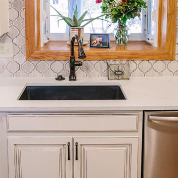
This challenging kitchen came our way at the same time as another similarly located Centennial kitchen. It was apparent that both houses had been built by the same builder: tight space, low ceilings, awkward arrangement, and poor building materials. Our client here is a single mother of three boys with an incredibly demanding work life. Once finally home at the end of a busy day, our client was virtually unable to use her kitchen. Cabinet doors were falling off, limited storage and workspace offered her little opportunity to cook and prep for her children, and the dark and low ceiling created an atmosphere that can only be described as depressing. Our client is also from Louisiana and has always dreamed of a kitchen that reminds her of home warmth and hospitality. Our goal was not only to expand functional storage and workspace, but bring in the southern NOLA appeal that reminds our client so much of home. To do this, we removed the wall between the formal dining room and kitchen to create an extended kitchen that runs the full length of both spaces. The back wall of what used to be the dining room is now the cooking zone for our client: we've relocated her range and microwave, and have created an island full of storage where her children can sit and socialize. We've also lifted up the low ceiling to create a tray ceiling that we have finished with ghostwood. The cabinetry is an off-white color with a hazelnut glaze that offers a more traditional, warm appearance. The island and mini work nook feature dramatic, handmade tin ceiling tiles for a dramatic texture and color. We've finished the space with functional quartz countertops and an arabesque two-toned marble backspalsh. The sinks, faucets and hardware are all in a matte black finish that offer a dramatic pop throughout the space. Little touches of Parisian flair add to this Cajun-French aesthetic and we are so thrilled with the final result!
 Granit Architects + Interiors
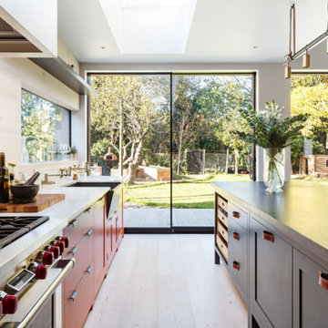
We are delighted to have completed the radical transformation of a tired detached property in South Croydon.
When they appointed Granit, our clients were living in the property which had previously been divided into a number of flats.
The historic sub-division had resulted in an extremely poor use of space with redundant staircases, kitchens and bathrooms throughout.
Our clients sought to reconfigure the property back into a single dwelling for his growing family.
Our client had an eye for design and was keen to balance contemporary design whilst maintaining as much of the character of the original house.
Maximising natural light, space and establishing a visual and physical connection were also key drivers for the design. Owing to the size of the property, it became apparent that reconfiguration rather than extension provided the solution to meet the brief.
A metal clad ‘intervention’ was introduced to the rear facade. This created a strong horizontal element creating a visual balance with the vertical nature of the three storey gable.
The metal cladding specified echoed the colour of the red brick string courses tying old with new. Slender frame sliding doors provide access and views of the large garden.
The central circulation space was transformed by the introduction of a double height glazed slot wrapping up the rear facade and onto the roof. This allows daylight to permeate into the heart of the otherwise dark deep floor plan. The staircase was reconfigured into a series of landings looking down over the main void space below and out towards the tree canopies at the rear of the garden.
The introduction of double pocket doors throughout the ground floor creates a series of interconnected spaces and the whitewashed Larch flooring flows seamlessly from room to room. A bold palette of colours and materials lends character and texture throughout the property.
The end result is a spacious yet cosy environment for the family to inhabit for years to come.

Sponsored
Columbus, OH

Structural Remodeling
Franklin County's Heavy Timber Specialists | Best of Houzz 2020!
 TVL Creative Ltd.
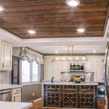
This challenging kitchen came our way at the same time as another similarly located Centennial kitchen. It was apparent that both houses had been built by the same builder: tight space, low ceilings, awkward arrangement, and poor building materials. Our client here is a single mother of three boys with an incredibly demanding work life. Once finally home at the end of a busy day, our client was virtually unable to use her kitchen. Cabinet doors were falling off, limited storage and workspace offered her little opportunity to cook and prep for her children, and the dark and low ceiling created an atmosphere that can only be described as depressing. Our client is also from Louisiana and has always dreamed of a kitchen that reminds her of home warmth and hospitality. Our goal was not only to expand functional storage and workspace, but bring in the southern NOLA appeal that reminds our client so much of home. To do this, we removed the wall between the formal dining room and kitchen to create an extended kitchen that runs the full length of both spaces. The back wall of what used to be the dining room is now the cooking zone for our client: we've relocated her range and microwave, and have created an island full of storage where her children can sit and socialize. We've also lifted up the low ceiling to create a tray ceiling that we have finished with ghostwood. The cabinetry is an off-white color with a hazelnut glaze that offers a more traditional, warm appearance. The island and mini work nook feature dramatic, handmade tin ceiling tiles for a dramatic texture and color. We've finished the space with functional quartz countertops and an arabesque two-toned marble backspalsh. The sinks, faucets and hardware are all in a matte black finish that offer a dramatic pop throughout the space. Little touches of Parisian flair add to this Cajun-French aesthetic and we are so thrilled with the final result!
 Advance Design Studio, Ltd.
Bud Kane has remodeled nearly every room in his own home over many years. Now reaching his 70’s, he contemplated heading up a major kitchen and laundry room renovation himself, planning on doing the carpentry work with his own hands. “I was not convinced I would ever meet anyone who could do it as well as I could do it myself”, said Bud. Ruth and Bud spent 5 years visiting kitchen firms and interviewing designers. They couldn’t however bring themselves to pull the trigger on the project, until they met Advance Design Studio in 2015.
“No one understood what I wanted”, said Ruth. She was continually frustrated by experiences with designers who weren’t hearing what was important to her. “Everyone kept designing my kitchen with what they thought it should look like; I couldn’t find anyone who would listen to me”!
When they met designer Scott Christensen from Advance Design Studio, they liked him right away. He listened to Ruth and designed a kitchen that she loved, all the while interjecting years of wisdom and design expertise that Ruth appreciated. “The finished product is better than I expected”, says Ruth. “I respected Scott’s opinions and together we created the perfect place for me to bake with my grandkids and truly enjoy the kitchen and laundry room I’ve been dreaming of for many years!”
The kitchen transformation began with removing the home’s soffits, and extending new painted maple cabinetry to the ceiling with the addition of an elegant crown molding. Ruth’s new Vita Mix holds a coveted place on her counter, and adjustments were planned to size the cabinets in conjunction with the under cabinet decorative light molding to fit this appliance just right. “This one small detail was really important to me”, says Ruth smiling. An elegant new island replaced the original island, complete with room for 3 stools where her grandchildren will sit to make home-made pasta every Thanksgiving, and cookies at Christmas time. “Traditions are very important in my family, and making my kitchen work to suit cherished activities with my family was the number one reason this renovation was so desired”, replied Ruth when asked about the island.
A picture perfect new tea station replaced a cluttered unused desk area, creating a wonderful place to prepare hot drinks for sipping any season of the year while overlooking the couple’s wonderfully manicured gardens from the lovely 3 season’s room just off the kitchen. The soft sage island bead panel detail was repeated on the backsplash, replicating the feel of a fine old piece of furniture.
The biggest problem with the laundry room was 3 doors, one from the garage, one from the closet, and one to the hallway. “Scott designed a pocket door, and oh what a dream it is now to bring groceries in from the garage!” exclaims Bud who grew to disdain this task! Doing laundry is now a breeze in this attractive new space that doubles as a wonderful pantry for the kitchen with room to store food items that didn’t have a home in the poorly designed original space.
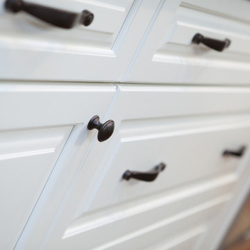
New Hickory distressed wood flooring was laid both in the kitchen and leading to the hall foyer. Soft gray wood-replicating porcelain was placed in the laundry area, making for an easily cleanable surface for what doubles as a mud room from the garage. Creamy tumbled marble graces an unobtrusive backsplash spilling onto shiny granite counter tops in a rich earthy pattern of fall colors that mimic colors throughout the home. Advance is known details that included custom crafted furniture toe kicks, luxurious crown moldings, and beaded under cabinet moldings. The kitchen is complete with a glass display cabinet showing Ruth’s treasured china tea collection.
Early on, it was initially only their intention of purchasing cabinets for the new design. They were so impressed however with Advance Design’s complete program for budgeting, design, installation and management that it became clear to them both that they wanted Advance to handle the entire project from start to finish. “After seeing the quality work they did, coupled with the in-house team completely dedicated to our satisfaction, it became apparent there was no other choice but to hire them to handle everything. And we’re so glad we did, we have not one regret”, says Bud.
“The attention to detail by the carpentry crew more than satisfied my perfectionist expectations of the finished carpentry,” exclaimed Bud. “Every one of Advance Design’s people we encountered from design through construction was wonderful. We’ve never met a group of people so dedicated to making sure we were happy with every single detail, and every single part of this experience”, said Ruth and Bud.
Designer: Scott Christensen
Photographer: Joe Nowak
 Remodeling by Joseph
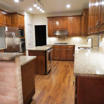
Eat-in kitchen - large traditional u-shaped medium tone wood floor eat-in kitchen idea in Dallas with an undermount sink, raised-panel cabinets, medium tone wood cabinets, granite countertops, beige backsplash, stone tile backsplash, stainless steel appliances and an island
20