
Search results for "Poor functionality" in Home Design Ideas
 The Home Co.
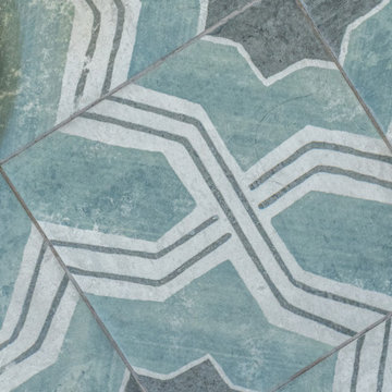
We ? bathroom renovations! This initially drab space was so poorly laid-out that it fit only a tiny vanity for a family of four!
Working in the existing footprint, and in a matter of a few weeks, we were able to design and renovate this space to accommodate a double vanity (SO important when it is the only bathroom in the house!). In addition, we snuck in a private toilet room for added functionality. Now this bath is a stunning workhorse!
 Nancy Finneson | DeMane Design
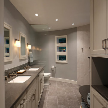
The owners of this remodel desired a refreshing new master bathroom. The original layout was poorly designed with minimal storage, a small shower, a rarely used bathtub and a water closet that was difficult to access. The old vanity flanked a curved wall of glass block (the main challenge with this space) which didn’t allow for mirrors and was always cluttered because of limited storage.
With smart space planning and attention to detail this well-appointed bathroom is now a uniquely personal space that functions brilliantly and balanced for the homeowners.
Photo: DeMane Design
 Milgard Windows & Doors
The Kiguchi family moved into their Austin, Texas home in 1994. Built in the 1980’s as part of a neighborhood development, they happily raised their family here but longed for something more contemporary. Once they became empty nesters, they decided it was time for a major remodel. After spending many years visiting Austin AIA Home Tours that highlight contemporary residential architecture, they had a lot of ideas and in 2013 were ready to interview architects and get their renovation underway.
The project turned into a major remodel due to an unstable foundation. Architects Ben Arbib and Ed Hughey, of Arbib Hughey Design were hired to solve the structural issue and look for inspiration in the bones of the house, which sat on top of a hillside and was surrounded by great views.
Unfortunately, with the old floor plan, the beautiful views were hidden by small windows that were poorly placed. In order to bring more natural light into the house the window sizes and configurations had to be addressed, all while keeping in mind the homeowners desire for a modern look and feel.
To achieve a more contemporary and sophisticated front of house, a new entry was designed that included removing a two-story bay window and porch. The entrance of the home also became more integrated with the landscape creating a template for new foliage to be planted. Older exterior materials were updated to incorporate a more muted palette of colors with a metal roof, dark grey siding in the back and white stucco in the front. Deep eaves were added over many of the new large windows for clean lines and sun protection.
“Inside it was about opening up the floor plan, expanding the views throughout the house, and updating the material palette to get a modern look that was also warm and inviting,” said Ben from Arbib Hughey Design. “Prior to the remodel, the house had the typical separation of rooms. We removed the walls between them and changed all of the windows to Milgard Thermally Improved Aluminum to connect the inside with the outside. No matter where you are you get nice views and natural light.”
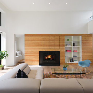
The architects wanted to create some drama, which they accomplished with the window placement and opening up the interior floor plan to an open concept approach. Cabinetry was used to help delineate intimate spaces. To add warmth to an all-white living room, white-washed oak wood floors were installed and pine planks were used around the fireplace. The large windows served as artwork bringing the color of nature into the space.
An octagon shaped, elevated dining room, (named “the turret”), had a big impact on the design of the house. They architects rounded the corners and added larger window openings overlooking a new sunken garden. The great room was also softened by rounding out the corners and that circular theme continued throughout the house, being picked up in skylight wells and kitchen cabinetry. A staircase leading to a catwalk was added and the result was a two-story window wall that flooded the home with natural light.
When asked why Milgard® Thermally Improved Aluminum windows were selected, the architectural team listed many reasons:
1) Aesthetics: “We liked the slim profiles and narrow sightlines. The window frames never get in the way of the view and that was important to us. They also have a very contemporary look that went well with our design.”
2) Options: “We liked that we could get large sliding doors that matched the windows, giving us a very cohesive look and feel throughout the project.”
3) Cost Effective: “Milgard windows are affordable. You get a good product at a good price.”
4) Custom Sizes: “Milgard windows are customizable, which allowed us to get the right window for each location.”
Ready to take on your own traditional to modern home remodeling project? Arbib Hughey Design advises, “Work with a good architect. That means picking a team that is creative, communicative, listens well and is responsive. We think it’s important for an architect to listen to their clients and give them something they want, not something the architect thinks they should have. At the same time you want an architect who is willing and able to think outside the box and offer up design options that you may not have considered. Design is about a lot of back and forth, trying out ideas, getting feedback and trying again.”
The home was completely transformed into a unique, contemporary house perfectly integrated with its site. Internally the home has a natural flow for the occupants and externally it is integrated with the surroundings taking advantage of great natural light. As a side note, it was highly praised as part of the Austin AIA homes tour.
Find the right local pro for your project
 Plain & Posh
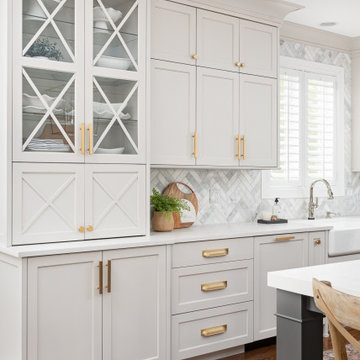
This large space did not function well for this family of 6. The cabinetry they had did not go to the ceiling and offered very poor storage options. The island that existed was tiny in comparrison to the space.
By taking the cabinets to the ceiling, enlarging the island and adding large pantry's we were able to achieve the storage needed. Then the fun began, all of the decorative details that make this space so stunning. Beautiful tile for the backsplash and a custom metal hood. Lighting and hardware to complement the hood.
Then, the vintage runner and natural wood elements to make the space feel more homey.
 Thyme & Place Design LLC
The client requested a kitchen that would not only provide a great space to cook and enjoy family meals but one that would fit in with her unique design sense. An avid collector of contemporary art, she wanted something unexpected in her 100-year-old home in both color and finishes but still providing a great layout with improved lighting, storage, and superior cooking abilities. The existing kitchen was in a closed off space trapped between the family room and the living. If you were in the kitchen, you were isolated from the rest of the house. Making the kitchen an integrated part of the home was a paramount request.
Step one, remove the wall separating the kitchen from the other rooms in the home which allowed the new kitchen to become an integrated space instead of an isolation room for the cook. Next, we relocated the pantry access which was in the family room to the kitchen integrating a poorly used recess which had become a catch all area which did not provide any usable space for storage or working area. To add valuable function in the kitchen we began by capturing unused "cubbies", adding a walk-in pantry from the kitchen, increasing the storage lost to un-needed drop ceilings and bring light and design to the space with a new large awning window, improved lighting, and combining interesting finishes and colors to reflect the artistic attitude of the client.
A bathroom located above the kitchen had been leaking into the plaster ceiling for several years. That along with knob and tube wiring, rotted beams and a brick wall from the back of the fireplace in the adjacent living room all needed to be brought to code. The walls, ceiling and floors in this 100+ year old home were completely out of level and the room’s foot print could not be increased.
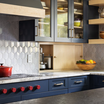
The choice of a Sub-Zero wolf product is a standard in my kitchen designs. The quality of the product, its manufacturing and commitment to food preservation is the reason I specify Sub Zero Wolf. For the cook top, the integrated line of the contemporary cooktop and the signature red knobs against the navy blue of the cabinets added to the design vibe of the kitchen. The cooking performance and the large continuous grate on the cooktop makes it an obvious choice for a cook looking for a great cook top with professional results in a more streamlined profile. We selected a Sharp microwave drawer for the island, an XO wine refrigerator, Bosch dishwasher and Kitchen Aid double convection wall ovens to round out the appliance package.
A recess created by the fireplace was outfitted with a cabinet which now holds small appliances within easy reach of my very petite client. Natural maple accents were used inside all the wall cabinets and repeated on the front of the hood and for the sliding door appliance cabinet and the floating shelves. This allows a brighter interior for the painted cabinets instead of the traditional same interior as exterior finish choice. The was an amazing transformation from the old to the new.
The final touches are the honey bronze hardware from Top Knobs, Mitzi pendants from Hudson Valley Lighting group,
a fabulous faucet from Brizo. To eliminate the old freestanding bottled water cooler, we specified a matching water filter faucet.
 Designs By Gia Interior Design and Renovation
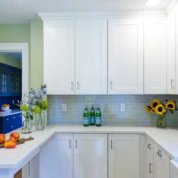
In this recent kitchen design and renovation project, these long time clients came to me originally, several years ago to start discussing the design of their kitchen. At that time, the kitchen in this 1800’s home included a kitchen that had been poorly remodeled in the 1980’s, so the kitchen had already lost most of it’s original charm. I created a design plan creating a beautiful large kitchen expanding the space into the adjacent rooms. My clients loved this design plan, but other home issues took precedence, so after a few additional years, my clients were now ready to start their kitchen project.
Their overall goals for the property did change since we first looked at this project, my clients decided that they did not want to enlarge or expand the small kitchen by opening it up to the adjacent rooms. So, I went back to the drawing board to create a kitchen in the existing kitchen space that fulfilled their new goals and created a beautiful functional space within the existing kitchen space. This new design, like my former design, honored this home’s traditional architecture, but added a light, fresh feel to the space using updated colors and material selections. This design consisted of additional storage and cabinetry, additional countertop space, and a small space to sit. We added new cabinetry, appliances, electrical, plumbing, beautiful quartz countertops, glass backsplash tile, traditional lighting fixtures, and finished everything off using beautiful classic hardware elements.
My clients are now in love with this new renovated kitchen space. It contains many of the elements of a much larger kitchen, and melds beautifully with the rest of the house which we have also designed renovated over the last few years. Finally my client’s get to enjoy their new kitchen space as much as they enjoy the rest of this beautiful home!
 J Design Group - Interior Designers Miami - Modern
AVENTURA MAGAZINE selected our client’s luxury 5000 Sf ocean front apartment in Miami Beach, to publish it in their issue and they Said:
Story by Linda Marx, Photography by Daniel Newcomb
Light & Bright
New York snowbirds redesigned their Miami Beach apartment to take advantage of the tropical lifestyle.
WHEN INTERIOR DESIGNER JENNIFER CORREDOR was asked to recreate a four-bedroom, six-bath condominium at The Bath Club in Miami Beach, she seized the opportunity to open the rooms and better utilize the vast ocean views.
In five months last year, the designer transformed a dark and closed 5,000-square-foot unit located on a high floor into a series of sweeping waterfront spaces and updated the well located apartment into a light and airy retreat for a sports-loving family of five.
“They come down from New York every other weekend and wanted to make their waterfront home a series of grand open spaces,” says Corrredor, of the J. Design Group in Coral Gables, a firm specializing in modern and contemporary interiors. “Since many of the rooms face the ocean, it made sense to open and lighten up the home, taking advantage of the awesome views of the sea and the bay.”
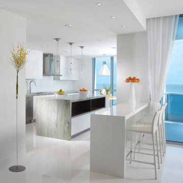
The designer used 40 x 40 all white tile throughout the apartment as a clean base. This way, her sophisticated use of color would stand out and bring the outdoors in.
The close-knit family members—two parents and three boys in college—like to do things together. But there were situations to overcome in the process of modernizing and opening the space. When Corredor was briefed on their desires, nothing seemed too daunting. The confident designer was ready to delve in. For example, she fixed an area at the front door
that was curved. “The wood was concave so I straightened it out,” she explains of a request from the clients. “It was an obstacle that I overcame as part of what I do in a redesign. I don’t consider it a difficult challenge. Improving what I see is part of the process.”
She also tackled the kitchen with gusto by demolishing a wall. The kitchen had formerly been enclosed, which was a waste of space and poor use of available waterfront ambience. To create a grand space linking the kitchen to the living room and dining room area, something had to go. Once the wall was yesterday’s news, she relocated the refrigerator and freezer (two separate appliances) to the other side of the room. This change was a natural functionality in the new open space. “By tearing out the wall, the family has a better view of the kitchen from the living and dining rooms,” says Corredor, who also made it easier to walk in and out of one area and into the other. “The views of the larger public space and the surrounding water are breathtaking.
Opening it up changed everything.”
They clients can now see the kitchen from the living and dining areas, and at the same time, dwell in an airy and open space instead of feeling stuck in a dark enclosed series of rooms. In fact, the high-top bar stools that Corredor selected for the kitchen can be twirled around to use for watching TV in the living room.
In keeping with the theme of moving seamlessly from one room to the other, Corredor designed a subtle wall of glass in the living room along with lots of comfortable seating. This way, all family members feel at ease while relaxing, talking, or watching sporting events on the large flat screen television. “For this room, I wanted more open space, light and a supreme airy feeling,” she says. “With the glass design making a statement, it quickly became the star of the show.”…….
….. To add texture and depth, Jennifer Corredor custom created wood doors here, and in other areas of the home. They provide a nice contrast to the open Florida tropical feel. “I added character to the openness by using exotic cherry wood,” she says. “I repeated this throughout the home and it works well.”
Known for capturing the client’s vision while adding her own innovative twists, Jennifer Corredor lightened the family room, giving it a contemporary and modern edge with colorful art and matching throw pillows on the sofas. She added a large beige leather ottoman as the center coffee table in the room. This round piece was punctuated with a bold-toned flowering plant atop. It effortlessly matches the pillows and colors of the contemporary canvas.
Miami,
Miami Interior Designers,
Miami Interior Designer,
Interior Designers Miami,
Interior Designer Miami,
Modern Interior Designers,
Modern Interior Designer,
Modern interior decorators,
Modern interior decorator,
Contemporary Interior Designers,
Contemporary Interior Designer,
Interior design decorators,
Interior design decorator,
Interior Decoration and Design,
Black Interior Designers,
Black Interior Designer,
Interior designer,
Interior designers,
Interior design decorators,
Interior design decorator,
Home interior designers,
Home interior designer,
Interior design companies,
Interior decorators,
Interior decorator,
Decorators,
Decorator,
Miami Decorators,
Miami Decorator,
Decorators Miami,
Decorator Miami,
Interior Design Firm,
Interior Design Firms,
Interior Designer Firm,
Interior Designer Firms,
Interior design,
Interior designs,
Home decorators,
Interior decorating Miami,
Best Interior Designers,
Interior design decorator,
Miami Beach

Sponsored
Columbus, OH

Structural Remodeling
Franklin County's Heavy Timber Specialists | Best of Houzz 2020!
 Thyme & Place Design LLC
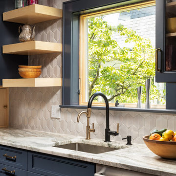
The client requested a kitchen that would not only provide a great space to cook and enjoy family meals but one that would fit in with her unique design sense. An avid collector of contemporary art, she wanted something unexpected in her 100-year-old home in both color and finishes but still providing a great layout with improved lighting, storage, and superior cooking abilities. The existing kitchen was in a closed off space trapped between the family room and the living. If you were in the kitchen, you were isolated from the rest of the house. Making the kitchen an integrated part of the home was a paramount request.
Step one, remove the wall separating the kitchen from the other rooms in the home which allowed the new kitchen to become an integrated space instead of an isolation room for the cook. Next, we relocated the pantry access which was in the family room to the kitchen integrating a poorly used recess which had become a catch all area which did not provide any usable space for storage or working area. To add valuable function in the kitchen we began by capturing unused "cubbies", adding a walk-in pantry from the kitchen, increasing the storage lost to un-needed drop ceilings and bring light and design to the space with a new large awning window, improved lighting, and combining interesting finishes and colors to reflect the artistic attitude of the client.
A bathroom located above the kitchen had been leaking into the plaster ceiling for several years. That along with knob and tube wiring, rotted beams and a brick wall from the back of the fireplace in the adjacent living room all needed to be brought to code. The walls, ceiling and floors in this 100+ year old home were completely out of level and the room’s foot print could not be increased.
The choice of a Sub-Zero wolf product is a standard in my kitchen designs. The quality of the product, its manufacturing and commitment to food preservation is the reason I specify Sub Zero Wolf. For the cook top, the integrated line of the contemporary cooktop and the signature red knobs against the navy blue of the cabinets added to the design vibe of the kitchen. The cooking performance and the large continuous grate on the cooktop makes it an obvious choice for a cook looking for a great cook top with professional results in a more streamlined profile. We selected a Sharp microwave drawer for the island, an XO wine refrigerator, Bosch dishwasher and Kitchen Aid double convection wall ovens to round out the appliance package.
A recess created by the fireplace was outfitted with a cabinet which now holds small appliances within easy reach of my very petite client. Natural maple accents were used inside all the wall cabinets and repeated on the front of the hood and for the sliding door appliance cabinet and the floating shelves. This allows a brighter interior for the painted cabinets instead of the traditional same interior as exterior finish choice. The was an amazing transformation from the old to the new.
The final touches are the honey bronze hardware from Top Knobs, Mitzi pendants from Hudson Valley Lighting group,
a fabulous faucet from Brizo. To eliminate the old freestanding bottled water cooler, we specified a matching water filter faucet.
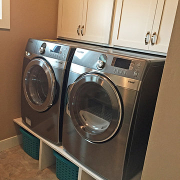
 Cypress Homes, Inc.
Dedicated laundry room - mid-sized contemporary dedicated laundry room idea in Other with white cabinets, laminate countertops, a side-by-side washer/dryer and shaker cabinets
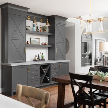 Plain & Posh
This large space did not function well for this family of 6. The cabinetry they had did not go to the ceiling and offered very poor storage options. The island that existed was tiny in comparrison to the space.
By taking the cabinets to the ceiling, enlarging the island and adding large pantry's we were able to achieve the storage needed. Then the fun began, all of the decorative details that make this space so stunning. Beautiful tile for the backsplash and a custom metal hood. Lighting and hardware to complement the hood.
Then, the vintage runner and natural wood elements to make the space feel more homey.
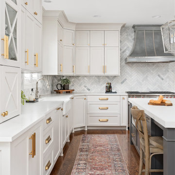 Plain & Posh
This large space did not function well for this family of 6. The cabinetry they had did not go to the ceiling and offered very poor storage options. The island that existed was tiny in comparrison to the space.
By taking the cabinets to the ceiling, enlarging the island and adding large pantry's we were able to achieve the storage needed. Then the fun began, all of the decorative details that make this space so stunning. Beautiful tile for the backsplash and a custom metal hood. Lighting and hardware to complement the hood.
Then, the vintage runner and natural wood elements to make the space feel more homey.
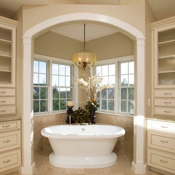
 Michael Nash Design, Build & Homes
After moving into a luxurious home in Ashburn, Virginia, the homeowners decided the master bathroom needed to be revamped. The existing whirlpool tub was far too big, the shower too small and the make-up area poorly designed.
From a functional standpoint, they wanted lots of storage, his and her separate vanities with a large make-up area, better lighting, a large steam shower and a vaulted ceiling. Aesthetics were also important, however, and the lady of the house had always dreamed of having a Venetian style spa.
Taking some space from an adjacent closet has allowed for a much larger shower stall with an arched transom window letting plenty of natural light into the space. Using various sizes of tumbled limestone to build its walls, it includes a rain shower head, a hand shower and body sprayers. A seating bench and storage niches make it easier to use.
New plumbing was put in place to add a large vanity with upper glass cabinets for the man of the house, while one corner of the space was used to create a make-up desk complete with a seamless mirror and embedded sconce lights
A free standing Neapolitan-style soaking tub with fluted columns and arched header is the real focal point of this space. Set among large corner windows, under a stylish chandelier, this elegant design sets this bathroom apart from any bathroom in its category.
 Designs By Gia Interior Design and Renovation
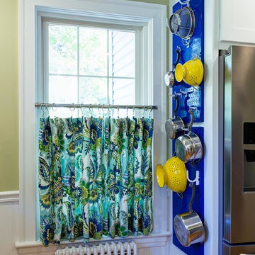
In this recent kitchen design and renovation project, these long time clients came to me originally, several years ago to start discussing the design of their kitchen. At that time, the kitchen in this 1800’s home included a kitchen that had been poorly remodeled in the 1980’s, so the kitchen had already lost most of it’s original charm. I created a design plan creating a beautiful large kitchen expanding the space into the adjacent rooms. My clients loved this design plan, but other home issues took precedence, so after a few additional years, my clients were now ready to start their kitchen project.
Their overall goals for the property did change since we first looked at this project, my clients decided that they did not want to enlarge or expand the small kitchen by opening it up to the adjacent rooms. So, I went back to the drawing board to create a kitchen in the existing kitchen space that fulfilled their new goals and created a beautiful functional space within the existing kitchen space. This new design, like my former design, honored this home’s traditional architecture, but added a light, fresh feel to the space using updated colors and material selections. This design consisted of additional storage and cabinetry, additional countertop space, and a small space to sit. We added new cabinetry, appliances, electrical, plumbing, beautiful quartz countertops, glass backsplash tile, traditional lighting fixtures, and finished everything off using beautiful classic hardware elements.
My clients are now in love with this new renovated kitchen space. It contains many of the elements of a much larger kitchen, and melds beautifully with the rest of the house which we have also designed renovated over the last few years. Finally my client’s get to enjoy their new kitchen space as much as they enjoy the rest of this beautiful home!


 McCabe By Design LLC
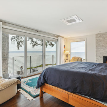
Our client purchased what had been a custom home built in 1973 on a high bank waterfront lot. They did their due diligence with respect to the septic system, well and the existing underground fuel tank but little did they know, they had purchased a house that would fit into the Three Little Pigs Story book.
The original idea was to do a thorough cosmetic remodel to bring the home up to date using all high durability/low maintenance materials and provide the homeowners with a flexible floor plan that would allow them to live in the home for as long as they chose to, not how long the home would allow them to stay safely. However, there was one structure element that had to change, the staircase.
The staircase blocked the beautiful water/mountain few from the kitchen and part of the dining room. It also bisected the second-floor master suite creating a maze of small dysfunctional rooms with a very narrow (and unsafe) top stair landing. In the process of redesigning the stairs and reviewing replacement options for the 1972 custom milled one inch thick cupped and cracked cedar siding, it was discovered that the house had no seismic support and that the dining/family room/hot tub room and been a poorly constructed addition and required significant structural reinforcement. It should be noted that it is not uncommon for this home to be subjected to 60-100 mile an hour winds and that the geographic area is in a known earthquake zone.
Once the structural engineering was complete, the redesign of the home became an open pallet. The homeowners top requests included: no additional square footage, accessibility, high durability/low maintenance materials, high performance mechanicals and appliances, water and energy efficient fixtures and equipment and improved lighting incorporated into: two master suites (one upstairs and one downstairs), a healthy kitchen (appliances that preserve fresh food nutrients and materials that minimize bacterial growth), accessible bathing and toileting, functionally designed closets and storage, a multi-purpose laundry room, an exercise room, a functionally designed home office, a catio (second floor balcony on the front of the home), with an exterior that was not just code compliant but beautiful and easy to maintain.
All of this was achieved and more. The finished project speaks for itself.
 STUDIO NINE & CO.
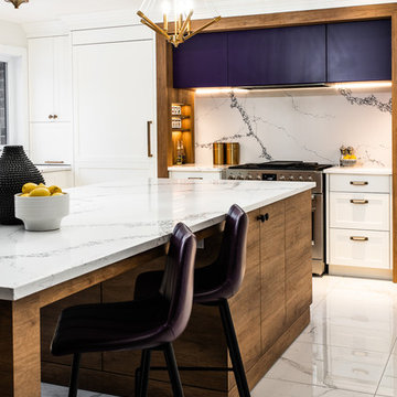
When this family of 7 bought their home, they came to us and said "We want a purple kitchen!". Naturally we jumped at the opportunity to create something outside of the box. With 5 young children, functionality and storage was imperative. We designed the kitchen to accommodate our client's lifestyle and busy household. It houses, 3 floor to ceiling storage compartments, each with its own individual function. First, the "Chef's Pantry", complete with top to bottom pullouts. Secondly, the "Breakfast Pantry", that houses everyday appliances, dinner ware, breakfast cereals and spreads. Finally, the once closet, converted 'Walk In Pantry". The oak frame around the range was specifically designed to allow for quick & easy access to everyday cooking essentials, and serve as a focal point in the space. Additional accessories included in the design were a double garbage pull out bin, retractable shelf for smaller, yet heavy appliances, Tupperware organizer, 2 spice pulls, and 2 Le Mans corner organizers. We opted for bespoke cabinetry, with an HDF painted & and oak construction, paired with purple and champagne bronze accents to tie it all together. Overall, this once dull and poorly organized kitchen is now the embodiment of bright, bold and beautiful, offering this colorful family comfort and convenience as they live life as an expression of their values.
 Architectural Resource LLC
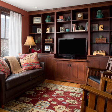
The Brooke Residence ‘Addi- tion by Subtraction’ remodeling project was recognized with numerous regional and national awards and was selected for Fine Homebuilding’s Annual Issue on Houses.
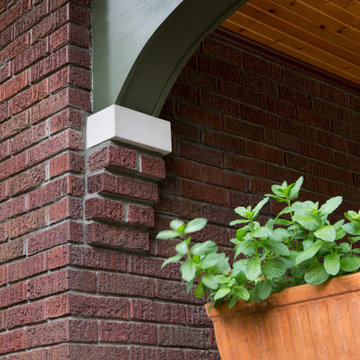
This 1920’s Craftsman Bungalow had been poorly modified in the 70’s in an attempt to address poor energy performance with a scabbed on solarium. The design solution removed the solarium and completely reimagined the floor plan: The kitchen was relocated to the rear; the stairway was relocated to enhance function, and a better connection to the family room was created.
 Architectural Resource LLC
The Brooke Residence ‘Addi- tion by Subtraction’ remodeling project was recognized with numerous regional and national awards and was selected for Fine Homebuilding’s Annual Issue on Houses.
This 1920’s Craftsman Bungalow had been poorly modified in the 70’s in an attempt to address poor energy performance with a scabbed on solarium. The design solution removed the solarium and completely reimagined the floor plan: The kitchen was relocated to the rear; the stairway was relocated to enhance function, and a better connection to the family room was created.
 Gordon Reese Design Build
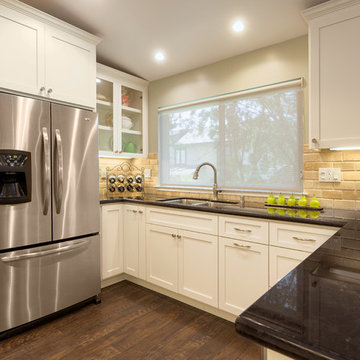
Our clients have lived in this Bay Area home for over 20 years and their kitchen had all the charm of that '70''s style; it no longer showcased their personal style or provided the functionality they needed. Outdated features included inset fluorescent ceiling lighting, uninspired cabinet style, and poor layout and functionality. This kitchen received a First Place Award from the National Association of Remodeling Industry's REMMIES in October 2013.
 TVL Creative Ltd.
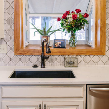
This challenging kitchen came our way at the same time as another similarly located Centennial kitchen. It was apparent that both houses had been built by the same builder: tight space, low ceilings, awkward arrangement, and poor building materials. Our client here is a single mother of three boys with an incredibly demanding work life. Once finally home at the end of a busy day, our client was virtually unable to use her kitchen. Cabinet doors were falling off, limited storage and workspace offered her little opportunity to cook and prep for her children, and the dark and low ceiling created an atmosphere that can only be described as depressing. Our client is also from Louisiana and has always dreamed of a kitchen that reminds her of home warmth and hospitality. Our goal was not only to expand functional storage and workspace, but bring in the southern NOLA appeal that reminds our client so much of home. To do this, we removed the wall between the formal dining room and kitchen to create an extended kitchen that runs the full length of both spaces. The back wall of what used to be the dining room is now the cooking zone for our client: we've relocated her range and microwave, and have created an island full of storage where her children can sit and socialize. We've also lifted up the low ceiling to create a tray ceiling that we have finished with ghostwood. The cabinetry is an off-white color with a hazelnut glaze that offers a more traditional, warm appearance. The island and mini work nook feature dramatic, handmade tin ceiling tiles for a dramatic texture and color. We've finished the space with functional quartz countertops and an arabesque two-toned marble backspalsh. The sinks, faucets and hardware are all in a matte black finish that offer a dramatic pop throughout the space. Little touches of Parisian flair add to this Cajun-French aesthetic and we are so thrilled with the final result!
 SDG | Schlosser Design Group, LLC.
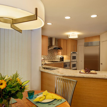
This contemporary home got a face lift with a fully gutted kitchen, laundry and den. The original kitchen had a poor layout with a corner sink cab that swallowed up valuable storage space. The added center island had limited clearance causing the owners to bump into it at every turn. The storage was poorly planned and non-functional. We were able to relocate the sink, adjust the angle of the peninsula allowing a better more open flow for this busy family while provided more storage with fewer cabinets than they had before.
17