
Search results for "Poor functionality" in Home Design Ideas
 Michael Nash Design, Build & Homes
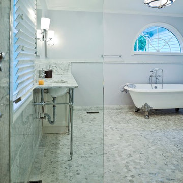
Starting Each Day Clean and Refreshed In This Classically-Modern, Marble Masterpiece
In 1985, the previous owner of the house had added an addition of which part included a 17 feet by 13 feet space off the master bedroom for both a master bath and walk-in closet. Irrespective of the dated red carpet that blanketed the entire bathroom of this 1964 colonial in Annandale, VA, the combination bathroom/closet space had its other oddities, primarily in that there was no shower. The current homeowners -- a family of five, who has been in the home for 7 years, was tired of going down the hall to use the kids’ bathroom to take a shower before work. The renovation that they have created now is a bright and luxurious space that one could bask in all day. They used this bathroom renovation opportunity to total remake the layout and function of this essential room that sets the tone for the day ahead.
Prior to the renovation, the existing bathroom oddly had two entrances, a typical one off of the master bedroom, but another straight off the upstairs hallway. As the toilet was out in the open in the previous design, ensuring that this second door was closed when company was in town was essential and a nuisance. As you entered the room, situated below the arc window, a large soaking tub that was covered on three sides with wooden steps dominated the room from the corner it projected. A relatively small 42” single bowl sink did not leave much space for his and hers toiletries, and there was no other linen closet or cabinetry for storage in the bathroom. The 8 foot by 5 foot closet with accordion doors had poorly laid out rungs not letting the storage space to be fully utilized. At over 220 square feet, the room did offer considerable space to work with, yet the existing layout, which even included a partition wall behind the vanity, felt cramped and dysfunctional.
The homeowners wished to create a classic yet modern, private, deluxe bathroom that would better integrate into their master suite and enable them to start and end each day in a luxurious way. They wanted to maintain having a soaking tub, add in a large shower, have an enclosed commode, expand to include double sinks, and add more storage for toiletries and linens. We worked with the customer to develop a creative design with extensive plumbing rework that accomplished all these needs and more.
The first order of business was to gut out all the carpet, tub, cabinetry, and non-load bearing partition walls. The new tub would be generally in the same location, but as the previous walk-in closet would be repurposed for the commode and the walk-in shower additional water lines, plumbing, and draining needed to be added; fortunately the room below is the garage, which enabled the team to frame out some bulkheads to accomplish this complex plumbing. Following the framing, including walling up the second entrance to the bathroom, adding in a pocket door for the commode, and creating the shape of the new shower, the team also laid down the wiring for one of the luxuries of this room – heated flooring. A glossy percaline boarder, and two-inch hexagon shape percaline tiles cover the entire floor, making it much easier and cleaner than the previous carpet.
Marble look tile is predominant throughout the bathroom as despite the angled frameless glass door, the entire shower is covered in 18 inch polished marble look tiles. The shower coats the user in water from either the overhead rain head, large main showerhead and/or the hand held sprayer. Over 7 feet of white Italian Statuetto marble countertop, enable the couple to have two sink bowls and plenty of room on each side. The bowls are exposed in this stainless steel console sink design which required the team to ensure that the exposed plumbing looked pristine, and painting the bottom of the porcelain bowl to match the coloring.
The white cast-iron 72-inch Cecilia claw-foot soaking tub and its chrome lion’s paws complement that other chrome and white used throughout the room. A tall, almost floor-to-ceiling linen closet finished in arctic white is nestled in the corner near the tub, enabling ample storage of towels, etc. Other cabinetry includes an 18 inch-wide vanity with decorative footing is centered between the two sinks, and a 27 inch wall mounted cabinet with shelf is above the Kohler Devonshire elongated toilet.
Billowing cloud colored grey blue paint was a great choice for this room to pick up on the veining in the marble. Mirrored medicine chests, a chandelier, wall sconces, and overhead recessed lighting also were incorporated into the design and function of the new room.
The artful combination of classic design from material choices, such as free-standing Victorian claw-foot tub along with the modern design as seen in the angled shower, frameless medicine cabinet mirrors, and frosted glass pocket door on the commode, make this bathroom quite a masterpiece.
The clients are enjoying having their private space and not having the use the kids’ bathroom anymore.
 Stacey Kocevar Designs, LLC
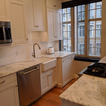
The existing, builder-grade, kitchen was not functional, as it was poorly lit, much needed storage space was underutilized, and un-safe, as the microwave was hung over the sink, causing the homeowners to hit their heads while working at the sink. Being a unit in an historic building, I was unable to move any of the existing plumbing & electrical, but could add to, as we did with the recessed and under cabinet LED lighting, I moved the microwave to a safe location, off of the counter and next to the refrigerator, and took the cabinetry to the ceiling, gaining an additional 12" of vertical storage along the main wall of the kitchen. Due to a supply vent being on the wall above the refrigerator, we had to get creative in how we brought it through the crown molding build-up, which led to a custom vent cover, that was designed and then fabricated to fit perfectly. This kitchen is packed with details that all came together to create a stunning, yet functional, new kitchen.
 Michael Nash Design, Build & Homes
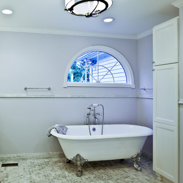
Starting Each Day Clean and Refreshed In This Classically-Modern, Marble Masterpiece
In 1985, the previous owner of the house had added an addition of which part included a 17 feet by 13 feet space off the master bedroom for both a master bath and walk-in closet. Irrespective of the dated red carpet that blanketed the entire bathroom of this 1964 colonial in Annandale, VA, the combination bathroom/closet space had its other oddities, primarily in that there was no shower. The current homeowners -- a family of five, who has been in the home for 7 years, was tired of going down the hall to use the kids’ bathroom to take a shower before work. The renovation that they have created now is a bright and luxurious space that one could bask in all day. They used this bathroom renovation opportunity to total remake the layout and function of this essential room that sets the tone for the day ahead.
Prior to the renovation, the existing bathroom oddly had two entrances, a typical one off of the master bedroom, but another straight off the upstairs hallway. As the toilet was out in the open in the previous design, ensuring that this second door was closed when company was in town was essential and a nuisance. As you entered the room, situated below the arc window, a large soaking tub that was covered on three sides with wooden steps dominated the room from the corner it projected. A relatively small 42” single bowl sink did not leave much space for his and hers toiletries, and there was no other linen closet or cabinetry for storage in the bathroom. The 8 foot by 5 foot closet with accordion doors had poorly laid out rungs not letting the storage space to be fully utilized. At over 220 square feet, the room did offer considerable space to work with, yet the existing layout, which even included a partition wall behind the vanity, felt cramped and dysfunctional.
The homeowners wished to create a classic yet modern, private, deluxe bathroom that would better integrate into their master suite and enable them to start and end each day in a luxurious way. They wanted to maintain having a soaking tub, add in a large shower, have an enclosed commode, expand to include double sinks, and add more storage for toiletries and linens. We worked with the customer to develop a creative design with extensive plumbing rework that accomplished all these needs and more.
The first order of business was to gut out all the carpet, tub, cabinetry, and non-load bearing partition walls. The new tub would be generally in the same location, but as the previous walk-in closet would be repurposed for the commode and the walk-in shower additional water lines, plumbing, and draining needed to be added; fortunately the room below is the garage, which enabled the team to frame out some bulkheads to accomplish this complex plumbing. Following the framing, including walling up the second entrance to the bathroom, adding in a pocket door for the commode, and creating the shape of the new shower, the team also laid down the wiring for one of the luxuries of this room – heated flooring. A glossy percaline boarder, and two-inch hexagon shape percaline tiles cover the entire floor, making it much easier and cleaner than the previous carpet.
Marble look tile is predominant throughout the bathroom as despite the angled frameless glass door, the entire shower is covered in 18 inch polished marble look tiles. The shower coats the user in water from either the overhead rain head, large main showerhead and/or the hand held sprayer. Over 7 feet of white Italian Statuetto marble countertop, enable the couple to have two sink bowls and plenty of room on each side. The bowls are exposed in this stainless steel console sink design which required the team to ensure that the exposed plumbing looked pristine, and painting the bottom of the porcelain bowl to match the coloring.
The white cast-iron 72-inch Cecilia claw-foot soaking tub and its chrome lion’s paws complement that other chrome and white used throughout the room. A tall, almost floor-to-ceiling linen closet finished in arctic white is nestled in the corner near the tub, enabling ample storage of towels, etc. Other cabinetry includes an 18 inch-wide vanity with decorative footing is centered between the two sinks, and a 27 inch wall mounted cabinet with shelf is above the Kohler Devonshire elongated toilet.
Billowing cloud colored grey blue paint was a great choice for this room to pick up on the veining in the marble. Mirrored medicine chests, a chandelier, wall sconces, and overhead recessed lighting also were incorporated into the design and function of the new room.
The artful combination of classic design from material choices, such as free-standing Victorian claw-foot tub along with the modern design as seen in the angled shower, frameless medicine cabinet mirrors, and frosted glass pocket door on the commode, make this bathroom quite a masterpiece.
The clients are enjoying having their private space and not having the use the kids’ bathroom anymore.
Find the right local pro for your project
 McCabe By Design LLC
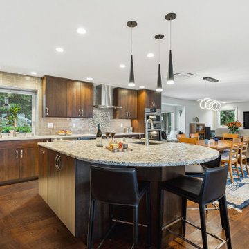
Our client purchased what had been a custom home built in 1973 on a high bank waterfront lot. They did their due diligence with respect to the septic system, well and the existing underground fuel tank but little did they know, they had purchased a house that would fit into the Three Little Pigs Story book.
The original idea was to do a thorough cosmetic remodel to bring the home up to date using all high durability/low maintenance materials and provide the homeowners with a flexible floor plan that would allow them to live in the home for as long as they chose to, not how long the home would allow them to stay safely. However, there was one structure element that had to change, the staircase.
The staircase blocked the beautiful water/mountain few from the kitchen and part of the dining room. It also bisected the second-floor master suite creating a maze of small dysfunctional rooms with a very narrow (and unsafe) top stair landing. In the process of redesigning the stairs and reviewing replacement options for the 1972 custom milled one inch thick cupped and cracked cedar siding, it was discovered that the house had no seismic support and that the dining/family room/hot tub room and been a poorly constructed addition and required significant structural reinforcement. It should be noted that it is not uncommon for this home to be subjected to 60-100 mile an hour winds and that the geographic area is in a known earthquake zone.
Once the structural engineering was complete, the redesign of the home became an open pallet. The homeowners top requests included: no additional square footage, accessibility, high durability/low maintenance materials, high performance mechanicals and appliances, water and energy efficient fixtures and equipment and improved lighting incorporated into: two master suites (one upstairs and one downstairs), a healthy kitchen (appliances that preserve fresh food nutrients and materials that minimize bacterial growth), accessible bathing and toileting, functionally designed closets and storage, a multi-purpose laundry room, an exercise room, a functionally designed home office, a catio (second floor balcony on the front of the home), with an exterior that was not just code compliant but beautiful and easy to maintain.
All of this was achieved and more. The finished project speaks for itself.
 Voar Construction
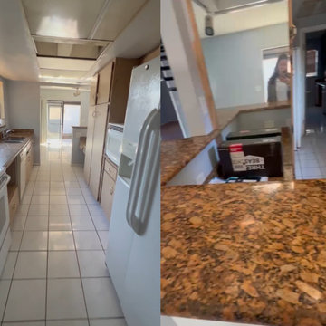
Before – Kitchen: Outdated, Cramped, and Poorly Designed
The original kitchen was in poor condition, with broken and outdated cabinets, old appliances, and a dysfunctional layout. The pantry was placed at the entrance, making the space feel even smaller and more closed off. The countertops and finishes were dated, and the ceiling lighting was damaged and out of style.
Overall, the kitchen lacked efficiency, style, and flow. The renovation transformed it into a much more modern, open, and functional space—maximizing layout, storage, and visual continuity with a single-level countertop.
 CITYDESKSTUDIO, Inc.
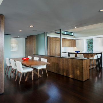
This home enjoys stunning views of Sweeney Lake from almost anywhere in the home; however it was in need of repair and a significant reorganization of the plan to take full advantage of site. The project is about the complete restoration and rethinking of this vintage 1965 mid-century gem. The house is deceivingly large with a full finished lower level and an indoor pool room; however it lived cramped and broken up. The entry was uninviting and small, the poolroom unused and poorly heated, the kitchen undersized, and the bedrooms and baths poorly accessed.
Our task was to open up the home through the rethinking of the floor plan and the introduction of a new central axis connecting and organizing the homes functions and spaces around view corridors and existing or new focal points. The home had beautiful features to build upon; the central brick fireplace, the raised roofs over the living and pool rooms, and the view to the lake itself. A fully redone exterior and interior preserve the homes proportion and scale, while at the same time bring greater connection to the site and a much needed clarity to the homes organization.
Project Team:
Ben Awes AIA, Principal-In-Charge
Bob Ganser AIA
Christian Dean AIA
Nate Dodge
 Betz Pools Limited
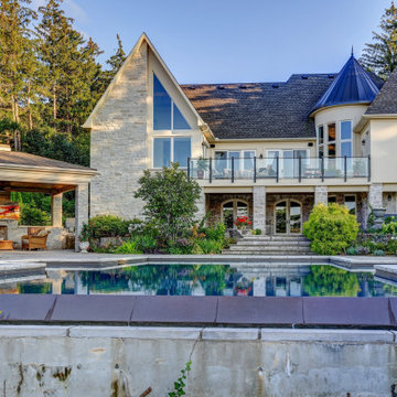
This pool’s infinity edge was poorly designed and did not function properly. Betz resolved this by improving the water recirculation and installing a properly functioning auto leveller to maintain a constant level along the spill wall. Infinity pools require special knowledge and techniques to ensure they work properly.

Sponsored
Columbus, OH

Structural Remodeling
Franklin County's Heavy Timber Specialists | Best of Houzz 2020!
 Paintzen, Inc.
For many, professional interior design is a luxury. Whether your home’s design project is large or small, having the ability to transform your house, apartment or condo into a beautiful, unique space is a wonderful opportunity for self-expression. Even if it is a just simple accent wall painted in a color that speaks to you, or a complete renovation of your cabinets to achieve the kitchen of your dreams, interior design allows you to create an environment that is both personal and comfortable.
That is exactly how interior designer and founder of Design Exchange Sean Carlson Perry feels about what he does for a living. “The reason that I love designing spaces, and value the impact of space design on people, is the way the spaces make us feel, the visceral appeal of good design. Good design should stimulate the senses and generate an emotionally engaging experience. As a designer, I get to massage and sculpt people’s experience of space!” Perry shared with us.
In late 2017, the Paintzen team connected with Perry regarding a very special design project he was working on. Design Exchange was renovating, redesigning and re-furnishing The Ali Forney Center. The Ali Forney Center, based in New York City, is the largest and most comprehensive organization dedicated to housing homeless LGBTQ youth. Nearly 40% of the homeless youth population is LGBTQ. Homeless LGBTQ youth are eight times more likely to experience violence, discrimination, and suicide. AFC houses 124 youths each night and provides services to over 1,400 homeless young people per year.
Although the organization does an incredible job to provide safety and shelter to homeless youth, Perry and his team felt the space itself could use some updating and could feel more welcoming. Rooms were dark, cold, and lacked proper storage. Furniture was in poor shape and didn’t work. The rooms were being under-utilized; overall, there was so much more that could be done within the walls of the AFC that could be improved using interior design & paint!
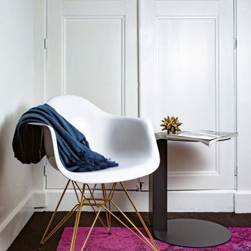
We at Paintzen were excited to partner with Design Exchange to do our part in this transformation. The dark, paneled walls were re-painted white. This entirely opened up the space, making it brighter, warmer and more welcoming. The white walls also served as a much better backdrop for smart lighting, as well as for the furniture, wall decor, and new flooring. Beyond painting, Perry and his team used FLOR carpet tiles for durability in a bright Fuchsia shade for a pop of color. They created a more functional layout to maximize the space and make better use of its architectural details and added new furniture including lamps, tables, throws, a sofa, a TV and a Roku to make the space beautiful, and even fun.
“Design increases connection and community,” Perry told us. “When we revamp a shelter space, history tells us that the residents spend more time in the space, more time with their peers, building connections and community; a greater sense of home.” Perry’s goal was to create an environment that set its residents up for success by improving their quality of life, outlook and self-esteem.
“This isn’t extreme home makeover (although I wish I had that budget!). It’s about improving the aesthetics of the space to create a better environment and experience for people who are going through challenging times. I’ve been lucky enough to have an amount of work that allows me to donate a portion of profits to Design Exchange Projects.”
Sean Carlson Perry founded Design Exchange as a way to use his talent, passion, and skills to help those who are struggling, or in a place of immediate need. He was searching to bring deeper meaning and a humanitarian component to his work. Perry has worked with clients in New York, San Francisco, and Los Angeles. “Good design—functionally, aesthetically and ergonomically—promotes a better quality of life.” This is a mantra that describes why Perry does what he does through Design Exchange, working to help the underserved of New York City and other cities across the country.
“I grew up gay in Nebraska, and have gone through some hard times when I was younger, but I can’t imagine going through what these kids go through – rejection from family, being kicked out of the house for being who they are, homeless and having nowhere else to turn,” said Perry. “Luckily, there is The Ali Forney Center. Doing these projects for AFC strikes close to home for me, so they are extra special and close to my heart.”
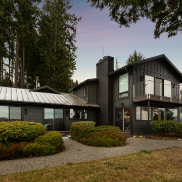 McCabe By Design LLC
Our client purchased what had been a custom home built in 1973 on a high bank waterfront lot. They did their due diligence with respect to the septic system, well and the existing underground fuel tank but little did they know, they had purchased a house that would fit into the Three Little Pigs Story book.
The original idea was to do a thorough cosmetic remodel to bring the home up to date using all high durability/low maintenance materials and provide the homeowners with a flexible floor plan that would allow them to live in the home for as long as they chose to, not how long the home would allow them to stay safely. However, there was one structure element that had to change, the staircase.
The staircase blocked the beautiful water/mountain few from the kitchen and part of the dining room. It also bisected the second-floor master suite creating a maze of small dysfunctional rooms with a very narrow (and unsafe) top stair landing. In the process of redesigning the stairs and reviewing replacement options for the 1972 custom milled one inch thick cupped and cracked cedar siding, it was discovered that the house had no seismic support and that the dining/family room/hot tub room and been a poorly constructed addition and required significant structural reinforcement. It should be noted that it is not uncommon for this home to be subjected to 60-100 mile an hour winds and that the geographic area is in a known earthquake zone.
Once the structural engineering was complete, the redesign of the home became an open pallet. The homeowners top requests included: no additional square footage, accessibility, high durability/low maintenance materials, high performance mechanicals and appliances, water and energy efficient fixtures and equipment and improved lighting incorporated into: two master suites (one upstairs and one downstairs), a healthy kitchen (appliances that preserve fresh food nutrients and materials that minimize bacterial growth), accessible bathing and toileting, functionally designed closets and storage, a multi-purpose laundry room, an exercise room, a functionally designed home office, a catio (second floor balcony on the front of the home), with an exterior that was not just code compliant but beautiful and easy to maintain.
All of this was achieved and more. The finished project speaks for itself.
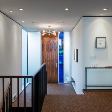 CITYDESKSTUDIO, Inc.
This home enjoys stunning views of Sweeney Lake from almost anywhere in the home; however it was in need of repair and a significant reorganization of the plan to take full advantage of site. The project is about the complete restoration and rethinking of this vintage 1965 mid-century gem. The house is deceivingly large with a full finished lower level and an indoor pool room; however it lived cramped and broken up. The entry was uninviting and small, the poolroom unused and poorly heated, the kitchen undersized, and the bedrooms and baths poorly accessed.
Our task was to open up the home through the rethinking of the floor plan and the introduction of a new central axis connecting and organizing the homes functions and spaces around view corridors and existing or new focal points. The home had beautiful features to build upon; the central brick fireplace, the raised roofs over the living and pool rooms, and the view to the lake itself. A fully redone exterior and interior preserve the homes proportion and scale, while at the same time bring greater connection to the site and a much needed clarity to the homes organization.
Project Team:
Ben Awes AIA, Principal-In-Charge
Bob Ganser AIA
Christian Dean AIA
Nate Dodge
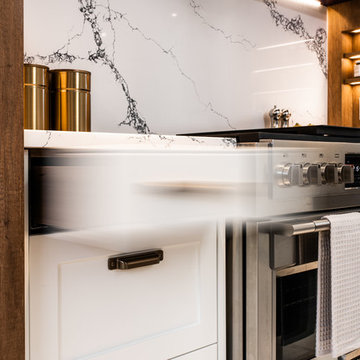
 STUDIO NINE & CO.
When this family of 7 bought their home, they came to us and said "We want a purple kitchen!". Naturally we jumped at the opportunity to create something outside of the box. With 5 young children, functionality and storage was imperative. We designed the kitchen to accommodate our client's lifestyle and busy household. It houses, 3 floor to ceiling storage compartments, each with its own individual function. First, the "Chef's Pantry", complete with top to bottom pullouts. Secondly, the "Breakfast Pantry", that houses everyday appliances, dinner ware, breakfast cereals and spreads. Finally, the once closet, converted 'Walk In Pantry". The oak frame around the range was specifically designed to allow for quick & easy access to everyday cooking essentials, and serve as a focal point in the space. Additional accessories included in the design were a double garbage pull out bin, retractable shelf for smaller, yet heavy appliances, Tupperware organizer, 2 spice pulls, and 2 Le Mans corner organizers. We opted for bespoke cabinetry, with an HDF painted & and oak construction, paired with purple and champagne bronze accents to tie it all together. Overall, this once dull and poorly organized kitchen is now the embodiment of bright, bold and beautiful, offering this colorful family comfort and convenience as they live life as an expression of their values.
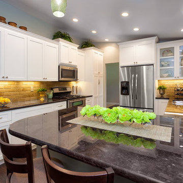
 Gordon Reese Design Build
Our clients have lived in this Bay Area home for over 20 years and their kitchen had all the charm of that '70''s style; it no longer showcased their personal style or provided the functionality they needed. Outdated features included inset fluorescent ceiling lighting, uninspired cabinet style, and poor layout and functionality. This kitchen received a First Place Award from the National Association of Remodeling Industry's REMMIES in October 2013.
 Architectural Resource LLC
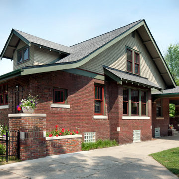
The Brooke Residence ‘Addi- tion by Subtraction’ remodeling project was recognized with numerous regional and national awards and was selected for Fine Homebuilding’s Annual Issue on Houses.
This 1920’s Craftsman Bungalow had been poorly modified in the 70’s in an attempt to address poor energy performance with a scabbed on solarium. The design solution removed the solarium and completely reimagined the floor plan: The kitchen was relocated to the rear; the stairway was relocated to enhance function, and a better connection to the family room was created.


 CITYDESKSTUDIO, Inc.
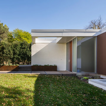
This home enjoys stunning views of Sweeney Lake from almost anywhere in the home; however it was in need of repair and a significant reorganization of the plan to take full advantage of site. The project is about the complete restoration and rethinking of this vintage 1965 mid-century gem. The house is deceivingly large with a full finished lower level and an indoor pool room; however it lived cramped and broken up. The entry was uninviting and small, the poolroom unused and poorly heated, the kitchen undersized, and the bedrooms and baths poorly accessed.
Our task was to open up the home through the rethinking of the floor plan and the introduction of a new central axis connecting and organizing the homes functions and spaces around view corridors and existing or new focal points. The home had beautiful features to build upon; the central brick fireplace, the raised roofs over the living and pool rooms, and the view to the lake itself. A fully redone exterior and interior preserve the homes proportion and scale, while at the same time bring greater connection to the site and a much needed clarity to the homes organization.
Project Team:
Ben Awes AIA, Principal-In-Charge
Bob Ganser AIA
Christian Dean AIA
Nate Dodge
 Bloomin Blinds of North Charlotte
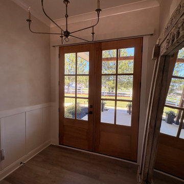
Discover how premium light-filtering materials and smart-home automation can secure street-level entryway glass without losing natural daylight.
Choosing the right window treatments for a home's front entrance is one of the most challenging design decisions a homeowner can face. The front door is the focal point of a home's curb appeal, often featuring expansive glass panels or side-by-side double doors designed to make a grand architectural statement.
During the day, these large glass features are an asset, flooding entryways and foyers with beautiful natural daylight. However, for homes situated on busy local roads or highly trafficked street-level lots, the dynamic completely changes once the sun goes down.
The moment interior lights are switched on in the evening, a stark contrast is created with the dark outdoors. This creates a severe privacy issue, leaving the entire foyer completely exposed to passing traffic and pedestrians. Finding a solution that delivers absolute evening privacy without permanently plunging the front entrance into darkness during the day requires understanding how modern window treatment materials and operating systems interact.
Light-Filtering vs. Blackout Fabrics
The first step in solving street-level privacy is selecting the correct fabric type. Many homeowners mistakenly assume they need heavy, opaque blackout shades to secure their home from outside eyes at night. While blackout fabrics certainly block 100% of the view, they also block 100% of the natural daylight during the day, forcing you to constantly raise and lower the shades just to see inside your own foyer.
A more effective approach for entryways utilizes premium light-filtering materials. These specialized fabrics are engineered with a precise, tight weave that operates on the principles of directional light and optical density.
Daytime Functionality: When the sun is shining outside, the exterior light levels are significantly higher than the interior light levels. The light-filtering fabric diffuses the intense, direct sunlight into a soft, ambient glow throughout the entryway. This keeps the home bright, eliminates harsh glares, and protects interior hardwood flooring, paint, and trim from damaging UV rays.
Night-Time Functionality: At night, the lighting dynamic reverses. The interior foyer lights make the inside bright, while the outside is dark. Because of the specialized tight weave, the fabric blocks the transmission of clear shapes and details. To a person standing out on the street or driving by on a busy road, the view inside is completely obstructed, delivering total privacy when the family is home for the evening.
Challenges of Front Door Installations
Securing privacy for a double wide front entrance introduces unique structural hurdles that standard windows do not face. Traditional blinds with hanging cords or manual pull chains are poorly suited for front doors. They disrupt the clean architectural lines of a grand foyer, create a safety hazard, and can easily get tangled or damaged when the doors are opened and closed.
The window treatments must be mounted high and wide enough above the door trim to ensure that the front doors can swing open and close freely without ever catching on the fabric or the lower hem bar.
How We Applied These Principles in Sherrills Ford, NC
Applying these exact educational principles to real-world homes is what Cole and I do every day at Bloomin' Blinds of North Charlotte. We recently worked with a homeowner in Sherrills Ford whose beautiful new construction property sat on a highly trafficked road. They loved their double wide front door entrance but felt entirely too exposed to the street at night.
We brought our mobile showroom directly to their driveway. This allowed us to hold up premium light-filtering fabric samples directly against their entryway glass, matching the materials perfectly to their home's natural lighting, interior paint, and trim before making a single cut.
To solve their street-level privacy issue, we custom-built and installed two matching light-filtering roller shades, mounting them flawlessly side-by-side above the front door frame. To keep the home’s interior design completely cohesive, we carried the exact same style to the back of the house, installing a matching single roller shade on the rear door.
Smart Home Window Automation at Your Fingertips
Because entryway windows can be tall and awkward to reach manually, our family team integrated advanced smart-home motorization into this Sherrills Ford project.
Beyond the convenience of a handheld remote control, these automated roller shades feature seamless Wi-Fi integration. The homeowners can control their privacy through a dedicated smartphone app or link the system directly to their existing voice-activated smart home networks, including Amazon Alexa, Google Assistant, and Apple HomeKit.
This allows for complete hands-free window automation. The clients can program custom daily routines—such as setting the front entry shades to automatically lower exactly at sunset—or simply use a voice command to secure the foyer instantly from the comfort of the couch.
 Architectural Resource LLC
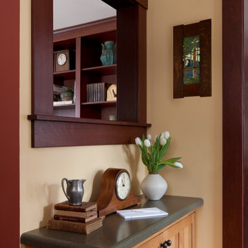
The Brooke Residence ‘Addi- tion by Subtraction’ remodeling project was recognized with numerous regional and national awards and was selected for Fine Homebuilding’s Annual Issue on Houses.
This 1920’s Craftsman Bungalow had been poorly modified in the 70’s in an attempt to address poor energy performance with a scabbed on solarium. The design solution removed the solarium and completely reimagined the floor plan: The kitchen was relocated to the rear; the stairway was relocated to enhance function, and a better connection to the family room was created.
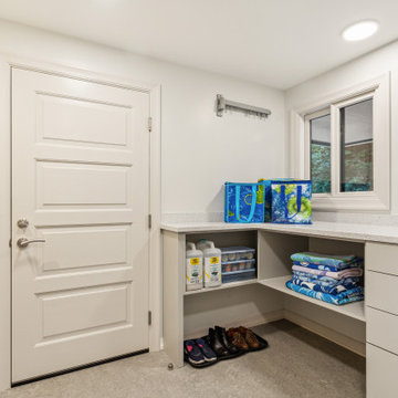 McCabe By Design LLC
Our client purchased what had been a custom home built in 1973 on a high bank waterfront lot. They did their due diligence with respect to the septic system, well and the existing underground fuel tank but little did they know, they had purchased a house that would fit into the Three Little Pigs Story book.
The original idea was to do a thorough cosmetic remodel to bring the home up to date using all high durability/low maintenance materials and provide the homeowners with a flexible floor plan that would allow them to live in the home for as long as they chose to, not how long the home would allow them to stay safely. However, there was one structure element that had to change, the staircase.
The staircase blocked the beautiful water/mountain few from the kitchen and part of the dining room. It also bisected the second-floor master suite creating a maze of small dysfunctional rooms with a very narrow (and unsafe) top stair landing. In the process of redesigning the stairs and reviewing replacement options for the 1972 custom milled one inch thick cupped and cracked cedar siding, it was discovered that the house had no seismic support and that the dining/family room/hot tub room and been a poorly constructed addition and required significant structural reinforcement. It should be noted that it is not uncommon for this home to be subjected to 60-100 mile an hour winds and that the geographic area is in a known earthquake zone.
Once the structural engineering was complete, the redesign of the home became an open pallet. The homeowners top requests included: no additional square footage, accessibility, high durability/low maintenance materials, high performance mechanicals and appliances, water and energy efficient fixtures and equipment and improved lighting incorporated into: two master suites (one upstairs and one downstairs), a healthy kitchen (appliances that preserve fresh food nutrients and materials that minimize bacterial growth), accessible bathing and toileting, functionally designed closets and storage, a multi-purpose laundry room, an exercise room, a functionally designed home office, a catio (second floor balcony on the front of the home), with an exterior that was not just code compliant but beautiful and easy to maintain.
All of this was achieved and more. The finished project speaks for itself.
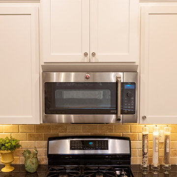 Gordon Reese Design Build
Our clients have lived in this Bay Area home for over 20 years and their kitchen had all the charm of that '70''s style; it no longer showcased their personal style or provided the functionality they needed. Outdated features included inset fluorescent ceiling lighting, uninspired cabinet style, and poor layout and functionality. This kitchen received a First Place Award from the National Association of Remodeling Industry's REMMIES in October 2013.
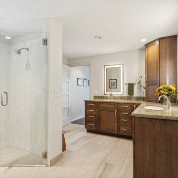 McCabe By Design LLC
Our client purchased what had been a custom home built in 1973 on a high bank waterfront lot. They did their due diligence with respect to the septic system, well and the existing underground fuel tank but little did they know, they had purchased a house that would fit into the Three Little Pigs Story book.
The original idea was to do a thorough cosmetic remodel to bring the home up to date using all high durability/low maintenance materials and provide the homeowners with a flexible floor plan that would allow them to live in the home for as long as they chose to, not how long the home would allow them to stay safely. However, there was one structure element that had to change, the staircase.
The staircase blocked the beautiful water/mountain few from the kitchen and part of the dining room. It also bisected the second-floor master suite creating a maze of small dysfunctional rooms with a very narrow (and unsafe) top stair landing. In the process of redesigning the stairs and reviewing replacement options for the 1972 custom milled one inch thick cupped and cracked cedar siding, it was discovered that the house had no seismic support and that the dining/family room/hot tub room and been a poorly constructed addition and required significant structural reinforcement. It should be noted that it is not uncommon for this home to be subjected to 60-100 mile an hour winds and that the geographic area is in a known earthquake zone.
Once the structural engineering was complete, the redesign of the home became an open pallet. The homeowners top requests included: no additional square footage, accessibility, high durability/low maintenance materials, high performance mechanicals and appliances, water and energy efficient fixtures and equipment and improved lighting incorporated into: two master suites (one upstairs and one downstairs), a healthy kitchen (appliances that preserve fresh food nutrients and materials that minimize bacterial growth), accessible bathing and toileting, functionally designed closets and storage, a multi-purpose laundry room, an exercise room, a functionally designed home office, a catio (second floor balcony on the front of the home), with an exterior that was not just code compliant but beautiful and easy to maintain.
All of this was achieved and more. The finished project speaks for itself.
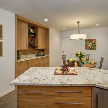
 SDG | Schlosser Design Group, LLC.
This contemporary home got a face lift with a fully gutted kitchen, laundry and den. The original kitchen had a poor layout with a corner sink cab that swallowed up valuable storage space. The added center island had limited clearance causing the owners to bump into it at every turn. The storage was poorly planned and non-functional. We were able to relocate the sink, adjust the angle of the peninsula allowing a better more open flow for this busy family while provided more storage with fewer cabinets than they had before.
26