
Search results for "Poor functionality" in Home Design Ideas
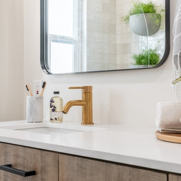
 The Home Co.
We ? bathroom renovations! This initially drab space was so poorly laid-out that it fit only a tiny vanity for a family of four!
Working in the existing footprint, and in a matter of a few weeks, we were able to design and renovate this space to accommodate a double vanity (SO important when it is the only bathroom in the house!). In addition, we snuck in a private toilet room for added functionality. Now this bath is a stunning workhorse!
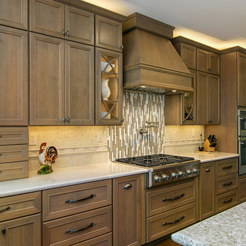
 Coastal Home Design Studio
This kitchen started as a builder basic with no personality or charm. The layout didn't have the best function and the island was poorly placed. The homeowners purchased this house with remodeling and upgrading in mind. The layout was changed to accommodate two people cooking together. Zones were created for meal prepping, cooking and baking. The island was expanded to fill the space and utilize bar seating. The walk through butlers pantry was turned in to a wine bar with a fridge, storage and custom glass cabinets. A medium toned hardwood floor was layed throughout the entire lower level
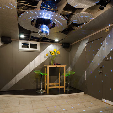
 Mason Hearn
The client's basement was a poorly-finished strange place; was cluttered and not functional as an entertainment space. We updated to a club-like atmosphere to include a state of the art entertainment area, poker/card table, unique curved bar area, karaoke and dance floor area with a disco ball to provide reflecting fractals above to pull the focus to the center of the area to tell everyone; this is where the action is!
Find the right local pro for your project
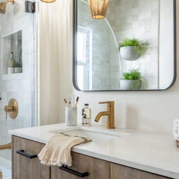 The Home Co.
We ? bathroom renovations! This initially drab space was so poorly laid-out that it fit only a tiny vanity for a family of four!
Working in the existing footprint, and in a matter of a few weeks, we were able to design and renovate this space to accommodate a double vanity (SO important when it is the only bathroom in the house!). In addition, we snuck in a private toilet room for added functionality. Now this bath is a stunning workhorse!
 Katz Builders, Inc.
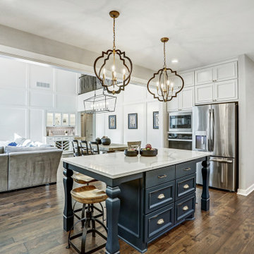
Inadequate storage and awkward doorways throughout the room made the kitchen function poorly. Removing the wall from the kitchen to the great room
opened up the space and allowed the small tight kitchen to be reconfigured and enlarged. Blue is the go-to color this year and it is featured on the island. White shaker cabinets. Pendant lighting. Saddle bar stools. Island seats five. Calcutta White Quartz countertops. Induction cooktop, Convection oven. Steam oven are some of the appliance package. Plank Hickory Hardwood flooring throughout the house. Two large porcelain Farmhouse sink allows for lots of cooks in the kitchen. Cabinetry provides extra deep drawers for storage of pots and pans.
 Michael Nash Design, Build & Homes
After moving into a luxurious home in Ashburn, Virginia, the homeowners decided the master bathroom needed to be revamped. The existing whirlpool tub was far too big, the shower too small and the make-up area poorly designed.
From a functional standpoint, they wanted lots of storage, his and her separate vanities with a large make-up area, better lighting, a large steam shower and a vaulted ceiling. Aesthetics were also important, however, and the lady of the house had always dreamed of having a Venetian style spa.
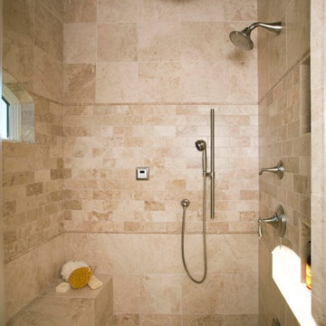
Taking some space from an adjacent closet has allowed for a much larger shower stall with an arched transom window letting plenty of natural light into the space. Using various sizes of tumbled limestone to build its walls, it includes a rain shower head, a hand shower and body sprayers. A seating bench and storage niches make it easier to use.
New plumbing was put in place to add a large vanity with upper glass cabinets for the man of the house, while one corner of the space was used to create a make-up desk complete with a seamless mirror and embedded sconce lights
A free standing Neapolitan-style soaking tub with fluted columns and arched header is the real focal point of this space. Set among large corner windows, under a stylish chandelier, this elegant design sets this bathroom apart from any bathroom in its category.
 Mason Hearn
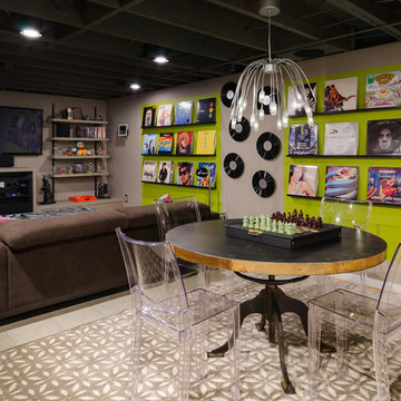
The client's basement was a poorly-finished strange place; was cluttered and not functional as an entertainment space. We updated to a club-like atmosphere to include a state of the art entertainment area, poker/card table, unique curved bar area, karaoke and dance floor area with a disco ball to provide reflecting fractals above to pull the focus to the center of the area to tell everyone; this is where the action is!

Sponsored
Columbus, OH

Structural Remodeling
Franklin County's Heavy Timber Specialists | Best of Houzz 2020!
 Michael Nash Design, Build & Homes
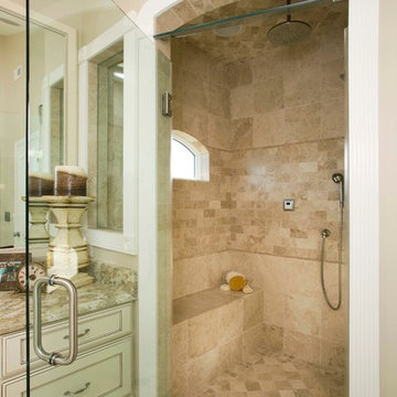
After moving into a luxurious home in Ashburn, Virginia, the homeowners decided the master bathroom needed to be revamped. The existing whirlpool tub was far too big, the shower too small and the make-up area poorly designed.
From a functional standpoint, they wanted lots of storage, his and her separate vanities with a large make-up area, better lighting, a large steam shower and a vaulted ceiling. Aesthetics were also important, however, and the lady of the house had always dreamed of having a Venetian style spa.
Taking some space from an adjacent closet has allowed for a much larger shower stall with an arched transom window letting plenty of natural light into the space. Using various sizes of tumbled limestone to build its walls, it includes a rain shower head, a hand shower and body sprayers. A seating bench and storage niches make it easier to use.
New plumbing was put in place to add a large vanity with upper glass cabinets for the man of the house, while one corner of the space was used to create a make-up desk complete with a seamless mirror and embedded sconce lights
A free standing Neapolitan-style soaking tub with fluted columns and arched header is the real focal point of this space. Set among large corner windows, under a stylish chandelier, this elegant design sets this bathroom apart from any bathroom in its category.
 The Home Co.
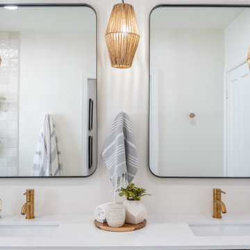
We ? bathroom renovations! This initially drab space was so poorly laid-out that it fit only a tiny vanity for a family of four!
Working in the existing footprint, and in a matter of a few weeks, we were able to design and renovate this space to accommodate a double vanity (SO important when it is the only bathroom in the house!). In addition, we snuck in a private toilet room for added functionality. Now this bath is a stunning workhorse!
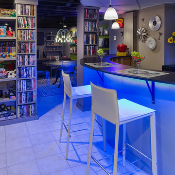 Mason Hearn
The client's basement was a poorly-finished strange place; was cluttered and not functional as an entertainment space. We updated to a club-like atmosphere to include a state of the art entertainment area, poker/card table, unique curved bar area, karaoke and dance floor area with a disco ball to provide reflecting fractals above to pull the focus to the center of the area to tell everyone; this is where the action is!
 Nancy Finneson | DeMane Design
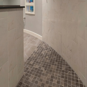
The owners of this remodel desired a refreshing new master bathroom. The original layout was poorly designed with minimal storage, a small shower, a rarely used bathtub and a water closet that was difficult to access. The old vanity flanked a curved wall of glass block (the main challenge with this space) which didn’t allow for mirrors and was always cluttered because of limited storage.
With smart space planning and attention to detail this well-appointed bathroom is now a uniquely personal space that functions brilliantly and balanced for the homeowners.
Photo: DeMane Design
 San Luis Kitchen Co.
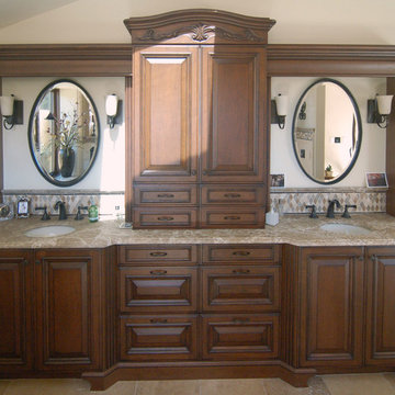
When the homeowners decided to move from San Francisco to the Central Coast, they were looking for a more relaxed lifestyle, a unique place to call their own, and an environment conducive to raising their young children. They found it all in San Luis Obispo. They had owned a house here in SLO for several years that they had used as a rental. As the homeowners own and run a contracting business and relocation was not impossible, they decided to move their business and make this SLO rental into their dream home.
As a rental, the house was in a bare-bones condition. The kitchen had old white cabinets, boring white tile counters, and a horrendous vinyl tile floor. Not only was the kitchen out-of-date and old-fashioned, it was also pretty worn out. The tiles were cracking and the grout was stained, the cabinet doors were sagging, and the appliances were conflicting (ie: you could not open the stove and dishwasher at the same time).
To top it all off, the kitchen was just too small for the custom home the homeowners wanted to create.
Thus enters San Luis Kitchen. At the beginning of their quest to remodel, the homeowners visited San Luis Kitchen’s showroom and fell in love with our Tuscan Grotto display. They sat down with our designers and together we worked out the scope of the project, the budget for cabinetry and how that fit into their overall budget, and then we worked on the new design for the home starting with the kitchen.
As the homeowners felt the kitchen was cramped, it was decided to expand by moving the window wall out onto the existing porch. Besides the extra space gained, moving the wall brought the kitchen window out from under the porch roof – increasing the natural light available in the space. (It really helps when the homeowner both understands building and can do his own contracting and construction.) A new arched window and stone clad wall now highlights the end of the kitchen. As we gained wall space, we were able to move the range and add a plaster hood, creating a focal nice focal point for the kitchen.
The other long wall now houses a Sub-Zero refrigerator and lots of counter workspace. Then we completed the kitchen by adding a wrap-around wet bar extending into the old dining space. We included a pull-out pantry unit with open shelves above it, wine cubbies, a cabinet for glassware recessed into the wall, under-counter refrigerator drawers, sink base and trash cabinet, along with a decorative bookcase cabinet and bar seating. Lots of function in this corner of the kitchen; a bar for entertaining and a snack station for the kids.
After the kitchen design was finalized and ordered, the homeowners turned their attention to the rest of the house. They asked San Luis Kitchen to help with their master suite, a guest bath, their home control center (essentially a deck tucked under the main staircase) and finally their laundry room. Here are the photos:
I wish I could show you the rest of the house. The homeowners took a poor rental house and turned it into a showpiece! They added custom concrete floors, unique fiber optic lighting, large picture windows, and much more. There is now an outdoor kitchen complete with pizza oven, an outdoor shower and exquisite garden. They added a dedicated dog run to the side yard for their pooches and a rooftop deck at the very peak. Such a fun house.
Wood-Mode Fine Custom Cabinetry, Barcelona
 Thyme & Place Design LLC
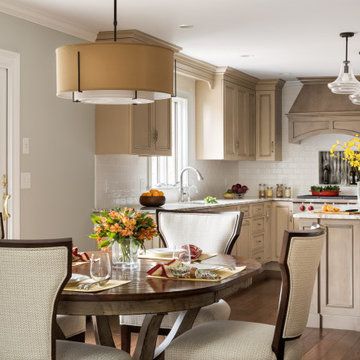
The existing 1970’s kitchen contained once DIY painted cabinets with drop ceilings, poor lighting, inaccessible storage, failing appliances and an outdated floor plan. The client desired a new and improved kitchen designed for a cook which was not only functional but would beautifully integrate into the design style of the home. State of the art appliances, customized storage for all things cooking and entertaining, subtle latte colored cabinets with a contrasting island, and much improved lighting and ventilation came together to create the clients dream kitchen. Designing an Island layout was the key in the transformation from an outdated room to an outstanding reimagined kitchen.


 Art Garden Design
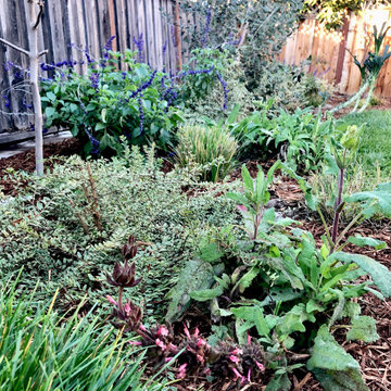
This Oakland backyard was overgrown with 5’ tall grasses, it had an uneven concrete slab with a giant shed, brick edging and poorly located concrete retaining walls. After finalizing the design, a two-weeklong demolition took place. Unnecessary debris was removed and the property was terraced to provide defined areas of entertaining and play for the adults, children, and pets. The transformation from an unusable backyard to a functioning landscape was highlighted by an entertainment patio, redwood arbor, medicinal herbs, fruit trees, and a curvilinear shaped lawn. After the house remodel, we continued to unify the landscape with a new backdoor landing, moss rock retaining walls, and a flagstone pathway planted with shade tolerant ground covers.
 MMW Architects
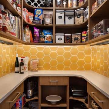
What the owners of the Madeline Ave Residence loved about the home when they bought it was the charm of the original 1920’s structure. However, a dissonance addition from the 1970’s shifted original charm to aesthetic awkwardness and poor flow. While maintaining the feel of the front façade, the rest of the home was reconfigured and choreographed to offer beauty and meet functional needs. Like many homes in historic districts, the homes grow organically to meet needs. Multiple forms and roof lines result.
Due to incorporating these same moves, this renovation fits seamlessly into the neighborhood. It is formal where it needs to be yet comfortable for the daily life. The people, the dog, the cats, the wine: all were carefully tended to throughout the design of the home. The spacious rooms and crisp white palette set the stage for vibrant tile and offers many locations for large scale art. Easy connections to the exterior spaces offer all-season gathering under the shade of the trellis or while making s’mores around the fire pit.
 Walczak Design And Build
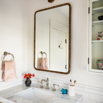
When this family came to us, they loved their home — but their bathrooms were failing them. The kids' bathroom had a non-functioning tub, a serious problem with two young children in the house. The primary bathroom was battling an active shower leak, a poor layout, and finishes well past their prime. Both spaces needed to be gutted. We got to work.
The Primary Bath: Elevated, Effortless, Unmistakably Theirs
Our clients arrived with a clear vision and a beautiful, refined sense of style. The layout was reconfigured from the ground up, and at the heart of the room sits a custom double vanity in a soft, sophisticated sage, topped with a stunning marble countertop and coordinating backsplash. Paired with elegant walnut-framed mirrors, a sculptural black and brass sconce, and wall-mounted polished nickel faucets, the vanity wall is a showpiece. Custom woven shades add warmth without sacrificing light.
The walk-in shower delivers — floor-to-ceiling white subway tile, a mosaic marble floor, transom windows, and frameless glass. Schluter DITRA radiant floor heating adds the kind of quiet luxury you feel every morning. Both marble surfaces were professionally sealed with StoneGuard to protect the investment for the long haul.
The Kids' Bath: Cheerful, Timeless, Built to Last
The girls' bathroom is designed with just as much intention as any room in the house. A warm white oak vanity with marble countertop anchors the space, paired with an antique brass-framed mirror and raspberry custom sconce shades that bring personality without being precious. A botanical-print Roman shade layers in pattern and charm.
The fully rebuilt tub-shower features wall-to-wall white subway tile, polished nickel fixtures, and a beautiful geometric floor tile in cream and warm taupe. A glass-front wall cabinet keeps things tidy, and tile wainscoting wraps the room for durability where it counts. Schluter DITRA radiant heat runs underfoot here too — because warm floors aren't just for adults.
Two bathrooms. Completely distinct. Completely intentional. Built for a family that already loved their home — and loves it even more now.
 Kitchen Solvers of Spring Hill
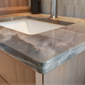
These homeowners were ready to completely transform their master bathroom. The existing space felt cramped and outdated, with an impractical linen closet, a small vanity, poor lighting, a bulky tub, and a shower that had seen better days. Their vision was clear—they wanted a warm, inviting, spa-inspired retreat with natural elements, rich textures, and a unique wood feature wall, rather than the all-white look that has become so common.
The finished design brings that vision to life through a beautiful blend of color, texture, and thoughtful details. A stunning cherry vanity and counter stack, topped with luxurious quartzite countertops, create warmth and elegance. The feature wall, finished in 1" x 3" Articulo tile, adds depth and visual interest, while large-format floor tiles provide a clean, modern foundation.
The curbless shower features coordinating hex tile flooring and niches, complemented by porcelain slab walls and glass panels that create an open, airy feel. A spacious freestanding tub offers the perfect place to relax and unwind. To maximize functionality, the doorway was relocated to accommodate a larger vanity, and custom barn and closet doors were added to enhance the room's character.
Programmable lighting tailored to the homeowners' lifestyle, along with a custom wood feature wall designed to showcase decorative plants, transformed a once-empty wall into a stunning focal point. What was once a dreaded space is now a beautiful spa-like retreat and one of the homeowners' favorite rooms in the house.
 Nip Tuck Remodeling
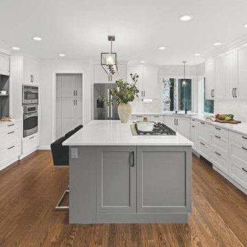
This home had dated and falling apart finishes, an insignificant fireplace in a giant living room, and a poor layout in the family room. Not to mention the primary bath covered in bamboo wallpaper.
The clients wanted a functional, updated and good-looking kitchen, a more adult family room, an updated serene primary bath. The remaining baths to be updated and modern. And, to make it feel like a holistic update, they wanted a welcoming staircase/entry.
As with most clients, stretching their dollar as far as possible was important. They didn't want to enlarge any footprint or move walls - we had to stay within existing bounds. With a whole home remodel costs can add up quickly depending on where we start & stop. For this family it made sense to do all the work at once to avoid repeat remodels. It was either buy new and still have to customize, or remodel to their exact needs and wants. The remodel was more affordable and made just for them.
Many finishes are clean, simple, and modern. A window was removed! in the family room to allow for a symmetrical entertainment center. A dramatic floor to ceiling fireplace surround was created in the Living room. The staircase was totally redone in both shape and style! The primary bath was reworked to get a two-person shower, and soaking tub. Serene /quiet finishes in the primary helped achieve a mellow /calming atmosphere. All new doors and trim throughout.
 Castle Building & Remodeling
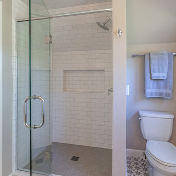
This 1932 South Minneapolis bathroom was OK to look at but did not suit the client’s aesthetics. Not to mention, it was composed of poorly-made and impractical products. Glass mosaic tiles in the shower were hard to clean and were cracking, while the vanity was falling apart.
The clients wanted something fresher that connected with the rest of the feel of their home, and products that were easier to maintain. The layout remained the same, but the space was updated with traditional style cement tiles, subway tiles and a timeless style/finish for the new vanity. Quartz was used for the vanity top, which will be easy to clean and maintain for the homeowner for years to come. A frameless glass enclosure was installed in order to eliminate the problematic stall-style shower curtain that the client despised.
The result was a bathroom that is classic in style but modern in maintenance and function.
 Nantucket Looms
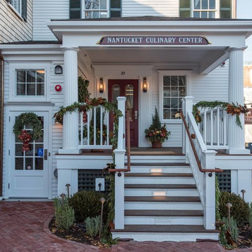
The building was in poor condition and required a complete overhaul, as well as a new addition to house the commercial kitchen and dining room. The Looms’ design team of Liz Winship and Mary Beth Ferro were brought in early on in the process to work closely with the architects and contractors to collaborate in designing a space that would blend the historic integrity of the period building and the neighborhood with the practical, code-driven requirements of a multi-functional commercial space. The “look” was to be inspired by Nantucket’s unique land and seascape, while also feeling a little “on trend” and contemporary. The outdoor lighting here is by Hubbardton Forge of Vermont. It was chosen for its handmade look, innovative design and modern American blacksmith aesthetic. The door is the repainted original door to the building.
30