
Search results for "Poor functionality" in Home Design Ideas
 LaMantia Design and Remodeling
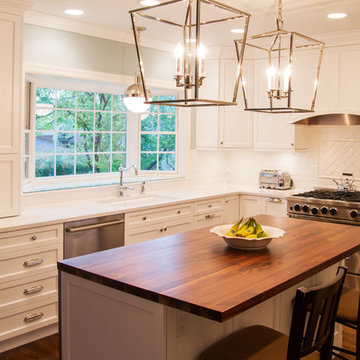
The clients found a house they loved for two reasons…location, location, location (first reason) and the exterior style was similar to a beloved childhood home. They came to LaMantia inquiring as to the possibilities for the first floor. Armed with the clients’ “wants and desires” LaMantia designers Jackie Prazak and Andy LaMantia went about redesigning most of the first floor into an open floor plan fit for the young family.
LaMantia & Prazak found the key to providing the enlarged feeling was through the poorly designed existing home addition. The additional living space was difficult to access, thus providing no useful function to the home.
Completely removing the original exterior walls of the home that blocked access into the addition was the first step in the plan. With the walls removed, the original walled-off space became a part of the home. Relocating the first floor Powder Room, revising the entry closet, removing the wall into the kitchen and resizing the Living Room all were key components to the final rebirth of the larger picture.
To finalize the new kitchen space, it was suggested to raise the Bay window unit thus allowing the relocated sink location. With all the revisions, the Kitchen now could easily accommodate a stretched out “L” layout with a large seated Island and a separate desk area.
With the final plans in place, the clients were amazed to find that within the existing walls of their newly purchased home they had gained so much extra use. And…the very last prize they gained was a dreamed of Mudroom!
 Plain & Posh
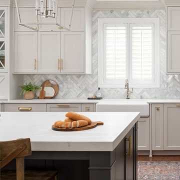
This large space did not function well for this family of 6. The cabinetry they had did not go to the ceiling and offered very poor storage options. The island that existed was tiny in comparrison to the space.
By taking the cabinets to the ceiling, enlarging the island and adding large pantry's we were able to achieve the storage needed. Then the fun began, all of the decorative details that make this space so stunning. Beautiful tile for the backsplash and a custom metal hood. Lighting and hardware to complement the hood.
Then, the vintage runner and natural wood elements to make the space feel more homey.
 Plain & Posh
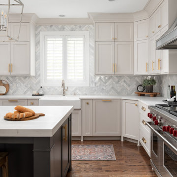
This large space did not function well for this family of 6. The cabinetry they had did not go to the ceiling and offered very poor storage options. The island that existed was tiny in comparrison to the space.
By taking the cabinets to the ceiling, enlarging the island and adding large pantry's we were able to achieve the storage needed. Then the fun began, all of the decorative details that make this space so stunning. Beautiful tile for the backsplash and a custom metal hood. Lighting and hardware to complement the hood.
Then, the vintage runner and natural wood elements to make the space feel more homey.
Find the right local pro for your project
 Plain & Posh
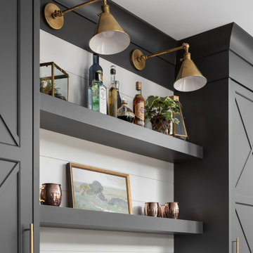
This large space did not function well for this family of 6. The cabinetry they had did not go to the ceiling and offered very poor storage options. The island that existed was tiny in comparrison to the space.
By taking the cabinets to the ceiling, enlarging the island and adding large pantry's we were able to achieve the storage needed. Then the fun began, all of the decorative details that make this space so stunning. Beautiful tile for the backsplash and a custom metal hood. Lighting and hardware to complement the hood.
Then, the vintage runner and natural wood elements to make the space feel more homey.
![[Bracketed Space] House](https://st.hzcdn.com/fimgs/9cd131f907d2cf3c_4936-w360-h360-b0-p0--.jpg)
 Matt Fajkus Architecture
The site descends from the street and is privileged with dynamic natural views toward a creek below and beyond. To incorporate the existing landscape into the daily life of the residents, the house steps down to the natural topography. A continuous and jogging retaining wall from outside to inside embeds the structure below natural grade at the front with flush transitions at its rear facade. All indoor spaces open up to a central courtyard which terraces down to the tree canopy, creating a readily visible and occupiable transitional space between man-made and nature.
The courtyard scheme is simplified by two wings representing common and private zones - connected by a glass dining “bridge." This transparent volume also visually connects the front yard to the courtyard, clearing for the prospect view, while maintaining a subdued street presence. The staircase acts as a vertical “knuckle,” mediating shifting wing angles while contrasting the predominant horizontality of the house.
Crips materiality and detailing, deep roof overhangs, and the one-and-half story wall at the rear further enhance the connection between outdoors and indoors, providing nuanced natural lighting throughout and a meaningful framed procession through the property.
Photography
Spaces and Faces Photography
 Tamara Rosenbloom Design LLC
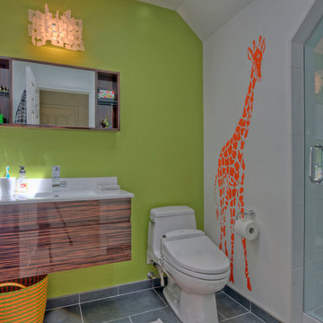
This bedroom is small and had a tiny existing closet and poor flow, so we had to get creative. We reworked the layout to allow for a walk in closet and replaced old carpet with bamboo flooring. By adding a loft bed, we gained a large custom desk space, complete with tool chest as desk storage. Since my client’s view of the ceiling got a little closer, we added interest with bold color and design. A contemporary dresser and comfortable reading chair round out the space. The existing bathroom had a leaking shower with odd angles. To save money, we kept the angles and added a European shower tower, maximizing luxury and function in a tight space. The wall mounted vanity is visually lighter than a traditional vanity and makes the room feel larger. And we can’t forget the giraffe – a fun and colorful accent for a true animal lover!
Photos by Mike Martin www.martinvisualtours.com
 Right Arm Construction
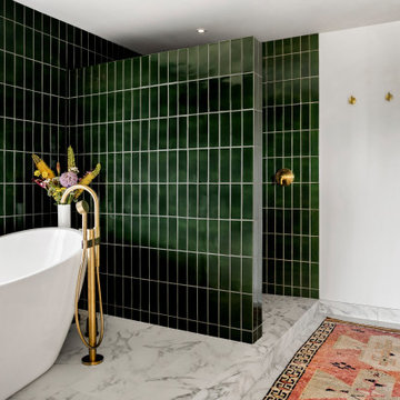
Large trendy master single-sink bathroom photo in Portland with flat-panel cabinets, medium tone wood cabinets, marble countertops, white countertops and a built-in vanity

Sponsored
Columbus, OH

Structural Remodeling
Franklin County's Heavy Timber Specialists | Best of Houzz 2020!
 CBI Design Professionals, Inc.
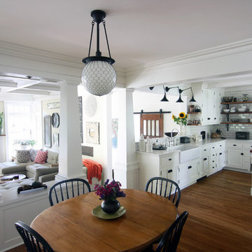
This home addition was intended to expand the home to provide the space needed for the growing new family. The existing kitchen was gutted, expanded and opened up to a family room and nook area. Custom inset cabinets were our preference; however cost was a significant concern. The owner researched multiple companies and standard product lines to save on her budget. After careful analysis, we discovered that it was just as cost effective to use the local custom cabinet maker we preferred. This allowed for more precise detailing and unique features. The goal of a classical farm house kitchen character updated with modern features was able to be obtained much to the home owner's delight.
A family room was added to this home, opening up to a screen porch that takes advantage of a previously unused side yard. The much needed new rear entry provides the family a space for their laundry room and is now the primary entry point from the detached garage. Great care was taken to ensure that the home’s new detailing could have been built this way originally. The space however needed to have a modern function for a modern family. The homes existing exterior had aluminum siding and trim which concealed original millwork and shingles. When the nondescript materials were removed, it was discovered that the original was in poor condition. Careful attention was taken to replace and/or repair original materials wherever possible around the entire home, in order to create a seamless exterior character.
 Michael Nash Design, Build & Homes
2010 REGIONAL AWARD WINNER
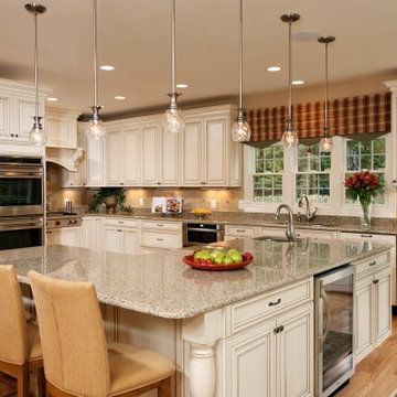
Built in 2000, this center hall colonial in Fairfax Station, Virginia had a kitchen that was neither functional nor aesthetically pleasing.
First, the floor plan was poorly rationalized. The work triangle was inefficient, a large pantry took up too much floor space, and a series of railings between the kitchen and family room obstructed traffic flow.
Aesthetically, the space was dated. Dutch cabinetry, floral wallpaper and a faux Victorian chandelier all cried for an update. Additionally, the homeowners wanted to incorporate high-end appliances and other amenities like a wine cooler and steam cooker.
Overall, the owners were seeking to replace worn out-of-style kitchen with a substantially upgraded “open” facility that combines traditional and contemporary features configured to support multiple social and culinary needs.
Working with Michael Nash Design, Build & Homes, they decided to implement a series of strategic revisions that would support their new use goals.
First, they removed an obstructive bearing wall between the existing kitchen and mudroom, creating a recessed niche for a new 48” gas range with custom hood. An unused desk taken out provided a spot for the new 48” two-drawer refrigerator/freezer.
A custom-designed L-shaped granite-surfaced island with bar sink, icemaker and mini-drawer refrigerator takes center stage in the space and offers seating for six. Now the chef can entertain guests while preparing the meal.
From an aesthetic point of view, the interior features are nothing less than stunning. Softly painted walls, decorative ceramic tile backsplashes and granite surfaces combine with custom made cabinets to create an elegant space. Antiqued soft-opaque cabinet facings, wood panel refrigerator door inserts, glass-facing display cabinets and a custom mantle range hood are true works of craftsmanship. Fine detail is expressed with flutes and corbels. Beauty is truly in the details of this award-winning kitchen.
 Dave Fox Design Build Remodelers
Dave Fox Design Build Remodelers
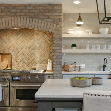
This kitchen remodel combined an under-utilized formal dining room and a small, poorly laid-out, kitchen into one large cohesive and functional space. The two furniture-inspired custom islands are great for entertaining; one can be used for socializing, while the other can be utilized for cleaning and prep work. A custom thin brick surround encompasses the professional-grade gas range with additional spice and oil storage while other interesting materials including, honed quartz countertops, glazed thin brick backsplash, and oversized statement lighting complete this gourmet kitchen.
 Thyme & Place Design LLC
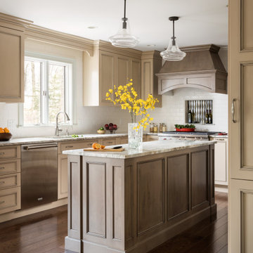
The existing 1970’s kitchen contained once DIY painted cabinets with drop ceilings, poor lighting, inaccessible storage, failing appliances and an outdated floor plan. The client desired a new and improved kitchen designed for a cook which was not only functional but would beautifully integrate into the design style of the home. State of the art appliances, customized storage for all things cooking and entertaining, subtle latte colored cabinets with a contrasting island, and much improved lighting and ventilation came together to create the clients dream kitchen. Designing an Island layout was the key in the transformation from an outdated room to an outstanding reimagined kitchen.
 Advance Design Studio, Ltd.
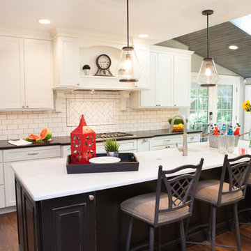
The major kitchen renovation of this old country farmhouse was a task of love, one that had been planned for many years by these Barrington seasoned homeowners. After interviewing no less than five companies, the homeowners chose the design team at Advance Design Studio to make the transformation they had long planned for.
“They had an understanding of the right design for the space almost from the instant they walked in the room”, says Sharon Scott of the design team of Nicole Ryan at Todd Jurs at Advance Design Studio. “They were the only designers who laid out ideas in the first meeting at the house that we really loved”, she says. “It was obvious that they understood the house, and understood us - and from then on the decision to hire them literally made itself”.
The original kitchen had a dividing “wall” of cabinetry…that made the rather large space seem very small, and cut off the kitchen from the eating area that has a beautiful garden view completely hidden from the main kitchen. Circulation was poor, leaving family members on top of one another when entertaining family and friends.
The new kitchen design nearly doubles the kitchen size within the original space; opening it up completely and enjoying an expansive island containing a new Kohler Whitehaven Smart Divide farm sink, a dishwasher, and pull out double trash receptacle. The great new gathering space accommodates four pull out stools beckoning grandchildren and friends alike. Removing the range from the island and relocating it to create a dramatic “feature” wall, completely out of the way of guests; it is now crowned with a beautiful completely customized wood hood designed to ventilate much more efficiently than the original island range containing a limited downdraft system.
The much more efficient use of the space after removing a pantry closet made way for a fully functional “tall wall” housing a double oven and refrigerator, out of the way of guests. Removing the restrictive cabinetry wall now allowed for an expansive floor to ceiling pantry cabinet with full extension pull out shelving, and an elegant display area complete with a beautiful furniture detailed buffet.
Fitting perfectly into the farmhouse charm of the old estate, Medallion Silver Lancaster cabinetry was chosen in a soft white Maple Divinity paint finish lining the perimeter. The stunning island hints to this old home’s past with Medallion Gold’s Maple Devonshire style graced with a Carriage Black Heirloom painted finish. The rubbed off black paint finish reveals the soft wood tones beneath, mimicking furniture you’d see in your grandmother’s home that has lovingly been polished for years to reveal a soft, subtly rubbed-off sheen.
Counter tops reverse contrast with perimeter tops of black “Raven” granite possessing a subtle honed finish, and a shift to Quartz Difinity Viareggio - resembling white Carrera marble on the island. A simple herringbone detail completes the decorative range wall, and subtle porcelain subway tiles grace the backsplash throughout.
The design is finished off with crisp Thermador and Bosch stainless steel appliances, and bright brushed cup pull and handle combination hardware. A pull down Kohler Bellaria faucet makes cleanup a breeze, and soft under-cabinet LED lighting throughout makes every work surface shine softly, and highlights the cabinetry display area with grace.
One special detail was created to make the dramatic ceiling transition to a vaulted area above the breakfast nook extra special. A tongue and groove solid wood ceiling was hung above, and a subtle greenish-grey distressed paint finish was hand developed on site by the talented crew, complementing the new kitchen with a completely unique surface that appears as if it’s been there for many, many years. It’s just one standout feature in the amazing new space that is sure to be in every conversation as newcomers enjoy the newest best hangout in this old home renewed!
After 30 years of renovating homes, this now content homeowner sips a cup of tea enjoying her new garden view, and reminisces projects of past – and lastly reports their experience with Advance Design Studio culminating with their amazing new kitchen to be the most enjoyable and satisfying home experience yet.
Designer: Nicole Ryan
Photographer: Joe Nowak
 LaMantia Design and Remodeling
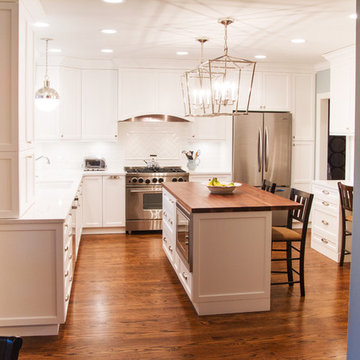
The clients found a house they loved for two reasons…location, location, location (first reason) and the exterior style was similar to a beloved childhood home. They came to LaMantia inquiring as to the possibilities for the first floor. Armed with the clients’ “wants and desires” LaMantia designers Jackie Prazak and Andy LaMantia went about redesigning most of the first floor into an open floor plan fit for the young family.
LaMantia & Prazak found the key to providing the enlarged feeling was through the poorly designed existing home addition. The additional living space was difficult to access, thus providing no useful function to the home.
Completely removing the original exterior walls of the home that blocked access into the addition was the first step in the plan. With the walls removed, the original walled-off space became a part of the home. Relocating the first floor Powder Room, revising the entry closet, removing the wall into the kitchen and resizing the Living Room all were key components to the final rebirth of the larger picture.
To finalize the new kitchen space, it was suggested to raise the Bay window unit thus allowing the relocated sink location. With all the revisions, the Kitchen now could easily accommodate a stretched out “L” layout with a large seated Island and a separate desk area.
With the final plans in place, the clients were amazed to find that within the existing walls of their newly purchased home they had gained so much extra use. And…the very last prize they gained was a dreamed of Mudroom!


 Amsted Design-Build
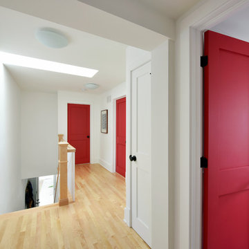
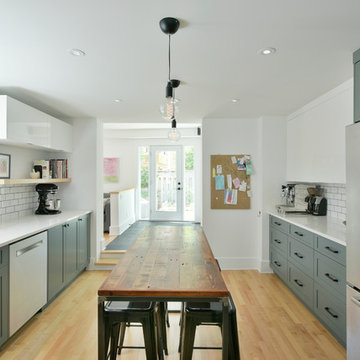
Previously renovated with a two-story addition in the 80’s, the home’s square footage had been increased, but the current homeowners struggled to integrate the old with the new.
An oversized fireplace and awkward jogged walls added to the challenges on the main floor, along with dated finishes. While on the second floor, a poorly configured layout was not functional for this expanding family.
From the front entrance, we can see the fireplace was removed between the living room and dining rooms, creating greater sight lines and allowing for more traditional archways between rooms.
At the back of the home, we created a new mudroom area, and updated the kitchen with custom two-tone millwork, countertops and finishes. These main floor changes work together to create a home more reflective of the homeowners’ tastes.
On the second floor, the master suite was relocated and now features a beautiful custom ensuite, walk-in closet and convenient adjacency to the new laundry room.
Gordon King Photography
 Usable Space Interiors, LLC
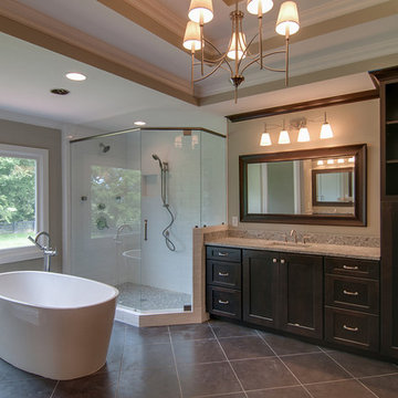
This master bath originally had an enclosed shower that felt like a cave, builder grade cabinets and poor use of storage. USI, opened up the wall, changed the direction of the tub, and closet space, resulting in a lovely, and functional retreat!
 Amsted Design-Build
Previously renovated with a two-story addition in the 80’s, the home’s square footage had been increased, but the current homeowners struggled to integrate the old with the new.
An oversized fireplace and awkward jogged walls added to the challenges on the main floor, along with dated finishes. While on the second floor, a poorly configured layout was not functional for this expanding family.
From the front entrance, we can see the fireplace was removed between the living room and dining rooms, creating greater sight lines and allowing for more traditional archways between rooms.
At the back of the home, we created a new mudroom area, and updated the kitchen with custom two-tone millwork, countertops and finishes. These main floor changes work together to create a home more reflective of the homeowners’ tastes.
On the second floor, the master suite was relocated and now features a beautiful custom ensuite, walk-in closet and convenient adjacency to the new laundry room.
Gordon King Photography
 Advance Design Studio, Ltd.
The major kitchen renovation of this old country farmhouse was a task of love, one that had been planned for many years by these Barrington seasoned homeowners. After interviewing no less than five companies, the homeowners chose the design team at Advance Design Studio to make the transformation they had long planned for.
“They had an understanding of the right design for the space almost from the instant they walked in the room”, says Sharon Scott of the design team of Nicole Ryan at Todd Jurs at Advance Design Studio. “They were the only designers who laid out ideas in the first meeting at the house that we really loved”, she says. “It was obvious that they understood the house, and understood us - and from then on the decision to hire them literally made itself”.
The original kitchen had a dividing “wall” of cabinetry…that made the rather large space seem very small, and cut off the kitchen from the eating area that has a beautiful garden view completely hidden from the main kitchen. Circulation was poor, leaving family members on top of one another when entertaining family and friends.
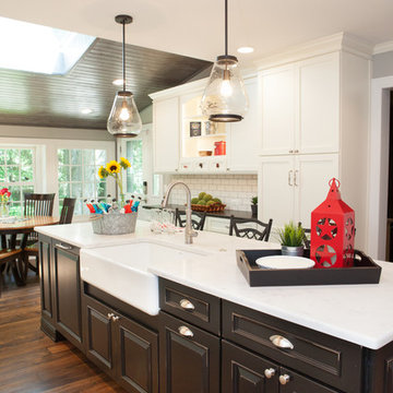
The new kitchen design nearly doubles the kitchen size within the original space; opening it up completely and enjoying an expansive island containing a new Kohler Whitehaven Smart Divide farm sink, a dishwasher, and pull out double trash receptacle. The great new gathering space accommodates four pull out stools beckoning grandchildren and friends alike. Removing the range from the island and relocating it to create a dramatic “feature” wall, completely out of the way of guests; it is now crowned with a beautiful completely customized wood hood designed to ventilate much more efficiently than the original island range containing a limited downdraft system.
The much more efficient use of the space after removing a pantry closet made way for a fully functional “tall wall” housing a double oven and refrigerator, out of the way of guests. Removing the restrictive cabinetry wall now allowed for an expansive floor to ceiling pantry cabinet with full extension pull out shelving, and an elegant display area complete with a beautiful furniture detailed buffet.
Fitting perfectly into the farmhouse charm of the old estate, Medallion Silver Lancaster cabinetry was chosen in a soft white Maple Divinity paint finish lining the perimeter. The stunning island hints to this old home’s past with Medallion Gold’s Maple Devonshire style graced with a Carriage Black Heirloom painted finish. The rubbed off black paint finish reveals the soft wood tones beneath, mimicking furniture you’d see in your grandmother’s home that has lovingly been polished for years to reveal a soft, subtly rubbed-off sheen.
Counter tops reverse contrast with perimeter tops of black “Raven” granite possessing a subtle honed finish, and a shift to Quartz Difinity Viareggio - resembling white Carrera marble on the island. A simple herringbone detail completes the decorative range wall, and subtle porcelain subway tiles grace the backsplash throughout.
The design is finished off with crisp Thermador and Bosch stainless steel appliances, and bright brushed cup pull and handle combination hardware. A pull down Kohler Bellaria faucet makes cleanup a breeze, and soft under-cabinet LED lighting throughout makes every work surface shine softly, and highlights the cabinetry display area with grace.
One special detail was created to make the dramatic ceiling transition to a vaulted area above the breakfast nook extra special. A tongue and groove solid wood ceiling was hung above, and a subtle greenish-grey distressed paint finish was hand developed on site by the talented crew, complementing the new kitchen with a completely unique surface that appears as if it’s been there for many, many years. It’s just one standout feature in the amazing new space that is sure to be in every conversation as newcomers enjoy the newest best hangout in this old home renewed!
After 30 years of renovating homes, this now content homeowner sips a cup of tea enjoying her new garden view, and reminisces projects of past – and lastly reports their experience with Advance Design Studio culminating with their amazing new kitchen to be the most enjoyable and satisfying home experience yet.
Designer: Nicole Ryan
Photographer: Joe Nowak
 New England Design & Construction
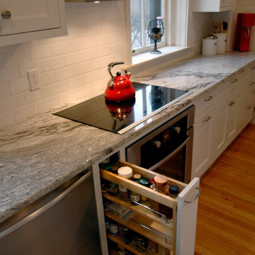
Formerly a cramped, dark, and poorly laid out galley kitchen, NEDC transformed this space by knocking out a wall and replacing it with a beautiful breakfast bar. We lightened up the space by using lighter finishes like white cabinets and backsplash with a lighter granite counter top that has flecks of cranberry throughout to warm it up. Opening up the wall enabled more natural light to permeate the space.
Photos by Kara Wilson
 CBI Design Professionals, Inc.
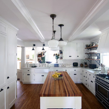
This home addition was intended to expand the home to provide the space needed for the growing new family. The existing kitchen was gutted, expanded and opened up to a family room and nook area. Custom inset cabinets were our preference; however cost was a significant concern. The owner researched multiple companies and standard product lines to save on her budget. After careful analysis, we discovered that it was just as cost effective to use the local custom cabinet maker we preferred. This allowed for more precise detailing and unique features. The goal of a classical farm house kitchen character updated with modern features was able to be obtained much to the home owner's delight.
A family room was added to this home, opening up to a screen porch that takes advantage of a previously unused side yard. The much needed new rear entry provides the family a space for their laundry room and is now the primary entry point from the detached garage. Great care was taken to ensure that the home’s new detailing could have been built this way originally. The space however needed to have a modern function for a modern family. The homes existing exterior had aluminum siding and trim which concealed original millwork and shingles. When the nondescript materials were removed, it was discovered that the original was in poor condition. Careful attention was taken to replace and/or repair original materials wherever possible around the entire home, in order to create a seamless exterior character.
 Thyme & Place Design LLC
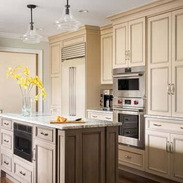
The existing 1970’s kitchen contained once DIY painted cabinets with drop ceilings, poor lighting, inaccessible storage, failing appliances and an outdated floor plan. The client desired a new and improved kitchen designed for a cook which was not only functional but would beautifully integrate into the design style of the home. State of the art appliances, customized storage for all things cooking and entertaining, subtle latte colored cabinets with a contrasting island, and much improved lighting and ventilation came together to create the clients dream kitchen. Designing an Island layout was the key in the transformation from an outdated room to an outstanding reimagined kitchen.
29