
Search results for "Post work socials" in Home Design Ideas
 InnovationLand
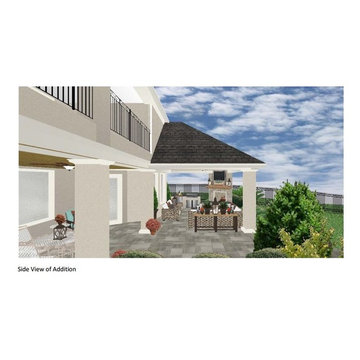
We are so excited about this stylish Houston patio addition!
It's one of our most recent outdoor living space design projects - and one of our new favorites!
We particularly love the rustic corner fireplace, the beautiful, vaulted pine ceiling and the Restoration Hardware furniture and accessories.
"Even though this space has an outdoor kitchen - often the highlight of our projects - the focus here is beautiful, comfortable outdoor living," says Outdoor Homescapes of Houston owner Wayne Franks. "And I have to say, I think this is one of the most gorgeous spaces we've created for doing that - in style."
"This project was special from the start, as we were creating this space for a friend of Wayne’s who had been a long time mentor to his boys growing up," adds Lisha Maxey, owner of LGH Designs in Houston (she coordinated furniture and finishes for the project). "This client was the principal of their high school and knew all of them very well and Wayne, too. This made it very personal, indeed, and we wanted everything to be perfect!"
The 23- by 16-foot addition, located at the back of the house in Cypress, looks out onto a manmade lake in the homeowners' subdivision. The focal point? A 9-foot-8-inch-high-by-7-foot-wide corner fireplace in Earth Grey rustic ledgestone from Colorstone in Houston. The fireplace features a custom wooden mantel, stone bench seating and a 52-inch Sunbrite outdoor TV.
Another highlight is the flooring - silver travertine tile laid out in a Versailles pattern. "We chose silver travertine in a 'Tumbled' color palette with variations of cream and brown," says Lisha. "So we had those two colors, plus grey, to pull from."
The 7-foot-long, stucco outdoor kitchen island's countertops are also noteworthy - Absolute Black granite in a leathered finish offering a modern look and a dark grey hue that works perfectly with the color palette. The kitchen island also houses an RCS 30-inch grill and fridge.
The seating area includes a sectional couch, coffee table, two swivel chairs and two ottomans - all from Restoration Hardware.
"We used Restoration Hardware's Biscayne sectional, swivel chairs and ottomans in gray, with textured linen weave in Sand and cushions and peacock accent pillows in gray," says Lisha. The coffee table is made of solid teak with a concrete top - as is the matching side table.
"We added a console table, also in teak, behind the sofa. And for accents, we added three Amalfi lanterns from Restoration Hardware in weathered zinc."
A Sunbrella® Heathered area rug (in Gray) was added to anchor the space and visually tie it together.
"The space as a whole leans towards a transitional style, in that it has many traditional cozy comforts and colors, but the furniture gives it a more contemporary look," says Lisha. "The idea from the beginning was to marry these two styles, as our clients wanted a look that would not age and be in vogue for years to come."
On the exterior, you can see how we worked to make the addition blend with the existing home - matching the shingles and stucco and continuing the landscaping.
3D graphic renderings and a virtual video tour allowed the clients to know exactly what the space would look like beforehand.
"It takes a lot of the guesswork out of the process," says Outdoor Homescapes' graphic designer, Kristy Buell Franks. "Floor plans and elevation drawings are good for giving an idea of the overall scope of the project, but it's the 3D renderings that really show what the space is going to look like."
The 3D graphics and video tours also help immensely when choosing finishing materials and furniture, she says: "The clients' choices can be put into the design to allow the clients to see how the materials will work with the existing materials on the house and how the furniture will look in the space."
What do you like about this space? Post a comment and let us know!
URL http://www.outdoorhomescapes.com
 Flavin Architects
New Additions to Hoover + Hill
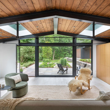
This project is a continuation of the renovation and updating work Flavin Architects had previously completed at the 1958 Wales house, designed by architect Henry Hoover and Walter Hill. Our clients, a young family, desired more space for guests, a home office, a yoga studio, and covered car parking. The challenge was to respect the architects’ original vision and not to interfere with the perfect cruciform plan of the house. To accomplish these goals, we converted the existing garage/workshop structure into a guest house and then designed a new, separate carport/storage building.
The new carport building shares the low-slope gable of the original Hoover structure. The post and beam structure characteristic of Hoover’s design is updated through the use of galvanized steel posts and I beams. The galvanized beams cantilever to support a sheltered walkway leading from the parking to a guest house terrace defined in relationship to the three structures surrounding it. The terrace is paved in slate with a central rain garden. Wood lattice clads the carport, providing good ventilation and letting the building glow like a lantern at night. Our guest house renovation celebrates the unique structural timber ceiling of the original garage. We replaced opaque plywood trusses with a slender cable truss structurally engineered by Webb Structural Services. This cable truss allows for a view of the timber ceiling. A wall of glass facing the courtyard replaced the original garage door. A murphy bed in the rear room enables quick conversion from guest quarters to weight room.
 Rudloff Custom Builders
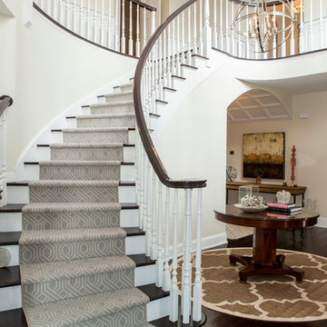
This grand 2 story open foyer has an eye catching curved staircase with a patterned carpet runner, dark treads and dark stained handrail. A round center hall walnut table graces the space and is visually balanced by the orb "globe" style hanging pendant fixture above it. The patterned oval rug plays homage to the coffered ceiling above and aids in bringing ones eye up to this beautifully designed space.
The living room with it's comfortable yet elegant furnishings and curved wall sconces with petite shades are also seen from the center hall. Off of the living room one can see a glimpse of the hallway's "curved" coffered ceiling, the console table with globe and wooden sculptures. The contemporary painting above the console's table brings everything together culminating into an elegant and welcoming environment.
Philadelphia Magazine August 2014 issue to showcase its beauty and excellence.
Photo by Alicia's Art, LLC
RUDLOFF Custom Builders, is a residential construction company that connects with clients early in the design phase to ensure every detail of your project is captured just as you imagined. RUDLOFF Custom Builders will create the project of your dreams that is executed by on-site project managers and skilled craftsman, while creating lifetime client relationships that are build on trust and integrity.
We are a full service, certified remodeling company that covers all of the Philadelphia suburban area including West Chester, Gladwynne, Malvern, Wayne, Haverford and more.
As a 6 time Best of Houzz winner, we look forward to working with you on your next project.
Find the right local pro for your project
 Dennis Mayer - Photographer
Photography by Dennis Mayer
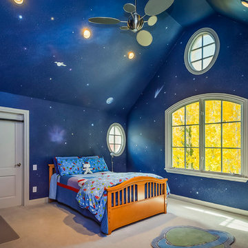
Inspiration for a timeless boy kids' room remodel in San Francisco
Inspiration for a timeless boy kids' room remodel in San Francisco
 Jeff King & Company
Cesar Rubio
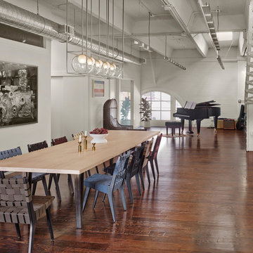
Example of a huge urban medium tone wood floor great room design in San Francisco with white walls
Example of a huge urban medium tone wood floor great room design in San Francisco with white walls
 Hardwood Design Company
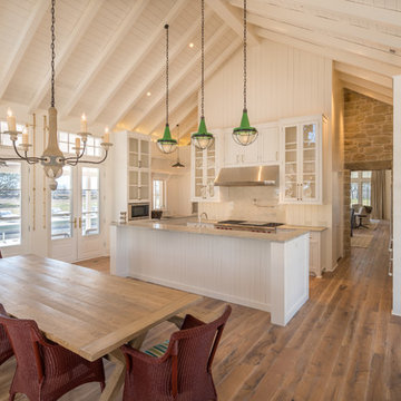
Modern Farmhouse Design With Oiled Texas Post Oak Hardwood Floors. Marbled Bathroom With Separate Vanities And Free Standing Tub. Open floor Plan Living Room With White Wooden Gabled Ceiling.
 Chr DAUER Architects
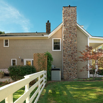
A typical post-1906 Noe Valley house is simultaneously restored, expanded and redesigned to keep what works and rethink what doesn’t. The front façade, is scraped and painted a crisp monochrome white—it worked. The new asymmetrical gabled rear addition takes the place of a windowless dead end box that didn’t. A “Great kitchen”, open yet formally defined living and dining rooms, a generous master suite, and kid’s rooms with nooks and crannies, all make for a newly designed house that straddles old and new.
Structural Engineer: Gregory Paul Wallace SE
General Contractor: Cardea Building Co.
Photographer: Open Homes Photography
Sponsored
Westerville, OH

Custom Home Works
Franklin County's Award-Winning Design, Build and Remodeling Expert
 Greystones Landscape & Stone Work
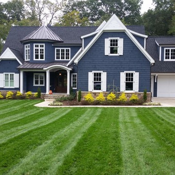
Example of a classic blue two-story exterior home design in Charlotte with a shingle roof
 Pacific Coast Custom Design
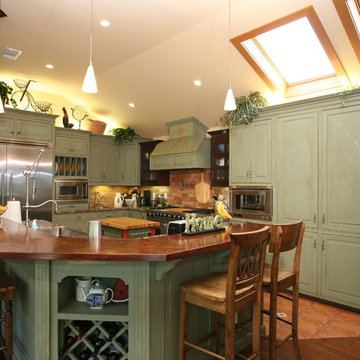
One of our favorite projects. This amazing remodeled kitchen is a showplace. If you are brave enough to choose a color it really pays off. Finished in a country green distressed look this kitchen is really eye catching. The vaulted ceiling and varied cabinets heights add to the charm. We clad the support post and worked it into the island to open the space up for this truly amazing kitchen. This space is not only stunning it is very functional. This project is in down town Huntington Beach, CA, but it could be anywhere in the country.
 Mirador Builders
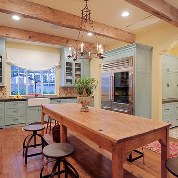
Reclaimed Pine Work Table purchased at the Marburger Antique Fair by Mirador Builders
The Custom Backsplash Tile Can Also be Seen Thru the Window as the Back of a Wall Fountain.
 User
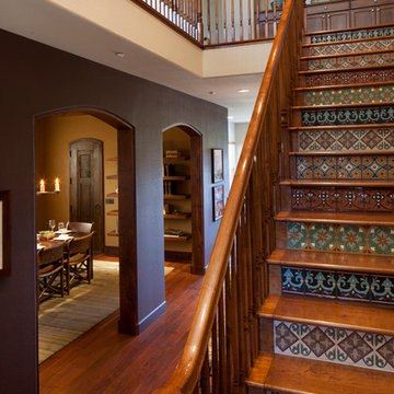
UserASID Design Excellence First Place Residential – Best Individual Room (Traditional): This dining room was created by Michael Merrill Design Studio to reflect the client’s desire for having a gracious and warm space based on a Santa Fe aesthetic. We worked closely with her to create the custom staircase she envisioned.
Photos © Paul Dyer Photography
 Miro Kitchen Design
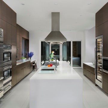
 This kitchen was designed utilizing the length and height of the space. While maintaining a truly functional working area. The emphases on a family kitchen as well as an entertainment area were achieved by keeping the functional components of the kitchen on one side while being able to socialize at an arms-length on the other. No one was to be made to feel left-out, with the island that eventual becomes a projected table to the workstation. Stainless steel was chosen to emphasize the gorgeousness and caliber of the appliances. Custom walnut cabinets accompanied by large format porcelain tile, and quartz counter-tops tie the space together. Hardware placement again reinforces clean lines of the kitchen.
 Advance Design Studio, Ltd.
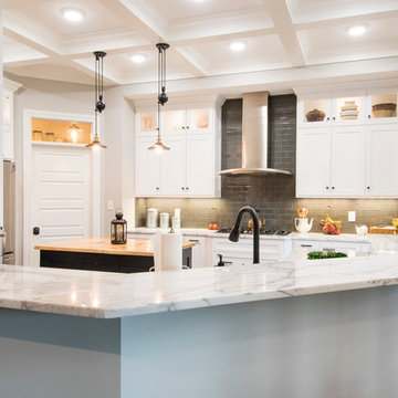
After six years of living in their Huntley IL home, Chris and Meghan were tired of their dark, dingy, outdated kitchen and it was finally time for a long-anticipated change. “The kitchen is the place where we live, it’s where we do everything,” Meghan said. “It was important that it be a space where we wanted to be.” Meghan loves cooking and enjoys including their girls in healthy meal prepping, this led them to want a brighter, more enjoyable kitchen with increased functionality and improved storage.
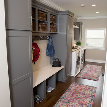
For Chris especially, the laundry room was an entirely dysfunctional eyesore. “We had a washer and a dryer, but it was all kind-of cobbled together!” Chris said. “There were always laundry piles everywhere, we weren’t really sure what we wanted to do in there, but it was time for us to make a change.” The mess of the space was stressful every time they walked in the door from the garage each day. Kids’ backpacks and shoes piled up haphazardly in the makeshift boot-bench closet left the family feeling disorganized and stressed. They needed space for folding clothes and locker cubbies to help keep the family organized.
Having known Christine and Todd in the Huntley community for years, Chris and Meghan were familiar with their work. “We already trusted them personally and having seen their projects for years we knew they did top notch work. After we reviewed the initial round of designs, we knew that hiring them was definitely the right choice,” Meghan and Chris said. Although Chris had done a lot of work in their home himself, the kitchen and laundry room renovation was such a large undertaking that he didn’t want to steal time away from his family to spend what would surely be many long weekends doing the job himself. “That would not have been a wise choice for us,” Chris laughed.
“Our designer, Michelle was very, very, easy to work with; anything we wanted to see or weren’t sure about, she went above and beyond to make this easy for us. She was easy to get hold of and always quick to respond,” the couple said. Michelle pulled ideas that mirrored the couple’s taste and style and was adept at directing the couple to limited choices that didn’t overwhelm them and kept the process moving. “I have a hard time making decisions. Michelle made the decision-making process so easy. I loved how she listened to what I liked and then presented three great options for me to choose from,” Meghan said.
The main objectives for the kitchen were better storage solutions, they wanted the space to reflect their lifestyle and taste, and they wanted it to last for years with low maintenance. One of the first steps in creating a more functional kitchen was relocating the refrigerator, creating an improved workflow for the busy family.
“We didn’t know that we could even move the refrigerator to a new location where it is now, that was something that we never would have thought of,” Chris said. “The new refrigerator location makes the kitchen feel so much bigger. We didn’t add any space, but our whole kitchen with the new design just seems like it’s so much larger than before!” Meghan said.
The perimeter mist colored cabinets helped warm and brighten the entire room, while the graphite colored cabinets on the island added contrast. Using this fresh, clean color palette satisfied the couple’s desire for a bright space that was the exact opposite of what they had before. Organization accessories were also added to the cabinets such as a spice drawer tray and roll outs to create hidden convenience.
“I absolutely love the hidden spices – it makes cooking so much more enjoyable!” Chris said. “And all the pull outs, and the double trash bin, who would think you could get so excited about organization!” the couple said in unison.
One thing they hated in their original kitchen was how dark the space felt. Added lighting on the ceiling with the new light fixtures combined with the lighter cabinetry colors throughout solved this problem. “Our new kitchen has this warm, almost cozy feeling that our old kitchen never had, it’s just a space that I love spending my time in now,” Meghan said. The light airy feeling was accentuated with the use of floating white shelves on either side of the decorative range hood. “We have so much cabinetry space, the new design is amazing we actually have more storage space than we will ever need,” Meghan said.
The island was extended to create more work surface and added space for stool seating. “The new island changes how we live. Now the kids can be in the kitchen with us, doing homework, eating breakfast, and the three of us have special dinners there when Chris is working late,” Meghan said.
The Carrara Marmi Quartz countertops were chosen because they are, not only beautiful, but are made from hard-working material that doesn’t require maintenance. The white subway tile backsplash that wraps to the ceiling behind the focal point cooktop range/hood compliments the crisp white countertops perfectly, while brushed brass hardware and light fixtures keep the design fresh and new.
The couple had a few fears at the beginning of the project, as most homeowners do. Their biggest fear was being out of their kitchen and laundry room for an extended time. The crew made it very easy for the family to work in a limited space keeping the washer and dryer hooked up the majority of the time, and also getting appliances working with minimal downtime.
“They above and beyond accommodated us to get us through the process,” Meghan said. “They did a great job making sure we were as comfortable as possible throughout the process,” Chris added.
“Our project manager DJ did a great job. He was very good at updating us on schedule changes, getting guys in as quickly as possible. Everyone that stepped in the house was nice and did great work,” said Chris. They thought Advance’s carpenter was phenomenal and were impressed when he took a conceptual idea from a photograph and worked with designer Michelle to create a one of a kind range/hood that has become the topic of conversation with friends and family who visit the new kitchen. “He was in our house literally every day for several weeks. He was easy to work with and good at what he did,” Meghan and Chris said.
The focal point of the kitchen; a hand-crafted, custom-built ventilation hood was clad with handpicked reclaimed barnwood. Advance Design’s carpenter built the framework and the cladding to create a one-of-a-kind design element that the couple loves.
“I think it was especially fun for him to create something unique from scratch, showcasing his talent in this area,” Meghan said. “I love that my kitchen is not like everyone else’s. I got to pick out the wood on my hood and watch it being built and was able to choose what pieces of wood went where on it. It’s totally unique.”
Red Oak flooring was toothed-in throughout the kitchen and the rest of the first floor anywhere changes were made. Then the whole floor was refinished to tone down the orange undertones in the existing floor stain, ultimately changing the color complexion of the entire first floor. The result is a completely new feeling to the entire home.
Renovating the laundry room was extremely important to Meghan and Chris, but they had trouble visualizing what the possibilities were for the seemingly small space. Michelle produced beautiful 3D illustrations that helped them envision the space in a whole new way.
“I must have told Michelle 100 times that I am a visual person, seeing the designs in 3D made it so easy to make decisions and see what we could really do with our space,” Meghan said.
A dividing wall and doorway were removed between the existing laundry room and hallway formerly containing a coat closet, providing space to design specialized graphite colored cabinetry matching the kitchen island to house custom storage cubbies for each family member. Adding the tall utility cabinetry in the new laundry area helped solve the storage issue, tucking away cleaning supplies, household items, and even the cat got its own cubby.
“I love how everything is now hidden in its own space. I can’t tell you how much I hated coming home and seeing everything sitting around on counters,” Chris said.
Electrical outlets were planned for the inside of utility cabinets, so devices could charge in hidden locations. Stacking the washer and dryer allowed for wider countertop space to provide a folding area and a special space for clothes to hang. “The way I do laundry has been completely transformed! I can actually fold clothes and hang them now right out of the washer and dryer,” Meghan said.
“The end result in the kitchen and the laundry/mud room was an updated light and bright space, with a smarter work flow that better meets the needs of this family,” Michelle said.
“I would totally recommend Advance Design,” Meghan said. “Sometimes I sit and just look at my kitchen and laundry room and think ‘Wow, I can’t believe I get to live here!’ It’s an understatement to say we love our new space.”

 Fluidesign Studio
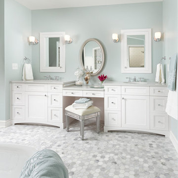
Building Design, Plans (in collaboration with Orfield Drafting), and Interior Finishes by: Fluidesign Studio I Builder & Creative Collaborator : Anchor Builders I Photographer: sethbennphoto.com
 Shrock Premier Custom Construction
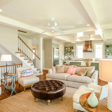
Shrock Premier Custom Construction works closely with clients to create a space which perfectly suits their desires, needs, and budget. The owners of this charming lake home wanted a retreat for family and friends with outdoor living and relaxation as the focus. Despite its cottage appearance, this Shrock Premier weekend get--a-way will certainly surprise visitors with it's ample size. The lovely open concept kitchen, living area, and breakfast room provide a wonderful flow and comfortable seating for all. The ceiling detail, delightful color palette, and choice of materials give this marvelous home that coveted lake vibe. www.shrockpremier.com
 Tyner Construction Co Inc
Shawn Stom http://www.shawnstom.com/
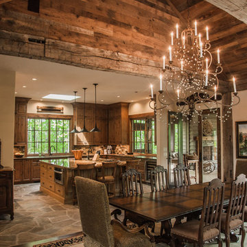
Great room - rustic dark wood floor great room idea in Other with beige walls
Great room - rustic dark wood floor great room idea in Other with beige walls
 Jeff King & Company
Cesar Rubio
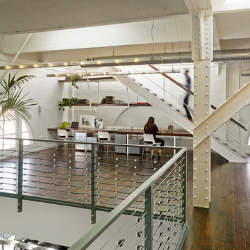
Example of a large urban built-in desk medium tone wood floor home studio design in San Francisco with white walls
Example of a large urban built-in desk medium tone wood floor home studio design in San Francisco with white walls

Sponsored
Columbus, OH

Hope Restoration & General Contracting
Columbus Design-Build, Kitchen & Bath Remodeling, Historic Renovations
 RiverWorks Design Studio
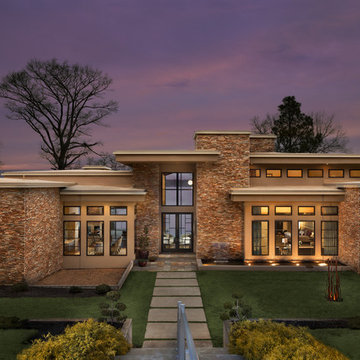
A Mid-Century Modern lake home on the Tennessee River in Muscle Shoals, Al. Architect Phil Kean of Winter Park, Fl and Alexander Modern Homes as the builder. This 10,000 sq. Ft. Home has 6 Bedrooms and 7 1/2 baths featuring retractable sliding glass doors which are motorized and blur the lines between indoors and out.
 TKS Design Group
Download our free ebook, Creating the Ideal Kitchen. DOWNLOAD NOW
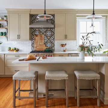
The homeowners came to us looking to update the kitchen in their historic 1897 home. The home had gone through an extensive renovation several years earlier that added a master bedroom suite and updates to the front façade. The kitchen however was not part of that update and a prior 1990’s update had left much to be desired. The client is an avid cook, and it was just not very functional for the family.
The original kitchen was very choppy and included a large eat in area that took up more than its fair share of the space. On the wish list was a place where the family could comfortably congregate, that was easy and to cook in, that feels lived in and in check with the rest of the home’s décor. They also wanted a space that was not cluttered and dark – a happy, light and airy room. A small powder room off the space also needed some attention so we set out to include that in the remodel as well.
See that arch in the neighboring dining room? The homeowner really wanted to make the opening to the dining room an arch to match, so we incorporated that into the design.
Another unfortunate eyesore was the state of the ceiling and soffits. Turns out it was just a series of shortcuts from the prior renovation, and we were surprised and delighted that we were easily able to flatten out almost the entire ceiling with a couple of little reworks.
Other changes we made were to add new windows that were appropriate to the new design, which included moving the sink window over slightly to give the work zone more breathing room. We also adjusted the height of the windows in what was previously the eat-in area that were too low for a countertop to work. We tried to keep an old island in the plan since it was a well-loved vintage find, but the tradeoff for the function of the new island was not worth it in the end. We hope the old found a new home, perhaps as a potting table.
Designed by: Susan Klimala, CKD, CBD
Photography by: Michael Kaskel
For more information on kitchen and bath design ideas go to: www.kitchenstudio-ge.com
 Jeff King & Company
Cesar Rubio
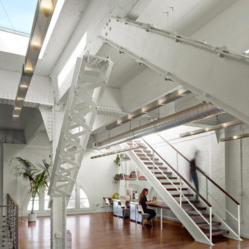
Example of a huge urban built-in desk medium tone wood floor home office design in San Francisco with white walls
Example of a huge urban built-in desk medium tone wood floor home office design in San Francisco with white walls
24