
Search results for "Practical planning" in Home Design Ideas
 Arthaus Design Studio
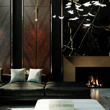
This luxury residential project explores a refined balance between contemporary minimalism and warm, livable sophistication. Designed with a focus on atmosphere, texture, and architectural harmony, the interiors combine premium natural materials, soft ambient lighting, and carefully curated details to create a timeless living experience.
The concept emphasizes clean architectural lines enriched by warm tones, textured stone, elegant wood finishes, bespoke furniture elements, and layered lighting compositions. Each space was designed to feel both visually striking and deeply comfortable, blending modern aesthetics with a welcoming residential character.
Special attention was given to material continuity and spatial flow, creating a cohesive design language throughout the project. From the serene private areas to the sophisticated social spaces, the interiors reflect understated luxury, functionality, and a strong sense of balance.
Project Scope:
• Interior Design
• Interior Visualization
• Material & Lighting Concept
• Space Planning
• CGI & Architectural Rendering
 Audus Kitchens
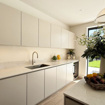
This open-plan kitchen project in St Albans was about creating a light-filled, family-friendly space that seamlessly connects cooking, dining, and relaxing.
Our clients wanted a layout that brought everyone together while maintaining a clean, airy atmosphere with a soft, neutral colour palette.
We used our handleless cabinetry in a calming Sand matte finish — a warm, light beige tone that beautifully reflects the natural light in the room. This sleek, modern style enhances the open-plan feel while providing a timeless backdrop for everyday living.
Silestone Lagoon 20mm quartz worktops complement the cabinetry with soft veining and a durable surface, perfect for everyday family life.
The kitchen has fully integrated Siemens appliances, offering a streamlined and efficient cooking experience. A Quooker tap adds modern-day convenience, delivering instant boiling water on demand.
To ensure a cohesive feel throughout the open-plan layout, we extended the same cabinetry into the living area with bespoke media wall units in the same finish. This space is now a welcoming, multifunctional hub — bright, practical, and beautifully connected.
Curious about our kitchens and what we offer? Explore more projects or download our brochure to discover our ranges, finishes, and design approach.

 safe ZOnea
Ask a kitchen designer in Chicago which countertop question comes up most and you will hear the same answer: white or off-white quartz, and which shade. Homeowners walk into showrooms with a photo saved on their phone, usually a bright, veined slab from a magazine spread, and leave an hour later realizing there are a dozen versions of that same look. The confusion is not about taste. It is about the fact that "white quartz" covers a huge range of patterns, undertones, and price points, and nobody explains the differences before the sale.
Older bungalows and newer builds alike are getting stripped of their dated laminate and butcher block in favor of quartz, and the reasons are practical rather than trendy. Quartz does not need sealing, resists the kind of staining that granite can suffer over decades, and holds up to the freeze-thaw humidity swings that Chicago basements and kitchens go through every year. Once a homeowner commits to quartz, though, the real decision starts: which white, and does the pattern justify the difference in cost.
This piece walks through three specific slabs that keep showing up in Chicago renovation projects, why designers reach for them in different rooms, and what actually separates a flat white surface from one with real depth. None of this requires a design background to follow. It is mostly about paying attention to how a slab behaves under kitchen lighting, how busy the vending gets, and how it photographs versus how it looks in person.
Why White Quartz Took Over Chicago Kitchens
Ten years ago, granite dominated Chicago kitchen remodels almost by default. It was durable, it looked expensive, and every fabricator in the metro area carried a wide range of colors. Quartz has since taken over that position, and the shift happened faster than most contractors expected. Engineered stone gave homeowners a more predictable surface, since natural granite varies slab to slab while quartz is manufactured to a consistent pattern batch after batch.
The other driver is light. Chicago winters are long and gray, and a lot of kitchens, especially in older two-flats and courtyard buildings, do not get much direct sun. A dark granite countertop in a dim kitchen can make the whole room feel smaller. White and light-toned quartz reflects what little natural light comes through the windows, and it makes a galley kitchen or a north-facing space feel noticeably brighter without touching the cabinetry or the layout.
There is also a resale argument that local real estate agents bring up constantly. White quartz photographs well for listings, reads as updated and low-maintenance to buyers touring in person, and does not compete visually with whatever cabinet color the next owner might prefer. It is a safer bet than a bold veined marble look or a colored quartz that might feel dated in five years.
Arctic White and the Cost Question
Among the flatter, more uniform whites, arctic white quartz price comes up constantly in budget conversations because the slab sits at a more approachable point than the heavily veined Italian-marble-inspired patterns. It reads as clean and bright without the busy movement that some homeowners find overwhelming in a small kitchen. Fabricators in the Chicago area tend to keep it in stock precisely because demand stays steady across both new construction and remodel projects.
Part of what keeps this slab affordable relative to its heavily patterned cousins comes down to manufacturing complexity. A quartz surface with minimal veining and a consistent white base is simpler to produce at scale than one that mimics the irregular, high-contrast movement of natural Calacatta marble. That production difference shows up directly in what a homeowner pays per square foot, and it is worth asking a fabricator to walk through that pricing before assuming every white quartz costs the same.
Homeowners planning a full kitchen, including an island, backsplash, and perimeter counters, often use a flatter white like this specifically because it lets other elements carry the visual interest. A patterned tile backsplash or a bold cabinet color reads more clearly against a calm countertop than against one already fighting for attention with heavy veining. Designers frequently pair simpler whites with statement lighting fixtures for exactly this reason.
What Makes Calacatta Patterns Different
Calacatta refers to a family of marble originally quarried in Italy, known for a bright white background broken up by bold, often gold-toned veining that moves in thick, dramatic streaks rather than thin gray lines. Natural Calacatta marble is soft, porous, and expensive to maintain, which is exactly why quartz manufacturers spent years developing engineered versions that replicate the look without the upkeep headaches.
The challenge with any Calacatta-style quartz is getting the veining to look organic instead of printed. Early generations of engineered stone struggled with repetitive patterns that gave away the fact the slab was manufactured rather than cut from actual marble. Modern digital printing and layering techniques have closed that gap considerably, and the better Calacatta-inspired quartz lines now vary the veining across each slab batch so two counters in the same kitchen do not look identical.
Chicago designers gravitate toward Calacatta patterns for kitchens that function as the visual centerpiece of an open floor plan, which describes a large share of the gut renovations happening in neighborhoods like Lincoln Park, Roscoe Village, and the North Shore suburbs. When the kitchen island is visible from the living room and dining area, a dramatic veined surface becomes part of the home's overall design language rather than a purely functional work surface.
Calacatta Arno Under Kitchen Lighting
One of the more popular options in this category, calacatta arno quartz, balances a warm white base with soft gray and gold veining that avoids looking too stark under the cooler LED lighting common in newer Chicago builds. Homeowners touring showrooms sometimes make the mistake of judging a slab entirely under warm incandescent lighting, then get surprised when the same surface looks slightly different once installed under their kitchen's actual fixtures.
What separates this particular pattern from flatter competitors is how the veining clusters rather than spreading evenly across the slab. That clustering mimics the way real quarried marble forms, with denser mineral deposits in some sections and cleaner stretches in others. Fabricators cutting a large island slab from a single piece will often orient the pattern intentionally so the busiest veining lands somewhere visually interesting rather than getting cut off at an edge.
Because the background reads warmer than a stark white, this pattern tends to pair well with brass or matte gold hardware, a combination that has been showing up repeatedly in Chicago kitchen remodels over the past few renovation seasons. Cabinet painters report a similar trend, with more clients requesting warm white or greige cabinet colors specifically because they complement this kind of veined quartz better than a cooler, blue-toned white would.
Silestone's Version of the Calacatta Look
Manufacturers compete directly in this Calacatta-inspired category, and silestone eternal calacatta gold represents one brand's specific take on the pattern, distinguished by richer gold veining set against a brighter white base than some competing slabs in the same family. Silestone has built a reputation around anti-bacterial surface treatments in addition to the standard quartz durability, a detail some homeowners specifically ask about for kitchens used heavily by families with young children.
The veining in this particular slab tends to run in longer, more continuous lines compared to the clustered pattern found in some other Calacatta-style options, which gives large island surfaces a sense of visual flow from one end to the other. Fabricators working with bigger islands, the kind increasingly common in open-concept Chicago remodels, often favor patterns like this because there is less need to worry about seams interrupting a busy, disconnected pattern.
Price positioning for this slab tends to sit toward the upper end of the engineered quartz category, reflecting both the brand's manufacturing process and the complexity of replicating that continuous gold veining consistently across production batches. Homeowners weighing this option against other Calacatta-style quartz should ask their fabricator directly about batch availability, since premium patterns sometimes have longer lead times than standard stock colors.
Living With Quartz Day to Day
Beyond how a slab looks in a showroom or a listing photo, the daily experience of owning quartz countertops matters more once the renovation dust settles. Quartz resists scratching far better than laminate and holds up to the acidic spills, hot pans, and general abuse of an active kitchen without the sealing maintenance that natural stone requires every year or two. That low-maintenance reputation is a large part of why quartz overtook granite in the first place.
Heat resistance is a detail that gets less attention than it should. While quartz handles moderate heat well, manufacturers generally recommend using a trivet or pad for very hot pots straight off the stove, since sudden temperature shock can occasionally cause stress marks in the resin binder that holds the engineered stone together. This is a minor precaution rather than a major limitation, but it is worth mentioning to anyone assuming quartz is entirely indestructible.
Cleaning routines stay simple across almost every pattern in this category. A damp cloth and mild soap handle daily messes, and the nonporous surface means wine, coffee, and tomato-based sauces do not soak in the way they can with unsealed granite or marble. Homeowners moving from an older stone counter often mention how much less they worry about everyday spills once quartz is installed, which is a quality-of-life change that rarely makes it into the initial design conversation.
Choosing Between the Three
There is no single correct answer among these three slabs, and that is exactly why they keep coming up together in the same design conversations across Chicago renovation projects. A flatter white with minimal veining suits kitchens where other elements need to carry the visual interest, while a bolder Calacatta-inspired pattern makes sense when the countertop itself is meant to be the centerpiece of an open floor plan.
Budget matters too, and it is worth having a direct conversation with a fabricator about where each option lands before falling in love with a specific slab in a showroom. Lighting, cabinet color, and how the kitchen connects to the rest of the home all play into which pattern will actually look right once installation is finished rather than just in a photo.
Whatever direction a homeowner leans, seeing a full slab in person under actual kitchen lighting remains the single most useful step before signing off. Photos only go so far once the countertop is sitting in the room it will live in for years.
Find the right local pro for your project

 The Olde Mill - Box Beams, Mantels & Shelves
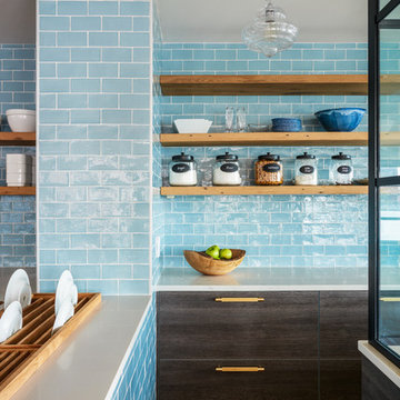
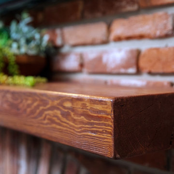
Transitional style remodel with rustic elements. Space planning by Ourso Designs. Beams, door casings, and mantel by The Olde Mill.
Photo by Collin Richie
 Archimple LLC
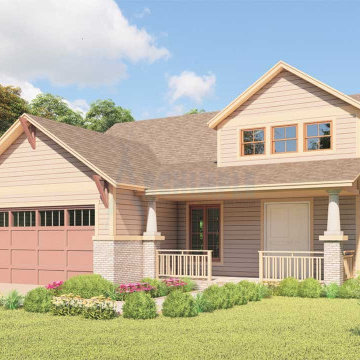
This three-bedroom cottage-style house plan offers simplicity and cultural charm, perfect for single-family living. With a two-story design and a two-car garage, it balances functionality with an open floor plan for a healthy lifestyle.
A welcoming rectangular-shaped porch with two decorative columns leads into the living room, complete with a coat closet and fireplace. The living space flows seamlessly into the dining area and spacious kitchen, featuring an island and walk-in cabinet pantry.
The master bedroom, positioned at the rear, boasts a well-equipped master bath and a swing French door opening to a private deck, ideal for relaxation.
Two additional bedrooms with closets and a shared bath are located on the main level. Upstairs, a theatre room and recreational space offer extra entertainment, complemented by a convenient powder room.
In summary, this cottage-style house plan offers easy living and various advantages, making it a cozy and practical choice for modern homeowners.
 Crystal Kitchen + Bath
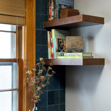
The goal for this 1939 Tudor-style story-and-a-half home was to create a kitchen that offered the conveniences, storage, and performance of a modern workspace while preserving the warmth, craftsmanship, and vintage charm that made the home special. The client, an avid home cook, wanted the room to feel as though it had always belonged to the house, with thoughtful upgrades that respected the original architecture rather than competing with it. Just as important, she needed a more efficient layout with enough storage for small appliances, so everyday cooking would no longer require carrying items up from the lower level.
Several existing conditions shaped the design approach. The kitchen retained original, amber-stained birch woodwork that the client wished to keep, and the compact footprint was interrupted by six doorways and two windows, none of which were to be moved, altered, or replaced. A previous flooring update had left the door casings undercut too short, creating visible gaps where the casing met the floor. The existing vintage 40-inch range also lacked proper ventilation, yet the client wished to accommodate a refrigerator, dishwasher, cooktop, double ovens, built-in microwave, and effective venting above the cooktop into the new kitchen layout.
To honor the original millwork, beaded inset-style cherry cabinetry was selected in a soft, hand-rubbed finish that will deepen over time and develop a natural patina. Charcoal-gray soapstone countertops complement the cabinetry while reinforcing the historic character of the home with an organic, timeworn texture. The former breakfast nook was transformed into a butler’s pantry, adding valuable base cabinet storage and expanded work surfaces for frequently used small appliances. Also in the butler’s pantry, a single upper cabinet was paired with open shelves to give an open, airy feeling while adding character and practical storage. A classic single-bowl apron-front workstation sink contributes both period-appropriate character and practical prep and cleanup function.
Because the home’s openings were such a defining feature, the design worked within the existing architecture instead of altering it. Custom plinth blocks were created for each doorway to extend the original casing gracefully down to the new natural red oak flooring, resolving the earlier construction issue while adding a detail that feels authentic to the age of the house. Despite the number of door and window openings, the new layout provides a significantly more functional, built-in kitchen with an improved work triangle for serious cooking.
Appliance placement was carefully planned to deliver the requested performance without overwhelming the small room. Three cooking functions (double ovens & microwave) were consolidated into one location with a GE Café double oven featuring Advantium Technology, while the client’s compact 31-inch refrigerator was reused to preserve space. A sleek 30-inch induction cooktop provides efficient cooking, and a Vent-A-Hood ARS ductless vent hood supplies needed ventilation without requiring a duct run to the exterior.
The finish palette balances richness, texture, and historical sensitivity. A deeply textured navy backsplash tile adds depth and dramatic shadow play against the soapstone, while wallpaper in the back entry echoes the tile’s geometric pattern to visually connect the adjoining spaces. Oil-rubbed bronze cabinet hardware and light fixtures enhance the warmth of the cherry cabinetry and complete the antique-inspired feel.
Lighting was layered to make the compact kitchen brighter, more useful, and more inviting. Vintage-style semi-flush ceiling fixtures establish the overall tone, while dimmable puck lights highlight select areas and undercabinet task lighting keeps work surfaces well illuminated.
The completed kitchen now feels both highly functional and deeply rooted in the home’s history. Rich cherry cabinetry, velvety soapstone, natural red oak flooring, navy tile, bronze accents, and carefully preserved birch trim work together to create a warm, cohesive space that celebrates timeless craftsmanship. By increasing storage, improving workflow, integrating modern appliances, and respecting the Tudor home’s original character, the design achieves the client’s vision: a kitchen that feels personal, practical, historically appropriate, and as though it has always been there.

Sponsored
Columbus, OH

Hope Restoration & General Contracting
Columbus Design-Build, Kitchen & Bath Remodeling, Historic Renovations
 Anthony W Design
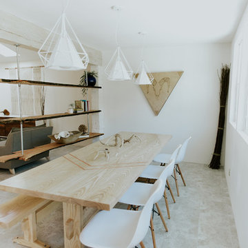
Great room - small scandinavian porcelain tile and gray floor great room idea in Phoenix with white walls and no fireplace
 By Two Studio
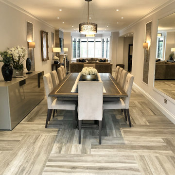
The dining room was designed to feel both refined and inviting, forming a seamless extension of the home’s calm, cohesive interior scheme. A soft, neutral palette creates a sense of understated elegance, while bespoke joinery adds both visual interest and practical storage.
Positioned to work effortlessly within the wider layout, the space supports both formal dining and more relaxed, open plan living. Thoughtfully selected lighting sits at the heart of the room, creating a warm, ambient glow that enhances the atmosphere from day through to evening entertaining.
Carefully curated furniture and artwork bring balance and personality, ensuring the room feels considered without being overly styled. The result is a dining space that is timeless, functional and perfectly suited to modern family living.
 Emily Rennie Design
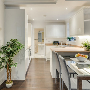
This glass dining table is an unobtrusive extension to the open plan kitchen area. The decoration is neutral and light but has been designed with plenty of storage, offering a beautiful and practical space for entertaining guests.
 Arbor South Architecture
Mike Dean
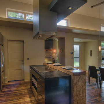
Small transitional galley medium tone wood floor and brown floor open concept kitchen photo in Other with an undermount sink, flat-panel cabinets, dark wood cabinets, concrete countertops, gray backsplash, ceramic backsplash, stainless steel appliances, an island and gray countertops
Small transitional galley medium tone wood floor and brown floor open concept kitchen photo in Other with an undermount sink, flat-panel cabinets, dark wood cabinets, concrete countertops, gray backsplash, ceramic backsplash, stainless steel appliances, an island and gray countertops
 Audus Kitchens
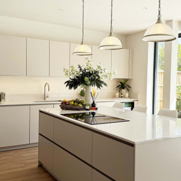
This open-plan kitchen project in St Albans was about creating a light-filled, family-friendly space that seamlessly connects cooking, dining, and relaxing.
Our clients wanted a layout that brought everyone together while maintaining a clean, airy atmosphere with a soft, neutral colour palette.
We used our handleless cabinetry in a calming Sand matte finish — a warm, light beige tone that beautifully reflects the natural light in the room. This sleek, modern style enhances the open-plan feel while providing a timeless backdrop for everyday living.
Silestone Lagoon 20mm quartz worktops complement the cabinetry with soft veining and a durable surface, perfect for everyday family life.
The kitchen has fully integrated Siemens appliances, offering a streamlined and efficient cooking experience. A Quooker tap adds modern-day convenience, delivering instant boiling water on demand.
To ensure a cohesive feel throughout the open-plan layout, we extended the same cabinetry into the living area with bespoke media wall units in the same finish. This space is now a welcoming, multifunctional hub — bright, practical, and beautifully connected.
Curious about our kitchens and what we offer? Explore more projects or download our brochure to discover our ranges, finishes, and design approach.
 Audus Kitchens
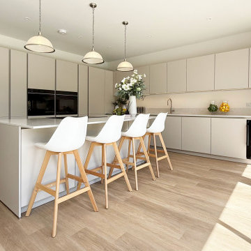
This open-plan kitchen project in St Albans was about creating a light-filled, family-friendly space that seamlessly connects cooking, dining, and relaxing.
Our clients wanted a layout that brought everyone together while maintaining a clean, airy atmosphere with a soft, neutral colour palette.
We used our handleless cabinetry in a calming Sand matte finish — a warm, light beige tone that beautifully reflects the natural light in the room. This sleek, modern style enhances the open-plan feel while providing a timeless backdrop for everyday living.
Silestone Lagoon 20mm quartz worktops complement the cabinetry with soft veining and a durable surface, perfect for everyday family life.
The kitchen has fully integrated Siemens appliances, offering a streamlined and efficient cooking experience. A Quooker tap adds modern-day convenience, delivering instant boiling water on demand.
To ensure a cohesive feel throughout the open-plan layout, we extended the same cabinetry into the living area with bespoke media wall units in the same finish. This space is now a welcoming, multifunctional hub — bright, practical, and beautifully connected.
Curious about our kitchens and what we offer? Explore more projects or download our brochure to discover our ranges, finishes, and design approach.

Sponsored
Columbus, OH
Free consultation for landscape design!

Peabody Landscape Group
Franklin County's Reliable Landscape Design & Contracting
 Concepts & Dimensions
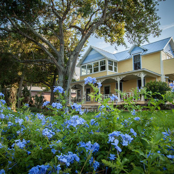
Simply elegant. Postively Serene.
SolRisa Inn; A Historic Bed & Breakfast that evokes a fine old Caribbean home; a place where plantationers’ heavy textiles and conservative style surrenders to island breezes, practical fabrics and ease.
The renovation of two Indian River side homes into the Bed & Breakfast was two years in completion.
...stripped and put back together;
original architectural elements restored
space carved out for private baths and fire exits, marketing personalities created for each suite, antiquing for historical details....
 RESIDE
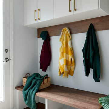
A custom mudroom design featuring a built-in bench, upper cabinetry, and dedicated drop zone storage. This practical entryway remodel enhances organization while maintaining a cohesive look with the adjacent kitchen renovation.
 Element Home Builders
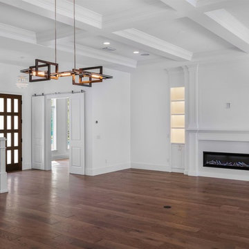
Inspiration for a mid-sized transitional open concept dark wood floor and brown floor family room remodel in Orlando with white walls, a ribbon fireplace, a stone fireplace and no tv
 Audus Kitchens
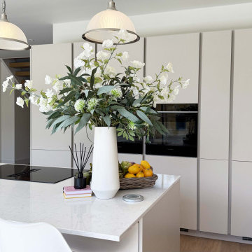
This open-plan kitchen project in St Albans was about creating a light-filled, family-friendly space that seamlessly connects cooking, dining, and relaxing.
Our clients wanted a layout that brought everyone together while maintaining a clean, airy atmosphere with a soft, neutral colour palette.
We used our handleless cabinetry in a calming Sand matte finish — a warm, light beige tone that beautifully reflects the natural light in the room. This sleek, modern style enhances the open-plan feel while providing a timeless backdrop for everyday living.
Silestone Lagoon 20mm quartz worktops complement the cabinetry with soft veining and a durable surface, perfect for everyday family life.
The kitchen has fully integrated Siemens appliances, offering a streamlined and efficient cooking experience. A Quooker tap adds modern-day convenience, delivering instant boiling water on demand.
To ensure a cohesive feel throughout the open-plan layout, we extended the same cabinetry into the living area with bespoke media wall units in the same finish. This space is now a welcoming, multifunctional hub — bright, practical, and beautifully connected.
Curious about our kitchens and what we offer? Explore more projects or download our brochure to discover our ranges, finishes, and design approach.

 Arthaus Design Studio
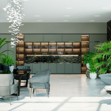
This luxury residential project explores a refined balance between contemporary minimalism and warm, livable sophistication. Designed with a focus on atmosphere, texture, and architectural harmony, the interiors combine premium natural materials, soft ambient lighting, and carefully curated details to create a timeless living experience.
The concept emphasizes clean architectural lines enriched by warm tones, textured stone, elegant wood finishes, bespoke furniture elements, and layered lighting compositions. Each space was designed to feel both visually striking and deeply comfortable, blending modern aesthetics with a welcoming residential character.
Special attention was given to material continuity and spatial flow, creating a cohesive design language throughout the project. From the serene private areas to the sophisticated social spaces, the interiors reflect understated luxury, functionality, and a strong sense of balance.
Project Scope:
• Interior Design
• Interior Visualization
• Material & Lighting Concept
• Space Planning
• CGI & Architectural Rendering
 Mihaly Slocombe
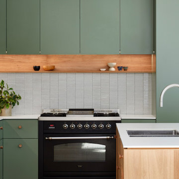
Brunswick Parlour transforms a Victorian cottage into a hard-working, personalised home for a family of four.
Our clients loved the character of their Brunswick terrace home, but not its inefficient floor plan and poor year-round thermal control. They didn't need more space, they just needed their space to work harder.
The front bedrooms remain largely untouched, retaining their Victorian features and only introducing new cabinetry. Meanwhile, the main bedroom’s previously pokey en suite and wardrobe have been expanded, adorned with custom cabinetry and illuminated via a generous skylight.
At the rear of the house, we reimagined the floor plan to establish shared spaces suited to the family’s lifestyle. Flanked by the dining and living rooms, the kitchen has been reoriented into a more efficient layout and features custom cabinetry that uses every available inch. In the dining room, the Swiss Army Knife of utility cabinets unfolds to reveal a laundry, more custom cabinetry, and a craft station with a retractable desk. Beautiful materiality throughout infuses the home with warmth and personality, featuring Blackbutt timber flooring and cabinetry, and selective pops of green and pink tones.
The house now works hard in a thermal sense too. Insulation and glazing were updated to best practice standard, and we’ve introduced several temperature control tools. Hydronic heating installed throughout the house is complemented by an evaporative cooling system and operable skylight.
The result is a lush, tactile home that increases the effectiveness of every existing inch to enhance daily life for our clients, proving that good design doesn’t need to add space to add value.
 Arthaus Design Studio
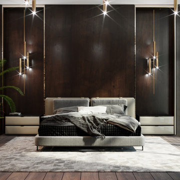
This luxury residential project explores a refined balance between contemporary minimalism and warm, livable sophistication. Designed with a focus on atmosphere, texture, and architectural harmony, the interiors combine premium natural materials, soft ambient lighting, and carefully curated details to create a timeless living experience.
The concept emphasizes clean architectural lines enriched by warm tones, textured stone, elegant wood finishes, bespoke furniture elements, and layered lighting compositions. Each space was designed to feel both visually striking and deeply comfortable, blending modern aesthetics with a welcoming residential character.
Special attention was given to material continuity and spatial flow, creating a cohesive design language throughout the project. From the serene private areas to the sophisticated social spaces, the interiors reflect understated luxury, functionality, and a strong sense of balance.
Project Scope:
• Interior Design
• Interior Visualization
• Material & Lighting Concept
• Space Planning
• CGI & Architectural Rendering
71