
Search results for "Predominant" in Home Design Ideas
 Ian McClelland Associates Ltd
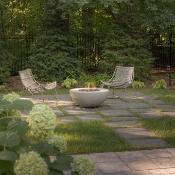
Set in the heavily treed neighbourhood of Minneola, this project was developed in a way to be sympathetic to its mature trees and woodland views. The negative-edge pool is predominantly viewed from inside the home, while the outdoor kitchen, fireplace and dinning are clearly for entertaining. The surrounding forest provides a rich backdrop and seclusion.
 Whitespace
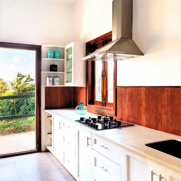
The villa features two distinct design styles. The ground floor predominantly showcases contemporary elements while the first floor channels a country cottage air. The aesthetic duality stems from the clients’ affinity for rustic design, and the need to create a modish shell for entertaining. The home is deeply rooted in European design—drawing inspiration from travels across Italy, Greece, Malta and Spain
 STUDIO KONDE | Konrad Idaszewski Architect
Visit our page: https://conde.pl/architekt-wnetrz-poznan/
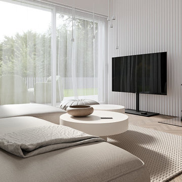
Modbarn house interior designed by STUDIO KONDE Konrad Idaszewski Architekt, a Poznań-based interior architect creating contemporary residential spaces with a strong architectural identity. As part of the Modelowedomy collection of individually configurable houses, Modbarn combines the character of a modern barn with a spacious high-ceilinged living and dining area, while the kitchen is partially separated from the lounge by an openwork shelving unit.
Contemporary living room designed as part of a modern barn house interior project in Poland. The space combines minimalist architecture, natural materials and soft neutral tones to create a calm and timeless atmosphere. Full-height glazing brings the garden directly into the composition, while the impressive ceiling height emphasizes the generous scale of the living area.
Seen from the lounge, the high interior is defined by a light palette and carefully coordinated textures. A large, deep upholstered sofa in warm beige occupies the foreground, accompanied by a folded textured throw and soft cushions. In front of it, two low round coffee tables create a layered arrangement, with a sculptural wooden bowl providing a simple decorative accent. A large woven rug extends across the seating zone, introducing a subtle tactile pattern and visually anchoring the furniture against the light oak herringbone floor.
The television is presented as a freestanding element on a slim black floor stand rather than mounted directly onto the wall, giving the arrangement a lighter and more architectural appearance. Behind it, the entire wall is finished with narrow vertical white slats, creating a distinctive ribbed texture that adds depth to the otherwise monochromatic interior. Several slender pendant lights hang from the high ceiling above the living and dining area, emphasizing the vertical proportions of the room.
Next to the television, a freestanding black wood-burning stove stands on its own protective glass hearth. Its compact, traditional form and visible flame introduce a strong dark accent and a sense of warmth against the predominantly white and beige surroundings. The contrast between the black stove, television stand and pale finishes gives the room a crisp contemporary character without losing its residential feel.
Large windows and glazed doors fill the background with daylight and provide a direct view towards the greenery outside. White vertical blinds soften the extensive glazing, while the light-filled garden becomes a natural backdrop for the neutral interior. The combination of the tall living space, textured wall cladding, freestanding television, wood-burning stove, soft sofa and natural timber flooring illustrates the refined yet comfortable approach to modern interiors developed by STUDIO KONDE, an interior architecture studio in Poznań.
Find the right local pro for your project
 Interior Design Imports
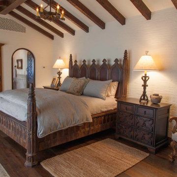
An historic Spanish Colonial residence built in 1925 being redesigned and furnished for a modern-day Southern California family was the challenge. The interiors of the main house needed the backgrounds set and then a timeless collection created for its furnishings. Lifestyle was always a consideration as well as the interiors relating to the strong architecture of the residence. Natural colors such as terra cotta, tans, blues, greens, old red and soft vintage shades were incorporated throughout. Our goal was to maintain the historic character of the residence combining design elements and materials considered classic in Southern California Spanish Colonial architecture. Natural fiber textiles, leathers and woven linens were the predominated upholstery choices. A 7000 square foot basement was added and furnished to provide a gym, Star Wars theater, game areas, spa area and a simulator for indoor golf and other sports.
Antiques were selected throughout the world, fine art from major galleries, custom reproductions fabricated in the old-world style. Collectible carpets were selected for the reclaimed hardwood flooring in all the areas. An estancia and garden over the basement were created and furnished with old world designs and materials as reclaimed woods, terra cotta and French limestone flooring.
 Michael Nash Design, Build & Homes
Starting Each Day Clean and Refreshed In This Classically-Modern, Marble Masterpiece
In 1985, the previous owner of the house had added an addition of which part included a 17 feet by 13 feet space off the master bedroom for both a master bath and walk-in closet. Irrespective of the dated red carpet that blanketed the entire bathroom of this 1964 colonial in Annandale, VA, the combination bathroom/closet space had its other oddities, primarily in that there was no shower. The current homeowners -- a family of five, who has been in the home for 7 years, was tired of going down the hall to use the kids’ bathroom to take a shower before work. The renovation that they have created now is a bright and luxurious space that one could bask in all day. They used this bathroom renovation opportunity to total remake the layout and function of this essential room that sets the tone for the day ahead.
Prior to the renovation, the existing bathroom oddly had two entrances, a typical one off of the master bedroom, but another straight off the upstairs hallway. As the toilet was out in the open in the previous design, ensuring that this second door was closed when company was in town was essential and a nuisance. As you entered the room, situated below the arc window, a large soaking tub that was covered on three sides with wooden steps dominated the room from the corner it projected. A relatively small 42” single bowl sink did not leave much space for his and hers toiletries, and there was no other linen closet or cabinetry for storage in the bathroom. The 8 foot by 5 foot closet with accordion doors had poorly laid out rungs not letting the storage space to be fully utilized. At over 220 square feet, the room did offer considerable space to work with, yet the existing layout, which even included a partition wall behind the vanity, felt cramped and dysfunctional.
The homeowners wished to create a classic yet modern, private, deluxe bathroom that would better integrate into their master suite and enable them to start and end each day in a luxurious way. They wanted to maintain having a soaking tub, add in a large shower, have an enclosed commode, expand to include double sinks, and add more storage for toiletries and linens. We worked with the customer to develop a creative design with extensive plumbing rework that accomplished all these needs and more.
The first order of business was to gut out all the carpet, tub, cabinetry, and non-load bearing partition walls. The new tub would be generally in the same location, but as the previous walk-in closet would be repurposed for the commode and the walk-in shower additional water lines, plumbing, and draining needed to be added; fortunately the room below is the garage, which enabled the team to frame out some bulkheads to accomplish this complex plumbing. Following the framing, including walling up the second entrance to the bathroom, adding in a pocket door for the commode, and creating the shape of the new shower, the team also laid down the wiring for one of the luxuries of this room – heated flooring. A glossy percaline boarder, and two-inch hexagon shape percaline tiles cover the entire floor, making it much easier and cleaner than the previous carpet.
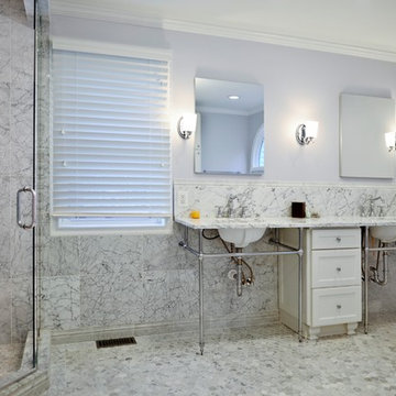
Marble look tile is predominant throughout the bathroom as despite the angled frameless glass door, the entire shower is covered in 18 inch polished marble look tiles. The shower coats the user in water from either the overhead rain head, large main showerhead and/or the hand held sprayer. Over 7 feet of white Italian Statuetto marble countertop, enable the couple to have two sink bowls and plenty of room on each side. The bowls are exposed in this stainless steel console sink design which required the team to ensure that the exposed plumbing looked pristine, and painting the bottom of the porcelain bowl to match the coloring.
The white cast-iron 72-inch Cecilia claw-foot soaking tub and its chrome lion’s paws complement that other chrome and white used throughout the room. A tall, almost floor-to-ceiling linen closet finished in arctic white is nestled in the corner near the tub, enabling ample storage of towels, etc. Other cabinetry includes an 18 inch-wide vanity with decorative footing is centered between the two sinks, and a 27 inch wall mounted cabinet with shelf is above the Kohler Devonshire elongated toilet.
Billowing cloud colored grey blue paint was a great choice for this room to pick up on the veining in the marble. Mirrored medicine chests, a chandelier, wall sconces, and overhead recessed lighting also were incorporated into the design and function of the new room.
The artful combination of classic design from material choices, such as free-standing Victorian claw-foot tub along with the modern design as seen in the angled shower, frameless medicine cabinet mirrors, and frosted glass pocket door on the commode, make this bathroom quite a masterpiece.
The clients are enjoying having their private space and not having the use the kids’ bathroom anymore.
 CRS Marble & Granite
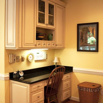
Black Pearl granite is a predominately black granite of a mostly solid color tone containing subtle speckles of blacks, golds, silvers, browns, greens and shades of gray.
Fabricated and Installed by APEX Marble & Granite
http://apexmarbleandgranite.com/
 TaylorPro Design and Remodeling, Inc.
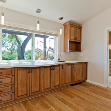
This space was created as a dance studio for this client and was part of a larger master suite addition. The Bellmont Cabinetry selected for this space serves as an anchor for the entire space.
"We found Kerry at TaylorPro early on in our decision process. He was the only contractor to give us a detailed budgetary bid for are original vision of our addition. This level of detail was ultimately the decision factor for us to go with TaylorPro. Throughout the design process the communication was thorough, we knew exactly what was happening and didn’t feel like we were in the dark. Construction was well run and their attention to detail was a predominate character of Kerry and his team. Dancing is such a large part of our life and our new space is the loved by all that visit."
~ Liz & Gary O.
Photos by: Jon Upson
 David Manning Architecture
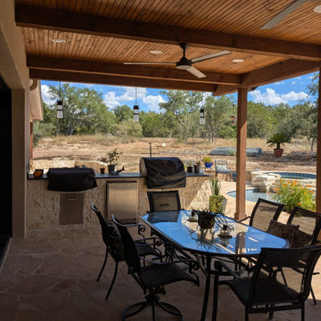
View to the East from the Covered Terrace. Set up for the predominant breeze from the southeast.
Patio kitchen - mid-sized southwestern backyard stone patio kitchen idea in Austin with a roof extension
Patio kitchen - mid-sized southwestern backyard stone patio kitchen idea in Austin with a roof extension
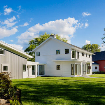
 Battle Associates, Architects
This project created a singular modern home for clients with two distinct professions; she is an artist; he is a musician. Their directive to Battle Associates was to “design the home of their dreams,” and “make it cool.” As the design evolved, three volumes emerged each with its own individual character. Shapes, materials, and colors reinforced the concept. The “Red Barn” houses a music studio, garage, guest, and children’s bedrooms. The “Industrial” volume is the Art Studio. The “Middle” volume is where the clients live. Each structure has its own set of exterior details, materials, and colors. The three buildings are oriented to maximize views around a man-made pond and a conserved hefty locus tree. Clean, contemporary lines set the tone for the details throughout the project, creating an appropriate environment for displaying artwork. Maple, bamboo, and painted finishes were the predominant palette, complemented with steel and glass for the stairs. Kitchen details favored cut-away pulls instead of hardware. The shell of the entire home was detailed and constructed with a high degree of energy efficiency in mind. Ultra-insulation was the standard with foam panels, triple glazing, and near passive house standards for construction.
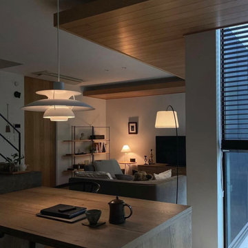
 Zepboo
This project is a client case study of a homeowner living in The Hague, Netherlands. The client's residence is a 180-square-meter detached villa. Originally from Vietnam, they immigrated to the Netherlands and settled in a picturesque town in The Hague. With a passion for tea culture, the entire house is styled in a modern fusion of Chinese and Japanese influences, predominantly featuring white and black-gray furniture, and even includes a dedicated tea room.
The client reached out to us via Facebook, seeking recommendations and assistance in selecting suitable lighting fixtures for their dining area. We discussed their floor plan and desired style in detail. Firstly, considering the spaciousness of their villa, the dining area required ambient lighting rather than a central overhead light. We suggested incorporating pendant lights, spotlights, or strip lights to enhance the overall atmosphere. Secondly, their home decor adopted a minimalist approach, primarily using a black-white-gray color scheme, making vibrant and colorful lighting fixtures unsuitable.
Ultimately, we recommended the PH5 pendant light in a white color, featuring a Nordic modern design, to the client. Upon receiving the product, the client expressed their satisfaction, stating that the chosen lighting fixture perfectly matched their requirements. We are delighted to share this case study with everyone, hoping to provide inspiration and ideas for your own interior design endeavors.
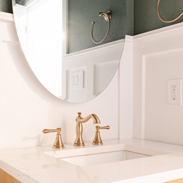
 Dwellify
This dark, dated, and dull powder room underwent a remarkable transformation, transitioning from a basic pedestal sink to a customized vanity with ample storage. By incorporating wainscoting along the perimeter, the bathroom acquired a touch of elegance and sophistication, making it an inviting and personalized space for guests. Departing from its previous predominantly white color scheme, the room embraced a bold aesthetic with a warm green wall paint and a star-patterned, personality-filled tile floor. Warmth and character were infused into the space through the addition of rich wood accents and luxurious gold fixtures. To evoke a sense of serenity and tranquility, a serene green hue was introduced, further enhancing the room's ambiance and creating a welcoming retreat for guests to enjoy.
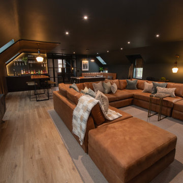
 Revival by Design
Above a newly constructed triple garage, we created a multifunctional space for a family that likes to entertain, but also spend time together watching movies, sports and playing pool.
Having worked with our clients before on a previous project, they gave us free rein to create something they couldn’t have thought of themselves. We planned the space to feel as open as possible, whilst still having individual areas with their own identity and purpose.
As this space was going to be predominantly used for entertaining in the evening or for movie watching, we made the room dark and enveloping using Farrow and Ball Studio Green in dead flat finish, wonderful for absorbing light. We then set about creating a lighting plan that offers multiple options for both ambience and practicality, so no matter what the occasion there was a lighting setting to suit.
The bar, banquette seat and sofa were all bespoke, specifically designed for this space, which allowed us to have the exact size and cover we wanted. We also designed a restroom and shower room, so that in the future should this space become a guest suite, it already has everything you need.
Given that this space was completed just before Christmas, we feel sure it would have been thoroughly enjoyed for entertaining.
 Woodling Landscape Design
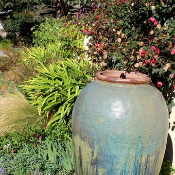
Large pots can be used as focal points in the garden, with or without plantings inside.
Large, historic home from the 1930's overlooking downtown Santa Cruz. My clients are self-described "plantaholics" and tend to buy many plants, only to have them die. They have an extensive gardening area and low water budget. Our main goal was to make the overall design cohesive between various areas of the garden while utilizing interesting and unusual plant selections - a very fun project for me! We removed over 3,000 square feet of traditional grass and replaced it with several lawn alternatives. The first is a walkable groundcover that uses a fraction of the water of regular grass (and can be seen here in several seasons, one of which has tiny flowers); The second is a California native grass that grows long (or can be kept short) and can tolerate some shade. Both of these are excellent choices for clients with children or dogs who want a green patch without using excessive water. My clients love plants from Australia and South Africa so plants from the Proteacea and other Southern Hemisphere beauties are used predominantly throughout the project. Clean, flowing water is so important for wildlife and the beautiful stone fountain is a constant gathering spot for birds and other animals. My clients are beyond thrilled with their gorgeous, nature-filled garden and ever-expanding plant knowledge.
 Costa del Sol Interiors | Interior Designer
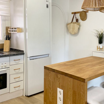
This interior design project involved a comprehensive renovation that completely transformed the appearance and features of an apartment located on the Costa del Sol, Spain. The goal was to modernize the space, enhance functionality, and create a more sophisticated and welcoming atmosphere, aligned with a Nordic style that emphasizes warmth and natural elements.
### Space Redistribution:
Originally, the apartment had only one bedroom and one bathroom. The first phase of the renovation involved redistributing the space to add a second bathroom, with one of them becoming an en-suite connected directly to the master bedroom. This addition significantly improved comfort and privacy, allowing each bedroom to have its own bathroom. Additionally, a new laundry area was created, providing a dedicated space for the washing machine, water heater, and cleaning supplies, optimizing the home's functionality without compromising aesthetics.
### Flooring and Visual Continuity:
The old dark, square-patterned flooring was replaced with porcelain tiles that mimic the texture and tone of wood. This new material was extended from the interior to the terrace, creating a sense of continuity and spaciousness. This change not only modernized the apartment's appearance but also reinforced the visual harmony between indoor and outdoor spaces, inviting residents to enjoy the natural light and views offered by the coastal location.
### Bathroom Renovation:
With the addition of a second bathroom, both spaces were completely renovated. The old tiles and bathtub were removed in favor of a more modern and functional design. Light-colored ceramics reflecting the Nordic style were installed, along with contemporary fixtures and clean lines. The en-suite bathroom was designed to offer an intimate and luxurious space, while the second bathroom, though equally modern, provides comfort and accessibility for the rest of the home.
### Style and Décor:
The predominant Nordic style was reflected in the choice of materials and colors. The walls were adorned with wooden slats, a detail that adds texture and warmth to the space, while the décor focused on natural elements like wood, linen, and plant fibers, creating a serene and relaxing atmosphere. Neutral tones and simple lines prevail, achieving a perfect balance between sophistication and comfort.
### Final Result:
The result is an apartment that not only looks more spacious and modern but also exudes a sense of tranquility and comfort. The renovation has transformed the space into a home that invites you to enjoy sunny days on the Costa del Sol, with a terrace seamlessly integrated with the interior and living spaces that reflect a sophisticated, functional, and inviting lifestyle.
Este proyecto de interiorismo consistió en una reforma integral que transformó por completo el aspecto y las características de un apartamento ubicado en la Costa del Sol, España. El objetivo era modernizar el espacio, mejorar la funcionalidad y crear un ambiente más sofisticado y acogedor, alineado con un estilo nórdico que resalta la calidez y la naturalidad.
### Redistribución del Espacio:
Inicialmente, el apartamento contaba con una sola habitación y un solo baño. La primera fase de la reforma implicó una redistribución del espacio, añadiendo un segundo baño, de los cuales uno se convirtió en suite, conectado directamente con la habitación principal. Esta ampliación mejoró significativamente la comodidad y privacidad, permitiendo que cada habitación tuviera su propio baño. Además, se creó una nueva zona de lavadero, un espacio dedicado para la lavadora, el termotanque y los elementos de limpieza, optimizando la funcionalidad del hogar sin sacrificar la estética.
### Suelos y Continuidad Visual:
Se reemplazaron los antiguos suelos de color oscuro, de apariencia cuadrada, por un porcelánico que imita la textura y el tono de la madera. Este nuevo material se extendió desde el interior hasta la terraza, creando una sensación de continuidad y amplitud. Este cambio no solo modernizó el aspecto del apartamento, sino que también reforzó la armonía visual entre los espacios interiores y exteriores, invitando a disfrutar de la luz natural y las vistas que ofrece la ubicación costera.
### Renovación de Baños:
Con la adición de un segundo baño, ambos espacios fueron completamente renovados. Se eliminaron los viejos azulejos y la bañera en favor de un diseño más moderno y funcional. Se instalaron cerámicas de tonos claros que reflejan el estilo nórdico, junto con elementos contemporáneos y líneas limpias. El baño en suite, en particular, fue diseñado para ofrecer un espacio íntimo y lujoso, mientras que el segundo baño, aunque igualmente moderno, ofrece comodidad y accesibilidad para el resto de la casa.
### Estilo y Decoración:
El estilo nórdico predominante se reflejó en la elección de materiales y colores. Las paredes fueron adornadas con palillería, un detalle que aporta textura y calidez al espacio, mientras que la decoración se basó en elementos naturales como madera, lino y fibras vegetales, creando una atmósfera serena y relajante. Los tonos neutros y las líneas simples predominan, logrando un equilibrio perfecto entre sofisticación y comodidad.
### Resultado Final:
El resultado es un apartamento que no solo se ve más amplio y moderno, sino que también transmite una sensación de tranquilidad y confort. La reforma ha transformado el espacio en un hogar que invita a disfrutar de los días soleados en la Costa del Sol, con una terraza que se integra perfectamente con el interior, y unos ambientes interiores que reflejan un estilo de vida sofisticado, funcional y acogedor.
 Interior Design Imports
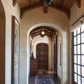
An historic Spanish Colonial residence built in 1925 being redesigned and furnished for a modern-day Southern California family was the challenge. The interiors of the main house needed the backgrounds set and then a timeless collection created for its furnishings. Lifestyle was always a consideration as well as the interiors relating to the strong architecture of the residence. Natural colors such as terra cotta, tans, blues, greens, old red and soft vintage shades were incorporated throughout. Our goal was to maintain the historic character of the residence combining design elements and materials considered classic in Southern California Spanish Colonial architecture. Natural fiber textiles, leathers and woven linens were the predominated upholstery choices. A 7000 square foot basement was added and furnished to provide a gym, Star Wars theater, game areas, spa area and a simulator for indoor golf and other sports.
Antiques were selected throughout the world, fine art from major galleries, custom reproductions fabricated in the old-world style. Collectible carpets were selected for the reclaimed hardwood flooring in all the areas. An estancia and garden over the basement were created and furnished with old world designs and materials as reclaimed woods, terra cotta and French limestone flooring.
 Whitespace
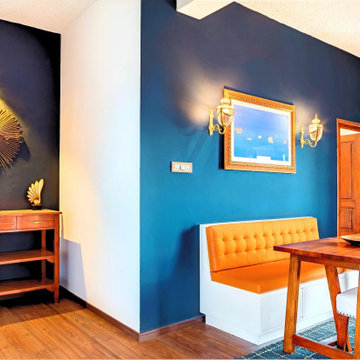
The villa features two distinct design styles. The ground floor predominantly showcases contemporary elements while the first floor channels a country cottage air. The aesthetic duality stems from the clients’ affinity for rustic design, and the need to create a modish shell for entertaining. The home is deeply rooted in European design—drawing inspiration from travels across Italy, Greece, Malta and Spain
 StudioLAB
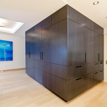
Steps from Riverside Park, the existing apartment had previously not been renovated for 30 years and was in dire need of a complete overhaul. StudioLAB was presented with the challenge of re-designing the space to fit a modern family’s lifestyle today with the flexibility to adjust as they evolve into their tomorrow. The existing formal closed kitchen and dining room were combined and opened up to allow the owners to entertain in an open living environment and allow natural light to permeate throughout different exposures of the apartment. Bathrooms were gutted, enlarged and reconfigured. Central air conditioning was added with minimal ducting as to be hidden and not seem clunky. Built-in bookshelves run the length of the perimeter walls below windows, concealing radiators and providing extra valuable storage in every room. A neutral color palette, minimalist details, and refined materials create a warm, modern atmosphere. Light brown oak veneered archways as well as LED cove ceilings are used to separate programmatic spaces visually without the use of physical partitions. A charcoal stained cube built-in was designed with in the foyer to create deep storage while continuing into the kitchen to hide the built-in refrigerator and pantry visually connecting the two spaces. The family’s two children share one large bedroom in order to create a playroom in the other which can also serves as a guest room when needed. The master bedroom features a full height grey stained ash veneered wall unit that serves as the predominant clothes storage. A panel housing the TV slides to reveal more clothes storage behind. To utilize the exiting formal maid’s room behind the kitchen, a small study and powder room were created that house laundry machines as well.
 Chic Decor
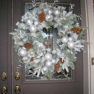
Holiday wreath using natural and formal elements. I love juxtapositions and the combination of the pine cones with the silver balls is a great example. The pine cones lend warmth to the predominantly silvery scheme. The dusting of "snow" is the final touch.

 Mark Levy Studio
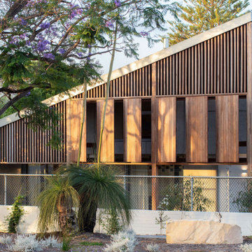
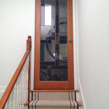
"What A Way To Go" is at the top of this sky-lit stairwell. Our client is a film editor, and with his creative input, we collaborated on a design for the home office editing room. The predominant glass selections are different textures of clear, with accents of blue, green, rose and teal.
Photo: Mark Levy Studio
22