
Search results for "Primary function" in Home Design Ideas
 Phoenix Home Remodeling
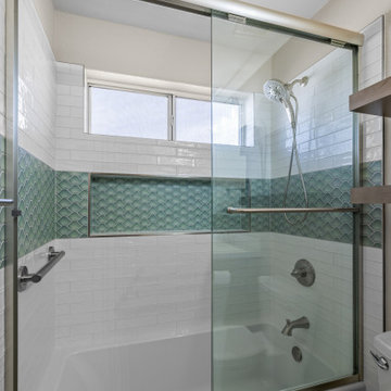
Garth & Stephanie wanted their guest bathroom to reflect the same updated style and functionality. The goal was to take the dated finishes out and bring in materials that would make the room feel brighter and more inviting for family and visitors.
The bathtub was kept, but everything around it was rebuilt. The new shower walls were finished with Bedrosians Marin Pearl White tile.
A bold accent band was introduced with Tilebar’s Suki Green Fishscale mosaic, carried through the recessed niche for a distinctive focal point.
Plumbing fixtures were upgraded to match the selections in the primary bathroom, ensuring consistency throughout the home. A sliding glass shower door replaced the shower curtain, and a brushed nickel grab bar was added for safety.
The vanity carries over the same cabinetry, quartz countertop, and faucet style as the primary bathroom, creating a cohesive look between the two spaces.
A new storage mirror and matching floating shelves were installed, along with a light fixture similar to the one in the primary bath, maintaining a balanced design theme.
The guest bathroom now feels fresh, functional, and closely connected to the primary bathroom. Guests now enjoy a stylish space that complements the overall design vision achieved in the remodel.
 Phoenix Home Remodeling
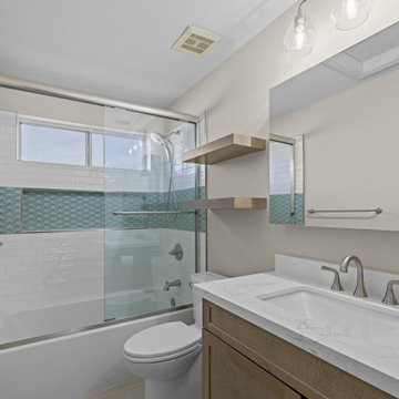
Garth & Stephanie wanted their guest bathroom to reflect the same updated style and functionality. The goal was to take the dated finishes out and bring in materials that would make the room feel brighter and more inviting for family and visitors.
The bathtub was kept, but everything around it was rebuilt. The new shower walls were finished with Bedrosians Marin Pearl White tile.
A bold accent band was introduced with Tilebar’s Suki Green Fishscale mosaic, carried through the recessed niche for a distinctive focal point.
Plumbing fixtures were upgraded to match the selections in the primary bathroom, ensuring consistency throughout the home. A sliding glass shower door replaced the shower curtain, and a brushed nickel grab bar was added for safety.
The vanity carries over the same cabinetry, quartz countertop, and faucet style as the primary bathroom, creating a cohesive look between the two spaces.
A new storage mirror and matching floating shelves were installed, along with a light fixture similar to the one in the primary bath, maintaining a balanced design theme.
The guest bathroom now feels fresh, functional, and closely connected to the primary bathroom. Guests now enjoy a stylish space that complements the overall design vision achieved in the remodel.
 Schloegel Design Remodel
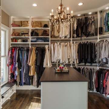
This custom primary closet is designed to function like a boutique dressing space, combining elevated style with everyday practicality. At the center, a built-in island provides both surface space and dedicated accessory storage—perfect for organizing jewelry, sunglasses, and smaller essentials while keeping everything easily accessible.
Thoughtful, integrated lighting highlights the wardrobe and enhances visibility throughout, giving the space a polished, high-end feel. Connected directly to the primary suite, the layout creates a seamless daily routine, further elevated by the addition of in-closet laundry with a stacked washer and dryer for ultimate convenience.
Custom storage solutions maximize every inch, including pull-down hanging rods that bring upper rows of clothing within easy reach. The result is a highly functional, beautifully organized space that simplifies daily living while delivering a true luxury closet experience.
Find the right local pro for your project
 Phoenix Home Remodeling
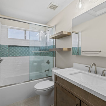
Garth & Stephanie wanted their guest bathroom to reflect the same updated style and functionality. The goal was to take the dated finishes out and bring in materials that would make the room feel brighter and more inviting for family and visitors.
The bathtub was kept, but everything around it was rebuilt. The new shower walls were finished with Bedrosians Marin Pearl White tile.
A bold accent band was introduced with Tilebar’s Suki Green Fishscale mosaic, carried through the recessed niche for a distinctive focal point.
Plumbing fixtures were upgraded to match the selections in the primary bathroom, ensuring consistency throughout the home. A sliding glass shower door replaced the shower curtain, and a brushed nickel grab bar was added for safety.
The vanity carries over the same cabinetry, quartz countertop, and faucet style as the primary bathroom, creating a cohesive look between the two spaces.
A new storage mirror and matching floating shelves were installed, along with a light fixture similar to the one in the primary bath, maintaining a balanced design theme.
The guest bathroom now feels fresh, functional, and closely connected to the primary bathroom. Guests now enjoy a stylish space that complements the overall design vision achieved in the remodel.
 Nip Tuck Remodeling
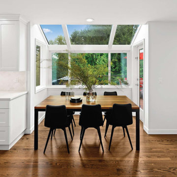
This home had dated and falling apart finishes, an insignificant fireplace in a giant living room, and a poor layout in the family room. Not to mention the primary bath covered in bamboo wallpaper.
The clients wanted a functional, updated and good-looking kitchen, a more adult family room, an updated serene primary bath. The remaining baths to be updated and modern. And, to make it feel like a holistic update, they wanted a welcoming staircase/entry.
As with most clients, stretching their dollar as far as possible was important. They didn't want to enlarge any footprint or move walls - we had to stay within existing bounds. With a whole home remodel costs can add up quickly depending on where we start & stop. For this family it made sense to do all the work at once to avoid repeat remodels. It was either buy new and still have to customize, or remodel to their exact needs and wants. The remodel was more affordable and made just for them.
Many finishes are clean, simple, and modern. A window was removed! in the family room to allow for a symmetrical entertainment center. A dramatic floor to ceiling fireplace surround was created in the Living room. The staircase was totally redone in both shape and style! The primary bath was reworked to get a two-person shower, and soaking tub. Serene /quiet finishes in the primary helped achieve a mellow /calming atmosphere. All new doors and trim throughout.
 USI Design & Remodeling
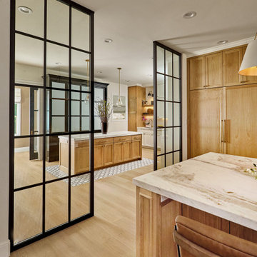
Located in Argyle, Texas, this comprehensive whole-home renovation was conceived as a response to a family whose lifestyle had outgrown the limitations of the existing residence. USI Design & Remodeling reimagined the home's interior architecture, transforming a collection of compartmentalized rooms into a cohesive environment designed for modern living, entertaining, and daily comfort. The project encompassed the kitchen, family room, dining room, lounge, office, primary bathroom, and supporting circulation spaces, creating a unified experience that feels both expansive and intentional.
At the heart of the renovation is a completely reconfigured kitchen and gathering space designed around functionality, hospitality, and visual connection. Architectural barriers were removed to improve sightlines and circulation, allowing the kitchen, dining, and family spaces to function as a single integrated living environment. Adjacent to the kitchen, the former pantry, laundry, and service corridor were reimagined as a hybrid scullery and utility suite, creating a highly functional support space that discreetly accommodates food preparation, storage, organization, and household operations without compromising the elegance of the primary living areas.
The renovation extends beyond aesthetics to create a home tailored to the family's evolving needs. Consistent architectural detailing, layered textures, and thoughtful proportions establish continuity throughout the residence, allowing each room to feel connected to the larger design narrative. The result is a sophisticated yet approachable home that balances practical performance with timeless design, delivering a renewed living experience that is both highly functional and distinctly luxurious.
 Pamela Harvey Interiors
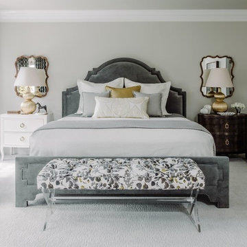
Our St. Pete studio was hired to transform a dated primary suite into a more usable, functional space. We reconfigured the bathroom and closet space to make the floor plan more practical for everyday use. In the bedroom, we went with a classic black and white palette with a large, comfortable bed and classy leather chairs. We added black patterned curtains to flank the beautiful windows offering stunning views outside. We also added a stylish fireplace to add a touch of warmth to the bedroom. The bathroom was given a soothing palette with beautiful herringbone-shaped tiles. A freestanding tub adds a luxurious vibe to the bathroom.
---
Pamela Harvey Interiors offers interior design services in St. Petersburg and Tampa, and throughout Florida’s Suncoast area, from Tarpon Springs to Naples, including Bradenton, Lakewood Ranch, and Sarasota.
For more about Pamela Harvey Interiors, see here: https://www.pamelaharveyinteriors.com/

Sponsored
Columbus, OH

Structural Remodeling
Franklin County's Heavy Timber Specialists | Best of Houzz 2020!
 Jacobson Construction
This is the story about a kitchen that was showing it’s age with white countertops and dark oak cabinets on a dark oak floor. It all worked once, but now the kitchen felt dark, cramped and dysfunctional. The owners were looking for a total kitchen transformation.
After a disastrous beginning with a contractor taking their money and vanishing into thin air, the owners were left with a completely gutted kitchen that consisted of only the walls. They hired Rick Jacobson to rescue them and restart the project.
The new kitchen design began with the idea of using Cobalt Blue as a primary color. The blue seen on many glassware pieces is Cobalt Blue, and it was decided to use it in the tile for the kitchen, as well as the pendant lights. Another goal was to make the kitchen brighter with an easier traffic flow, as well as completely updated cabinetry. And there were traffic patterns to improve, a refrigerator to move, and exhaust vents to reroute.
Rick Jacobson listened to the owners and worked to create the kitchen that the owners imagined. He began by thinking through the traffic flow patterns. He noted that the doorway from the dining room needed to be widened. He added rounded doorway headers to match the home’s existing décor.
He carefully thought through where the kitchen island should be, including how opening the oven doors would be in relation to people sitting at the kitchen island at a family gathering. Kitchen cabinet touches include off edge flat panel doors, soft close wooden drawers, and a spice cabinet with two slide-out racks. The new longer center island features a drawer microwave that opens and closes automatically with the push of a button. The center island also features two recycling bins and seating for four. Rick even thought of adding decorative elements to the existing half wall to make it look in line with the kitchen island. The kitchen’s black granite countertops offer an unusually appealing view: There are lots of interesting reflections throughout the kitchen.
Another of Rick’s touches is that all of the lights, including recessed ceiling lights, three cobalt blue pendant lights and below cabinet lights are on dimmers which work to balance daytime and nighttime lighting.
The under mounted stainless steel single sink is complemented with a gooseneck faucet. The stainless steel gas range is thin enough to allow for a wide drawer below for utensils, and the stainless steel vent hood is vented through the ceiling to outdoors, allowing additional storage space in the top cabinets. Double ovens with white doors are the perfect match to the cabinets, with a location that makes baking and roasting easier with the two large vertical storage for baking sheets and supplies nearby.
The result: A functional, open, bright and Cobalt blue kitchen.
 Erica Peale Design
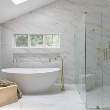
This luxurious spa-like bathroom was remodeled from a dated 90's bathroom. The entire space was demolished and reconfigured to be more functional. Walnut Italian custom floating vanities, large format 24"x48" porcelain tile that ran on the floor and up the wall, marble countertops and shower floor, brass details, layered mirrors, and a gorgeous white oak clad slat walled water closet. This space just shines!
 Klopf Architecture
The Roger Lee designed house from 1962 was purchased by the current homeowners in almost original condition, as the previous owners elected to defer most maintenance projects over the years. The clients were able to see beyond the dated materials and finishes, single-paned glass and uninsulated walls and they approached Klopf Architecture to help them expand and update the entire home, one the family could settle into and enjoy for years to come. It was important that the new designs were aligned with Lee's original intent not only because of the client's appreciation for mid-century modern architecture, but also because the house was deemed historical. The Stanford Real Estate Office requires a stringent design review which safeguards the integrity of the community, which Klopf Architecture was happy to oblige going into their updated designs.
As with many original mid-century modern homes, the house was scaled to the 1960s lifestyle where rooms were smaller and openings to views were limited and tightly framed. The original conditions defined the direction the family of four would take in updating the house and making it comfortable for their modern lifestyle. Klopf designed a full gut remodel and major addition to bring the house into the 21st century and provide the living area needed for the client's family. The newly expanded house added just about 1,100 sf to create an airy, comfortable and family friendly house, taking full advantage of the beautiful southwestern views that extend out to the hills beyond. The enclosed garage created an additional 240 sf of covered space for long-term storage.
A cracked swimming pool created an eyesore taking up a majority of the backyard landscape, so it was one of the first elements to go during the transformation. Working with Outer Space Landscape Architects, the family asked for a mix of relaxing outdoor patio spaces that eventually blend into the native landscaping, extending their views outward toward the natural greenery of the trees beyond their property. Filling in the old pool was a smart way to expand the living spaces outward. The orientation of the house was designed to enjoy the views, but the original architecture provided the first homeowners with mere glimpses of the landscape outside.
Klopf was able to broaden those views, continuing and extending on the original architecture to take full advantage of the unobstructed natural views across the rear facade of the house. Small horizontal openings in the primary bedroom and office were replaced with much taller windows that now follow the angled roof line upward, extending across almost all of the facade. We worked with Western Windows, whose designs included an oblique-shaped, operable casement that allowed our design to rise with the slope. A new corner office added to the primary suite, offers a bright and functional work-from-home solution that looks out at the distant views and added natural light from the expanded window configuration that now wraps around the corner.
The existing lower level was designed by Lee as a utilitarian space, serving as a wet pool room with a drain in the center of the floor, bathroom, laundry and storage areas. Without the need for a pool room, Klopf was able to convert the area into a much more comfortable and functional living space with a new family room and guest suite. The new spaces enjoy easy access to a new outdoor patio through floor to ceiling, full-width glass sliders.
Continuing along the rear facade, a previously exposed deck extending from the living room and hallway provided access to the backyard through a single set of stairs leading toward the side of the house which made sense when the pool was in place. The new deck was re-envisioned as an extension of the main living room and now serves as a second outdoor living room. A new slatted pergola above provides the homeowners welcome relief from the hot afternoon sun. A second set of stairs now creates a better connection to the redesigned lower level. Klopf was able to reconfigure the spaces, extending the living room outward toward the views, where the family now claims it as the heart of the home, spending a large majority of their time outdoors.
Back inside, the original wood-burning Malm fireplace was beautifully restored and a gas burner installed to comply with California's strict air standards. It now rests in front of a wall of Heath accent tiles where a dated red brick wall used to stand. A new taller window brings more light and views into the refreshed interior living room. The original glass doors opposite the fireplace were replaced by larger sliders that when fully opened, create a seamless transition to the new outdoor living area so the two spaces feel like one connected space. The original utilitarian kitchen was needlessly tucked into the far back corner and closed-off, out of sight from the living room, so the clients asked Klopf to open it up and expand the kitchen forward so it felt more connected. Today the much larger kitchen is connected to the living area where a short wall with a cutout offers a visual glimpse into the kitchen and a handy pass-through counter for serving guests. A new breakfast nook was also added to create another spot where the family can gather for casual meals. Just outside, a new built-in outdoor grill and prep area extends the kitchen outside and connects to a new outdoor dining spot nestled amongst the trees, taking advantage of the views out back.
Klopf was able to expand the other two bedrooms, add a new laundry room and half-bath and convert the carport to an enclosed garage to add more storage areas which was lost when the pool house was converted to the family and guest room.
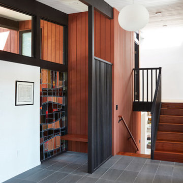
To maintain a historical connection to the original designs, the exterior siding was repeated on all exterior walls, a full-height stained glass window at the front entryway restored, and an interior slatted screen element repeated outside at the exterior entry courtyard and over the new outdoor living room to create a shade trellis. The new house stands proudly and shines against it's new landscaping features, while respecting and expanding on the original intent of Roger Lee's designs epitomizing the comforts of indoor-outdoor living in Northern California.
Completion year: 2020
Klopf Architecture project team: John Klopf, Klara Kevane, Noel Andrade
Contractor: ORB Construction, Brendan O'Reilly
Structural engineer: Sezen and Moon
Landscape architect: Outer space
Furnishings and decoration: Urbanism Designs
Photographer: Mariko Reed
 Rodwin Architecture & Skycastle Construction
Rodwin Architecture & Skycastle Homes
Location: Boulder, Colorado, USA
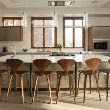
Interior design, space planning and architectural details converge thoughtfully in this transformative project. A 15-year old, 9,000 sf. home with generic interior finishes and odd layout needed bold, modern, fun and highly functional transformation for a large bustling family. To redefine the soul of this home, texture and light were given primary consideration. Elegant contemporary finishes, a warm color palette and dramatic lighting defined modern style throughout. A cascading chandelier by Stone Lighting in the entry makes a strong entry statement. Walls were removed to allow the kitchen/great/dining room to become a vibrant social center. A minimalist design approach is the perfect backdrop for the diverse art collection. Yet, the home is still highly functional for the entire family. We added windows, fireplaces, water features, and extended the home out to an expansive patio and yard.
The cavernous beige basement became an entertaining mecca, with a glowing modern wine-room, full bar, media room, arcade, billiards room and professional gym.
Bathrooms were all designed with personality and craftsmanship, featuring unique tiles, floating wood vanities and striking lighting.
This project was a 50/50 collaboration between Rodwin Architecture and Kimball Modern

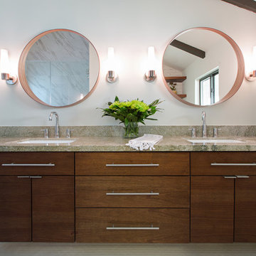
 Jamie House Design
This stunning mid-century modern remodel embraces the timeless charm of the era while incorporating modern functionality. Featuring clean lines, organic textures, and warm wood tones, the design highlights the home’s original character with contemporary updates. Thoughtfully curated furnishings, iconic mid-century silhouettes, and an open-concept layout create a seamless flow between spaces. This project exemplifies high-end Littleton interior design, showcasing how mid-century modern style can be reimagined for today’s lifestyle while staying true to its classic roots.


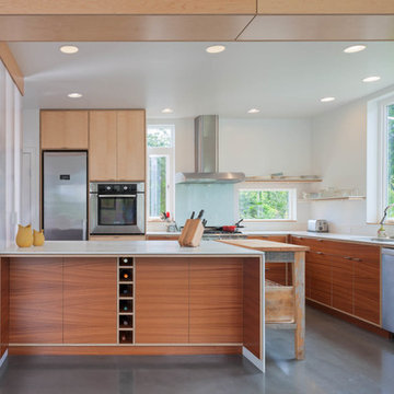
 b9 architects
Our client’s goal was to create a small, high-performance, healthy home for herself and her teenage son while providing a place for her father to age in place. An attached private accessory dwelling provides a space for him as well as flexibility in the future. The new home was designed to minimize its footprint on site, made smaller than the original 1930’s house.
Embracing adaptability and efficiency, the residence includes two dwellings: a one-bedroom 795 square-foot accessory dwelling at the lower grade and a two-story 1330 square-foot primary dwelling located above. Involved in all aspects of project execution, our client oversaw the process by living in a used trailer parked in the backyard throughout the project’s construction. Family-Share focused on maximizing the footprint’s performance, access to natural light and the health of the occupants. Sustainable features include high-performance glazing, solar preheat for domestic and hot water in-floor heating and reclaimed fir car decking rainscreen siding.
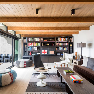
Living room - mid-sized contemporary formal and enclosed light wood floor and beige floor living room idea in Seattle with white walls
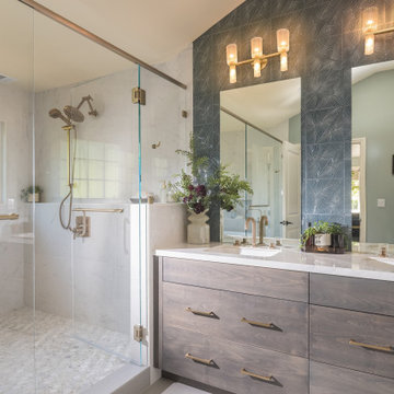
 Design Matters
This dreamy bath retreat centers around a luxurious wet room with a freestanding tub and gleaming brass fixtures, offering the essence of a private in-home spa. The vanity showcases stunning accent tile, Rift-Cut White Oak cabinetry in a weathered finish, and shimmery fluted sconces that cast a warm, elegant glow.
Notable furnishings & materials:
- Lightology - Master Bath Sconces / Fluted in Brass Finish
- Top Knobs Honey Bronze Pulls
- Cabinetry: Rift Cut White Oak in Weathered Finish
- TABLEAU BY KELLY WEARSTLER through Ann Sacks - Earthenware - Tableau is singularly chic with rich textures and iconic patterns.
- Countertop - All Natural Stone Porcelain Slab - White porcelain slab with subtle light gray veining
- Shower Walls - All Natural Stone - Porcelain, Color/Finish: Fairy White Lucido
- Wetroom Floor - TILE BAR - Aspekt Calacatta Hexagon Honed Marble
 Decorations Lucullus
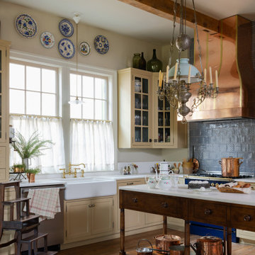
Part mirage, part miracle - this masterful modern evocation is in the best Louisiana vernacular tradition. It was conceived by architect Kevin Gossen (Gossen Architects Lafayette, Louisiana) for an unusual piece of property in Metairie whose cheated landscape gives the illusion of open country spaces. He has created a “cottage” that already looks as if it might be a survivor from a couple of centuries ago.
Using reclaimed building materials, magnificent beams, beautiful old flooring with classically scaled rooms, it was a perfect project for Decorations Lucullus.
Both architect and interior designers admit the real magic rested with the client whose highly developed aesthetic and extensive experience in design gave the process amazing vitality.
Conceived as a “résidence secondaire” to be near grandchildren, she wanted something more snug than her large primary house out of town but without sacrificing the qualities of charm or elegance.
While the project is still evolving, she can’t repress a smile when some passer-by stops to chat over the rose-heavy iron fence, perhaps peering into the gracious side hall, asking how this old house has managed to survive all the changes in the neighborhood.
Photography by Sara Essex Bradly
 Lincoln Lighthill Architect
Lincoln Lighthill Architect employed several discrete updates that collectively transform this existing row house.
At the heart of the home, a section of floor was removed at the top level to open up the existing stair and allow light from a new skylight to penetrate deep into the home. The stair itself received a new maple guardrail and planter, with a Fiddle-leaf fig tree growing up through the opening towards the skylight.
On the top living level, an awkwardly located entrance to a full bathroom directly off the main stair was moved around the corner and out of the way by removing a little used tub from the bathroom, as well as an outdated heater in the back corner. This created a more discrete entrance to the existing, now half-bath, and opened up a space for a wall of pantry cabinets with built-in refrigerator, and an office nook at the rear of the house with a huge new awning window to let in light and air.
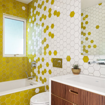
Downstairs, the two existing bathrooms were reconfigured and recreated as dedicated master and kids baths. The kids bath uses yellow and white hexagonal Heath tile to create a pixelated celebration of color. The master bath, hidden behind a flush wall of walnut cabinetry, utilizes another Heath tile color to create a calming retreat.
Throughout the home, walnut thin-ply cabinetry creates a strong contrast to the existing maple flooring, while the exposed blond edges of the material tie the two together. Rounded edges on integral pulls and door edges create pinstripe detailing that adds richness and a sense of playfulness to the design.
This project was featured by Houzz: https://tinyurl.com/stn2hcze
 Copper Sky Design + Remodel
The owners of this 1956 ranch home in Atlanta partnered with Copper Sky Design + Remodel to modernize the space while enhancing its mid-century character. The standout feature of the project is the kitchen, where a custom curved wood tambour island adds a striking retro element. This open-concept space is warmed by wood ceiling beams and tongue-and-groove planks, creating a blend of mid-century charm and modern functionality. The adjacent breakfast nook offers a cozy spot for morning coffee, while geometric tile patterns and asymmetrical designs throughout the kitchen honor the home's original era.
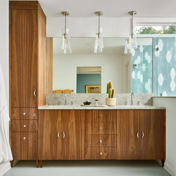
The remodel included reconfiguring the floor plan to add practical spaces like a laundry room, jack-and-jill bathroom, and pantry. The primary bathroom was updated with retro-inspired hexagon tiles, tying the room's design into the home's mid-century aesthetic. In the entryway, a vibrant front door and modern tile work, paired with clerestory windows, create a bright and welcoming atmosphere.
On the exterior, new wood-look garage doors and vintage breeze blocks enhance the home's curb appeal, while a fresh coat of paint ties everything together. These thoughtful updates to both the interior and exterior reflect a harmonious balance between mid-century nostalgia and modern living.

47