
Search results for "Primary goal" in Home Design Ideas
 Drewett Works
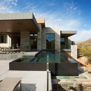
The primary goal for this project was to craft a modernist derivation of pueblo architecture. Set into a heavily laden boulder hillside, the design also reflects the nature of the stacked boulder formations. The site, located near local landmark Pinnacle Peak, offered breathtaking views which were largely upward, making proximity an issue. Maintaining southwest fenestration protection and maximizing views created the primary design constraint. The views are maximized with careful orientation, exacting overhangs, and wing wall locations. The overhangs intertwine and undulate with alternating materials stacking to reinforce the boulder strewn backdrop. The elegant material palette and siting allow for great harmony with the native desert.
The Elegant Modern at Estancia was the collaboration of many of the Valley's finest luxury home specialists. Interiors guru David Michael Miller contributed elegance and refinement in every detail. Landscape architect Russ Greey of Greey | Pickett contributed a landscape design that not only complimented the architecture, but nestled into the surrounding desert as if always a part of it. And contractor Manship Builders -- Jim Manship and project manager Mark Laidlaw -- brought precision and skill to the construction of what architect C.P. Drewett described as "a watch."
Project Details | Elegant Modern at Estancia
Architecture: CP Drewett, AIA, NCARB
Builder: Manship Builders, Carefree, AZ
Interiors: David Michael Miller, Scottsdale, AZ
Landscape: Greey | Pickett, Scottsdale, AZ
Photography: Dino Tonn, Scottsdale, AZ
Publications:
"On the Edge: The Rugged Desert Landscape Forms the Ideal Backdrop for an Estancia Home Distinguished by its Modernist Lines" Luxe Interiors + Design, Nov/Dec 2015.
Awards:
2015 PCBC Grand Award: Best Custom Home over 8,000 sq. ft.
2015 PCBC Award of Merit: Best Custom Home over 8,000 sq. ft.
The Nationals 2016 Silver Award: Best Architectural Design of a One of a Kind Home - Custom or Spec
2015 Excellence in Masonry Architectural Award - Merit Award
Photography: Dino Tonn
 Drewett Works
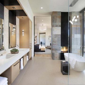
With adjacent neighbors within a fairly dense section of Paradise Valley, Arizona, C.P. Drewett sought to provide a tranquil retreat for a new-to-the-Valley surgeon and his family who were seeking the modernism they loved though had never lived in. With a goal of consuming all possible site lines and views while maintaining autonomy, a portion of the house — including the entry, office, and master bedroom wing — is subterranean. This subterranean nature of the home provides interior grandeur for guests but offers a welcoming and humble approach, fully satisfying the clients requests.
While the lot has an east-west orientation, the home was designed to capture mainly north and south light which is more desirable and soothing. The architecture’s interior loftiness is created with overlapping, undulating planes of plaster, glass, and steel. The woven nature of horizontal planes throughout the living spaces provides an uplifting sense, inviting a symphony of light to enter the space. The more voluminous public spaces are comprised of stone-clad massing elements which convert into a desert pavilion embracing the outdoor spaces. Every room opens to exterior spaces providing a dramatic embrace of home to natural environment.
Grand Award winner for Best Interior Design of a Custom Home
The material palette began with a rich, tonal, large-format Quartzite stone cladding. The stone’s tones gaveforth the rest of the material palette including a champagne-colored metal fascia, a tonal stucco system, and ceilings clad with hemlock, a tight-grained but softer wood that was tonally perfect with the rest of the materials. The interior case goods and wood-wrapped openings further contribute to the tonal harmony of architecture and materials.
Grand Award Winner for Best Indoor Outdoor Lifestyle for a Home This award-winning project was recognized at the 2020 Gold Nugget Awards with two Grand Awards, one for Best Indoor/Outdoor Lifestyle for a Home, and another for Best Interior Design of a One of a Kind or Custom Home.
At the 2020 Design Excellence Awards and Gala presented by ASID AZ North, Ownby Design received five awards for Tonal Harmony. The project was recognized for 1st place – Bathroom; 3rd place – Furniture; 1st place – Kitchen; 1st place – Outdoor Living; and 2nd place – Residence over 6,000 square ft. Congratulations to Claire Ownby, Kalysha Manzo, and the entire Ownby Design team.
Tonal Harmony was also featured on the cover of the July/August 2020 issue of Luxe Interiors + Design and received a 14-page editorial feature entitled “A Place in the Sun” within the magazine.
 Drewett Works
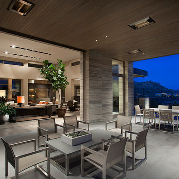
The primary goal for this project was to craft a modernist derivation of pueblo architecture. Set into a heavily laden boulder hillside, the design also reflects the nature of the stacked boulder formations. The site, located near local landmark Pinnacle Peak, offered breathtaking views which were largely upward, making proximity an issue. Maintaining southwest fenestration protection and maximizing views created the primary design constraint. The views are maximized with careful orientation, exacting overhangs, and wing wall locations. The overhangs intertwine and undulate with alternating materials stacking to reinforce the boulder strewn backdrop. The elegant material palette and siting allow for great harmony with the native desert.
The Elegant Modern at Estancia was the collaboration of many of the Valley's finest luxury home specialists. Interiors guru David Michael Miller contributed elegance and refinement in every detail. Landscape architect Russ Greey of Greey | Pickett contributed a landscape design that not only complimented the architecture, but nestled into the surrounding desert as if always a part of it. And contractor Manship Builders -- Jim Manship and project manager Mark Laidlaw -- brought precision and skill to the construction of what architect C.P. Drewett described as "a watch."
Project Details | Elegant Modern at Estancia
Architecture: CP Drewett, AIA, NCARB
Builder: Manship Builders, Carefree, AZ
Interiors: David Michael Miller, Scottsdale, AZ
Landscape: Greey | Pickett, Scottsdale, AZ
Photography: Dino Tonn, Scottsdale, AZ
Publications:
"On the Edge: The Rugged Desert Landscape Forms the Ideal Backdrop for an Estancia Home Distinguished by its Modernist Lines" Luxe Interiors + Design, Nov/Dec 2015.
Awards:
2015 PCBC Grand Award: Best Custom Home over 8,000 sq. ft.
2015 PCBC Award of Merit: Best Custom Home over 8,000 sq. ft.
The Nationals 2016 Silver Award: Best Architectural Design of a One of a Kind Home - Custom or Spec
2015 Excellence in Masonry Architectural Award - Merit Award
Photography: Dino Tonn
Find the right local pro for your project
 Ridgecrest Designs
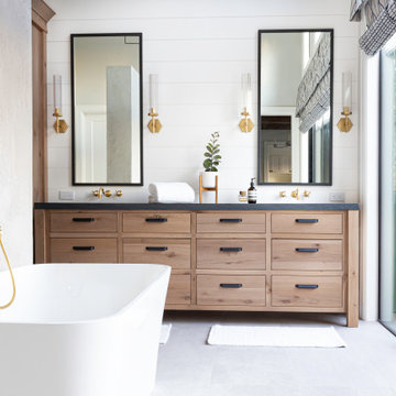
Master bathroom featuring freestanding tub, white oak vanity and linen cabinet, large format porcelain tile with a concrete look. Brass fixtures and bronze hardware.
 TVL Creative Ltd.
[Our Clients]
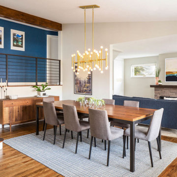
We were so excited to help these new homeowners re-envision their split-level diamond in the rough. There was so much potential in those walls, and we couldn’t wait to delve in and start transforming spaces. Our primary goal was to re-imagine the main level of the home and create an open flow between the space. So, we started by converting the existing single car garage into their living room (complete with a new fireplace) and opening up the kitchen to the rest of the level.
[Kitchen]
The original kitchen had been on the small side and cut-off from the rest of the home, but after we removed the coat closet, this kitchen opened up beautifully. Our plan was to create an open and light filled kitchen with a design that translated well to the other spaces in this home, and a layout that offered plenty of space for multiple cooks. We utilized clean white cabinets around the perimeter of the kitchen and popped the island with a spunky shade of blue. To add a real element of fun, we jazzed it up with the colorful escher tile at the backsplash and brought in accents of brass in the hardware and light fixtures to tie it all together. Through out this home we brought in warm wood accents and the kitchen was no exception, with its custom floating shelves and graceful waterfall butcher block counter at the island.
[Dining Room]
The dining room had once been the home’s living room, but we had other plans in mind. With its dramatic vaulted ceiling and new custom steel railing, this room was just screaming for a dramatic light fixture and a large table to welcome one-and-all.
[Living Room]
We converted the original garage into a lovely little living room with a cozy fireplace. There is plenty of new storage in this space (that ties in with the kitchen finishes), but the real gem is the reading nook with two of the most comfortable armchairs you’ve ever sat in.
[Master Suite]
This home didn’t originally have a master suite, so we decided to convert one of the bedrooms and create a charming suite that you’d never want to leave. The master bathroom aesthetic quickly became all about the textures. With a sultry black hex on the floor and a dimensional geometric tile on the walls we set the stage for a calm space. The warm walnut vanity and touches of brass cozy up the space and relate with the feel of the rest of the home. We continued the warm wood touches into the master bedroom, but went for a rich accent wall that elevated the sophistication level and sets this space apart.
[Hall Bathroom]
The floor tile in this bathroom still makes our hearts skip a beat. We designed the rest of the space to be a clean and bright white, and really let the lovely blue of the floor tile pop. The walnut vanity cabinet (complete with hairpin legs) adds a lovely level of warmth to this bathroom, and the black and brass accents add the sophisticated touch we were looking for.
[Office]
We loved the original built-ins in this space, and knew they needed to always be a part of this house, but these 60-year-old beauties definitely needed a little help. We cleaned up the cabinets and brass hardware, switched out the formica counter for a new quartz top, and painted wall a cheery accent color to liven it up a bit. And voila! We have an office that is the envy of the neighborhood.
 Stalburg Design
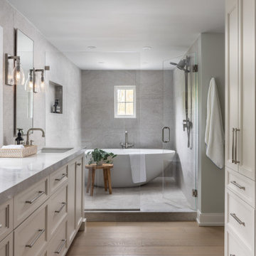
Relocating from their home in Brisbane, Australia with ocean views to the Pacific, our clients envisioned a refresh for their new lakefront cottage on Pine Lake in West Bloomfield, Michigan. Completed in July 2024, we created new spaces, reimagined old ones, and even swapped places for a primary bedroom and its en suite bath.
Our goal was to create a serene and soothing spa- like experience for the bathroom, all while maintaining gorgeous lake views. But this reconfiguration presented some challenges. The primary bedroom was oversized, while its adjacent bath was tiny and crowded. We completely flipped the locations of the bedroom and bathroom, even rerouting plumbing over the bar in the lower level to accommodate the freestanding tub.
To maximize space, we designed large, walk-in dressing pantries that are as functional as they are beautiful, and lead to the large dual custom vanity. The vanity itself is freestanding to provide access for hand towel bath hardware on its sides. The his-and-hers unit contains built-in dividers, laundry hampers and trash pullouts to maximize its function. An enclosed water closet allows for privacy in the open concept bathroom, and is placed beyond the cabinetry.
The star of this space is the large enclosed wet room. As the focal point of the bathroom, its oversized tiled walls and deep built-in bench allow for a steam or soaking in the tub while enjoying stunning lake views. The wet room is spacious and serene, and perfect for an end to a Michigan winter day.
 The Green Room Interiors
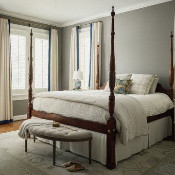
Chattanooga, TN interior design project with overall goal to update the primary bedroom with a neutral color palette to create a calm sanctuary.
Large elegant master medium tone wood floor bedroom photo in Other with gray walls, a standard fireplace and a stone fireplace
Large elegant master medium tone wood floor bedroom photo in Other with gray walls, a standard fireplace and a stone fireplace
 Drewett Works
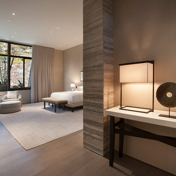
The primary goal for this project was to craft a modernist derivation of pueblo architecture. Set into a heavily laden boulder hillside, the design also reflects the nature of the stacked boulder formations. The site, located near local landmark Pinnacle Peak, offered breathtaking views which were largely upward, making proximity an issue. Maintaining southwest fenestration protection and maximizing views created the primary design constraint. The views are maximized with careful orientation, exacting overhangs, and wing wall locations. The overhangs intertwine and undulate with alternating materials stacking to reinforce the boulder strewn backdrop. The elegant material palette and siting allow for great harmony with the native desert.
The Elegant Modern at Estancia was the collaboration of many of the Valley's finest luxury home specialists. Interiors guru David Michael Miller contributed elegance and refinement in every detail. Landscape architect Russ Greey of Greey | Pickett contributed a landscape design that not only complimented the architecture, but nestled into the surrounding desert as if always a part of it. And contractor Manship Builders -- Jim Manship and project manager Mark Laidlaw -- brought precision and skill to the construction of what architect C.P. Drewett described as "a watch."
Project Details | Elegant Modern at Estancia
Architecture: CP Drewett, AIA, NCARB
Builder: Manship Builders, Carefree, AZ
Interiors: David Michael Miller, Scottsdale, AZ
Landscape: Greey | Pickett, Scottsdale, AZ
Photography: Dino Tonn, Scottsdale, AZ
Publications:
"On the Edge: The Rugged Desert Landscape Forms the Ideal Backdrop for an Estancia Home Distinguished by its Modernist Lines" Luxe Interiors + Design, Nov/Dec 2015.
Awards:
2015 PCBC Grand Award: Best Custom Home over 8,000 sq. ft.
2015 PCBC Award of Merit: Best Custom Home over 8,000 sq. ft.
The Nationals 2016 Silver Award: Best Architectural Design of a One of a Kind Home - Custom or Spec
2015 Excellence in Masonry Architectural Award - Merit Award
Photography: Dino Tonn
 Copper Sky Design + Remodel
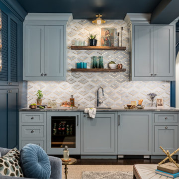
The primary goal of this basement project was to give these homeowners more space: both for their own everyday use and for guests. By excavating an unusable crawl space, we were able to build out a full basement with 9’ high ceilings, a guest bedroom, a full bathroom, a gym, a large storage room, and a spacious entertainment room that includes a kitchenette. In all, the homeowners gained over 1,100 of finished space.
 TVL Creative Ltd.
[Our Clients]
We were so excited to help these new homeowners re-envision their split-level diamond in the rough. There was so much potential in those walls, and we couldn’t wait to delve in and start transforming spaces. Our primary goal was to re-imagine the main level of the home and create an open flow between the space. So, we started by converting the existing single car garage into their living room (complete with a new fireplace) and opening up the kitchen to the rest of the level.
[Kitchen]
The original kitchen had been on the small side and cut-off from the rest of the home, but after we removed the coat closet, this kitchen opened up beautifully. Our plan was to create an open and light filled kitchen with a design that translated well to the other spaces in this home, and a layout that offered plenty of space for multiple cooks. We utilized clean white cabinets around the perimeter of the kitchen and popped the island with a spunky shade of blue. To add a real element of fun, we jazzed it up with the colorful escher tile at the backsplash and brought in accents of brass in the hardware and light fixtures to tie it all together. Through out this home we brought in warm wood accents and the kitchen was no exception, with its custom floating shelves and graceful waterfall butcher block counter at the island.
[Dining Room]
The dining room had once been the home’s living room, but we had other plans in mind. With its dramatic vaulted ceiling and new custom steel railing, this room was just screaming for a dramatic light fixture and a large table to welcome one-and-all.
[Living Room]
We converted the original garage into a lovely little living room with a cozy fireplace. There is plenty of new storage in this space (that ties in with the kitchen finishes), but the real gem is the reading nook with two of the most comfortable armchairs you’ve ever sat in.
[Master Suite]
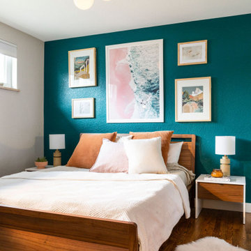
This home didn’t originally have a master suite, so we decided to convert one of the bedrooms and create a charming suite that you’d never want to leave. The master bathroom aesthetic quickly became all about the textures. With a sultry black hex on the floor and a dimensional geometric tile on the walls we set the stage for a calm space. The warm walnut vanity and touches of brass cozy up the space and relate with the feel of the rest of the home. We continued the warm wood touches into the master bedroom, but went for a rich accent wall that elevated the sophistication level and sets this space apart.
[Hall Bathroom]
The floor tile in this bathroom still makes our hearts skip a beat. We designed the rest of the space to be a clean and bright white, and really let the lovely blue of the floor tile pop. The walnut vanity cabinet (complete with hairpin legs) adds a lovely level of warmth to this bathroom, and the black and brass accents add the sophisticated touch we were looking for.
[Office]
We loved the original built-ins in this space, and knew they needed to always be a part of this house, but these 60-year-old beauties definitely needed a little help. We cleaned up the cabinets and brass hardware, switched out the formica counter for a new quartz top, and painted wall a cheery accent color to liven it up a bit. And voila! We have an office that is the envy of the neighborhood.
 ZeroEnergy Design
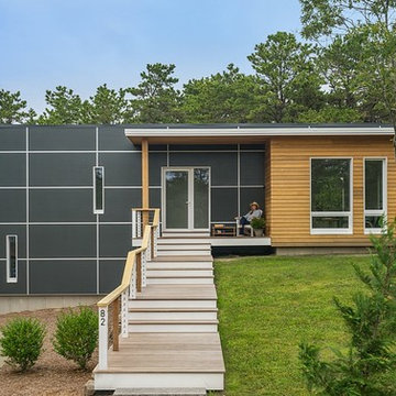
This modern green home offers both a vacation destination on Cape Cod near local family members and an opportunity for rental income.
FAMILY ROOTS. A West Coast couple living in the San Francisco Bay Area sought a permanent East Coast vacation home near family members living on Cape Cod. As academic professionals focused on sustainability, they sought a green, energy efficient home that was well-aligned with their values. With no green homes available for sale on Cape Cod, they decided to purchase land near their family and build their own.
SLOPED SITE. Comprised of a 3/4 acre lot nestled in the pines, the steeply sloping terrain called for a plan that embraced and took advantage of the slope. Of equal priority was optimizing solar exposure, preserving privacy from abutters, and creating outdoor living space. The design accomplished these goals with a simple, rectilinear form, offering living space on the both entry and lower/basement levels. The stepped foundation allows for a walk-out basement level with light-filled living space on the down-hill side of the home. The traditional basement on the eastern, up-hill side houses mechanical equipment and a home gym. The house welcomes natural light throughout, captures views of the forest, and delivers entertainment space that connects indoor living space to outdoor deck and dining patio.
MODERN VISION. The clean building form and uncomplicated finishes pay homage to the modern architectural legacy on the outer Cape. Durable and economical fiber cement panels, fixed with aluminum channels, clad the primary form. Cedar clapboards provide a visual accent at the south-facing living room, which extends a single roof plane to cover the entry porch.
SMART USE OF SPACE. On the entry level, the “L”-shaped living, dining, and kitchen space connects to the exterior living, dining, and grilling spaces to effectively double the home’s summertime entertainment area. Placed at the western end of the entry level (where it can retain privacy but still claim expansive downhill views) is the master suite with a built-in study. The lower level has two guest bedrooms, a second full bathroom, and laundry. The flexibility of the space—crucial in a house with a modest footprint—emerges in one of the guest bedrooms, which doubles as home office by opening the barn-style double doors to connect it to the bright, airy open stair leading up to the entry level. Thoughtful design, generous ceiling heights and large windows transform the modest 1,100 sf* footprint into a well-lit, spacious home. *(total finished space is 1800 sf)
RENTAL INCOME. The property works for its owners by netting rental income when the owners are home in San Francisco. The house especially caters to vacationers bound for nearby Mayo Beach and includes an outdoor shower adjacent to the lower level entry door. In contrast to the bare bones cottages that are typically available on the Cape, this home offers prospective tenants a modern aesthetic, paired with luxurious and green features. Durable finishes inside and out will ensure longevity with the heavier use that comes with a rental property.
COMFORT YEAR-ROUND. The home is super-insulated and air-tight, with mechanical ventilation to provide continuous fresh air from the outside. High performance triple-paned windows complement the building enclosure and maximize passive solar gain while ensuring a warm, draft-free winter, even when sitting close to the glass. A properly sized air source heat pump offers efficient heating & cooling, and includes a carefully designed the duct distribution system to provide even comfort throughout the house. The super-insulated envelope allows us to significantly reduce the equipment capacity, duct size, and airflow quantities, while maintaining unparalleled thermal comfort.
ENERGY EFFICIENT. The building’s shell and mechanical systems play instrumental roles in the home’s exceptional performance. The building enclosure reduces the most significant energy glutton: heating. Continuous super-insulation, thorough air sealing, triple-pane windows, and passive solar gain work together to yield a miniscule heating load. All active energy consumers are extremely efficient: an air source heat pump for heating and cooling, a heat pump hot water heater, LED lighting, energy recovery ventilation (ERV), and high efficiency appliances. The result is a home that uses 70% less energy than a similar new home built to code requirements.
OVERALL. The home embodies the owners’ goals and values while comprehensively enabling thermal comfort, energy efficiency, a vacation respite, and supplementary income.
PROJECT TEAM
ZeroEnergy Design - Architect & Mechanical Designer
A.F. Hultin & Co. - Contractor
Pamet Valley Landscape Design - Landscape & Masonry
Lisa Finch - Original Artwork
European Architectural Supply - Windows
Eric Roth Photography - Photography
 Copper Sky Design + Remodel
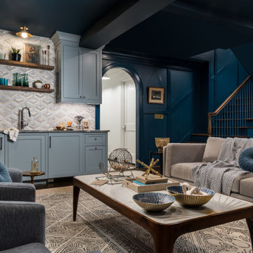
The primary goal of this basement project was to give these homeowners more space: both for their own everyday use and for guests. By excavating an unusable crawl space, we were able to build out a full basement with 9’ high ceilings, a guest bedroom, a full bathroom, a gym, a large storage room, and a spacious entertainment room that includes a kitchenette. In all, the homeowners gained over 1,100 of finished space.
 TKS Design Group
Free ebook, Creating the Ideal Kitchen. DOWNLOAD NOW
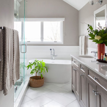
This client came to us wanting some help with updating the master bath in their home. Their primary goals were to increase the size of the shower, add a rain head, add a freestanding tub and overall freshen the feel of the space.
The existing layout of the bath worked well, so we left the basic footprint the same, but increased the size of the shower and added a freestanding tub on a bit of an angle which allowed for some additional storage.
One of the most important things on the wish list was adding a rainhead in the shower, but this was not an easy task with the angled ceiling. We came up with the solution of using an extra long wall-mounted shower arm that was reinforced with a meal bracket attached the ceiling. This did the trick, and no extra framing or insulation was required to make it work.
The materials selected for the space are classic and fresh. Large format white oriental marble is used throughout the bath, on the floor in a herrinbone pattern and in a staggered brick pattern on the walls. Alder cabinets with a gray stain contrast nicely with the white marble, while shiplap detail helps unify the space and gives it a casual and cozy vibe. Storage solutions include an area for towels and other necessities at the foot of the tub, roll out shelves and out storage in the vanities and a custom niche and shaving ledge in the shower. We love how just a few simple changes can make such a great impact!
Designed by: Susan Klimala, CKBD
Photography by: LOMA Studios
For more information on kitchen and bath design ideas go to: www.kitchenstudio-ge.com
 Nathan Taylor for Obelisk Home
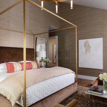
Bedroom - large transitional master medium tone wood floor, brown floor, vaulted ceiling and wallpaper bedroom idea in Other with brown walls, a standard fireplace and a stone fireplace
 InnovationLand
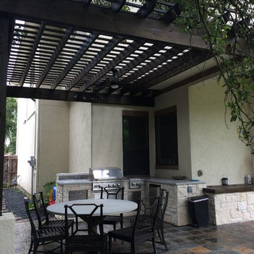
Among our Houston outdoor kitchens, this one is unique because of its concrete countertops, pergola with stucco wrapping and custom storage.
"It's not one of our biggest covered outdoor kitchens in Houston," says Outdoor Homescapes of Houston owner Wayne Franks. "But it's unique, and it looks really nice, too!"
The client, a young family, wanted an outdoor kitchen with a more minimalistic, modern look, explains Outdoor Homescapes senior designer Lisha Maxey.
"They're both doctors and very much attuned to detail," she says. "Their primary goal was to create a space where they could lounge while the children played as well as an area to entertain family and friends while cooking and dining outside."
Like a growing number of people wanting small outdoor kitchens in Houston, this client expressed interest in using concrete as a surface material: "The look is contemporary and is easily paired with any type of outdoor furniture," says Maxey, "from wicker to teak to iron."
Here's a closeup of the concrete countertops. You'll notice that they're glossy and smooth like glass, thanks to special sealers and a topcoat of UV-resistant resin that prevents the countertop from yellowing.
Since these particular clients lean toward the minimalistic side of contemporary design, she continues, "the standard granite countertop of many Houston outdoor kitchens would not work, since it typically has a lot of movement and can be busy."
Lisha sees the use of concrete as a growing outdoor design trend for Houston outdoor kitchens: "It's easy to maintain and again, leans towards a more modern look for outdoor."
All the furniture and lighting is from Restoration Hardware, says Lisha, who's offering $500 in free outdoor furniture consultation services as a special promotion. (Interested? Just contact us!)
The dining and lounge chairs are from the Antibes collection in cast aluminum with a bronze finish. The table is a Belgian Trestle made of weathered concrete and teak. Simple track lighting was used on the pergola in keeping with the minimalist look of the space.
The pergola is a treated pine, stained a Minwax Jacobean, which appears almost black. "This client chose a pergola over a roof extension off the house because they wanted it to still seem light and airy in their outdoor space for their young children," explains Lisha. "They wanted a certain degree of sun and shade protection, which a pergola does provide, but they wanted it to seem a bit like a park for the kids to play in."
"The seating/storage bin was not a part of the original design," says Lisha. "As the project progressed, the client expressed interest in some sort of chest for the new outdoor furniture cushions to be stored in."
The design for the storage bin was developed to accommodate this request: "It eventually evolved into a seating area as well. And to keep the look consistent with the new kitchen, it was agreed that the stone be carried through the design. The wood top was necessary so we could design a hinged access for storage."
 TKS Design Group
Free ebook, Creating the Ideal Kitchen. DOWNLOAD NOW
This client came to us wanting some help with updating the master bath in their home. Their primary goals were to increase the size of the shower, add a rain head, add a freestanding tub and overall freshen the feel of the space.
The existing layout of the bath worked well, so we left the basic footprint the same, but increased the size of the shower and added a freestanding tub on a bit of an angle which allowed for some additional storage.
One of the most important things on the wish list was adding a rainhead in the shower, but this was not an easy task with the angled ceiling. We came up with the solution of using an extra long wall-mounted shower arm that was reinforced with a meal bracket attached the ceiling. This did the trick, and no extra framing or insulation was required to make it work.
The materials selected for the space are classic and fresh. Large format white oriental marble is used throughout the bath, on the floor in a herrinbone pattern and in a staggered brick pattern on the walls. Alder cabinets with a gray stain contrast nicely with the white marble, while shiplap detail helps unify the space and gives it a casual and cozy vibe. Storage solutions include an area for towels and other necessities at the foot of the tub, roll out shelves and out storage in the vanities and a custom niche and shaving ledge in the shower. We love how just a few simple changes can make such a great impact!
Designed by: Susan Klimala, CKBD
Photography by: LOMA Studios
For more information on kitchen and bath design ideas go to: www.kitchenstudio-ge.com
 TVL Creative Ltd.
[Our Clients]
We were so excited to help these new homeowners re-envision their split-level diamond in the rough. There was so much potential in those walls, and we couldn’t wait to delve in and start transforming spaces. Our primary goal was to re-imagine the main level of the home and create an open flow between the space. So, we started by converting the existing single car garage into their living room (complete with a new fireplace) and opening up the kitchen to the rest of the level.
[Kitchen]
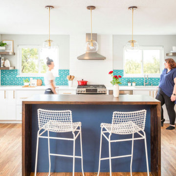
The original kitchen had been on the small side and cut-off from the rest of the home, but after we removed the coat closet, this kitchen opened up beautifully. Our plan was to create an open and light filled kitchen with a design that translated well to the other spaces in this home, and a layout that offered plenty of space for multiple cooks. We utilized clean white cabinets around the perimeter of the kitchen and popped the island with a spunky shade of blue. To add a real element of fun, we jazzed it up with the colorful escher tile at the backsplash and brought in accents of brass in the hardware and light fixtures to tie it all together. Through out this home we brought in warm wood accents and the kitchen was no exception, with its custom floating shelves and graceful waterfall butcher block counter at the island.
[Dining Room]
The dining room had once been the home’s living room, but we had other plans in mind. With its dramatic vaulted ceiling and new custom steel railing, this room was just screaming for a dramatic light fixture and a large table to welcome one-and-all.
[Living Room]
We converted the original garage into a lovely little living room with a cozy fireplace. There is plenty of new storage in this space (that ties in with the kitchen finishes), but the real gem is the reading nook with two of the most comfortable armchairs you’ve ever sat in.
[Master Suite]
This home didn’t originally have a master suite, so we decided to convert one of the bedrooms and create a charming suite that you’d never want to leave. The master bathroom aesthetic quickly became all about the textures. With a sultry black hex on the floor and a dimensional geometric tile on the walls we set the stage for a calm space. The warm walnut vanity and touches of brass cozy up the space and relate with the feel of the rest of the home. We continued the warm wood touches into the master bedroom, but went for a rich accent wall that elevated the sophistication level and sets this space apart.
[Hall Bathroom]
The floor tile in this bathroom still makes our hearts skip a beat. We designed the rest of the space to be a clean and bright white, and really let the lovely blue of the floor tile pop. The walnut vanity cabinet (complete with hairpin legs) adds a lovely level of warmth to this bathroom, and the black and brass accents add the sophisticated touch we were looking for.
[Office]
We loved the original built-ins in this space, and knew they needed to always be a part of this house, but these 60-year-old beauties definitely needed a little help. We cleaned up the cabinets and brass hardware, switched out the formica counter for a new quartz top, and painted wall a cheery accent color to liven it up a bit. And voila! We have an office that is the envy of the neighborhood.
 JRP Design & Remodel
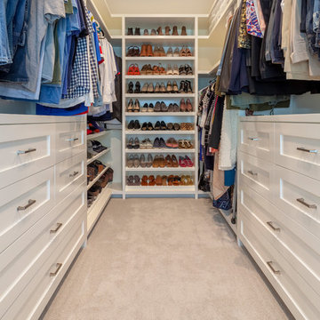
This transitional primary suite remodel is simply breathtaking. It is all but impossible to choose the best part of this dreamy primary space. Neutral colors in the bedroom create a tranquil escape from the world. One of the main goals of this remodel was to maximize the space of the primary closet. From tiny and cramped to large and spacious, it is now simple, functional, and sophisticated. Every item has a place or drawer to keep a clean and minimal aesthetic.
The primary bathroom builds on the neutral color palette of the bedroom and closet with a soothing ambiance. The JRP team used crisp white, soft cream, and cloudy gray to create a bathroom that is clean and calm. To avoid creating a look that falls flat, these hues were layered throughout the room through the flooring, vanity, shower curtain, and accent pieces.
Stylish details include wood grain porcelain tiles, crystal chandelier lighting, and a freestanding soaking tub. Vadara quartz countertops flow throughout, complimenting the pure white cabinets and illuminating the space. This spacious transitional primary suite offers plenty of functional yet elegant features to help prepare for every occasion. The goal was to ensure that each day begins and ends in a tranquil space.
Flooring:
Porcelain Tile – Cerdomus, Savannah, Dust
Shower - Stone - Zen Paradise, Sliced Wave, Island Blend Wave
Bathtub: Freestanding
Light Fixtures: Globe Chandelier - Crystal/Polished Chrome
Tile:
Shower Walls: Ceramic Tile - Atlas Tile, 3D Ribbon, White Matte
Photographer: J.R. Maddox
 TKS Design Group
Free ebook, Creating the Ideal Kitchen. DOWNLOAD NOW
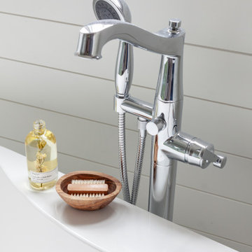
This client came to us wanting some help with updating the master bath in their home. Their primary goals were to increase the size of the shower, add a rain head, add a freestanding tub and overall freshen the feel of the space.
The existing layout of the bath worked well, so we left the basic footprint the same, but increased the size of the shower and added a freestanding tub on a bit of an angle which allowed for some additional storage.
One of the most important things on the wish list was adding a rainhead in the shower, but this was not an easy task with the angled ceiling. We came up with the solution of using an extra long wall-mounted shower arm that was reinforced with a meal bracket attached the ceiling. This did the trick, and no extra framing or insulation was required to make it work.
The materials selected for the space are classic and fresh. Large format white oriental marble is used throughout the bath, on the floor in a herrinbone pattern and in a staggered brick pattern on the walls. Alder cabinets with a gray stain contrast nicely with the white marble, while shiplap detail helps unify the space and gives it a casual and cozy vibe. Storage solutions include an area for towels and other necessities at the foot of the tub, roll out shelves and out storage in the vanities and a custom niche and shaving ledge in the shower. We love how just a few simple changes can make such a great impact!
Designed by: Susan Klimala, CKBD
Photography by: LOMA Studios
For more information on kitchen and bath design ideas go to: www.kitchenstudio-ge.com
 TVL Creative Ltd.
[Our Clients]
We were so excited to help these new homeowners re-envision their split-level diamond in the rough. There was so much potential in those walls, and we couldn’t wait to delve in and start transforming spaces. Our primary goal was to re-imagine the main level of the home and create an open flow between the space. So, we started by converting the existing single car garage into their living room (complete with a new fireplace) and opening up the kitchen to the rest of the level.
[Kitchen]
The original kitchen had been on the small side and cut-off from the rest of the home, but after we removed the coat closet, this kitchen opened up beautifully. Our plan was to create an open and light filled kitchen with a design that translated well to the other spaces in this home, and a layout that offered plenty of space for multiple cooks. We utilized clean white cabinets around the perimeter of the kitchen and popped the island with a spunky shade of blue. To add a real element of fun, we jazzed it up with the colorful escher tile at the backsplash and brought in accents of brass in the hardware and light fixtures to tie it all together. Through out this home we brought in warm wood accents and the kitchen was no exception, with its custom floating shelves and graceful waterfall butcher block counter at the island.
[Dining Room]
The dining room had once been the home’s living room, but we had other plans in mind. With its dramatic vaulted ceiling and new custom steel railing, this room was just screaming for a dramatic light fixture and a large table to welcome one-and-all.
[Living Room]
We converted the original garage into a lovely little living room with a cozy fireplace. There is plenty of new storage in this space (that ties in with the kitchen finishes), but the real gem is the reading nook with two of the most comfortable armchairs you’ve ever sat in.
[Master Suite]
This home didn’t originally have a master suite, so we decided to convert one of the bedrooms and create a charming suite that you’d never want to leave. The master bathroom aesthetic quickly became all about the textures. With a sultry black hex on the floor and a dimensional geometric tile on the walls we set the stage for a calm space. The warm walnut vanity and touches of brass cozy up the space and relate with the feel of the rest of the home. We continued the warm wood touches into the master bedroom, but went for a rich accent wall that elevated the sophistication level and sets this space apart.
[Hall Bathroom]
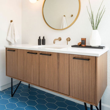
The floor tile in this bathroom still makes our hearts skip a beat. We designed the rest of the space to be a clean and bright white, and really let the lovely blue of the floor tile pop. The walnut vanity cabinet (complete with hairpin legs) adds a lovely level of warmth to this bathroom, and the black and brass accents add the sophisticated touch we were looking for.
[Office]
We loved the original built-ins in this space, and knew they needed to always be a part of this house, but these 60-year-old beauties definitely needed a little help. We cleaned up the cabinets and brass hardware, switched out the formica counter for a new quartz top, and painted wall a cheery accent color to liven it up a bit. And voila! We have an office that is the envy of the neighborhood.
1