
Search results for "Primary goal" in Home Design Ideas
 TKS Design Group
Free ebook, Creating the Ideal Kitchen. DOWNLOAD NOW
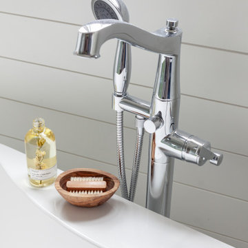
This client came to us wanting some help with updating the master bath in their home. Their primary goals were to increase the size of the shower, add a rain head, add a freestanding tub and overall freshen the feel of the space.
The existing layout of the bath worked well, so we left the basic footprint the same, but increased the size of the shower and added a freestanding tub on a bit of an angle which allowed for some additional storage.
One of the most important things on the wish list was adding a rainhead in the shower, but this was not an easy task with the angled ceiling. We came up with the solution of using an extra long wall-mounted shower arm that was reinforced with a meal bracket attached the ceiling. This did the trick, and no extra framing or insulation was required to make it work.
The materials selected for the space are classic and fresh. Large format white oriental marble is used throughout the bath, on the floor in a herrinbone pattern and in a staggered brick pattern on the walls. Alder cabinets with a gray stain contrast nicely with the white marble, while shiplap detail helps unify the space and gives it a casual and cozy vibe. Storage solutions include an area for towels and other necessities at the foot of the tub, roll out shelves and out storage in the vanities and a custom niche and shaving ledge in the shower. We love how just a few simple changes can make such a great impact!
Designed by: Susan Klimala, CKBD
Photography by: LOMA Studios
For more information on kitchen and bath design ideas go to: www.kitchenstudio-ge.com
 Drewett Works
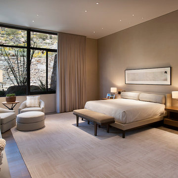
The primary goal for this project was to craft a modernist derivation of pueblo architecture. Set into a heavily laden boulder hillside, the design also reflects the nature of the stacked boulder formations. The site, located near local landmark Pinnacle Peak, offered breathtaking views which were largely upward, making proximity an issue. Maintaining southwest fenestration protection and maximizing views created the primary design constraint. The views are maximized with careful orientation, exacting overhangs, and wing wall locations. The overhangs intertwine and undulate with alternating materials stacking to reinforce the boulder strewn backdrop. The elegant material palette and siting allow for great harmony with the native desert.
The Elegant Modern at Estancia was the collaboration of many of the Valley's finest luxury home specialists. Interiors guru David Michael Miller contributed elegance and refinement in every detail. Landscape architect Russ Greey of Greey | Pickett contributed a landscape design that not only complimented the architecture, but nestled into the surrounding desert as if always a part of it. And contractor Manship Builders -- Jim Manship and project manager Mark Laidlaw -- brought precision and skill to the construction of what architect C.P. Drewett described as "a watch."
Project Details | Elegant Modern at Estancia
Architecture: CP Drewett, AIA, NCARB
Builder: Manship Builders, Carefree, AZ
Interiors: David Michael Miller, Scottsdale, AZ
Landscape: Greey | Pickett, Scottsdale, AZ
Photography: Dino Tonn, Scottsdale, AZ
Publications:
"On the Edge: The Rugged Desert Landscape Forms the Ideal Backdrop for an Estancia Home Distinguished by its Modernist Lines" Luxe Interiors + Design, Nov/Dec 2015.
Awards:
2015 PCBC Grand Award: Best Custom Home over 8,000 sq. ft.
2015 PCBC Award of Merit: Best Custom Home over 8,000 sq. ft.
The Nationals 2016 Silver Award: Best Architectural Design of a One of a Kind Home - Custom or Spec
2015 Excellence in Masonry Architectural Award - Merit Award
Photography: Dino Tonn
 MATHISON | MATHISON ARCHITECTS
Watermark Residence was conceived as a “downsizing” project for Owners looking to transition from the home where they raised their family to a simpler lifestyle. The footprint and exterior massing of the single family condo was prescribed, but MMA wove new details into these constraints and was urged by the Owner to completely reinvent the interior experience.
From the exterior, the home sits subtly on a corner lot, referencing the neighborhood in its style, but with a warmth and crispness that speaks also to the interiors.
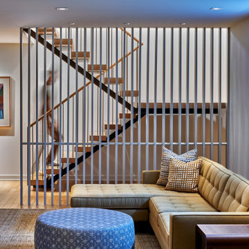
The primary goal of the project was to provide an open, inviting atmosphere of connected spaces that allowed natural light into all areas of the home. Upon entry, there is an immediate involvement in the daily activities with the living and dining rooms being the focal point, and a more intimate kitchen slightly out of view.
Throughout the home, the idea of privacy and transparency plays an important role in the organization of spaces and materials chosen. More private corridors lead to intimate bedroom spaces and functional laundry and mudrooms. A two-floor, semi-transparent slat wall shields direct visibility from the street, while also providing connection between the entertaining spaces of the home. Combined with the white oak, open staircase, the movement between levels feels intuitive and inviting.
A simple palette of materials, understated in their appearance but detailed in their execution, are threaded throughout the home. Gathering spaces are represented with open slats, grounding brick, white oak, and bright walls. Movement deeper into the house brings refined slat panels with integrated hardware at kitchen millwork, softly painted cabinetry, and warm tones of walnut in furniture elements. The most private spaces of the home further extrude the slat element into fluted panels, painted in deeper colors.
Find the right local pro for your project

 TVL Creative Ltd.
Our clients were looking to make this home their forever home and to create a warm and welcoming space that the whole family would enjoy returning to every day. One of our primary goals in this project was to change how our clients moved through their home. We tossed aside the existing walls that blocked off the kitchen and introduced a butler’s pantry to connect the kitchen directly to the dining room. Contrast is king in this home, and we utilized a variety of light and dark finishes to create distinctive layers and lean into opportunities for accents. To tie the space in this home together, we introduced warm hardwood flooring throughout the main level and selected a soft grey paint as our primary wall color.
Kitchen- The heart of this home is most definitely the kitchen! We erased every trace of the original builder kitchen and created a space that welcomes one and all. The glorious island, with its light cabinetry and dramatic quartz countertop, provides the perfect gathering place for morning coffee and baking sessions. At the perimeter of the kitchen, we selected a handsome grey finish with a brushed linen effect for an extra touch of texture that ties in with the high variation backsplash tile giving us a softened handmade feel. Black metal accents from the hardware to the light fixtures unite the kitchen with the rest of the home.
Butler’s Pantry- The Butler’s Pantry quickly became one of our favorite spaces in this home! We had fun with the backsplash tile patten (utilizing the same tile we highlighted in the kitchen but installed in a herringbone pattern). Continuing the warm tones through this space with the butcher block counter and open shelving, it works to unite the front and back of the house. Plus, this space is home to the kegerator with custom family tap handles!
Mud Room- We wanted to make sure we gave this busy family a landing place for all their belongings. With plenty of cabinetry storage, a sweet built-in bench, and hooks galore there’s no more jockeying to find a home for coats.
Fireplace- A double-sided fireplace means double the opportunity for a dramatic focal point! On the living room side (the tv-free grown-up zone) we utilized reclaimed wooden planks to add layers of texture and bring in more cozy warm vibes. On the family room side (aka the tv room) we mixed it up with a travertine ledger stone that ties in with the warm tones of the kitchen island.
Staircase- The standard builder handrail was just not going to do it anymore! So, we leveled up designed a custom steel & wood railing for this home with a dark finish that allows it to contrast beautifully against the walls and tie in with the dark accent finishes throughout the home.
 TKS Design Group
Free ebook, Creating the Ideal Kitchen. DOWNLOAD NOW
This client came to us wanting some help with updating the master bath in their home. Their primary goals were to increase the size of the shower, add a rain head, add a freestanding tub and overall freshen the feel of the space.
The existing layout of the bath worked well, so we left the basic footprint the same, but increased the size of the shower and added a freestanding tub on a bit of an angle which allowed for some additional storage.
One of the most important things on the wish list was adding a rainhead in the shower, but this was not an easy task with the angled ceiling. We came up with the solution of using an extra long wall-mounted shower arm that was reinforced with a meal bracket attached the ceiling. This did the trick, and no extra framing or insulation was required to make it work.
The materials selected for the space are classic and fresh. Large format white oriental marble is used throughout the bath, on the floor in a herrinbone pattern and in a staggered brick pattern on the walls. Alder cabinets with a gray stain contrast nicely with the white marble, while shiplap detail helps unify the space and gives it a casual and cozy vibe. Storage solutions include an area for towels and other necessities at the foot of the tub, roll out shelves and out storage in the vanities and a custom niche and shaving ledge in the shower. We love how just a few simple changes can make such a great impact!
Designed by: Susan Klimala, CKBD
Photography by: LOMA Studios
For more information on kitchen and bath design ideas go to: www.kitchenstudio-ge.com
 JRP Design & Remodel
This transitional primary suite remodel is simply breathtaking. It is all but impossible to choose the best part of this dreamy primary space. Neutral colors in the bedroom create a tranquil escape from the world. One of the main goals of this remodel was to maximize the space of the primary closet. From tiny and cramped to large and spacious, it is now simple, functional, and sophisticated. Every item has a place or drawer to keep a clean and minimal aesthetic.
The primary bathroom builds on the neutral color palette of the bedroom and closet with a soothing ambiance. The JRP team used crisp white, soft cream, and cloudy gray to create a bathroom that is clean and calm. To avoid creating a look that falls flat, these hues were layered throughout the room through the flooring, vanity, shower curtain, and accent pieces.
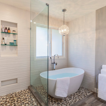
Stylish details include wood grain porcelain tiles, crystal chandelier lighting, and a freestanding soaking tub. Vadara quartz countertops flow throughout, complimenting the pure white cabinets and illuminating the space. This spacious transitional primary suite offers plenty of functional yet elegant features to help prepare for every occasion. The goal was to ensure that each day begins and ends in a tranquil space.
Flooring:
Porcelain Tile – Cerdomus, Savannah, Dust
Shower - Stone - Zen Paradise, Sliced Wave, Island Blend Wave
Bathtub: Freestanding
Light Fixtures: Globe Chandelier - Crystal/Polished Chrome
Tile:
Shower Walls: Ceramic Tile - Atlas Tile, 3D Ribbon, White Matte
Photographer: J.R. Maddox
 Drewett Works
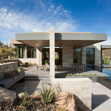
The primary goal for this project was to craft a modernist derivation of pueblo architecture. Set into a heavily laden boulder hillside, the design also reflects the nature of the stacked boulder formations. The site, located near local landmark Pinnacle Peak, offered breathtaking views which were largely upward, making proximity an issue. Maintaining southwest fenestration protection and maximizing views created the primary design constraint. The views are maximized with careful orientation, exacting overhangs, and wing wall locations. The overhangs intertwine and undulate with alternating materials stacking to reinforce the boulder strewn backdrop. The elegant material palette and siting allow for great harmony with the native desert.
The Elegant Modern at Estancia was the collaboration of many of the Valley's finest luxury home specialists. Interiors guru David Michael Miller contributed elegance and refinement in every detail. Landscape architect Russ Greey of Greey | Pickett contributed a landscape design that not only complimented the architecture, but nestled into the surrounding desert as if always a part of it. And contractor Manship Builders -- Jim Manship and project manager Mark Laidlaw -- brought precision and skill to the construction of what architect C.P. Drewett described as "a watch."
Project Details | Elegant Modern at Estancia
Architecture: CP Drewett, AIA, NCARB
Builder: Manship Builders, Carefree, AZ
Interiors: David Michael Miller, Scottsdale, AZ
Landscape: Greey | Pickett, Scottsdale, AZ
Photography: Dino Tonn, Scottsdale, AZ
Publications:
"On the Edge: The Rugged Desert Landscape Forms the Ideal Backdrop for an Estancia Home Distinguished by its Modernist Lines" Luxe Interiors + Design, Nov/Dec 2015.
Awards:
2015 PCBC Grand Award: Best Custom Home over 8,000 sq. ft.
2015 PCBC Award of Merit: Best Custom Home over 8,000 sq. ft.
The Nationals 2016 Silver Award: Best Architectural Design of a One of a Kind Home - Custom or Spec
2015 Excellence in Masonry Architectural Award - Merit Award
Photography: Dino Tonn
 TKS Design Group
Free ebook, Creating the Ideal Kitchen. DOWNLOAD NOW
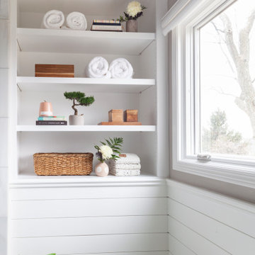
This client came to us wanting some help with updating the master bath in their home. Their primary goals were to increase the size of the shower, add a rain head, add a freestanding tub and overall freshen the feel of the space.
The existing layout of the bath worked well, so we left the basic footprint the same, but increased the size of the shower and added a freestanding tub on a bit of an angle which allowed for some additional storage.
One of the most important things on the wish list was adding a rainhead in the shower, but this was not an easy task with the angled ceiling. We came up with the solution of using an extra long wall-mounted shower arm that was reinforced with a meal bracket attached the ceiling. This did the trick, and no extra framing or insulation was required to make it work.
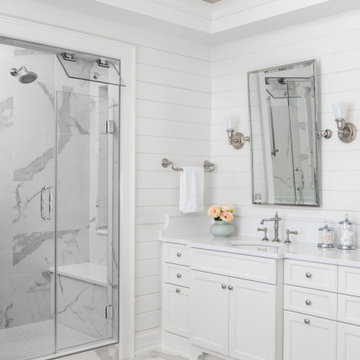
The materials selected for the space are classic and fresh. Large format white oriental marble is used throughout the bath, on the floor in a herrinbone pattern and in a staggered brick pattern on the walls. Alder cabinets with a gray stain contrast nicely with the white marble, while shiplap detail helps unify the space and gives it a casual and cozy vibe. Storage solutions include an area for towels and other necessities at the foot of the tub, roll out shelves and out storage in the vanities and a custom niche and shaving ledge in the shower. We love how just a few simple changes can make such a great impact!
Designed by: Susan Klimala, CKBD
Photography by: LOMA Studios
For more information on kitchen and bath design ideas go to: www.kitchenstudio-ge.com
 Drewett Works
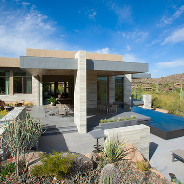
The primary goal for this project was to craft a modernist derivation of pueblo architecture. Set into a heavily laden boulder hillside, the design also reflects the nature of the stacked boulder formations. The site, located near local landmark Pinnacle Peak, offered breathtaking views which were largely upward, making proximity an issue. Maintaining southwest fenestration protection and maximizing views created the primary design constraint. The views are maximized with careful orientation, exacting overhangs, and wing wall locations. The overhangs intertwine and undulate with alternating materials stacking to reinforce the boulder strewn backdrop. The elegant material palette and siting allow for great harmony with the native desert.
The Elegant Modern at Estancia was the collaboration of many of the Valley's finest luxury home specialists. Interiors guru David Michael Miller contributed elegance and refinement in every detail. Landscape architect Russ Greey of Greey | Pickett contributed a landscape design that not only complimented the architecture, but nestled into the surrounding desert as if always a part of it. And contractor Manship Builders -- Jim Manship and project manager Mark Laidlaw -- brought precision and skill to the construction of what architect C.P. Drewett described as "a watch."
Project Details | Elegant Modern at Estancia
Architecture: CP Drewett, AIA, NCARB
Builder: Manship Builders, Carefree, AZ
Interiors: David Michael Miller, Scottsdale, AZ
Landscape: Greey | Pickett, Scottsdale, AZ
Photography: Dino Tonn, Scottsdale, AZ
Publications:
"On the Edge: The Rugged Desert Landscape Forms the Ideal Backdrop for an Estancia Home Distinguished by its Modernist Lines" Luxe Interiors + Design, Nov/Dec 2015.
Awards:
2015 PCBC Grand Award: Best Custom Home over 8,000 sq. ft.
2015 PCBC Award of Merit: Best Custom Home over 8,000 sq. ft.
The Nationals 2016 Silver Award: Best Architectural Design of a One of a Kind Home - Custom or Spec
2015 Excellence in Masonry Architectural Award - Merit Award
Photography: Dino Tonn
 JRP Design & Remodel
This transitional primary suite remodel is simply breathtaking. It is all but impossible to choose the best part of this dreamy primary space. Neutral colors in the bedroom create a tranquil escape from the world. One of the main goals of this remodel was to maximize the space of the primary closet. From tiny and cramped to large and spacious, it is now simple, functional, and sophisticated. Every item has a place or drawer to keep a clean and minimal aesthetic.
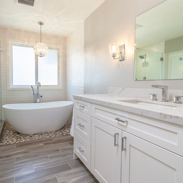
The primary bathroom builds on the neutral color palette of the bedroom and closet with a soothing ambiance. The JRP team used crisp white, soft cream, and cloudy gray to create a bathroom that is clean and calm. To avoid creating a look that falls flat, these hues were layered throughout the room through the flooring, vanity, shower curtain, and accent pieces.
Stylish details include wood grain porcelain tiles, crystal chandelier lighting, and a freestanding soaking tub. Vadara quartz countertops flow throughout, complimenting the pure white cabinets and illuminating the space. This spacious transitional primary suite offers plenty of functional yet elegant features to help prepare for every occasion. The goal was to ensure that each day begins and ends in a tranquil space.
Flooring:
Porcelain Tile – Cerdomus, Savannah, Dust
Shower - Stone - Zen Paradise, Sliced Wave, Island Blend Wave
Bathtub: Freestanding
Light Fixtures: Globe Chandelier - Crystal/Polished Chrome
Tile:
Shower Walls: Ceramic Tile - Atlas Tile, 3D Ribbon, White Matte
Photographer: J.R. Maddox
 Klopf Architecture
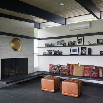
Set in a quiet neighborhood and framed by mature trees, this residence presented a unique opportunity: to thoughtfully evolve a custom mid-century modern home into a space that supports the everyday rhythms of a growing family. With a deep respect for the home’s original architecture, Klopf Architecture reimagined the house to better meet the needs of its owners—introducing functional improvements while preserving the spirit and character of its mid-century roots.
The clients approached Klopf Architecture with a clear vision: refresh their home while seamlessly integrating new programmatic elements. Key goals included clarifying and enhancing the entry sequence; connecting the detached garage to the main house with a practical yet architecturally intentional intervention; adding functional spaces such as a mudroom and laundry room; expanding and remodeling the primary suite’s bathroom and closet; and creating a more engaging outdoor space that capitalized on the site’s impressive views, featuring a fire pit and outdoor kitchen.
As a couple with distinct yet complementary perspectives—one focused on modern functionality and technology, and the other dedicated to preserving the home’s architectural integrity—their collaboration with Klopf Architecture resulted in a solution that harmonized both ideals. Their shared commitment to improving the livability of their home led to a design dialogue rooted in balance. This dynamic partnership shaped the direction of the renovation, ensuring that every decision honored the spirit of the original home while aligning with the practical needs of their growing family.
Designing within the constraints of the sloped site posed one of the project’s central challenges. The detached garage sat at a higher elevation than the main house, requiring a solution that ensured architectural and geometric compatibility between the two structures. Rather than create a purely utilitarian link, Klopf Architecture introduced an intentional connection that contributes to the overall architectural language. A notable pinch point in the plan—where differing geometries converged—was treated as a hinge point, turning a potentially awkward juncture into an architectural feature. This area now functions as both a transition and a moment of design interest that unifies the overall plan.
The design also addressed the underutilized outdoor area, which was located in a shadowed portion of the site with geometrical limitations. A new connection to the rear deck was created in this same area, making the outdoor space more useful and inviting. Klopf Architecture introduced carefully positioned openings and spatial improvements that forged a strong visual and functional connection between indoor and outdoor spaces. The outdoor area now reads as a deliberate extension of the home, embracing natural light and emphasizing the dramatic views.
Working through multiple design iterations, Klopf Architecture crafted a solution that preserved the architectural language of the original home while supporting the functional needs of modern life. The garage-to-house connection became more than a passage—it evolved into an architectural moment of transition. A new mudroom and laundry space enhanced convenience without compromising the clean lines of the design. The primary suite was expanded to create a private, serene retreat. The reimagined backyard, complete with fire pit and kitchen, now plays a vital role in the family’s daily routine and social life.
Outcomes and Lasting Impact
The result is a home that balances heritage with contemporary design, technical precision with design sensibility. The redesign not only met the clients’ initial goals but also exceeded expectations in its ability to seamlessly blend past and present, function and beauty, making the outdoor kitchen a favorite gathering place.
Beyond aesthetics, the renovation has significantly improved daily life for the family. The newly integrated garage connection has streamlined routines, providing a seamless transition between arriving home, storing belongings, and entering the main living spaces. The expanded primary suite offers a retreat-like atmosphere, creating a private space to unwind at the end of the day. The redesigned outdoor areas have also become an extension of their lifestyle—whether it's casual family dinners around the fire pit, entertaining friends in the outdoor kitchen, or simply enjoying the view from the reimagined backyard.
Through a thoughtful and strategic approach, the house has been successfully evolved into a home that remains true to its mid-century modern roots while enhancing livability, functionality, and the overall quality of life for the modern-day owners.
Klopf Architecture Team: Geoffrey Campen, Fernanda Bernardes
Architectural Interior Design: Klopf Architecture
Structural Engineer: Base Design Inc.
Contractor: Golden Snail Builders
Photography: Mariko Reed
Year Completed:2022
 TVL Creative Ltd.
[Our Clients]
We were so excited to help these new homeowners re-envision their split-level diamond in the rough. There was so much potential in those walls, and we couldn’t wait to delve in and start transforming spaces. Our primary goal was to re-imagine the main level of the home and create an open flow between the space. So, we started by converting the existing single car garage into their living room (complete with a new fireplace) and opening up the kitchen to the rest of the level.
[Kitchen]
The original kitchen had been on the small side and cut-off from the rest of the home, but after we removed the coat closet, this kitchen opened up beautifully. Our plan was to create an open and light filled kitchen with a design that translated well to the other spaces in this home, and a layout that offered plenty of space for multiple cooks. We utilized clean white cabinets around the perimeter of the kitchen and popped the island with a spunky shade of blue. To add a real element of fun, we jazzed it up with the colorful escher tile at the backsplash and brought in accents of brass in the hardware and light fixtures to tie it all together. Through out this home we brought in warm wood accents and the kitchen was no exception, with its custom floating shelves and graceful waterfall butcher block counter at the island.
[Dining Room]
The dining room had once been the home’s living room, but we had other plans in mind. With its dramatic vaulted ceiling and new custom steel railing, this room was just screaming for a dramatic light fixture and a large table to welcome one-and-all.
[Living Room]
We converted the original garage into a lovely little living room with a cozy fireplace. There is plenty of new storage in this space (that ties in with the kitchen finishes), but the real gem is the reading nook with two of the most comfortable armchairs you’ve ever sat in.
[Master Suite]
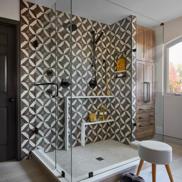
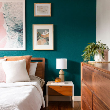
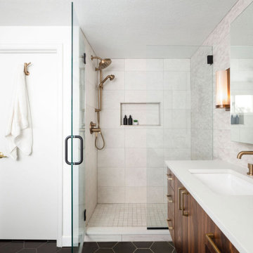
This home didn’t originally have a master suite, so we decided to convert one of the bedrooms and create a charming suite that you’d never want to leave. The master bathroom aesthetic quickly became all about the textures. With a sultry black hex on the floor and a dimensional geometric tile on the walls we set the stage for a calm space. The warm walnut vanity and touches of brass cozy up the space and relate with the feel of the rest of the home. We continued the warm wood touches into the master bedroom, but went for a rich accent wall that elevated the sophistication level and sets this space apart.
[Hall Bathroom]
The floor tile in this bathroom still makes our hearts skip a beat. We designed the rest of the space to be a clean and bright white, and really let the lovely blue of the floor tile pop. The walnut vanity cabinet (complete with hairpin legs) adds a lovely level of warmth to this bathroom, and the black and brass accents add the sophisticated touch we were looking for.
[Office]
We loved the original built-ins in this space, and knew they needed to always be a part of this house, but these 60-year-old beauties definitely needed a little help. We cleaned up the cabinets and brass hardware, switched out the formica counter for a new quartz top, and painted wall a cheery accent color to liven it up a bit. And voila! We have an office that is the envy of the neighborhood.
 Deep River Partners
A young family sought their forever home where they would grow together and create lasting memories. Designing this custom home on a spacious 4.5-acre waterfront lot provided the perfect setting to create an openness with spaces where every member of the family could enjoy.
The primary goal was to maximize the lake views with separate special spaces for various uses and activities, yet with an open concept for connection between rooms. They wanted a home that would stand the test of time and grow with the family.
Traditional with a classic sensibility lead the design theme. A happy color palette of soft toned colors in blues, pinks, and turquoise - with a nod to lake living through patterns, and natural elements - provides a lived in and welcoming sense. It’s eclectic flair of polished sparkle finds balanced with rustic detailing that gives it a curated presentation with classic styling for the sense of a home that has always been there.
 TVL Creative Ltd.
[Our Clients]
We were so excited to help these new homeowners re-envision their split-level diamond in the rough. There was so much potential in those walls, and we couldn’t wait to delve in and start transforming spaces. Our primary goal was to re-imagine the main level of the home and create an open flow between the space. So, we started by converting the existing single car garage into their living room (complete with a new fireplace) and opening up the kitchen to the rest of the level.
[Kitchen]
The original kitchen had been on the small side and cut-off from the rest of the home, but after we removed the coat closet, this kitchen opened up beautifully. Our plan was to create an open and light filled kitchen with a design that translated well to the other spaces in this home, and a layout that offered plenty of space for multiple cooks. We utilized clean white cabinets around the perimeter of the kitchen and popped the island with a spunky shade of blue. To add a real element of fun, we jazzed it up with the colorful escher tile at the backsplash and brought in accents of brass in the hardware and light fixtures to tie it all together. Through out this home we brought in warm wood accents and the kitchen was no exception, with its custom floating shelves and graceful waterfall butcher block counter at the island.
[Dining Room]
The dining room had once been the home’s living room, but we had other plans in mind. With its dramatic vaulted ceiling and new custom steel railing, this room was just screaming for a dramatic light fixture and a large table to welcome one-and-all.
[Living Room]
We converted the original garage into a lovely little living room with a cozy fireplace. There is plenty of new storage in this space (that ties in with the kitchen finishes), but the real gem is the reading nook with two of the most comfortable armchairs you’ve ever sat in.
[Master Suite]
This home didn’t originally have a master suite, so we decided to convert one of the bedrooms and create a charming suite that you’d never want to leave. The master bathroom aesthetic quickly became all about the textures. With a sultry black hex on the floor and a dimensional geometric tile on the walls we set the stage for a calm space. The warm walnut vanity and touches of brass cozy up the space and relate with the feel of the rest of the home. We continued the warm wood touches into the master bedroom, but went for a rich accent wall that elevated the sophistication level and sets this space apart.
[Hall Bathroom]
The floor tile in this bathroom still makes our hearts skip a beat. We designed the rest of the space to be a clean and bright white, and really let the lovely blue of the floor tile pop. The walnut vanity cabinet (complete with hairpin legs) adds a lovely level of warmth to this bathroom, and the black and brass accents add the sophisticated touch we were looking for.
[Office]
We loved the original built-ins in this space, and knew they needed to always be a part of this house, but these 60-year-old beauties definitely needed a little help. We cleaned up the cabinets and brass hardware, switched out the formica counter for a new quartz top, and painted wall a cheery accent color to liven it up a bit. And voila! We have an office that is the envy of the neighborhood.
 TVL Creative Ltd.
[Our Clients]
We were so excited to help these new homeowners re-envision their split-level diamond in the rough. There was so much potential in those walls, and we couldn’t wait to delve in and start transforming spaces. Our primary goal was to re-imagine the main level of the home and create an open flow between the space. So, we started by converting the existing single car garage into their living room (complete with a new fireplace) and opening up the kitchen to the rest of the level.
[Kitchen]
The original kitchen had been on the small side and cut-off from the rest of the home, but after we removed the coat closet, this kitchen opened up beautifully. Our plan was to create an open and light filled kitchen with a design that translated well to the other spaces in this home, and a layout that offered plenty of space for multiple cooks. We utilized clean white cabinets around the perimeter of the kitchen and popped the island with a spunky shade of blue. To add a real element of fun, we jazzed it up with the colorful escher tile at the backsplash and brought in accents of brass in the hardware and light fixtures to tie it all together. Through out this home we brought in warm wood accents and the kitchen was no exception, with its custom floating shelves and graceful waterfall butcher block counter at the island.
[Dining Room]
The dining room had once been the home’s living room, but we had other plans in mind. With its dramatic vaulted ceiling and new custom steel railing, this room was just screaming for a dramatic light fixture and a large table to welcome one-and-all.
[Living Room]
We converted the original garage into a lovely little living room with a cozy fireplace. There is plenty of new storage in this space (that ties in with the kitchen finishes), but the real gem is the reading nook with two of the most comfortable armchairs you’ve ever sat in.
[Master Suite]
This home didn’t originally have a master suite, so we decided to convert one of the bedrooms and create a charming suite that you’d never want to leave. The master bathroom aesthetic quickly became all about the textures. With a sultry black hex on the floor and a dimensional geometric tile on the walls we set the stage for a calm space. The warm walnut vanity and touches of brass cozy up the space and relate with the feel of the rest of the home. We continued the warm wood touches into the master bedroom, but went for a rich accent wall that elevated the sophistication level and sets this space apart.
[Hall Bathroom]
The floor tile in this bathroom still makes our hearts skip a beat. We designed the rest of the space to be a clean and bright white, and really let the lovely blue of the floor tile pop. The walnut vanity cabinet (complete with hairpin legs) adds a lovely level of warmth to this bathroom, and the black and brass accents add the sophisticated touch we were looking for.
[Office]
We loved the original built-ins in this space, and knew they needed to always be a part of this house, but these 60-year-old beauties definitely needed a little help. We cleaned up the cabinets and brass hardware, switched out the formica counter for a new quartz top, and painted wall a cheery accent color to liven it up a bit. And voila! We have an office that is the envy of the neighborhood.
 Beth Kooby Design
Emily Jenkins Followill photography
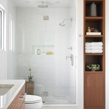
This bath was one of Atlanta Homes and Lifestyles Bath of the Year winners for 2014!!
Mid-sized minimalist master white tile and glass tile marble floor bathroom photo in Atlanta with an undermount sink, flat-panel cabinets, medium tone wood cabinets and white walls
Mid-sized minimalist master white tile and glass tile marble floor bathroom photo in Atlanta with an undermount sink, flat-panel cabinets, medium tone wood cabinets and white walls

 TVL Creative Ltd.
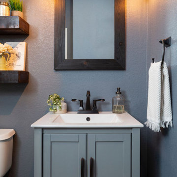
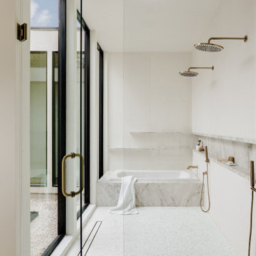
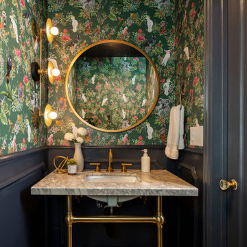
This project was not only full of many bathrooms but also many different aesthetics. The goals were fourfold, create a new master suite, update the basement bath, add a new powder bath and my favorite, make them all completely different aesthetics.
Primary Bath-This was originally a small 60SF full bath sandwiched in between closets and walls of built-in cabinetry that blossomed into a 130SF, five-piece primary suite. This room was to be focused on a transitional aesthetic that would be adorned with Calcutta gold marble, gold fixtures and matte black geometric tile arrangements.
Powder Bath-A new addition to the home leans more on the traditional side of the transitional movement using moody blues and greens accented with brass. A fun play was the asymmetry of the 3-light sconce brings the aesthetic more to the modern side of transitional. My favorite element in the space, however, is the green, pink black and white deco tile on the floor whose colors are reflected in the details of the Australian wallpaper.
Hall Bath-Looking to touch on the home's 70's roots, we went for a mid-mod fresh update. Black Calcutta floors, linear-stacked porcelain tile, mixed woods and strong black and white accents. The green tile may be the star but the matte white ribbed tiles in the shower and behind the vanity are the true unsung heroes.
 Drewett Works
The primary goal for this project was to craft a modernist derivation of pueblo architecture. Set into a heavily laden boulder hillside, the design also reflects the nature of the stacked boulder formations. The site, located near local landmark Pinnacle Peak, offered breathtaking views which were largely upward, making proximity an issue. Maintaining southwest fenestration protection and maximizing views created the primary design constraint. The views are maximized with careful orientation, exacting overhangs, and wing wall locations. The overhangs intertwine and undulate with alternating materials stacking to reinforce the boulder strewn backdrop. The elegant material palette and siting allow for great harmony with the native desert.
The Elegant Modern at Estancia was the collaboration of many of the Valley's finest luxury home specialists. Interiors guru David Michael Miller contributed elegance and refinement in every detail. Landscape architect Russ Greey of Greey | Pickett contributed a landscape design that not only complimented the architecture, but nestled into the surrounding desert as if always a part of it. And contractor Manship Builders -- Jim Manship and project manager Mark Laidlaw -- brought precision and skill to the construction of what architect C.P. Drewett described as "a watch."
Project Details | Elegant Modern at Estancia
Architecture: CP Drewett, AIA, NCARB
Builder: Manship Builders, Carefree, AZ
Interiors: David Michael Miller, Scottsdale, AZ
Landscape: Greey | Pickett, Scottsdale, AZ
Photography: Dino Tonn, Scottsdale, AZ
Publications:
"On the Edge: The Rugged Desert Landscape Forms the Ideal Backdrop for an Estancia Home Distinguished by its Modernist Lines" Luxe Interiors + Design, Nov/Dec 2015.
Awards:
2015 PCBC Grand Award: Best Custom Home over 8,000 sq. ft.
2015 PCBC Award of Merit: Best Custom Home over 8,000 sq. ft.
The Nationals 2016 Silver Award: Best Architectural Design of a One of a Kind Home - Custom or Spec
2015 Excellence in Masonry Architectural Award - Merit Award
Photography: Dino Tonn
2