
Search results for "Primary reason" in Home Design Ideas
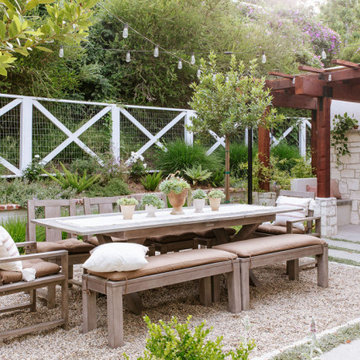

 Walker Home Design
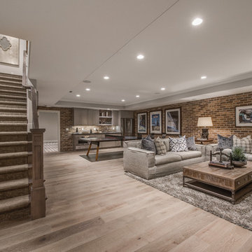
Example of a large classic light wood floor and brown floor basement design in Salt Lake City
 Story LLC
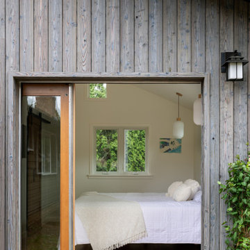
Small minimalist gray one-story wood house exterior photo in Seattle with a hip roof, a shingle roof and a black roof
Find the right local pro for your project
 Fratantoni Interior Designers
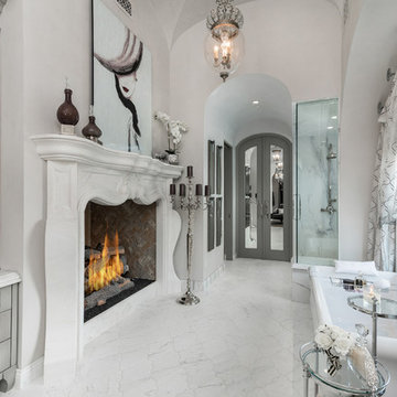
The French Villa master bathroom blends refined luxury with thoughtful detailing. A white marble fireplace sits parallel to the freestanding tub, creating a serene focal point. Marble flooring, mosaic floor tile, and honed marble surfaces are accented with soft gray tones. At the far end, a glass walk-in shower with marble tile showcases a sophisticated shower design. Arched doorways, arched walkways, and detailed molding & millwork highlight the architectural charm. Built-in shelving, custom cabinets, and mullion glass cabinetry provide functional storage. Finished with marble countertops, pendant lighting, statement lighting, and abstract wall art, this white bathroom reflects the elevated design Fratantoni is known for.
 Graham Baba Architects
Michael Matisse
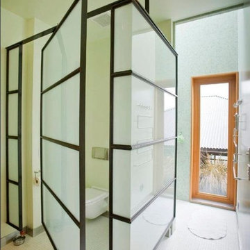
Urban white tile bathroom photo in Seattle with a wall-mount toilet
Urban white tile bathroom photo in Seattle with a wall-mount toilet
 River Valley Landscapes
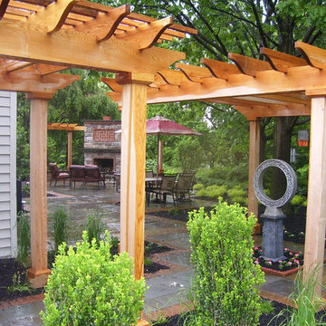
 After many years of having no outdoor living space and dealing with overgrown plants and trees the owner’s decided it was time to revitalize their backyard. They knew they wanted a large sitting area with a wood burning fireplace, room for outdoor dining and a place for the grill. A connecting walk would be needed to get guests from the driveway to the outdoor space. Last but not least, the owners wanted the ability to and a reason for stepping out of their unusable patio doors.
The designers decided from the start the fireplace would be the prominent feature and focal point for the entire project. A large fireplace accented with sitting walls and arbors was positioned to anchor the corner of the patio. Stone was chosen to set the fireplace apart as its own element. Brick was used for the sitting walls and brick accents were added to the fireplace to tie into the house. An inlaid herringbone brick detail was incorporated above the stone mantle to simulate artwork which is typically found above indoor fireplaces. Flagstone was used for the wall caps and hearth to match the patio and thicker flagstone tread stock was used for the mantle and top. The arbors were added to visually balance the pergolas at the opposite side of the patio.
For the patio the designers created a series of offset spaces to help subtly divide the space into two areas, sitting and dining. Two large existing trees also help dictate the shape of the patio. Cut flagstone was chosen for the surface bordered by a double soldier edge of brick. The brick edging also surrounds a decorative gravel area topped with an urn fountain which provides a secondary focal point and the sound of water. Large flagstone treads were used for the steps leading to the previously unused patio doors. Opposite the fireplace a short walk leads to a square transition area with a statue chosen by the owner. The statue provides a strong focal point when entering from the driveway. A longer walk leads from this space along the house to the driveway.
The pergolas and arbors were designed by the landscape designer as part of this project but were ultimately contracted separately by the owner. The larger square pergola was intended as an area for a bench or two separate from the main patio. The longer pergola was added later in the design phase to help provide shade to the interior of the house. The arbors at the fireplace were added to balance out the wood elements at the opposite side while adding additional architectural interest to the fireplace.
While this project was predominantly hardscaping, planting and lighting were also incorporated into the design. Several large existing trees were retained and serious of smaller understory trees were added to help enclose the space. The designer’s took advantage of the large trees to place down lights on the branches to achieve a moonlight effect at night. Additional lighting was used on the pergola, to accent focal points, to up light the smaller trees and around the patio. Massed planting of Japanese forest grass provides bold foliage color for the shady garden. A mulch path leads off behind the fireplace to another garden and a secluded area ideal for a bench or small table and chairs. Additional plantings were added along the rear property line to screen and unsightly fence.
This project has obviously completely changed the way the owners use their backyard. They now have a seamless transition from indoors to outdoors with the use of the patio doors. The large patio allows for entertaining small gatherings outdoors for the first time. The fireplace has definitely become the primary gathering place for family and friends.
 Klopf Architecture
Built for the Bluff, A Sea Ranch Home is Remade from the Inside Out
The house had always been grounded, on an ocean bluff at The Sea Ranch. It sits unencumbered, adjacent to one of the most dramatic stretches of the Sonoma coast with protected commons meadow to the east, uninterrupted Pacific views to the west, and a bluff trail running alongside. What it lacked was the feeling of home, one that could hold up its own against the natural landscape.
The owners are entrepreneurs with deep involvement across tech, real estate, and development and they know how things are built. The Sea Ranch house had been in their lives for years, a second residence and a place for family to gather. Built for a different time, it felt more compromising than comfortable. Sitting in a closed off nook, the kitchen fit one cook at a time and turned its back on the rest of the house. The entry was dim and compressed, divided by a structural column that presented itself at exactly the wrong moment. The primary suite was small relative to the view outside it. A large rear bedroom sat behind a lowered ceiling with a bathroom that had never been added. The house was certainly worth the trouble of doing it right.
What followed was not one project but four, each with its own design challenge, each addressed over a period of time.
Where the House Meets the Ocean
The most complex piece of the project, in both structural and spatial terms, was the kitchen expansion. The existing room was a single-person galley squeezed in as an afterthought with no meaningful connection to the dining room, the living space, or the deck outside. To make it useful for a family that cooks and gathers, it needed to grow outward into an existing patio and flow into the rooms around it.
A big challenge was the roofline. Several planes at different pitches and angles converged directly where additional volume was needed. A new form had to join that geometry without reading as a correction. The solution found the simplest possible connection between the existing angles, a roofline that from outside the structure, appears entirely original. From the bluff trail where the addition is visible, there is no discernible seam.
Inside, the kitchen is now open to the living and dining rooms without interruption. A large sliding glass door connects the space onto the rear deck. The deck itself was expanded and oriented so that the body of the house shields it from the coastal wind which is a common consideration that determines whether outdoor space at The Sea Ranch actually gets used. The result is a room that works for large family gatherings where no one feels cutoff, and one that makes the boundary between being inside and outside easy to ignore.
Welcoming Light
A structural column stood at the convergence of eight distinct roof planes in the entry. It was load-bearing, but it was also the reason the entry had always felt like a hallway rather than a welcoming arrival.
With the structural engineer, a custom steel connector was designed to receive beams from six separate directions, redistributing the load through a single new continuous beam. The column was surgically removed. Three triangular skylights were then cut into the roof above, their shapes drawn from the
existing geometry of the planes around them. The entry is now bright and open. The skylights feel native to the structure because they follow the logic already present in the roof.
Two Suites, Two Views
At opposite ends of the house, the two bedroom suites were each reconfigured, and each found a different way to introduce more of the landscape into the room.
An addition to the primary suite extended the structure outward to create a wraparound plan with a loop from the bedroom through bath and closet that had not been possible before. The expansion opened a slot view from the tub and shower toward the ocean. The view is precise and private. The ocean view is present and deliberate.
The rear bedroom absorbed an adjacent storage room to transform it into a full second suite with a vaulted ceiling, a large bathroom with a tub, a shower, and a sauna. A private fenced garden courtyard sits just beyond the glass bringing the outdoors inside. The tub was placed so that, looking past the courtyard and through the bedroom beyond, the ocean is visible at the far end. It is a long view and it makes the room feel larger and more settled than its footprint would suggest.
Glass on Four Sides, Fire at the Center
The main living and gathering room had always been caught between two competing facts: glass on four sides meant exceptional views but at The Sea Ranch, it also meant a cold room. A 360-degree cylindrical fireplace was added at the center on a raised stone base, providing radiant heat in every direction and giving the room a focal point around which a group naturally orients itself, whether that means two people at the end of the day or the whole family after dinner.
Owners Who Picked Up the Tools
The owner was not a passive client. they came with construction knowledge, specific ideas, and the desire to be an active part of the process, a dynamic that other architects may had found difficult, which Klopf Architecture accepted as an asset. They took it upon themselves to complete some of the work during construction, including the installation of a new radiant heating system beneath the floors.
The radiant system added to the older and less-desirable forced-air setup. At The Sea Ranch, that change matters as the house sits close enough to the ocean and moving air competes with the sound of it, where radiant heat does not. Solar panels were added to the roof as part of the new system. Insulation was upgraded throughout the walls, roof, and crawl space. The house that had always had the right setting now holds warmth the way a house on the bluff should.
They were also deeply involved in the design and selections throughout, and the finished house reflects both of them in ways that are specific rather than generic. The process took longer and moved through more iterations than a more arms-length relationship might have allowed. The result is more defined and personal because of it.
The Landscape Holds Priority
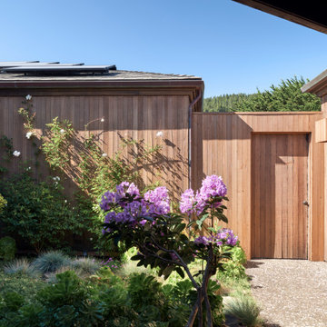
Every exterior decision was shaped by The Sea Ranch Design Standards, which require that buildings defer to the landscape around them rather than compete with it. Because this house sits on the bluff and is visible from the public trail, the additions faced a close review. Existing materials were matched. Geometries were resolved. The additions had to become indistinguishable from the original building.
From the trail, the house reads exactly as it always has — low, cedar-clad, secondary to the meadow and the water. The setting holds priority. Inside, the house has been remade.
Klopf Architecture Project Team: Geoff Campen and Trenton Jewett
Contractor: Shawn Bettega Construction
Photography: ©2025 Mariko Reed
Year Completed: 2023
Location: The Sea Ranch, CA

Sponsored
Sunbury, OH

J.Holderby - Renovations
Franklin County's Leading General Contractors - 2X Best of Houzz!


 Manson-Hing Architects Inc.
Ciro Coelho
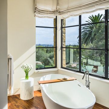
Inspiration for a large transitional master medium tone wood floor freestanding bathtub remodel in Santa Barbara
Inspiration for a large transitional master medium tone wood floor freestanding bathtub remodel in Santa Barbara
 building Lab, inc.
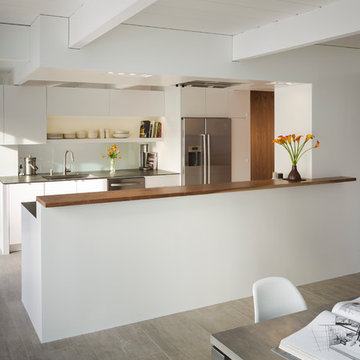
Eichler in Marinwood - The primary organizational element of the interior is the kitchen. Embedded within the simple post and beam structure, the kitchen was conceived as a programmatic block from which we would carve in order to contribute to both sense of function and organization.
photo: scott hargis

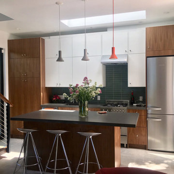
 INSPIRED KITCHEN DESIGN
He explains: “I tried using the IKEA kitchen planner but the more I used it, the more questions I had. IKD, with all their expertise in kitchen design took all the hard decisions off of my hands. Plus the cost was very reasonable.”
With a total budget of roughly $16,000, the couple selected a variety of high-end appliances, non-IKEA products and, of course, the IKEA SEKTION cabinet system to create a contemporary kitchen “with a splash of Scandinavian modern.”
But it also needed to be reliable enough for everyday cooking as well as entertaining.
“We have a large outdoor entertaining area by the entrance,” he adds.
The pair combined the IKEA SEKTION cabinet framework with custom doors and drawer faces from the Cabinet Face.
For the appliances, Richard selected a 24” Bertazonni range; an 18” Bosch dishwasher and 24” Bosch microwave drawer; a Franke Professional Series Sink; a KWC Domo kitchen faucet; a BodyGlove BG3000 water filter system; an InSinkErator Indulge Modern single-handle instant hot and cold water dispenser faucet and the Evolution Series garbage disposal, also from InSinkErator.
The couple selected Silestone Cemento Spa countertop material as well as IKEA OMLOPP drawer lighting and IKEA IRSTA countertop lighting to finish the look.
Sponsored
Sunbury, OH
J.Holderby - Renovations
Franklin County's Leading General Contractors - 2X Best of Houzz!
 Bergeron Custom Homes, LLC
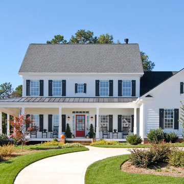
Farmhouse white two-story exterior home idea in Charleston with a mixed material roof

 BUILD
BUILD@Amber Frederiksen Photography
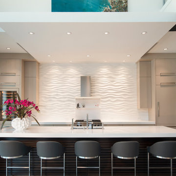
Open concept kitchen - large contemporary galley porcelain tile open concept kitchen idea in Miami with white backsplash, an island, an undermount sink, flat-panel cabinets, beige cabinets, quartz countertops and stainless steel appliances
Open concept kitchen - large contemporary galley porcelain tile open concept kitchen idea in Miami with white backsplash, an island, an undermount sink, flat-panel cabinets, beige cabinets, quartz countertops and stainless steel appliances
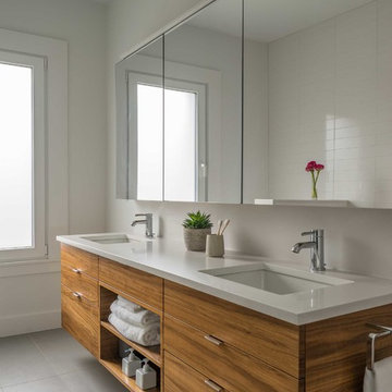
 ZeroEnergy Design
This renovated brick rowhome in Boston’s South End offers a modern aesthetic within a historic structure, creative use of space, exceptional thermal comfort, a reduced carbon footprint, and a passive stream of income.
DESIGN PRIORITIES. The goals for the project were clear - design the primary unit to accommodate the family’s modern lifestyle, rework the layout to create a desirable rental unit, improve thermal comfort and introduce a modern aesthetic. We designed the street-level entry as a shared entrance for both the primary and rental unit. The family uses it as their everyday entrance - we planned for bike storage and an open mudroom with bench and shoe storage to facilitate the change from shoes to slippers or bare feet as they enter their home. On the main level, we expanded the kitchen into the dining room to create an eat-in space with generous counter space and storage, as well as a comfortable connection to the living space. The second floor serves as master suite for the couple - a bedroom with a walk-in-closet and ensuite bathroom, and an adjacent study, with refinished original pumpkin pine floors. The upper floor, aside from a guest bedroom, is the child's domain with interconnected spaces for sleeping, work and play. In the play space, which can be separated from the work space with new translucent sliding doors, we incorporated recreational features inspired by adventurous and competitive television shows, at their son’s request.
MODERN MEETS TRADITIONAL. We left the historic front facade of the building largely unchanged - the security bars were removed from the windows and the single pane windows were replaced with higher performing historic replicas. We designed the interior and rear facade with a vision of warm modernism, weaving in the notable period features. Each element was either restored or reinterpreted to blend with the modern aesthetic. The detailed ceiling in the living space, for example, has a new matte monochromatic finish, and the wood stairs are covered in a dark grey floor paint, whereas the mahogany doors were simply refinished. New wide plank wood flooring with a neutral finish, floor-to-ceiling casework, and bold splashes of color in wall paint and tile, and oversized high-performance windows (on the rear facade) round out the modern aesthetic.
RENTAL INCOME. The existing rowhome was zoned for a 2-family dwelling but included an undesirable, single-floor studio apartment at the garden level with low ceiling heights and questionable emergency egress. In order to increase the quality and quantity of space in the rental unit, we reimagined it as a two-floor, 1 or 2 bedroom, 2 bathroom apartment with a modern aesthetic, increased ceiling height on the lowest level and provided an in-unit washer/dryer. The apartment was listed with Jackie O'Connor Real Estate and rented immediately, providing the owners with a source of passive income.
ENCLOSURE WITH BENEFITS. The homeowners sought a minimal carbon footprint, enabled by their urban location and lifestyle decisions, paired with the benefits of a high-performance home. The extent of the renovation allowed us to implement a deep energy retrofit (DER) to address air tightness, insulation, and high-performance windows. The historic front facade is insulated from the interior, while the rear facade is insulated on the exterior. Together with these building enclosure improvements, we designed an HVAC system comprised of continuous fresh air ventilation, and an efficient, all-electric heating and cooling system to decouple the house from natural gas. This strategy provides optimal thermal comfort and indoor air quality, improved acoustic isolation from street noise and neighbors, as well as a further reduced carbon footprint. We also took measures to prepare the roof for future solar panels, for when the South End neighborhood’s aging electrical infrastructure is upgraded to allow them.
URBAN LIVING. The desirable neighborhood location allows the both the homeowners and tenant to walk, bike, and use public transportation to access the city, while each charging their respective plug-in electric cars behind the building to travel greater distances.
OVERALL. The understated rowhouse is now ready for another century of urban living, offering the owners comfort and convenience as they live life as an expression of their values.
Photography Eric Roth Photo
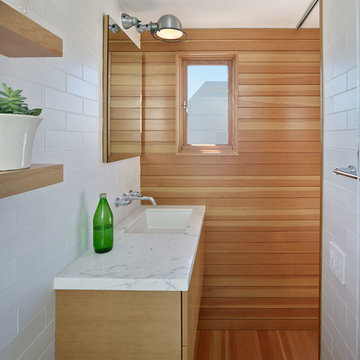
 Lee & Co Contractors
Bathroom - mid-sized contemporary master white tile and subway tile medium tone wood floor bathroom idea in San Francisco with an undermount sink, flat-panel cabinets and medium tone wood cabinets
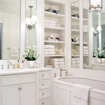
 Studio 511
A beautiful, clean, cool, classic, white Master Bath. Interior Design by Ashley Whittaker.
Small elegant master white tile mosaic tile floor bathroom photo in New York with an undermount sink, white cabinets, marble countertops, an undermount tub, white walls, raised-panel cabinets and white countertops
Small elegant master white tile mosaic tile floor bathroom photo in New York with an undermount sink, white cabinets, marble countertops, an undermount tub, white walls, raised-panel cabinets and white countertops
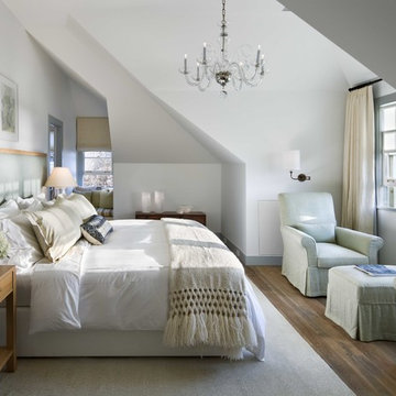
 Ike Kligerman Barkley
Inspiration for a mid-sized coastal master dark wood floor bedroom remodel in Boston with white walls
2