
Search results for "Primary reason" in Home Design Ideas
 Breeze Giannasio Interiors
Stacy Zarin Goldberg
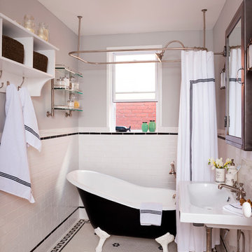
Bathroom - mid-sized eclectic porcelain tile and black and white tile porcelain tile bathroom idea in DC Metro with a wall-mount sink, white cabinets, a one-piece toilet and gray walls
Bathroom - mid-sized eclectic porcelain tile and black and white tile porcelain tile bathroom idea in DC Metro with a wall-mount sink, white cabinets, a one-piece toilet and gray walls
 Paintzen, Inc.
When we imagine the homes of our favorite actors, we often think of picturesque kitchens, artwork hanging on the walls, luxurious furniture, and pristine conditions 24/7. But for celebrities with children, sometimes that last one isn’t always accurate! Kids will be kids – which means there may be messy bedrooms, toys strewn across their play area, and maybe even some crayon marks or finger-paints on walls or floors.
Lucy Liu recently partnered with One Kings Lane and Paintzen to redesign her son Rockwell’s playroom in their Manhattan apartment for that reason. Previously, Lucy had decided not to focus too much on the layout or color of the space – it was simply a room to hold all of Rockwell’s toys. There wasn’t much of a design element to it and very little storage.
Lucy was ready to change that – and transform the room into something more sophisticated and tranquil for both Rockwell and for guests (especially those with kids!). And to really bring that transformation to life, one of the things that needed to change was the lack of color and texture on the walls.
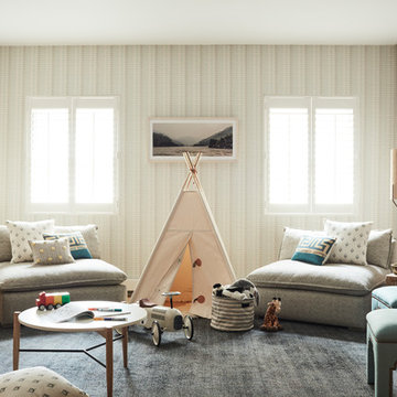
When selecting the color palette, Lucy and One Kings Lane designer Nicole Fisher decided on a more neutral, contemporary style. They chose to avoid the primary colors, which are too often utilized in children’s rooms and playrooms.
Instead, they chose to have Paintzen paint the walls in a cozy gray with warm beige undertones. (Try PPG ‘Slate Pebble’ for a similar look!) It created a perfect backdrop for the decor selected for the room, which included a tepee for Rockwell, some Tribal-inspired artwork, Moroccan woven baskets, and some framed artwork.
To add texture to the space, Paintzen also installed wallpaper on two of the walls. The wallpaper pattern involved muted blues and grays to add subtle color and a slight contrast to the rest of the walls. Take a closer look at this smartly designed space, featuring a beautiful neutral color palette and lots of exciting textures!
 River Valley Landscapes
After many years of having no outdoor living space and dealing with overgrown plants and trees the owner’s decided it was time to revitalize their backyard. They knew they wanted a large sitting area with a wood burning fireplace, room for outdoor dining and a place for the grill. A connecting walk would be needed to get guests from the driveway to the outdoor space. Last but not least, the owners wanted the ability to and a reason for stepping out of their unusable patio doors.
The designers decided from the start the fireplace would be the prominent feature and focal point for the entire project. A large fireplace accented with sitting walls and arbors was positioned to anchor the corner of the patio. Stone was chosen to set the fireplace apart as its own element. Brick was used for the sitting walls and brick accents were added to the fireplace to tie into the house. An inlaid herringbone brick detail was incorporated above the stone mantle to simulate artwork which is typically found above indoor fireplaces. Flagstone was used for the wall caps and hearth to match the patio and thicker flagstone tread stock was used for the mantle and top. The arbors were added to visually balance the pergolas at the opposite side of the patio.
For the patio the designers created a series of offset spaces to help subtly divide the space into two areas, sitting and dining. Two large existing trees also help dictate the shape of the patio. Cut flagstone was chosen for the surface bordered by a double soldier edge of brick. The brick edging also surrounds a decorative gravel area topped with an urn fountain which provides a secondary focal point and the sound of water. Large flagstone treads were used for the steps leading to the previously unused patio doors. Opposite the fireplace a short walk leads to a square transition area with a statue chosen by the owner. The statue provides a strong focal point when entering from the driveway. A longer walk leads from this space along the house to the driveway.
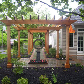
The pergolas and arbors were designed by the landscape designer as part of this project but were ultimately contracted separately by the owner. The larger square pergola was intended as an area for a bench or two separate from the main patio. The longer pergola was added later in the design phase to help provide shade to the interior of the house. The arbors at the fireplace were added to balance out the wood elements at the opposite side while adding additional architectural interest to the fireplace.
While this project was predominantly hardscaping, planting and lighting were also incorporated into the design. Several large existing trees were retained and serious of smaller understory trees were added to help enclose the space. The designer’s took advantage of the large trees to place down lights on the branches to achieve a moonlight effect at night. Additional lighting was used on the pergola, to accent focal points, to up light the smaller trees and around the patio. Massed planting of Japanese forest grass provides bold foliage color for the shady garden. A mulch path leads off behind the fireplace to another garden and a secluded area ideal for a bench or small table and chairs. Additional plantings were added along the rear property line to screen and unsightly fence.
This project has obviously completely changed the way the owners use their backyard. They now have a seamless transition from indoors to outdoors with the use of the patio doors. The large patio allows for entertaining small gatherings outdoors for the first time. The fireplace has definitely become the primary gathering place for family and friends.
Find the right local pro for your project
 Organized Living
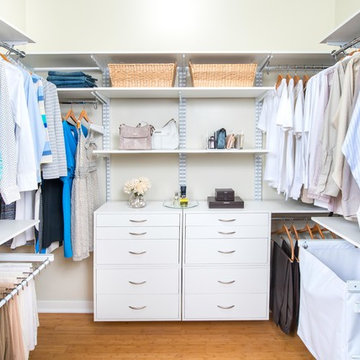
Organized Living freedomRail is the perfect combination of strength, ease and versatility to save you time, money and stress. The heart of this organization system is its ability to adjust- and readjust – to suit you and your family’s ever-changing needs. Learn more about freedomRail and its unique benefits here: http://organizedliving.com/home/products/freedomrail/about

 Rikki Snyder
Photo: Rikki Snyder © 2014 Houzz
Example of a small cottage enclosed medium tone wood floor living room design in New York with green walls, a standard fireplace and a stone fireplace
Example of a small cottage enclosed medium tone wood floor living room design in New York with green walls, a standard fireplace and a stone fireplace
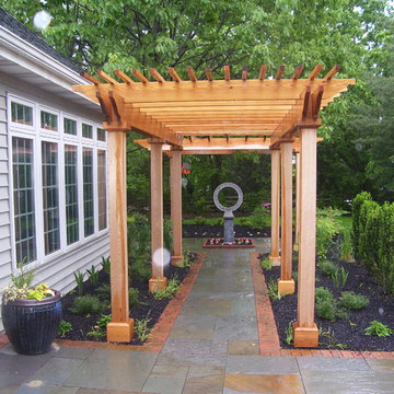 River Valley Landscapes
After many years of having no outdoor living space and dealing with overgrown plants and trees the owner’s decided it was time to revitalize their backyard. They knew they wanted a large sitting area with a wood burning fireplace, room for outdoor dining and a place for the grill. A connecting walk would be needed to get guests from the driveway to the outdoor space. Last but not least, the owners wanted the ability to and a reason for stepping out of their unusable patio doors.
The designers decided from the start the fireplace would be the prominent feature and focal point for the entire project. A large fireplace accented with sitting walls and arbors was positioned to anchor the corner of the patio. Stone was chosen to set the fireplace apart as its own element. Brick was used for the sitting walls and brick accents were added to the fireplace to tie into the house. An inlaid herringbone brick detail was incorporated above the stone mantle to simulate artwork which is typically found above indoor fireplaces. Flagstone was used for the wall caps and hearth to match the patio and thicker flagstone tread stock was used for the mantle and top. The arbors were added to visually balance the pergolas at the opposite side of the patio.
For the patio the designers created a series of offset spaces to help subtly divide the space into two areas, sitting and dining. Two large existing trees also help dictate the shape of the patio. Cut flagstone was chosen for the surface bordered by a double soldier edge of brick. The brick edging also surrounds a decorative gravel area topped with an urn fountain which provides a secondary focal point and the sound of water. Large flagstone treads were used for the steps leading to the previously unused patio doors. Opposite the fireplace a short walk leads to a square transition area with a statue chosen by the owner. The statue provides a strong focal point when entering from the driveway. A longer walk leads from this space along the house to the driveway.
The pergolas and arbors were designed by the landscape designer as part of this project but were ultimately contracted separately by the owner. The larger square pergola was intended as an area for a bench or two separate from the main patio. The longer pergola was added later in the design phase to help provide shade to the interior of the house. The arbors at the fireplace were added to balance out the wood elements at the opposite side while adding additional architectural interest to the fireplace.
While this project was predominantly hardscaping, planting and lighting were also incorporated into the design. Several large existing trees were retained and serious of smaller understory trees were added to help enclose the space. The designer’s took advantage of the large trees to place down lights on the branches to achieve a moonlight effect at night. Additional lighting was used on the pergola, to accent focal points, to up light the smaller trees and around the patio. Massed planting of Japanese forest grass provides bold foliage color for the shady garden. A mulch path leads off behind the fireplace to another garden and a secluded area ideal for a bench or small table and chairs. Additional plantings were added along the rear property line to screen and unsightly fence.
This project has obviously completely changed the way the owners use their backyard. They now have a seamless transition from indoors to outdoors with the use of the patio doors. The large patio allows for entertaining small gatherings outdoors for the first time. The fireplace has definitely become the primary gathering place for family and friends.
 lisa furey interiors
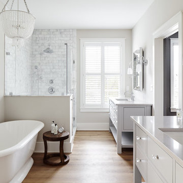
Example of a large farmhouse master marble tile and white tile medium tone wood floor, brown floor and double-sink bathroom design in Philadelphia with gray walls, an undermount sink, quartz countertops, a hinged shower door, gray cabinets, gray countertops, beaded inset cabinets and a freestanding vanity

Sponsored
Sunbury, OH

J.Holderby - Renovations
Franklin County's Leading General Contractors - 2X Best of Houzz!
 Laurel Wreath Homes
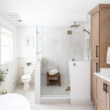
Full renovation for this Primary Bathroom. Re-worked the floor plan to create a larger walk-in shower space with custom glass enclosure. Designed a custom wooden vanity with plenty of storage, with a subtly veined quartz countertop. Free standing bathtub is surrounded by a half wall of paneling, painted in a light and bright color scheme. Neutral tile installed on bathroom floor and shower walls, with a coordinating penny tile on the shower floor and niches. Textured bamboo roman shades and floating shelves were installed for contrast and mixed and matched black and gold hardware for detail.
 Jess Blackwell Photography
Photo by Jess Blackwell Photography
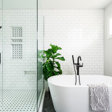
Transitional master white tile and subway tile black floor bathroom photo in Denver with white walls
Transitional master white tile and subway tile black floor bathroom photo in Denver with white walls
 Klopf Architecture
Built for the Bluff, A Sea Ranch Home is Remade from the Inside Out
The house had always been grounded, on an ocean bluff at The Sea Ranch. It sits unencumbered, adjacent to one of the most dramatic stretches of the Sonoma coast with protected commons meadow to the east, uninterrupted Pacific views to the west, and a bluff trail running alongside. What it lacked was the feeling of home, one that could hold up its own against the natural landscape.
The owners are entrepreneurs with deep involvement across tech, real estate, and development and they know how things are built. The Sea Ranch house had been in their lives for years, a second residence and a place for family to gather. Built for a different time, it felt more compromising than comfortable. Sitting in a closed off nook, the kitchen fit one cook at a time and turned its back on the rest of the house. The entry was dim and compressed, divided by a structural column that presented itself at exactly the wrong moment. The primary suite was small relative to the view outside it. A large rear bedroom sat behind a lowered ceiling with a bathroom that had never been added. The house was certainly worth the trouble of doing it right.
What followed was not one project but four, each with its own design challenge, each addressed over a period of time.
Where the House Meets the Ocean
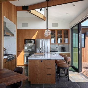
The most complex piece of the project, in both structural and spatial terms, was the kitchen expansion. The existing room was a single-person galley squeezed in as an afterthought with no meaningful connection to the dining room, the living space, or the deck outside. To make it useful for a family that cooks and gathers, it needed to grow outward into an existing patio and flow into the rooms around it.
A big challenge was the roofline. Several planes at different pitches and angles converged directly where additional volume was needed. A new form had to join that geometry without reading as a correction. The solution found the simplest possible connection between the existing angles, a roofline that from outside the structure, appears entirely original. From the bluff trail where the addition is visible, there is no discernible seam.
Inside, the kitchen is now open to the living and dining rooms without interruption. A large sliding glass door connects the space onto the rear deck. The deck itself was expanded and oriented so that the body of the house shields it from the coastal wind which is a common consideration that determines whether outdoor space at The Sea Ranch actually gets used. The result is a room that works for large family gatherings where no one feels cutoff, and one that makes the boundary between being inside and outside easy to ignore.
Welcoming Light
A structural column stood at the convergence of eight distinct roof planes in the entry. It was load-bearing, but it was also the reason the entry had always felt like a hallway rather than a welcoming arrival.
With the structural engineer, a custom steel connector was designed to receive beams from six separate directions, redistributing the load through a single new continuous beam. The column was surgically removed. Three triangular skylights were then cut into the roof above, their shapes drawn from the
existing geometry of the planes around them. The entry is now bright and open. The skylights feel native to the structure because they follow the logic already present in the roof.
Two Suites, Two Views
At opposite ends of the house, the two bedroom suites were each reconfigured, and each found a different way to introduce more of the landscape into the room.
An addition to the primary suite extended the structure outward to create a wraparound plan with a loop from the bedroom through bath and closet that had not been possible before. The expansion opened a slot view from the tub and shower toward the ocean. The view is precise and private. The ocean view is present and deliberate.
The rear bedroom absorbed an adjacent storage room to transform it into a full second suite with a vaulted ceiling, a large bathroom with a tub, a shower, and a sauna. A private fenced garden courtyard sits just beyond the glass bringing the outdoors inside. The tub was placed so that, looking past the courtyard and through the bedroom beyond, the ocean is visible at the far end. It is a long view and it makes the room feel larger and more settled than its footprint would suggest.
Glass on Four Sides, Fire at the Center
The main living and gathering room had always been caught between two competing facts: glass on four sides meant exceptional views but at The Sea Ranch, it also meant a cold room. A 360-degree cylindrical fireplace was added at the center on a raised stone base, providing radiant heat in every direction and giving the room a focal point around which a group naturally orients itself, whether that means two people at the end of the day or the whole family after dinner.
Owners Who Picked Up the Tools
The owner was not a passive client. they came with construction knowledge, specific ideas, and the desire to be an active part of the process, a dynamic that other architects may had found difficult, which Klopf Architecture accepted as an asset. They took it upon themselves to complete some of the work during construction, including the installation of a new radiant heating system beneath the floors.
The radiant system added to the older and less-desirable forced-air setup. At The Sea Ranch, that change matters as the house sits close enough to the ocean and moving air competes with the sound of it, where radiant heat does not. Solar panels were added to the roof as part of the new system. Insulation was upgraded throughout the walls, roof, and crawl space. The house that had always had the right setting now holds warmth the way a house on the bluff should.
They were also deeply involved in the design and selections throughout, and the finished house reflects both of them in ways that are specific rather than generic. The process took longer and moved through more iterations than a more arms-length relationship might have allowed. The result is more defined and personal because of it.
The Landscape Holds Priority
Every exterior decision was shaped by The Sea Ranch Design Standards, which require that buildings defer to the landscape around them rather than compete with it. Because this house sits on the bluff and is visible from the public trail, the additions faced a close review. Existing materials were matched. Geometries were resolved. The additions had to become indistinguishable from the original building.
From the trail, the house reads exactly as it always has — low, cedar-clad, secondary to the meadow and the water. The setting holds priority. Inside, the house has been remade.
Klopf Architecture Project Team: Geoff Campen and Trenton Jewett
Contractor: Shawn Bettega Construction
Photography: ©2025 Mariko Reed
Year Completed: 2023
Location: The Sea Ranch, CA
 Go Home Builders
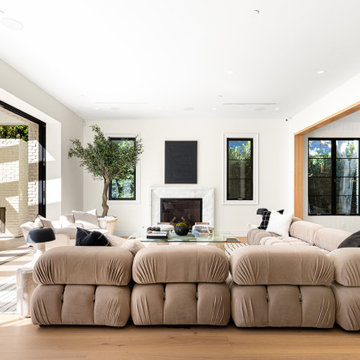
A 10,355 sq ft home built ground-up on a 16,418 sq ft lot in Brentwood Park, north of Sunset. Seven bedrooms, nine bathrooms, three stories, and an elevator.
New construction is rare in Brentwood Park — the lots are generous, the housing stock is old and it almost never turns over. Most of what gets built there is a renovation behind an existing façade.
The lower level is the part that took the engineering. A full subterranean floor carrying a cinema, fitness studio, sauna, steam shower, temperature-controlled wine room, game lounge and bar, plus guest and staff accommodation. Basements are uncommon in Los Angeles for a reason.
Above it, a chef's kitchen with marble counters, walk-in pantry, breakfast area and coffee bar, opening through retractable walls of glass to a resort-style pool, spa, outdoor kitchen and lawn. Formal dining, private office and a guest suite on the main level. Four ensuite bedrooms upstairs plus a primary suite with a private terrace, fireplace, dual dressing rooms and a book-matched marble bath. A detached guest studio with its own kitchenette and bathroom.
Four fireplaces. Solar. Stone tile and wood throughout. Three-car garage behind a circular driveway.
Built by Go Home Builders — CSLB License #1076807, Altadena, CA.
 Paintzen, Inc.
When we imagine the homes of our favorite actors, we often think of picturesque kitchens, artwork hanging on the walls, luxurious furniture, and pristine conditions 24/7. But for celebrities with children, sometimes that last one isn’t always accurate! Kids will be kids – which means there may be messy bedrooms, toys strewn across their play area, and maybe even some crayon marks or finger-paints on walls or floors.
Lucy Liu recently partnered with One Kings Lane and Paintzen to redesign her son Rockwell’s playroom in their Manhattan apartment for that reason. Previously, Lucy had decided not to focus too much on the layout or color of the space – it was simply a room to hold all of Rockwell’s toys. There wasn’t much of a design element to it and very little storage.
Lucy was ready to change that – and transform the room into something more sophisticated and tranquil for both Rockwell and for guests (especially those with kids!). And to really bring that transformation to life, one of the things that needed to change was the lack of color and texture on the walls.
When selecting the color palette, Lucy and One Kings Lane designer Nicole Fisher decided on a more neutral, contemporary style. They chose to avoid the primary colors, which are too often utilized in children’s rooms and playrooms.
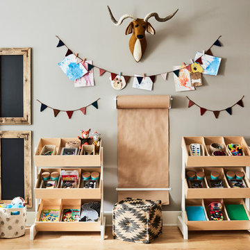
Instead, they chose to have Paintzen paint the walls in a cozy gray with warm beige undertones. (Try PPG ‘Slate Pebble’ for a similar look!) It created a perfect backdrop for the decor selected for the room, which included a tepee for Rockwell, some Tribal-inspired artwork, Moroccan woven baskets, and some framed artwork.
To add texture to the space, Paintzen also installed wallpaper on two of the walls. The wallpaper pattern involved muted blues and grays to add subtle color and a slight contrast to the rest of the walls. Take a closer look at this smartly designed space, featuring a beautiful neutral color palette and lots of exciting textures!
 Delphinium Design
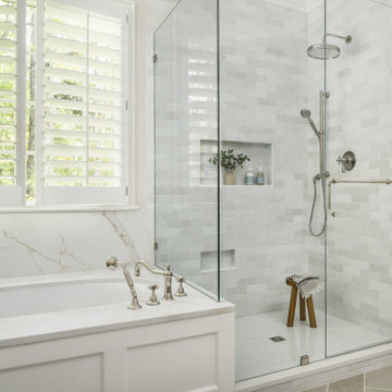
Primary bathroom designed by Delphinium Design in Charlotte, North Carolina features porcelain herringbone tile floor, large walk-in alcove shower with glass door, subway tile design and shower bench and built-in tub.
Sponsored
Sunbury, OH
J.Holderby - Renovations
Franklin County's Leading General Contractors - 2X Best of Houzz!
 User
UserJeff Herr
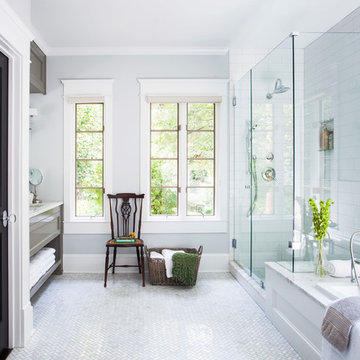
Mid-sized transitional master white tile and subway tile bathroom photo in Atlanta with an undermount sink, gray cabinets, marble countertops and gray walls
Mid-sized transitional master white tile and subway tile bathroom photo in Atlanta with an undermount sink, gray cabinets, marble countertops and gray walls
 Kathy Marshall Design
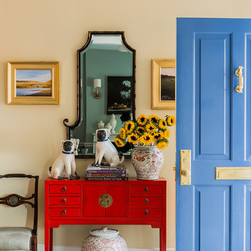
Lovely front entrance with delft blue paint and brass accents. Front doors should say welcome and thank you for visiting, I think this does just that!
 TKS Design Group
Download our free ebook, Creating the Ideal Kitchen. DOWNLOAD NOW
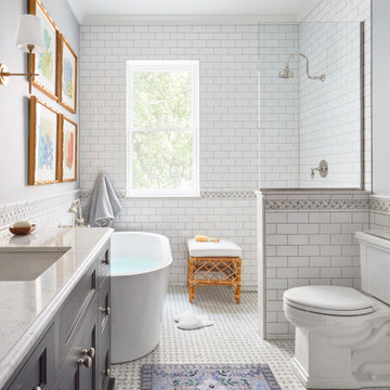
This master bath remodel is the cat's meow for more than one reason! The materials in the room are soothing and give a nice vintage vibe in keeping with the rest of the home. We completed a kitchen remodel for this client a few years’ ago and were delighted when she contacted us for help with her master bath!
The bathroom was fine but was lacking in interesting design elements, and the shower was very small. We started by eliminating the shower curb which allowed us to enlarge the footprint of the shower all the way to the edge of the bathtub, creating a modified wet room. The shower is pitched toward a linear drain so the water stays in the shower. A glass divider allows for the light from the window to expand into the room, while a freestanding tub adds a spa like feel.
The radiator was removed and both heated flooring and a towel warmer were added to provide heat. Since the unit is on the top floor in a multi-unit building it shares some of the heat from the floors below, so this was a great solution for the space.
The custom vanity includes a spot for storing styling tools and a new built in linen cabinet provides plenty of the storage. The doors at the top of the linen cabinet open to stow away towels and other personal care products, and are lighted to ensure everything is easy to find. The doors below are false doors that disguise a hidden storage area. The hidden storage area features a custom litterbox pull out for the homeowner’s cat! Her kitty enters through the cutout, and the pull out drawer allows for easy clean ups.
The materials in the room – white and gray marble, charcoal blue cabinetry and gold accents – have a vintage vibe in keeping with the rest of the home. Polished nickel fixtures and hardware add sparkle, while colorful artwork adds some life to the space.
 River Valley Landscapes
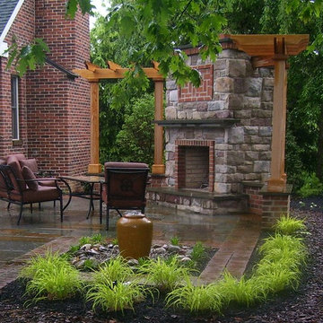
 After many years of having no outdoor living space and dealing with overgrown plants and trees the owner’s decided it was time to revitalize their backyard. They knew they wanted a large sitting area with a wood burning fireplace, room for outdoor dining and a place for the grill. A connecting walk would be needed to get guests from the driveway to the outdoor space. Last but not least, the owners wanted the ability to and a reason for stepping out of their unusable patio doors.
The designers decided from the start the fireplace would be the prominent feature and focal point for the entire project. A large fireplace accented with sitting walls and arbors was positioned to anchor the corner of the patio. Stone was chosen to set the fireplace apart as its own element. Brick was used for the sitting walls and brick accents were added to the fireplace to tie into the house. An inlaid herringbone brick detail was incorporated above the stone mantle to simulate artwork which is typically found above indoor fireplaces. Flagstone was used for the wall caps and hearth to match the patio and thicker flagstone tread stock was used for the mantle and top. The arbors were added to visually balance the pergolas at the opposite side of the patio.
For the patio the designers created a series of offset spaces to help subtly divide the space into two areas, sitting and dining. Two large existing trees also help dictate the shape of the patio. Cut flagstone was chosen for the surface bordered by a double soldier edge of brick. The brick edging also surrounds a decorative gravel area topped with an urn fountain which provides a secondary focal point and the sound of water. Large flagstone treads were used for the steps leading to the previously unused patio doors. Opposite the fireplace a short walk leads to a square transition area with a statue chosen by the owner. The statue provides a strong focal point when entering from the driveway. A longer walk leads from this space along the house to the driveway.
The pergolas and arbors were designed by the landscape designer as part of this project but were ultimately contracted separately by the owner. The larger square pergola was intended as an area for a bench or two separate from the main patio. The longer pergola was added later in the design phase to help provide shade to the interior of the house. The arbors at the fireplace were added to balance out the wood elements at the opposite side while adding additional architectural interest to the fireplace.
While this project was predominantly hardscaping, planting and lighting were also incorporated into the design. Several large existing trees were retained and serious of smaller understory trees were added to help enclose the space. The designer’s took advantage of the large trees to place down lights on the branches to achieve a moonlight effect at night. Additional lighting was used on the pergola, to accent focal points, to up light the smaller trees and around the patio. Massed planting of Japanese forest grass provides bold foliage color for the shady garden. A mulch path leads off behind the fireplace to another garden and a secluded area ideal for a bench or small table and chairs. Additional plantings were added along the rear property line to screen and unsightly fence.
This project has obviously completely changed the way the owners use their backyard. They now have a seamless transition from indoors to outdoors with the use of the patio doors. The large patio allows for entertaining small gatherings outdoors for the first time. The fireplace has definitely become the primary gathering place for family and friends.
 Jennifer Gilmer Kitchen & Bath
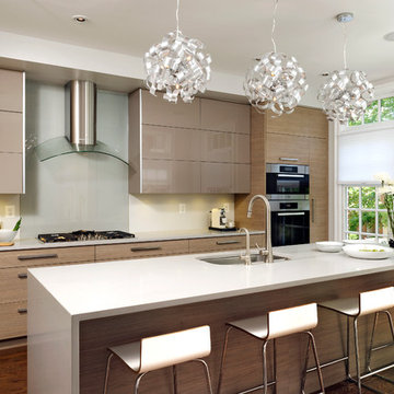
Washington D.C. - Contemporary - Kitchen Design by #PaulBentham4JenniferGilmer. All the wall cabinets reach almost to the ceiling and are accented with a slim ¾” recessed negative detail to add visual interest while keeping them from overpowering the room. Pairing the smoky woodgrain melamine and high gloss brown/gray PET gave the room a warm yet unmistakably European feel without being too stark and provides easy maintenance. Photography by Bob Narod. http://www.gilmerkitchens.com/
 Design Harmony
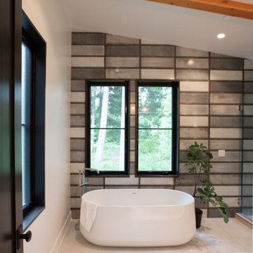
Working with repeat clients is always a dream! The had perfect timing right before the pandemic for their vacation home to get out city and relax in the mountains. This modern mountain home is stunning. Check out every custom detail we did throughout the home to make it a unique experience!
 Grounded Homes
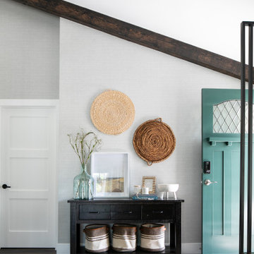
Contemporary Craftsman kitchen designed by Kennedy Cole Interior Design.
build: Luxe Remodeling
Example of a mid-sized trendy entryway design in Orange County
Example of a mid-sized trendy entryway design in Orange County
1