
Search results for "Prioritize functionality" in Home Design Ideas
 Vineuve Construction Inc.
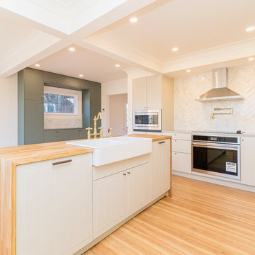
This project was proudly designed and built by Vineuve. We spared no expense on its transformation and the result has been well worth the care and effort. We prioritized function, longevity, and a clean, bright aesthetic while preserving the existing character of the space.
 Vineuve Construction Inc.
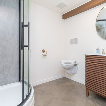
This basement suite bathroom was proudly designed and built by Vineuve. We spared no expense on its transformation and the result has been well worth the care and effort. We prioritized function, longevity, and a clean, bright aesthetic while preserving the existing character of the space
 Clifton Leung Design Workshop - CLDW.com.hk
Scandi-crafted Home Interiors in Dynasty Court
Tucked away atop of the Victoria Peak behind Hong Kong's unrelenting hustle and bustle, the residences found along Old Peak Road have been known to offer an oasis just within reach of the city. Set at the western point of Hong Kong Island, this panoramic neighbourhood boasts beautiful views over the town, hiking trails galore, and some of the city's priciest homes. Given its regarded status, it's of little surprise that those who live atop of The Peak chose to renovate rather than relocate as the years go by.
Having worked with Clifton, ten years prior, the homeowner of the Dynasty Court Residence believed it to be time for his 1,794sq.ft three-bedroom apartment to be given a complete and total facelift. Built back in the '90s, the residence had been updated once before through Clifton's services, but with a new chapter of retirement drawing nearer, the desire for a modern touch presented itself once again – this time with inspiration from Scandinavian interiors.
Given the instructions to keep the prior design of architectural and office feel but update everything, CLDW took on the role of refurbisher to their repeat client, this time however with a more curved and coloured approach than the boxey one before it.
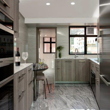
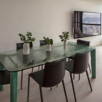
With the brief of out with the old, in with the new underway, Clifton and his team set out to deploy a modern feel to the apartment with updates to everything from the floors, walls, doors and even the appliances – prioritizing functionality and simplicity. As the kitchen had been left out of the past retouch, this time around with retirement underway in was more important to give the couple a contemporary space to explore their culinary skills. Rounded chairs and tables complement the more square-like feel of the room, with washed grey tiles and soft tan cabinets.
Meanwhile, the living room and dining room were under the instructions to be void of paintings and wall decorations – with the exception of the past CD changer – as the focal point of the rooms was to remain the spectacular view which looks down upon Hong Kong's Central district all the way to the Kowloon harbourside. Again, curvey furniture can be seen among the interiors, with rounded sofas, chairs and even the coffee table. The furniture – much like the interiors – remains minimalist, as the homeowners require little to no storage space, a rare thing indeed for Hong Kong.
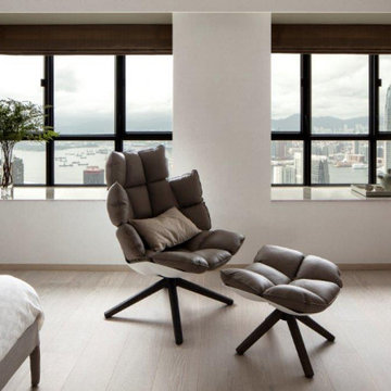
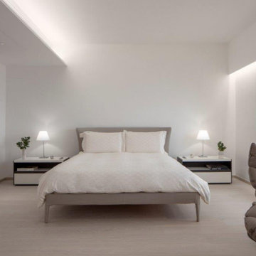
Inside the master bedroom, the updated lighting remains concealed within the walls as another finely executed play on curves from Clifton, which ensures minimalism. Over to the guest bedroom/study, more brown tones can be seen for an Earthy feel for guests, and the Mrs of the house to do her exercises.
With Scandinavian design and minimalism being one of the most popular trends of modern interior design, it takes a true professional to understand its principals of warm and natural palettes, while not too overpowering and bright. Ever present in the Dynasty Court home is the maximization of natural light, which gives it an airy environment a house at the Peak most certainly deserves.
Find the right local pro for your project
 Clifton Leung Design Workshop - CLDW.com.hk
Scandi-crafted Home Interiors in Dynasty Court
Tucked away atop of the Victoria Peak behind Hong Kong's unrelenting hustle and bustle, the residences found along Old Peak Road have been known to offer an oasis just within reach of the city. Set at the western point of Hong Kong Island, this panoramic neighbourhood boasts beautiful views over the town, hiking trails galore, and some of the city's priciest homes. Given its regarded status, it's of little surprise that those who live atop of The Peak chose to renovate rather than relocate as the years go by.
Having worked with Clifton, ten years prior, the homeowner of the Dynasty Court Residence believed it to be time for his 1,794sq.ft three-bedroom apartment to be given a complete and total facelift. Built back in the '90s, the residence had been updated once before through Clifton's services, but with a new chapter of retirement drawing nearer, the desire for a modern touch presented itself once again – this time with inspiration from Scandinavian interiors.
Given the instructions to keep the prior design of architectural and office feel but update everything, CLDW took on the role of refurbisher to their repeat client, this time however with a more curved and coloured approach than the boxey one before it.
With the brief of out with the old, in with the new underway, Clifton and his team set out to deploy a modern feel to the apartment with updates to everything from the floors, walls, doors and even the appliances – prioritizing functionality and simplicity. As the kitchen had been left out of the past retouch, this time around with retirement underway in was more important to give the couple a contemporary space to explore their culinary skills. Rounded chairs and tables complement the more square-like feel of the room, with washed grey tiles and soft tan cabinets.
Meanwhile, the living room and dining room were under the instructions to be void of paintings and wall decorations – with the exception of the past CD changer – as the focal point of the rooms was to remain the spectacular view which looks down upon Hong Kong's Central district all the way to the Kowloon harbourside. Again, curvey furniture can be seen among the interiors, with rounded sofas, chairs and even the coffee table. The furniture – much like the interiors – remains minimalist, as the homeowners require little to no storage space, a rare thing indeed for Hong Kong.
Inside the master bedroom, the updated lighting remains concealed within the walls as another finely executed play on curves from Clifton, which ensures minimalism. Over to the guest bedroom/study, more brown tones can be seen for an Earthy feel for guests, and the Mrs of the house to do her exercises.
With Scandinavian design and minimalism being one of the most popular trends of modern interior design, it takes a true professional to understand its principals of warm and natural palettes, while not too overpowering and bright. Ever present in the Dynasty Court home is the maximization of natural light, which gives it an airy environment a house at the Peak most certainly deserves.
 Clifton Leung Design Workshop - CLDW.com.hk
Scandi-crafted Home Interiors in Dynasty Court
Tucked away atop of the Victoria Peak behind Hong Kong's unrelenting hustle and bustle, the residences found along Old Peak Road have been known to offer an oasis just within reach of the city. Set at the western point of Hong Kong Island, this panoramic neighbourhood boasts beautiful views over the town, hiking trails galore, and some of the city's priciest homes. Given its regarded status, it's of little surprise that those who live atop of The Peak chose to renovate rather than relocate as the years go by.
Having worked with Clifton, ten years prior, the homeowner of the Dynasty Court Residence believed it to be time for his 1,794sq.ft three-bedroom apartment to be given a complete and total facelift. Built back in the '90s, the residence had been updated once before through Clifton's services, but with a new chapter of retirement drawing nearer, the desire for a modern touch presented itself once again – this time with inspiration from Scandinavian interiors.
Given the instructions to keep the prior design of architectural and office feel but update everything, CLDW took on the role of refurbisher to their repeat client, this time however with a more curved and coloured approach than the boxey one before it.
With the brief of out with the old, in with the new underway, Clifton and his team set out to deploy a modern feel to the apartment with updates to everything from the floors, walls, doors and even the appliances – prioritizing functionality and simplicity. As the kitchen had been left out of the past retouch, this time around with retirement underway in was more important to give the couple a contemporary space to explore their culinary skills. Rounded chairs and tables complement the more square-like feel of the room, with washed grey tiles and soft tan cabinets.
Meanwhile, the living room and dining room were under the instructions to be void of paintings and wall decorations – with the exception of the past CD changer – as the focal point of the rooms was to remain the spectacular view which looks down upon Hong Kong's Central district all the way to the Kowloon harbourside. Again, curvey furniture can be seen among the interiors, with rounded sofas, chairs and even the coffee table. The furniture – much like the interiors – remains minimalist, as the homeowners require little to no storage space, a rare thing indeed for Hong Kong.
Inside the master bedroom, the updated lighting remains concealed within the walls as another finely executed play on curves from Clifton, which ensures minimalism. Over to the guest bedroom/study, more brown tones can be seen for an Earthy feel for guests, and the Mrs of the house to do her exercises.
With Scandinavian design and minimalism being one of the most popular trends of modern interior design, it takes a true professional to understand its principals of warm and natural palettes, while not too overpowering and bright. Ever present in the Dynasty Court home is the maximization of natural light, which gives it an airy environment a house at the Peak most certainly deserves.
 Vineuve Construction Inc.
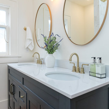
This bathroom was proudly designed and built by Vineuve. We spared no expense on its transformation and the result has been well worth the care and effort. We prioritized function, longevity, and a clean, bright aesthetic while preserving the existing character of the space.
 Vineuve Construction Inc.
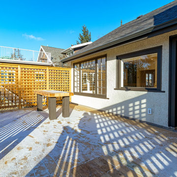
This Deck was proudly designed and built by Vineuve. We spared no expense on its transformation and the result has been well worth the care and effort. We prioritized function, longevity, and a clean, bright aesthetic while preserving the existing character of the space

Sponsored
Columbus, OH

Structural Remodeling
Franklin County's Heavy Timber Specialists | Best of Houzz 2020!
 Clifton Leung Design Workshop - CLDW.com.hk
Scandi-crafted Home Interiors in Dynasty Court
Tucked away atop of the Victoria Peak behind Hong Kong's unrelenting hustle and bustle, the residences found along Old Peak Road have been known to offer an oasis just within reach of the city. Set at the western point of Hong Kong Island, this panoramic neighbourhood boasts beautiful views over the town, hiking trails galore, and some of the city's priciest homes. Given its regarded status, it's of little surprise that those who live atop of The Peak chose to renovate rather than relocate as the years go by.
Having worked with Clifton, ten years prior, the homeowner of the Dynasty Court Residence believed it to be time for his 1,794sq.ft three-bedroom apartment to be given a complete and total facelift. Built back in the '90s, the residence had been updated once before through Clifton's services, but with a new chapter of retirement drawing nearer, the desire for a modern touch presented itself once again – this time with inspiration from Scandinavian interiors.
Given the instructions to keep the prior design of architectural and office feel but update everything, CLDW took on the role of refurbisher to their repeat client, this time however with a more curved and coloured approach than the boxey one before it.
With the brief of out with the old, in with the new underway, Clifton and his team set out to deploy a modern feel to the apartment with updates to everything from the floors, walls, doors and even the appliances – prioritizing functionality and simplicity. As the kitchen had been left out of the past retouch, this time around with retirement underway in was more important to give the couple a contemporary space to explore their culinary skills. Rounded chairs and tables complement the more square-like feel of the room, with washed grey tiles and soft tan cabinets.
Meanwhile, the living room and dining room were under the instructions to be void of paintings and wall decorations – with the exception of the past CD changer – as the focal point of the rooms was to remain the spectacular view which looks down upon Hong Kong's Central district all the way to the Kowloon harbourside. Again, curvey furniture can be seen among the interiors, with rounded sofas, chairs and even the coffee table. The furniture – much like the interiors – remains minimalist, as the homeowners require little to no storage space, a rare thing indeed for Hong Kong.
Inside the master bedroom, the updated lighting remains concealed within the walls as another finely executed play on curves from Clifton, which ensures minimalism. Over to the guest bedroom/study, more brown tones can be seen for an Earthy feel for guests, and the Mrs of the house to do her exercises.
With Scandinavian design and minimalism being one of the most popular trends of modern interior design, it takes a true professional to understand its principals of warm and natural palettes, while not too overpowering and bright. Ever present in the Dynasty Court home is the maximization of natural light, which gives it an airy environment a house at the Peak most certainly deserves.
 Vineuve Construction Inc.
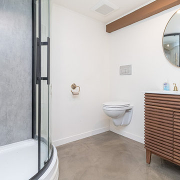
This basement suite bathroom was proudly designed and built by Vineuve. We spared no expense on its transformation and the result has been well worth the care and effort. We prioritized function, longevity, and a clean, bright aesthetic while preserving the existing character of the space
 Vineuve Construction Inc.
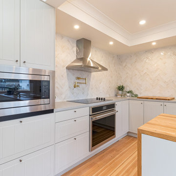
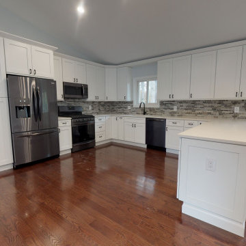
This kitchen was proudly designed and built by Vineuve. We spared no expense on its transformation and the result has been well worth the care and effort. We prioritized function, longevity, and a clean, bright aesthetic while preserving the existing character of the space.
 D'CASSA
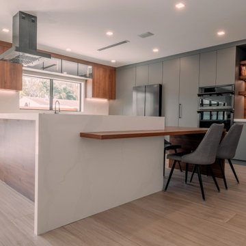
Are you in search of a modern kitchen design that combines functionality and style seamlessly? Look no further! Our latest project boasts a perfect fusion of warm wood textures and sleek grey lacquer details. Here’s what you can expect:
Design Highlights:
Wood and Grey Lacquer Harmony: This modern kitchen design harmoniously blends the warmth of wood with the sophistication of dark grey lacquer. This combination enhances both the coziness and contemporary aesthetics of the space.
Glass and Metal Cabinets: The kitchen cabinets feature transparent glass and polished metal surfaces. This not only adds a touch of modern elegance but also allows you to showcase your kitchenware.
Custom Display Bar: A standout feature of this kitchen project is the custom-designed display bar. It provides a stylish space for entertaining guests or celebrating special moments.
Functionality and Comfort: Beyond aesthetics, this kitchen project prioritizes functionality. Ample countertop space, modern kitchen appliances, and storage options are thoughtfully integrated to make your daily life easier.
This modern kitchen design aims to create a space that is both aesthetically stunning and practical. The perfect balance between wood and grey lacquer creates an inviting atmosphere, while the specially crafted display bar adds an element of fun and sophistication to your kitchen experience. Let’s bring style and functionality together with this modern kitchen design.
For more information and customization options, please don’t hesitate to reach out. We would be delighted to help you bring the perfect kitchen design to life.
 Drury Design
The Setup:
After purchasing this home, the homeowners faced a unique opportunity to reimagine their kitchen and nearby spaces. Water damage from a burst pipe had left much of the home’s interior in need of repair, and while the existing kitchen was functional and in relatively good shape, it didn’t align with the family’s vision for their new home. The layout included a peninsula that wasn’t ideal, and there were some druthers with the nearby pantry.
Since the space needed to be rebuilt anyway, the homeowners saw this as a chance to create a kitchen that was both highly functional for their four young children and timeless in its design. The project also included a refresh of the adjacent message center and dining room — spaces that play key roles in the family’s daily life. The goal was to create a cohesive flow between these areas, balancing modern functionality with the craftsman-inspired character of the rest of the home.
Design Objectives:
- Replace the outdated peninsula with a large island to maximize counter space and create new seating options.
- Open up the space visually by removing soffits and rethinking the cabinetry layout.
Incorporate concealed refrigeration and freezer units to provide significant storage for the family while maintaining a streamlined aesthetic.
- Integrate black cabinetry into the design without making the space feel harsh or heavy.
- Ensure the lighting plan balances functional task lighting with ambient accent lighting.
- Avoid visual clutter in the cabinetry design while still giving a nod to the craftsman aesthetic.
- Incorporate a slab backsplash as a key design feature.
Design Challenges:
- The outdated peninsula left dead space in the kitchen and lacked sufficient seating for the family.
- The cooktop wall was cramped, with small cabinets flanking the hood, limited storage, and soffits that made the space feel closed-in.
- The family needed significant refrigeration space (two refrigerators and a freezer) but wanted to avoid a cluttered look with visible stainless steel appliances.
- Adding black cabinetry risked making the space feel too dark or heavy.
- The original lighting plan was insufficient, particularly over the dining table where a decorative fixture proved too dim.
- The family wanted shaker-style drawer fronts to match the home’s arts-and-crafts design but worried that too much shaker cabinetry might look overly busy.
- Prioritizing a slab backsplash in the wish list priority planning.
The Renewed Space
Design Solutions:
- A functional island: The peninsula was replaced with a large island that provides continuous countertop space for prepping and serving. The island also features seating for four people, creating a central hub for informal meals and activities.
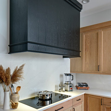
- Streamlined cooktop wall: The soffits were removed, and the upper cabinets on the cooktop wall were eliminated to create a more open, streamlined design. A custom oversized hood became the focal point of the wall, with the blower unit offset inside it to align with the cooktop while maintaining exterior visual symmetry.
- Concealed refrigeration: Two column refrigerators and one freezer were integrated into the cabinetry, concealing them behind wood paneling that blends seamlessly with the overall design.
- Warm black cabinetry: The black cabinetry was crafted from hickory with a visible grain, softening its appearance and adding warmth. The grain detail gives the cabinetry a rich, textured look that avoids feeling stark or overpowering.
- Additional lighting: In the dining area, recessed can lights were added during an additional installation phase to supplement the gorgeous decorative fixture’s dim output. The new lighting plan creates a layered effect, combining functional task lighting with softer ambient lighting.
- Simplified cabinetry details: Slab drawer fronts were used on the upper drawers, while five-piece shaker fronts (with slightly less prominent rail and stile pieces) were reserved for the middle and lower drawers. This approach simplified the overall look while maintaining the craftsman-inspired aesthetic.
- Slab backsplash priority: The slab backsplash was prioritized by making thoughtful adjustments elsewhere, like opting not to extend cabinetry to the ceiling, which also helped visually prioritize the gorgeous slab backsplash. This decision also enhanced the kitchen’s furniture-like feel, aligning with the home’s craftsman character.
- This kitchen perfectly balances practicality with timeless style. By addressing the family’s functional needs — ample seating, smart storage, and effective lighting — while incorporating thoughtful design elements like warm black cabinetry and a striking slab backsplash, Alicia created a space that works beautifully for a busy household. The result is a cohesive, inviting kitchen that honors the home’s craftsman roots and will serve the family well for years to come.
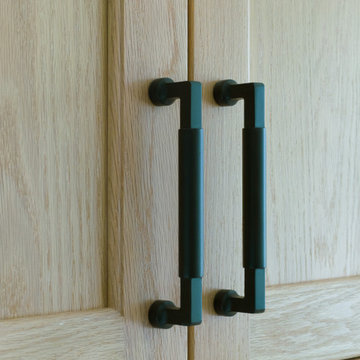 Drury Design
The Setup:
After purchasing this home, the homeowners faced a unique opportunity to reimagine their kitchen and nearby spaces. Water damage from a burst pipe had left much of the home’s interior in need of repair, and while the existing kitchen was functional and in relatively good shape, it didn’t align with the family’s vision for their new home. The layout included a peninsula that wasn’t ideal, and there were some druthers with the nearby pantry.
Since the space needed to be rebuilt anyway, the homeowners saw this as a chance to create a kitchen that was both highly functional for their four young children and timeless in its design. The project also included a refresh of the adjacent message center and dining room — spaces that play key roles in the family’s daily life. The goal was to create a cohesive flow between these areas, balancing modern functionality with the craftsman-inspired character of the rest of the home.
Design Objectives:
- Replace the outdated peninsula with a large island to maximize counter space and create new seating options.
- Open up the space visually by removing soffits and rethinking the cabinetry layout.
Incorporate concealed refrigeration and freezer units to provide significant storage for the family while maintaining a streamlined aesthetic.
- Integrate black cabinetry into the design without making the space feel harsh or heavy.
- Ensure the lighting plan balances functional task lighting with ambient accent lighting.
- Avoid visual clutter in the cabinetry design while still giving a nod to the craftsman aesthetic.
- Incorporate a slab backsplash as a key design feature.
Design Challenges:
- The outdated peninsula left dead space in the kitchen and lacked sufficient seating for the family.
- The cooktop wall was cramped, with small cabinets flanking the hood, limited storage, and soffits that made the space feel closed-in.
- The family needed significant refrigeration space (two refrigerators and a freezer) but wanted to avoid a cluttered look with visible stainless steel appliances.
- Adding black cabinetry risked making the space feel too dark or heavy.
- The original lighting plan was insufficient, particularly over the dining table where a decorative fixture proved too dim.
- The family wanted shaker-style drawer fronts to match the home’s arts-and-crafts design but worried that too much shaker cabinetry might look overly busy.
- Prioritizing a slab backsplash in the wish list priority planning.
The Renewed Space
Design Solutions:
- A functional island: The peninsula was replaced with a large island that provides continuous countertop space for prepping and serving. The island also features seating for four people, creating a central hub for informal meals and activities.
- Streamlined cooktop wall: The soffits were removed, and the upper cabinets on the cooktop wall were eliminated to create a more open, streamlined design. A custom oversized hood became the focal point of the wall, with the blower unit offset inside it to align with the cooktop while maintaining exterior visual symmetry.
- Concealed refrigeration: Two column refrigerators and one freezer were integrated into the cabinetry, concealing them behind wood paneling that blends seamlessly with the overall design.
- Warm black cabinetry: The black cabinetry was crafted from hickory with a visible grain, softening its appearance and adding warmth. The grain detail gives the cabinetry a rich, textured look that avoids feeling stark or overpowering.
- Additional lighting: In the dining area, recessed can lights were added during an additional installation phase to supplement the gorgeous decorative fixture’s dim output. The new lighting plan creates a layered effect, combining functional task lighting with softer ambient lighting.
- Simplified cabinetry details: Slab drawer fronts were used on the upper drawers, while five-piece shaker fronts (with slightly less prominent rail and stile pieces) were reserved for the middle and lower drawers. This approach simplified the overall look while maintaining the craftsman-inspired aesthetic.
- Slab backsplash priority: The slab backsplash was prioritized by making thoughtful adjustments elsewhere, like opting not to extend cabinetry to the ceiling, which also helped visually prioritize the gorgeous slab backsplash. This decision also enhanced the kitchen’s furniture-like feel, aligning with the home’s craftsman character.
- This kitchen perfectly balances practicality with timeless style. By addressing the family’s functional needs — ample seating, smart storage, and effective lighting — while incorporating thoughtful design elements like warm black cabinetry and a striking slab backsplash, Alicia created a space that works beautifully for a busy household. The result is a cohesive, inviting kitchen that honors the home’s craftsman roots and will serve the family well for years to come.


 Mayflower Construction Group
How to Tell When a Design Trend is Timeless
Design trends come and go, but some styles withstand the test of time. Whether in architecture, interior design, or branding, timeless design is one that remains relevant and appealing for decades. But how can you tell if a trend is truly timeless or just a fleeting fad? Here are key indicators to help you identify designs that will never go out of style.
1. Simplicity Over Complexity
Timeless designs are often clean, simple, and functional. They avoid excessive ornamentation or gimmicky elements that might feel outdated in a few years. Classic materials, neutral color palettes, and well-balanced proportions contribute to a look that remains fresh over time.
2. Rooted in Functionality
If a design prioritizes function as much as form, it is more likely to endure. Practicality and usability should be at the core, ensuring that the design continues to serve its purpose efficiently. In construction, for example, well-planned layouts and durable materials contribute to long-lasting appeal.
3. Inspired by Nature
Natural elements, such as stone, wood, and earth tones, have always been a staple of timeless design. Since nature itself is everlasting, incorporating organic textures and colors helps create a look that never feels outdated.
4. Influenced by History, Not Hype
Timeless designs often take cues from historical influences that have proven their longevity. Architectural styles like mid-century modern, classical, and industrial remain relevant because they have strong foundations in design principles rather than passing fads.
5. Balanced and Harmonious Composition
Good design follows fundamental principles such as symmetry, proportion, and scale. If a trend maintains a sense of balance and harmony, it’s more likely to stand the test of time. Designs that feel chaotic or unbalanced tend to fade quickly as they become overwhelming or impractical.
6. Adaptability Across Different Eras
A timeless design is versatile enough to blend with evolving styles and trends. Whether paired with modern elements or classic details, it should integrate seamlessly without looking out of place.
7. Enduring Materials and Craftsmanship
Materials and craftsmanship play a major role in a design’s longevity. High-quality materials like marble, hardwood, and concrete age beautifully, while cheap, synthetic alternatives often deteriorate and lose appeal. Investing in quality ensures a long-lasting impact.
8. Avoiding Overly Trendy Details
Fads are often characterized by extreme variations in color, form, or material. If a design heavily relies on a specific moment’s aesthetic (like neon colors in the '80s or millennial pink in the 2010s), it will likely feel outdated once the hype fades.
9. Emotional Connection and Comfort
Timeless design tends to evoke a sense of comfort, nostalgia, or familiarity. Whether in architecture, web design, or fashion, people gravitate toward designs that make them feel at ease and connected to something meaningful.
Conclusion
The key to identifying a timeless design trend is recognizing qualities that prioritize longevity, function, and balance over fleeting hype. Whether designing a website, a home, or a brand identity, choosing elements that are simple, high-quality, and adaptable will ensure lasting appeal.
Do you want a design that stands the test of time? Let’s create something that never goes out of style!
 Drury Design
The Setup:
After purchasing this home, the homeowners faced a unique opportunity to reimagine their kitchen and nearby spaces. Water damage from a burst pipe had left much of the home’s interior in need of repair, and while the existing kitchen was functional and in relatively good shape, it didn’t align with the family’s vision for their new home. The layout included a peninsula that wasn’t ideal, and there were some druthers with the nearby pantry.
Since the space needed to be rebuilt anyway, the homeowners saw this as a chance to create a kitchen that was both highly functional for their four young children and timeless in its design. The project also included a refresh of the adjacent message center and dining room — spaces that play key roles in the family’s daily life. The goal was to create a cohesive flow between these areas, balancing modern functionality with the craftsman-inspired character of the rest of the home.
Design Objectives:
- Replace the outdated peninsula with a large island to maximize counter space and create new seating options.
- Open up the space visually by removing soffits and rethinking the cabinetry layout.
Incorporate concealed refrigeration and freezer units to provide significant storage for the family while maintaining a streamlined aesthetic.
- Integrate black cabinetry into the design without making the space feel harsh or heavy.
- Ensure the lighting plan balances functional task lighting with ambient accent lighting.
- Avoid visual clutter in the cabinetry design while still giving a nod to the craftsman aesthetic.
- Incorporate a slab backsplash as a key design feature.
Design Challenges:
- The outdated peninsula left dead space in the kitchen and lacked sufficient seating for the family.
- The cooktop wall was cramped, with small cabinets flanking the hood, limited storage, and soffits that made the space feel closed-in.
- The family needed significant refrigeration space (two refrigerators and a freezer) but wanted to avoid a cluttered look with visible stainless steel appliances.
- Adding black cabinetry risked making the space feel too dark or heavy.
- The original lighting plan was insufficient, particularly over the dining table where a decorative fixture proved too dim.
- The family wanted shaker-style drawer fronts to match the home’s arts-and-crafts design but worried that too much shaker cabinetry might look overly busy.
- Prioritizing a slab backsplash in the wish list priority planning.
The Renewed Space
Design Solutions:
- A functional island: The peninsula was replaced with a large island that provides continuous countertop space for prepping and serving. The island also features seating for four people, creating a central hub for informal meals and activities.
- Streamlined cooktop wall: The soffits were removed, and the upper cabinets on the cooktop wall were eliminated to create a more open, streamlined design. A custom oversized hood became the focal point of the wall, with the blower unit offset inside it to align with the cooktop while maintaining exterior visual symmetry.
- Concealed refrigeration: Two column refrigerators and one freezer were integrated into the cabinetry, concealing them behind wood paneling that blends seamlessly with the overall design.
- Warm black cabinetry: The black cabinetry was crafted from hickory with a visible grain, softening its appearance and adding warmth. The grain detail gives the cabinetry a rich, textured look that avoids feeling stark or overpowering.
- Additional lighting: In the dining area, recessed can lights were added during an additional installation phase to supplement the gorgeous decorative fixture’s dim output. The new lighting plan creates a layered effect, combining functional task lighting with softer ambient lighting.
- Simplified cabinetry details: Slab drawer fronts were used on the upper drawers, while five-piece shaker fronts (with slightly less prominent rail and stile pieces) were reserved for the middle and lower drawers. This approach simplified the overall look while maintaining the craftsman-inspired aesthetic.
- Slab backsplash priority: The slab backsplash was prioritized by making thoughtful adjustments elsewhere, like opting not to extend cabinetry to the ceiling, which also helped visually prioritize the gorgeous slab backsplash. This decision also enhanced the kitchen’s furniture-like feel, aligning with the home’s craftsman character.
- This kitchen perfectly balances practicality with timeless style. By addressing the family’s functional needs — ample seating, smart storage, and effective lighting — while incorporating thoughtful design elements like warm black cabinetry and a striking slab backsplash, Alicia created a space that works beautifully for a busy household. The result is a cohesive, inviting kitchen that honors the home’s craftsman roots and will serve the family well for years to come.
 DJ's Home Improvements
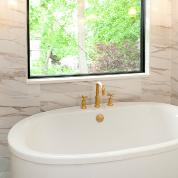
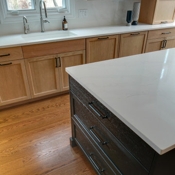
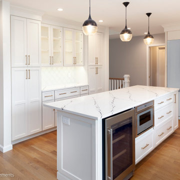
Experience the epitome of luxury living with our Whole House Remodel. This ambitious project breathes new life into every corner, turning your residence into a masterpiece of modern design. Immerse yourself in a harmonious blend of contemporary style and timeless comfort. Witness the seamless integration of premium materials, bespoke finishes, and innovative layouts that redefine the concept of home. This total overhaul extends beyond aesthetics, prioritizing functionality and practicality to create a living environment that caters to every need.
 Drury Design
The Setup:
After purchasing this home, the homeowners faced a unique opportunity to reimagine their kitchen and nearby spaces. Water damage from a burst pipe had left much of the home’s interior in need of repair, and while the existing kitchen was functional and in relatively good shape, it didn’t align with the family’s vision for their new home. The layout included a peninsula that wasn’t ideal, and there were some druthers with the nearby pantry.
Since the space needed to be rebuilt anyway, the homeowners saw this as a chance to create a kitchen that was both highly functional for their four young children and timeless in its design. The project also included a refresh of the adjacent message center and dining room — spaces that play key roles in the family’s daily life. The goal was to create a cohesive flow between these areas, balancing modern functionality with the craftsman-inspired character of the rest of the home.
Design Objectives:
- Replace the outdated peninsula with a large island to maximize counter space and create new seating options.
- Open up the space visually by removing soffits and rethinking the cabinetry layout.
Incorporate concealed refrigeration and freezer units to provide significant storage for the family while maintaining a streamlined aesthetic.
- Integrate black cabinetry into the design without making the space feel harsh or heavy.
- Ensure the lighting plan balances functional task lighting with ambient accent lighting.
- Avoid visual clutter in the cabinetry design while still giving a nod to the craftsman aesthetic.
- Incorporate a slab backsplash as a key design feature.
Design Challenges:
- The outdated peninsula left dead space in the kitchen and lacked sufficient seating for the family.
- The cooktop wall was cramped, with small cabinets flanking the hood, limited storage, and soffits that made the space feel closed-in.
- The family needed significant refrigeration space (two refrigerators and a freezer) but wanted to avoid a cluttered look with visible stainless steel appliances.
- Adding black cabinetry risked making the space feel too dark or heavy.
- The original lighting plan was insufficient, particularly over the dining table where a decorative fixture proved too dim.
- The family wanted shaker-style drawer fronts to match the home’s arts-and-crafts design but worried that too much shaker cabinetry might look overly busy.
- Prioritizing a slab backsplash in the wish list priority planning.
The Renewed Space
Design Solutions:
- A functional island: The peninsula was replaced with a large island that provides continuous countertop space for prepping and serving. The island also features seating for four people, creating a central hub for informal meals and activities.
- Streamlined cooktop wall: The soffits were removed, and the upper cabinets on the cooktop wall were eliminated to create a more open, streamlined design. A custom oversized hood became the focal point of the wall, with the blower unit offset inside it to align with the cooktop while maintaining exterior visual symmetry.
- Concealed refrigeration: Two column refrigerators and one freezer were integrated into the cabinetry, concealing them behind wood paneling that blends seamlessly with the overall design.
- Warm black cabinetry: The black cabinetry was crafted from hickory with a visible grain, softening its appearance and adding warmth. The grain detail gives the cabinetry a rich, textured look that avoids feeling stark or overpowering.
- Additional lighting: In the dining area, recessed can lights were added during an additional installation phase to supplement the gorgeous decorative fixture’s dim output. The new lighting plan creates a layered effect, combining functional task lighting with softer ambient lighting.
- Simplified cabinetry details: Slab drawer fronts were used on the upper drawers, while five-piece shaker fronts (with slightly less prominent rail and stile pieces) were reserved for the middle and lower drawers. This approach simplified the overall look while maintaining the craftsman-inspired aesthetic.
- Slab backsplash priority: The slab backsplash was prioritized by making thoughtful adjustments elsewhere, like opting not to extend cabinetry to the ceiling, which also helped visually prioritize the gorgeous slab backsplash. This decision also enhanced the kitchen’s furniture-like feel, aligning with the home’s craftsman character.
- This kitchen perfectly balances practicality with timeless style. By addressing the family’s functional needs — ample seating, smart storage, and effective lighting — while incorporating thoughtful design elements like warm black cabinetry and a striking slab backsplash, Alicia created a space that works beautifully for a busy household. The result is a cohesive, inviting kitchen that honors the home’s craftsman roots and will serve the family well for years to come.
 DJ's Home Improvements
Experience the epitome of luxury living with our Whole House Remodel. This ambitious project breathes new life into every corner, turning your residence into a masterpiece of modern design. Immerse yourself in a harmonious blend of contemporary style and timeless comfort. Witness the seamless integration of premium materials, bespoke finishes, and innovative layouts that redefine the concept of home. This total overhaul extends beyond aesthetics, prioritizing functionality and practicality to create a living environment that caters to every need.
 Sidler Designs
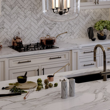
As your interior designer, I've crafted an eclectic living space that seamlessly blends style and comfort. The open-concept layout promotes connection, while the sophisticated color palette of whites, charcoals, and warm woods creates a inviting atmosphere. Thoughtful lighting, including statement pendants and ample natural light, enhances the ambiance. Textured elements and curated decor add personality without clutter. Greenery brings life to the space, complementing the views outside. This design doesn't just look beautiful—it transforms your daily living, fostering relaxation and joy. My approach creates a harmonious environment that reflects your unique style while prioritizing functionality, truly elevating your home life.
 D'CASSA
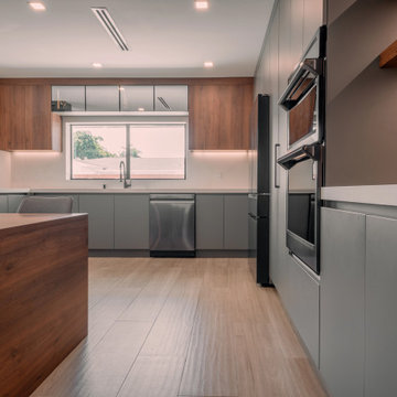
Are you in search of a modern kitchen design that combines functionality and style seamlessly? Look no further! Our latest project boasts a perfect fusion of warm wood textures and sleek grey lacquer details. Here’s what you can expect:
Design Highlights:
Wood and Grey Lacquer Harmony: This modern kitchen design harmoniously blends the warmth of wood with the sophistication of dark grey lacquer. This combination enhances both the coziness and contemporary aesthetics of the space.
Glass and Metal Cabinets: The kitchen cabinets feature transparent glass and polished metal surfaces. This not only adds a touch of modern elegance but also allows you to showcase your kitchenware.
Custom Display Bar: A standout feature of this kitchen project is the custom-designed display bar. It provides a stylish space for entertaining guests or celebrating special moments.
Functionality and Comfort: Beyond aesthetics, this kitchen project prioritizes functionality. Ample countertop space, modern kitchen appliances, and storage options are thoughtfully integrated to make your daily life easier.
This modern kitchen design aims to create a space that is both aesthetically stunning and practical. The perfect balance between wood and grey lacquer creates an inviting atmosphere, while the specially crafted display bar adds an element of fun and sophistication to your kitchen experience. Let’s bring style and functionality together with this modern kitchen design.
For more information and customization options, please don’t hesitate to reach out. We would be delighted to help you bring the perfect kitchen design to life.
8