
Search results for "Problem solving" in Home Design Ideas
 Black Rock Design | Build
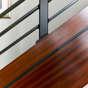
Purchased in a very dated style, these homeowners came to us to solve their remodeling problems! We redesigned the flow of the home to reflect their family's needs and desires. Now they have a masterpiece!
 DAPPLED EARTH– designs to nurture life!
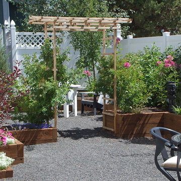
Cottage garden with lots of room for socializing and it solved a drainage problem. Under the gravel is storage and seepage for the surface flows that come to the property from the neighbors and has nowhere to go.
 Arclinea NY
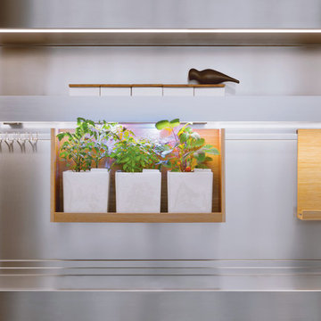
Are you a New Yorker with limited space who'd love to grow your food? Arclinea solved that problem. Check out our LED Greenhouse lights that help grow fresh produce in the heart of your kitchen.
Find the right local pro for your project
 Building Shelter Inc
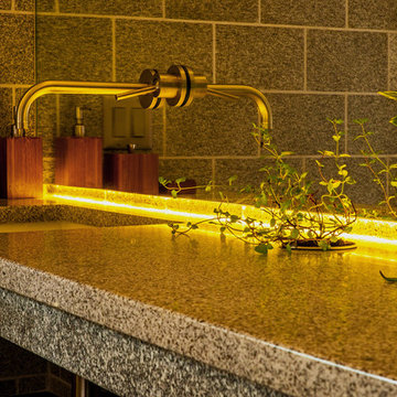
As code begins to require tighter and tighter houses we are locked in with chemicals that are used to build, decorate, furnish and clean our homes. This project was a stab at solving this significant health problem. Here are some key features that helped us create this self-purifying master bathroom:
- Air Purifying Paint
- Air Filtering Plants as per NASA research (pots cut into stone countertops)
- Low Energy indirect LED light strips
- Low VOC materials used throughout including underlayment, glues & grout
- Water-blown spray foam insulation
Photography: Gil Jacobs
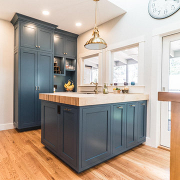
 RG Cowan Design Build
The History Modernized project was designed to solve the problem of a complicated and confined kitchen space in a beautiful turn of the century home. Our clients need for functionality, maximum use of space, and beauty led us to an amazing split kitchen design that allowed for two usable, overlapping work zones in an odd and elongated space.
Within this design we were able to open the kitchen to the existing dining area and create bar seating on the dining room side of the kitchen while modernizing the openness of the plan. Personally, we think function and Beauty tied on this one!
 Roeser Home Remodeling
This young couple in Glendale loved their home and their neighborhood, but with three growing children they felt they were running out of space. They began a list of needs which quickly grew after a couple of years. This list helped them to see how they used their current space, but also helped them identify what was lacking.
Their needs list quickly revealed that a two-story addition would be needed to fit all the family’s requirements. With much thought and discussion, a design was created by the Roeser Team in collaboration with Ann Begemann, architect. It was important to the homeowner that the design fit the look of the house. This is always a top priority for Roeser Home Remodeling. We pride ourselves in our finish product appearing as if it had always been there and especially in this remodel, we think we succeeded.
On the list of this family’s needs were to have ample storage space for the three children’s school and sporting equipment. A wider entrance hallway from the garage and the backyard provided a unique place to build custom locker spaces, along with a communication station that will close nice and neat when company is expected. Drawer units also give extra storage and allow for a filing system to keep track of all the paper work that comes home. Extra cabinets above the lockers provide much needed additional storage for out of season belongings. A 12 X 24 S140 tile floor laid in a broken joint pattern provides for easy cleaning of this space and keeps dirty shoes or boots from finding its way into the main living quarters.
The kitchen was at the top of the priority list for this family as well. The existing kitchen was just too small and narrow and did not allow for an eat-in kitchen, or an adequate workspace for the family. Since the homeowner loves to cook, our Roeser Home Remodeling designer came up with a beautiful design plan that allowed for both. The kitchen was moved to the addition, and the existing kitchen was remodeled with a breakfast nook, housing both a custom bench and a table with chairs, along with a pantry and dry bar. This was the perfect plan and now allows the homeowner to have seating and storage for the family and entertaining.
The custom bench was built to match a picture the homeowner had and was custom produced in our own little mill shop. A drawer on both sides of the bench is handy for any extra storage items that the family may need seasonally.
The kitchen quickly became a favorite with the Roeser Home Remodeling Team. With the mix of metals and the many extra features in this space, this kitchen is full of interest as well as function.
The perimeter cabinets are Wellborn Cabinet’s Premier Line, Charleston maple door style with glacier pewter finish. A Kohler Apron Front smart divide sink adds to the design and function of this beautiful kitchen.
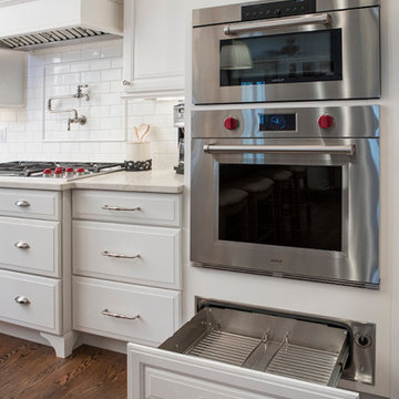
A wall mount pot filler hovers above a Wolfe five-burner stove top. The Wellborn hood unit passes the cabinet depth of the upper cabinets and compliments the Wellborn drawer unit underneath. Deeper drawers housed the 36” Wolf, five-burner professional gas stove top and added more storage. The addition of feet to the bottom of the drawer unit along with pushing back the toe kick gives an added detail and look of a furniture piece.
Flanking each end of the perimeter of cabinets are high end appliances. The 42” built-in French Door Sub-Zero Refrigerator/Freezer is left of the sink and concealed by Wellborn appliance panels. The Bosch 800 Series Dishwasher next in line is also concealed by a Wellborn appliance panel. However, the 30” Professional Wolf Oven and the 30” M Series Wolf Professional Convection Steam Oven sparkle with their stainless-steel finishes complimenting the Kohler Artifacts pull-down kitchen faucet, the Kohler Artifacts Pot Filler and the Top Knobs Hardware (Normandy Appliance Pulls in Polished Nickel, Button Faced Knob in Polish Nickel and the Tuscany Small D- Pull in Pewter Antique). A 30” Kitchen-Aid electric warming drawer is concealed by a Wellborn Drawer front and Top Knob hardware.
The Quartzite counter top in Taj Mahal is always an eye-catching feature for this beautiful kitchen. The large space of the island shows off its remarkable beauty. The island stands on its own with a custom design using Wellborn Cabinets Premier Line, Charleston maple door style in a Pebble Java finish, a darker finish cabinet not only serves as a focal point, but also warms the room against its starker contrast. The island houses a Sharp microwave drawer and its hardware is the same Tuscany small D-Pull as the rest of the kitchen, but in a German Bronze finish to compliment the island’s Hudson Valley Orchard Park light in an Aged Brass Finish.
The original half bath was the only bathroom on this floor of the house and the expense to move it was not an option. The location of the bathroom in the middle of the house was problematic. Roeser Home Remodeling solved the problem by creating an opening between the living room and new family room, along with giving the illusion of a small hallway behind the dry bar in the breakfast room. This created a nice space going into the living room and gave the feeling of an open floor plan, providing and a nice private entry to the existing half bath.
Updating the bath with wallpaper, a new Barclay- Stanford Pedestal Sink, a new Portsmouth wide-spread faucet in polished nickel, a new Devonshire comfort height toilet, new towel ring, paper holder, lighting and mirror made this cute little powder room a jewel in its own right!
The family room was also housed in the addition as a family hang-out place for homework, games and movie watching. Two sets of Sierra Pacific 6’0” X 6’8” aluminum clad wood French Sliding Patio Doors were installed to invite the outdoors in. This allowed for natural lighting and an open spacious feel to the room.
A Custom Entertainment Unit built by Roeser Home Remodeling in our mill shop, is the perfect space to house all the family’s television and gaming needs, keeping them neatly stored, but also close at hand.
Opposite of the French Doors is the original opening to the backyard. By keeping the opening and installing beautiful glass doors, it opened the flow of the house to the formal living room. By adding the glass doors, it provided a cozy area for quiet adult conversation while keeping an eye on the children as they play or watch TV.
 Black Rock Design | Build
Purchased in a very dated style, these homeowners came to us to solve their remodeling problems! We redesigned the flow of the home to reflect their family's needs and desires. Now they have a masterpiece!
 Petrick Architecture
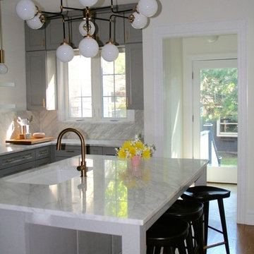
With help from my design-savvy client, I was able to create a stylish yet practical solution to her functional problems in the existing kitchen. The space was dark, cramped, and disorganized. While making dinner, she ran back and forth through a two-way door to communicate with her children in the family room. Backpacks and homework spilled into the kitchen and lights were on regardless of the time of day.
To solve these issues, we opened up the wall between the family room to improve communication and bring in more natural light. A mud room was defined by adding walls near the back door. We raised the ceiling to the original height and the new opening was trimmed to match all existing openings for a seamless design. Making dinner has a whole new outlook with a custom island that faces the family room and the warm southern sunlight. We finished it off embracing current trends with grey cabinets, marble counters with backsplash, brushed brass hardware and open shelving.
 C&R Remodeling
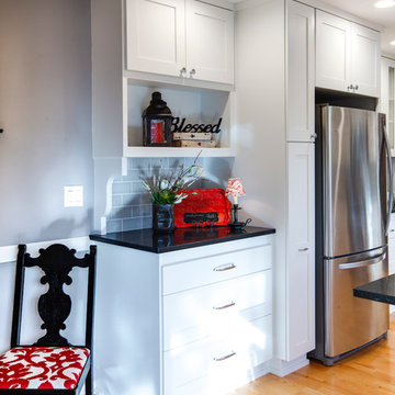
Our Interior Designers tell clients, “Be true to yourself, and you will love the results.” This kitchen remodel reflects that motto. The owners of this Salem area ranch home had a long-standing appreciation of the classic white, black, and red color combination. So when C&R Senior Interior Designer Linda Stewart selected the new color palette, she stayed close to that theme.
A challenge in nearly every older kitchen is the new refrigerator sizes. Remember the day when you could replace your refrigerator and the new one would fit perfectly in the existing space? Not anymore. Now, the super-sized refrigerators wreck havoc on most kitchen spaces. If, by luck, it happens to fit beneath the upper cabinet, it more than likely protrudes out into the room.
This kitchen had that issue. The refrigerator stuck out a good six inches from the cabinet edge, seriously affecting the visual flow. And with that much added depth, reaching the cabinet above was almost impossible.
C&R solved this problem with a custom cabinet and side pantry that extends the full depth of the refrigerator. This accomplished two good things: added architectural interest and a refrigerator proportional to the kitchen as a whole.
Terry Poe Photography
 JUMA architects
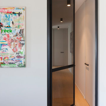
JUMA architects were contacted for the interior design of a shell-state apartment on the coast. The structural construction, the plastering, the floor screed and the technical fittings (heating ducts, plumbing, electricity and ventilation) of the apartment had already been realised.
It soon became apparent, however, that the assignment could not be limited to the interior decoration only, as the placement of kitchen, bathroom and dressing room in the existing plan turned out to be entirely impractical. More extensive renovation work was needed to meet the needs of the customer. The structure of the unit was therefore slightly adjusted to make the bathroom and dressing larger and more functional.
Also, the living room was dominated by a huge radiator that drew all the attention. To solve this problem, new pipes were laid to accommodate an integrated heating element in the sideboard. Gas pipes were fitted in the kitchen for the gas cooker which JUMA included in the design as a real eye-catcher. The sinks, in contrast, were given a more discreet placement.
Light oak parquet was selected for the floors throughout the apartment. The natural appearance of the wood gives all the rooms a warm feel. The built-in furniture was custom made and is finished in black satin lacquer to contrast the light-coloured wood. The dominant colour palette is deliberately kept very simple and neutral and is complemented with light grey tones and colour accents. The colour choice was in fact inspired by a beautiful picture of the coast.
The freestanding furniture and overall decorations were also selected or designed by JUMA architects. The arrangement of the seating area is very playful and atypical. JUMA did not want to put in a couch that would divide the space in two. The composition is meant to create a very open ambiance. A round table was chosen for the same reason. The round shape does not divide the space but allows fluid circulation.
Pictures © Liesbet Goetschalckx
 TOUCH Architect Co., Ltd.
PROJECT | Duplicate-Duplex
TYPE | private residence / home-studio
LOCATION | Phayathai Rd., Bangkok, Thailand
OWNER | Ms. Najaree Ratanajiajaroen / Chanon Treenet
ARCHITECT | TOUCH Architect Co.,Ltd.
FLOOR AREA | 64 sq.m.
FLOOR AREA (by proposing) | 75 sq.m.
COMPLETION | 2018
PHOTOGRAPHER | Chalermwat Wongchompoo
CONTRACTOR | Legend Construction Group
A major pain point of staying in 64 sq.m. of duplex condominium unit, which is used for a home-studio for an animator and an artist, is that there is not enough space for dwelling. Moreover, a double-volume space of living area with a huge glass curtain wall, faces West. High temperature occurs all day long, since it allows direct sunlight to come inside.
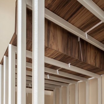
In order to solve both mentioned problems, three addition items are proposed which are, GRID PARTITION, EXTENSION DECK, and STEPPING SPACE.
A glass partition not only dividing space between kitchen and living, but also helps reduce electricity charge from air-condition. Grid-like of double glass frame is for stuff and stationery hanging, as to serve the owners’ activities.
Extension deck would help filtrating heat from direct sunlight, since an existing high glass facade facing West.
An existing staircase for going up to the second-floor bedroom, is added by a proposed space above, since this condominium unit has no enough space for dwelling or storage. In order to utilize the space in a small condominium, creating another staircase above the existing one helps increase the space.
The grid partition and the extension deck help ‘decrease’ the electricity charge, while the extension deck and the stepping space help ‘increase’ the space for 11 sq.m.
 Remodeling Contractors
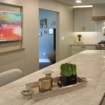
West Des Moines two story homes create challenges for homeowners with layouts including small rooms that don’t seem to flow together. The family that lives in this home found that entertaining and gathering in the kitchen was almost impossible with the current layout and asked for an addition to solve the problem. After listening to the challenges of that they faced and working with the homeowners, a new solution emerged without an addition, reducing the overall budget and allowing the whole main floor to be updated.
By removing the wall between the kitchen and dinning room, the team was able to design an island for family and friends to congregate around. Then by flanking the island with a large commercial range surrounded by a custom backsplash and custom hood a picture perfect kitchen was born. Lastly by repeating elements within the range hood, island and fireplace, the team was able to create unity throughout the space. This visually makes the space feel larger and feels like the addition was built
 Manning Design
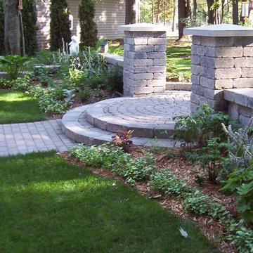
A gracious entry way was designed to highlight the front door, solve a water problem by building a low retaining wall, and create opportunities for perennial beds. Photo by Manning Design
 davewoo_house
David Woo Designs
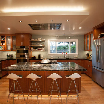
We really wanted an open design which completely reversed the claustrophobic feel of the old kitchen. The U-shape design is turned 90 degrees from the original kitchen. Now it faces the dining area which nicely blends the bar seating with kitchen table. For parties the kids can use the bar while the adults use the table.
We find having the range on the island allows the cooking to be done in front of guests while providing an abundance of work space and great flow around the island. The challenge in this design is avoiding the range hood blocking the view. We solved this problem by choosing an in-ceiling hood, the Cirrus by Best. This hood required more space in the ceiling than we had so a 6" drop box was made to accommodate the hood height. The box was made the same size as the island and included color LED lighting to provide an accent to the kitchen.
Instead of putting pendants over the island, which we had originally wanted, we installed mini pot lights to ensure the view across the island isn't disrupted. Four mini pot lights compliment the four bar seats and mini pendants were hung by the window over the sink instead.
 Reico Kitchen & Bath
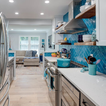
Designed by Akram Aljahmi of Reico Kitchen & Bath in King of Prussia, PA in collaboration with Property Remodeling Group, this transitional inspired kitchen design features white and grey finishes complemented by a bold splash of blue tile.
The kitchen design features Merillat Classic kitchen cabinets in Portrait door style with 5 piece drawer head in 2 finishes. The wall cabinets features a painted white Cotton finish and the base cabinets feature a painted grey Graphite finish. Kitchen countertops are engineered quartz in the color Carrera Marmi from Q by MSI. The kitchen also features a stunning blue herringbone tile back splash with 3x10 tiles.
According to the client, "Akram solved a fundamental function problem that I could not see a solution for. His re-imagining of how the main floor of our home could function was a dramatic shift that I can't wait to experience as part of day-to-day life. Really appreciate his space plan and layout, as well as his support selecting finishes. Akram and team were great to work with!".
Photos courtesy of BTW Images LLC.
 Noelle Johnson Landscape Consulting
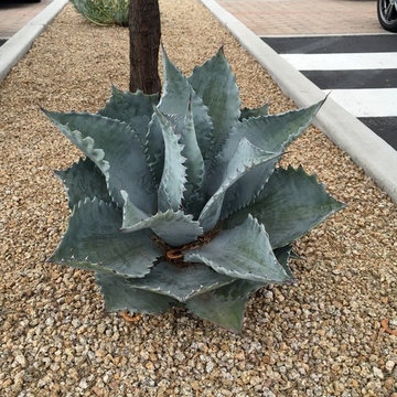
Garden travels. An agave makes a nice parking lot median planting.
Photo of a landscaping in Other.
Photo of a landscaping in Other.
 Labrador Interiors
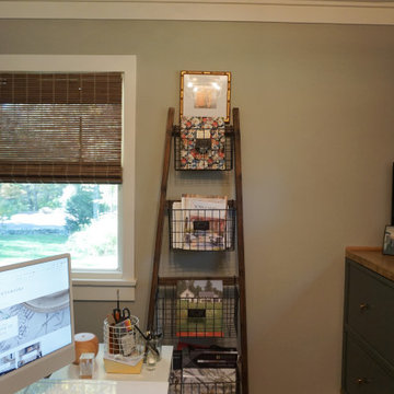
Running out of space in your home? Having a multipurpose room solves the problem! This room allows you to have an organized work space and a large walk in-closet. The key thing is to know what you need to satify both so you plan it out. So here is a "Cloffice"

 Drury Design
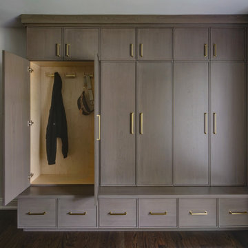
Some rooms never quite find their purpose. That was the case with this space, which had gradually become a combination home office, pantry overflow area, pet zone, and general catch-all for daily life. While it offered plenty of square footage, it wasn’t helping the homeowners stay organized, and valuable storage was scattered between an overcrowded pantry closet and various pieces of furniture throughout the room.
Having previously partnered with Drury Design on a kitchen remodel, these homeowners once again turned to Senior Designer Samantha Schoell to help them rethink how their home could better support the way they actually live. What began as a conversation about adding some cabinetry quickly evolved into a comprehensive storage solution — one designed to accommodate everything from groceries and sports equipment to pet supplies and everyday household essentials.
Design Objectives:
Create Organization: Consolidate pantry overflow, household supplies, and everyday essentials into a single, highly functional space.
Support Family Life: Provide dedicated storage for coats, bags, sports equipment, and the routines of an active household.
Accommodate Pets: Incorporate thoughtful features for the family’s dogs while maintaining a clean, organized appearance.
Maximize Existing Space: Transform an underutilized room without expanding the home’s footprint.
Maintain Flexibility: Preserve the room’s long-term versatility and appeal for future homeowners.
Design Challenges:
Multiple Functions: The room was being used simultaneously as a home office, pantry, storage area, and pet space without a cohesive organizational strategy.
Insufficient Pantry Storage: The nearby pantry closet had become overcrowded and difficult to navigate.
Visual Clutter: Everyday items, pet supplies, and household necessities lacked dedicated storage locations.
Unused Potential: Despite its generous size, the room was not contributing meaningfully to the home’s overall functionality.
Balancing Practicality and Style: The homeowners wanted substantial storage without creating a space that felt overly utilitarian.
Design Solutions:
Purpose-Built Storage Plan: Custom cabinetry was designed to support multiple functions within a unified storage system, allowing the room to serve as a mudroom, pantry extension, household hub, and pet station.
Expanded Pantry Capacity: Floor-to-ceiling cabinetry, a secondary refrigerator, and extensive drawer storage dramatically increased food storage and organization capabilities.
Hidden Organization: Closed cabinetry conceals household items, sports gear, pet supplies, and everyday clutter, creating a calm and orderly appearance.
Full-Room Transformation: Rather than simply adding cabinets to one wall, the design reimagined the entire room, utilizing its footprint to create a true family command center.
Furniture-Inspired Cabinetry: Warm wood finishes, decorative hardware, open display shelving, and thoughtful detailing elevate the room beyond pure utility, helping it feel like a natural extension of the home’s design.
The most successful remodeling projects often solve problems homeowners have simply learned to live with. In this case, a room that once served several purposes — but excelled at none — was transformed into one of the hardest-working spaces in the home.
Today, groceries, pet supplies, seasonal gear, household essentials, and daily routines all have a designated place. Even the family’s dogs were thoughtfully considered, with a built-in resting area integrated into the cabinetry. The result is a room that feels remarkably organized despite supporting countless everyday activities — a reflection of how thoughtful design can bring clarity, efficiency, and calm to the busiest parts of family life.
 Nested Interior Design
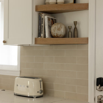
These floating white oak shelves solved a unique problem for our clients! Since the front door opens directly into the kitchen, bringing the upper cabinets all the way to the edge would have created a crowded headspace when entering/leaving the home. The solution was clear: floating shelves! Though, even with floating shelves we were concerned about a 90 degree corner and an unsuspecting guests' forehead one day colliding! Our fix was a custom curve, perfectly suited to maximize the depth & functionality of the shelves while eliminating any risk of a collision. We love how these additions turned out!
84