
Search results for "Proceed" in Home Design Ideas
 RBD Contracting Inc.
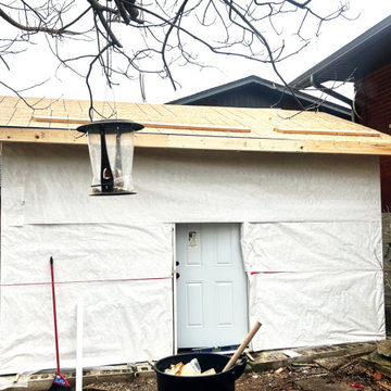
Our team successfully removed the previous metal structure for the homeowner. Following the debris clearance, we commenced the foundation footings. Once the foundation was completed, we proceeded with the construction of the wall framing and floor, allowing for the installation of the roof trusses. After boarding the framing and roof, we wrapped the structure in Tyvek weatherproofing and began the indoor work, including electrical, insulation, and drywall. The project was completed with the installation of new siding, eavestroughs, shingles, and a door, providing our clients with the multi-functional space they desired.
 Propel Studio Architecture
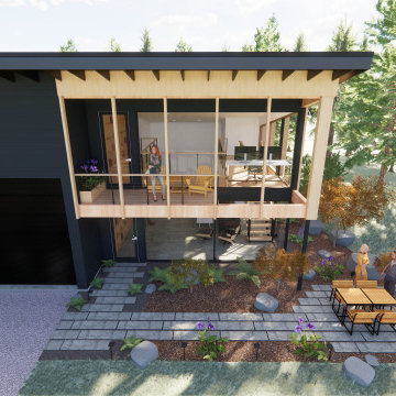
The existing under-utilized garage will be converted into a modern style home office & future ADU.
This detached residential home office & future accessory dwelling will serve as a focus work space, as well as an independent living space for family or guests to stay overnight with privacy from the main home. The interior has been personalized with an open lofted space and full height shelving for books or other storage. A custom design rolling library ladder will reinforce the library ambiance. The “Loft-brary” also utilizes a floor to ceiling corner glass window system, allowing it to be closely connected to the adjacent Japanese style landscaping.
Primarily serving as a home office studio, the interior is conceived to be open & spacious with lots of shared light, with a lofted upper floor work area taking advantage of views overlooking the adjacent valley. A small kitchen and full bathroom are provided with adequate space for the future bedroom.
Careful attention was given to the solar conditions of the building’s orientation, and an integrated exterior shading system is provided to mitigate the challenging afternoon sun.
A second floor covered exterior deck is provided to allow for year round fresh air work breaks. Propel was hired as architect and landscape designer on the project and we are currently exploring small variations in the plan before proceeding with full construction documentation, engineering, permitting and construction. Target completion is late summer 2022.
 Classic Kitchens Designs & Renovations Ltd.
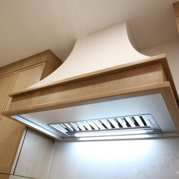
Our homeowner needed a kitchen update and removing a loadbearing support wall between the kitchen and Family room was essential to create the open concept feel they were looking for. Once the new beam was in, we proceeded to the installation of new Luxury Vinyl flooring followed by custom stained Alderwood, narrow rail cabinetry. Quartz countertops and backsplash, as well as Custom island with waterfall ends really added to the look. The addition of pendants over the island, potlights and undercabinets provided the final touches that make this kitchen shine!
Find the right local pro for your project
 RAJ Kitchen and Bath, LLC
 “Full apartment design”.
IF you have not yet seen this apartment conversion before, we strongly urge you to go to the bottom left of this page and click on the short 2-minutes video. It would put a lot of things into perspective when you come back and continue reading this.
It is true we were literally handed the keys and told a list of things that they wanted to have happen and we were to go into the apartment, look at the space and come up with a design that would satisfy all of that need. UNTIL we showed up! The unit had really seen some better days but we knew we had to look past that and come up with a concept that would work for them.
The immediate challenges were centered around 3 big ideas:
1. Adding a second bedroom to the already small footprint
2. Figuring out a way to make the kitchen bigger, better and brighter
3. Creating a master room walk in closet
It’s always difficult to add new rooms into existing footprint without expanding out or up and not incurring any opportunity cost. In this case, that was exactly what we had to do. Item one and two above had to be tackled as one. We went ahead and switched out the location of the dining room and eliminating an area where there was a “nook” type eat-in area. By doing so, we were able to cut right into that footprint and change the layout of the kitchen.
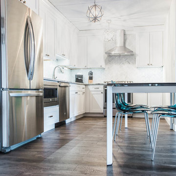
That one move allowed us to dig into the kitchen design because it was now the main focal point in the apartment. It was no longer an option to keep it in that tiny hole where it was, so we had to ensure that this design was functional and aesthetically pleasing at the same time. By adding the table into the space where an Island typically would go, we were able to both cut cost and still provide a dining experience. The Table serves as an Island as well when cooking.
We then proceeded to block in the existing doorway to the dining room. By doing this, we were able to create a full room which allowed us to put a door on the other side and called that room Bedroom #2. This was easier to do because all of the mechanicals were already in that space (light, heater and windows). By shifting things around, we also achieved a huge wall to wall closet from inside. PERFECT!
Then we moved into the Single bedroom. We thought it was a big room with a small closet, so by creatively adding an L shaped wall and steal some footprint into the bedroom side, we were able to put a door on that new room and design it for the walk-in closet. Even after this, the bedroom still holds a queen size bed with 2 night stands, a TV on the wall, a sitting chair and plenty of room to walk around. This was done by rethinking the location for the bed and night stands.
The bathroom was gutted to make sure there was no leaks and rebuild from the ground up. We kept all of the plumbing where it was, added a new vanity, medicine cabinet, tiles and lighting and it was done.
From there, the rest of the unit had new flooring all throughout, paint, and lighting. After completion and walk through, this project was handed over back to the clients.
Execution and collaboration between all the trades were: Reggie and his team from Premier Interiors and Rohan from RD Mechanical Services.
p.s. Please see our website to see the video.
 The Hamlin Group
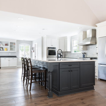
Our clients at River Chase had purchased a new home that while the size and location of the home were just what they were looking for, the dated kitchen needed some attention.
The planning process was key to this and every project, as the original kitchen had a dividing wall, the ceiling had a pitch, and pluming and venting would have to be moved. After a few design drawings and specifications of details the clients were requesting, we proceeded with tearing everything out and brought their kitchen and new great room into modern times.
Thanks for viewing -
The Hamlin Group team
 Division 9 Inc.
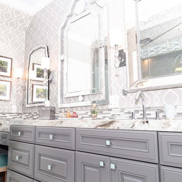
One of the top factors that can influence the value of a property is the Master Bathroom. During the complete makeover on this project, we proceeded with the complete demolition of the existing master bathroom, including floors, vanity, plumbing, lighting fixtures, toitel and tub.
In collaboration with the prestigious designer, Roberto Lugo, the D9 team worked on the layout for the Master Bathroom. With the plan of optimizing the space, we gave ample room to the vanity and the shower to allow them to include all the requested features from the homeowner.
To create an inspiring and elegant atmosphere the combination of selected colors, textures and materials played a key role. The Master Bathroom was given elegance by the unique look of the gray toned Marble countertops, combined with the sophistication and detailed finish of the bathroom cabinets, and the neutral gray paint used to finish the raised-cabinets.
The shower enclosure presents a double shower with two Marble benches and four shower fixtures with hinged door.

 Sardone | McLain
Built by Sardone Construction and designed by HPD Architecture, this custom B'Wow Dog House was created for the SPCA Home for the Holidays. This custom-made dog house was raffled off at Northpark Centre in Dallas, TX, with all proceeds going to the SPCA.
 Tile Doctor Ltd
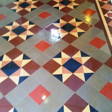
This extremely dirty and dull Victorian tiled hallway floor was at a house in Westcliffe on Sea near Southend. The tiles were well overdue for a deep clean and having worked on many of these types of floors before I was confident we could do the job.
Any sealer that was originally present had worn off years earlier so I went straight in with a strong solution of Tile Doctor Pro-Clean diluted 1:1 with water. This was applied to the floor and left to soak in for ten minutes before being worked into the tiles with a black scrubbing pad fitted to a rotary buffing machine.
The soiled cleaning solution was then removed using a wet vacuum and the floor was rinsed. The process was then repeated a few times to ensure all the ingrained dirt had been removed and we also tackled a few paint splashes that became evident. The floor was given a final and thorough rinse with water to ensure all trace of cleaning products had been removed and dried as much as possible using a wet vacuum.
The Victorian tiles were left to dry out for two days before we returned and the floor checked for dampness using a damp meter. Everything checked out OK so we proceeded to seal the tiles using numerous coats of Tile Doctor Seal and Go which is our recommended sealer for Victorian tiles as it gives a nice low sheen effect that enhances their appearance as well as protecting them from future staining.
Nick Murphy
South Essex Tile Doctor
 13 Design Lane Interiors
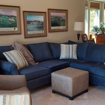
My client was delighted to learn of my custom furniture source, Castellano Furnishings, and proceeded with an order of a sectional, ottoman and swivel chair. Notice that the fabric on the back of the chair is the same as the pillows and the leather on the inside of the chair is the same as the ottoman.
 Simply Perfect
Advice on interior design is available everywhere—from TV shows and websites to books, magazines and apps.
We love seeing people become engaged in design and educated on the wide range of possibilities. But we hope you’ll proceed with caution.
It’s not that style errors are a matter of life and death. It’s just that it’s easy to choose designs that aren’t necessarily reflective of your own personality and character. And since you’re typically stuck with your interior design decisions for years, styles that don’t quite fit can tend to grate on you.
Interiors that give one person comfort may unleash chaos in someone else. This goes beyond favorite colors or hot trends, right to the heart of interior design, where you find questions of composition, balance, repetition, space and more.
The goal is to find that unique combination of design elements that gives you comfort, support and balance.
In one home, that perfect balance was struck through the use of symmetry. A pair of comfortable swivel chairs sit beneath matching indigo patterned paintings. Matching bookcases below the paintings contain similar, but not identical, arrangements of books, vases and bowls. Woods and bronzes help warm up the simple white bookcase shelving.
Two matching poufs in front of the fireplace provide additional seating. The sofa is accented with a pair of pillows with a blue pattern that echoes the artwork.
The effect of the symmetry is to achieve order and simplicity, which I promote at every opportunity. After all, your home interiors should be the setting or the backdrop of your life—not center stage.
Antique bronze and blue are complementary colors. Together, they offer a rich palette of richness and depth, which brings out the beauty of wood and stone.
In the home office, a unique, whitewash-stained wooden desk rests on metal, Sawhorse-inspired legs for a warm, rustic look. The black leather chair features a contemporary silhouette with an antique brass frame. An adjustable desk lamp has bronze accents.
The bookcase combines a sleek, black metal frame with concrete shelves, for another unusual pairing. It’s kept uncluttered for an orderly, peaceful look. Items on the shelves include a bronze-accented lamp and a pair
of high gloss-finished wooden bookends.
The elegant artwork behind the desk is a simple midnight-blue and bronze with mottled white. Deep blues are again picked up in the rug, which adds a stately vibe with a modern pattern and satisfying texture.
Within the framework of symmetry, the living room repeats the blue-and-bronze color scheme.
A large midcentury brass clock above the fireplace keeps the natural stone visible, rather than hidden behind a painting or television, while its straight lines and color create a beautiful contrast.
The sofa is a soft, neutral blue. The pattern on the round brass side table features echoes the darker blue-patterned rug, as well as the rug in the office, tying the rooms together.
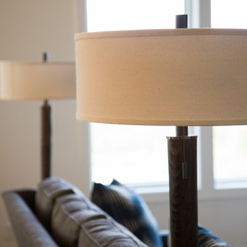
Indigo blue books adjacent to bronze vases on the shelves repeat the color scheme. The soapstone-topped coffee table echoes the shape of the fireplace. A pair of tall, matching floor lamps with long wooden bases, brass pulls and simple linen shades combine both the colors and symmetry found throughout the home.
 Simply Perfect
Advice on interior design is available everywhere—from TV shows and websites to books, magazines and apps.
We love seeing people become engaged in design and educated on the wide range of possibilities. But we hope you’ll proceed with caution.
It’s not that style errors are a matter of life and death. It’s just that it’s easy to choose designs that aren’t necessarily reflective of your own personality and character. And since you’re typically stuck with your interior design decisions for years, styles that don’t quite fit can tend to grate on you.
Interiors that give one person comfort may unleash chaos in someone else. This goes beyond favorite colors or hot trends, right to the heart of interior design, where you find questions of composition, balance, repetition, space and more.
The goal is to find that unique combination of design elements that gives you comfort, support and balance.
In one home, that perfect balance was struck through the use of symmetry. A pair of comfortable swivel chairs sit beneath matching indigo patterned paintings. Matching bookcases below the paintings contain similar, but not identical, arrangements of books, vases and bowls. Woods and bronzes help warm up the simple white bookcase shelving.
Two matching poufs in front of the fireplace provide additional seating. The sofa is accented with a pair of pillows with a blue pattern that echoes the artwork.
The effect of the symmetry is to achieve order and simplicity, which I promote at every opportunity. After all, your home interiors should be the setting or the backdrop of your life—not center stage.
Antique bronze and blue are complementary colors. Together, they offer a rich palette of richness and depth, which brings out the beauty of wood and stone.
In the home office, a unique, whitewash-stained wooden desk rests on metal, Sawhorse-inspired legs for a warm, rustic look. The black leather chair features a contemporary silhouette with an antique brass frame. An adjustable desk lamp has bronze accents.
The bookcase combines a sleek, black metal frame with concrete shelves, for another unusual pairing. It’s kept uncluttered for an orderly, peaceful look. Items on the shelves include a bronze-accented lamp and a pair
of high gloss-finished wooden bookends.
The elegant artwork behind the desk is a simple midnight-blue and bronze with mottled white. Deep blues are again picked up in the rug, which adds a stately vibe with a modern pattern and satisfying texture.
Within the framework of symmetry, the living room repeats the blue-and-bronze color scheme.
A large midcentury brass clock above the fireplace keeps the natural stone visible, rather than hidden behind a painting or television, while its straight lines and color create a beautiful contrast.
The sofa is a soft, neutral blue. The pattern on the round brass side table features echoes the darker blue-patterned rug, as well as the rug in the office, tying the rooms together.
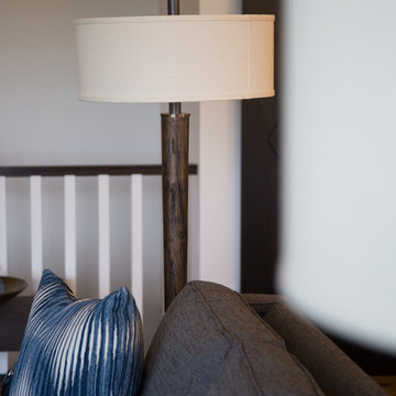
Indigo blue books adjacent to bronze vases on the shelves repeat the color scheme. The soapstone-topped coffee table echoes the shape of the fireplace. A pair of tall, matching floor lamps with long wooden bases, brass pulls and simple linen shades combine both the colors and symmetry found throughout the home.
 T. Morgan Construction, Inc.
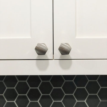
This first floor remodel was a GAME - CHANGER for this house. We took down more than 3 walls and installed a massive support beam. The first floor of this home went from cramped and disconnected to the perfect space for family gatherings. After the space was opened up, we proceeded with a gorgeous kitchen remodel with a modern geometric theme. The hardwood floors transition uniquely and beautifully into the hexagonal floor tile. The back splash is simple and lovely, also following the geometric theme with the hex tile. The last hexagonal touch to this kitchen is its unique hardware. This remodel had several modern touches, without overwhelming the "homey" feeling of a fireplace and hardwoods. All in all, this remodel created the perfect place for entertaining and raising a family.

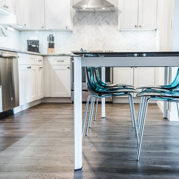 RAJ Kitchen and Bath, LLC
 “Full apartment design”.
IF you have not yet seen this apartment conversion before, we strongly urge you to go to the bottom left of this page and click on the short 2-minutes video. It would put a lot of things into perspective when you come back and continue reading this.
It is true we were literally handed the keys and told a list of things that they wanted to have happen and we were to go into the apartment, look at the space and come up with a design that would satisfy all of that need. UNTIL we showed up! The unit had really seen some better days but we knew we had to look past that and come up with a concept that would work for them.
The immediate challenges were centered around 3 big ideas:
1. Adding a second bedroom to the already small footprint
2. Figuring out a way to make the kitchen bigger, better and brighter
3. Creating a master room walk in closet
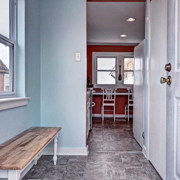
It’s always difficult to add new rooms into existing footprint without expanding out or up and not incurring any opportunity cost. In this case, that was exactly what we had to do. Item one and two above had to be tackled as one. We went ahead and switched out the location of the dining room and eliminating an area where there was a “nook” type eat-in area. By doing so, we were able to cut right into that footprint and change the layout of the kitchen.
That one move allowed us to dig into the kitchen design because it was now the main focal point in the apartment. It was no longer an option to keep it in that tiny hole where it was, so we had to ensure that this design was functional and aesthetically pleasing at the same time. By adding the table into the space where an Island typically would go, we were able to both cut cost and still provide a dining experience. The Table serves as an Island as well when cooking.
We then proceeded to block in the existing doorway to the dining room. By doing this, we were able to create a full room which allowed us to put a door on the other side and called that room Bedroom #2. This was easier to do because all of the mechanicals were already in that space (light, heater and windows). By shifting things around, we also achieved a huge wall to wall closet from inside. PERFECT!
Then we moved into the Single bedroom. We thought it was a big room with a small closet, so by creatively adding an L shaped wall and steal some footprint into the bedroom side, we were able to put a door on that new room and design it for the walk-in closet. Even after this, the bedroom still holds a queen size bed with 2 night stands, a TV on the wall, a sitting chair and plenty of room to walk around. This was done by rethinking the location for the bed and night stands.
The bathroom was gutted to make sure there was no leaks and rebuild from the ground up. We kept all of the plumbing where it was, added a new vanity, medicine cabinet, tiles and lighting and it was done.
From there, the rest of the unit had new flooring all throughout, paint, and lighting. After completion and walk through, this project was handed over back to the clients.
Execution and collaboration between all the trades were: Reggie and his team from Premier Interiors and Rohan from RD Mechanical Services.
p.s. Please see our website to see the video.

 Ash and Line
A dear client who resides in Mcallen-TX requested a Full Backyard Design including a pool, outdoor kitchen, firepit, edible garden, art, and a secluded area for quiet reading and privacy among other structures and hardscape.
We proceeded with the design process virtually due to his location being away from The Woodlands, TX. The client filled a questionnaire with specific questions regarding his site nature, style, and needs. He sent photos of the existing landscape, survey, and photos from the house interior that would help us match his modern style to his outdoor space.
We were very pleased to present our planting and construction drawings with 3D walk-thru video in a videoconference. All plans were sent to this client to start the building process at his own pace. He certainly loved the modern space we were able to create for him!
"You envision it, we create it" is our EZ MOTTO
 LR Home
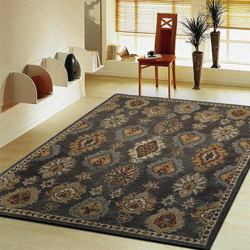
"Integrity" displays intricately beautiful rugs with a geometric uniqueness, perfect for adding a spark to your living space. This collection offers a spectrum of hues and patterns, making it impossible not to find the perfect one for you. True to it's name, a percentage of the collection's proceeds will go toward funding care for our veterans through "Wounded Warrior Project." Pieces such as these can pull together any area in your home, as well as helping those who have risked their lives pulling together our nation.
 Nathan Allan Glass Studios Inc.
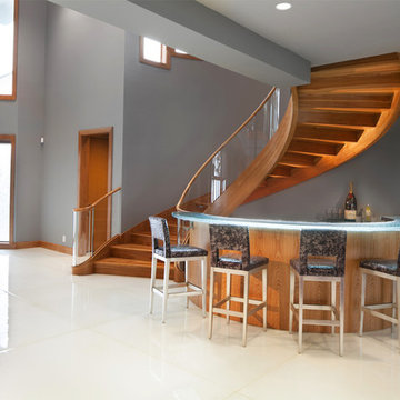
What surprises people most when entering and walking on the glowing white surface in this particular Private Residence (Williamsburg, VA) is when they find out they are walking on a sea of glass! Yes, GLASS! Not marble, not granite, but GLASS! Nathan Allan has created a very fresh, unique flooring surface, which is smooth to touch on the majority of the glass surface, yet has an almost invisible safety finish permanently embedded in the glass surface.
THE GLASS
Nathan Allan’s Glass Flooring incorporates features which are visually stunning, while also providing a safety finish which provides comfort to everyone walking on the glass. Our Sandstone texture is forged into the bottom surface of the glass, while our exclusive Glass Sandpaper safety finish is fused onto the walking surface. To enhance all features, we added a bright, sparkling, White Metallic color finish throughout each flooring panel.
SPECIFICATIONS
Each Glass Flooring panel is produced in 1/2″ (12mm) thick, Low Iron, tempered safety glass. Tempered glass provides added strength, insuring that the Glass Flooring can accept a heavy load. Panels vary in size and dimension, with most panels measured at a block size of 5’0 x 6’0 (1500mm x 1800mm). Perimeter Edge panels were carved and shaped to fit tightly against the curved walls. Glass Sandpaper, ASTM tested in labs with the highest slip-coefficient safety ratings, is fused onto the walking surface, to provide a very comfortable and effective safety feature.
Flooring Glass Details:
1/2″ (12mm) thick, Low iron tempered safety glass
Flat Polished Edges
Glass Sandpaper on walking surface
Sandstone texture on bottom surface
White Metallic color finish on bottom surface
Panels sizes up to 5’0 x 6’0
Approximately 800 square feet of glass flooring
Perimeter panels shape cut to fit
Almost overshadowed by the spectacular flooring is a 1.5” thick, Heavy Glasstop, Crescent shaped, with Nathan Allan’s Rocky Mountain texture.
DESIGN
A White Sea of Glass flooring is the finished result of combining a light Sandstone texture on the bottom glass surface, with the added touch of a sparkling White Metallic color finish. Combined with our Glass Sandpaper safety finish, and the natural and artificial light sources, our Glass Flooring shimmers within the entire entrance space.
INSTALLATION
Using very important installation techniques, Nathan Allan worked hand in hand with great team of professionals: Vicki Bristow, designer, W. M. Jordan Company, GC, and Pompei Inc, glass flooring installer. Templates were produced for all perimeter edge panels, and every shaped panel. All flooring panels are secured to the substrate with special adhesives, and joints are filled with matching color sealants.
“A beautiful project is always enhanced when working with quality, prestigious builders, and talented trade’s people. The tight organization and open communication by all the team members contributed greatly to a project proceeding seamlessly, with the incredible visual results to prove it.” Barry Allan – Director
Photo credit: Morgan Howarth
 Linda Edelwich Realtor
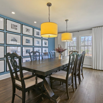
Nestled on 2.57 private acres in a highly sought-after neighborhood adjacent to Glastonbury line, this meticulously maintained custom home welcomes you through gracious double doors into a residence that emanates coastal charm. Richly toned floors contrast beautifully w/crisp neutral walls throughout, while the front-to-back living room serves as a stunning centerpiece w/its elegant gas-fireplace & French doors on either side opening to a screened porch-creating a delightful cross-breeze when open. No popcorn ceilings here! Open floor plan features a versatile home office with built-ins, flowing seamlessly into a gourmet kitchen showcasing a stylish island, custom cabinetry, & stainless-steel appliances adjacent to an expansive dining area w/stylish twin chandeliers. Practical luxury continues with a generous walk-in pantry & custom drop zone with shiplap detailing and shoe cubbies near the three-car garage with soaring ceilings. Upstairs, discover a sumptuous primary suite featuring a stylishly remodeled bathroom w/walk-in shower. Also complemented by a spacious walk-in closet & window flanked by custom built-ins, while two additional bedrooms share another beautifully updated bathroom & convenient 2nd-floor laundry. Additional space w/an unfinished walk-up attic & 880sf of finished extra living space in the walk-out lower level, complete with built in sauna, laminate flooring and ample storage-all crowned by the property's signature wrap-around porch. Roof '17
 Advance Design Studio, Ltd.
Mike and Anne of Barrington Hills desperately needed to update and renovate both their kid’s hall bath and guest bath, and in their 1980’s home each project presented a different set of unique challenges to overcome. When they set out to identify the right remodeling company to partner with, it was important to find a company that could help them to visualize design solutions for the bath renovations. When they came across Advance Design Studio’s website, they were immediately drawn to the solution-oriented remodeling process and the family friendly company.
They say they chose Advance Design because of the integrated approach of “Common Sense Remodeling”, making the design, project management and construction all happen in one place. When they met with Project Designer Michelle Lecinski, they knew they chose the right company. “Michelle’s excellent work on the initial designs made it easy to proceed with Advance Design Studio,” Mike said.
Like most homeowners anticipating a big renovation project, they had some healthy fears; with two bathrooms being remodeled at the same time they worried about timeframes and staying within budget. With the help of Michelle, and the “Common Sense” guidelines, they were confident that Advance Design would stay true, orchestrating all the moving parts to stay within both the estimated timeline and budget.
The guest bath offered the biggest design challenge. A dormer obstruction made the already cramped shower awkward to access. Mike and Anne also wanted the shower size to be expanded, making it more accommodating. Working with Advance’s construction expert DJ Yurik, Michelle relocated the shower concealing the original dormer and creating a larger, more comfortable and aesthetically pleasing guest shower.
The unsightly and not at all user-friendly closet was removed and replaced with elegant White Maple Dura Supreme cabinetry with much improved function featuring dual tall linen cabinets, a special makeup area and two sinks, providing a dual vanity which was extremely important for better guest use.
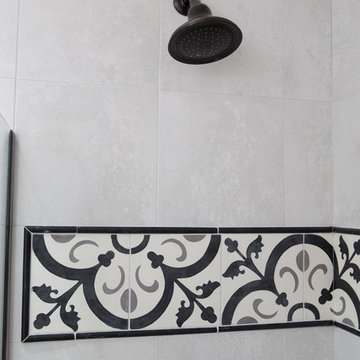
The Fossil Brown quartz countertop is in pleasing contrast to the white cabinetry, and coordinates nicely with the mocha porcelain tile gracing the shower for an accent. The decorative glazed turquoise tile backsplash, tile border, and bottle niche adds a taste of marine green to the room, while marble-looking porcelain tile makes guests feel they are staying in a 5-star hotel. Polished nickel Kohler plumbing fixtures were chosen to add a touch of sophistication. This renovated guest bath is comfortable and elegant, and Anne and Mike’s house guests may never want to leave!
“The end result was updated and restyled bathrooms that the client will enjoy and increase the value of their home,” Designer Michelle said.
The children’s hall bath had its own set of challenges. The current placement of the sink was not conducive to the best use of the existing space, nor did it allow for any visual interest, something Advance’s designers always work to achieve even within the tight confines of a small bath. Advance removed the linen closet and used the gain in wall space to create a dramatic focal point on the vanity wall. They also took additional space that wasn’t being used for new Storm Gray Dura Supreme tall built-in linen cabinets, creating functional storage space that the former bath lacked. A customized glass splash panel was created for the bath, and the high ceilings with skylights were accented with a custom-made track lighting fixture featuring industrial pipe and cage materials.
Authentic cement encaustic tile was used wall to wall surrounding the vanity to create a dramatic and interesting back drop for the new elegant and stately furniture-like double sink wall. Hand-made encaustic tile originated in Western Europe beginning in the 1850’s and reminded Mike and Anne of tile they had seen and loved from their travels overseas. Today, encaustic tile has made a re-appearance in today’s modern bath design with its wide array of appealing patterns and artistic use of color.
Oil rubbed bronze Kohler fixtures echo the black accents in the beautiful tile pattern and reflect the matte black of the unique lighting detail. Easy to maintain Blanca Arabescato Quartz countertops add practicality and natural beauty and compliments the warm wood porcelain tile floors. This handsome bath has generated praise from friends and family even before it’s complete unveiling as photos of the space leaked out on social media! It’s not only completely functional to use, but especially pretty to look at.
“Advance Design Studio did a terrific job for us. We really appreciated how easy it was to work with them on a complex project of the complete remodeling of two bathrooms. They very capably handled all the details from design, to project management, to construction. It is a great group of people to work with and we would welcome the opportunity to work with them again anytime,” Mike said.
 RAJ Kitchen and Bath, LLC
 “Full apartment design”.
IF you have not yet seen this apartment conversion before, we strongly urge you to go to the bottom left of this page and click on the short 2-minutes video. It would put a lot of things into perspective when you come back and continue reading this.
It is true we were literally handed the keys and told a list of things that they wanted to have happen and we were to go into the apartment, look at the space and come up with a design that would satisfy all of that need. UNTIL we showed up! The unit had really seen some better days but we knew we had to look past that and come up with a concept that would work for them.
The immediate challenges were centered around 3 big ideas:
1. Adding a second bedroom to the already small footprint
2. Figuring out a way to make the kitchen bigger, better and brighter
3. Creating a master room walk in closet
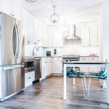
It’s always difficult to add new rooms into existing footprint without expanding out or up and not incurring any opportunity cost. In this case, that was exactly what we had to do. Item one and two above had to be tackled as one. We went ahead and switched out the location of the dining room and eliminating an area where there was a “nook” type eat-in area. By doing so, we were able to cut right into that footprint and change the layout of the kitchen.
That one move allowed us to dig into the kitchen design because it was now the main focal point in the apartment. It was no longer an option to keep it in that tiny hole where it was, so we had to ensure that this design was functional and aesthetically pleasing at the same time. By adding the table into the space where an Island typically would go, we were able to both cut cost and still provide a dining experience. The Table serves as an Island as well when cooking.
We then proceeded to block in the existing doorway to the dining room. By doing this, we were able to create a full room which allowed us to put a door on the other side and called that room Bedroom #2. This was easier to do because all of the mechanicals were already in that space (light, heater and windows). By shifting things around, we also achieved a huge wall to wall closet from inside. PERFECT!
Then we moved into the Single bedroom. We thought it was a big room with a small closet, so by creatively adding an L shaped wall and steal some footprint into the bedroom side, we were able to put a door on that new room and design it for the walk-in closet. Even after this, the bedroom still holds a queen size bed with 2 night stands, a TV on the wall, a sitting chair and plenty of room to walk around. This was done by rethinking the location for the bed and night stands.
The bathroom was gutted to make sure there was no leaks and rebuild from the ground up. We kept all of the plumbing where it was, added a new vanity, medicine cabinet, tiles and lighting and it was done.
From there, the rest of the unit had new flooring all throughout, paint, and lighting. After completion and walk through, this project was handed over back to the clients.
Execution and collaboration between all the trades were: Reggie and his team from Premier Interiors and Rohan from RD Mechanical Services.
p.s. Please see our website to see the video.
12