
Search results for "Proceed" in Home Design Ideas
 down2earth Interior Design, LLC.
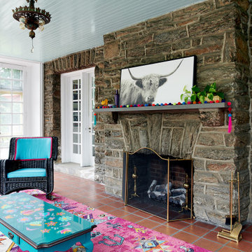
With limited travel options available during the pandemic, everyone is spending lots more time at home. Many are even looking for ways to incorporate interior design elements from their favorite destinations into their spaces: this lets you feel like you’re traveling, even when you’re not. This project was my own personal quarantine design dream: to create an interior scheme for my sunroom that captures the color, joy and exuberance of those brilliant indoor/outdoor spaces you find in Mexico. My sunroom is filled with sunshine, and sunshine makes my kids think of two beach vacations we took to Cancun. Since we couldn't take them there, or anywhere, I decided to bring a little bit of Mexico home.
As a backdrop, I embraced our floor to ceiling windows, great white wood paneled walls, and terra cotta floor tile, and added a soothing blue green paint to the beadboard ceiling, which to me is the color of a pool (Sherwin Williams Waterfall).
Over the terra cotta tile, I layered a bright pink rug and pulled out the turquoise and yellow accents for the furniture. The furniture is at least 60 years old and will not fit out of the doors, so I had it resprayed in place and had new cushions made in indoor outdoor fabric (and trimmed it in hot pink tape).
I also had a new gas logset installed in the fireplace opening to keep this room toasty in the spring and fall. Cheery Mexican pompoms line the slate mantle, which also features a black and white photo of cattle (they have lots of that in Mexico, right?) A pair of mullioned doors leads back to the living room of the home.
The piece de resistance of this whole seating grouping is the coffee table. It was originally a stained wood coffee table that inhabited my in-laws’ living room in pristine condition for many years. Then it came to my house, where my son proceeded to bang his trains against it and generally abused and dented it. I had it sanded down and painted Sherwin Williams Green Bay. Over this teal colored base, my mother, who’s an artist, painted the most beautiful design of birds and flowers for me based on the Otomi tradition of Mexican embroidery. Otomi embroidery motifs typically incorporate animals and plants native to the Tenango area in central Mexico.
 Eccentricity Designs LLC
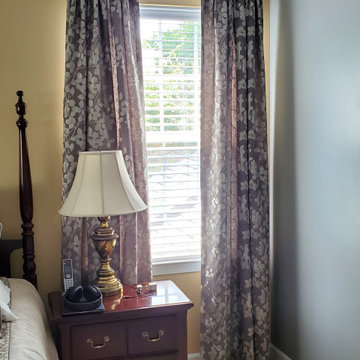
This client asked for help to upgrade her bedroom. She said her "safe" decorating style left something to be desired and she didn't know how to wake it up. The furniture was to remain however the room had great architectural lines to accent. I selected two colors that helped define the lines in the architecture. The bedding was added and we proceeded to move forward on the window treatments. The fabric is a rich cotton blend with a slight shimmer in the leaf pattern. With such short window walls I felt valances drew the eye down (shown in the before images) so they were not added to the new draperies. There is a custom cornice on the small window by the dressing area that coordinates with the draperies. The bench was reupholstered and a new centerpiece was added for the top of the television.
The client is soo pleased with the changes.
 Phillips Family Construction
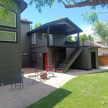
We replaced the siding in the courtyard and changed from 3-row cottage siding to shaker siding in front of the house to a different style above the garage and above the bump out as well as the front door. We proceeded to caulk all nail holes and then primed and painted the entire house which was about 3300 square feet.
Find the right local pro for your project
 Linda Edelwich Realtor
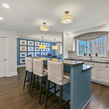
Nestled on 2.57 private acres in a highly sought-after neighborhood adjacent to Glastonbury line, this meticulously maintained custom home welcomes you through gracious double doors into a residence that emanates coastal charm. Richly toned floors contrast beautifully w/crisp neutral walls throughout, while the front-to-back living room serves as a stunning centerpiece w/its elegant gas-fireplace & French doors on either side opening to a screened porch-creating a delightful cross-breeze when open. No popcorn ceilings here! Open floor plan features a versatile home office with built-ins, flowing seamlessly into a gourmet kitchen showcasing a stylish island, custom cabinetry, & stainless-steel appliances adjacent to an expansive dining area w/stylish twin chandeliers. Practical luxury continues with a generous walk-in pantry & custom drop zone with shiplap detailing and shoe cubbies near the three-car garage with soaring ceilings. Upstairs, discover a sumptuous primary suite featuring a stylishly remodeled bathroom w/walk-in shower. Also complemented by a spacious walk-in closet & window flanked by custom built-ins, while two additional bedrooms share another beautifully updated bathroom & convenient 2nd-floor laundry. Additional space w/an unfinished walk-up attic & 880sf of finished extra living space in the walk-out lower level, complete with built in sauna, laminate flooring and ample storage-all crowned by the property's signature wrap-around porch. Roof '17
 BURNETTE BUILDERS
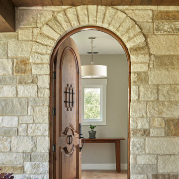
This beautiful traditional hill country-style home highlighted with contemporary elements on a family plot bringing two generations closer together.
Approaching the home, you notice the traditional Texas hill country aesthetics of limestone paired with a metal roof, but these features change as you proceed to the back exterior elevation. The back of the home is composed mostly of glass and steel, to create a luminous harmonization with the outdoors and showcase an open staircase. Integrating these contemporary design elements required much attention to detail from the Burnette team.
 Simply Perfect
Advice on interior design is available everywhere—from TV shows and websites to books, magazines and apps.
We love seeing people become engaged in design and educated on the wide range of possibilities. But we hope you’ll proceed with caution.
It’s not that style errors are a matter of life and death. It’s just that it’s easy to choose designs that aren’t necessarily reflective of your own personality and character. And since you’re typically stuck with your interior design decisions for years, styles that don’t quite fit can tend to grate on you.
Interiors that give one person comfort may unleash chaos in someone else. This goes beyond favorite colors or hot trends, right to the heart of interior design, where you find questions of composition, balance, repetition, space and more.
The goal is to find that unique combination of design elements that gives you comfort, support and balance.
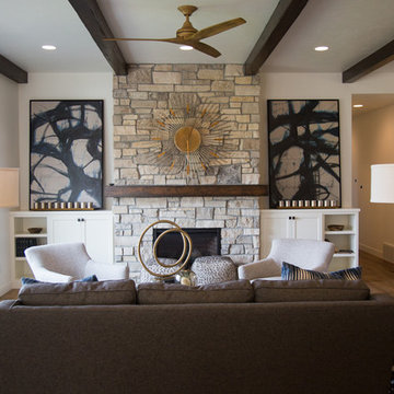
In one home, that perfect balance was struck through the use of symmetry. A pair of comfortable swivel chairs sit beneath matching indigo patterned paintings. Matching bookcases below the paintings contain similar, but not identical, arrangements of books, vases and bowls. Woods and bronzes help warm up the simple white bookcase shelving.
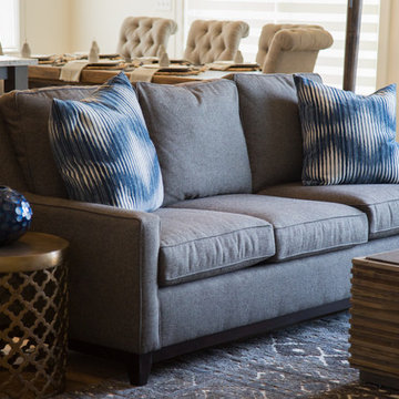
Two matching poufs in front of the fireplace provide additional seating. The sofa is accented with a pair of pillows with a blue pattern that echoes the artwork.
The effect of the symmetry is to achieve order and simplicity, which I promote at every opportunity. After all, your home interiors should be the setting or the backdrop of your life—not center stage.
Antique bronze and blue are complementary colors. Together, they offer a rich palette of richness and depth, which brings out the beauty of wood and stone.
In the home office, a unique, whitewash-stained wooden desk rests on metal, Sawhorse-inspired legs for a warm, rustic look. The black leather chair features a contemporary silhouette with an antique brass frame. An adjustable desk lamp has bronze accents.
The bookcase combines a sleek, black metal frame with concrete shelves, for another unusual pairing. It’s kept uncluttered for an orderly, peaceful look. Items on the shelves include a bronze-accented lamp and a pair
of high gloss-finished wooden bookends.
The elegant artwork behind the desk is a simple midnight-blue and bronze with mottled white. Deep blues are again picked up in the rug, which adds a stately vibe with a modern pattern and satisfying texture.
Within the framework of symmetry, the living room repeats the blue-and-bronze color scheme.
A large midcentury brass clock above the fireplace keeps the natural stone visible, rather than hidden behind a painting or television, while its straight lines and color create a beautiful contrast.
The sofa is a soft, neutral blue. The pattern on the round brass side table features echoes the darker blue-patterned rug, as well as the rug in the office, tying the rooms together.
Indigo blue books adjacent to bronze vases on the shelves repeat the color scheme. The soapstone-topped coffee table echoes the shape of the fireplace. A pair of tall, matching floor lamps with long wooden bases, brass pulls and simple linen shades combine both the colors and symmetry found throughout the home.
 TKS Design Group
Free ebook, Creating the Ideal Kitchen. DOWNLOAD NOW
One of my very favorite parts of the design process is space planning and considering all the possible floor plan solutions at the beginning stages of the project. What works for one person as a solution may not be the best solution for the next. What you think you want going into the process, may change once all the space planning options are considered. This was exactly the case for this family. They thought they really wanted an island configuration.
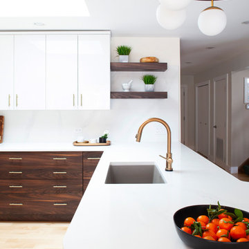
Once we figured out the flow of the work triangle and saw how great a large peninsula would work for the family, we proceeded along those lines. The peninsula not only works great for food prep, it also allows more of a traditional table seating versus an island with everyone lined up in a row — not so great for daily dinner conversation.
To the right of that is a counter depth fridge and a speed oven which gives some flexibility with cooking and reheating smaller meals instead of having to heat the entire oven. An induction cooktop with its easy to clean surface keeps the space looking clean and tidy. Induction heats very quickly to high temperatures so is also wonderful to cook on. To the right of cooktop is a long stretch of countertop perfect for prep space.
Storage was very important to the homeowners. We took our time discussing where spice pull outs and tray dividers would be located, how the corner storage would be addressed and the location of the other items such as trash and recycling cans. We worked as many drawers as possible into the space, as I always recommend drawers over doors and/or roll outs as they offer the most flexibility and ease of use. Customizing these details is time well spent as having a place for everything and everything in its place, just like Mom said, really is the key to a functional and professionally designed kitchen.
The talls and wall cabinets are white acrylic which combined with the white marble look quartz countertops and full height backsplash keep the room feeling light, bright and airy. The wood toned base cabinets are made of a textured laminate that has the look of wood but is a very easy to maintain product. Brushed gold metal on the hardware, faucet and chandelier add a warm touch and ties into the blond maple flooring. The neighboring breakfast room was also remodeled as part of the project and houses a small coffee station.
Designed by: Susan Klimala, CKBD
Photography by: Kari Firak
For more information on kitchen and bath design ideas go to: www.kitchenstudio-ge.com
 Simply Perfect
Advice on interior design is available everywhere—from TV shows and websites to books, magazines and apps.
We love seeing people become engaged in design and educated on the wide range of possibilities. But we hope you’ll proceed with caution.
It’s not that style errors are a matter of life and death. It’s just that it’s easy to choose designs that aren’t necessarily reflective of your own personality and character. And since you’re typically stuck with your interior design decisions for years, styles that don’t quite fit can tend to grate on you.
Interiors that give one person comfort may unleash chaos in someone else. This goes beyond favorite colors or hot trends, right to the heart of interior design, where you find questions of composition, balance, repetition, space and more.
The goal is to find that unique combination of design elements that gives you comfort, support and balance.
In one home, that perfect balance was struck through the use of symmetry. A pair of comfortable swivel chairs sit beneath matching indigo patterned paintings. Matching bookcases below the paintings contain similar, but not identical, arrangements of books, vases and bowls. Woods and bronzes help warm up the simple white bookcase shelving.
Two matching poufs in front of the fireplace provide additional seating. The sofa is accented with a pair of pillows with a blue pattern that echoes the artwork.
The effect of the symmetry is to achieve order and simplicity, which I promote at every opportunity. After all, your home interiors should be the setting or the backdrop of your life—not center stage.
Antique bronze and blue are complementary colors. Together, they offer a rich palette of richness and depth, which brings out the beauty of wood and stone.
In the home office, a unique, whitewash-stained wooden desk rests on metal, Sawhorse-inspired legs for a warm, rustic look. The black leather chair features a contemporary silhouette with an antique brass frame. An adjustable desk lamp has bronze accents.
The bookcase combines a sleek, black metal frame with concrete shelves, for another unusual pairing. It’s kept uncluttered for an orderly, peaceful look. Items on the shelves include a bronze-accented lamp and a pair
of high gloss-finished wooden bookends.
The elegant artwork behind the desk is a simple midnight-blue and bronze with mottled white. Deep blues are again picked up in the rug, which adds a stately vibe with a modern pattern and satisfying texture.
Within the framework of symmetry, the living room repeats the blue-and-bronze color scheme.
A large midcentury brass clock above the fireplace keeps the natural stone visible, rather than hidden behind a painting or television, while its straight lines and color create a beautiful contrast.
The sofa is a soft, neutral blue. The pattern on the round brass side table features echoes the darker blue-patterned rug, as well as the rug in the office, tying the rooms together.
Indigo blue books adjacent to bronze vases on the shelves repeat the color scheme. The soapstone-topped coffee table echoes the shape of the fireplace. A pair of tall, matching floor lamps with long wooden bases, brass pulls and simple linen shades combine both the colors and symmetry found throughout the home.
 Nathan Allan Glass Studios Inc.
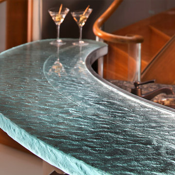
What surprises people most when entering and walking on the glowing white surface in this particular Private Residence (Williamsburg, VA) is when they find out they are walking on a sea of glass! Yes, GLASS! Not marble, not granite, but GLASS! Nathan Allan has created a very fresh, unique flooring surface, which is smooth to touch on the majority of the glass surface, yet has an almost invisible safety finish permanently embedded in the glass surface.
THE GLASS
Nathan Allan’s Glass Flooring incorporates features which are visually stunning, while also providing a safety finish which provides comfort to everyone walking on the glass. Our Sandstone texture is forged into the bottom surface of the glass, while our exclusive Glass Sandpaper safety finish is fused onto the walking surface. To enhance all features, we added a bright, sparkling, White Metallic color finish throughout each flooring panel.
SPECIFICATIONS
Each Glass Flooring panel is produced in 1/2″ (12mm) thick, Low Iron, tempered safety glass. Tempered glass provides added strength, insuring that the Glass Flooring can accept a heavy load. Panels vary in size and dimension, with most panels measured at a block size of 5’0 x 6’0 (1500mm x 1800mm). Perimeter Edge panels were carved and shaped to fit tightly against the curved walls. Glass Sandpaper, ASTM tested in labs with the highest slip-coefficient safety ratings, is fused onto the walking surface, to provide a very comfortable and effective safety feature.
Flooring Glass Details:
1/2″ (12mm) thick, Low iron tempered safety glass
Flat Polished Edges
Glass Sandpaper on walking surface
Sandstone texture on bottom surface
White Metallic color finish on bottom surface
Panels sizes up to 5’0 x 6’0
Approximately 800 square feet of glass flooring
Perimeter panels shape cut to fit
Almost overshadowed by the spectacular flooring is a 1.5” thick, Heavy Glasstop, Crescent shaped, with Nathan Allan’s Rocky Mountain texture.
DESIGN
A White Sea of Glass flooring is the finished result of combining a light Sandstone texture on the bottom glass surface, with the added touch of a sparkling White Metallic color finish. Combined with our Glass Sandpaper safety finish, and the natural and artificial light sources, our Glass Flooring shimmers within the entire entrance space.
INSTALLATION
Using very important installation techniques, Nathan Allan worked hand in hand with great team of professionals: Vicki Bristow, designer, W. M. Jordan Company, GC, and Pompei Inc, glass flooring installer. Templates were produced for all perimeter edge panels, and every shaped panel. All flooring panels are secured to the substrate with special adhesives, and joints are filled with matching color sealants.
“A beautiful project is always enhanced when working with quality, prestigious builders, and talented trade’s people. The tight organization and open communication by all the team members contributed greatly to a project proceeding seamlessly, with the incredible visual results to prove it.” Barry Allan – Director
Photo credit: Morgan Howarth
 ONE Design
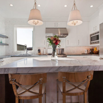
A diamond in the rough was polished to a new brilliance in this remodel. Moving the kitchen to be front and center of everything was the key to this remodel. Carrying the motif of less is more, this remodel emphasized the qualities this Parisian-styled home had with a modern open floor plan. Working through different design studies with the client, we identified the optimum layout and created space for an additional bedroom. Fusing old world details with contemporary living, we ensured the rehabilitation pays homage to its original detailing while expressing a bold narrative, delicately balanced within the original structural framework. Careful detailing of the structural elements ensured the work could proceed without affecting the unit below. Completed in 2014, this home now offers its young family the full urban experience of stylish San Francisco living.
 Division 9 Inc.
One of the top factors that can influence the value of a property is the Master Bathroom. During the complete makeover on this project, we proceeded with the complete demolition of the existing master bathroom, including floors, vanity, plumbing, lighting fixtures, toitel and tub.
In collaboration with the prestigious designer, Roberto Lugo, the D9 team worked on the layout for the Master Bathroom. With the plan of optimizing the space, we gave ample room to the vanity and the shower to allow them to include all the requested features from the homeowner.
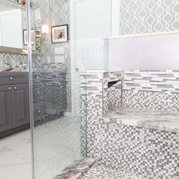
To create an inspiring and elegant atmosphere the combination of selected colors, textures and materials played a key role. The Master Bathroom was given elegance by the unique look of the gray toned Marble countertops, combined with the sophistication and detailed finish of the bathroom cabinets, and the neutral gray paint used to finish the raised-cabinets.
The shower enclosure presents a double shower with two Marble benches and four shower fixtures with hinged door.

 Hendley & Co
Luke Williams
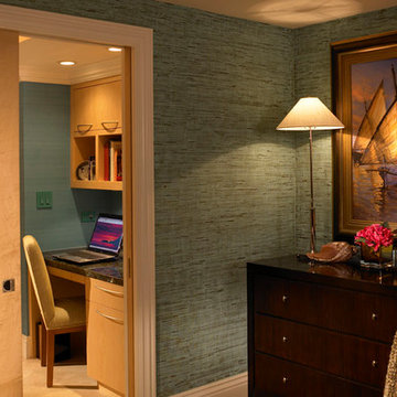
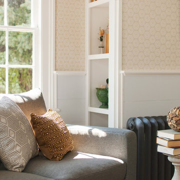
Mid-sized transitional enclosed carpeted family room library photo in New York with gray walls, no tv and no fireplace
Mid-sized transitional enclosed carpeted family room library photo in New York with gray walls, no tv and no fireplace
 TKS Design Group
Free ebook, Creating the Ideal Kitchen. DOWNLOAD NOW
Sometimes it take a few tries to get a space to work how you want it to and that’s exactly what happened with this Hinsdale client. Their desire for a family friendly, open floor plan had them reworking an opening between the kitchen and family room and relocating some pantry cabinets in an attempt to make their home’s flow more suitable to their lifestyle. After living with this small change for a few years, they decided that a full kitchen remodel was really what was needed to make their home function the way they desired.
They came in with the stereotypical “sketch on a napkin” done by an architect friend, and we proceeded to make that design come to life with a few tweaks along the way. The space was quite unique and also a bit challenging because of its multiple angled walls. While interesting, angles can be a challenge when trying make a space functional.
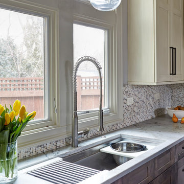
The new kitchen has a great lineup of large appliances, including a large built-in fridge, steam oven and Galley workstation, which is a large prep sink that utilizes several inserts such as strainers and cutting boards and acts as a very large prep space. The new induction cooktop is easy to keep clean and a microwave drawer in the island is located away from the main prep space for convenient access.
The main perimeter has tons of countertop space, with additional prep space available at the island and a slightly raised peninsula for casual meals and nice homework spot for the couple’s teenaged children. The kitchen also included a large shallow depth pantry and a large counter height desk area for keeping track of paperwork.
The weathered finish on the cabinets and custom metal hood are a nice juxtaposition to the more sleek glass mosaic backsplash and waterfall countertops. The pendants and cabinet hardware provide modern details that provide an overall casual yet sophisticated feel in this transitional design.
Designed by: Susan Klimala, CKD, CBD
Photography by: Mike Kaskel
For more information on kitchen and bath design ideas go to: www.kitchenstudio-ge.com

 Southern Living Plant Collection
Deep Purple flowers cover these tough plants from early spring to frost. Like her cousin Wendy’s Wish Salvia, this Salvia will form a ball of color in your yard, with no pruning or deadheading. A portion of plant proceeds go to Make-A-Wish® AU.
FEATURES
Bloom/Feature Dark purple flowers bloom year-round in frost-free climates, or until frost
Plant Type Perennials
Evergreen or Deciduous Herbaceous
USDA Zones 9b, 10
Zone Detail Hardy to 25°F USDA zones 9b-10
Key Features Blooms won't fade in the heat; forming a ball of color with no pruning or deadheading
Use Perennial, borders, garden beds, containers
Exposure Full sun to part shade
Bloom Season Year-round in frost-free climates, or until frost
Dimension 3-4’ H x 3' W
Growth Rate Fast in spring and summer
CARE
Water Moderate to regular water
Soil Type Well-drained garden soil
Fertilizer Apply a balanced slow release each spring
Pruning Cut back to 3" in early spring to maintain shape
PLANTING INSTRUCTIONS
• water before planting
• plant in full sun to part shade
• dig hole 2X the width of pot,
• backfill and plant 1”-2” above soil level
• water and add more soil if needed
• mulch around plants
 D&G Exteriors
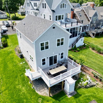
Complete exterior remodel for three homes on the same property. These houses got a complete exterior and interior remodel, D&G Exteriors oversaw the exterior work. A little bit about the project:
Roof: All three houses got a new roof using Certainteed Landmark Shingles, ice and water, and synthetic underlayment.
Siding: For siding, we removed all the old layers of siding, exposing some areas of rot that had developed. After fixing those areas, we proceeded with the installation of new cedar shingles. As part of the installation, we applied weather barrier, a “breather” membrane to provide drainage and airflow for the shingles, and all new flashing details. All trim
Windows: All windows on all three houses were replaced with new Harvey vinyl windows. We used new construction windows instead of replacement windows so we could properly waterproof them.
Deck: All three houses got a new deck and remodeled porch as well. We used Azek composite decking and railing systems.
Additional: The houses also got new doors and gutters.
 Tile Doctor Ltd
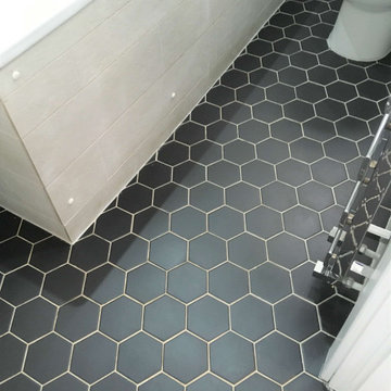
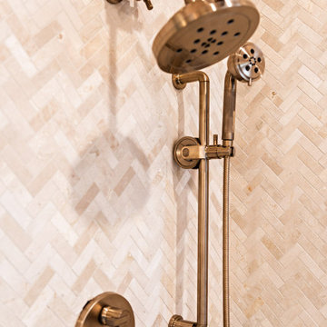
The pictures showed are of an Encaustic Cement tiled floor that had been installed in the bathroom of a property in Twickenham. At the time the tiles were installed, they did not seal them and had since accumulated dirt, especially in the grout lines.
Encaustic cement tiles have become extremely popular in the last few years with many beautiful artistic often geometric patterns available to choose from. The very nature of the cement-based tile however does make it slightly porous, and if left unsealed dirt will become ingrained in the tile making it difficult to remove and keep clean. Like grout they do therefore need to be sealed in order to keep them looking at their best for longer.
Now we normally recommend using diamond encrusted burnishing pads when renovating Encaustic Cement tiles however in this case the face of the tiles were not too bad and it was really the grout that needed the most attention. So, to cut the cost for customer, I advised a straightforward alkaline scrub clean and seal.
To clean the tile and grout I sprayed the floor with a strong dilution of Tile Doctor Pro-Clean and left it to soak into the dirt for ten minutes. Space in the bathroom was quite tight so instead of using a mechanical floor scrubber I scrubbed the tile and grout by hand working the alkaline cleaning solution into the pores to release the grout in dirt.
After scrubbing the floor was rinsed with a little water and the soil removed with a wet vacuum. Afterwards the floor was inspected, and any stubborn areas retreated with repeat of the process. After a final rinse, the floor was dried as much as possible with the wet vacuum.
Fortunately, the weather has been amazing of late and so it did not take long for the floor to dry, being a small space and a little encouragement from a heat gun always helps. Removing excess moisture before sealing is essential as even a small amount can cloud the sealer resulting in an uneven appearance.
Once satisfied that the floor was dry, I proceeded to seal it by applying a couple two coats of Tile Doctor Colour Grow across the Encaustic tile and grout. As an impregnating sealer Colour Grow penetrates the pores of the cement occupying the space and thus prevent any dirt from becoming ingrained there. Colour Grow’s colour intensifying properties also helped to deepen the black colour of the tile enhancing the contrast between the tiles and grout.
Now the floor has been properly sealed it will be far easier for the customer to keep them clean in future. For maximum longevity of the sealer I recommend maintenance cleaning with Tile Doctor Neutral Cleaner. Don’t be tempted to use supermarket cleaning products without reading the label first, many are simply too strong for cleaning sealed surfaces and will strip off the sealer prematurely leaving the tiles unprotected.
Jonathan Oldham
South Middlesex Tile Doctor
 De Young Properties
With overwhelming support by the community who dug deep and donated, the 2018 Central Valley St. Jude Dream Home Giveaway successfully raised $957,100 for St. Jude Children’s Research Hospital! Since 2007, De Young Properties has been a major donor and builder of 12 St. Jude Dream Homes, helping to raise $11,628,545 to help the kids of St. Jude fight cancer and other life-threatening childhood diseases. One hundred percent of the proceeds will be donated to St. Jude Children’s Research Hospital, which works around the clock to develop cures to save the lives of boys and girls, including children in the San Joaquin Valley.
“We strongly believe in our responsibility to help others, which is why the St. Jude’s Dream Home Giveaway is so important to us and our entire De Young team. We are grateful to our community’s continued support of our business – a community that has given so much to us, which is why we are so passionate about giving back. In fact, we are even more passionate today than we were in 2007 when we first partnered with St. Jude Children’s Research Hospital. We are honored to be a donor and builder of our 12th St. Jude Dream Home in this war against childhood cancer. St. Jude Children’s Research Hospital positively affects the lives of families across the country, in addition to giving us the opportunity to change the life of a local family,” said Paula De Young of De Young Properties. “This amazing pediatric research center, that not only treats life threatening cases in children, also freely gives guidance to doctors around the world and here in the Central Valley. We count ourselves fortunate to be able to help such an important cause”
The 2018 St. Jude Dream Home is one of the most popular De Young floorplans, the Residence 210 with a beautiful Cottage elevation, and will offer three bedrooms, two full bathrooms, a formal dining room, spacious den and an open-air courtyard with a gorgeous stone accented fireplace.
With celebrity designer, Michael Moloney, donating his design talent and resources once again as Design Ambassador for this year’s St. Jude Dream Home, the home boasts a long list of special features, including fashionable quartz and granite counters from Granite Mountain Stone Design, premium designer maple cabinetry and professional closet design from KraftMaid Cabinetry and stainless steel Bosch appliances with a gas range, washer, dryer and built-in refrigerator. In addition, premium-grade wood-look porcelain tile floors by Shaw Floors, spacious 10’ ceilings, professional and water efficient front and back yard landscaping, and Energy Star approved Eagle Brand Cool Roof Tile.
The prime Clovis location of the St. Jude Dream Home is in the De Young Trailside at Loma Vista community which is within walking distance to Reagan Educational Center and located within the greater 3,300-acre Loma Vista master-planned community designed by the City of Clovis. In addition, it is a short drive from Clovis Community Medical Center and a variety of entertainment and dining options including the Sierra Vista Mall, The Square at Campus Pointe, Old Town Clovis and even Wild Water Adventure Park. Easy access to Highway 168 and Herndon Avenue can provide a fast work commute during the week and a family outing to Shaver or Huntington lakes on the weekend and even more.
De Young Properties would like to once again thank everyone in the community who contributed their hard-earned dollars to this worthy cause. They are appreciative of everyone who donated, volunteered or purchased a ticket to win this year’s St. Jude Dream Home, and feel privileged to be able to help such an important cause.
 RAJ Kitchen and Bath, LLC
 “Full apartment design”.
IF you have not yet seen this apartment conversion before, we strongly urge you to go to the bottom left of this page and click on the short 2-minutes video. It would put a lot of things into perspective when you come back and continue reading this.
It is true we were literally handed the keys and told a list of things that they wanted to have happen and we were to go into the apartment, look at the space and come up with a design that would satisfy all of that need. UNTIL we showed up! The unit had really seen some better days but we knew we had to look past that and come up with a concept that would work for them.
The immediate challenges were centered around 3 big ideas:
1. Adding a second bedroom to the already small footprint
2. Figuring out a way to make the kitchen bigger, better and brighter
3. Creating a master room walk in closet
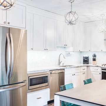
It’s always difficult to add new rooms into existing footprint without expanding out or up and not incurring any opportunity cost. In this case, that was exactly what we had to do. Item one and two above had to be tackled as one. We went ahead and switched out the location of the dining room and eliminating an area where there was a “nook” type eat-in area. By doing so, we were able to cut right into that footprint and change the layout of the kitchen.
That one move allowed us to dig into the kitchen design because it was now the main focal point in the apartment. It was no longer an option to keep it in that tiny hole where it was, so we had to ensure that this design was functional and aesthetically pleasing at the same time. By adding the table into the space where an Island typically would go, we were able to both cut cost and still provide a dining experience. The Table serves as an Island as well when cooking.
We then proceeded to block in the existing doorway to the dining room. By doing this, we were able to create a full room which allowed us to put a door on the other side and called that room Bedroom #2. This was easier to do because all of the mechanicals were already in that space (light, heater and windows). By shifting things around, we also achieved a huge wall to wall closet from inside. PERFECT!
Then we moved into the Single bedroom. We thought it was a big room with a small closet, so by creatively adding an L shaped wall and steal some footprint into the bedroom side, we were able to put a door on that new room and design it for the walk-in closet. Even after this, the bedroom still holds a queen size bed with 2 night stands, a TV on the wall, a sitting chair and plenty of room to walk around. This was done by rethinking the location for the bed and night stands.
The bathroom was gutted to make sure there was no leaks and rebuild from the ground up. We kept all of the plumbing where it was, added a new vanity, medicine cabinet, tiles and lighting and it was done.
From there, the rest of the unit had new flooring all throughout, paint, and lighting. After completion and walk through, this project was handed over back to the clients.
Execution and collaboration between all the trades were: Reggie and his team from Premier Interiors and Rohan from RD Mechanical Services.
p.s. Please see our website to see the video.
 Tile Doctor Ltd
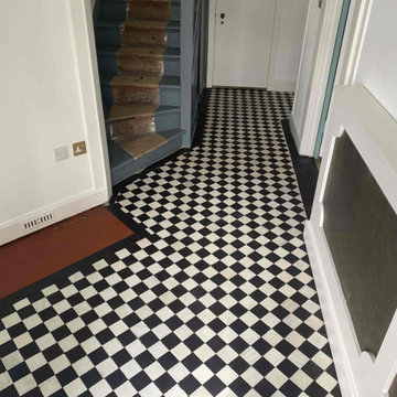
This client from North London had recently bought a property in Highgate N6 and during renovation had discovered an original Victorian tiled floor in the hallway. The floor was laid in a classic black and white diamond pattern but unfortunately a large section was missing and had been filled with concrete. Furthermore, most of the remaining floor had been covered in cement and glue.
I carried out a survey of the floor to determine the main issues and was then able to email over a quote later that day that included rebuilding the missing section of flooring. I suspect the floor had been excavated at some point in the past to install central heating and then rather than have the excavated section restored it was simply back filled and then levelled with a cement screed before finally gluing down a carpet on top.
Once the quote was accepted, I sourced replacement tiles from the Vintage Floor Tile company. Situated in Kent they are a reclamation yard that specialises in supplying original geometric and encaustic tiles including the major historical makers such as Minton and Craven Dunnill.
Armed with replacement tiles I started by removing the concrete that had been used to backfill the missing section and prepare a new surface for tiling with quick drying cement. When ready I was able to carefully build back the original pattern using the replacements. The tiles were secured with tile adhesive and once that had gone off, they were grouted.
The floor was left to set fully overnight and then the next day I was able to return and clean the whole floor using a strong dilution of Tile Doctor Remove and Go. As usual this was left to soak into the tiles for a good ten minutes before being scrubbed into the tiles using a black scrubbing pad. The Tile Doctor Remove and Go did a good job of cleaning the floor and the cleaning solution soon turned black with dirt during the scrubbing. The floor was rinsed with water and the soil extracted with a wet vacuum. After inspecting the floor any areas that needed further work were hand scrubbed and rinsed again until I was happy the floor was clean.
The last part of the cleaning process was to give the tiles an acid wash using Tile Doctor Acid Gel which further cleans the floor by removing old cement residue and grout haze. It also neutralises efflorescent salts in the tiles which are a common issue with floors of this age with no damp proof membrane. After another rinse and extraction, the floor was given a final rinse and then dried as much as possible using the wet vacuum.
I left the floor to dry out for a couple of days before returning to apply a protective sealer. Tile and Stone should be dry before sealing so I use a damp meter first to double check. All was well so to seal the tiles I proceeded to apply the first of what would be three coats of sealer. I used Tile Doctor Colour Grow for this, it works by impregnating the tile occupying the pores and thereby preventing dirt from becoming ingrained there. This product also enhances the black and white colour of the tiles and makes the floor much easier to clean.
Once done the floor was transformed and needless to say my customer was very pleased with the result. For the aftercare of Victorian Tiled floors, I recommend the use of a ph neural tile cleaner such as Tile Doctor Neutral Cleaner; most supermarket tile cleaners are simply too strong for use on sealed floors and can strip off the sealer prematurely.
Andrew Newstead
North London Tile Doctor
15