
Search results for "Process requests" in Home Design Ideas
 Renovisions
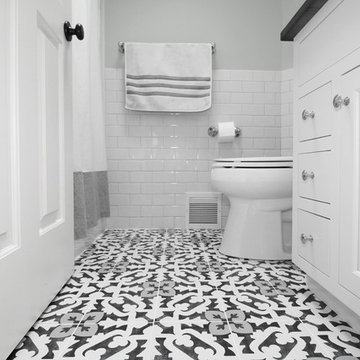
One of our favorite clients requested our services once again, this time to update their outdated full bath. The main goal, aside from keeping the existing tub and surround in place, was to replace the tired vanity, small medicine cabinet, countertop, sink, flooring, light fixture, shower valve and trims with products that are more on trend. The desire was to create a wow factor and display their personal style.
Designing a bath with transitional finishes and a clean aesthetic was top of mind when we selected a white painted inset-style vanity, contrasting marble-look quartz countertop in suede finish and classic 3” x 6” white subway wall tiles. Tying together different patterns and incorporating 8” x 8” black and white deco floor tiles provides an interesting and refreshing industrial look that is an expression of our client’s individuality and style. Adding to this industrial style feature was the double light fixture with clear seeded glass mounted over the new framed recessed medicine cabinet with matching painted finish. Also, a priority in the remodeling process was to provide proper ventilation to not only keep air moving, but to ensure moisture is cleared from the room while showering.
This newly remodeled updated bathroom is light and airy, and clients are thrilled with the result.
“Hi Cathy, I just wanted to let you know how pleased we are with our bathrooms and stairs!! Ed, Bradley, and Charlie did their usual fantastic job, not to mention your guidance and expertise. We could not be more thrilled! Each and every time I look at the wall color in the upstairs bath, I comment to myself that Liz really is a ‘wiz’. Thank you, thank you, thank you!”
- Susan and Hal M. (Hanover)
 InsideWright
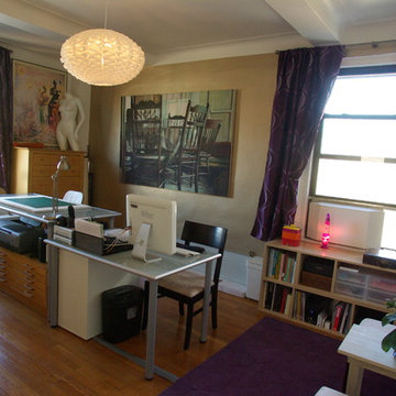
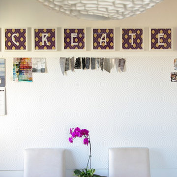
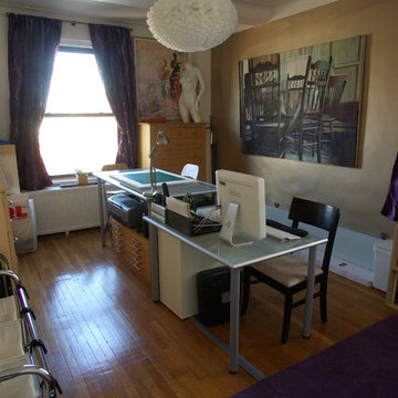
This was a HUGE project that I eventually had a lot of fun with. Another Feng Shui request existed here: this area of the home was supposed to have purples and golds and no unfinished projects or clutter of any kind. Well, this was a storage room. Boxes full of items that were never used, empty boxes to maybe use for shipping in the future, broken items that were intended to be fixed, and furniture that might one day be put to use. Purging was both challenging and incredibly rewarding. I pulled everything out of the room so that it could be plastered and painted and only brought back items that had a use and belonged in this room ... which became a functioning office and studio for a very creative individual. A 4 x 8' piece of Homasote was covered in an ooge patterned wallpaper to be used as a cork board for creative ideas. The ogee motif is repeated in the drapes, decorative paper in frames and backing wigs, and the rug. (The modernist lighting pendant lamp has a related wave-like pattern.) The ogee pattern was inspired by a pair of antique chairs that are too fragile to sit on, so became decorative accents. Not all of the clutter disappeared. It is an artist's studio, clutter is a natural part of the creative process. There's a "Modern Metallics Champagne" accent wall, and purple and gold accents scattered around the room. Purple and gold are not colors I wanted to drown this room in.
 Beall's Nursery & Landscaping
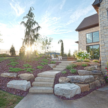
This custom-built home in The Ridge of North Park Manor was built by Barrington Homes in 2019. We worked with the homeowners early in the building process to create a custom master plan for the entire property.
In the front of the home, we made recommend addition contouring to increase the curb appeal and views of the home from the road. The backyard featured a multi-level walkout basement which created unique terraced entertaining spaces. From the covered patio space, we incorporated a large boulder wall to create extra flat usable lawn space for the kids to play. Our design team created a unique swimming pool area mid-level between the basement and the first-floor covered patio. The homeowner requested a small swimming pool with a larger entertaining space around it. The space includes a circular gas firepit surrounded a sitting wall and pillars. The customer chose a natural look by selecting Lampus Desert Blend Country Stone pillars. The homeowner wanted to incorporate a spa into the entertaining space without obstructing the view from the upper level space and pool area. Our design team solved this by integrating the spa into the landscape surrounded by plantings and boulders to mask the look of the bulky spa. The pergola above the spa with a custom drapery created an elegant look and provided a nice cover to incorporate lighting for evening enjoyment.
Find the right local pro for your project
 SAW Live Edge
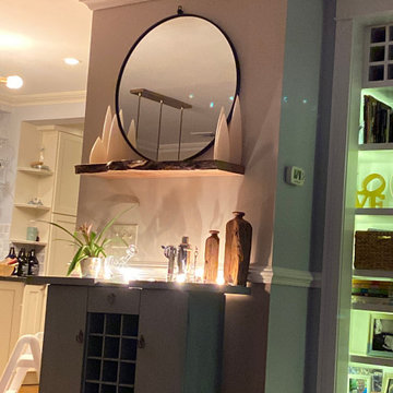
These slabs are cut from Big Leaf Maple Trees from the Canada West Coast. Big Leaf Maple is a rare tree that has a ton of character and beauty. (Exact shown piece has been sold!! You will receive a similar product although all pieces from the live edge detail/ movement and grain will vary. CUSTOM SIZES AVAILABLE upon request please contact for pricing)
_____________________________________________________________________
PROCESS //
Made from the highest quality hardwoods and kiln dried down to single digit moisture content. These are the best floating shelf/ mantels available. I hand pick each piece of wood for your project.
The depth of this live edge floating shelf makes it a perfect bookshelf. It's also ideal for a variety of other uses such as to hold kitchenware, bathroom products or next to your bed as a floating nightstand.
Each shelf comes fitted with a steel support brace (clear coated to prevent rust) with support anchors made of 1/2" thick steel.
Can support up to 50lbs per 24". (If mounted properly)
Comes with all mounting screws #12 x 2.5".
Drilled to accommodate studs 16"oc or 24"oc.
Finished with 3-4 coats of OSMO Polyx Oil Finish to help protect from moisture and other elements. Low VOC.
Each live edge shelf is one-of-a-kind.
 JRP Design & Remodel
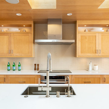
Our clients are seasoned home renovators. Their Malibu oceanside property was the second project JRP had undertaken for them. After years of renting and the age of the home, it was becoming prevalent the waterfront beach house, needed a facelift. Our clients expressed their desire for a clean and contemporary aesthetic with the need for more functionality. After a thorough design process, a new spatial plan was essential to meet the couple’s request. This included developing a larger master suite, a grander kitchen with seating at an island, natural light, and a warm, comfortable feel to blend with the coastal setting.
Demolition revealed an unfortunate surprise on the second level of the home: Settlement and subpar construction had allowed the hillside to slide and cover structural framing members causing dangerous living conditions. Our design team was now faced with the challenge of creating a fix for the sagging hillside. After thorough evaluation of site conditions and careful planning, a new 10’ high retaining wall was contrived to be strategically placed into the hillside to prevent any future movements.
With the wall design and build completed — additional square footage allowed for a new laundry room, a walk-in closet at the master suite. Once small and tucked away, the kitchen now boasts a golden warmth of natural maple cabinetry complimented by a striking center island complete with white quartz countertops and stunning waterfall edge details. The open floor plan encourages entertaining with an organic flow between the kitchen, dining, and living rooms. New skylights flood the space with natural light, creating a tranquil seaside ambiance. New custom maple flooring and ceiling paneling finish out the first floor.
Downstairs, the ocean facing Master Suite is luminous with breathtaking views and an enviable bathroom oasis. The master bath is modern and serene, woodgrain tile flooring and stunning onyx mosaic tile channel the golden sandy Malibu beaches. The minimalist bathroom includes a generous walk-in closet, his & her sinks, a spacious steam shower, and a luxurious soaking tub. Defined by an airy and spacious floor plan, clean lines, natural light, and endless ocean views, this home is the perfect rendition of a contemporary coastal sanctuary.
PROJECT DETAILS:
• Style: Contemporary
• Colors: White, Beige, Yellow Hues
• Countertops: White Ceasarstone Quartz
• Cabinets: Bellmont Natural finish maple; Shaker style
• Hardware/Plumbing Fixture Finish: Polished Chrome
• Lighting Fixtures: Pendent lighting in Master bedroom, all else recessed
• Flooring:
Hardwood - Natural Maple
Tile – Ann Sacks, Porcelain in Yellow Birch
• Tile/Backsplash: Glass mosaic in kitchen
• Other Details: Bellevue Stand Alone Tub
Photographer: Andrew, Open House VC

 CRES Builders Corp.
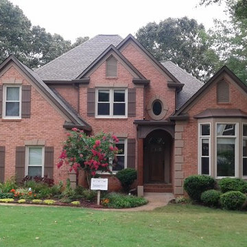
The Smith’s hired us to do several home improvement projects to the exterior of their house, which were inspired by two other homes in the neighborhood. To start, they were looking to add a front porch with a more prominent entrance, as well as a garage eyebrow. In addition, since they were also not happy with the color of their home’s stucco or brick, we were asked to design a new color palette which would utilize the new window color, while also reducing the focus of the stucco.
With that, since the homeowners were concerned about efficiency and making sure the house was properly maintained, they requested new windows, as well as new gutters, downspouts, and covers. Their siding was also an issue since a large portion of it had started to rot and since the rear sunroom and deck had sunk 4+ inches, structural issues were also a problem.
Our Process: In an effort to create the pleasing exterior that was requested, we reached out to an architectural team member who helped us envision a four color paint palette. We installed a rustic cedar porch post, craftsman-style shutters, and metal roof details for a very pleasing result.
As requested, we also installed all-new windows throughout the home and replaced their gutters, downspouts, and covers, as well as the siding that had rotted away.
Since their deck was improperly installed, we removed the old sun room and deck footings, and poured new ones. However, I was not comfortable fixing the issue without knowing the cause, so upon closer inspection, we discovered that water from the neighbor’s house, the driveway, and the Smith’s roof was causing drainage issues. To fix the problem, we installed two main underground drainage lines which would divert water away from the home. From there, we were able to bring both structures to level heights where they could be properly secured and as a finishing touch, we added new tile to the sunroom to give it a more rustic feel.
As a result of the drainage issues, a large section of the driveway had sunk as well, so we removed the concrete and poured it with proper underlayment, rebar, stronger concrete, and a proper pitch.
Extras: While working at the home, the owners asked us to install a new wood-burning fireplace, as well as a new front door and an exhaust fan in the master bathroom. In addition, since we overheard the homeowner say that they wanted to be able to park their car in the garage, we made a point to organize it for them so there was adequate space for a vehicle.
Result: The Smith’s had originally found us on Houzz.com and were incredibly pleased with our quality of work, as well as our ability to stay within their budget and stick to a set timeline. Not only did they give us an excellent review, but hugs were given upon our final goodbye as well. It was a great day.
 Twelve Stones Designs, LLC
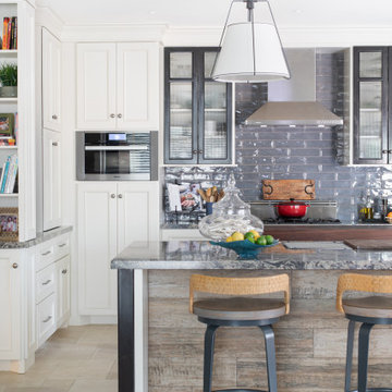
The owners of this kitchen had spent the money to upgrade the finishes in their kitchen upon building the home 12 years ago, but after living in the space for several years they realized how nonfunctional the layout really was. The (then) two preschool aged children had grown into busy, hungry teenagers with many friends who also liked to hang out at the house. So the family needed a more functional kitchen with better traffic flow, space for daily activities revolving around the kitchen at different times of day, and a kitchen that could accommodate cooking for and serving large groups. Furthermore, the dark, traditional finishes no longer reflected the homeowners’ style. They requested a brighter, more relaxed, coastal style that reflected their love of the seaside cities they like to visit.
Originally, the kitchen was U-shaped with a narrow island in the middle. The island created narrow aisles that bottle-necked at the dishwasher, refrigerator, and cooktop areas. There was a pass-through from the foyer into the kitchen, but the owners never liked that the pass-through was also located so close to the powder room. The awkward proximity was unappealing and made guests feel uncomfortable.
The kitchen’s storage was made up of lots of narrow cabinets, apothecary drawers, clipped corner units, and very few drawers. It lacked useful storage for the larger items the family used on a daily basis. And the kitchen’s only pantry was small closet that had only builder-grade, narrow shelving with no illumination to be able to see the contents inside.
Overall, the kitchen’s lighting plan was poorly executed. Only six recessed cans illuminated the entire kitchen and nook areas. The under cabinet lighting was not evenly distributed either. In fact, the builder had mis-placed the under cabinet lighting around the decorative pilasters which made for choppy, dark cubbies. Further, the builder didn’t include any lighting over the sink or the bar area, which meant whoever was doing the dishes was always in their own shadow. That, coupled with the steep overhang of the game room above made the bar area feel like a dim, cavernous space that wasn’t inviting or task oriented. The kitchen looked out into the main living space, but the raised bar and a narrow wall (which held the only large cabinet in the kitchen) created more of a barrier than a relationship to the living room or breakfast nook. In fact, one couldn’t even see the breakfast nook from the cooktop or sink areas due to its orientation. The raised bar top was too narrow to comfortably sit to either dine at or chat from due to the lack of knee space. The the homeowners confided that the kitchen felt more like a dark, dirty prison than place where the family, or their guests, wanted to gather and commune.
The clients' needs and desires were:
➢ to create a kitchen that would be a space the family loved to be in; to relate to the adjacent spaces all around, and to have better flow for entertaining large groups
➢ to remove the walls between the breakfast nook and living area and to be able to utilize the natural light from the windows in both those areas
➢ to incorporate a functional chopping block for prepping fresh food for home cooked meals, an island with a large sink and drain board, 2 pull out trash cans, and seating for at least the 2 teens to eat or do homework
➢ to design a kitchen and breakfast nook with an airy, coastal, relaxed vibe that blended with the rest of the house's coastal theme
➢ to integrate a layered lighting plan which would include ample general illumination, specific task lighting, decorative lighting, and lots of illuminated storage
➢ to design a kitchen with not only more storage for all the husband’s kitchen gadgets and collection of oils and spices, but smart storage, including a coffee/breakfast bar and a place to store and conceal the toaster oven and microwave
➢ to find a way to utilize the large open space between the kitchen, pantry area, and breakfast nook
Twelve Stones Designs achieved the owner's goals by:
➢ removing the walls between the kitchen and living room to allow the natural light to filter in from the adjacent rooms and to create a connection between the kitchen, nook, and living spaces for a sense of unity and communion
➢ removing the existing pantry and designing 3 large pantry style cabinets with LED tape lights and rollout drawers to house lots of kitchen appliances, gadgets, and tons of groceries. We also took the cabinets all the way up to the 9’ ceiling for additional storage for seasonal items and bulk storage.
➢ designing 2 islands - 1 with a gorgeous black walnut chopping block that houses a drawer for chopping and carving knives and a custom double pull out trash unit for point of use utilization - and 1 that houses the dishwasher, a large Blanco Gourmet sink with integrated drain board, woven baskets for fresh root vegetables and kitchen towels, plenty of drawer storage for kitchen items, and bar seating for up to 4 diners.
➢ closing off the space between the kitchen and the powder room to create a beautiful new private alcove for the powder room as well as adding some decorative storage. This also gave us space to include more tall storage near the new range for precision placement of the husband’s extensive oil and spice collection as well as a location for a combo-steam oven the wife wanted for baking and cooking healthy meals.
The project is enhanced functionally by:
➢ incorporated USB and standard receptacles for the kids’ laptops and phone charging in the large island
➢ designing the small island to include additional open shelving for items used on a daily basis such as a variety of bowls, plates, and colanders. This set up also works well for the husband who prefers to “plate” his dinners in restaurant-style fashion before presenting them to the table.
➢ the integration of specific storage units, such as double stacked cutlery drawers, a custom spice pull-out, a Kuerig coffee and tea pod drawer, and custom double stacked utensil drawers
➢ moving the refrigerator to the old oven location - this eliminated the bottle neck as well as created a better relationship to the eating table. It also utilizes the floor space between the pantry, nook, and kitchen
➢ creating a banquet style breakfast nook - this banquette seating not only doubles the amount of seating for large gatherings but it better utilizes the odd space between the kitchen and the previous nook area. It also helps to create a distinct pathway from the mudroom room through the pantry area, kitchen, nook, and living room.
➢ the coffee/breakfast bar area which includes the perfect location for the concealed microwave and toaster oven, convenient storage for the coffee pods and tea accoutrements. Roll-out drawers below also house the smoothie maker, hot water kettle, and a plethora of smoothie-making ingredients such as protein powders, smoothie additives, etc. Furthermore, the drawers below the Keurig house measuring utensil, cutlery, baking supplies and tupperware storage.
➢ incorporating lots of wide drawers and pullouts to accommodate large cookware.
➢ utilizing as much vertical space as possible by building storage to the ceiling which accommodates the family’s abundant amount of serving platters, baking sheets, bakeware, casserole dishes, and additional cutting boards.
The project is enhanced aesthetically by:
➢ new 5-piece Versailles pattern porcelain tile that now seamlessly joins the entire down stairs area together creating a bright, cohesiveness feeling instead of choppy separated spaces - it also adds a coastal feeling
➢ designing a cabinet to conceal the microwave and toaster oven
➢ the coastal influenced light fixtures over the nook table and island
➢ the sandy colors of the Langdon Cambria countertops. The swirling pattern and sparkling quartz pieces remind the homeowner of black-and-tan sandy beaches
➢ the striped banquet seating whose creamy white background and blue-green stripes were the inspiration for the cabinet and wall colors.
➢ All the interior doors were painted black to coordinate with the blacks and grays in the backsplash tile and countertop. This also adds a hint of tailored formality to an otherwise casual space.
➢ the use of WAC's Oculux small aperture LED units for the overhead lighting complimented with Diode LED strips for task lighting under the cabinets and inside the pantry and glass wall cabinets. All of the lighting applications are on separate dimmer switches.
Innovative uses of materials or construction methods by Realty Restoration LLC:
➢ Each 1-1/2” x 3” block of reclaimed end-grain black walnut that makes up the center island chopping block was hand milled and built in the shop. It was designed to look substantial and proportional to the surrounding elements, executed by creating the 4 inch tall top with a solid wood chamfered edge band.
➢ The metal doors on either side of the vent hood were also custom designed for this project and built in the Realty Restoration LLC shop. They are made 1x2, 11-gauge mild steel with ribbed glass. Weighing 60 lbs a piece, heavy duty cabinet hinges were added to support the weight of the door and keep them from sagging.
➢ Under-cabinet receptacles were added along the range wall in order to have a clean, uninterrupted backsplash.
Design obstacles to overcome:
➢ Because we were removing the demising walls between the kitchen and living room, we had to find a way to plumb and vent the new island. We did this by tunneling through the slab (the slab had post tension cables which prevented us from just trenching) to run a new wet vent through a nearby structural wall. We pulled the existing hot and cold lines between upper floor joists and ran them down the structural wall as well and up through a conduit in the tunnel.
➢ Since we were converting from wall overs to a gas range it allowed us to utilize the 220 feed for the wall ovens to provide a new sub panel for all the new kitchen circuits
➢ Due to framing deficiencies inherited from the original build there was a 1-1/2” differential in the floor-to-ceiling height over a 20 foot span; by utilizing the process of cutting and furring coupled with the crown moulding details on the cabinet elevations we were able to mask the problem and provide seamless transitions between the cabinet components.
Evidence of superior craftsmanship:
➢ uniquely designed, one-of-a-kind metal “X” end panels on the large island. The end panels were custom made in the Realty Restoration LLC shop and fitted to the exact dimensions of the island. The welding seams are completely indistinguishable - the posts look like they are cut from a single sheet of metal
➢ square metal posts on the small island were also custom made and designed to compliment and carry through the metal element s throughout the kitchen
➢ the beautiful, oversized end panels on the pantry cabinets which give the breakfast nook a tailored look
➢ integrating a large format 5 piece Versailles tile pattern to seamlessly flow from the existing spaces into the new kitchen space
➢ By constructing a custom cabinet that jogged around a corner we could not remodel (housing the entry way coat closet) we were able to camouflage the adjacent wall offset within the upper and lower cabinets. By designing around the existing jog in the structural walls we accomplished a few things: we were able to find the space to house, and hide, the microwave and toaster oven yet still have a clean cohesive appearance from the kitchen side. Additionally, the owners were able to keep their much needed coat closet and we didn’t have to increase the budget with unnecessary structural work.

 Pennsylvania Landscape & Nursery Association
Terran Landscapes http://www.terranlandscapes.com
Project Entry: Fishers Woodland Garden
2014 PLNA Awards for Landscape Excellence Winner
Category: Theme Garden $15,000-$30,000
Award Level: Bronze
Photo Description:
We were contracted by the client to design a calming space for their staff to relax, take a walk, and enjoy a leisurely lunch as well as to provide their grandchildren a place to run and pick flowers. The space was originally dominated by large trees and had been overgrown with ivy, sumac and aggressive vines, providing an unwelcome, dark space with little color or visual appeal. The client requested a colorful blend of shrubs and perennials that would provide interest throughout the seasons, as well as provide privacy by screening the street traffic along Carisbrooke Road.
Our goal was to create the privacy screen along the road by layering plants from the ground to the tree canopy. The theme was to let nature inspire the landscape, allowing a space that was originally woodland to become an enhanced version of itself, creating a beautiful habitat for birds and butterflies to excite the senses and satisfy all who enjoy the beauty of nature.
We began by clearing the brush and removing all aggressive vines and ivy that jeopardized the health of the trees. We kept and transplanted all non- invasive or native plant material in the area to various locations throughout the property. Several yards of compost were then tilled into the soil and the existing trees fertilized to provide a rich growing environment.
A few challenges occurred during the design process. It was decided that a new generator was to be installed in the woodland and due to a future addition to the house, we were forced to eliminate planned additional impervious pathway surfaces. We provided screening to hide the generator and buffer the noise, and created a meandering path and sitting area out of natural woodchips instead of the proposed bluestone to solve the impervious space issue. The woodchips add a sense of informality and invite the viewer to walk slowly through the space. The reduced noise from the additional screening of the generator allows for quiet reflection as chipmunks scurry and hummingbirds dart about between the flowers.
Our plant palette consists of shady understory plants that thrive and flower vigorously from spring through fall. A tall, lush, evergreen backdrop of Ilex opaca and Prunus laurocerasus ‘Schipkaensis’ provides the screening and blends into a middle layer of ‘Ivory Halo’ dogwood, hydrangeas and winterberry hollies. Beautiful perennials and groundcovers bloom along the woodland path, providing a low visual layer of color and texture. Movement throughout the garden is provided by the graceful Calamagrostis brachytricha and Hakenchloa that soften the nearby hardscaping. The woodland floor is full of shade-loving Solomon’s seal, hosta, astilbe, ferns, bleeding heart, Tiarella and Aconitum.
The street side of this woodland required plants with a preference for a little more sun and drought tolerance. A palette of oakleaf hydrangea, Agastache, Liatris and Rudbeckia softens the fence line and provides the desired color.
As designed and installed, the woodland garden successfully provides the client’s family and office staff a quiet space where they can take a peaceful moment and enjoy nature.
Photo Credit: Lisa C. Falls
 Vetter Architects
Steve Gotter
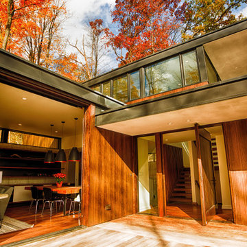
The client’s request was quite common - a typical 2800 sf builder home with 3 bedrooms, 2 baths, living space, and den. However, their desire was for this to be “anything but common.” The result is an innovative update on the production home for the modern era, and serves as a direct counterpoint to the neighborhood and its more conventional suburban housing stock, which focus views to the backyard and seeks to nullify the unique qualities and challenges of topography and the natural environment.
The Terraced House cautiously steps down the site’s steep topography, resulting in a more nuanced approach to site development than cutting and filling that is so common in the builder homes of the area. The compact house opens up in very focused views that capture the natural wooded setting, while masking the sounds and views of the directly adjacent roadway. The main living spaces face this major roadway, effectively flipping the typical orientation of a suburban home, and the main entrance pulls visitors up to the second floor and halfway through the site, providing a sense of procession and privacy absent in the typical suburban home.
Clad in a custom rain screen that reflects the wood of the surrounding landscape - while providing a glimpse into the interior tones that are used. The stepping “wood boxes” rest on a series of concrete walls that organize the site, retain the earth, and - in conjunction with the wood veneer panels - provide a subtle organic texture to the composition.
The interior spaces wrap around an interior knuckle that houses public zones and vertical circulation - allowing more private spaces to exist at the edges of the building. The windows get larger and more frequent as they ascend the building, culminating in the upstairs bedrooms that occupy the site like a tree house - giving views in all directions.
The Terraced House imports urban qualities to the suburban neighborhood and seeks to elevate the typical approach to production home construction, while being more in tune with modern family living patterns.
Overview:
Elm Grove
Size:
2,800 sf,
3 bedrooms, 2 bathrooms
Completion Date:
September 2014
Services:
Architecture, Landscape Architecture
Interior Consultants: Amy Carman Design
 Vetter Architects
The client’s request was quite common - a typical 2800 sf builder home with 3 bedrooms, 2 baths, living space, and den. However, their desire was for this to be “anything but common.” The result is an innovative update on the production home for the modern era, and serves as a direct counterpoint to the neighborhood and its more conventional suburban housing stock, which focus views to the backyard and seeks to nullify the unique qualities and challenges of topography and the natural environment.
The Terraced House cautiously steps down the site’s steep topography, resulting in a more nuanced approach to site development than cutting and filling that is so common in the builder homes of the area. The compact house opens up in very focused views that capture the natural wooded setting, while masking the sounds and views of the directly adjacent roadway. The main living spaces face this major roadway, effectively flipping the typical orientation of a suburban home, and the main entrance pulls visitors up to the second floor and halfway through the site, providing a sense of procession and privacy absent in the typical suburban home.
Clad in a custom rain screen that reflects the wood of the surrounding landscape - while providing a glimpse into the interior tones that are used. The stepping “wood boxes” rest on a series of concrete walls that organize the site, retain the earth, and - in conjunction with the wood veneer panels - provide a subtle organic texture to the composition.
The interior spaces wrap around an interior knuckle that houses public zones and vertical circulation - allowing more private spaces to exist at the edges of the building. The windows get larger and more frequent as they ascend the building, culminating in the upstairs bedrooms that occupy the site like a tree house - giving views in all directions.
The Terraced House imports urban qualities to the suburban neighborhood and seeks to elevate the typical approach to production home construction, while being more in tune with modern family living patterns.
Overview:
Elm Grove
Size:
2,800 sf,
3 bedrooms, 2 bathrooms
Completion Date:
September 2014
Services:
Architecture, Landscape Architecture
Interior Consultants: Amy Carman Design
 DreamMaker Bath and Kitchen - Utah
Photographer: Michael Brewer
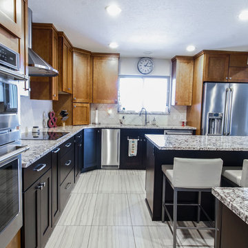
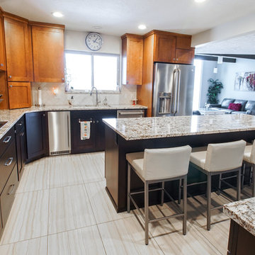
In order to help the homeowners achieve their vision Heather, our designer, knew that some walls needed to be removed. We removed one L-shaped wall to open up the kitchen area to the rest of the home, this relieved high traffic areas in the home and improved the flow of the main level tremendously. We also removed a closet to help maximize their space. We added a mudroom off of the kitchen with lockers for easy organization of the kid’s backpacks, coats, and shoes.
The homeowners had some specific ideas in mind for the style of the kitchen. They wanted two-toned shaker cabinets, white backsplash with a unique design, and they requested large floor tiles. Heather helped them through the selection process and they happily landed on:
- Light Maple Upper Cabinets
- Dark Maple Lower Cabinets
- White Subway Tile Backsplash in a Herringbone
Pattern
- Large 17x35 porcelain tile flooring
- Light Granite Counter Tops
 SAW Live Edge
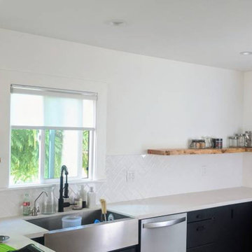
These slabs are cut from Big Leaf Maple Trees from the Canada West Coast. Big Leaf Maple is a rare tree that has a ton of character and beauty. (Exact shown piece has been sold!! You will receive a similar product although all pieces from the live edge detail/ movement and grain will vary. CUSTOM SIZES AVAILABLE upon request please contact for pricing)
_____________________________________________________________________
PROCESS //
Made from the highest quality hardwoods and kiln dried down to single digit moisture content. These are the best floating shelf/ mantels available. I hand pick each piece of wood for your project.
The depth of this live edge floating shelf makes it a perfect bookshelf. It's also ideal for a variety of other uses such as to hold kitchenware, bathroom products or next to your bed as a floating nightstand.
Each shelf comes fitted with a steel support brace (clear coated to prevent rust) with support anchors made of 1/2" thick steel.
Can support up to 50lbs per 24". (If mounted properly)
Comes with all mounting screws #12 x 2.5".
Drilled to accommodate studs 16"oc or 24"oc.
Finished with 3-4 coats of OSMO Polyx Oil Finish to help protect from moisture and other elements. Low VOC.
Each live edge shelf is one-of-a-kind.
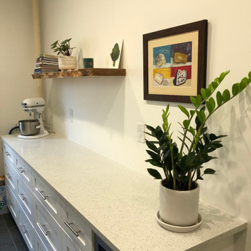 SAW Live Edge
These slabs are cut from Big Leaf Maple Trees from the Canada West Coast. Big Leaf Maple is a rare tree that has a ton of character and beauty. (Exact shown piece has been sold!! You will receive a similar product although all pieces from the live edge detail/ movement and grain will vary. CUSTOM SIZES AVAILABLE upon request please contact for pricing)
_____________________________________________________________________
PROCESS //
Made from the highest quality hardwoods and kiln dried down to single digit moisture content. These are the best floating shelf/ mantels available. I hand pick each piece of wood for your project.
The depth of this live edge floating shelf makes it a perfect bookshelf. It's also ideal for a variety of other uses such as to hold kitchenware, bathroom products or next to your bed as a floating nightstand.
Each shelf comes fitted with a steel support brace (clear coated to prevent rust) with support anchors made of 1/2" thick steel.
Can support up to 50lbs per 24". (If mounted properly)
Comes with all mounting screws #12 x 2.5".
Drilled to accommodate studs 16"oc or 24"oc.
Finished with 3-4 coats of OSMO Polyx Oil Finish to help protect from moisture and other elements. Low VOC.
Each live edge shelf is one-of-a-kind.
 Hearthstone Inc
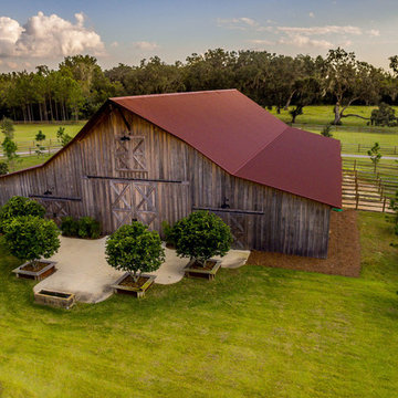
Richard Herman is in the hospitality business and owns several upscale hotels in Florida and in other states as well as cattle ranches in both Florida and Missouri. Their farm in Ocala is by farm their most unique. The property serves as a 4-H demonstration project for the purpose of children’s education. They have been working with the Academy Prep of St. Pete which is dedicated to inner-city youths that are selected on the basis of need and achievement. Wife Diane spends her time on the farm raising Gypsy Vanners, a diminutive draft horse named after the job they did in Eastern Europe, pulling the wagons (vans) for gypsies that wandered across the continent. On the Ocala farm, there are several mules with a unique profession.
Richard had visited the Hearthstone display at a Log & Timber Home Shows at the Orlando Convention Center many years ago. He was impressed that Hearthstone had stayed in touch with him over the years by mailings, invitations to shows, and periodic phone calls. When the time came to start serious consideration of the design of barn, Hearthstone responded promptly and professionally to Richard and Diane’s requests for information and a review of their ideas for their barn, which would serve as the centerpiece for their new farm.
They wanted a multipurpose facility that could accommodate an educational environment and a large hall suitable for the fundraising events for his charities. Richard wanted a barn that reflected the look and feel of barns built at the dawn of the 20th century. Besides the rustic chicken houses and vegetable gardens, they have completely renovated a 1020’s era farmhouse to be as historically correct as possible and serves as the entry to the farm.
“They very careful to feel us out, get comfortable with our capabilities, and be convinced that we could perform as promised,” said Project Manager John Ricketson of Hearthstone.
Design Process
There were some initial drawings that gave us a start on the basic shape and size of the barn. From there, it was a process of narrowing down the uses of each area and the spans that could be achieved. The barn was going to have the traditional “board & batten” exterior siding and a metal roof. There is a cantilevered ‘hay hood” on the north gable end above the large sliding barn doors that open into the foyer and horse stalls. The wings house a combination of areas, beginning with the large restrooms to accommodate crowds for events. Other parts of the wings have garage areas for the farm vehicles, feed room, tack room, wash rack, storage, offices, and smaller restrooms.
Keeping with the look and feel of the turn of the century, Hearthstone developed a process for giving the timbers a surface texture that mimicked the circular cuts of timbers that had just come out of an old sawmill. This was easier said than done. Randy Giles guided his millwright (Wolfgang) in designing a machine that would do this effectively.
The barn was delivered in October of 2014 and was erected over the course of two weeks, thanks to a hardworking crew (Eric Foster) and near-perfect weather. After the Hearthstone crew completed the erection and roof dry-in, it was time for the local carpenters to step up and install some light conventional framing on the gable ends before applying the roof fascia and exterior board & batten siding. Next came the big sliding barn doors, plumbing, electrical, heating, and cooling. Large rustic fixtures were hung from the great hall roof timbers.
Exterior
The board & batten siding was cypress and allowed to turn color naturally as rain hit it and the sun started working on it with UV rays. This method causes a much grayer look closer to the ground and less so where the roof overhang provides protection. The North end has some large limestone boulders and planters arranged around the pad with tall pampas grass. The planters provide casual seating before events and during outside receptions. The entire area was sodded with lush St. Augustine grass and split rail fences were added to enclose the barn area. The corrugated metal roof was a special order material that immediately rusted after being exposed to moisture. The layer of rust protects the metal from the elements.
Interior
The board & batten theme was carried throughout most of the interior with the timbers left natural to show off the circular saw texture. All of the tongue & groove decking was shipped in advance to allow the local painter to pre-stain it with a dark brown transparent stain that is a beautiful background to the light color Eastern White Pine timbers.
“Everything was unique in this project” said Project Manager John Ricketson. “The setting on a small demonstration farm close to Ocala, the multipurpose design, the circular saw texture on the timbers.”
The Hermans are very proud of their farm’s outcome. Richard sent a note to Randy Giles, owner of Hearthstone: “The Barn is fantastic, not a single problem, period. Next month, we have Jo Dee Messina coming in to help with a fundraiser for a local center for abused kids. Folks love the farm, ...... but that barn gets all of the attention. I would encourage you to use me as a reference for your sales team, feel free to extend my cell phone to any prospective purchasers.”
 DreamMaker Bath and Kitchen - Utah
Photographer: Michael Brewer
In order to help the homeowners achieve their vision Heather, our designer, knew that some walls needed to be removed. We removed one L-shaped wall to open up the kitchen area to the rest of the home, this relieved high traffic areas in the home and improved the flow of the main level tremendously. We also removed a closet to help maximize their space. We added a mudroom off of the kitchen with lockers for easy organization of the kid’s backpacks, coats, and shoes.
The homeowners had some specific ideas in mind for the style of the kitchen. They wanted two-toned shaker cabinets, white backsplash with a unique design, and they requested large floor tiles. Heather helped them through the selection process and they happily landed on:
- Light Maple Upper Cabinets
- Dark Maple Lower Cabinets
- White Subway Tile Backsplash in a Herringbone
Pattern
- Large 17x35 porcelain tile flooring
- Light Granite Counter Tops
 User
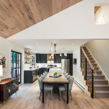
UserA Vermont second home renovation used for an active family who skis. Photos by Matthew Niemann Photography.
Inspiration for a contemporary light wood floor and beige floor great room remodel in Dallas with white walls
Inspiration for a contemporary light wood floor and beige floor great room remodel in Dallas with white walls
 InsideWright
This was a HUGE project that I eventually had a lot of fun with. Another Feng Shui request existed here: this area of the home was supposed to have purples and golds and no unfinished projects or clutter of any kind. Well, this was a storage room. Boxes full of items that were never used, empty boxes to maybe use for shipping in the future, broken items that were intended to be fixed, and furniture that might one day be put to use. Purging was both challenging and incredibly rewarding. I pulled everything out of the room so that it could be plastered and painted and only brought back items that had a use and belonged in this room ... which became a functioning office and studio for a very creative individual. A 4 x 8' piece of Homasote was covered in an ooge patterned wallpaper to be used as a cork board for creative ideas. The ogee motif is repeated in the drapes, decorative paper in frames and backing wigs, and the rug. (The modernist lighting pendant lamp has a related wave-like pattern.) The ogee pattern was inspired by a pair of antique chairs that are too fragile to sit on, so became decorative accents. Not all of the clutter disappeared. It is an artist's studio, clutter is a natural part of the creative process. There's a "Modern Metallics Champagne" accent wall, and purple and gold accents scattered around the room. Purple and gold are not colors I wanted to drown this room in.

 Total System Service
As a manager of a building or property, you quickly learn the art of mediation. One minute you may be working with a vendor to keep the building’s operating system running efficient and smooth; the next moment you may be calming a tenant down after finding the change in the system disrupted his office’s workflow. Give and take; it’s the only way to make sure every day runs perfectly.
Overall, you have two goals to strive for in everything you do.
1. Keep the building running properly, upgrading systems as appropriate, and striving to do all you can on a pre-established budget.
2. Keep the building occupants happy, with as little disruption as possible.
While some changes are minor, barely registering on a building occupant’s mind, with HVAC challenges, that’s rarely the case. If a HVAC contractor is replacing an air handler, for instance, and disconnects one and moves to the next unit, it may cause major disruptions to sensitive areas of a building. And if the occupant wasn’t prepared for the disruption, you can have a mighty unhappy customer on your hand.
Anytime you are working on HVAC projects throughout your building, there are strategies you can put into place to keep things running smooth.
Communicate with occupants
Communication is key to any good relationship, and as a property manager, this rule is a great place to start. If you will be working with the HVAC equipment, block out the timeframe for work to be done, and understand the potential consequences of the process. Then communicate this process with every point of contact you have throughout the building. The more detail you can provide, the less surprises you’ll have throughout the process. You can also work with your building’s occupants before the process begins, finding out if there are better timeframes than others.
Establish a realistic schedule
As a property manager, its easy to provide your expectations for the HVAC project at hand, and request that the proposal be written in such a way that work is completed on your timeframe. Unfortunately, many contractors want your business and will agree to anything upfront in order to win the bid, knowing full well the work will take longer than specified. Instead of projecting your timeframes into the proposal process, ask for HVAC project bids to establish realistic schedules of how long the process will take, and what areas of your property will be most effected throughout the schedule. This will help you avoid crises between you and the contractor, and you and your tenants.
Plan for the whole system
If one small piece of your HVAC system is weak, its easy to fix that one small piece. But how will that impact your overall system? Will it cause weak spots in different parts of the building – maybe a corner office will have reduced air flow, and therefore be colder in the winter and warmer in the summer? When retrofitting new pieces with older existing systems, its easy to reduce the efficiency of your entire system. Before agreeing to certain repairs, make sure you understand how it will impact your entire system overall. An easy way of handling this problem is by working with the same HVAC contractor again and again, He will understand your system’s potential, and know when to make repairs, and when to replace.
Have points of contact available for immediate assistance
In many cases, problems arise because connections can’t be made. Can the HVAC contractor get a hold or you or another person that can make decisions at a moments notice if a problem arises? Do you have access to decision makers throughout the building that may be impacted by this change? Many projects have been put on hold simply because a person in authority can’t be found to give the go-ahead to move forward. If you have access to these people during the time of the project, you’ll be able to complete the project in record time.
Test
Finally, if you can test things in stages, or test when the potential for problems is the smallest, you reduce the chances of bigger emergency issues falling into your lap. If you’ll be installing a new terminal unit, can you make the switch on a Saturday morning when the building is largely unoccupied? If you’re replacing a large system, can you replace and test in phases so the entire project isn’t released at once?
Most issues can be avoided with just a little strategy from the beginning. If you’ve never had a HVAC maintenance team to help you stay on track with your building’s heating and cooling, now may be the time to find out how easy a team approach makes the process.
 InsideWright
This was a HUGE project that I eventually had a lot of fun with. Another Feng Shui request existed here: this area of the home was supposed to have purples and golds and no unfinished projects or clutter of any kind. Well, this was a storage room. Boxes full of items that were never used, empty boxes to maybe use for shipping in the future, broken items that were intended to be fixed, and furniture that might one day be put to use. Purging was both challenging and incredibly rewarding. I pulled everything out of the room so that it could be plastered and painted and only brought back items that had a use and belonged in this room ... which became a functioning office and studio for a very creative individual. A 4 x 8' piece of Homasote was covered in an ooge patterned wallpaper to be used as a cork board for creative ideas. The ogee motif is repeated in the drapes, decorative paper in frames and backing wigs, and the rug. (The modernist lighting pendant lamp has a related wave-like pattern.) The ogee pattern was inspired by a pair of antique chairs that are too fragile to sit on, so became decorative accents. Not all of the clutter disappeared. It is an artist's studio, clutter is a natural part of the creative process. There's a "Modern Metallics Champagne" accent wall, and purple and gold accents scattered around the room. Purple and gold are not colors I wanted to drown this room in.
20