
Search results for "Proper functioning" in Home Design Ideas
 Renovisions
These clients were looking for a designer/builder that would handle everything from concept to completion, providing peace of mind for themselves! “Working alongside Renovisions was a pleasant experience” said our clients as we cared to understand their vision, needs, wants and desires, enabling us to execute their projects successfully and professionally.
During the design phase, our well-organized staff listened to the client’s requests and combined several design elements that produced a beautiful, calming and transitional feel to the new kitchen space.
During the remodel phase, the clients had these top 5 items on the list of enhancements:
* High- functioning ventilation to clear as much odors as possible
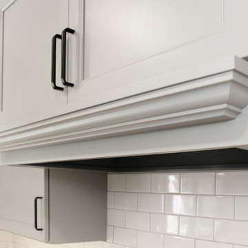
(When we first met with the clients, they stated, “Something very fishy was going on in their outdated kitchen. Although they enjoyed cooking fish dinners, they fishy odors often annoyed them)! Renovisions designed and installed a wood hood in matching light gray painted finish with a hood liner that provided the maximum ventilation, while staying within the proper building code of a 350cfm air exchange, without having to add a make -up air system which would have added to the cost of the project.
*Better functioning ‘Spinner Storage’ for interior storage. The clients loved them in their old kitchen; we furnished and installed new and better-quality spinners storage units.
*A unique opening between the kitchen and family room that allowed homeowners to pass meals through as they enjoyed a movie from the family room.
*A Smart-Divide porcelain enamel sink with stainless steel grids allow plenty of room for dirty dishes, pots and pans as well as separate areas to prep and wash dishes as needed.
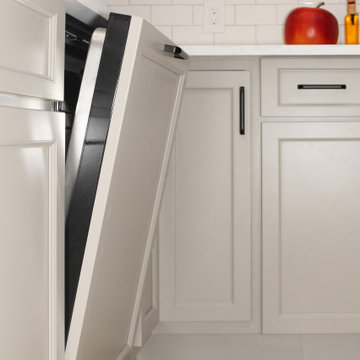
* Anti-glare finishes were a must have for these clients; kitchen cabinetry in a matte gray neutral finish, faucet and cabinet hardware in a matte black finish and stunning Cambria quartz countertops in a suede finish set the stage.
At completion phase, homeowners were ensured that they were receiving high-quality products, style and craftmanship in the most efficient time frame and were thrilled with look of their new kitchen that also provided plenty of prep, entertaining and seating space.
The clients attributes the success of the design to the emotions it inspired when the job was completed – they simply love everything about it!
 Renovisions
These clients were looking for a designer/builder that would handle everything from concept to completion, providing peace of mind for themselves! “Working alongside Renovisions was a pleasant experience” said our clients as we cared to understand their vision, needs, wants and desires, enabling us to execute their projects successfully and professionally.
During the design phase, our well-organized staff listened to the client’s requests and combined several design elements that produced a beautiful, calming and transitional feel to the new kitchen space.
During the remodel phase, the clients had these top 5 items on the list of enhancements:
* High- functioning ventilation to clear as much odors as possible
(When we first met with the clients, they stated, “Something very fishy was going on in their outdated kitchen. Although they enjoyed cooking fish dinners, they fishy odors often annoyed them)! Renovisions designed and installed a wood hood in matching light gray painted finish with a hood liner that provided the maximum ventilation, while staying within the proper building code of a 350cfm air exchange, without having to add a make -up air system which would have added to the cost of the project.
*Better functioning ‘Spinner Storage’ for interior storage. The clients loved them in their old kitchen; we furnished and installed new and better-quality spinners storage units.
*A unique opening between the kitchen and family room that allowed homeowners to pass meals through as they enjoyed a movie from the family room.
*A Smart-Divide porcelain enamel sink with stainless steel grids allow plenty of room for dirty dishes, pots and pans as well as separate areas to prep and wash dishes as needed.
* Anti-glare finishes were a must have for these clients; kitchen cabinetry in a matte gray neutral finish, faucet and cabinet hardware in a matte black finish and stunning Cambria quartz countertops in a suede finish set the stage.
At completion phase, homeowners were ensured that they were receiving high-quality products, style and craftmanship in the most efficient time frame and were thrilled with look of their new kitchen that also provided plenty of prep, entertaining and seating space.
The clients attributes the success of the design to the emotions it inspired when the job was completed – they simply love everything about it!
 Nicole Dingle Design
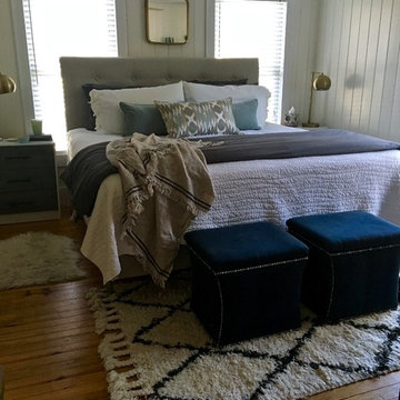
The house is about 100 years old and was originally on Pawleys Island proper. It was moved to “mainland” Pawleys island about 10 or 15 years ago and was purchased by owners in 2009. It’s a cozy (read small), happy house with lots of character that hugs you when you walk in.
There were a couple of changes that absolutely needed to happen to make the house more functional. The first was a laundry room, the second was a place for us to eat as a family and entertain, and the third was a more functional kitchen.
Here is the end result.
Find the right local pro for your project
 More Space Place - Palm Harbor/Lutz/St Petersburg
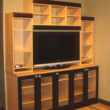
The ever increasing screen size of today’s modern sleek TV’s offer very exciting visual opportunities. When choosing an entertainment system for it, functionality should be a key ingredient.
Functionality becomes the issue as soon as you start to connect the TV to the cable box, DVD player, amplifier, surround sound speakers and subwoofers…and any of the other numerous components, including computers and gaming devices. Beyond the initial hook up, there will likely be future needs for components to be upgraded or replaced. A properly designed media entertainment center can make this not only easier but also make a statement as an artful furniture addition to the living room, man Cave or bedroom.
 CCM Contracting LLC
Full Kitchen Remodel in Green Bay, WI
Complete Transformation | Flooring, Cabinetry, Drywall & Finish Carpentry
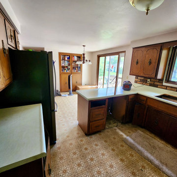
This full kitchen remodel in Green Bay, Wisconsin transformed an outdated layout with original cabinetry and worn flooring into a clean, modern, highly functional space designed for long-term durability.
As a veteran-owned home remodeling contractor serving Brown County, our goal was to completely rebuild the space from the inside out — not simply update surface finishes.
Scope of Work Included:
• Full demolition of existing cabinetry and finishes
• New drywall installation and wall preparation
• Updated electrical layout coordination
• Interior painting throughout
• Installation of new shaker-style cabinets
• Modern cabinet hardware
• New laminate countertops
• Luxury vinyl plank flooring installation
• New base trim and window casing
• Updated sink and appliance integration
The original kitchen featured dated cabinetry, heavy trim details, and aging sheet vinyl flooring. By removing the old finishes and rebuilding with clean lines and neutral tones, the space now feels brighter, larger, and more functional.
The new layout maximizes wall space, improves workflow, and creates a cohesive transition into the adjoining dining area. Updated trim and casing details complete the project and elevate the overall finish quality.
Built for Homeowners Who Value Quality
CCM Contracting LLC is a veteran-owned remodeling contractor serving Green Bay and Brown County, Wisconsin.
We specialize in structured, full-scope renovations for homeowners who prioritize craftsmanship, communication, and professional execution.
We do not approach projects as surface upgrades. We rebuild spaces properly — with durable materials, disciplined process, and clean finish work.
If you are planning a kitchen remodel in Green Bay and are seeking a contractor who treats your home with precision and respect, we welcome the opportunity to discuss your vision.
 Paintzen, Inc.
For many, professional interior design is a luxury. Whether your home’s design project is large or small, having the ability to transform your house, apartment or condo into a beautiful, unique space is a wonderful opportunity for self-expression. Even if it is a just simple accent wall painted in a color that speaks to you, or a complete renovation of your cabinets to achieve the kitchen of your dreams, interior design allows you to create an environment that is both personal and comfortable.
That is exactly how interior designer and founder of Design Exchange Sean Carlson Perry feels about what he does for a living. “The reason that I love designing spaces, and value the impact of space design on people, is the way the spaces make us feel, the visceral appeal of good design. Good design should stimulate the senses and generate an emotionally engaging experience. As a designer, I get to massage and sculpt people’s experience of space!” Perry shared with us.
In late 2017, the Paintzen team connected with Perry regarding a very special design project he was working on. Design Exchange was renovating, redesigning and re-furnishing The Ali Forney Center. The Ali Forney Center, based in New York City, is the largest and most comprehensive organization dedicated to housing homeless LGBTQ youth. Nearly 40% of the homeless youth population is LGBTQ. Homeless LGBTQ youth are eight times more likely to experience violence, discrimination, and suicide. AFC houses 124 youths each night and provides services to over 1,400 homeless young people per year.
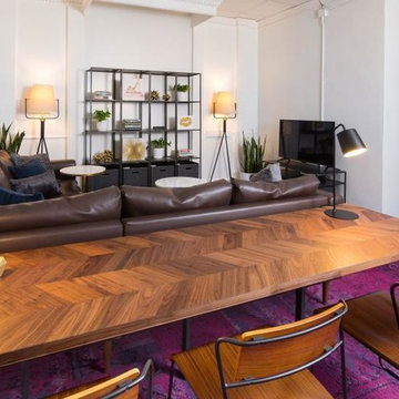
Although the organization does an incredible job to provide safety and shelter to homeless youth, Perry and his team felt the space itself could use some updating and could feel more welcoming. Rooms were dark, cold, and lacked proper storage. Furniture was in poor shape and didn’t work. The rooms were being under-utilized; overall, there was so much more that could be done within the walls of the AFC that could be improved using interior design & paint!
We at Paintzen were excited to partner with Design Exchange to do our part in this transformation. The dark, paneled walls were re-painted white. This entirely opened up the space, making it brighter, warmer and more welcoming. The white walls also served as a much better backdrop for smart lighting, as well as for the furniture, wall decor, and new flooring. Beyond painting, Perry and his team used FLOR carpet tiles for durability in a bright Fuchsia shade for a pop of color. They created a more functional layout to maximize the space and make better use of its architectural details and added new furniture including lamps, tables, throws, a sofa, a TV and a Roku to make the space beautiful, and even fun.
“Design increases connection and community,” Perry told us. “When we revamp a shelter space, history tells us that the residents spend more time in the space, more time with their peers, building connections and community; a greater sense of home.” Perry’s goal was to create an environment that set its residents up for success by improving their quality of life, outlook and self-esteem.
“This isn’t extreme home makeover (although I wish I had that budget!). It’s about improving the aesthetics of the space to create a better environment and experience for people who are going through challenging times. I’ve been lucky enough to have an amount of work that allows me to donate a portion of profits to Design Exchange Projects.”
Sean Carlson Perry founded Design Exchange as a way to use his talent, passion, and skills to help those who are struggling, or in a place of immediate need. He was searching to bring deeper meaning and a humanitarian component to his work. Perry has worked with clients in New York, San Francisco, and Los Angeles. “Good design—functionally, aesthetically and ergonomically—promotes a better quality of life.” This is a mantra that describes why Perry does what he does through Design Exchange, working to help the underserved of New York City and other cities across the country.
“I grew up gay in Nebraska, and have gone through some hard times when I was younger, but I can’t imagine going through what these kids go through – rejection from family, being kicked out of the house for being who they are, homeless and having nowhere else to turn,” said Perry. “Luckily, there is The Ali Forney Center. Doing these projects for AFC strikes close to home for me, so they are extra special and close to my heart.”
 Sosna Inc
Our Clients, a retired couple with a dog, were first time renovators. They approached Sosna to renovate their outdated Shared Bathroom because they were embarrassed for guests to use it. The cluttered layout was difficult to navigate, and it lacked useful storage space. As well, there was no fan for proper ventilation.
They were concerned about a renovation being messy, and disrupting their everyday lives, as they would be living in their home during construction. They also had a tight deadline that needed to be met. We completed this project on time, with great care taken so the family would be comfortable during the duration of construction.
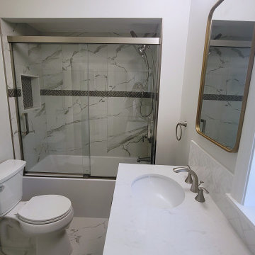
The Bathroom was given a fresh update with clean, modern tiles on the floor and shower walls, which were complimented with herringbone accent tiles. A glass shower door provided a more open and airy feel to the space. A stylish navy blue navy blue prefabricated vanity adorned with elegant gold hardware and a brushed nickel faucet, as well as a white freestanding cabinet, and wall mounted cabinet provided plenty of useful storage space. The Shared Bathroom was tied together with a blend of gold and brushed nickel hardware used throughout.
As a result of the renovation, the couple now enjoys a fresh and modern Shared Bathroom that they take pride in showing to their guests. The addition of extra storage space has eliminated clutter, and everything has its place. The installation of a timer fan ensures proper ventilation. These updates have significantly improved the functionality of the Bathroom, creating a more comfortable and useful space for the family.

Sponsored
Columbus, OH

Structural Remodeling
Franklin County's Heavy Timber Specialists | Best of Houzz 2020!
 Hillview Custom Renovations
Custom Basement Master Suite with Spa-Inspired Bath & Walk-In Closet:
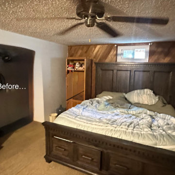
This basement renovation transformed an unfinished lower level into a private, fully functional master retreat designed for comfort, storage, and long-term livability.
The spacious bedroom was intentionally designed with a soft neutral palette, plush carpeting, and layered lighting to create a calm, restful environment. A custom barn door system adds architectural interest while concealing a generous walk-in closet. Inside, thoughtfully designed shelving and hanging systems maximize storage and organization, turning what was once unused space into a highly functional dressing area.
The adjoining bathroom blends modern simplicity with warm rustic touches. A beautiful wood vanity with matte black fixtures grounds the space, while clean-lined lighting and a streamlined mirror keep the look fresh and contemporary. The walk-in shower features a sleek glass enclosure and geometric tile for subtle texture and visual interest, creating a spa-like feel within a compact footprint.
Throughout the suite, careful planning ensured proper lighting, comfort, and flow — elevating the basement from secondary space to true primary living quarters.
At Hillview Custom Renovations, we believe lower levels can offer just as much beauty and intention as the main floor. This project reflects our commitment to creating spaces that are not only well-built, but thoughtfully designed for everyday life.
 ESM Construction LLC
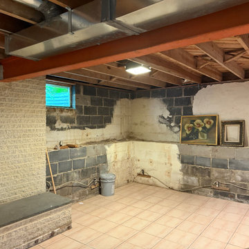
This project involved finishing a basement space to create a clean, functional, and comfortable living area. The scope of work included installation of insulation to reduce sound transfer between floors, new drywall installation, recessed lighting, and electrical upgrades with new wiring connected to the main panel.
An egress window was installed to meet safety requirements and provide emergency exit access. The installation included cutting the foundation wall, installing the window well, gravel drainage system, and ensuring code compliance.
Existing tile flooring was maintained, while walls and ceilings were repaired, textured, and painted. Select areas were finished with decorative stucco to highlight the original brick for a unique design feature. Plumbing lines were adjusted as needed to allow proper drywall installation on the ceiling.
The final result is a bright and functional basement space suitable for comfortable daily use.
 Pool Environments, Inc.
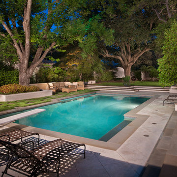
Originally designed by one of the most notable landscape architects in town, this once impressive project had faltered in recent years. The pool and spa still functioned well, and the client wanted to keep it intact. In addition, they wanted to keep as much of the existing landscaping as possible. The surrounding decks, walls, and steps were fair game. At first glance, one might think that our changes were simple material changes. Upon closer inspection, however, one can see the subtle, yet transformative changes that come together to update this classic pool in a tasteful, timeless manner, and improve the flow and usability of the deck areas, while softening the feel of the massive hardscape.
The subtle changes begin as soon as you walk out the back door of the house. The existing decking had a lot of what we call “tweeners”; areas that are overly generous walkways, yet not large enough to house furniture. The awkwardly small bluestone patio was expanded to accommodate a generous seating area, by pushing the step-down closer to the pool. Our talented stone mason carefully married the new bluestone into the existing, resulting in an imperceptible difference between the two. As you descend the new bluestone steps to the pool level, your bare feet will be thankful for the new smooth-finished limestone colored concrete, with a hand cut pattern carefully etched into its surface. The old red brick decking was so hot that the owners could not walk around the pool in bare feet. The brick coping was also replaced with an eased edge Pennsylvania Premier Stone which matches the new step treads throughout the project. Between the house and the pool, a large raised planter was reconfigured, giving additional space to the pool deck for a shaded lounge chair area.
Across the pool, a bank of rather tall painted brick retaining walls were cut down, shortened, and moved. This lessened the visual impact of the walls, which were rather overwhelming in the space, as well as opening up a new seating area, nestled under the arms of the massive pecan at the back of the property. Rather than continuing solid decking around the entire pool, the area near these walls has been transformed to large stone stepper pads set in a sea of beautiful St. Augustine lawn. This creates a visually softened area that is still suited to setting tables and chairs when the guest list calls for additional seating.
The spa area is quite possibly the most dramatic change on this project. Yet more raised planter walls divided this area into awkward spaces, unsuited to proper furniture placement. The planters were removed, new stone decks, once again expertly married into the existing, opening the area to house a large dining table and new built in bbq area. The spa itself was re-imagined with the bluestone coping, and painted brick veneer. The most impressive addition though is the new handmade glazed tiles that surround the existing cast stone water feature. This water feature was almost unnoticeable against the painted brick wall, but now the dramatic arch and pop of color draw the eye to this quaint little corner of the property.
 Randy Angell Designs
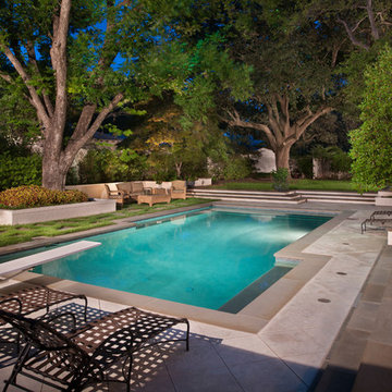
The subtle changes begin as soon as you walk out the back door of the house. The existing decking had a lot of what we call "tweeners"; areas that are overly generous walkways, yet not large enough to house furniture. The awkwardly small bluestone patio was expanded to accommodate a generous seating area. This was done by pushing the step-down closer to the pool.
Our talented stone mason carefully married the new bluestone into the existing portion of the patio, resulting in an imperceptible difference between the two.
As you descend the new bluestone steps to the pool level, your bare feet will be thankful for the new smooth-finished, limestone-colored concrete, with a hand cut pattern carefully etched into it's surface.
The old red brick decking was so hot that the owners could not walk around the pool with their bare feet. The brick coping was also replaced with an eased edge, Pennsylvania Premier Stone which matches the new step treads throughout the project.
Between the house and the pool, a large raised planter was reconfigured, giving additional space to the pool deck for a shaded lounge chair area. Across the pool, a bank of rather tall painted brick retaining walls were cut down, shortened and moved. This lessened the visual impact of the walls (which were overwhelming in the space) and also opened up a new seating area, nestled under the arms of the massive Pecan tree at the back of the property.
Rather than continuing solid decking around the entire pool, the area near these walls has been transformed to large stone stepper pads set in a sea of beautiful St. Augustine lawn. This creates a visually softened area that is still suited to setting tables and chairs when the guest list calls for additional seating.
The spa area is possibly the most dramatic change on this project. Yet more raised planter walls divided this area into awkward spaces, unsuited for proper furniture placement. The planters were removed, new stone decks added, and once again expertly married into the existing decks, opening the area to house a large dining table and a newly built-in BBQ area.
The spa itself was re-imagined with the bluestone coping and painted brick veneer. The most impressive addition though is the new handmade glazed tiles that surround the existing cast stone water feature. This water feature was almost unnoticeable against the painted brick wall, but now the dramatic arch and pop of color draw the eye to this quaint little corner of the property.
Originally designed by one of the most notable landscape architects in town, this once impressive project had faltered in recent years. The pool and spa still functioned well, and the client wanted to keep it intact. In addition, they wanted to keep as much of the existing landscape as possible. But, the surrounding decks, walls and steps were fair game.
At first glance, one might think that our changes were simple material changes. However, upon closer inspection, one can see the subtle-yet-transformative changes that came together to update this classic pool in a tasteful, timeless manner, as well as to improve the flow and usability of the deck areas, while softening the feel of this massive hardscape.
 Joy Street Design
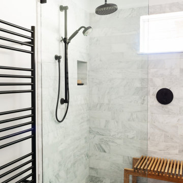
Our Oakland studio changed the layout of the master suite and kid's bathroom in this home and gave it a modern update:
---
Designed by Oakland interior design studio Joy Street Design. Serving Alameda, Berkeley, Orinda, Walnut Creek, Piedmont, and San Francisco.
For more about Joy Street Design, click here:
https://www.joystreetdesign.com/
To learn more about this project, click here:
https://www.joystreetdesign.com/portfolio/bathroom-design-renovation
 Shannon Ggem Design
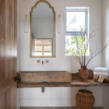
Powder room - southwestern gray floor powder room idea in Los Angeles with white walls, a vessel sink, wood countertops and brown countertops



 TKS Design Group
Download our free ebook, Creating the Ideal Kitchen. DOWNLOAD NOW
This client was referred to us from a past client. They are a busy 2-career household with young children and enjoy entertaining friends and family in their home. They have a beautiful open concept home but unfortunately the kitchen was not fitting for the rest of the home. They were not quite sure what to do with the space. We talked about trying to refresh it or do more of a minor remodel, but in the end they decided a full gut would get them to where they wanted to be.
One problem was there was no place for guests to hang out other than the large and awkward banquette area. The brick wall and tiled hood area were feeling a bit dated and tired. The space was just not functional for their lifestyle. There was no prep space near the cooktop and no landing area for items coming out of the ovens or refrigerator, plus a big dead zone in the center of the room.
Banquettes, like the one they previously had in the space, are great for small spaces, but when they get really large like this one, it makes getting in and out of the seating area awkward and uncomfortable. Plus, there was room for a large table, so we eliminated the awkward built in.
We started by removing the faux brick wall between the kitchen and back entry. We relocated the entry to the garage over a couple feet in order to get every last inch out of the new kitchen. We also made the decision to close up the primary window that faced the pretty ho hum brick wall of the neighbor’s house. There was plenty of light coming in from the seating area, so we just didn’t feel the window was adding much to the room.
Construction went smoothy. There was a bit of rework with electrical, flooring and HVAC, but in the end, we think it was well worth it.
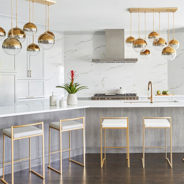
The clients really wanted a sleek contemporary look, and we originally had planned for a full height slab backsplash, but due to it’s size, it was a budget buster. Instead, we got creative and settled on large format porcelain tiles that have a similar feel but were a fraction of the cost. We made sure the wall was plumb and level so that the fit and finish would mimic that of slab material.
The final space was quite a change. A large prep sink sits directly across from the new pro-style range with plenty additional prep space on the large island. The refrigerator and ovens now have miles of landing space, and a nice tight work triangle makes cooking a breeze.
Since we wanted a more contemporary feel, not many wall cabinets were included. Instead, we outfitted some of the drawers for dish storage with a peg system. Two large pantries flanking the refrigerator hold baking supplies and small appliances. Large drawers by the cooktop hold pots and pans, and an appliance garage tucked away to the left of the range hides away miscellaneous items. The large island also houses a microwave drawer and tons of storage, most of which is drawers offering maximum convenience.
The island now seats 5-6 people comfortably along with the new table in the seating area which can seat up to 8. Entertaining will be a breeze in this space. With such a clean backdrop, we knew we would need some drama with the lighting, so we chose two sets of staggered pendants, which we adjusted for the right visual balance above the island.
We also included a small coffee station to the right of the main kitchen, which helps keep the coffee clutter out of the kitchen proper. Two tones of complimentary gray are featured in this kitchen. The perimeter is a light gray that reads almost white. The island is a gray stain that adds some depth and interest with the visible wood texture. The countertops are clean white quartz, and the hardware, barstools and light fixtures add warm brass tones. I see lots of cooking and entertaining with family and friends in the near future in this bright and airy new space.
Designed by: Susan Klimala, CKD, CBD
Photography by: Michael Kaskel
For more information on kitchen and bath design ideas go to: www.kitchenstudio-ge.com

 Thinkterior LLC
For a family who believes fitness is not only an essential part of life but also a fun opportunity for the whole family to connect, build and achieve greatness together there is nothing better than a custom designed obstacle course right in your back yard.
THEME
The theme of this half mile trail through the woods is evident in the fun, creative and all-inclusive obstacles hidden in the natural flow of the land around this amazing family home. The course was created with adults and children, advanced and beginner athletes, competitive and entertaining events all accounted for. Each of the 13 obstacles was designed to be challenging no matter the size, skill or ability of the athlete lucky enough to run the course.
FOCUS
The focus for this family was to create an outdoor adventure that could be an athletic, social and personal outlet for their entire family while maintaining the natural beauty of the landscape and without altering the sweeping views from the home. The large scale of the challenging obstacles is camouflaged within the landscape using the rolling hills and mature trees as a natural curtain in every season. The beauty of the course does not diminish the functional and demanding nature of the obstacles which are designed to focus on multiple strength, agility, and cardio fitness abilities and intensities.
STORAGE
The start of the trail includes a raised training area offering a dedicated space clear from the ground to place bags, mats and other equipment used during the run. A small all-terrain storage cart was provided for use with 6 yoga mats, 3 medicine balls of various weights, rings, sprinting cones, and a large digital timer to record laps.
GROWTH
The course was designed to provide an athletic and fun challenge for children, teens and adults no matter their experience or athletic prowess. This course offers competitive athletes a challenge and budding athletes an opportunity to experience and ignite their passion for physical activity. Initially the concept for the course was focused on the youngest of the family however as the design grew so did the obstacles and now it is a true family experience that will meet their adapting needs for years. Each obstacle is paired with an instructional sign directing the runners in proper use of the obstacle, adaptations for skill levels and tips on form. These signs are all customized for this course and are printed on metal to ensure they last for many years.
SAFETY
Safety is crucial for all physical activity and an obstacle course of this scale presents unique safety concerns. Children should always be supervised when participating in an adventure on the course however additional care was paid to details on the course to ensure everyone has a great time. All of the course obstacles have been created with pressure treated lumber that will withstand the seasonal poundings. All footer pilings that support obstacles have been placed into the ground between 3 to 4 feet (.9 to 1.2 meters) and each piling has 2 to 3 bags of concrete (totaling over 90 bags used throughout the course) ensuring stability of the structure and safety of the participants. Additionally, all obstacle lumber has been given rounded corners and sanded down offering less splintering and more time for everyone to enjoy the course.
This athletic and charismatic family strives to incorporate a healthy active lifestyle into their daily life and this obstacle course offers their family an opportunity to strengthen themselves and host some memorable and active events at their amazing home.
 Nancy Finneson | DeMane Design
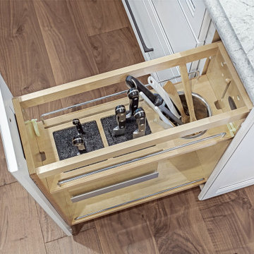
This kitchen has a new layout which resulted in more organized storage and work space. Each drawer fills special needs. A flush mounted ceiling hood give it an open feel. A custom baking center keeps like items in their proper place and accessible. Off white glazed cabinets and ogee edged quartz countertops make an elegant statement. A raised live-edge bar and beverage cooler make entertaining a breeze.
 Vintage Cellars & Saunas
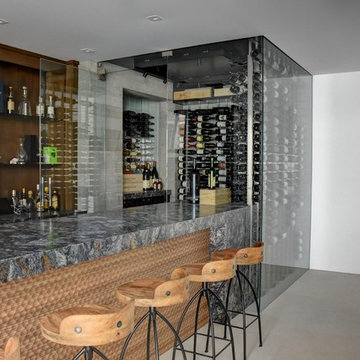
This gorgeous contemporary glass front custom wine cellar in Corona Del Mar, Newport Beach, California is an eye catcher. The sleek, glass ultra modern wine room was a unique and exciting project for our team here at Vintage Cellars. The stone bar extends into the wine cellar itself, but due to mechanical, cooling, and condensation concerns, our expert custom wine cellar team knew that extra measures needed to be taken to ensure the end quality remained top notch.
The bar itself was divided into two sections, one cut section outside to make up the main seating area and the other inside the glass wine room. The stone bar, which is porous, takes up a good portion of the front facing glass panel. Had the bar simply extended into the wine cellar and been sealed off at the joints, the stone would have eventually transferred in enough heat and moisture to cause condensation. Proper wine cellar design and planning enabled this wine cellar to not only look fantastic, but function perfectly as well.
One interesting unique feature in this Corona Del Mar, Newport Beach, Orange County, California glass and metal wine cellar is an extension of floor to ceiling frames mounted to the backside of the stone bar. This feature was made to seamlessly show consistency in floor to ceiling vintageview frames throughout.
Corona Del Mar, Newport Beach, Laguna Beach, Huntington Beach, Newport Coast, Ladera Ranch, Coto De Caza, Laguna Hills, San Clemente, Dana Point, Seal Beach, Laguna Niguel still remain the areas in Orange County that we build wine cellars most often.
Contemporary wine cellars such as this are becoming more and more popular in modern design trends. Interior Design, Architecture, and Construction all play a part in ensuring that the client’s vision comes to reality. This project was no different. Working closely with David Close Homes, Vintage Cellars was able to meet with the client and team involved, determine the ultimate wine cellar wine room wine closet goals, and see them to the finish.
Upon walking into this glass and metal modern contemporary wine cellar, you become quickly surrounded with triple deep bottles from many of the world’s best wineries. On the left below the countertop is a black stained poplar wine racking system for single 750ml bottles. Above lies room for display case storage, room for large format bottles, and label forward vintageview design racking to the ceiling. On the middle wall of this wine room is room for case storage below, similarly with triple deep vintageview floor to ceiling frames dying into more case storage above. On the right side of this wall lies a vertical space for single large format case storage.
Ultra Modern wine cellars such as this are all the rage in contemporary homes in San Diego, Orange County, and Los Angeles. This glass enclosed wine cellar with a sleek modern contemporary racking system is truly a showpiece in this home in Corona Del Mar, Newport Beach, California. Wine Racking, Wine Cellar Cooling, Wine Cellar design, Wine Cellar Build out and Wine Cellar Installation is what Vintage Cellars does best. Timeless Luxury.
 Albertsson Hansen Architecture and Interior Design
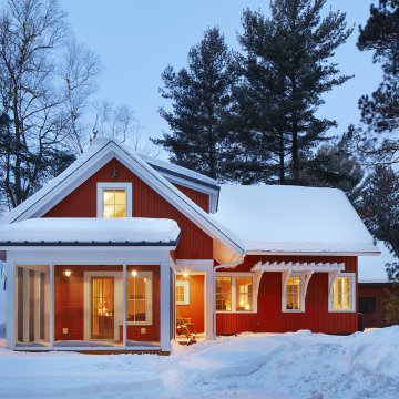
Mountain style red two-story board and batten exterior home photo in Minneapolis
48