
Search results for "Properly filed" in Home Design Ideas
 OSCAR E. FLORES DESIGN STUDIO, LLC
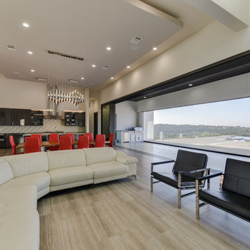
Two story Modern House locate it in Cresta Bella San Antonio, Texas
with amazing hill country and downtown views, house was
design by OSCAR E FLORES DESIGN STUDIO
 Noble Architects, LLC
Photography: Garett + Carrie Buell of Studiobuell/ studiobuell.com
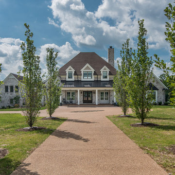
Example of a large cottage two-story exterior home design in Nashville with a shingle roof
Example of a large cottage two-story exterior home design in Nashville with a shingle roof
 Haven Design and Construction
Matthew Niemann Photography
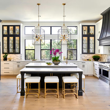
Example of a transitional u-shaped light wood floor and beige floor kitchen design in Austin with a farmhouse sink, raised-panel cabinets, gray backsplash, paneled appliances, an island, white countertops, quartz countertops, white cabinets and stone tile backsplash
Example of a transitional u-shaped light wood floor and beige floor kitchen design in Austin with a farmhouse sink, raised-panel cabinets, gray backsplash, paneled appliances, an island, white countertops, quartz countertops, white cabinets and stone tile backsplash
Find the right local pro for your project

 TKS Design Group
Download our free ebook, Creating the Ideal Kitchen. DOWNLOAD NOW
This client was referred to us from a past client. They are a busy 2-career household with young children and enjoy entertaining friends and family in their home. They have a beautiful open concept home but unfortunately the kitchen was not fitting for the rest of the home. They were not quite sure what to do with the space. We talked about trying to refresh it or do more of a minor remodel, but in the end they decided a full gut would get them to where they wanted to be.
One problem was there was no place for guests to hang out other than the large and awkward banquette area. The brick wall and tiled hood area were feeling a bit dated and tired. The space was just not functional for their lifestyle. There was no prep space near the cooktop and no landing area for items coming out of the ovens or refrigerator, plus a big dead zone in the center of the room.
Banquettes, like the one they previously had in the space, are great for small spaces, but when they get really large like this one, it makes getting in and out of the seating area awkward and uncomfortable. Plus, there was room for a large table, so we eliminated the awkward built in.
We started by removing the faux brick wall between the kitchen and back entry. We relocated the entry to the garage over a couple feet in order to get every last inch out of the new kitchen. We also made the decision to close up the primary window that faced the pretty ho hum brick wall of the neighbor’s house. There was plenty of light coming in from the seating area, so we just didn’t feel the window was adding much to the room.
Construction went smoothy. There was a bit of rework with electrical, flooring and HVAC, but in the end, we think it was well worth it.
The clients really wanted a sleek contemporary look, and we originally had planned for a full height slab backsplash, but due to it’s size, it was a budget buster. Instead, we got creative and settled on large format porcelain tiles that have a similar feel but were a fraction of the cost. We made sure the wall was plumb and level so that the fit and finish would mimic that of slab material.
The final space was quite a change. A large prep sink sits directly across from the new pro-style range with plenty additional prep space on the large island. The refrigerator and ovens now have miles of landing space, and a nice tight work triangle makes cooking a breeze.
Since we wanted a more contemporary feel, not many wall cabinets were included. Instead, we outfitted some of the drawers for dish storage with a peg system. Two large pantries flanking the refrigerator hold baking supplies and small appliances. Large drawers by the cooktop hold pots and pans, and an appliance garage tucked away to the left of the range hides away miscellaneous items. The large island also houses a microwave drawer and tons of storage, most of which is drawers offering maximum convenience.
The island now seats 5-6 people comfortably along with the new table in the seating area which can seat up to 8. Entertaining will be a breeze in this space. With such a clean backdrop, we knew we would need some drama with the lighting, so we chose two sets of staggered pendants, which we adjusted for the right visual balance above the island.
We also included a small coffee station to the right of the main kitchen, which helps keep the coffee clutter out of the kitchen proper. Two tones of complimentary gray are featured in this kitchen. The perimeter is a light gray that reads almost white. The island is a gray stain that adds some depth and interest with the visible wood texture. The countertops are clean white quartz, and the hardware, barstools and light fixtures add warm brass tones. I see lots of cooking and entertaining with family and friends in the near future in this bright and airy new space.
Designed by: Susan Klimala, CKD, CBD
Photography by: Michael Kaskel
For more information on kitchen and bath design ideas go to: www.kitchenstudio-ge.com
 Wilkinson
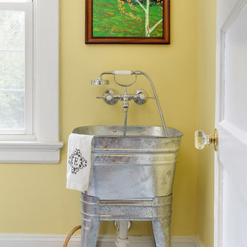
Oversized laundry washbasin with telephone handle handshower | Photo by Tad Davis Photography
*Homeowner sourced the galvanized sink
Example of a transitional laundry room design in Raleigh with an utility sink and yellow walls
Example of a transitional laundry room design in Raleigh with an utility sink and yellow walls
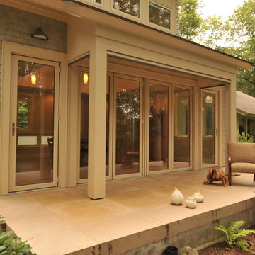
 Torrey Architecture, Inc.
This transitional bungalow home's small addition allows the long rays of the winter sun to warm this family room's stone floor while shading it from the high summer sun.


Sponsored
Columbus, OH

Hope Restoration & General Contracting
Columbus Design-Build, Kitchen & Bath Remodeling, Historic Renovations
 Walcott Adams Verneuille Architects
Point Clear Bayfront Beauty
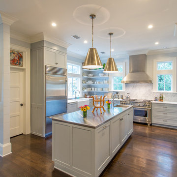
Example of a mid-sized classic u-shaped dark wood floor and brown floor eat-in kitchen design in Other with shaker cabinets, wood countertops, stainless steel appliances, a farmhouse sink and an island
Example of a mid-sized classic u-shaped dark wood floor and brown floor eat-in kitchen design in Other with shaker cabinets, wood countertops, stainless steel appliances, a farmhouse sink and an island
 User
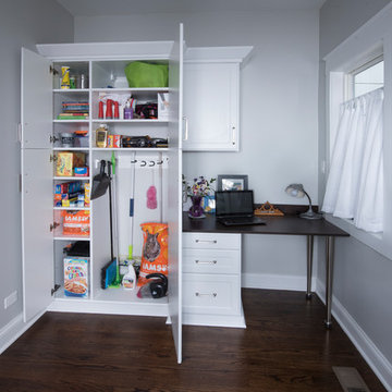
UserDesigned by Tim Higbee of Closet Works
Keeping the pantry cabinet and the utility cabinet separate (food vs cleaning products brooms and mops), was relatively easy in concept, but we needed to ration the space in order to leave room for a proper desk with drawers.
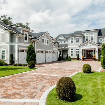
 J.A. Long, Inc
Built by:
J.A. Long, Inc
Design Builders
Large craftsman gray two-story wood exterior home idea in Jacksonville
Large craftsman gray two-story wood exterior home idea in Jacksonville
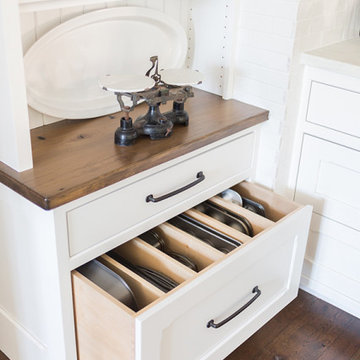
 Millpond Kitchens and Cabinetry
A contemporary farmhouse kitchen renovation, made custom and built by Amish craftsmen. Cabinets are flat inset panel shaker style cabinetry, a custom distressed antique black glazed oak island countertop, marble countertops and a plethora of drawers, custom pull out trays, hidden book shelf, custom muffin drawer and more.
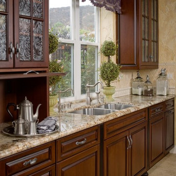
 Leslie Cohen Design
Like many projects, this began with a discussion about reconfiguring the island and refinishing the cabinets. Then the clients asked if I could change their sink (undermounted below granite), add a second dishwasher, and replace her double oven. When they realized the extent of those requests, they decided they might as well replace the cabinets and get the quality, storage, and finishes they wanted. They desired traditional styling with a French motif, and luxurious, yet durable finishes that would complement her eggplant/gold/green fabrics.
To avoid more expense, we kept the existing windows and retained the existing placement of major appliances (except the cooktop which we moved slightly for better function). I relocated the microwave to the island so that we could install a built-in, larger refrigerator.
I reconfigured the layout to better accommodate the needs of this large family – they have six children and three dogs. Everyone has breakfast, takes lunches, has dinner at home daily, and even the dog food is cooked from scratch. There are great organizational accessories in the cabinets. The full-extension quiet-close dovetail drawers minimize noise and feel like fine furniture. The cabinet and countertop finishes are extremely durable. Even the Iroko wood eating counter is easily maintained using an oil-wax that repels stains.
The island shape provides seating for three as well as room for the cooktop, warming drawer, microwave drawer, and generous storage. The sprawling countertop works well for their volume of food preparation. The desk area now functions with proper phone and electrical outlets, file drawers, and enough counter.
The choice of flooring was critical – the kitchen is part of a great room that flows into a large entry hall. The existing travertine, tile, and carpet did not wear well. I selected durable porcelain tiles that resemble limestone and wood and created a European-inspired woven design in the entry. A simpler version of the same materials in the kitchen and an inset real wood into the seating area create flow between the rooms.
To create more visual interest, I removed non-critical soffits. The remaining soffits were clad with wood so it appears that all is part of the cabinet design. The mixture of glazed cherry and black rubbed-through-paint on cherry finishes are enhanced by the dramatic black and gold veins in the creamy granite counter. We retained the straw and plaster walls that create an old-world feeling.
The custom mahogany and iron pantry door balanced the design and completed this truly unique space. Pewter cabinet hardware and patterned glass accentuate the motif. Many of the cabinet accountrements are made from a compo material and recreate historical French mouldings. The remaining adornments are hand-carved wood.
On top of beauty and function, the cabinet boxes are made from environmentally-friendly, no formaldehyde-added agriboard. So we have traditional design, ornate mouldings, multi-step finishes, and are still nice to the earth and my clients!
My scope of work encompassed the complete design process: from design concepts, through working drawings, materials specifications, purchasing, and project administration.
Ed Gohlich - photographer
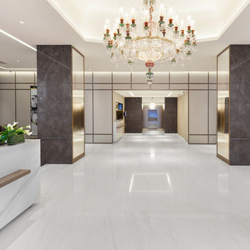
 JSE Interior Design
Plaza 400 is a premiere full-service luxury co-op in Manhattan’s Upper East Side. Built in 1968 by architect Philip Birnbaum and Associates, the well-known building has 40 stories and 627 residences. Amenities include a heated outdoor pool, state of the art fitness center, garage, driveway, bike room, laundry room, party room, playroom and rooftop deck.
The extensive 2017 renovation included the main lobby, elevator lift hallway and mailroom. Plaza 400’s gut renovation included new 4’x8′ Calacatta floor slabs, custom paneled feature wall with metal reveals, marble slab front desk and mailroom desk, modern ceiling design, hand blown cut mirror on all columns and custom furniture for the two “Living Room” areas.
The new mailroom was completely gutted as well. A new Calacatta Marble desk welcomes residents to new white lacquered mailboxes, Calacatta Marble filing countertop and a Jonathan Adler chandelier, all which come together to make this space the new jewel box of the Lobby.
The hallway’s gut renovation saw the hall outfitted with new etched bronze mirrored glass panels on the walls, 4’x8′ Calacatta floor slabs and a new vaulted/arched pearlized faux finished ceiling with crystal chandeliers and LED cove lighting.
Sponsored
Columbus, OH
Hope Restoration & General Contracting
Columbus Design-Build, Kitchen & Bath Remodeling, Historic Renovations


 Cummings Architecture + Interiors
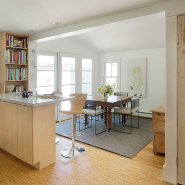
Blending contemporary and historic styles requires innovative design and a well-balanced aesthetic. That was the challenge we faced in creating a modern kitchen for this historic home in Lynnfield, MA. The final design retained the classically beautiful spatial and structural elements of the home while introducing a sleek sophistication. We mixed the two design palettes carefully. For instance, juxtaposing the warm, distressed wood of an original door with the smooth, brightness of non-paneled, maple cabinetry. A cork floor and accent cabinets of white metal add texture while a seated, step-down peninsula and built in bookcase create an open transition from the kitchen proper to an inviting dining space. This is truly a space where the past and present can coexist harmoniously.
Photo Credit: Eric Roth
 Medallion Cabinetry
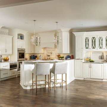
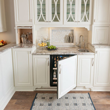
"The homeowners wanted a kitchen that reflected their personalities and cooking styles. Sophisticated but still elegant." designer Rodney Lee of York, PA.
After designing a successful home office space remodel, our same client came back to us to discuss plans and possibilities for their kitchen renovation. After a few discussions with the client, we decided the overall design concept for their kitchen would be “Sophisticated Elegance.” The homeowners wanted a kitchen that reflected their personalities and their cooking styles. Sophisticated but still elegant. The space had to be extremely functional and the color scheme had to have a certain warmth that matched the rest of their home.
The Medallion line has a wide range of architectural elements that helped us achieve that “Sophisticated Elegance”; curved/arched range hood, openings, valances, and corbels and trim. The “Sophistication” lies purely in the detail, the fixtures, the angles in the peninsula, and the changes in height and depth.
We wanted the color scheme to be as warm as possible as it would be in a bright, elegant space. We considered two colors and ended up choosing Divinity over the White Icing. The grey tones in the marble backsplash tile kept the colors modern but warm. We used natural stone versus the more aggregated quartz to maintain the use of natural product and unpredictable patterns and natural elements. We also used a dark rich stain on walnut wood as a good break from all the bright painted finishes. Oak and walnut reflect the “heart” of Pennsylvania and was a great way to maintain the use of natural elements.
The kitchen was divided into individual areas, each one focused on a particular need and/or function. My biggest challenge was transitioning the peninsula into the wet bar/hutch area while maintaining proper separation from the kitchen cabinetry and still tying it into the rest of the space.
A wealth of storage solutions.
•Desk Area. The client wanted a functional work area so we created a furniture look with ogee edging in the walnut, provincial toe space detail in solid walnut, and open display storage at top. The desk has plenty of storage.
•Main Kitchen. We were able to open up this space by creating smart transitions and separations using custom Medallion products that cater to the clients’ lifestyle. Each piece is functional while staying true to the sophisticated elegance design throughout the home.
◦Main Cabinetry: Medallion Gold Wellington Maple Divinity Classic Paint
◦48" uppers around range area; glass eclipse mullion-arched hood design
◦Mixer lift base left of range; drawer warmer with custom panel
•The main work station, or power spot, can hold up to five work stations comfortably. The cook can work within the confines of the peninsula design and access everything needed to prepare complete meals in 1-2 steps. Every cabinet has deluxe roll-out trays and/or drawers, making this kitchen fully accessible. The client wanted to be able to display and stage different pieces and concepts during holidays and gatherings. We chose to go with the more modern Mission arch above the wall oven and fridge, which complimented many of the hard angles and distinct lines used in the kitchen space.
My favorite part of this kitchen remodel came about just by listening to our client talk about how much they adored their daughter’s artwork. After numerous conversations, we landed on installing an artwork wall that was designed as a conversation piece and provides the ability to install different works of art.
 Medallion Cabinetry
"The homeowners wanted a kitchen that reflected their personalities and cooking styles. Sophisticated but still elegant." designer Rodney Lee of York, PA.
After designing a successful home office space remodel, our same client came back to us to discuss plans and possibilities for their kitchen renovation. After a few discussions with the client, we decided the overall design concept for their kitchen would be “Sophisticated Elegance.” The homeowners wanted a kitchen that reflected their personalities and their cooking styles. Sophisticated but still elegant. The space had to be extremely functional and the color scheme had to have a certain warmth that matched the rest of their home.
The Medallion line has a wide range of architectural elements that helped us achieve that “Sophisticated Elegance”; curved/arched range hood, openings, valances, and corbels and trim. The “Sophistication” lies purely in the detail, the fixtures, the angles in the peninsula, and the changes in height and depth.
We wanted the color scheme to be as warm as possible as it would be in a bright, elegant space. We considered two colors and ended up choosing Divinity over the White Icing. The grey tones in the marble backsplash tile kept the colors modern but warm. We used natural stone versus the more aggregated quartz to maintain the use of natural product and unpredictable patterns and natural elements. We also used a dark rich stain on walnut wood as a good break from all the bright painted finishes. Oak and walnut reflect the “heart” of Pennsylvania and was a great way to maintain the use of natural elements.
The kitchen was divided into individual areas, each one focused on a particular need and/or function. My biggest challenge was transitioning the peninsula into the wet bar/hutch area while maintaining proper separation from the kitchen cabinetry and still tying it into the rest of the space.
A wealth of storage solutions.
•Desk Area. The client wanted a functional work area so we created a furniture look with ogee edging in the walnut, provincial toe space detail in solid walnut, and open display storage at top. The desk has plenty of storage.
•Main Kitchen. We were able to open up this space by creating smart transitions and separations using custom Medallion products that cater to the clients’ lifestyle. Each piece is functional while staying true to the sophisticated elegance design throughout the home.
◦Main Cabinetry: Medallion Gold Wellington Maple Divinity Classic Paint
◦48" uppers around range area; glass eclipse mullion-arched hood design
◦Mixer lift base left of range; drawer warmer with custom panel
•The main work station, or power spot, can hold up to five work stations comfortably. The cook can work within the confines of the peninsula design and access everything needed to prepare complete meals in 1-2 steps. Every cabinet has deluxe roll-out trays and/or drawers, making this kitchen fully accessible. The client wanted to be able to display and stage different pieces and concepts during holidays and gatherings. We chose to go with the more modern Mission arch above the wall oven and fridge, which complimented many of the hard angles and distinct lines used in the kitchen space.
My favorite part of this kitchen remodel came about just by listening to our client talk about how much they adored their daughter’s artwork. After numerous conversations, we landed on installing an artwork wall that was designed as a conversation piece and provides the ability to install different works of art.
 Shane Cook
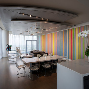
Award Winning project by Shane Cook Design. This project features a highly customized floor plan, not typical to the building, and interiors on an upper floor of Houston’s dominant upper Kirby high-rise condominium. The challenge of this project was to provide the maximum amount of wall space to feature the client’s world-class contemporary art collection, while at the same time leaving an open, airy, contemporary living space. Lighting design, also by Mr. Cook, was integral to the client’s need to properly light the art, while at the same time allow for flexibility in the rotation of pieces from the collection. The floating ceiling elements in the entry area and living/dining areas help to both define individual spaces and organize the lighting fixtures. The North side of the ceiling element over the living/dining area follows the swooping curve of the building exterior and helps engage the building’s freestanding structural column.
A meticulously detailed palate of neutral materials was chosen to create no competition with the featured artworks. While color is incorporated, it is kept to a “tone-on-tone” basis. A step up from the main living area into the kitchen serves to both give the overall space more of an open loft effect and separate this more utilitarian area. The curve of the steps up into the kitchen/tv area gives a sculptural quality to the space and plays off of the curve of the building’s facade.
Custom designed items, all by Shane Cook, include the wool and silk entry rug, ceiling elements with integrated lighting (including the electronic files needed for the CNC machine laser cutting of the ceiling’s panels and reveals), dining table, and master bath vanity. Furniture selection was also by Mr. Cook.
Artwork featured in the photography includes:
1- Entry: Robert Rauschenberg and Antony Gormley
2- Living/Dining: John Chamberlian (suspended from ceiling) and a monumental piece by Gene
Davis (on the feature wall)
3- Living1: George Segal, Gene Davis, and Bernar Venet
4- Breakfast: Roni Horn, Michael Rouillard, and Willem de Kooning
5- TV: Donald Judd
Image by: Aker Imaging
 Frenchs Cabinet Gallery llc
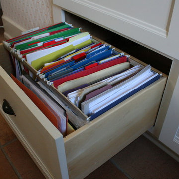
Built in 1938, this home has some beautiful architectural features. The former kitchen was charming, but it was not functional. Cabinet drawers were not opening properly, there was no hot water at the sink and there was no electric on the island. With the new kitchen design, we added several modern amenities, several of which are concealed behind cabinet doors and drawers.
Credits:
Designer: Erin Hurst, CKD-French's Cabinet Gallery, LLC
Contractor: Benjamin Breeding- Breeding Homes, LLC
Countertops: Smokey Mountain Tops
Cabinetry: Crestwood Inc.
Crown Molding: Stephens Millwork & Lumber Company
Tile: Dal Tile-Beth Taylor
Appliances: A1 Appliance-Tom Burns
Plumbing Fixtures: Kenny & Company-Jessica Smith
Paint: Jo Ella McClellan
Photographer: Dylan Reyes-Dylan Reyes Photos
2