
Search results for "Properly" in Home Design Ideas
 Nance Construction
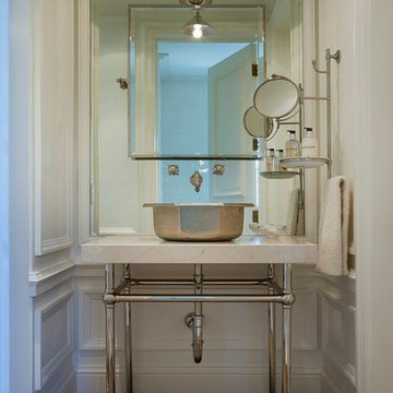
Inspiration for a mediterranean dark wood floor powder room remodel in Phoenix with a vessel sink, white walls and white countertops
 Pool Environments, Inc.
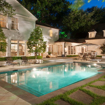
Originally designed by one of the most notable landscape architects in town, this once impressive project had faltered in recent years. The pool and spa still functioned well, and the client wanted to keep it intact. In addition, they wanted to keep as much of the existing landscaping as possible. The surrounding decks, walls, and steps were fair game. At first glance, one might think that our changes were simple material changes. Upon closer inspection, however, one can see the subtle, yet transformative changes that come together to update this classic pool in a tasteful, timeless manner, and improve the flow and usability of the deck areas, while softening the feel of the massive hardscape.
The subtle changes begin as soon as you walk out the back door of the house. The existing decking had a lot of what we call “tweeners”; areas that are overly generous walkways, yet not large enough to house furniture. The awkwardly small bluestone patio was expanded to accommodate a generous seating area, by pushing the step-down closer to the pool. Our talented stone mason carefully married the new bluestone into the existing, resulting in an imperceptible difference between the two. As you descend the new bluestone steps to the pool level, your bare feet will be thankful for the new smooth-finished limestone colored concrete, with a hand cut pattern carefully etched into its surface. The old red brick decking was so hot that the owners could not walk around the pool in bare feet. The brick coping was also replaced with an eased edge Pennsylvania Premier Stone which matches the new step treads throughout the project. Between the house and the pool, a large raised planter was reconfigured, giving additional space to the pool deck for a shaded lounge chair area.
Across the pool, a bank of rather tall painted brick retaining walls were cut down, shortened, and moved. This lessened the visual impact of the walls, which were rather overwhelming in the space, as well as opening up a new seating area, nestled under the arms of the massive pecan at the back of the property. Rather than continuing solid decking around the entire pool, the area near these walls has been transformed to large stone stepper pads set in a sea of beautiful St. Augustine lawn. This creates a visually softened area that is still suited to setting tables and chairs when the guest list calls for additional seating.
The spa area is quite possibly the most dramatic change on this project. Yet more raised planter walls divided this area into awkward spaces, unsuited to proper furniture placement. The planters were removed, new stone decks, once again expertly married into the existing, opening the area to house a large dining table and new built in bbq area. The spa itself was re-imagined with the bluestone coping, and painted brick veneer. The most impressive addition though is the new handmade glazed tiles that surround the existing cast stone water feature. This water feature was almost unnoticeable against the painted brick wall, but now the dramatic arch and pop of color draw the eye to this quaint little corner of the property.
 Inspired Interiors - Design. Build. Furnish.
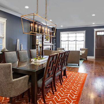
Mid-sized transitional medium tone wood floor great room photo in Chicago with blue walls
Find the right local pro for your project
 Tyler Karu Design + Interiors
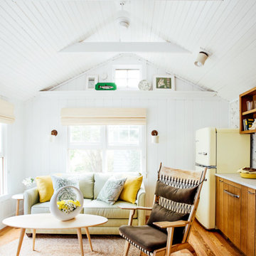
A tiny waterfront house in Kennebunkport, Maine.
Photos by James R. Salomon
Small beach style open concept medium tone wood floor living room photo in Portland Maine with white walls
Small beach style open concept medium tone wood floor living room photo in Portland Maine with white walls
 Crisp Architects
Rob Karosis
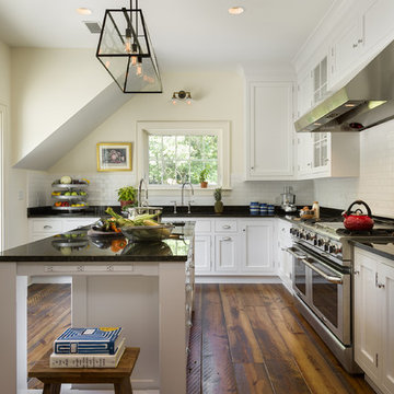
Inspiration for a country l-shaped dark wood floor kitchen remodel in New York with shaker cabinets, white cabinets, white backsplash, subway tile backsplash and an island
Inspiration for a country l-shaped dark wood floor kitchen remodel in New York with shaker cabinets, white cabinets, white backsplash, subway tile backsplash and an island

 TKS Design Group
Download our free ebook, Creating the Ideal Kitchen. DOWNLOAD NOW
This client was referred to us from a past client. They are a busy 2-career household with young children and enjoy entertaining friends and family in their home. They have a beautiful open concept home but unfortunately the kitchen was not fitting for the rest of the home. They were not quite sure what to do with the space. We talked about trying to refresh it or do more of a minor remodel, but in the end they decided a full gut would get them to where they wanted to be.
One problem was there was no place for guests to hang out other than the large and awkward banquette area. The brick wall and tiled hood area were feeling a bit dated and tired. The space was just not functional for their lifestyle. There was no prep space near the cooktop and no landing area for items coming out of the ovens or refrigerator, plus a big dead zone in the center of the room.
Banquettes, like the one they previously had in the space, are great for small spaces, but when they get really large like this one, it makes getting in and out of the seating area awkward and uncomfortable. Plus, there was room for a large table, so we eliminated the awkward built in.
We started by removing the faux brick wall between the kitchen and back entry. We relocated the entry to the garage over a couple feet in order to get every last inch out of the new kitchen. We also made the decision to close up the primary window that faced the pretty ho hum brick wall of the neighbor’s house. There was plenty of light coming in from the seating area, so we just didn’t feel the window was adding much to the room.
Construction went smoothy. There was a bit of rework with electrical, flooring and HVAC, but in the end, we think it was well worth it.
The clients really wanted a sleek contemporary look, and we originally had planned for a full height slab backsplash, but due to it’s size, it was a budget buster. Instead, we got creative and settled on large format porcelain tiles that have a similar feel but were a fraction of the cost. We made sure the wall was plumb and level so that the fit and finish would mimic that of slab material.
The final space was quite a change. A large prep sink sits directly across from the new pro-style range with plenty additional prep space on the large island. The refrigerator and ovens now have miles of landing space, and a nice tight work triangle makes cooking a breeze.
Since we wanted a more contemporary feel, not many wall cabinets were included. Instead, we outfitted some of the drawers for dish storage with a peg system. Two large pantries flanking the refrigerator hold baking supplies and small appliances. Large drawers by the cooktop hold pots and pans, and an appliance garage tucked away to the left of the range hides away miscellaneous items. The large island also houses a microwave drawer and tons of storage, most of which is drawers offering maximum convenience.
The island now seats 5-6 people comfortably along with the new table in the seating area which can seat up to 8. Entertaining will be a breeze in this space. With such a clean backdrop, we knew we would need some drama with the lighting, so we chose two sets of staggered pendants, which we adjusted for the right visual balance above the island.
We also included a small coffee station to the right of the main kitchen, which helps keep the coffee clutter out of the kitchen proper. Two tones of complimentary gray are featured in this kitchen. The perimeter is a light gray that reads almost white. The island is a gray stain that adds some depth and interest with the visible wood texture. The countertops are clean white quartz, and the hardware, barstools and light fixtures add warm brass tones. I see lots of cooking and entertaining with family and friends in the near future in this bright and airy new space.
Designed by: Susan Klimala, CKD, CBD
Photography by: Michael Kaskel
For more information on kitchen and bath design ideas go to: www.kitchenstudio-ge.com
 Architectural Resource LLC
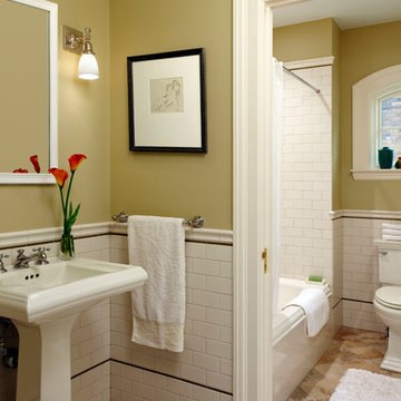
Our Clients, the proud owners of a landmark 1860’s era Italianate home, desired to greatly improve their daily ingress and egress experience. With a growing young family, the lack of a proper entry area and attached garage was something they wanted to address. They also needed a guest suite to accommodate frequent out-of-town guests and visitors. But in the homeowner’s own words, “He didn’t want to be known as the guy who ‘screwed up’ this beautiful old home”. Our design challenge was to provide the needed space of a significant addition, but do so in a manner that would respect the historic home. Our design solution lay in providing a “hyphen”: a multi-functional daily entry breezeway connector linking the main house with a new garage and in-law suite above.
 Tamara Day Design
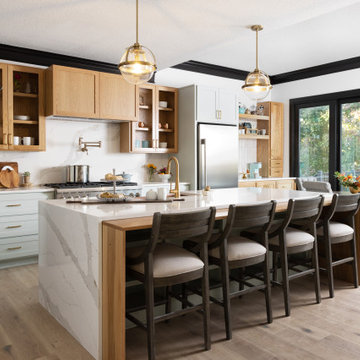
Inspiration for a large transitional galley light wood floor and beige floor open concept kitchen remodel in Kansas City with a farmhouse sink, recessed-panel cabinets, blue cabinets, quartz countertops, multicolored backsplash, quartz backsplash, stainless steel appliances, an island and multicolored countertops
 Hollester Interiors
Nat Rea Photography
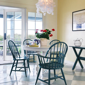
Inspiration for a coastal dining room remodel in Providence with yellow walls
Inspiration for a coastal dining room remodel in Providence with yellow walls
 Kitty & Company Interior Design
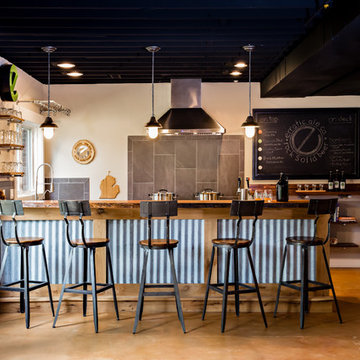
This home brew pub invites friends to gather around and taste the latest concoction. I happily tried Pumpkin when there last. The homeowners wanted warm and friendly finishes, and loved the more industrial style.
 Peach and Pine Interiors
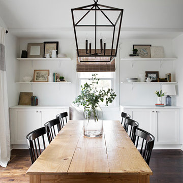
Example of a transitional medium tone wood floor and brown floor dining room design in Nashville with white walls

 Bay Area Custom Homes, Inc.
Michele Lee Willson Photography
Example of a trendy metal railing balcony design in San Francisco with a bbq area
Example of a trendy metal railing balcony design in San Francisco with a bbq area
 Flourish Interiors by Vanessa C Smith
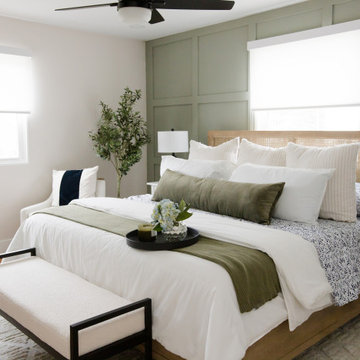
The use of earth tones is a rising interior design trend. One of the goals for us when designing at Flourish Interiors, is to create spaces that evoke a sense of harmony for our clients and their guests. Using earth tones can help accomplish this goal. By incorporating colors that remind us of nature, we can subtly be reminded of the peace and harmony being outdoors creates for the soul. This beautiful bedroom is the primary bedroom at our Legacy Home project.
 Create Design Build
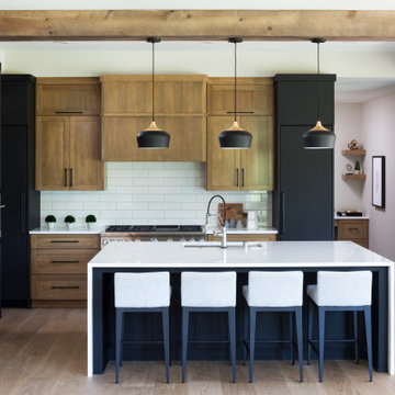
An artful blend of styles inspired by our love contemporary and modern farmhouses, while honoring tradition and simplicity.
Transitional l-shaped medium tone wood floor and brown floor eat-in kitchen photo in Minneapolis with a single-bowl sink, flat-panel cabinets, black cabinets, quartz countertops, white backsplash, porcelain backsplash, black appliances, an island and white countertops
Transitional l-shaped medium tone wood floor and brown floor eat-in kitchen photo in Minneapolis with a single-bowl sink, flat-panel cabinets, black cabinets, quartz countertops, white backsplash, porcelain backsplash, black appliances, an island and white countertops
 Nicely Done Kitchens
 http://www.nicelydonekitchens.com
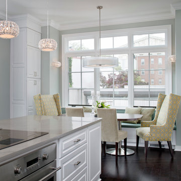
Example of a classic dark wood floor eat-in kitchen design in DC Metro with raised-panel cabinets, white cabinets and stainless steel appliances
Example of a classic dark wood floor eat-in kitchen design in DC Metro with raised-panel cabinets, white cabinets and stainless steel appliances
 Bernardo Pozas Residential Design
Photo credit: Mike Kelley
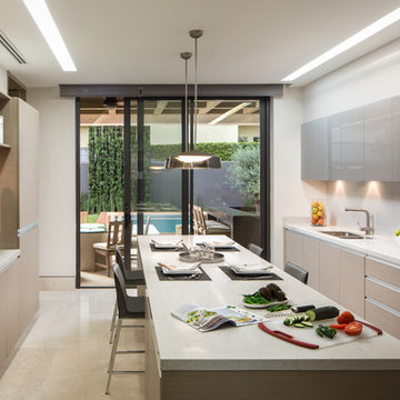
Trendy kitchen photo with a double-bowl sink, flat-panel cabinets, beige cabinets, white backsplash and an island
Trendy kitchen photo with a double-bowl sink, flat-panel cabinets, beige cabinets, white backsplash and an island
 Christine Donner Kitchen Design Inc.
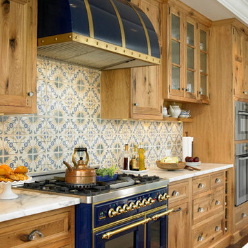
The Majestic range from Ilve in cobalt blue. The bonnet hood was custom designed to match the range. Cabinets in knotty butternut with antique glass panels, glass cup pulls. The hand painted tile backsplash was custom designed in this color palette of blue, gold, light brown and notes of soft green.
Photo by Nancy E. Hill
 ZeroEnergy Design
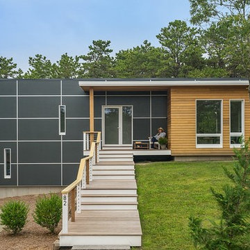
This modern green home offers both a vacation destination on Cape Cod near local family members and an opportunity for rental income.
FAMILY ROOTS. A West Coast couple living in the San Francisco Bay Area sought a permanent East Coast vacation home near family members living on Cape Cod. As academic professionals focused on sustainability, they sought a green, energy efficient home that was well-aligned with their values. With no green homes available for sale on Cape Cod, they decided to purchase land near their family and build their own.
SLOPED SITE. Comprised of a 3/4 acre lot nestled in the pines, the steeply sloping terrain called for a plan that embraced and took advantage of the slope. Of equal priority was optimizing solar exposure, preserving privacy from abutters, and creating outdoor living space. The design accomplished these goals with a simple, rectilinear form, offering living space on the both entry and lower/basement levels. The stepped foundation allows for a walk-out basement level with light-filled living space on the down-hill side of the home. The traditional basement on the eastern, up-hill side houses mechanical equipment and a home gym. The house welcomes natural light throughout, captures views of the forest, and delivers entertainment space that connects indoor living space to outdoor deck and dining patio.
MODERN VISION. The clean building form and uncomplicated finishes pay homage to the modern architectural legacy on the outer Cape. Durable and economical fiber cement panels, fixed with aluminum channels, clad the primary form. Cedar clapboards provide a visual accent at the south-facing living room, which extends a single roof plane to cover the entry porch.
SMART USE OF SPACE. On the entry level, the “L”-shaped living, dining, and kitchen space connects to the exterior living, dining, and grilling spaces to effectively double the home’s summertime entertainment area. Placed at the western end of the entry level (where it can retain privacy but still claim expansive downhill views) is the master suite with a built-in study. The lower level has two guest bedrooms, a second full bathroom, and laundry. The flexibility of the space—crucial in a house with a modest footprint—emerges in one of the guest bedrooms, which doubles as home office by opening the barn-style double doors to connect it to the bright, airy open stair leading up to the entry level. Thoughtful design, generous ceiling heights and large windows transform the modest 1,100 sf* footprint into a well-lit, spacious home. *(total finished space is 1800 sf)
RENTAL INCOME. The property works for its owners by netting rental income when the owners are home in San Francisco. The house especially caters to vacationers bound for nearby Mayo Beach and includes an outdoor shower adjacent to the lower level entry door. In contrast to the bare bones cottages that are typically available on the Cape, this home offers prospective tenants a modern aesthetic, paired with luxurious and green features. Durable finishes inside and out will ensure longevity with the heavier use that comes with a rental property.
COMFORT YEAR-ROUND. The home is super-insulated and air-tight, with mechanical ventilation to provide continuous fresh air from the outside. High performance triple-paned windows complement the building enclosure and maximize passive solar gain while ensuring a warm, draft-free winter, even when sitting close to the glass. A properly sized air source heat pump offers efficient heating & cooling, and includes a carefully designed the duct distribution system to provide even comfort throughout the house. The super-insulated envelope allows us to significantly reduce the equipment capacity, duct size, and airflow quantities, while maintaining unparalleled thermal comfort.
ENERGY EFFICIENT. The building’s shell and mechanical systems play instrumental roles in the home’s exceptional performance. The building enclosure reduces the most significant energy glutton: heating. Continuous super-insulation, thorough air sealing, triple-pane windows, and passive solar gain work together to yield a miniscule heating load. All active energy consumers are extremely efficient: an air source heat pump for heating and cooling, a heat pump hot water heater, LED lighting, energy recovery ventilation (ERV), and high efficiency appliances. The result is a home that uses 70% less energy than a similar new home built to code requirements.
OVERALL. The home embodies the owners’ goals and values while comprehensively enabling thermal comfort, energy efficiency, a vacation respite, and supplementary income.
PROJECT TEAM
ZeroEnergy Design - Architect & Mechanical Designer
A.F. Hultin & Co. - Contractor
Pamet Valley Landscape Design - Landscape & Masonry
Lisa Finch - Original Artwork
European Architectural Supply - Windows
Eric Roth Photography - Photography
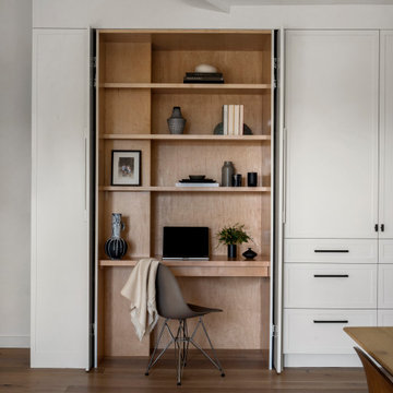
 Florence Livingston Interiors, LLC
Example of a beach style light wood floor home office design in San Francisco with white walls
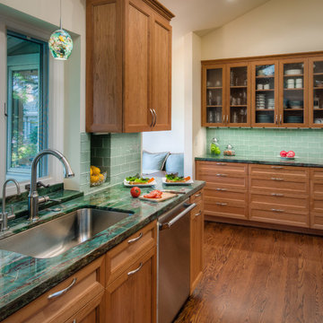
 C. Boesch Design
A need for extra counter space and fine wine service, creates a ‘JEWEL’ of a kitchen! As the artful anchor, the Emerald Glacier quartzite includes many shades of lush green, grey and red. Complimentary colors of natural cherry cabinets, warm walnut floors and surrounding Willow glass backsplash support the vibrant, playful colors creating an enhanced multifunctional space.
Copyright Dean J. Birinyi, ASMP
67