
Search results for "Proportionate" in Home Design Ideas
 Rolf Schroeder General Contractors, Inc.
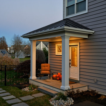
Our Clients came to us with a desire to renovate their home built in 1997, suburban home in Bucks County, Pennsylvania. The owners wished to create some individuality and transform the exterior side entry point of their home with timeless inspired character and purpose to match their lifestyle. One of the challenges during the preliminary phase of the project was to create a design solution that transformed the side entry of the home, while remaining architecturally proportionate to the existing structure.

 Rolf Schroeder General Contractors, Inc.
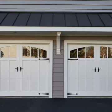
Our Clients came to us with a desire to renovate their home built in 1997, suburban home in Bucks County, Pennsylvania. The owners wished to create some individuality and transform the exterior side entry point of their home with timeless inspired character and purpose to match their lifestyle. One of the challenges during the preliminary phase of the project was to create a design solution that transformed the side entry of the home, while remaining architecturally proportionate to the existing structure.
Find the right local pro for your project
 ae design
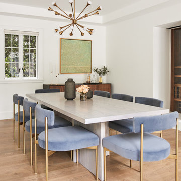
We removed the wood panelling from the walls in this room to create a modern space that would compliment the rest of the house.
The dining table is a custom extendable table in a grey stained ash finish. The brass frame of the dining chairs compliment the brass chandelier nicely. The black and walnut buffet provides storage in the dining room.
 KALLISTA
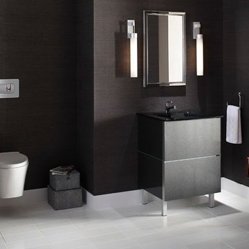
From Greek meaning “to float,” Pléo is a design that lifts elegant, modern form up off of the floor. Featuring a stylized, hourglass shaped bowl and a softly rounded actuator plate framed in smoky white glass, the Pléo wall-mounted toilet is a model of clean design. The dual-flush actuator buttons are intuitive to the touch with firm actuation. The bowl shape smoothly conforms to the wall in a straightforward approach and is proportionately scaled to fit any surrounding.
Pléo on KALLISTA.com | http://bit.ly/1jXw1li
 Metropolis Drafting and Construction Inc
When our client bought this house, it was stuck in limbo between the traditional interior and a 90's modern structure.
The direction we took was a combination of calm beige color scheme with clean lines and smooth surfaces.
The continuation of the same materials throughout the house finally bonded all the different spaces into a singular home.
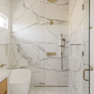
The two guest bathrooms were made with Cloe zellige style tiles and custom floating vanities made from white oak.
The same oak was used also for the built-in TV wall as floating shelves and base cabinets with a large, tiled center piece for the recessed TV and the electric fireplace.
The kitchen also received some of the white oak love in the form of the Island and the recessed cooking area.
The biggest issue with the kitchen space was the lack of proportions between the width and its length vs. the extreme height of the vaulted ceiling.
The solution I came up with was a secondary line of wall cabinets to be the same depth as the full height units to create a wrap around and make the space more proportionate.
Continuing to the master bathroom, here we have a true walk-in master bath suite, no door needed with this size of space.
All the walls received porcelain semi slab treatment. (72x36 porcelain tile) a lot of work went into selecting the correct tile pieces to give it the effect of a single slab installation but without the added cost.
All fixtures are by Kohler with their fantastic modern gold finish.
The result was a perfect flow of calm beige colors and warmth of natural wood throughout.
 Rolf Schroeder General Contractors, Inc.
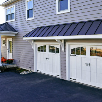
Our Clients came to us with a desire to renovate their home built in 1997, suburban home in Bucks County, Pennsylvania. The owners wished to create some individuality and transform the exterior side entry point of their home with timeless inspired character and purpose to match their lifestyle. One of the challenges during the preliminary phase of the project was to create a design solution that transformed the side entry of the home, while remaining architecturally proportionate to the existing structure.
 Metropolis Drafting and Construction Inc
When our client bought this house, it was stuck in limbo between the traditional interior and a 90's modern structure.
The direction we took was a combination of calm beige color scheme with clean lines and smooth surfaces.
The continuation of the same materials throughout the house finally bonded all the different spaces into a singular home.
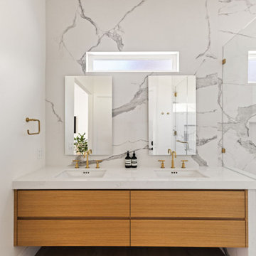
The two guest bathrooms were made with Cloe zellige style tiles and custom floating vanities made from white oak.
The same oak was used also for the built-in TV wall as floating shelves and base cabinets with a large, tiled center piece for the recessed TV and the electric fireplace.
The kitchen also received some of the white oak love in the form of the Island and the recessed cooking area.
The biggest issue with the kitchen space was the lack of proportions between the width and its length vs. the extreme height of the vaulted ceiling.
The solution I came up with was a secondary line of wall cabinets to be the same depth as the full height units to create a wrap around and make the space more proportionate.
Continuing to the master bathroom, here we have a true walk-in master bath suite, no door needed with this size of space.
All the walls received porcelain semi slab treatment. (72x36 porcelain tile) a lot of work went into selecting the correct tile pieces to give it the effect of a single slab installation but without the added cost.
All fixtures are by Kohler with their fantastic modern gold finish.
The result was a perfect flow of calm beige colors and warmth of natural wood throughout.
 Rolf Schroeder General Contractors, Inc.
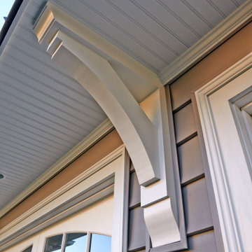
Our Clients came to us with a desire to renovate their home built in 1997, suburban home in Bucks County, Pennsylvania. The owners wished to create some individuality and transform the exterior side entry point of their home with timeless inspired character and purpose to match their lifestyle. One of the challenges during the preliminary phase of the project was to create a design solution that transformed the side entry of the home, while remaining architecturally proportionate to the existing structure.
 Black Cat Design Build, LLC
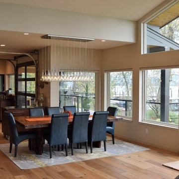
The dining room is situated to take in all the view. A large scale light fixture adds some dramatic flair, but is also proportionate to this open space.
The HW floors are a prefinished wide plank material with a low sheen finish that looks almost like raw wood (even though it's not).
 Vision Design
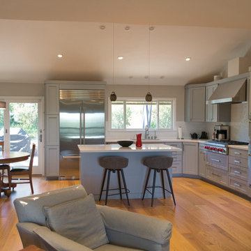
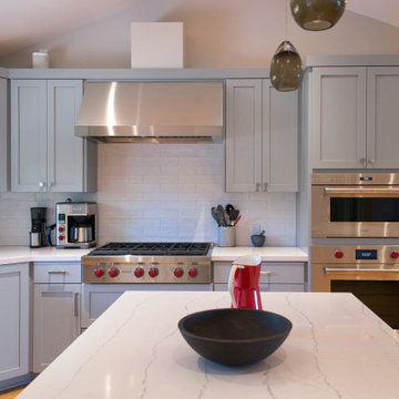
1960s enclosed kitchen with peninsula turned into an open kitchen to enjoy the beautiful views of the East Bay hills. We used gray cabinets and a full cathedral ceiling rather than a single-plane cathedral to modernize this kitchen and make it more proportionate to humans.
 Clawson Architects, LLC
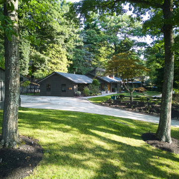
New carport to the left, renovated home to the right. Parking court and level playing court in-between the two buildings. As you ascend the driveway, the home reveals itself. A level parking/play court is flanked on the left by a new carport with storage for bikes and such and the renovated and re-envisioned home on the right. A defined walkway aligns with the formal entrance pergola and a more discrete gate calls attention to the fenced rear yard and less formal back door. By defining the entry to the home and creating a foyer, we were able to organize entry to the home and define zones. By reframing the roof and creating vaulted ceilings not only did we gain more natural light, but the spaces are also more proportionate and welcoming. (More interior images coming soon)
 Vision Design
1960s enclosed kitchen with peninsula turned into an open kitchen to enjoy the beautiful views of the East Bay hills. We used gray cabinets and a full cathedral ceiling rather than a single-plane cathedral to modernize this kitchen and make it more proportionate to humans.
 Metropolis Drafting and Construction Inc
When our client bought this house, it was stuck in limbo between the traditional interior and a 90's modern structure.
The direction we took was a combination of calm beige color scheme with clean lines and smooth surfaces.
The continuation of the same materials throughout the house finally bonded all the different spaces into a singular home.
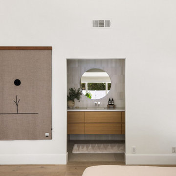
The two guest bathrooms were made with Cloe zellige style tiles and custom floating vanities made from white oak.
The same oak was used also for the built-in TV wall as floating shelves and base cabinets with a large, tiled center piece for the recessed TV and the electric fireplace.
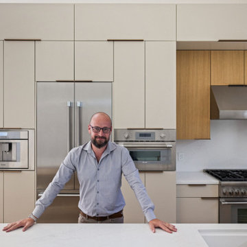
The kitchen also received some of the white oak love in the form of the Island and the recessed cooking area.
The biggest issue with the kitchen space was the lack of proportions between the width and its length vs. the extreme height of the vaulted ceiling.
The solution I came up with was a secondary line of wall cabinets to be the same depth as the full height units to create a wrap around and make the space more proportionate.
Continuing to the master bathroom, here we have a true walk-in master bath suite, no door needed with this size of space.
All the walls received porcelain semi slab treatment. (72x36 porcelain tile) a lot of work went into selecting the correct tile pieces to give it the effect of a single slab installation but without the added cost.
All fixtures are by Kohler with their fantastic modern gold finish.
The result was a perfect flow of calm beige colors and warmth of natural wood throughout.
 Metropolis Drafting and Construction Inc
When our client bought this house, it was stuck in limbo between the traditional interior and a 90's modern structure.
The direction we took was a combination of calm beige color scheme with clean lines and smooth surfaces.
The continuation of the same materials throughout the house finally bonded all the different spaces into a singular home.
The two guest bathrooms were made with Cloe zellige style tiles and custom floating vanities made from white oak.
The same oak was used also for the built-in TV wall as floating shelves and base cabinets with a large, tiled center piece for the recessed TV and the electric fireplace.
The kitchen also received some of the white oak love in the form of the Island and the recessed cooking area.
The biggest issue with the kitchen space was the lack of proportions between the width and its length vs. the extreme height of the vaulted ceiling.
The solution I came up with was a secondary line of wall cabinets to be the same depth as the full height units to create a wrap around and make the space more proportionate.
Continuing to the master bathroom, here we have a true walk-in master bath suite, no door needed with this size of space.
All the walls received porcelain semi slab treatment. (72x36 porcelain tile) a lot of work went into selecting the correct tile pieces to give it the effect of a single slab installation but without the added cost.
All fixtures are by Kohler with their fantastic modern gold finish.
The result was a perfect flow of calm beige colors and warmth of natural wood throughout.
 Castle Building & Remodeling
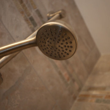
The basement bathroom of this 1975 split level needed some updating. The homeowner had found a few inspiration photos and a great natural stole tile that she wanted to use in the bathroom. we used the color variation of the stone to select the rest of the materials for the space. the existing bathroom had a small fiberglass shower and a linen cabinet at the back. we tore all of the of that out and installed a new larger tiled shower with a custom niche, grey pebble floor tile and rain textured glass panel. The toilet and vanity remained in the same location, but we shrunk the size of the vanity to make it more proportionate to the room. the new vanity was installed with a granite top, a natural stone tiled backsplash that continued to the ceiling, a coordinating mirror and square brushed nickel sconces.
 Naturescapes Landscape Specialists, Ltd
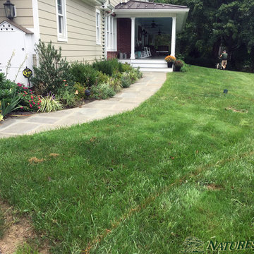
At this couple’s house, we worked in the front and rear. Out front, we enlarged the bedded area to embrace the front walkway and to be more proportionate with the large covered porch. Then we brought in conditioned bio-soil to improve the existing site. Next, we transplanted some larger crowded Boxwoods throughout and added shrubs, perennials and bulbs to the bedded area to make a more welcoming feel to the front of the house and giving it year-round interest.
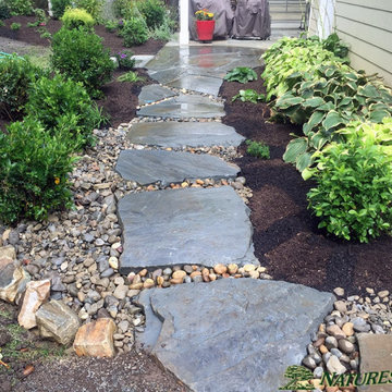
In the rear, we enlarged the beds around the patio, created pathways to the lawn and made a step way/walkway to the patio from the driveway. For the latter, we used slab flagstone steppers and river rock to check the flow of water coming from uphill during heavy rains. We added water-loving shrubs and perennials to create an inviting feel to the rear area.
 Naturescapes Landscape Specialists, Ltd
At this couple’s house, we worked in the front and rear. Out front, we enlarged the bedded area to embrace the front walkway and to be more proportionate with the large covered porch. Then we brought in conditioned bio-soil to improve the existing site. Next, we transplanted some larger crowded Boxwoods throughout and added shrubs, perennials and bulbs to the bedded area to make a more welcoming feel to the front of the house and giving it year-round interest.
In the rear, we enlarged the beds around the patio, created pathways to the lawn and made a step way/walkway to the patio from the driveway. For the latter, we used slab flagstone steppers and river rock to check the flow of water coming from uphill during heavy rains. We added water-loving shrubs and perennials to create an inviting feel to the rear area.
 Rebecca Randall Colour and Design
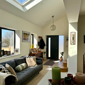
This project involved the complete restoration and remodeling of a small, semi-detached Victorian gardener’s cottage. Having remained untouched for over 30 years, the property was in desperate need of a sympathetic overhaul to transition it into a functional family home.
The owners, originally from South Africa, placed a high priority on the "Braai" lifestyle—the South African tradition of social, outdoor cooking and living. The challenge was to integrate this cultural requirement into a traditional English cottage setting while navigating the strict constraints of the property’s location within the Green Belt and an Area of Outstanding Natural Beauty (AONB).
Designing within an AONB is always a delicate balancing act, made more complex here by a history of previous extensions. To secure planning permission, we produced a meticulous Design and Access Statement, engaging in close consultation with local planners to ensure the new additions were proportionate and respectful of the cottage's heritage.
The internal layout was reimagined to create an expansive, open-plan kitchen and living area that serves as the home's central hub. To honor the owners' roots, the design centers on the transition between the interior and the landscape. We created a bespoke outdoor terrace specifically designed for the summer "Braai," positioned to take full advantage of the views over the surrounding open countryside.
 Eldorado Stone
Photography: Jordan Lotoski
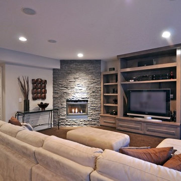
Inspiration for a contemporary living room remodel in San Diego
Inspiration for a contemporary living room remodel in San Diego
16