
Search results for "Proportionate" in Home Design Ideas

 Kevin Mason, Architect
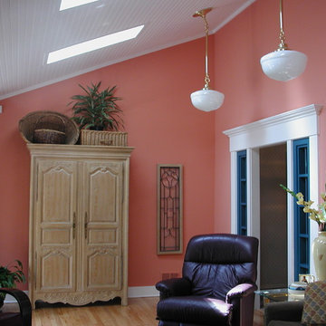
THE CORAL COLOR SCHEME CONTINUES in the family room.
BEAD BOARD ADDS TEXTURE to the sloped ceiling and matches paneling elsewhere in the house.
LARGE PENDANT LIGHT FIXTURES, proportionate to the room's scale, replaced outdated track lighting.
OPEN SCREENS THAT LOOK LIKE SIDELIGHTS flanking the framed opening repeat a theme.
 Chi Renovation & Design
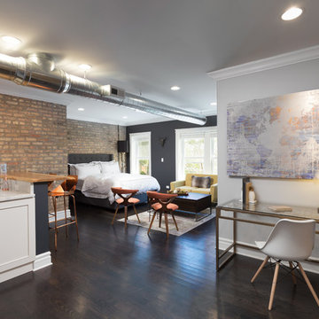
Upon entering this studio oasis, one is met with an elegant but compact office area. This design made the most sense proportionately and functionally, as the desk is sleek and doesn’t take up too much space but offers somewhere (tucked out of view) to rest papers, keys, and other smaller items we tend to leave around.
Designed by Chi Renovation & Design who serve Chicago and it's surrounding suburbs, with an emphasis on the North Side and North Shore. You'll find their work from the Loop through Lincoln Park, Skokie, Wilmette, and all the way up to Lake Forest.
For more about Chi Renovation & Design, click here: https://www.chirenovation.com/
Find the right local pro for your project
 N C R
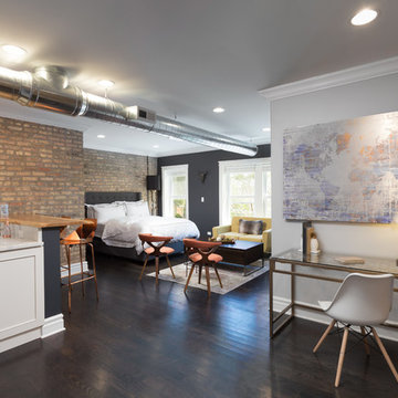
N C RUpon entering this studio oasis, one is met with an elegant but compact office area. This design made the most sense proportionately and functionally, as the desk is sleek and doesn’t take up too much space but offers somewhere (tucked out of view) to rest papers, keys, and other smaller items we tend to leave around.
Designed by Chi Renovation & Design who serve Chicago and it's surrounding suburbs, with an emphasis on the North Side and North Shore. You'll find their work from the Loop through Lincoln Park, Skokie, Wilmette, and all the way up to Lake Forest.
 Crystal Blackshaw Interiors
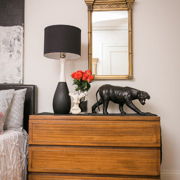
I use dressers a lot as bedside tables. They are a good size, hold a lot, and next to a queen or king bed are more proportionate and scaled. Top it with a tall or large lamp and either a couple large objects or a variety of smaller objects (styling is a whole other chapter!) You have a instant focal point to the bedroom.
jaziphotography
 Archadeck of Austin
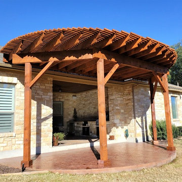
This pergola was custom-designed to cover the homeowners’ existing semi-circle patio. We performed a “dry fit” with materials laying atop the patio to ensure that the end result was perfectly-sized and proportionate to the patio. This South Austin family needed protection from the hot evening sun, so we topped the radius cedar pergola with tightly-fit wood slats for optimum sun protection. We attached the pergola with a bracket system, which will encourage rainwater to flow down the ledger into the gutters. The pergola was finished with rustic brown stain for a rich, saturated color aesthetic.
 Ferriss - Architectural Renderings
Here are some practical tips for creating a beautiful, comfortable and thoughtful living room design.
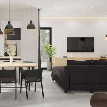
The living room in the house is the place where, as the name suggests, receives guests. However, the owners themselves relax here, spending time in front of the TV or a book, with drinks, pleasant conversation and other activities. Therefore, the living room should be the most comfortable place in your home.
The place of the sofa in the design of the living room
The sofa does not need to be placed in a draft. This means that it should not be on an imaginary line from window to door - if you drew a floor plan, it will just be easy to trace.
1. The sofa in front of the TV, diagonally from the door, is a great location. As if inviting you to sit down :)
2. Sofa near the door. A good solution if you often have overnight guests.
3. Corner sofa in the living room. Best placed in the farthest corner from the door. This will make the room look more spacious.
Correct opening of the door in the living room. Inward or outward?
Open inward or outward? There is no clear rule here, because everything depends on the layout and on the furniture placed. The main thing is that the door leaf opens freely and does not interfere with entering and exiting the room. Also, the door should not interfere with free access to the closet or dressing room.
TV in living room size and location. Location.
The TV is placed on the wall opposite to the sofa - this is the most logical and reasonable place for it in the living room. Moreover, the distance to it does not really matter: modern TV models can be placed close to the sofa.
Cabinet or bracket? To your taste. The main thing is that the television zone looks neat and presentable. Provide in advance a cable channel in which all the wires and numerous sockets for the receiver, modem, set-top box, sound bar will hide. Nothing spoils a design like sticking wires!
Height from the floor. It is optimal to place the TV 1 m from the floor to the middle of the screen - this is exactly the level of the eyes of a seated person.
Diagonal size. If there is a financial opportunity, consider options from 50 inches - smaller screens look lonely and lonely on an empty wall.
Living room furniture.
Armchair. Often the chair becomes an accent item in the interior, then its shade, and sometimes its shape, differ from the rest of the furniture. When choosing a chair, be guided also by your habits: for example, it will be more convenient to climb up with your feet and read a book in an armchair with dimensions of 90x90 cm, and you can “just sit comfortably” in a fireplace chair with a high back, comfortable armrests and with a seat 80x80 cm.
TV stand. Large TV stands are no longer as relevant as they used to be, when it was necessary to store a player, cassettes and discs there. For now, a console table or a narrow elegant pedestal is enough.
Coffee table. Nice piece of furniture that creates a cozy atmosphere. Some models, if necessary, can be transformed into a more spacious table for receiving guests - however, finding comfortable and beautiful specimens is not easy, plus they usually cost a lot.
Rack. An extremely useful type of furniture. :) Firstly, a large number of decor items can be beautifully placed on the rack. And secondly, it can also play the role of a light through partition, which divides the room into zones and does not select light at the same time. This is a very big plus for small apartments.
Fireplace. Here we are talking about electric fireplaces. Some of them come with a humidifier and heated, so 3-in-1 models can be very helpful. Fireplace portals have different styles: classic, antique, modern. Inconsistency with the general style of the living room can greatly spoil the impression of the room, so be careful with creativity. Sizing is an important issue. A large wall with a high ceiling also needs a proportionate fireplace; in horror, a small portal will look lonely and ridiculous.
What do you think about our new living room project?
https://www.ferriss.co
#ferriss #We_bring_objects_to_life #3drendering #architecture #San_Francisco
 TFLarkin, Inc
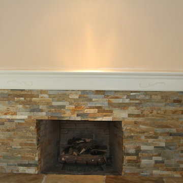
Mantle tops that support large posts or columns will stick out further from the wall. But the legs should stay proportionate in size.
Inspiration for a timeless living room remodel in San Diego
Inspiration for a timeless living room remodel in San Diego

 Metropolis Drafting and Construction Inc
When our client bought this house, it was stuck in limbo between the traditional interior and a 90's modern structure.
The direction we took was a combination of calm beige color scheme with clean lines and smooth surfaces.
The continuation of the same materials throughout the house finally bonded all the different spaces into a singular home.
The two guest bathrooms were made with Cloe zellige style tiles and custom floating vanities made from white oak.
The same oak was used also for the built-in TV wall as floating shelves and base cabinets with a large, tiled center piece for the recessed TV and the electric fireplace.
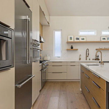
The kitchen also received some of the white oak love in the form of the Island and the recessed cooking area.
The biggest issue with the kitchen space was the lack of proportions between the width and its length vs. the extreme height of the vaulted ceiling.
The solution I came up with was a secondary line of wall cabinets to be the same depth as the full height units to create a wrap around and make the space more proportionate.
Continuing to the master bathroom, here we have a true walk-in master bath suite, no door needed with this size of space.
All the walls received porcelain semi slab treatment. (72x36 porcelain tile) a lot of work went into selecting the correct tile pieces to give it the effect of a single slab installation but without the added cost.
All fixtures are by Kohler with their fantastic modern gold finish.
The result was a perfect flow of calm beige colors and warmth of natural wood throughout.
 Julie Schuster Design Studio
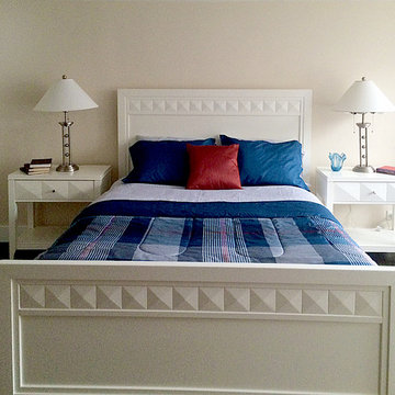
Staging a bed proportionate to the space is key. Clear circulation space around the room is important to showing to prospective buyers.
Bedroom - mid-sized contemporary master dark wood floor bedroom idea in New York with beige walls and no fireplace
Bedroom - mid-sized contemporary master dark wood floor bedroom idea in New York with beige walls and no fireplace
 Metropolis Drafting and Construction Inc
When our client bought this house, it was stuck in limbo between the traditional interior and a 90's modern structure.
The direction we took was a combination of calm beige color scheme with clean lines and smooth surfaces.
The continuation of the same materials throughout the house finally bonded all the different spaces into a singular home.
The two guest bathrooms were made with Cloe zellige style tiles and custom floating vanities made from white oak.
The same oak was used also for the built-in TV wall as floating shelves and base cabinets with a large, tiled center piece for the recessed TV and the electric fireplace.
The kitchen also received some of the white oak love in the form of the Island and the recessed cooking area.
The biggest issue with the kitchen space was the lack of proportions between the width and its length vs. the extreme height of the vaulted ceiling.
The solution I came up with was a secondary line of wall cabinets to be the same depth as the full height units to create a wrap around and make the space more proportionate.
Continuing to the master bathroom, here we have a true walk-in master bath suite, no door needed with this size of space.
All the walls received porcelain semi slab treatment. (72x36 porcelain tile) a lot of work went into selecting the correct tile pieces to give it the effect of a single slab installation but without the added cost.
All fixtures are by Kohler with their fantastic modern gold finish.
The result was a perfect flow of calm beige colors and warmth of natural wood throughout.
 Castle Building & Remodeling
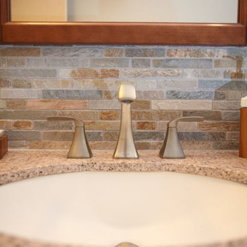
The basement bathroom of this 1975 split level needed some updating. The homeowner had found a few inspiration photos and a great natural stole tile that she wanted to use in the bathroom. we used the color variation of the stone to select the rest of the materials for the space. the existing bathroom had a small fiberglass shower and a linen cabinet at the back. we tore all of the of that out and installed a new larger tiled shower with a custom niche, grey pebble floor tile and rain textured glass panel. The toilet and vanity remained in the same location, but we shrunk the size of the vanity to make it more proportionate to the room. the new vanity was installed with a granite top, a natural stone tiled backsplash that continued to the ceiling, a coordinating mirror and square brushed nickel sconces.
 dRemodeling Design-Build
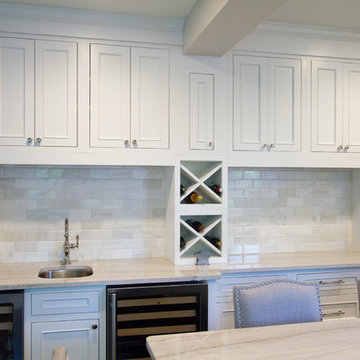
Although this kitchen had an abundance in square footage, the double bay windows made it a challenge to fit in a proportionate amount of cabinetry. When faced with this challenge, the designer proposed to set the main cabinetry back on the inside wall of the kitchen behind the island. Acting as a multi use space, the rear counter of the kitchen is great for meal prep, serving, and wine and spirits.
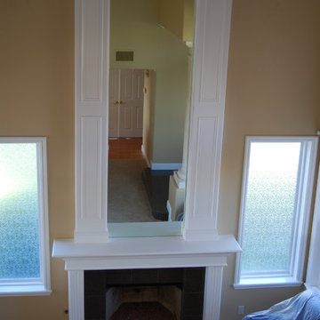 TFLarkin, Inc
Mantle tops that support large posts or columns will stick out further from the wall. But the legs should stay proportionate in size.
Example of a classic living room design in San Diego
Example of a classic living room design in San Diego
 Metropolis Drafting and Construction Inc
When our client bought this house, it was stuck in limbo between the traditional interior and a 90's modern structure.
The direction we took was a combination of calm beige color scheme with clean lines and smooth surfaces.
The continuation of the same materials throughout the house finally bonded all the different spaces into a singular home.
The two guest bathrooms were made with Cloe zellige style tiles and custom floating vanities made from white oak.
The same oak was used also for the built-in TV wall as floating shelves and base cabinets with a large, tiled center piece for the recessed TV and the electric fireplace.
The kitchen also received some of the white oak love in the form of the Island and the recessed cooking area.
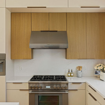
The biggest issue with the kitchen space was the lack of proportions between the width and its length vs. the extreme height of the vaulted ceiling.
The solution I came up with was a secondary line of wall cabinets to be the same depth as the full height units to create a wrap around and make the space more proportionate.
Continuing to the master bathroom, here we have a true walk-in master bath suite, no door needed with this size of space.
All the walls received porcelain semi slab treatment. (72x36 porcelain tile) a lot of work went into selecting the correct tile pieces to give it the effect of a single slab installation but without the added cost.
All fixtures are by Kohler with their fantastic modern gold finish.
The result was a perfect flow of calm beige colors and warmth of natural wood throughout.
 Castle Building & Remodeling
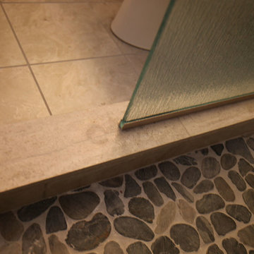
The basement bathroom of this 1975 split level needed some updating. The homeowner had found a few inspiration photos and a great natural stole tile that she wanted to use in the bathroom. we used the color variation of the stone to select the rest of the materials for the space. the existing bathroom had a small fiberglass shower and a linen cabinet at the back. we tore all of the of that out and installed a new larger tiled shower with a custom niche, grey pebble floor tile and rain textured glass panel. The toilet and vanity remained in the same location, but we shrunk the size of the vanity to make it more proportionate to the room. the new vanity was installed with a granite top, a natural stone tiled backsplash that continued to the ceiling, a coordinating mirror and square brushed nickel sconces.
 Metropolis Drafting and Construction Inc
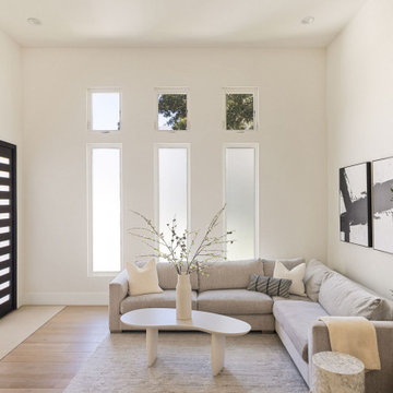
When our client bought this house, it was stuck in limbo between the traditional interior and a 90's modern structure.
The direction we took was a combination of calm beige color scheme with clean lines and smooth surfaces.
The continuation of the same materials throughout the house finally bonded all the different spaces into a singular home.
The two guest bathrooms were made with Cloe zellige style tiles and custom floating vanities made from white oak.
The same oak was used also for the built-in TV wall as floating shelves and base cabinets with a large, tiled center piece for the recessed TV and the electric fireplace.
The kitchen also received some of the white oak love in the form of the Island and the recessed cooking area.
The biggest issue with the kitchen space was the lack of proportions between the width and its length vs. the extreme height of the vaulted ceiling.
The solution I came up with was a secondary line of wall cabinets to be the same depth as the full height units to create a wrap around and make the space more proportionate.
Continuing to the master bathroom, here we have a true walk-in master bath suite, no door needed with this size of space.
All the walls received porcelain semi slab treatment. (72x36 porcelain tile) a lot of work went into selecting the correct tile pieces to give it the effect of a single slab installation but without the added cost.
All fixtures are by Kohler with their fantastic modern gold finish.
The result was a perfect flow of calm beige colors and warmth of natural wood throughout.
 Ivanka's
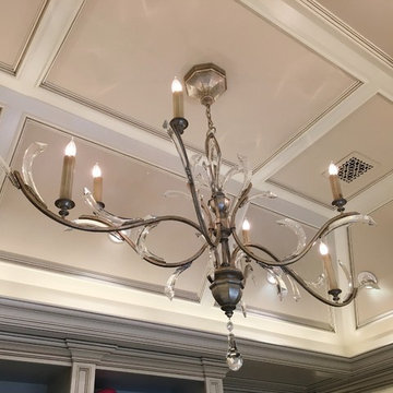
We wanted to break up the long and narrow spanse of this tray ceiling with stile and rail woodwork in custom measured boxes to treat and trick the eye. An oblong light fixture in a warm silver finish reaches proportionately across the room and sits above the large closet island below. We painted over the Reggio registers to minimize an interruption in the ceiling in an effort to let the decorative features stand out.
 Think Fabricate
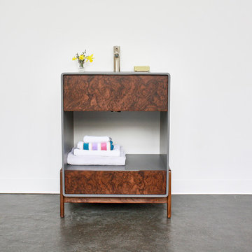
This vanity features a shorter, cradle-like base, which carries a proportionately larger Corian cabinet with radiused corners. It has the smooth, tactile appeal of a river rock and coordinates well with the original Wall*nut Medicine Cabinet S.
 Geraghty and Associates
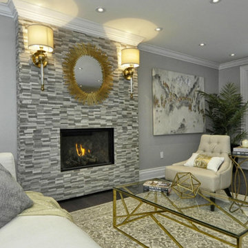
The warm glow of this feature fireplace is the perfect antidote to the frosted fir trees that frame the expansive vistas to the oversized back yard.
The painted poplar wood trim and is amply proportionate to the stepped crown moulding and the luxury of the window trim is further enhanced by the sumptuous back-band and handsome sill &apron detail.
17