
Search results for "Prototypes" in Home Design Ideas
 Boyenga Team / Compass
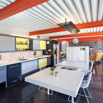
Eichler X-100 Kitchen: A Futuristic Vision of Function and Design
The kitchen of the Eichler X-100 is not just a place to cook—it is a designed system, a forward-thinking experiment in how everyday living could be streamlined, modernized, and elevated through architecture. Envisioned by A. Quincy Jones and Frederick Emmons for Joseph Eichler, the space reflects a bold reimagining of the American kitchen in the mid-20th century.
A Central Hub of the Home
Positioned within the home’s central utility core, the kitchen is strategically located to connect all major living zones. Rather than being tucked away, it becomes a functional anchor, allowing for seamless interaction between cooking, dining, and gathering spaces.
This layout reinforces Eichler’s philosophy:
the kitchen is not separate—it’s part of everyday life.
Innovation Built In
What sets the X-100 kitchen apart is its integration of experimental, built-in features that were far ahead of their time.
Highlights include:
A sliding dining table with integrated electric burners, blending cooking and dining into one continuous experience
Built-in appliances and systems, designed to reduce clutter and maximize efficiency
Thoughtful ergonomic planning that simplifies daily routines
These elements reflect a larger idea:
that the home should work for you—not the other way around.
Material as Modern Expression
The kitchen showcases extensive use of laminate surfaces (Formica)—a material that, in the 1950s, symbolized innovation, durability, and modern living. Clean, smooth, and easy to maintain, these surfaces reinforce the home’s futuristic identity.
Paired with steel structure and clean lines, the material palette creates a space that feels both industrial and approachable.
Open, Light-Filled Design
True to the X-100’s overall concept, the kitchen is fully integrated into the open-plan layout. Sightlines extend outward to living areas, glass walls, and even interior gardens, ensuring the space never feels enclosed.
Natural light filters in from multiple directions, enhanced by skylights and reflective surfaces, giving the kitchen a bright, uplifting atmosphere throughout the day.
A Prototype for Modern Living
In many ways, the X-100 kitchen anticipated how we live today:
Open-concept layouts
Multi-functional islands and dining spaces
Integrated appliances
Clean, minimal design
What feels standard now was radical in 1956.
Where Design Meets Daily Life
The kitchen of the Eichler X-100 is a perfect example of how architecture can elevate the everyday. It transforms routine into experience—where cooking, gathering, and living all happen within a single, beautifully orchestrated space.
It’s not just a kitchen.
It’s a glimpse into the future—designed decades ahead of its time.


Find the right local pro for your project
 Novu Designs
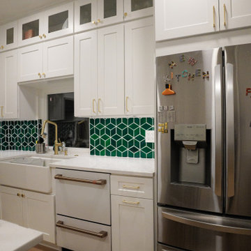
Our goal is to make your kitchen remodel as comfortable as possible. After establishing rapport with our client, we used our ingenuity to redesign and build their ideal kitchen in this stunning 10-foot-ceiling Brooklyn home. The warm tones of wood, quartz, and rich greens strike the ideal balance in creating this appealing design.
How did we achieve this look?
The Backsplash
Our client wanted a simple kitchen remodel in the shaker design, but she also wanted to include green. Initially, we proposed green cabinets to create a bold green look in the kitchen. The main objective was to incorporate our complimenting colors while keeping a feeling of lightness. After going through a number of ideas and 3D prototypes, installing as many cabinets as we could without overpowering the kitchen was our goal of optimizing space. We determined that the best way to brighten the space would be to install white shaker cabinets in addition to higher lumen recessed LED lighting. We decided that finding exquisite green backsplash tiles would be the best way to give it the desired green pop. After numerous searches, we came across a company called Mercury Mosaics.
While there were many green backsplash tiles to choose from, we opted for the mercury mosaics bluegrass diamond tiles. We loved these tiles because its created an illusion of cubes but at times, diamonds. The pattern is an art of illusion and its really gave us the personality we were looking for.
The Flooring of Choice
The flooring of choice was made by our client. We wanted the floors to feel soft and natural while capturing every bit of warmth to balance the whites and the greens and bring them together. While we could’ve opted for wood look tiles or luxury vinyl plank flooring, we ended up going with a premium slightly distressed white oak engineered hardwood flooring from Floor and Decor.
Accents
Although the flooring and the backsplash brought most of the kitchen together, we were still missing the cherry on top. The hardware and maybe something else?
We decided on thin profiled brushed brass hardware to give us that luxurious feel we were looking for every time we opened the cabinet. The cherry on top for us were the hand made quarter round oak shelves which really tied in the floors and cabinets together and gave us that final pop we were looking for. It truly added the perfect character for our client who is also a teen-fiction author of multiple books.
 Shuler Architecture
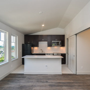
Like many West Coast cities, Seattle is facing a severe housing shortage at a time when labor and material costs have skyrocketed. Combined with a lack of available dirt, housing vacancy rates stubbornly hover under 5%.
A response to this housing perfect storm has been the evolution of a new housing prototype called a detached Auxiliary Dwelling Unit (DADU). This is commonly referred to as a Mother-in-Law (MIL) unit. As the name implies, this is a small, self-contained housing type that allows for additional housing to be built on an existing lot, creating greater density within our urban fabric. Generally thought of as either starter housing or aging-in-place concepts, these are extremely efficient floor plans that squeeze all the basic living functions into a compact space while envisioning the urban fabric as one's living room. In the case of our little DADU, our footprint is 20' x 20' and provides a ground level garage/music studio and an upper level apartment.
The misconception of these structure - thanks in large part to the misinformation campaign of the Not-So-Big-House movement - is the smaller translates into cheaper. Since these are essentially small houses, the truth is these are very expensive structures on a cost/sf basis. We conceptualized this structure as inexpensively as we could think of and it still ended up costing more than $400,000 or around $500/sf.
 HU-235072162
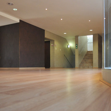
The Dental Studio is a highly intricate building that uniquely links two separate stands of two neighbourhoods and straddling a four metre broad municipal
servitude. The western part of the neighbourhood is an office precinct consisting of low scaled office buildings set around a communal access street and
parking. It was designed for a leading dental practice with state of the art equipment and progressive philosophy of service.
It presents itself as an uncomplicated rectangular structural mass that elegantly characterise an intersection of a major neighbourhood boulevard and is
notable along the eastern end with an upright circulation tower. The western end on the other hand, is characterised with vertical solar control screens
which serve a dual purpose, that is, sifting low down western sun rays as well as giving a serene appeal to the mass. The daring spotless form of the
building is a truthful reflection of the nature of the sterile dental environment that is housed within. This houses the central vestibule and reception with a
visual interface as well as pedestrian movements along the edge of the building.
Healing and healthcare is a paradox that requires architectural intervention. It is this same paradox that informed measures taken towards developing this
project as a revised prototype. Exacerbated by the need to research a building type that can promote healing environment, the Dental Studio attempts
to create a closer harmony with nature through views, landscape and daylight.
 ASC Building Products
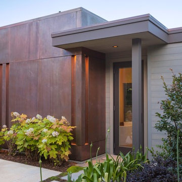
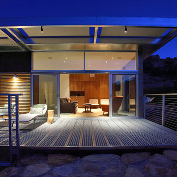
4,000 feet above sea level in the Southern California desert town of Yucca Valley rests this magnificent steel house prototype from Blue Sky Homes.
The project showcases ASC Building Products’ Iron Ox corrugated wall panel and Design Span® hp standing seam metal roofing.
Iron Ox is made from unpainted and untreated steel which allows the surface to rust and form a natural iron oxide finish. This provides a stunning, aged appearance.
The project also includes a host of other steel products from ASC Building Products’ sister companies, AEP Span and ASC Steel Deck, including structural steel composite floor deck and over 1,200 feet of AEP Span cold-formed structural Cee Sections.
Photo credit: Nuvue Interactive
 Northern Roof Tiles
Architect: Andre Tchelistcheff Architects New York. NY
Builder: Xhema of Greenwich CT
Installer: TRM Enterprises Bridgehampton NY
Back story.
Northern has worked with both Xhema and TRM many tiles. We have worked with Andre before he branched out on his own.
Originally Xhema’s contact was to replace the roof and repair the garage, which as some point had been made into an indoor swimming pool without adequate ventilation. The budget was about $8m and there were 20 drawings.
By the time the job was 6 months old the scope of work has expanded to over $30m and over 200 drawings had been produced.
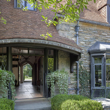
Northern was contacted to visit the site and evaluate the existing roof. Although the house had been added to over the years the same tile was used but due to the location of the house the color of the tile varied considerably from the front to the back.
Northern identified a large number of custom details which would require us to:
1) Match the existing Field tile in size, thickness (it was actually thicker at the butt and reduced to ½” where the tile is overlapped) , surface texture and the color.
2) Make tiles that are curved in their length to suit the curved rafter on the gabled dormers.
3) Make the curved tiles to suit the low slope octagonal tower.
4) Make the curved tiles and Arris style hips to suit the hipped dormers with the curved rafters.
5) Make the segmented tiles to suit the round turret.
6) Make the custom arris style hip tiles for the octagonal tower.
7) Make the custom Arris style hip to suit the different roof pitches as well as the varying splays at the eaves.
8) Make the custom pieces to suit the swept valleys
Simon broke down each section of the roof. He indented all items for each section and agreed the measure etc with the installers. This ‘Project Bible’ became an invaluable tool for the installer, our tile makers and us.
We shipped some samples from the original roof to Sahtas who replicated tall the details. I was visiting factory and delayed my return to the Saturday so that the tiles coming out of the kiln late Friday night could be wrapped and packed into newly purchase suit cases. I arrived home late Saturday evening and Simon picked me up Sunday afternoon and drove us down to Greenwich for an 8 am meeting with the clients. When we unpacked the tiles they were still warm and Hilfiger signed off on the color, although his wife suggested we make them a bit darker a ‘as he has a dreadful sense of color!’
We took Vincent Liot, owner of TRM to the factory twice so that he could oversee the prototyping of all the myriad custom pieces. This was an invaluable move as he pre-approved all the pieces before they were shipped.
The installation was completed and everyone was very pleased with the final outcome.
The Hilfiger’s estate manager told me that a group of friends who were staying the weekend after all the work was completed were heard to ask Mr. Hilfiger ‘I thought you were having a new roof’…to which he responded ‘we did but you can’t tell, which as the plan” …perfect!
In refection this is probably the most complicated roof Northern has ever had the pleasure to supply. We learned a lot of very valuable lessons but in future when we are asked how did we do it we will answer ‘that is for us to know and for you to pay for!’
 Val Glitsch, Architect
The clients for this house, descendants of a timber farming family, wanted a weekend house on their property in the Piney Woods. They imagined spending weekends and holidays year-round in a house suitable for three generations at once, including aging parents and children side-by-side.
The house, taking clues from the historic 'dogtrot' prototype, sets two bars (a two-story bedroom wing and a one-story living wing) straddling an open porch that buffers rowdiness at night and accommodates everyone for meals and games around the clock.
The porch is high, screened and louvered for breezes and against the sun in the summer, with operable translucent panels on the north side that close to deflect winter winds. The house, sited along the verge of the woods and the pasture, recalls the structure of the trees in its design while letting in filtered light (as in the woods) to interior spaces.
The house was the cover article for the "TexasArchitect" issue on East Texas. I have sense designed a renovation for the owners mid-century modern house in the city.
Paul Hester, Photographer
 Archimple LLC
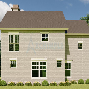
The Colonial house architecture offers a versatile duplex prototype perfect for a single-family home or a recreational center. Its grand entrance is complemented by a screened front porch, providing a welcoming space for relaxation.
On the ground level, a lounge area with a cozy fireplace offers warmth and comfort, while a unique addition includes a powder room for added convenience. The spacious kitchen features a formal dining area, ideal for hosting gatherings and meals.
Upstairs, the bedroom layout is designed to create a clear distinction between private and public spaces. The master suite boasts a walk-in closet and a modern ensuite bath with a separate tub and shower, ensuring comfort and luxury.
Additional features include two bedrooms with a Jack and Jill toilet, a utility layout for practicality, and a children's playroom for leisure and fun. With a plethora of amenities, this Colonial home is crafted to bring joy and satisfaction to its residents.
 Novu Designs
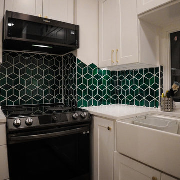
Our goal is to make your kitchen remodel as comfortable as possible. After establishing rapport with our client, we used our ingenuity to redesign and build their ideal kitchen in this stunning 10-foot-ceiling Brooklyn home. The warm tones of wood, quartz, and rich greens strike the ideal balance in creating this appealing design.
How did we achieve this look?
The Backsplash
Our client wanted a simple kitchen remodel in the shaker design, but she also wanted to include green. Initially, we proposed green cabinets to create a bold green look in the kitchen. The main objective was to incorporate our complimenting colors while keeping a feeling of lightness. After going through a number of ideas and 3D prototypes, installing as many cabinets as we could without overpowering the kitchen was our goal of optimizing space. We determined that the best way to brighten the space would be to install white shaker cabinets in addition to higher lumen recessed LED lighting. We decided that finding exquisite green backsplash tiles would be the best way to give it the desired green pop. After numerous searches, we came across a company called Mercury Mosaics.
While there were many green backsplash tiles to choose from, we opted for the mercury mosaics bluegrass diamond tiles. We loved these tiles because its created an illusion of cubes but at times, diamonds. The pattern is an art of illusion and its really gave us the personality we were looking for.
The Flooring of Choice
The flooring of choice was made by our client. We wanted the floors to feel soft and natural while capturing every bit of warmth to balance the whites and the greens and bring them together. While we could’ve opted for wood look tiles or luxury vinyl plank flooring, we ended up going with a premium slightly distressed white oak engineered hardwood flooring from Floor and Decor.
Accents
Although the flooring and the backsplash brought most of the kitchen together, we were still missing the cherry on top. The hardware and maybe something else?
We decided on thin profiled brushed brass hardware to give us that luxurious feel we were looking for every time we opened the cabinet. The cherry on top for us were the hand made quarter round oak shelves which really tied in the floors and cabinets together and gave us that final pop we were looking for. It truly added the perfect character for our client who is also a teen-fiction author of multiple books.
 Form Found Design
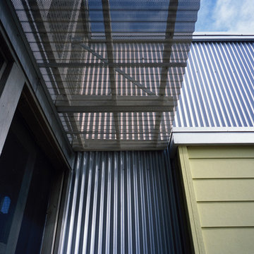
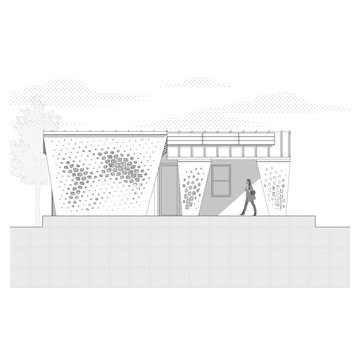
Inspired by the multi-functional performance of a shell structure in nature, the design of this two-bedroom, two-bath ADU explored a performance-based roof geometry that becomes the building façade and privacy screen. Coupled with deep roof overhangs, this second skin allows dappled light to penetrate the interior during the day while reflecting the detrimental UV radiation on the southern exposure. The perforations in the second skin are based on the effects of the sun path on the southern exposure and the location of the windows behind the screen. At night, the interior light glows through the perforations, contributing to the name of the project, “LuminOCity”.
Orange Coast College and UC Irvine formed a partnership called "Team MADE" to enter the 2023 Orange County Sustainability Decathlon. "MADE" is an acronym for Modular, Affordable Dwellings for the Environment. LuminOCity won second place in the competition and 9 awards in various categories. Following the competition, the home was donated to Homeless Intervention Services, Orange County, where it serves as an ADU on an existing property to provide transitional housing for youth experiencing housing insecurities.
This 750sf prefabricated, modular home is built on four, eight foot wide modules that nest together. The building system is predicated on a software-to-manufacturing pipeline called the FrameCAD Machine. This roll-former for light-gauge steel allowed Team MADE to prototype as well as site-manufacture every stud and track in the steel-framed home they would design. Over 100 student volunteers aided in the construction of the steel framing, MEP installation, building envelope, and site work. The use of prefabricated Light Gauge Steel allowed for higher construction tolerances with simplified assembly diagrams that could be followed by student volunteers. Joseph Sarafian, AIA was the lead architect as well as one of four faculty advisors on the project, leading the design of the project from conception to completion.
 Allison Armour
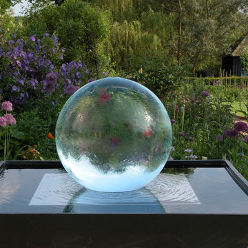
set in a 4.75 foot (1.45m) square black polycarbonate pool, the acrylic sphere fountain (like AquaLens) is set on a square platform and normally finished in stainless steel for maximum reflective effect. Aquasphere was the first water feature that Allison designed and produced. The original prototype still rests at her garden in West Sussex.
 Shuler Architecture
Like many West Coast cities, Seattle is facing a severe housing shortage at a time when labor and material costs have skyrocketed. Combined with a lack of available dirt, housing vacancy rates stubbornly hover under 5%.
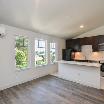
A response to this housing perfect storm has been the evolution of a new housing prototype called a detached Auxiliary Dwelling Unit (DADU). This is commonly referred to as a Mother-in-Law (MIL) unit. As the name implies, this is a small, self-contained housing type that allows for additional housing to be built on an existing lot, creating greater density within our urban fabric. Generally thought of as either starter housing or aging-in-place concepts, these are extremely efficient floor plans that squeeze all the basic living functions into a compact space while envisioning the urban fabric as one's living room. In the case of our little DADU, our footprint is 20' x 20' and provides a ground level garage/music studio and an upper level apartment.
The misconception of these structure - thanks in large part to the misinformation campaign of the Not-So-Big-House movement - is the smaller translates into cheaper. Since these are essentially small houses, the truth is these are very expensive structures on a cost/sf basis. We conceptualized this structure as inexpensively as we could think of and it still ended up costing more than $400,000 or around $500/sf.

 David Trubridge
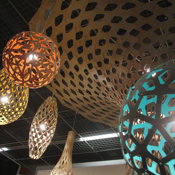
COR-1200-CAR-AQU - Coral - Bamboo Pendant - 48 - Caramel (Side A) - Aqua (Side B)
Coral is based on one of the geometric polyhedra that have interested David since he was a boy. The intricate form is made from just one single component repeated 60 times. Originally designed purely as an experiment, it only became a light later when David tried to find a use for it by putting a bulb inside. This was a pivotal moment. What followed was a whole new direction in exploring lighting structures made from minimal shell-like skins which also act as patterned shadow- makers.
FLO-0800-NAT-ORA - Floral - Bamboo Pendant - 32 - Natural (Side A) - Orange (Side B)
Floral designed three years after Coral light, is based on a geometric polyhedra forms. The intricate form is made from just one single component repeated 60 times. Floral was designed to offer a softer more decorative offering alongside Coral which is more structured.
KOU-0750-NAT-YEL - Kōura - Bamboo Pendant - 30 - Natural (Side A) - Yellow (Side B)
Koura was inspired by woven baskets and also from the curled form of the New Zealand native fresh water shrimp, koura, which is its Maori name. Like our other lights Koura is available in a wide range of sizes from small and intimate to very large and dramatic
HIN-0900-NAT-NAT - Hīnaki - Bamboo Pendant - 36 - Natural
Hinaki (1995) could be classed as David’s first exploration into lighting. In 1995 he made a prototype based on fish traps which are called hinaki by Maori, though often the name is used specifically for an eel trap. They were made from woven vines, some in amazingly beautiful forms. He set it aside for many years, only to develop it later (2011) after Coral had gained international attention.
NIK-HALF-NAT-NAT - Nīkau - Bamboo Pendant - Half - Natural
Nikau is the only indigenous palm tree in New Zealand, named apparently because unlike the coconut palm familiar to Polynesians, it has no nuts. The fronds from the palm were traditionally used for thatching and weaving. It has a large bulb at the top of its trunk and its leaves overlap in the criss-cross patterns which inspired this light.

 Shuler Architecture
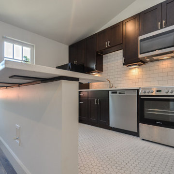
Like many West Coast cities, Seattle is facing a severe housing shortage at a time when labor and material costs have skyrocketed. Combined with a lack of available dirt, housing vacancy rates stubbornly hover under 5%.
A response to this housing perfect storm has been the evolution of a new housing prototype called a detached Auxiliary Dwelling Unit (DADU). This is commonly referred to as a Mother-in-Law (MIL) unit. As the name implies, this is a small, self-contained housing type that allows for additional housing to be built on an existing lot, creating greater density within our urban fabric. Generally thought of as either starter housing or aging-in-place concepts, these are extremely efficient floor plans that squeeze all the basic living functions into a compact space while envisioning the urban fabric as one's living room. In the case of our little DADU, our footprint is 20' x 20' and provides a ground level garage/music studio and an upper level apartment.
The misconception of these structure - thanks in large part to the misinformation campaign of the Not-So-Big-House movement - is the smaller translates into cheaper. Since these are essentially small houses, the truth is these are very expensive structures on a cost/sf basis. We conceptualized this structure as inexpensively as we could think of and it still ended up costing more than $400,000 or around $500/sf.
21