
Search results for "Pursued" in Home Design Ideas
 J Hill Interiors
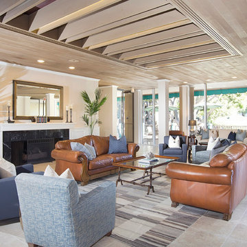
The Plaza Condominiums pursued J Hill Interior Designs to find a solution for a challenging lobby situation. The demographic of this condominium complex is very diverse, as was the design style of its HOA members. Moreover, there was existing furniture that needed to be incorporated into the design, all with budgets, and different design desires to keep in mind. The end product was fantastic with much great feedback. See more info about The Plaza here: http://plazacondospb.com/ - See more at: http://www.jhillinteriordesigns.com/project-peeks/#sthash.pMZXLTAg.dpuf


Find the right local pro for your project
 Progressive Design Build
It was in 2012 when Mike Spreckelmeier first met Roy and Patti. They had been despondent after meeting with multiple contractors in an attempt to start their kitchen remodel. The contractors lacked follow through, came tardy to meetings and even failed to show up at others.
Determined to leave nothing to chance in the pursuit of their dream, Roy and Patti followed up on a recommendation after overhearing a conversation that was taking place while they were standing in a gallingly long line waiting to cast a vote on Election Day.
With a solid recommendation to pursue, Roy and Patti contacted Progressive Design Build. The rest is history.
Mike showed up on time. For a small retainer, he provided preliminary sketches, ideas for maximizing space and storage, and solutions for a sunken family room that created a safety hazard and a problem with traffic flow. More importantly, he designed the project to the homeowners’ budget.
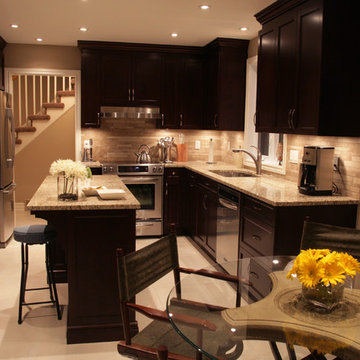
Progressive Design Build shot some different elevations and designed a plan to raise the floor, allowing all finished floors to be on the same level. Upon completion, the kitchen was stunning. Features included LED backlit fire glass shelving, white recessed panel cabinets, a subway tile backsplash, Granite countertop, integrated refrigerator, undermount sink, and more.
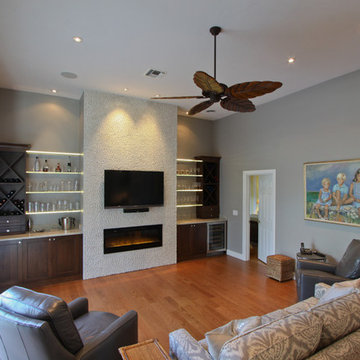
The living room was designed with complimentary finishes and included a natural stone fireplace wall with open cabinets flanked on both sides. The 12’ fireplace was made with a floor-to-ceiling white pebble finish.
This Bonita Bay project completed on time and on budget—allowing this fabulous family a wonderful opportunity to create lasting memories for many years to come.
 Gill Design Co.
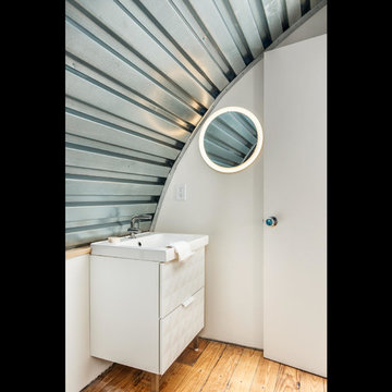
Custom Quonset Huts become artist live/work spaces, aesthetically and functionally bridging a border between industrial and residential zoning in a historic neighborhood. The open space on the main floor is designed to be flexible for artists to pursue their creative path. Upstairs, a living space helps to make creative pursuits in an expensive city more attainable.
The two-story buildings were custom-engineered to achieve the height required for the second floor. End walls utilized a combination of traditional stick framing with autoclaved aerated concrete with a stucco finish. Steel doors were custom-built in-house.
 Anima Architects
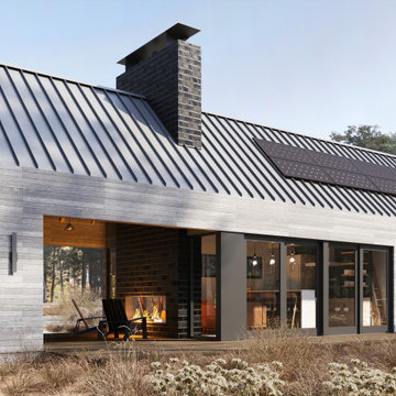
After having spent several years living in a trailer getting to know their rural property in La Pine Oregon, our clients made the decision to build a small off-the-grid modern cabin that they can retire in and use as a hub for entertaining family and friends. Keeping the cabin modest in scale and construction cost was critical to this couple since they planned to build the cabin themselves and didn’t want to overextend themselves financially so they can continue pursuing their love for international travel and maximize time spent with their loved ones.
Set amongst a grove of lodge pole pines, the cabin was designed with simplicity in mind and utilizes materials that help it fit in seamlessly with the surrounding high desert environment while being low maintenance and fire resistant. Although the cabin is compact in footprint, the interior spaces are all designed to open out onto a large outdoor deck, effectively doubling the usable living space, while a covered breezeway provides protected access to the main entry and houses an outdoor kitchen for entertaining in warmer weather and wood storage for use in the indoor/ outdoor fireplace during the winter months. The compact 600 square foot interior footprint also has a 200 square foot flexible loft space which can be used to work from and house guests alike. The exterior breezeway, main living space and loft was designed to be open to the vaulted wood rafters, steel collar ties and skylights above, creating a seamless transition between the interior and exterior and a sense of openness and lightness unusual for such a compact footprint.
 w.b. builders
Seth Hannula
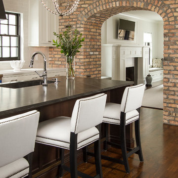
Elegant medium tone wood floor kitchen photo in Minneapolis with an undermount sink, shaker cabinets, white cabinets, gray backsplash, subway tile backsplash, paneled appliances and an island
Elegant medium tone wood floor kitchen photo in Minneapolis with an undermount sink, shaker cabinets, white cabinets, gray backsplash, subway tile backsplash, paneled appliances and an island

 InnovationLand
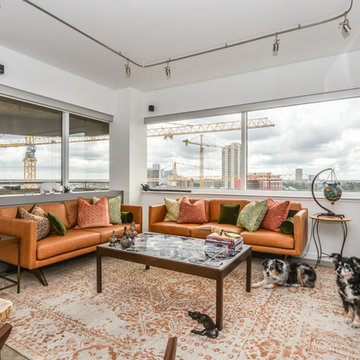
Houston Interior Designer Lisha Maxey took this Museum District condo from the dated, mirrored walls of the 1980s to Mid Century Modern with a gallery look featuring the client's art collection.
"The place was covered with glued-down, floor-to-ceiling mirrors," says Lisha Maxey, senior designer for Homescapes of Houston and principal at LGH Design Services in Houston. "When we took them off the walls, the walls came apart. We ended up taking them down to the studs."
The makeover took six months to complete, primarily because of strict condo association rules that only gave the Houston interior designers very limited access to the elevator - through which all materials and team members had to go.
"Monday through Friday, we could only be noisy from 10 a.m. to 2 p.m., and if we had to do something extra loud, like sawing or drilling, we had to schedule it with the management and they had to communicate that to the condo owners. So it was just a lot of coordination. But a lot of Inner City Loopers live in these kinds of buildings, so we're used to handling that kind of thing."
The client, a child psychiatrist in her 60s, recently moved to Houston from northeast Texas to be with friends. After being widowed three years ago, she decided it was time to let go of the traditionally styled estate that wasn't really her style anyway. An avid diver who has traveled around the world to pursue her passion, she has amassed a large collection of art from her travels. Downsizing to 1,600 feet and wanting to go more contemporary, she wanted the display - and the look - more streamlined.
"She wanted clean lines and muted colors, with the main focus being her artwork," says Maxey. "So we made the space a palette for that."
Enter the white, gallery-grade paint she chose for the walls: "It's halfway between satin and flat," explains Maxey. "It's not glossy and it's not chalky - just very smooth and clean."
Adding to the gallery theme is the satin nickel track lighting with lamps aimed to highlight pieces of art. "This lighting has no wires," notes Maxey. "It's powered by a positive and negative conduit."
The new flooring throughout is a blended-grey porcelain tile that looks like wood planks. "It's gorgeous, natural-looking and combines all the beauty of wood with the durability of tile," says Maxey. "We used it throughout the condo to unify the space."
After Maxey started looking at the client's bright, vibrant, colorful artwork, she felt the palette couldn't stay as muted anymore. Hence the Mid Century Modern orange leather sofas from West Elm and chartruese chairs from Joybird, plus the throw pillows in different textures, patterns and shades of gold, orange and green.
The concave lines of the Danish-inspired chairs, she notes, help them look beautiful from all the way around - a key to designing spaces for loft living.
"The table in the living room is very interesting," notes Maxey. "It was handmade for the client in 1974 and has a signature on it from the artist. She was adamant about including the piece, which has all these hand-painted black-and-white art tiles on the top. I took one look at it and said 'It's not really going to go.'"
However, after cutting 6 inches off the bottom and making it look a little distressed, the table ended up being the perfect complement to the sofas.
The dining room table - from Design Within Reach - is a solid piece of mahogany, the chair upholstery a mix of grey velvet and leather and the legs a shiny brass. "The side chairs are leather and the end ones are velvet," says Maxey. "It's a nice textural mix that lends depth and texture."
The galley kitchen, meanwhile, has been lightened and brightened, with white quartz countertops and backsplashes mimicking the look of Carrara marble, stainless steel appliances and a velvet green bench seat for a punch of color. The cabinets are painted a cool grey color called "Silverplate."
The two bathrooms have been updated with contemporary white vanities and vessel sinks and the master bath now features a walk-in shower tiled in Dolomite white marble (the floor is Bianco Carrara marble mosaic, done in a herringbone pattern.
In the master bedroom, Homescapes of Houston knocked down a wall between two smaller closets with swing doors to make one large walk-in closet with pocket doors. The closet in the guest bedroom also came out 13 more inches.
The client's artwork throughout personalizes the space and tells the story of a life. There's a huge bowl of shells from the client's diving adventures, framed art from her child psychiatry patients and a 16th century wood carving from a monastery that's been in her family forever.
"Her collection is quite impressive," says Maxey. "There's even a framed piece of autographed songs written by John Lennon." (You can see this black-framed piece of art on the wall in the photo above of two green chairs).
"We're extremely happy with how the project turned out, and so is the client," says Maxey. "No expense was spared for her. It was a labor of love and we were excited to do it."
 Interior Style, LLC
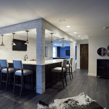
Modern Industrial Basement
photos by Eric Koraganie
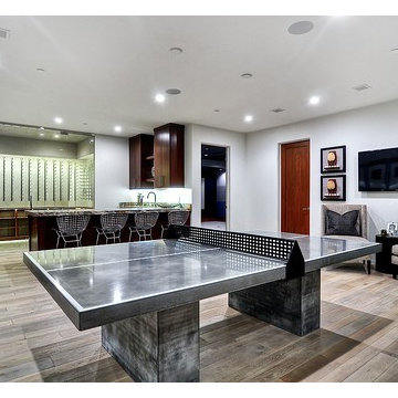
Example of a transitional basement design in DC Metro
Example of a transitional basement design in DC Metro
 Simmonds & Associates, Inc.
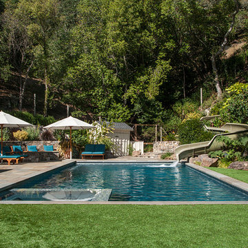
pool & waterslide
Inspiration for a contemporary pool remodel in San Francisco
Inspiration for a contemporary pool remodel in San Francisco
 SV Design
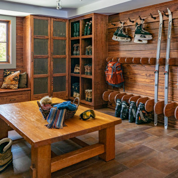
When an expanding family outgrew its beloved A frame vacation home, chaos followed. Outdoor gear multiplied exponentially, while any organized spot to stow it did not. Expected amenities were non-existent for needs of the crowd of outdoor enthusiasts. SV Design addressed the lacking elements and added practicality, with style: the multigenerational family members and friends can now appreciate space for the variety of hobbies and interests they pursue. Having worked with Siemasko + Verbridge in the past, the family turned to SV once again knowing we would design solution to address the growing list of concerns.
SV’s design of a three-story addition with a relatively small footprint was just what the home needed. A covered entry now provides the option of entering the main house or stopping off in the mud room to remove boots, drop off skis, and hang up wet clothes. Regardless of the way you enter the main house you will be greeted with a naturally lit, welcoming staircase of reclaimed white oak timber treads and steel stringers and rails. Each newel post is capped off with a polished granite sphere to pay homage to the Granite State in which the house resides.
The open stair invites you up to a spacious family space for playing board games, listening to music, gazing at the stars, or just lounging about in the warm comfort of the home. Traveling downstairs from the main level is a new, kid friendly media room for popcorn and movies, or a little video game sibling competition.
Perhaps the most striking new feature of the home is the custom designed Adirondack style bar built of varying tones of willow branches and bank. Topped off with a contrasting aged zinc counter, backsplash and shelf the bar is the perfect spot for the resident bar tender to mix up a tasty concoction for sitting by the crackling fire just steps away.
This home will provide comfort and ease for the family to relax and enjoy their getaway for years to come.

 InnovationLand
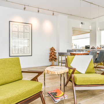
Houston Interior Designer Lisha Maxey took this Museum District condo from the dated, mirrored walls of the 1980s to Mid Century Modern with a gallery look featuring the client's art collection.
"The place was covered with glued-down, floor-to-ceiling mirrors," says Lisha Maxey, senior designer for Homescapes of Houston and principal at LGH Design Services in Houston. "When we took them off the walls, the walls came apart. We ended up taking them down to the studs."
The makeover took six months to complete, primarily because of strict condo association rules that only gave the Houston interior designers very limited access to the elevator - through which all materials and team members had to go.
"Monday through Friday, we could only be noisy from 10 a.m. to 2 p.m., and if we had to do something extra loud, like sawing or drilling, we had to schedule it with the management and they had to communicate that to the condo owners. So it was just a lot of coordination. But a lot of Inner City Loopers live in these kinds of buildings, so we're used to handling that kind of thing."
The client, a child psychiatrist in her 60s, recently moved to Houston from northeast Texas to be with friends. After being widowed three years ago, she decided it was time to let go of the traditionally styled estate that wasn't really her style anyway. An avid diver who has traveled around the world to pursue her passion, she has amassed a large collection of art from her travels. Downsizing to 1,600 feet and wanting to go more contemporary, she wanted the display - and the look - more streamlined.
"She wanted clean lines and muted colors, with the main focus being her artwork," says Maxey. "So we made the space a palette for that."
Enter the white, gallery-grade paint she chose for the walls: "It's halfway between satin and flat," explains Maxey. "It's not glossy and it's not chalky - just very smooth and clean."
Adding to the gallery theme is the satin nickel track lighting with lamps aimed to highlight pieces of art. "This lighting has no wires," notes Maxey. "It's powered by a positive and negative conduit."
The new flooring throughout is a blended-grey porcelain tile that looks like wood planks. "It's gorgeous, natural-looking and combines all the beauty of wood with the durability of tile," says Maxey. "We used it throughout the condo to unify the space."
After Maxey started looking at the client's bright, vibrant, colorful artwork, she felt the palette couldn't stay as muted anymore. Hence the Mid Century Modern orange leather sofas from West Elm and chartruese chairs from Joybird, plus the throw pillows in different textures, patterns and shades of gold, orange and green.
The concave lines of the Danish-inspired chairs, she notes, help them look beautiful from all the way around - a key to designing spaces for loft living.
"The table in the living room is very interesting," notes Maxey. "It was handmade for the client in 1974 and has a signature on it from the artist. She was adamant about including the piece, which has all these hand-painted black-and-white art tiles on the top. I took one look at it and said 'It's not really going to go.'"
However, after cutting 6 inches off the bottom and making it look a little distressed, the table ended up being the perfect complement to the sofas.
The dining room table - from Design Within Reach - is a solid piece of mahogany, the chair upholstery a mix of grey velvet and leather and the legs a shiny brass. "The side chairs are leather and the end ones are velvet," says Maxey. "It's a nice textural mix that lends depth and texture."
The galley kitchen, meanwhile, has been lightened and brightened, with white quartz countertops and backsplashes mimicking the look of Carrara marble, stainless steel appliances and a velvet green bench seat for a punch of color. The cabinets are painted a cool grey color called "Silverplate."
The two bathrooms have been updated with contemporary white vanities and vessel sinks and the master bath now features a walk-in shower tiled in Dolomite white marble (the floor is Bianco Carrara marble mosaic, done in a herringbone pattern.
In the master bedroom, Homescapes of Houston knocked down a wall between two smaller closets with swing doors to make one large walk-in closet with pocket doors. The closet in the guest bedroom also came out 13 more inches.
The client's artwork throughout personalizes the space and tells the story of a life. There's a huge bowl of shells from the client's diving adventures, framed art from her child psychiatry patients and a 16th century wood carving from a monastery that's been in her family forever.
"Her collection is quite impressive," says Maxey. "There's even a framed piece of autographed songs written by John Lennon." (You can see this black-framed piece of art on the wall in the photo above of two green chairs).
"We're extremely happy with how the project turned out, and so is the client," says Maxey. "No expense was spared for her. It was a labor of love and we were excited to do it."
 Progressive Design Build
It was in 2012 when Mike Spreckelmeier first met Roy and Patti. They had been despondent after meeting with multiple contractors in an attempt to start their kitchen remodel. The contractors lacked follow through, came tardy to meetings and even failed to show up at others.
Determined to leave nothing to chance in the pursuit of their dream, Roy and Patti followed up on a recommendation after overhearing a conversation that was taking place while they were standing in a gallingly long line waiting to cast a vote on Election Day.
With a solid recommendation to pursue, Roy and Patti contacted Progressive Design Build. The rest is history.
Mike showed up on time. For a small retainer, he provided preliminary sketches, ideas for maximizing space and storage, and solutions for a sunken family room that created a safety hazard and a problem with traffic flow. More importantly, he designed the project to the homeowners’ budget.
Progressive Design Build shot some different elevations and designed a plan to raise the floor, allowing all finished floors to be on the same level. Upon completion, the kitchen was stunning. Features included LED backlit fire glass shelving, white recessed panel cabinets, a subway tile backsplash, Granite countertop, integrated refrigerator, undermount sink, and more.
The living room was designed with complimentary finishes and included a natural stone fireplace wall with open cabinets flanked on both sides. The 12’ fireplace was made with a floor-to-ceiling white pebble finish.
This Bonita Bay project completed on time and on budget—allowing this fabulous family a wonderful opportunity to create lasting memories for many years to come.
 California Closets Connecticut
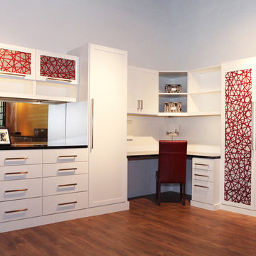
Multi-Purpose Office, Wall Bed & Storage with Dramatic Red Accents (closed)
Inserts Options
• Inserts provide stylish or colorful accents to your storage system, creating a highly personalized design feature to suit you and your home.
• Choose from a wide range of options like leather, glass, acrylic, and more.
• Accents of color provide a high-end look and make your storage system unique to your home.
• Inserts are durable and easy to maintain.
• Inserts provide an opportunity to add texture and depth to a design palette.
Our Products
At California Closets, we constantly pursue opportunities to provide our clients with environmentally sustainable options, and our products reflect this commitment.
All of our board is compliant with the California Air Resources Board (CARB), which consists of some of the most rigorous regulations for emission standards, and is available in a variety of substrates, including low-emitting formaldehyde. This certification applies to our three finishes - Classic, Lago®, and TesoroTM - which come in a wide range of beautiful colors and textures.
 Taylor & Taylor, Inc.
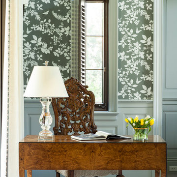
The bedroom is papered in a vegetal design from Schumacher with wood furnishings. The desk and chair from William Switzer offer a place for pursuing a book or a day's correspondence.
 STUDIO TASHIMA
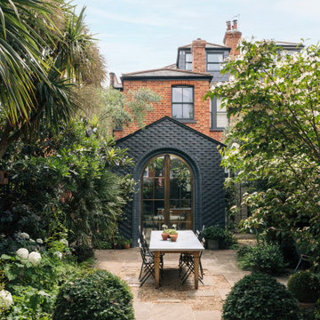
Keyes Road is a two-storey, semi-detached red brick house dating to around 1890-1910. The focus of our work was on the ground floor where we were asked to improve the layout and use of the main living areas of the house, for an active family of four. Important to the design was to maximise the quality and amount of light as well as connection to the garden and flow to the rest of the house.
Our proposal introduces three single storey extensions, comprising a central, large space that extends the main outrigger of the house. To each side are smaller volumes, affording a full width kitchen. While defining a series of discrete volumes, it was important for us to ensure that the kitchen, living, family and dining rooms that are interconnecting and continuous. The result is a big space punctuated by a series of differently sized arches, defining spaces to ensure their intimacy.
It was important for our client to have a sense of warmth and comfort - perhaps not dissimilar to the qualities of a hotel lobby. The colour scheme of the rooms are warm white painted plaster, natural wood flooring with black, bronze and brass accents. Indirect and carefully placed light fittings pulls together the atmosphere of the rooms - particularly in the evenings.
Externally, we felt it important to differentiate the extensions from the main house by using a dark, charcoal grey brick. This sets up a contrasting yet complimentary relationship to the rich red coloured brick house. The facets of the brick play with light and depth as do the graduated brick arches.
During the design process, we grappled with floor levels, the direction of sunlight, and care to not encroach on the neighbouring properties. As the house is in a conservation area, we worked closely with our trusted planning advisor. Throughout, we pursued a sensitive design strategy, using pitched roofs, matching materials and careful detailing. Internally, many of the original details are intact. This has enabled us to create an eclectic ensemble of elements, colours and materials varying in age and period.
 Gill Design Co.
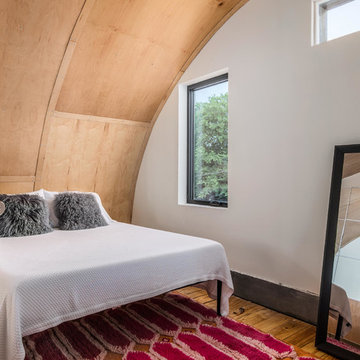
Custom Quonset Huts become artist live/work spaces, aesthetically and functionally bridging a border between industrial and residential zoning in a historic neighborhood. The open space on the main floor is designed to be flexible for artists to pursue their creative path. Upstairs, a living space helps to make creative pursuits in an expensive city more attainable.
The two-story buildings were custom-engineered to achieve the height required for the second floor. End walls utilized a combination of traditional stick framing with autoclaved aerated concrete with a stucco finish. Steel doors were custom-built in-house.
 Platinum Poolcare
Request Free Quote
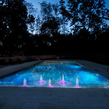
Pool with fiber optic stars in the floor of the pool. this pool also includes different types of water jets as well as led lighting.
11