
Search results for "Pursued" in Home Design Ideas
 Discovery Developers, Inc. DBA Discovery Builders
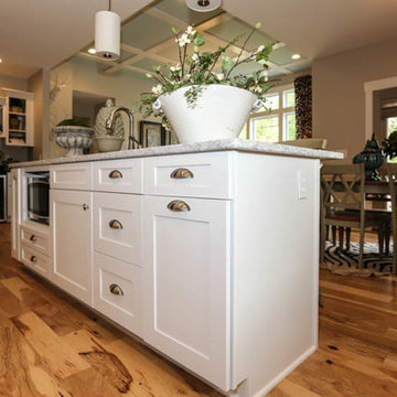
The Willow has it all...character, beauty, storage, and tremendous functionality!
Eclectic kitchen photo in Louisville
Eclectic kitchen photo in Louisville
 Saeed shenakhteh
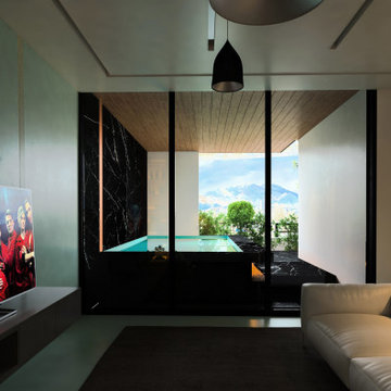
INSPIRATION: local settlements in northern Iran formed by a simple adaptation of the nature, geography and climate of that region. The local architecture of this place is so intertwined with nature and in harmony with the climate that it can be called naturalistic architecture. We are looking to redefining the region's former architecture, which needs protection, into today's language.
Unique properties: Extroverted architecture is a solution that is necessary to respond to the hot and humid climate of the location of this project. But in Iranian culture, introverted architecture is unavoidable therefore, in this residential apartment where several families live together and also have common spaces, providing a response to introversion and extroversion at the same time has been considered.
Description: Extreme use of the porch refers to the deep structures of the Iranian Architecture The "primitive cottage", which is a favorite of the residents of this small town, when converted into a contemporary apartment, must include several basic spaces to implement the residential scenario. Private and semi-private balconies are the most important of those spaces. Extensive vista is the potential of this project. because in addition to the forest view from the south and the beach view on the north side, the other two sides of the project have a unique view due to their height from the city.
Therefore, the location and type of openings affect the quality of the space. Each space has a pleasant view, light and proper air circulation. Roofed and non-roofed yards equally divided at different levels. These independent courtyards in the vertical surfaces seen as a vertical and integrated garden in the urban context.
CHALENGE: The value that the project pursues is to answer: How contemporary architecture can be faithful to culture, nature and context? How architecture can affect the audience without showing off?
this challenge arose for us when we noticed that the surrounding new buildings had nothing to do with local architecture except for adhering to a form such as a sloping roof. Audience tastes have also gone in a direction that is not compatible with contextual factors. So having a few touches of culture and context can be a turning point in the contemporary architecture of this Small scale area.
 MJH Construction, LLC
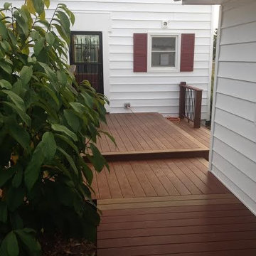
Full service residential and light commercial building, remodeling and design contractor
MJH Construction is committed to providing our customers with exceptional customer service, sound design, extreme craftsmanship, and the highest quality products to complete their projects and exceed expectations.
Owner and Founder, Michael J. Harkowa is a graduate of New York Institute of Technology with a Bachelor of Science Degree in Architecture. He has over 25 years of experience in the construction industry and has been a licensed contractor since 1989. He established MJH Construction in 1993 in Brentwood, NY, providing customers with remodeling and design services. In 1997, Mike moved to Maryland to pursue new opportunities in the remodeling and new construction markets as a founding member of Needwood Construction, LLC. He held the position of Senior Member/Partner of Needwood Construction, LLC for 15 years, as well as Vice President and later, President of Needwood Homes, Inc. for 9 years. In 2012, Mike re-established MJH Construction, LLC; providing building, remodeling & design services.
Find the right local pro for your project
 Bentham Plank
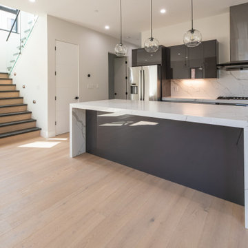
For those who prefer light-colored floors but do not wish for the consequent atmospheric coolness, Margot is the perfect solution: a light-colored floor that radiates an aura of warmth. In contrast to Sanzio and Burano, smooth and sophisticated Margot pursues a sense of unity, blurring the lines between floor planksboards. With its mellow texture and pleasantly bright ambience, Margot emanates an intoxicating impression of serene bliss.
 SV Design
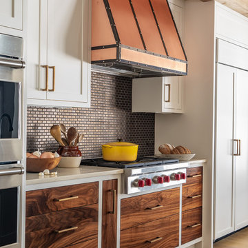
Nestled on the shore of New Hampshire’s Lake Winnipesaukee, is a family’s winter ski retreat. Contrary to the norm, this vacation home sees more use in the winter months than in the summer season. Breathtaking views of Mount Washington against a backdrop of shoreline dominate the scene; this vista was a driving force in the decision-making process. Doors and windows on the lakeside of the house were enlarged and expanded on to enhance the owners’ appreciation of their vantage point. The homeowners embraced, with a bit of convincing, a dark blue trim color for the exterior rather than the ubiquitous forest green common in the White Mountains. What began as a small renovation project morphed into a full renovation; the location warranted the upgrade. The client’s trust in the design team resulted in a home that is unique: contemporary while still offering the warmth and coziness of a winter retreat. The introduction of soft wood tones, a custom copper kitchen hood, and a warm muted color palate for interior trim and doors brings a coziness to the space without evoking a mountain ski lodge. The materials chosen further enhanced the natural elements of the site location: organic features include an antler chandelier, salvaged wood throughout for the mantel, ceilings, stair newels, and interior barn doors, and a live edge built-in bench in the mudroom.
Spaces were designed to encourage family interaction and togetherness. The importance of solitude was thoughtfully crafted into the architecture and interiors of the family’s vacation home. SV Design made sure there were spaces where individual family members can pursue their own interests: a dedicated craft space, a family office, and a kids’ loft area.
The redesign was forward thinking, to take the family into future phases in life, from the current teenage years through college years, and into the beyond of expanded family possibilities.
 Rivetti Company
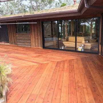
Rivetti Company offers expert custom deck and siding services. While adhering to industry quality standards, we work diligently to meet the needs of our customers. Our staff is committed to performing fine craftsmanship with cost efficiency and exceptional attention to detail.
San Diego-born Gianni Rivetti founded his company with the vision of continuing a family tradition passed down from his grandfather to his own father, a master woodworker. During his adolescence, Gianni developed a passion for carpentry learning alongside his father. He was then hired at 18 by a design build company and began honing both his rough and finish carpentry skills. Rivetti went on to gain over a decade of experience through his collaboration with the finest construction companies in Coastal California from Malibu, Santa Barbara, Carmel, Pebble Beach, and San Diego. Throughout his partnerships with the leading craftsmen in the industry, he cultivated a strong command of various tasks ranging from framing luxury homes to installing crown molding. Since then, Rivetti has acquired a specialized knowledge of custom decks, finish carpentry, siding, and general maintenance services. His background in executing projects from the ground up to their completion inspired the creation of Rivetti Company. Rivetti has now settled in San Diego to raise his son, Joseph, and pursue his craft.
 STUDIO TASHIMA
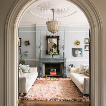
Keyes Road is a two-storey, semi-detached red brick house dating to around 1890-1910. The focus of our work was on the ground floor where we were asked to improve the layout and use of the main living areas of the house, for an active family of four. Important to the design was to maximise the quality and amount of light as well as connection to the garden and flow to the rest of the house.
Our proposal introduces three single storey extensions, comprising a central, large space that extends the main outrigger of the house. To each side are smaller volumes, affording a full width kitchen. While defining a series of discrete volumes, it was important for us to ensure that the kitchen, living, family and dining rooms that are interconnecting and continuous. The result is a big space punctuated by a series of differently sized arches, defining spaces to ensure their intimacy.
It was important for our client to have a sense of warmth and comfort - perhaps not dissimilar to the qualities of a hotel lobby. The colour scheme of the rooms are warm white painted plaster, natural wood flooring with black, bronze and brass accents. Indirect and carefully placed light fittings pulls together the atmosphere of the rooms - particularly in the evenings.
Externally, we felt it important to differentiate the extensions from the main house by using a dark, charcoal grey brick. This sets up a contrasting yet complimentary relationship to the rich red coloured brick house. The facets of the brick play with light and depth as do the graduated brick arches.
During the design process, we grappled with floor levels, the direction of sunlight, and care to not encroach on the neighbouring properties. As the house is in a conservation area, we worked closely with our trusted planning advisor. Throughout, we pursued a sensitive design strategy, using pitched roofs, matching materials and careful detailing. Internally, many of the original details are intact. This has enabled us to create an eclectic ensemble of elements, colours and materials varying in age and period.
 Hooker Furniture
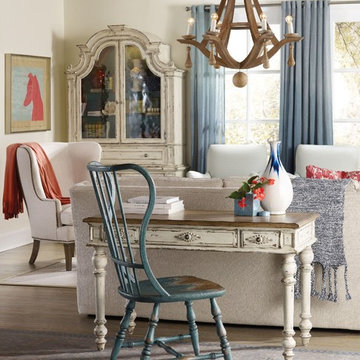
 Pursue serenity at home. Create your own personal sanctuary, a special place where you can experience comfort within.
Living room - living room idea in Other
Living room - living room idea in Other
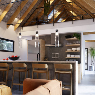
 Anima Architects
After having spent several years living in a trailer getting to know their rural property in La Pine Oregon, our clients made the decision to build a small off-the-grid modern cabin that they can retire in and use as a hub for entertaining family and friends. Keeping the cabin modest in scale and construction cost was critical to this couple since they planned to build the cabin themselves and didn’t want to overextend themselves financially so they can continue pursuing their love for international travel and maximize time spent with their loved ones.
Set amongst a grove of lodge pole pines, the cabin was designed with simplicity in mind and utilizes materials that help it fit in seamlessly with the surrounding high desert environment while being low maintenance and fire resistant. Although the cabin is compact in footprint, the interior spaces are all designed to open out onto a large outdoor deck, effectively doubling the usable living space, while a covered breezeway provides protected access to the main entry and houses an outdoor kitchen for entertaining in warmer weather and wood storage for use in the indoor/ outdoor fireplace during the winter months. The compact 600 square foot interior footprint also has a 200 square foot flexible loft space which can be used to work from and house guests alike. The exterior breezeway, main living space and loft was designed to be open to the vaulted wood rafters, steel collar ties and skylights above, creating a seamless transition between the interior and exterior and a sense of openness and lightness unusual for such a compact footprint.
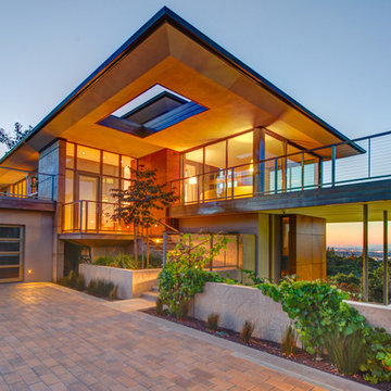
 2M Architecture
Builder: Matarozzi Pelsinger Builders
Structural: FTF Engineering
Landscape: Kimberly Moses Design
Photo: Treve Johnson Photography
Huge trendy beige three-story mixed siding exterior home photo in San Francisco
Huge trendy beige three-story mixed siding exterior home photo in San Francisco
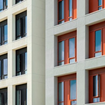
 User
UserMaceo May is the first residenital and 100% affordable housing development on Treasure Island in San Fransciso Bay. The buiding is a six-story, all-electric modular construction affordable housing project with 104 homes for formerly homeless veterans and their families. The apartment building offers 1 on-site manager’s unit and a mix of 24 studio, 47 one-bedroom and 34 two-bedroom units.
Net zero capable, Maceo May features custom Series 6000 windows from All Weather Architectural Aluminum to maximize energy efficiency. Passive design strategies and superior ventilation also limit energy use, create good air quality, and support the thermal comfort of residents. The operable All Weather Series 6000 windows are oriented to take advantage of San Francisco Bay breezes.
Amenities include residential services, property management offices, a community room, shared laundry room, parking, bicycle storage, common outdoor areas, a forested healing garden, a playground, and a roof deck.
Pursuing Fitwell certification, Maceo May emphasizes social cohesion and wellness with active design principles within the building to connect residents to each other. On track to earn a GreenPoint Gold certification, the project prioritizes resilience and sustainability by utilizing durable materials designed to withstand natural disasters and the effects of climate change.
 SV Design
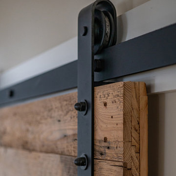
Nestled on the shore of New Hampshire’s Lake Winnipesaukee, is a family’s winter ski retreat. Contrary to the norm, this vacation home sees more use in the winter months than in the summer season. Breathtaking views of Mount Washington against a backdrop of shoreline dominate the scene; this vista was a driving force in the decision-making process. Doors and windows on the lakeside of the house were enlarged and expanded on to enhance the owners’ appreciation of their vantage point. The homeowners embraced, with a bit of convincing, a dark blue trim color for the exterior rather than the ubiquitous forest green common in the White Mountains. What began as a small renovation project morphed into a full renovation; the location warranted the upgrade. The client’s trust in the design team resulted in a home that is unique: contemporary while still offering the warmth and coziness of a winter retreat. The introduction of soft wood tones, a custom copper kitchen hood, and a warm muted color palate for interior trim and doors brings a coziness to the space without evoking a mountain ski lodge. The materials chosen further enhanced the natural elements of the site location: organic features include an antler chandelier, salvaged wood throughout for the mantel, ceilings, stair newels, and interior barn doors, and a live edge built-in bench in the mudroom.
Spaces were designed to encourage family interaction and togetherness. The importance of solitude was thoughtfully crafted into the architecture and interiors of the family’s vacation home. SV Design made sure there were spaces where individual family members can pursue their own interests: a dedicated craft space, a family office, and a kids’ loft area.
The redesign was forward thinking, to take the family into future phases in life, from the current teenage years through college years, and into the beyond of expanded family possibilities.
 InnovationLand
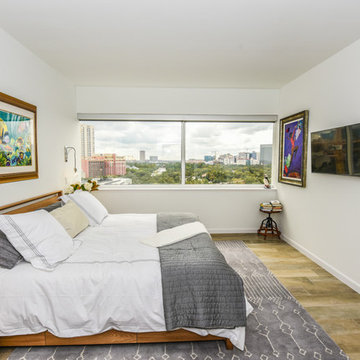
Houston Interior Designer Lisha Maxey took this Museum District condo from the dated, mirrored walls of the 1980s to Mid Century Modern with a gallery look featuring the client's art collection.
"The place was covered with glued-down, floor-to-ceiling mirrors," says Lisha Maxey, senior designer for Homescapes of Houston and principal at LGH Design Services in Houston. "When we took them off the walls, the walls came apart. We ended up taking them down to the studs."
The makeover took six months to complete, primarily because of strict condo association rules that only gave the Houston interior designers very limited access to the elevator - through which all materials and team members had to go.
"Monday through Friday, we could only be noisy from 10 a.m. to 2 p.m., and if we had to do something extra loud, like sawing or drilling, we had to schedule it with the management and they had to communicate that to the condo owners. So it was just a lot of coordination. But a lot of Inner City Loopers live in these kinds of buildings, so we're used to handling that kind of thing."
The client, a child psychiatrist in her 60s, recently moved to Houston from northeast Texas to be with friends. After being widowed three years ago, she decided it was time to let go of the traditionally styled estate that wasn't really her style anyway. An avid diver who has traveled around the world to pursue her passion, she has amassed a large collection of art from her travels. Downsizing to 1,600 feet and wanting to go more contemporary, she wanted the display - and the look - more streamlined.
"She wanted clean lines and muted colors, with the main focus being her artwork," says Maxey. "So we made the space a palette for that."
Enter the white, gallery-grade paint she chose for the walls: "It's halfway between satin and flat," explains Maxey. "It's not glossy and it's not chalky - just very smooth and clean."
Adding to the gallery theme is the satin nickel track lighting with lamps aimed to highlight pieces of art. "This lighting has no wires," notes Maxey. "It's powered by a positive and negative conduit."
The new flooring throughout is a blended-grey porcelain tile that looks like wood planks. "It's gorgeous, natural-looking and combines all the beauty of wood with the durability of tile," says Maxey. "We used it throughout the condo to unify the space."
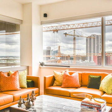
After Maxey started looking at the client's bright, vibrant, colorful artwork, she felt the palette couldn't stay as muted anymore. Hence the Mid Century Modern orange leather sofas from West Elm and bright green chairs from Joybird, plus the throw pillows in different textures, patterns and shades of gold, orange and green.
The concave lines of the Danish-inspired chairs, she notes, help them look beautiful from all the way around - a key to designing spaces for loft living.
"The table in the living room is very interesting," notes Maxey. "It was handmade for the client in 1974 and has a signature on it from the artist. She was adamant about including the piece, which has all these hand-painted black-and-white art tiles on the top. I took one look at it and said 'It's not really going to go.'"
However, after cutting 6 inches off the bottom and making it look a little distressed, the table ended up being the perfect complement to the sofas.
The dining room table - from Design Within Reach - is a solid piece of mahogany, the chair upholstery a mix of grey velvet and leather and the legs a shiny brass. "The side chairs are leather and the end ones are velvet," says Maxey. "It's a nice textural mix that lends depth and texture."
The galley kitchen, meanwhile, has been lightened and brightened, with white quartz countertops and backsplashes mimicking the look of Carrara marble, stainless steel appliances and a velvet green bench seat for a punch of color. The cabinets are painted a cool grey color called "Silverplate."
The two bathrooms have been updated with contemporary white vanities and vessel sinks and the master bath now features a walk-in shower tiled in Dolomite white marble (the floor is Bianco Carrara marble mosaic, done in a herringbone pattern.
In the master bedroom, Homescapes of Houston knocked down a wall between two smaller closets with swing doors to make one large walk-in closet with pocket doors. The closet in the guest bedroom also came out 13 more inches.
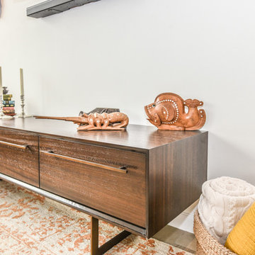
The client's artwork throughout personalizes the space and tells the story of a life. There's a huge bowl of shells from the client's diving adventures, framed art from her child psychiatry patients and a 16th century wood carving from a monastery that's been in her family forever.
"Her collection is quite impressive," says Maxey. "There's even a framed piece of autographed songs written by John Lennon." (You can see this black-framed piece of art on the wall in the photo above of two green chairs).
"We're extremely happy with how the project turned out, and so is the client," says Maxey. "No expense was spared for her. It was a labor of love and we were excited to do it."
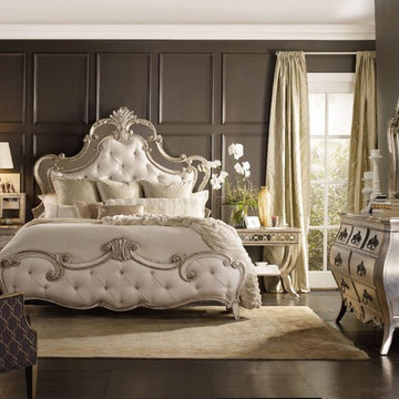 Hooker Furniture
Pursue serenity at home. Create your own personal sanctuary, a special place where you can experience comfort within.
Inspiration for a timeless bedroom remodel in Other
Inspiration for a timeless bedroom remodel in Other
 STUDIO TASHIMA
Keyes Road is a two-storey, semi-detached red brick house dating to around 1890-1910. The focus of our work was on the ground floor where we were asked to improve the layout and use of the main living areas of the house, for an active family of four. Important to the design was to maximise the quality and amount of light as well as connection to the garden and flow to the rest of the house.
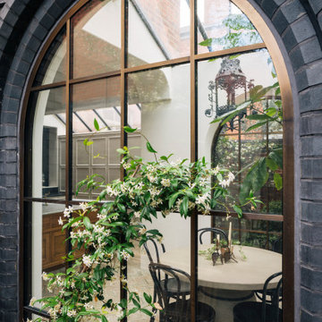
Our proposal introduces three single storey extensions, comprising a central, large space that extends the main outrigger of the house. To each side are smaller volumes, affording a full width kitchen. While defining a series of discrete volumes, it was important for us to ensure that the kitchen, living, family and dining rooms that are interconnecting and continuous. The result is a big space punctuated by a series of differently sized arches, defining spaces to ensure their intimacy.
It was important for our client to have a sense of warmth and comfort - perhaps not dissimilar to the qualities of a hotel lobby. The colour scheme of the rooms are warm white painted plaster, natural wood flooring with black, bronze and brass accents. Indirect and carefully placed light fittings pulls together the atmosphere of the rooms - particularly in the evenings.
Externally, we felt it important to differentiate the extensions from the main house by using a dark, charcoal grey brick. This sets up a contrasting yet complimentary relationship to the rich red coloured brick house. The facets of the brick play with light and depth as do the graduated brick arches.
During the design process, we grappled with floor levels, the direction of sunlight, and care to not encroach on the neighbouring properties. As the house is in a conservation area, we worked closely with our trusted planning advisor. Throughout, we pursued a sensitive design strategy, using pitched roofs, matching materials and careful detailing. Internally, many of the original details are intact. This has enabled us to create an eclectic ensemble of elements, colours and materials varying in age and period.
 Studio Good Architects
This award-winning home in Cannon Beach, Oregon takes advantage of excellent ocean views and southern solar exposure. The client’s goal was for a home that would last for multiple generations and capture their love of materials and forms found in nature. Designed to generate as much energy as it consumes on an annual basis, the home is pursuing the goal of being a “net-zero-energy” residence. The environmentally responsive design promotes a healthy indoor environment, saves energy with an ultra energy-efficient envelope, and utilized recycled and salvaged materials in its construction.
Nathan Good
 InnovationLand
Houston Interior Designer Lisha Maxey took this Museum District condo from the dated, mirrored walls of the 1980s to Mid Century Modern with a gallery look featuring the client's art collection.
"The place was covered with glued-down, floor-to-ceiling mirrors," says Lisha Maxey, senior designer for Homescapes of Houston and principal at LGH Design Services in Houston. "When we took them off the walls, the walls came apart. We ended up taking them down to the studs."
The makeover took six months to complete, primarily because of strict condo association rules that only gave the Houston interior designers very limited access to the elevator - through which all materials and team members had to go.
"Monday through Friday, we could only be noisy from 10 a.m. to 2 p.m., and if we had to do something extra loud, like sawing or drilling, we had to schedule it with the management and they had to communicate that to the condo owners. So it was just a lot of coordination. But a lot of Inner City Loopers live in these kinds of buildings, so we're used to handling that kind of thing."
The client, a child psychiatrist in her 60s, recently moved to Houston from northeast Texas to be with friends. After being widowed three years ago, she decided it was time to let go of the traditionally styled estate that wasn't really her style anyway. An avid diver who has traveled around the world to pursue her passion, she has amassed a large collection of art from her travels. Downsizing to 1,600 feet and wanting to go more contemporary, she wanted the display - and the look - more streamlined.
"She wanted clean lines and muted colors, with the main focus being her artwork," says Maxey. "So we made the space a palette for that."
Enter the white, gallery-grade paint she chose for the walls: "It's halfway between satin and flat," explains Maxey. "It's not glossy and it's not chalky - just very smooth and clean."
Adding to the gallery theme is the satin nickel track lighting with lamps aimed to highlight pieces of art. "This lighting has no wires," notes Maxey. "It's powered by a positive and negative conduit."
The new flooring throughout is a blended-grey porcelain tile that looks like wood planks. "It's gorgeous, natural-looking and combines all the beauty of wood with the durability of tile," says Maxey. "We used it throughout the condo to unify the space."
After Maxey started looking at the client's bright, vibrant, colorful artwork, she felt the palette couldn't stay as muted anymore. Hence the Mid Century Modern orange leather sofas from West Elm and chartruese chairs from Joybird, plus the throw pillows in different textures, patterns and shades of gold, orange and green.
The concave lines of the Danish-inspired chairs, she notes, help them look beautiful from all the way around - a key to designing spaces for loft living.
"The table in the living room is very interesting," notes Maxey. "It was handmade for the client in 1974 and has a signature on it from the artist. She was adamant about including the piece, which has all these hand-painted black-and-white art tiles on the top. I took one look at it and said 'It's not really going to go.'"
However, after cutting 6 inches off the bottom and making it look a little distressed, the table ended up being the perfect complement to the sofas.
The dining room table - from Design Within Reach - is a solid piece of mahogany, the chair upholstery a mix of grey velvet and leather and the legs a shiny brass. "The side chairs are leather and the end ones are velvet," says Maxey. "It's a nice textural mix that lends depth and texture."
The galley kitchen, meanwhile, has been lightened and brightened, with white quartz countertops and backsplashes mimicking the look of Carrara marble, stainless steel appliances and a velvet green bench seat for a punch of color. The cabinets are painted a cool grey color called "Silverplate."
The two bathrooms have been updated with contemporary white vanities and vessel sinks and the master bath now features a walk-in shower tiled in Dolomite white marble (the floor is Bianco Carrara marble mosaic, done in a herringbone pattern.
In the master bedroom, Homescapes of Houston knocked down a wall between two smaller closets with swing doors to make one large walk-in closet with pocket doors. The closet in the guest bedroom also came out 13 more inches.
The client's artwork throughout personalizes the space and tells the story of a life. There's a huge bowl of shells from the client's diving adventures, framed art from her child psychiatry patients and a 16th century wood carving from a monastery that's been in her family forever.
"Her collection is quite impressive," says Maxey. "There's even a framed piece of autographed songs written by John Lennon." (You can see this black-framed piece of art on the wall in the photo above of two green chairs).
"We're extremely happy with how the project turned out, and so is the client," says Maxey. "No expense was spared for her. It was a labor of love and we were excited to do it."
 InnovationLand
Houston Interior Designer Lisha Maxey took this Museum District condo from the dated, mirrored walls of the 1980s to Mid Century Modern with a gallery look featuring the client’s art collection.
The place was covered with glued-down, floor-to-ceiling mirrors,” says Lisha Maxey, senior designer for Homescapes of Houston and principal at LGH Design Services in Houston. “When we took them off the walls, the walls came apart. We ended up taking them down to the studs."
The makeover took six months to complete, primarily because of strict condo association rules that only gave the Houston interior designers very limited access to the elevator – through which all materials and team members had to go.
“Monday through Friday, we could only be noisy from 10 a.m. to 2 p.m., and if we had to do something extra loud, like sawing or drilling, we had to schedule it with the management and they had to communicate that to the condo owners. So it was just a lot of coordination. But a lot of Inner City Loopers live in these kinds of buildings, so we’re used to handling that kind of thing.”
The client, a child psychiatrist in her 60s, recently moved to Houston from northeast Texas to be with friends. After being widowed three years ago, she decided it was time to let go of the traditionally styled estate that wasn’t really her style anyway. An avid diver who has traveled around the world to pursue her passion, she has amassed a large collection of art from her travels. Downsizing to 1,600 feet and wanting to go more contemporary, she wanted the display – and the look – more streamlined.
“She wanted clean lines and muted colors, with the main focus being her artwork,” says Maxey. “So we made the space a palette for that.”
Enter the white, gallery-grade paint she chose for the walls: “It’s halfway between satin and flat,” explains Maxey. “It’s not glossy and it’s not chalky – just very smooth and clean."
Adding to the gallery theme is the satin nickel track lighting with lamps aimed to highlight pieces of art. “This lighting has no wires,” notes Maxey. “It’s powered by a positive and negative conduit.”
The new flooring throughout is a blended-grey porcelain tile that looks like wood planks. “It’s gorgeous, natural-looking and combines all the beauty of wood with the durability of tile,” says Maxey. “We used it throughout the condo to unify the space.”
After Maxey started looking at the client’s bright, vibrant, colorful artwork, she felt the palette couldn’t stay as muted anymore. Hence the Mid Century Modern orange leather sofas from West Elm and bright green chairs from Joybird, plus the throw pillows in different textures, patterns and shades of gold, orange and green.
The concave lines of the Danish-inspired chairs, she notes, help them look beautiful from all the way around – a key to designing spaces for loft living.
“The table in the living room is very interesting,” notes Maxey. “It was handmade for the client in 1974 and has a signature on it from the artist. She was adamant about including the piece, which has all these hand-painted black-and-white art tiles on the top. I took one look at it and said ‘It’s not really going to go.’”
However, after cutting 6 inches off the bottom and making it look a little distressed, the table ended up being the perfect complement to the sofas.
The dining room table – from Design Within Reach – is a solid piece of mahogany, the chair upholstery a mix of grey velvet and leather and the legs a shiny brass. “The side chairs are leather and the end ones are velvet,” says Maxey. “It’s a nice textural mix that lends depth and texture.”The galley kitchen, meanwhile, has been lightened and brightened, with new, white contemporary cabinetry, quartz countertops mimicking the look of Carrara marble, stainless steel appliances and a velvet green bench seat for a punch of color.The two bathrooms have been updated with contemporary white vanities and vessel sinks and the master bath now features a walk-in shower tiled in Dolomite white marble (the floor is Bianco Carrara marble mosaic, done in a herringbone pattern).In the master bedroom, Homescapes of Houston knocked down a wall between two smaller closets with swing doors to make one large walk-in closet with pocket doors. The closet in the guest bedroom also came out 13 more inches.The client’s artwork throughout personalizes the space and tells the story of a life. There’s a huge bowl of shells from the client’s diving adventures, framed art from her child psychiatry patients and a 16th century wood carving from a monastery that’s been in her family forever.
“Her collection is quite impressive,” says Maxey. “There’s even a framed piece of autographed songs written by John Lennon.” (You can see this black-framed piece of art on the wall in the photo above of two green chairs).
“We’re extremely happy with how the project turned out, and so is the client,” says Maxey. “No expense was spared for her. It was a labor of love and we were excited to do it.”
 STUDIO TASHIMA
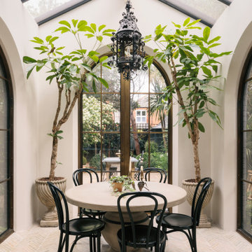
Keyes Road is a two-storey, semi-detached red brick house dating to around 1890-1910. The focus of our work was on the ground floor where we were asked to improve the layout and use of the main living areas of the house, for an active family of four. Important to the design was to maximise the quality and amount of light as well as connection to the garden and flow to the rest of the house.
Our proposal introduces three single storey extensions, comprising a central, large space that extends the main outrigger of the house. To each side are smaller volumes, affording a full width kitchen. While defining a series of discrete volumes, it was important for us to ensure that the kitchen, living, family and dining rooms that are interconnecting and continuous. The result is a big space punctuated by a series of differently sized arches, defining spaces to ensure their intimacy.
It was important for our client to have a sense of warmth and comfort - perhaps not dissimilar to the qualities of a hotel lobby. The colour scheme of the rooms are warm white painted plaster, natural wood flooring with black, bronze and brass accents. Indirect and carefully placed light fittings pulls together the atmosphere of the rooms - particularly in the evenings.
Externally, we felt it important to differentiate the extensions from the main house by using a dark, charcoal grey brick. This sets up a contrasting yet complimentary relationship to the rich red coloured brick house. The facets of the brick play with light and depth as do the graduated brick arches.
During the design process, we grappled with floor levels, the direction of sunlight, and care to not encroach on the neighbouring properties. As the house is in a conservation area, we worked closely with our trusted planning advisor. Throughout, we pursued a sensitive design strategy, using pitched roofs, matching materials and careful detailing. Internally, many of the original details are intact. This has enabled us to create an eclectic ensemble of elements, colours and materials varying in age and period.
 Designline
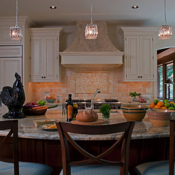
Companion counter stools continue the color scheme of the adjacent family room. The pendant lights add sparkle.
photo by Anne Gummerson
Inspiration for a large transitional u-shaped ceramic tile and beige floor eat-in kitchen remodel in DC Metro with an undermount sink, raised-panel cabinets, beige cabinets, granite countertops, beige backsplash, ceramic backsplash, stainless steel appliances and an island
Inspiration for a large transitional u-shaped ceramic tile and beige floor eat-in kitchen remodel in DC Metro with an undermount sink, raised-panel cabinets, beige cabinets, granite countertops, beige backsplash, ceramic backsplash, stainless steel appliances and an island
15