
Search results for "Quality graphics" in Home Design Ideas
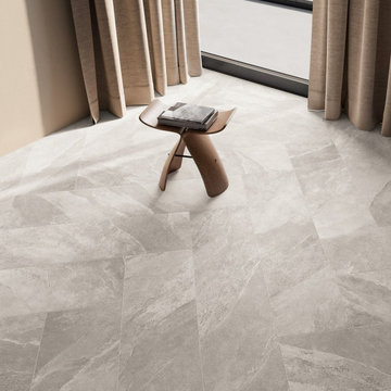
 Twelve50
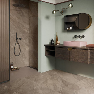
Florence shows a slate-like appeal following the directions and shades of the stone veins. The graphic path reproduces natural splits and deep textures, revealing a subtle metallic sheen.
The dark side of the collection points at urban-chic situations; its look fits trendy lounge bars, halls, and showrooms, right where new aesthetic connections find momentum.
The industry standard is to include an extra 10% allowance for ‘wastage’.
 Advance Design Studio, Ltd.
Jennifer and Dan have lived in their Deer Park Illinois home for 15 years, slowly making minor fixes like painting and decorating; but they had a new plan for their kitchen the entire time. An awkwardly placed garage door, and an island cooktop with a terrible downdraft made a full-scale kitchen remodel an absolute must. Jennifer had many ideas in mind and wanted to work with a company that could provide high-end work, while partnering with a designer that would tailor the kitchen to her ideas.
She was intrigued by the phrase “Common Sense Remodeling” in Advance Design’s feature she discovered while perusing an issue of the community’s Quintessential Barrington Magazine. Doing further research on the company’s website, as she looked through project profiles and read about Advance Design’s “Common Sense Remodeling” philosophy, she promptly scheduled an appointment to see if the people and ideas she read about were truly who they said they were. The more she read, the more she knew that the “Common Sense” approach to remodeling they described was exactly the type of company she was looking for.
The partnership was sealed after an initial consultation with Owner Todd Jurs and Project Designer Michelle Lecinski. They displayed a combination of friendliness, professionalism and respect that was unmatched by any of the other companies Jennifer talked to. She knew that with Advance Design, she would be able to retain the vision that she had in mind with high-quality craftsmanship.
“I reached out to Advance Design because of the ‘Common Sense Remodeling’ tagline,” Jennifer said. “That’s what lingered for me”. “Advance Design was the most respectful- of the house and of my design ideas, and the most professional of the handful of companies that looked at my project”.
Soon after the meeting Jennifer began working with Michelle on the project design. They quickly developed chemistry. Jennifer loved how Michelle researched and located every detail that Jennifer wanted for the kitchen. Between the two of them, every concept and idea was worked through and perfected. “Jennifer had definite ideas about what she wanted the new kitchen to look like, she just didn’t know how to bring it all together. We worked together really well to make her ideas into the practical reality necessary for a well-functioning kitchen, with the look and feel that she had envisioned”, says Michelle.
“Michelle was wonderful in using the CAD system she would show me new drawings every time we changed the layout while working through the design,” Jennifer said. “She was a really wonderful partner in execution, she made sure everything happened quickly and easily.”
The finished design drew out elements of Jennifer’s style and personality. The pair call the look “sophisticated farmhouse” to describe the kitchen renovation to family and friends. The result was a beautifully crafted, authentic-feeling space that satisfied Jennifer’s dreams 15 years in the making. The whole project consisted of a kitchen remodel, mudroom upgrade with powder room, and garage entry relocation. “The projects I personally like the best, are the ones that put the client’s dreams on display,” Project Designer Michelle said. “And this is one of those projects.”
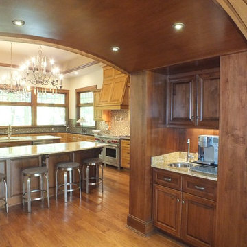
The main focal point of the kitchen is custom zinc and brass ventilation hood with a vintage sheen, which was hand made to order by a small company in Indiana named Vogler Metalworking. “It’s like sculpture, a true work of art”, says Jennifer. Your eye is immediately drawn towards this elegant yet practical hood that eliminated the home’s downdraft problem and added a striking conversation piece at the same time. The carpenters had to use special gloves when transporting and installing it, so they didn’t smudge it with fingerprints. The beautiful hood centers proudly over the stunning black enamel and brass LaCornue Range. “I had a friend who had a LaCornue range and after learning how easy it was to cook perfect meals, I was convinced I wanted to have one”, says Jennifer. This unique, breathtaking combination anchors the entire kitchen and is apparent immediately as you walk into the great room the surrounds the space.
DuraSupreme Crestwood cabinets with a Kendall Panel add function and sophistication. A custom gray paint color paired with a storm blue was developed so that the new kitchen looked like it belonged to the existing space. Unlacquered brass faucets and hardware were important to Jennifer because she wanted the living finishes to age over time. Remarkable brass diamond mesh cabinet door inserts imported from the UK continue to add this one-of-a-kind kitchen renovation; giving it a “you won’t see this everywhere” quality. The use of old railcar flooring for the coffee bar countertop and reclaimed oak for the open shelving gives an authenticity to the space uncommon in kitchens today.
Jennifer and Michelle fell in love with the Limestone Grey Stone while they were investigating unique island countertop ideas. They liked the fact that the limestone as a living finish will age and change over time. Calcutta Miel Quartz countertops made for an excellent pairing around the perimeter, as it’s durable and perfect for cooking preparations. A textured white subway tile backsplash that runs to the ceiling keeps your eye moving towards the open shelving, and to the main focal point of the stunning range hood combination.
“The kitchen functions beautifully, and it’s gorgeous,” beams Jennifer as she gestures with both hands while smiling ear to ear. “The most important thing was I wanted a kitchen that had a wonderful flow, cooked beautiful meals and was a great gathering place for family and friends, and this space does that perfectly! Beauty wise, it turned out exactly how I had envisioned. I felt the function part was the hardest part, and that was nailed”!
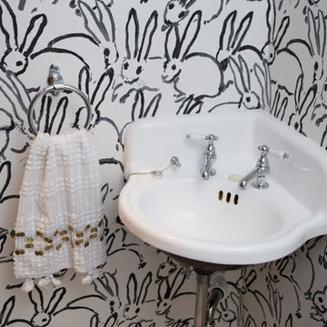
Relocating the garage entry to the new mudroom was a huge priority and has finally separated the family’s arriving home functions from their kitchen. Now coats and shoes and bags have their own area for dropping once members arrive home. Matching gray DuraSupreme cabinetry helped create gorgeous, purposeful lockers for the family. A reclaimed vintage sink and custom wall paper were added to the tiny powder room to beautify the once previously only functional space. Advance Design was even able to create a custom space for their dog to sleep while the family is away.
“It was unbelievable that a project of this size was completed in such a short time, and I think that’s because of the large amount of planning and preparation that went into it,” Jennifer marveled, “When we started, we were ready, and everything was prepared”.
When it came to execution, Project Manager Justin Davis and his crew were quick, accessible, and organized. Projects like this kitchen are typically completed in as little as 8-10 weeks. Jennifer’s kitchen however despite the relocation of some challenging HVAC in a soffit and moving of an exterior door was completed remarkably fast in part because the team was working with an existing tile floor that ran throughout the first floor that the client really loved.
“You get to know these people really well because they’re living in your house while you’re living in your house. They were so fast and really good, it didn’t take as long as even planned” reported Jennifer. “I would text Justin and he always responded almost immediately. I got to know all the guys who were working in our house and they were all wonderful people”.
Details in a customized kitchen like this one require skill and care from the people who install it. “All the guys on the job were skilled at what the did. I wanted small details like little feet to look like furniture, that is where their carpentry skill came in to make these all perfect”, said Jennifer. “The tile guys were wonderful. They even let me determine how I wanted the texture with the grout to appear for a salt and pepper look; now that is a very skilled trade person making it custom”.
In Jennifer’s interview, she continued to reference Advance Design’s “Common Sense Remodeling”, so I took a minute to ask her exactly what that phrase meant to her and how it played out in her experience with her project and the Advance Design team. Here is what she said: “I was intrigued about Common Sense Remodeling and in my head that there would be clear costs and prices, great communication between the design team, the execution team and me”, said Jennifer. They did deliver on that, it was so clear about the cost breakdown, what I could expect from everyone who came to my house, and everything that we had ordered. That to me is the Common Sense”!
It’s great to see a client take literally our assertion that a well-planned remodeling project is simply “Common Sense”! She anticipated each step of the way would be clear, concise, and predictable, all the while protecting the outcome due to the careful upfront planning. “Advance Design delivered on their ‘Common Sense Remodeling’ promise,” Jennifer said. “From the design team, to the execution team - everything was straight forward like I imagined. The project turned out exactly how I envisioned, I enjoyed this process and absolutely would recommend Advance Design Studio to anyone.”
 Jennifer Grey Interiors Design & Color Specialist
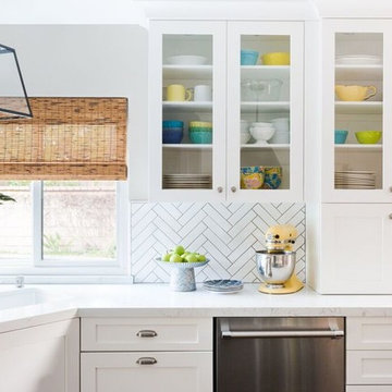
Eat-in kitchen - transitional l-shaped dark wood floor eat-in kitchen idea in Los Angeles with an undermount sink, shaker cabinets, white cabinets, quartz countertops, white backsplash, ceramic backsplash, stainless steel appliances and an island
Find the right local pro for your project
 ArchiCGI 3D Rendering
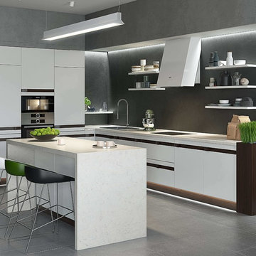
Atmospheric Kitchen Rendering.
Every detail of this kitchen can be imagined clearly, thanks to a high quality 3Dvisualization created by Archicgi.
Our team will make sure that each of your designs looks exactly according to the plan.
 Twelve50
Florence shows a slate-like appeal following the directions and shades of the stone veins. The graphic path reproduces natural splits and deep textures, revealing a subtle metallic sheen.
The dark side of the collection points at urban-chic situations; its look fits trendy lounge bars, halls, and showrooms, right where new aesthetic connections find momentum.
The industry standard is to include an extra 10% allowance for ‘wastage’.
 River Valley Landscapes
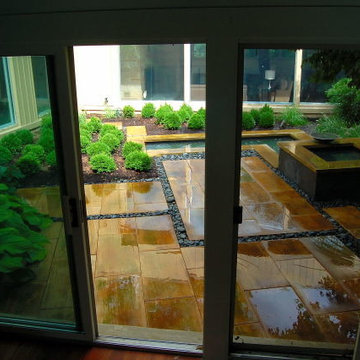
Blending contemporary forms and lush plantings, this Garden maximizes the sensory experience of the materials and planting from inside and outside the home. The garden occupies an interior courtyard framed by four interior walls. The home, designed by Architect Cliff May was built in 1948 and the following year was featured in House Beautiful Magazine. The clients list of needs and desires was brief. They wanted a space that would complement the mid century modern home and provide visual interest from inside the home. Some form of water was also requested. They had a budget of $30,000. In order to stay within their budget the clients performed the demolition of the old garden. The designer’s intent was to create a garden that would possess a clear sculptural quality and would be as visually striking from inside the home as it would be from inside the courtyard. The strategy behind the design was to use hardscape materials characterized by simple geometric forms and a planting palette that would emphasize form over color, and then to arrange the materials to achieve an interpretation of modern aesthetic.
The views from inside the homes three main living rooms present the garden as a graphic composition of space, hardscape materials and planting. Inside the courtyard the edges are defined by stone and planting. The floor is composed of rectangular slabs of Teakwood flagstone with a counterpoint of Mexican beach pebbles set within the joints and around the edges. Concrete along the edges of the Teakwood pads reduces migration of the modified stone and sand base. The contrast of the Mexican beach pebbles accentuates the pattern of the flagstone. The outside perimeter of the pebbles is contained with low profile edging. An existing catch drain was utilized for storm water runoff. A concrete block pier set on a concrete footing is covered with black stucco and provides a perch for a custom made copper bowl that circulates water into the L shaped water feature. The water features subterranean basin is constructed of pressure treated wood with a custom box liner insert. Since the Teakwood flagstone was unavailable as coping for the water feature, the designer chose Shawnee Buff stone to complement the Teakwood flagstone. The subtle sound of water spilling from the copper bowl and the reflective qualities of the water help to create an atmosphere of relaxation. The planting is composed of shades of green with white flowers in order to accentuate the graphic design. ‘Justin Brouwer’ Boxwood, ‘Sum and Substance’ Hosta, white Anemones, black bamboo and ornamental grasses contrast dramatically with the clean lines of the hardscape elements. The black bamboo is set in 30” diameter concrete containers to control the vigorous plant from spreading.
The construction of the interior courtyard space challenged the building team. They set up baffles between the front door and the door to the courtyard as well as temporary protection over the floor to allow the process to move forward without too much disturbance to the client’s lives. All of the materials were shuffled through the temporary portal.
The clients love the space and recently said that “the design is so well thought out and simple that they would never get tired of it.” The designs sculptural quality compliments the modern feel of the home and creates a sublime yet dramatic view from within the house or within the courtyard. The clients plan to purchase two black Bertoia Diamond chairs with red cushions which should perfectly integrate with the space.
 Floorplan Rugs
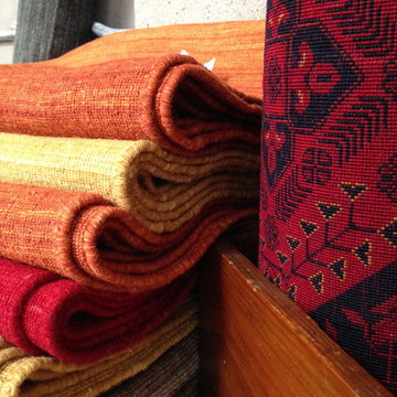
Though it was a complete coincidence, the side-by-side of the rugs in this photo is actually pretty amazing! Why? The rugs stacked on the left are Indian dhurries that are handwoven with simple colors and no patterns. This makes them a fast, affordable option of handmade rug. On the right, we have an Afghan style Biljik rug. They are known for their deep reds and navy blues, distinct floral and graphic patterns and soft pile. In many ways, this kind of tribal rug is a rug dealer's rug: when it comes down to it, they're one of the best values for exceptional quality. Unintentionally, we placed two examples of great value for money side by side!
Sponsored
Fredericksburg, OH

High Point Cabinets
Columbus' Experienced Custom Cabinet Builder | 4x Best of Houzz Winner

 ArchiCGI 3D Rendering
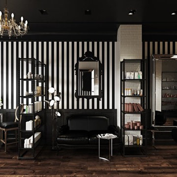
Barbershop Design presented on this 3d visualisations looks luxury. The space is extremely well-organized. The effectiveness of this interior design also depends on color palette and textures chosen by 3d artist.
Natural looking and high-quality 3D renderings made by ArchiCGI team help creating flawless presentations of your projects.
 Ezra Lee Design+Build
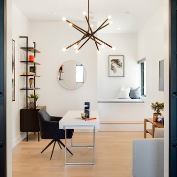
Trendy freestanding desk light wood floor and beige floor study room photo in Salt Lake City with white walls
 ArchiCGI 3D Rendering
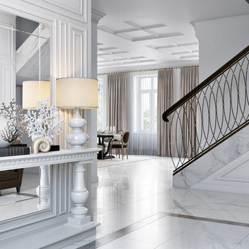
3D Design Rendering is an effective way to produce stunning high-quality visualisations for any interior idea that can be thought of. The preferred style doesn’t matter – a team of skilled Artists can make any idea a masterpiece. Even something classic can be made to look sleek and modern, like a classic Parisian apartment you see above.
 Ann Lowengart Interiors
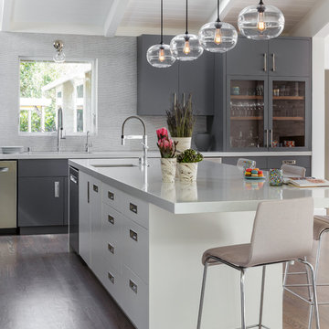
A partial remodel of a Marin ranch home, this residence was designed to highlight the incredible views outside its walls. The husband, an avid chef, requested the kitchen be a joyful space that supported his love of cooking. High ceilings, an open floor plan, and new hardware create a warm, comfortable atmosphere. With the concept that “less is more,” we focused on the orientation of each room and the introduction of clean-lined furnishings to highlight the view rather than the decor, while statement lighting, pillows, and textures added a punch to each space.
 ArchiCGI 3D Rendering
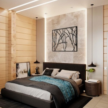
Barbershop Design presented on this 3d visualisations looks luxury. The space is extremely well-organized. The effectiveness of this interior design also depends on color palette and textures chosen by 3d artist.
Natural looking and high-quality 3D renderings made by ArchiCGI team help creating flawless presentations of your projects.
Sponsored
Fredericksburg, OH
High Point Cabinets
Columbus' Experienced Custom Cabinet Builder | 4x Best of Houzz Winner
 ArchiCGI 3D Rendering
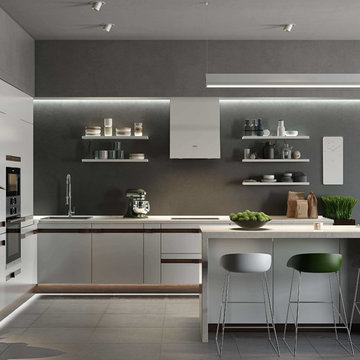
Atmospheric Kitchen 3DRendering.
Every detail of this kitchen can be imagined clearly, thanks to a high quality 3Dvisualization created by Archicgi.
Our team will make sure that each of your designs looks exactly according to the plan.

 Twelve50
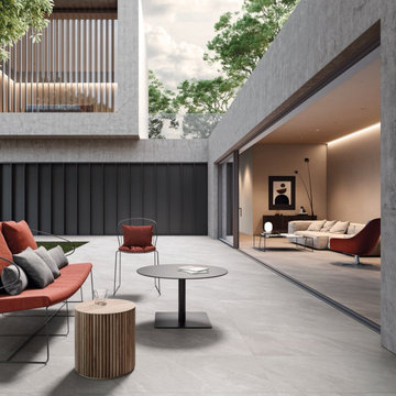
Florence shows a slate-like appeal following the directions and shades of the stone veins. The graphic path reproduces natural splits and deep textures, revealing a subtle metallic sheen.
The dark side of the collection points at urban-chic situations; its look fits trendy lounge bars, halls, and showrooms, right where new aesthetic connections find momentum.
The industry standard is to include an extra 10% allowance for ‘wastage’.
 Ferriss - Architectural Renderings
Why do you need 3D visualization of the project?
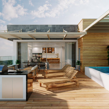
3D visualization is a photorealistic image of the future home, made in special graphic editors. Not every customer has a 3D mindset. And thanks to realistic visualizations, the client can see his house as it really will be.
Visualization helps to capture the volume, taking into account all the stylistic selections, finishing materials, fabrics and decor.
Who else, besides the customer, needs 3D visualization?
Visualization is also important for builders. This helps them understand what the final should look like after the project is completed. High-quality 3D visualization displays texture, color, texture, which greatly facilitates the elaboration of details.
Does this help to eliminate errors?
Yes, it helps.
At the design stage, certain interior items and decor fit into the space of the room. It is very important to take into account the dimensions and enter the parts correctly and ergonomically. Flat drawings, unlike 3D, often do not allow you to feel the true scale of furniture.
Ferriss develops designs of any complexity, contact us and we will help you make all your dreams come true.
https://www.ferriss.co/
Join to our telegram channel - https://lnkd.in/dZam-YY
Sponsored
Fredericksburg, OH
High Point Cabinets
Columbus' Experienced Custom Cabinet Builder | 4x Best of Houzz Winner
 Twelve50
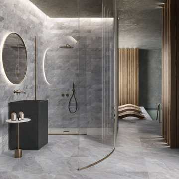
Florence shows a slate-like appeal following the directions and shades of the stone veins. The graphic path reproduces natural splits and deep textures, revealing a subtle metallic sheen.
The dark side of the collection points at urban-chic situations; its look fits trendy lounge bars, halls, and showrooms, right where new aesthetic connections find momentum.
The industry standard is to include an extra 10% allowance for ‘wastage’.
 ArchiCGI 3D Rendering
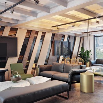
Office interior CG render is a great tool to present interior design of a workplace in photorealistic quality. The architect was aware of that fact when he set a goal to showcase all the features of the fresh office space that includes several zones for productive collegial work, individual tasks and relaxing. Thus, armed with a powerful CGI image, he managed to successfully present his client an alternative architectural approach to office interior design. Truly, how can one not make an impression with such a lifelike computer-generated 3D render?
 Astro Design Inc.
Design & Supply - Astro Design Centre, Ottawa Canada
Photo credit: Doublespace Photography.
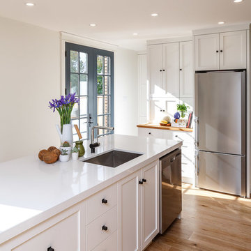
Knowing we wanted to maximize the amount of light and keep the Scandinavian feel, lots of white and blonde woods were used. 6” wide wire-brushed white oak flooring was installed. Farrow & Ball No.2001 Strong White was used on all walls, ceiling and trim. The existing brick fireplace was painted in No.2001 as well to create subtle texture. All interior & exterior doors were then painted out in Farrow & Ball No.31 Railings for a deep inky blue black contrast. The kitchen cabinetry is a combination of natural quarter sawn white oak and matte lacquer maple all done in Astro’s House Brand cabinetry. Simple matte black square knobs complete with back-plate create a crisp graphic quality to warm bright kitchen. The counters are a combination of Caesarstone 1141 Pure White quartz created the low maintenance hardworking surface needed for a young family. Along the stove wall a subtle backsplash was installed. The marble mosaic from Montreal’s very own MUD Tile (sold exclusively via Astro), was used to create depth, elongated hexagon Rock Salt mosaic nods toward the Scandinavian arts and crafts movement. A simple drywall hood fan was used against the mosaic. The fan was painted out in Farrow & Ball’s No.269 Cabbage White to pull the pastel green out of the mosaic.
11