
Search results for "Quick brush" in Home Design Ideas
 TVL Creative Ltd.
Our clients were looking to make this home their forever home and to create a warm and welcoming space that the whole family would enjoy returning to every day. One of our primary goals in this project was to change how our clients moved through their home. We tossed aside the existing walls that blocked off the kitchen and introduced a butler’s pantry to connect the kitchen directly to the dining room. Contrast is king in this home, and we utilized a variety of light and dark finishes to create distinctive layers and lean into opportunities for accents. To tie the space in this home together, we introduced warm hardwood flooring throughout the main level and selected a soft grey paint as our primary wall color.
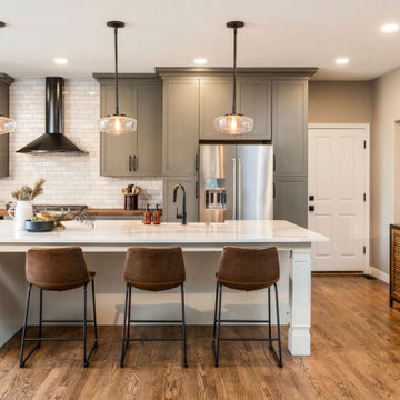
Kitchen- The heart of this home is most definitely the kitchen! We erased every trace of the original builder kitchen and created a space that welcomes one and all. The glorious island, with its light cabinetry and dramatic quartz countertop, provides the perfect gathering place for morning coffee and baking sessions. At the perimeter of the kitchen, we selected a handsome grey finish with a brushed linen effect for an extra touch of texture that ties in with the high variation backsplash tile giving us a softened handmade feel. Black metal accents from the hardware to the light fixtures unite the kitchen with the rest of the home.
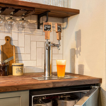
Butler’s Pantry- The Butler’s Pantry quickly became one of our favorite spaces in this home! We had fun with the backsplash tile patten (utilizing the same tile we highlighted in the kitchen but installed in a herringbone pattern). Continuing the warm tones through this space with the butcher block counter and open shelving, it works to unite the front and back of the house. Plus, this space is home to the kegerator with custom family tap handles!
Mud Room- We wanted to make sure we gave this busy family a landing place for all their belongings. With plenty of cabinetry storage, a sweet built-in bench, and hooks galore there’s no more jockeying to find a home for coats.
Fireplace- A double-sided fireplace means double the opportunity for a dramatic focal point! On the living room side (the tv-free grown-up zone) we utilized reclaimed wooden planks to add layers of texture and bring in more cozy warm vibes. On the family room side (aka the tv room) we mixed it up with a travertine ledger stone that ties in with the warm tones of the kitchen island.
Staircase- The standard builder handrail was just not going to do it anymore! So, we leveled up designed a custom steel & wood railing for this home with a dark finish that allows it to contrast beautifully against the walls and tie in with the dark accent finishes throughout the home.
 TKS Design Group
Free ebook, Creating the Ideal Kitchen. DOWNLOAD NOW
One of my very favorite parts of the design process is space planning and considering all the possible floor plan solutions at the beginning stages of the project. What works for one person as a solution may not be the best solution for the next. What you think you want going into the process, may change once all the space planning options are considered. This was exactly the case for this family. They thought they really wanted an island configuration.
Once we figured out the flow of the work triangle and saw how great a large peninsula would work for the family, we proceeded along those lines. The peninsula not only works great for food prep, it also allows more of a traditional table seating versus an island with everyone lined up in a row — not so great for daily dinner conversation.
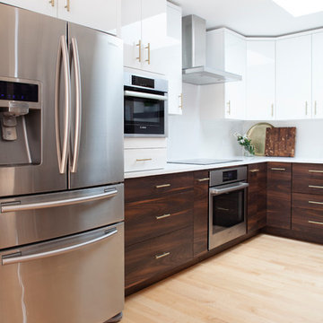
To the right of that is a counter depth fridge and a speed oven which gives some flexibility with cooking and reheating smaller meals instead of having to heat the entire oven. An induction cooktop with its easy to clean surface keeps the space looking clean and tidy. Induction heats very quickly to high temperatures so is also wonderful to cook on. To the right of cooktop is a long stretch of countertop perfect for prep space.
Storage was very important to the homeowners. We took our time discussing where spice pull outs and tray dividers would be located, how the corner storage would be addressed and the location of the other items such as trash and recycling cans. We worked as many drawers as possible into the space, as I always recommend drawers over doors and/or roll outs as they offer the most flexibility and ease of use. Customizing these details is time well spent as having a place for everything and everything in its place, just like Mom said, really is the key to a functional and professionally designed kitchen.
The talls and wall cabinets are white acrylic which combined with the white marble look quartz countertops and full height backsplash keep the room feeling light, bright and airy. The wood toned base cabinets are made of a textured laminate that has the look of wood but is a very easy to maintain product. Brushed gold metal on the hardware, faucet and chandelier add a warm touch and ties into the blond maple flooring. The neighboring breakfast room was also remodeled as part of the project and houses a small coffee station.
Designed by: Susan Klimala, CKBD
Photography by: Kari Firak
For more information on kitchen and bath design ideas go to: www.kitchenstudio-ge.com
 TVL Creative Ltd.
Our clients were looking to make this home their forever home and to create a warm and welcoming space that the whole family would enjoy returning to every day. One of our primary goals in this project was to change how our clients moved through their home. We tossed aside the existing walls that blocked off the kitchen and introduced a butler’s pantry to connect the kitchen directly to the dining room. Contrast is king in this home, and we utilized a variety of light and dark finishes to create distinctive layers and lean into opportunities for accents. To tie the space in this home together, we introduced warm hardwood flooring throughout the main level and selected a soft grey paint as our primary wall color.
Kitchen- The heart of this home is most definitely the kitchen! We erased every trace of the original builder kitchen and created a space that welcomes one and all. The glorious island, with its light cabinetry and dramatic quartz countertop, provides the perfect gathering place for morning coffee and baking sessions. At the perimeter of the kitchen, we selected a handsome grey finish with a brushed linen effect for an extra touch of texture that ties in with the high variation backsplash tile giving us a softened handmade feel. Black metal accents from the hardware to the light fixtures unite the kitchen with the rest of the home.
Butler’s Pantry- The Butler’s Pantry quickly became one of our favorite spaces in this home! We had fun with the backsplash tile patten (utilizing the same tile we highlighted in the kitchen but installed in a herringbone pattern). Continuing the warm tones through this space with the butcher block counter and open shelving, it works to unite the front and back of the house. Plus, this space is home to the kegerator with custom family tap handles!
Mud Room- We wanted to make sure we gave this busy family a landing place for all their belongings. With plenty of cabinetry storage, a sweet built-in bench, and hooks galore there’s no more jockeying to find a home for coats.
Fireplace- A double-sided fireplace means double the opportunity for a dramatic focal point! On the living room side (the tv-free grown-up zone) we utilized reclaimed wooden planks to add layers of texture and bring in more cozy warm vibes. On the family room side (aka the tv room) we mixed it up with a travertine ledger stone that ties in with the warm tones of the kitchen island.
Staircase- The standard builder handrail was just not going to do it anymore! So, we leveled up designed a custom steel & wood railing for this home with a dark finish that allows it to contrast beautifully against the walls and tie in with the dark accent finishes throughout the home.
Find the right local pro for your project
 Tile Doctor Ltd
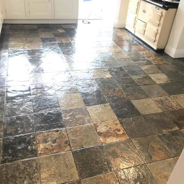
I recently completed the renovation of a Multi-Coloured Slate tiled kitchen floor in Sutton Coldfield. I was actually at the property before Christmas to survey the floor and quote for the work however the owners had planned to have a new kitchen installed in the new year, so we decided it was best for me to wait until after the installation to complete the work.
The slate was in good condition but like any stone floor you do need to maintain the sealer to prevent dirt becoming ingrained in the stone. Sealer do wear off overtime especially in the high foot traffic areas such as Kitchens and within a few years the tiles become dull and difficult to clean effectively.
The kitchen was installed on schedule and I got the call to arrange a visit to deep clean and reseal the floor which would take to two days, one to clean and one to seal.
To begin the restoration, I soaked the slate in a strong dilution of Tile Doctor Pro-Clean and left it to soak in for about ten minutes re-applying extra solution where it dried. Pro-Clean is a powerful tile cleaner that will strip old sealers when applied in concentrated form. I agitated the product using a black pad fitted to a rotary buffing machine. I paid particular attention to the grout which the customer had trouble keeping clean. The rotary pad struggles to reach into the recesses of the grout lines so I also made sure to scrub the solution into the grout with a grout brush.
Once I was satisfied that the Slate and the Grout was clean and clear of old sealers, I gave the whole floor a thorough rinse with water using a wet vacuum to extract the soil and get the floor as dry as possible. The floor was then left to dry off fully overnight.
Returning to the property the next day, I ran some quick damp tests to check for any excess moisture that might have prevented me from sealing the floor. We will always do this as excess moisture can affect the sealer curing.
The customer was very happy with the clean and the floor was dry, so we discussed sealer options to find out their preference for Matt or Satin finish. With the decision made to go with a Satin finish I began the application of the Tile Doctor Seal and Go which enhances the look of the stone with an aesthetically pleasing low-sheen finish, as well as providing on-going protection against ingrained dirt and staining.
A total of four coats of Seal and Go were needed to seal the Slate tiles and as you can see from the photos the sealer really put the life back into the floor.
Trevor Preece
Staffordshire Tile Doctor
 Signature Custom Homes
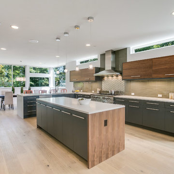
In our Contemporary Bellevue Residence we wanted the aesthetic to be clean and bright. This is a similar plan to our Victoria Crest home with a few changes and different design elements. Areas of focus; large open kitchen with waterfall countertops and awning upper flat panel cabinets, elevator, interior and exterior fireplaces, floating flat panel vanities in bathrooms, home theater room, large master suite and rooftop deck.
Photo Credit: Layne Freedle
 Advance Design Studio, Ltd.
After six years of living in their Huntley IL home, Chris and Meghan were tired of their dark, dingy, outdated kitchen and it was finally time for a long-anticipated change. “The kitchen is the place where we live, it’s where we do everything,” Meghan said. “It was important that it be a space where we wanted to be.” Meghan loves cooking and enjoys including their girls in healthy meal prepping, this led them to want a brighter, more enjoyable kitchen with increased functionality and improved storage.
For Chris especially, the laundry room was an entirely dysfunctional eyesore. “We had a washer and a dryer, but it was all kind-of cobbled together!” Chris said. “There were always laundry piles everywhere, we weren’t really sure what we wanted to do in there, but it was time for us to make a change.” The mess of the space was stressful every time they walked in the door from the garage each day. Kids’ backpacks and shoes piled up haphazardly in the makeshift boot-bench closet left the family feeling disorganized and stressed. They needed space for folding clothes and locker cubbies to help keep the family organized.
Having known Christine and Todd in the Huntley community for years, Chris and Meghan were familiar with their work. “We already trusted them personally and having seen their projects for years we knew they did top notch work. After we reviewed the initial round of designs, we knew that hiring them was definitely the right choice,” Meghan and Chris said. Although Chris had done a lot of work in their home himself, the kitchen and laundry room renovation was such a large undertaking that he didn’t want to steal time away from his family to spend what would surely be many long weekends doing the job himself. “That would not have been a wise choice for us,” Chris laughed.
“Our designer, Michelle was very, very, easy to work with; anything we wanted to see or weren’t sure about, she went above and beyond to make this easy for us. She was easy to get hold of and always quick to respond,” the couple said. Michelle pulled ideas that mirrored the couple’s taste and style and was adept at directing the couple to limited choices that didn’t overwhelm them and kept the process moving. “I have a hard time making decisions. Michelle made the decision-making process so easy. I loved how she listened to what I liked and then presented three great options for me to choose from,” Meghan said.
The main objectives for the kitchen were better storage solutions, they wanted the space to reflect their lifestyle and taste, and they wanted it to last for years with low maintenance. One of the first steps in creating a more functional kitchen was relocating the refrigerator, creating an improved workflow for the busy family.
“We didn’t know that we could even move the refrigerator to a new location where it is now, that was something that we never would have thought of,” Chris said. “The new refrigerator location makes the kitchen feel so much bigger. We didn’t add any space, but our whole kitchen with the new design just seems like it’s so much larger than before!” Meghan said.
The perimeter mist colored cabinets helped warm and brighten the entire room, while the graphite colored cabinets on the island added contrast. Using this fresh, clean color palette satisfied the couple’s desire for a bright space that was the exact opposite of what they had before. Organization accessories were also added to the cabinets such as a spice drawer tray and roll outs to create hidden convenience.
“I absolutely love the hidden spices – it makes cooking so much more enjoyable!” Chris said. “And all the pull outs, and the double trash bin, who would think you could get so excited about organization!” the couple said in unison.
One thing they hated in their original kitchen was how dark the space felt. Added lighting on the ceiling with the new light fixtures combined with the lighter cabinetry colors throughout solved this problem. “Our new kitchen has this warm, almost cozy feeling that our old kitchen never had, it’s just a space that I love spending my time in now,” Meghan said. The light airy feeling was accentuated with the use of floating white shelves on either side of the decorative range hood. “We have so much cabinetry space, the new design is amazing we actually have more storage space than we will ever need,” Meghan said.
The island was extended to create more work surface and added space for stool seating. “The new island changes how we live. Now the kids can be in the kitchen with us, doing homework, eating breakfast, and the three of us have special dinners there when Chris is working late,” Meghan said.
The Carrara Marmi Quartz countertops were chosen because they are, not only beautiful, but are made from hard-working material that doesn’t require maintenance. The white subway tile backsplash that wraps to the ceiling behind the focal point cooktop range/hood compliments the crisp white countertops perfectly, while brushed brass hardware and light fixtures keep the design fresh and new.
The couple had a few fears at the beginning of the project, as most homeowners do. Their biggest fear was being out of their kitchen and laundry room for an extended time. The crew made it very easy for the family to work in a limited space keeping the washer and dryer hooked up the majority of the time, and also getting appliances working with minimal downtime.
“They above and beyond accommodated us to get us through the process,” Meghan said. “They did a great job making sure we were as comfortable as possible throughout the process,” Chris added.
“Our project manager DJ did a great job. He was very good at updating us on schedule changes, getting guys in as quickly as possible. Everyone that stepped in the house was nice and did great work,” said Chris. They thought Advance’s carpenter was phenomenal and were impressed when he took a conceptual idea from a photograph and worked with designer Michelle to create a one of a kind range/hood that has become the topic of conversation with friends and family who visit the new kitchen. “He was in our house literally every day for several weeks. He was easy to work with and good at what he did,” Meghan and Chris said.
The focal point of the kitchen; a hand-crafted, custom-built ventilation hood was clad with handpicked reclaimed barnwood. Advance Design’s carpenter built the framework and the cladding to create a one-of-a-kind design element that the couple loves.
“I think it was especially fun for him to create something unique from scratch, showcasing his talent in this area,” Meghan said. “I love that my kitchen is not like everyone else’s. I got to pick out the wood on my hood and watch it being built and was able to choose what pieces of wood went where on it. It’s totally unique.”
Red Oak flooring was toothed-in throughout the kitchen and the rest of the first floor anywhere changes were made. Then the whole floor was refinished to tone down the orange undertones in the existing floor stain, ultimately changing the color complexion of the entire first floor. The result is a completely new feeling to the entire home.
Renovating the laundry room was extremely important to Meghan and Chris, but they had trouble visualizing what the possibilities were for the seemingly small space. Michelle produced beautiful 3D illustrations that helped them envision the space in a whole new way.
“I must have told Michelle 100 times that I am a visual person, seeing the designs in 3D made it so easy to make decisions and see what we could really do with our space,” Meghan said.
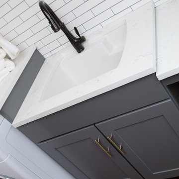
A dividing wall and doorway were removed between the existing laundry room and hallway formerly containing a coat closet, providing space to design specialized graphite colored cabinetry matching the kitchen island to house custom storage cubbies for each family member. Adding the tall utility cabinetry in the new laundry area helped solve the storage issue, tucking away cleaning supplies, household items, and even the cat got its own cubby.
“I love how everything is now hidden in its own space. I can’t tell you how much I hated coming home and seeing everything sitting around on counters,” Chris said.
Electrical outlets were planned for the inside of utility cabinets, so devices could charge in hidden locations. Stacking the washer and dryer allowed for wider countertop space to provide a folding area and a special space for clothes to hang. “The way I do laundry has been completely transformed! I can actually fold clothes and hang them now right out of the washer and dryer,” Meghan said.
“The end result in the kitchen and the laundry/mud room was an updated light and bright space, with a smarter work flow that better meets the needs of this family,” Michelle said.
“I would totally recommend Advance Design,” Meghan said. “Sometimes I sit and just look at my kitchen and laundry room and think ‘Wow, I can’t believe I get to live here!’ It’s an understatement to say we love our new space.”
 Tile Doctor Ltd
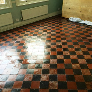
I was contacted recently by a client in East Grinstead, who asked me to restore a large area of damaged Quarry tiles in his house. East Grinstead actually dates back to the 14th century and is a town known for its many interesting houses and historic buildings. Hard-wearing Quarry tiles are most often used in high traffic areas, such as reception areas and hallways, although they are also commonly used for patio areas and porches. In these busy areas, the tiles can get dirty quickly, and this can lead to damage over time if they are not regularly tended to.
In this case, the damage to the tiles had actually been caused by regular flooding over a period of several years. The damage was so extreme that I advised my client that the only means of total restoration was re-tiling. However, my client informed me that the property was currently on the market for sale and this wasn’t an option. Instead, he settled on a deep clean and seal which, while not a complete restoration, would still significantly improve the condition of the tiled floor.
My first day of work was spent moving a significant amount of large furniture out of the room and into the garden. Once the area was completely clear, I was able to apply a layer of Tile Doctor Pro-Clean, using a stiff deck brush to really work it into the damaged stone. Pro-Clean helped to lift out a huge amount of the muck and ingrained dirt revealing, unfortunately, yet more damage beneath.
Once I had finished for the day, my client opened the windows to allow the warm sunshine to dry up any remaining moisture. This was important, as any excess moisture left on the floor may have affected the performance of the sealer when I returned to complete the sealing.
I allowed the floor a two-day drying period, during which time my client decided to colour some of the tiles with red doorstep paint. He counted up to two thousand tiles before giving up!
When I returned after 48 hours, I set about sealing the floor using Tile Doctor Seal & Go, which provided the eye-catching gloss finish and durable protection the client wanted whilst the house was still on the market. As it was another warm day, the homeowners went out cycling around the Ashdown forest, leaving me to complete the sealing carefully and without distraction.
When they returned a few hours later, they were amazed by the results! Although a complete re-tiling was not possible under the circumstances, both myself and my clients were extremely pleased with how great the Quarry tiles were now looking, especially after such significant water damage.
Sponsored
Sunbury, OH

J.Holderby - Renovations
Franklin County's Leading General Contractors - 2X Best of Houzz!
 TVL Creative Ltd.
Our clients were looking to make this home their forever home and to create a warm and welcoming space that the whole family would enjoy returning to every day. One of our primary goals in this project was to change how our clients moved through their home. We tossed aside the existing walls that blocked off the kitchen and introduced a butler’s pantry to connect the kitchen directly to the dining room. Contrast is king in this home, and we utilized a variety of light and dark finishes to create distinctive layers and lean into opportunities for accents. To tie the space in this home together, we introduced warm hardwood flooring throughout the main level and selected a soft grey paint as our primary wall color.
Kitchen- The heart of this home is most definitely the kitchen! We erased every trace of the original builder kitchen and created a space that welcomes one and all. The glorious island, with its light cabinetry and dramatic quartz countertop, provides the perfect gathering place for morning coffee and baking sessions. At the perimeter of the kitchen, we selected a handsome grey finish with a brushed linen effect for an extra touch of texture that ties in with the high variation backsplash tile giving us a softened handmade feel. Black metal accents from the hardware to the light fixtures unite the kitchen with the rest of the home.
Butler’s Pantry- The Butler’s Pantry quickly became one of our favorite spaces in this home! We had fun with the backsplash tile patten (utilizing the same tile we highlighted in the kitchen but installed in a herringbone pattern). Continuing the warm tones through this space with the butcher block counter and open shelving, it works to unite the front and back of the house. Plus, this space is home to the kegerator with custom family tap handles!
Mud Room- We wanted to make sure we gave this busy family a landing place for all their belongings. With plenty of cabinetry storage, a sweet built-in bench, and hooks galore there’s no more jockeying to find a home for coats.
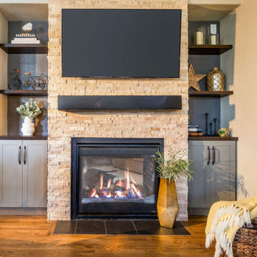
Fireplace- A double-sided fireplace means double the opportunity for a dramatic focal point! On the living room side (the tv-free grown-up zone) we utilized reclaimed wooden planks to add layers of texture and bring in more cozy warm vibes. On the family room side (aka the tv room) we mixed it up with a travertine ledger stone that ties in with the warm tones of the kitchen island.
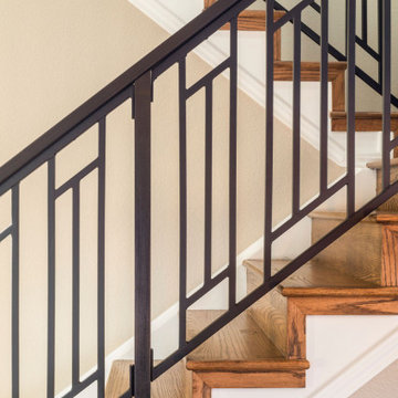
Staircase- The standard builder handrail was just not going to do it anymore! So, we leveled up designed a custom steel & wood railing for this home with a dark finish that allows it to contrast beautifully against the walls and tie in with the dark accent finishes throughout the home.
 TVL Creative Ltd.
Our clients were looking to make this home their forever home and to create a warm and welcoming space that the whole family would enjoy returning to every day. One of our primary goals in this project was to change how our clients moved through their home. We tossed aside the existing walls that blocked off the kitchen and introduced a butler’s pantry to connect the kitchen directly to the dining room. Contrast is king in this home, and we utilized a variety of light and dark finishes to create distinctive layers and lean into opportunities for accents. To tie the space in this home together, we introduced warm hardwood flooring throughout the main level and selected a soft grey paint as our primary wall color.
Kitchen- The heart of this home is most definitely the kitchen! We erased every trace of the original builder kitchen and created a space that welcomes one and all. The glorious island, with its light cabinetry and dramatic quartz countertop, provides the perfect gathering place for morning coffee and baking sessions. At the perimeter of the kitchen, we selected a handsome grey finish with a brushed linen effect for an extra touch of texture that ties in with the high variation backsplash tile giving us a softened handmade feel. Black metal accents from the hardware to the light fixtures unite the kitchen with the rest of the home.
Butler’s Pantry- The Butler’s Pantry quickly became one of our favorite spaces in this home! We had fun with the backsplash tile patten (utilizing the same tile we highlighted in the kitchen but installed in a herringbone pattern). Continuing the warm tones through this space with the butcher block counter and open shelving, it works to unite the front and back of the house. Plus, this space is home to the kegerator with custom family tap handles!
Mud Room- We wanted to make sure we gave this busy family a landing place for all their belongings. With plenty of cabinetry storage, a sweet built-in bench, and hooks galore there’s no more jockeying to find a home for coats.
Fireplace- A double-sided fireplace means double the opportunity for a dramatic focal point! On the living room side (the tv-free grown-up zone) we utilized reclaimed wooden planks to add layers of texture and bring in more cozy warm vibes. On the family room side (aka the tv room) we mixed it up with a travertine ledger stone that ties in with the warm tones of the kitchen island.
Staircase- The standard builder handrail was just not going to do it anymore! So, we leveled up designed a custom steel & wood railing for this home with a dark finish that allows it to contrast beautifully against the walls and tie in with the dark accent finishes throughout the home.
 TKS Design Group
Free ebook, Creating the Ideal Kitchen. DOWNLOAD NOW
One of my very favorite parts of the design process is space planning and considering all the possible floor plan solutions at the beginning stages of the project. What works for one person as a solution may not be the best solution for the next. What you think you want going into the process, may change once all the space planning options are considered. This was exactly the case for this family. They thought they really wanted an island configuration.
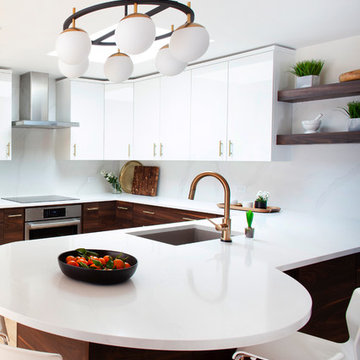
Once we figured out the flow of the work triangle and saw how great a large peninsula would work for the family, we proceeded along those lines. The peninsula not only works great for food prep, it also allows more of a traditional table seating versus an island with everyone lined up in a row — not so great for daily dinner conversation.
To the right of that is a counter depth fridge and a speed oven which gives some flexibility with cooking and reheating smaller meals instead of having to heat the entire oven. An induction cooktop with its easy to clean surface keeps the space looking clean and tidy. Induction heats very quickly to high temperatures so is also wonderful to cook on. To the right of cooktop is a long stretch of countertop perfect for prep space.
Storage was very important to the homeowners. We took our time discussing where spice pull outs and tray dividers would be located, how the corner storage would be addressed and the location of the other items such as trash and recycling cans. We worked as many drawers as possible into the space, as I always recommend drawers over doors and/or roll outs as they offer the most flexibility and ease of use. Customizing these details is time well spent as having a place for everything and everything in its place, just like Mom said, really is the key to a functional and professionally designed kitchen.
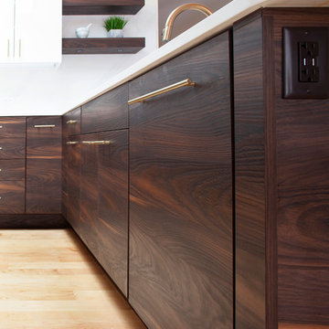
The talls and wall cabinets are white acrylic which combined with the white marble look quartz countertops and full height backsplash keep the room feeling light, bright and airy. The wood toned base cabinets are made of a textured laminate that has the look of wood but is a very easy to maintain product. Brushed gold metal on the hardware, faucet and chandelier add a warm touch and ties into the blond maple flooring. The neighboring breakfast room was also remodeled as part of the project and houses a small coffee station.
Designed by: Susan Klimala, CKBD
Photography by: Kari Firak
For more information on kitchen and bath design ideas go to: www.kitchenstudio-ge.com
 TKS Design Group
Free ebook, Creating the Ideal Kitchen. DOWNLOAD NOW
One of my very favorite parts of the design process is space planning and considering all the possible floor plan solutions at the beginning stages of the project. What works for one person as a solution may not be the best solution for the next. What you think you want going into the process, may change once all the space planning options are considered. This was exactly the case for this family. They thought they really wanted an island configuration.
Once we figured out the flow of the work triangle and saw how great a large peninsula would work for the family, we proceeded along those lines. The peninsula not only works great for food prep, it also allows more of a traditional table seating versus an island with everyone lined up in a row — not so great for daily dinner conversation.
To the right of that is a counter depth fridge and a speed oven which gives some flexibility with cooking and reheating smaller meals instead of having to heat the entire oven. An induction cooktop with its easy to clean surface keeps the space looking clean and tidy. Induction heats very quickly to high temperatures so is also wonderful to cook on. To the right of cooktop is a long stretch of countertop perfect for prep space.
Storage was very important to the homeowners. We took our time discussing where spice pull outs and tray dividers would be located, how the corner storage would be addressed and the location of the other items such as trash and recycling cans. We worked as many drawers as possible into the space, as I always recommend drawers over doors and/or roll outs as they offer the most flexibility and ease of use. Customizing these details is time well spent as having a place for everything and everything in its place, just like Mom said, really is the key to a functional and professionally designed kitchen.
The talls and wall cabinets are white acrylic which combined with the white marble look quartz countertops and full height backsplash keep the room feeling light, bright and airy. The wood toned base cabinets are made of a textured laminate that has the look of wood but is a very easy to maintain product. Brushed gold metal on the hardware, faucet and chandelier add a warm touch and ties into the blond maple flooring. The neighboring breakfast room was also remodeled as part of the project and houses a small coffee station.
Designed by: Susan Klimala, CKBD
Photography by: Kari Firak
For more information on kitchen and bath design ideas go to: www.kitchenstudio-ge.com
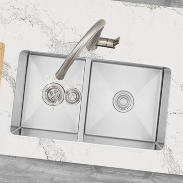
 Stylish
Do you want to upgrade your kitchen? Replace your current sink with this Canadian STYLISH stainless steel kitchen sink. This luxurious 33” x 18” double undermount kitchen sink is made of surgical grade SUS 304 16G stainless steel, this sleek and luxurious kitchen sink with a brushed satin finish will look amazing in your kitchen! Even after years of constant use, the patina finish of the kitchen sink will never oxidize. The X-pattern drain grooves in this undermount kitchen sink’s basin allow for optimal drainage. the undermount sink will drain and dry quickly and effortlessly. Also, the 10mm radius sink corners are smooth and easy to clean, so that your skin will always be shiny and free of bacteria and unpleasant smells. The STYLISH stainless steel sink is here to make your life easier. Keep your cabinets intact. Water condensation in kitchen sinks often causes your cabinets to get ruined. This won’t be a problem if you install the STYLISH undermount sink in your kitchen. The stone guard coating of our stainless steel sinks prevents condensation and makes the sink quiet. Our kitchen sinks are Canadian designed and meet the highest plumbing standards for North America, so you can trust us when we say that this is the best sink on the market.
This functional STYLISH sink will not make loud noises when the water is on. Thanks to the 2mm and 3mm extra thick pads, this is a very quiet sink. STYLISH has equipped the undermount kitchen sink with a soundproofing system, so that you will be able to wash dishes and your hands without having to deal with loud, annoying noises. Another great feature of this sink is that the double bowls are 60/40 and extra deep. One of the bowls is extra-large for even bigger pots. The extra deep basins of this double undermount kitchen sink can fit large pots and pans easily. The 10-inch depth is also great because it can hide the dirty dishes under the countertop line until you have the time to wash them. This undermount kitchen sink comes with two luxury stainless steel basket strainers. These are also extra deep, so that they can catch more food scraps than regular strainers. Also included are two stainless steel bottom grids, perfect to protect the bottom of your stainless steel kitchen sink, one cutting template and mounting brackets. This double undermount kitchen sink was designed with the busy parent and young professional in mind. The modern and linear style will integrate perfectly in any kitchen space.
 TVL Creative Ltd.
Our clients were looking to make this home their forever home and to create a warm and welcoming space that the whole family would enjoy returning to every day. One of our primary goals in this project was to change how our clients moved through their home. We tossed aside the existing walls that blocked off the kitchen and introduced a butler’s pantry to connect the kitchen directly to the dining room. Contrast is king in this home, and we utilized a variety of light and dark finishes to create distinctive layers and lean into opportunities for accents. To tie the space in this home together, we introduced warm hardwood flooring throughout the main level and selected a soft grey paint as our primary wall color.
Kitchen- The heart of this home is most definitely the kitchen! We erased every trace of the original builder kitchen and created a space that welcomes one and all. The glorious island, with its light cabinetry and dramatic quartz countertop, provides the perfect gathering place for morning coffee and baking sessions. At the perimeter of the kitchen, we selected a handsome grey finish with a brushed linen effect for an extra touch of texture that ties in with the high variation backsplash tile giving us a softened handmade feel. Black metal accents from the hardware to the light fixtures unite the kitchen with the rest of the home.
Butler’s Pantry- The Butler’s Pantry quickly became one of our favorite spaces in this home! We had fun with the backsplash tile patten (utilizing the same tile we highlighted in the kitchen but installed in a herringbone pattern). Continuing the warm tones through this space with the butcher block counter and open shelving, it works to unite the front and back of the house. Plus, this space is home to the kegerator with custom family tap handles!
Mud Room- We wanted to make sure we gave this busy family a landing place for all their belongings. With plenty of cabinetry storage, a sweet built-in bench, and hooks galore there’s no more jockeying to find a home for coats.
Fireplace- A double-sided fireplace means double the opportunity for a dramatic focal point! On the living room side (the tv-free grown-up zone) we utilized reclaimed wooden planks to add layers of texture and bring in more cozy warm vibes. On the family room side (aka the tv room) we mixed it up with a travertine ledger stone that ties in with the warm tones of the kitchen island.
Staircase- The standard builder handrail was just not going to do it anymore! So, we leveled up designed a custom steel & wood railing for this home with a dark finish that allows it to contrast beautifully against the walls and tie in with the dark accent finishes throughout the home.

 TKS Design Group
Free ebook, Creating the Ideal Kitchen. DOWNLOAD NOW
One of my very favorite parts of the design process is space planning and considering all the possible floor plan solutions at the beginning stages of the project. What works for one person as a solution may not be the best solution for the next. What you think you want going into the process, may change once all the space planning options are considered. This was exactly the case for this family. They thought they really wanted an island configuration.
Once we figured out the flow of the work triangle and saw how great a large peninsula would work for the family, we proceeded along those lines. The peninsula not only works great for food prep, it also allows more of a traditional table seating versus an island with everyone lined up in a row — not so great for daily dinner conversation.
To the right of that is a counter depth fridge and a speed oven which gives some flexibility with cooking and reheating smaller meals instead of having to heat the entire oven. An induction cooktop with its easy to clean surface keeps the space looking clean and tidy. Induction heats very quickly to high temperatures so is also wonderful to cook on. To the right of cooktop is a long stretch of countertop perfect for prep space.
Storage was very important to the homeowners. We took our time discussing where spice pull outs and tray dividers would be located, how the corner storage would be addressed and the location of the other items such as trash and recycling cans. We worked as many drawers as possible into the space, as I always recommend drawers over doors and/or roll outs as they offer the most flexibility and ease of use. Customizing these details is time well spent as having a place for everything and everything in its place, just like Mom said, really is the key to a functional and professionally designed kitchen.
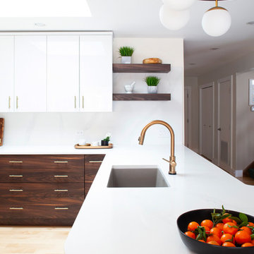
The talls and wall cabinets are white acrylic which combined with the white marble look quartz countertops and full height backsplash keep the room feeling light, bright and airy. The wood toned base cabinets are made of a textured laminate that has the look of wood but is a very easy to maintain product. Brushed gold metal on the hardware, faucet and chandelier add a warm touch and ties into the blond maple flooring. The neighboring breakfast room was also remodeled as part of the project and houses a small coffee station.
Designed by: Susan Klimala, CKBD
Photography by: Kari Firak
For more information on kitchen and bath design ideas go to: www.kitchenstudio-ge.com
 Paradise Found Construction
Jesse had inherited his townhome, and had lived there for several years. His career took him to another state, and the home was unoccupied for over a year. He decided that he would not return to Raleigh and that it was time to sell.
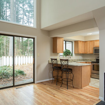
The 1975 home still had the original kitchen and baths, and was in need of general repair and new flooring. The HVAC system, water heater, and washer and dryer had been replaced as they aged and became non-functional, and the exterior had been maintained by the Home Owner’s Association. Jesse wanted to update the home and have it sell as quickly as possible, so we got to work determining what the best use of the budget would be to accomplish this goal.
We focused on updating the major interior design elements that would provide the most enjoyment, durability, and energy efficiency for the new homeowners.
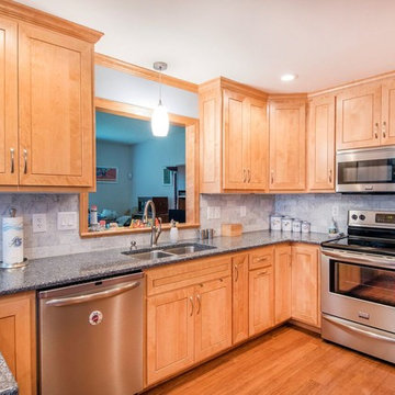
We started with completely gutting the Kitchen and reconfiguring it by moving the refrigerator into the laundry area, and stacked the washer and dryer to save space. We replaced all of the old vinyl cabinets with durable natural wood cabinetry, and added granite counter tops and a stainless steel sink. We also removed the ceiling-hung cabinets over the counter peninsula to open up the Kitchen and bring in more light and facilitate better flow and interaction, and added a floor-to-ceiling Pantry Closet to make up for the lost storage space. All of the Kitchen appliances were replaced with new energy efficient models.
We next gutted the downstairs Powder Bath and replaced the vinyl vanity with matching cabinetry with the kitchen, and replaced the toilet (as well as all other toilets in the home) with an EPA WaterSense rated low-flow toilets. We removed the wallpaper and finished the walls smooth, replaced the lighting and mirror, and removed the carpet and installed a porcelain tile floor.
The second floor 2nd Bedroom had been left open to the Great Room with a balcony and accordion door for privacy, but it left the room open to all of the noise from the Great Room and Kitchen. In order to make the room function as a private bedroom, we removed the balcony and installed a full wall in its place.
Replacing all of the flooring was also at the top of the list, as was general repair on the walls and new paint throughout. We installed natural oak flooring in the Great Room and porcelain tile in the entry foyer. The seals on several of the exterior windows and the Master Bedroom sliding door had been compromised and needed to be replaced, as well as several interior doors and repair of all the louvered closet doors. The two upstairs Baths were functionally sound and the tile was in good shape. We replaced the toilets with EPA WaterSense rated low-flow toilets, and painted the vanities with a brighter color palette.
The end result was bright, open, and comfortable updated home ready for its new occupants.
Design Features
Durable and handsome natural wood cabinetry.
Granite Kitchen and Powder countertops.
Stainless Kitchen appliances and white refrigerator.
Stainless Kitchen sink and brushed nickel faucets.
Brushed Nickel cabinetry and door hardware.
Low-flow EPA WaterSense rated toilets.
Light and bright natural hardwood flooring.
Porcelain tile and luxury vinyl flooring.
New carpet.
Private 2nd Bedroom.
Light and bright No-VOC paints and finishes.
Energy Efficient and Green Features
Energy efficient EPA Energy Star appliances.
EPA WaterSense rated low-flow toilets.
Energy efficient EPA Energy Star windows and door.
Durable No-VOC cabinetry.
Durable porcelain tile flooring.
Low-flow faucets.
Energy efficient CFL lighting throughout.
No-VOC paints and finishes.
 Tile Doctor Ltd
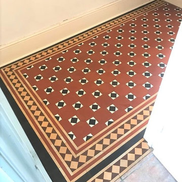
Our client had recently moved to a property in Newport, Gwent and when removing the carpet in the hallway she discovered this beautiful Victorian Tiled floor. The property had numerous period features and realising the value that the floor could add to the property she was keen to have it restored and so contacted Tile Doctor for help.
We popped round to survey the floor and except for a couple of broken tiles it had preserved well under the carpet. It was a shame the previous owner had covered the floor over but I was confident we could source some matching tiles to replace the broken ones and then restore the overall appearance. We gave the client a quote for the work which would take a couple of days. Pleased to hear that the floor could be restored and that it could soon be on show the quote was accepted and a date set to do the work.
We returned later the same month to renovate the floor and started by removing the broken tiles, cleaning out the old grout and adhesive and then relaying matching replacements. There are several specialist suppliers that can supply Victorian tiles so we can usually source reclaimed or reproduction tiles.
Some of the grout lines had dropped so as well as grouting around the replacement tiles more renovation work was needed to ensure the grout was level. We used quick setting products for this work, so I was able to move on to cleaning the floor later that afternoon.
To restore the appearance of the Victorian Tiles I used a strong dilution of Tile Doctor Pro-Clean combined with Tile Doctor Remove and Go which was left to soak in for ten minutes before being scrubbed into the tiles. This created a powerful cleaner/stripper cocktail which gets to work at removing dirt, grime and breaking down old sealers paint splashes.
After extracting the soil using a wet vacuum the floor was inspected. There were a few stubborn areas which were treated to a repeat clean and a wire brush to get the floor as clean as possible.
The floor was rinsed with water to remove any trace of cleaning products and then as much moisture as possible was extracted using a wet vacuum. The floor was left to dry off overnight and we arranged to return the next day to apply a sealer.
The following morning, we checked the floor was dry using a damp meter and this confirmed we were good to apply the sealer. The floor was sealed with Tile Doctor Colour Grow which is an impregnating sealer that protects the floor and enhances the beautiful colours in the tile. Three coats of the sealer were applied allowing each coat to dry before applying the next.
The client was very happy with the result and how beautiful the floor looked as you can see from the picture.
Paul Wales
Monmouthshire Tile Doctor
 TVL Creative Ltd.
Our clients were looking to make this home their forever home and to create a warm and welcoming space that the whole family would enjoy returning to every day. One of our primary goals in this project was to change how our clients moved through their home. We tossed aside the existing walls that blocked off the kitchen and introduced a butler’s pantry to connect the kitchen directly to the dining room. Contrast is king in this home, and we utilized a variety of light and dark finishes to create distinctive layers and lean into opportunities for accents. To tie the space in this home together, we introduced warm hardwood flooring throughout the main level and selected a soft grey paint as our primary wall color.
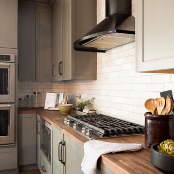
Kitchen- The heart of this home is most definitely the kitchen! We erased every trace of the original builder kitchen and created a space that welcomes one and all. The glorious island, with its light cabinetry and dramatic quartz countertop, provides the perfect gathering place for morning coffee and baking sessions. At the perimeter of the kitchen, we selected a handsome grey finish with a brushed linen effect for an extra touch of texture that ties in with the high variation backsplash tile giving us a softened handmade feel. Black metal accents from the hardware to the light fixtures unite the kitchen with the rest of the home.
Butler’s Pantry- The Butler’s Pantry quickly became one of our favorite spaces in this home! We had fun with the backsplash tile patten (utilizing the same tile we highlighted in the kitchen but installed in a herringbone pattern). Continuing the warm tones through this space with the butcher block counter and open shelving, it works to unite the front and back of the house. Plus, this space is home to the kegerator with custom family tap handles!
Mud Room- We wanted to make sure we gave this busy family a landing place for all their belongings. With plenty of cabinetry storage, a sweet built-in bench, and hooks galore there’s no more jockeying to find a home for coats.
Fireplace- A double-sided fireplace means double the opportunity for a dramatic focal point! On the living room side (the tv-free grown-up zone) we utilized reclaimed wooden planks to add layers of texture and bring in more cozy warm vibes. On the family room side (aka the tv room) we mixed it up with a travertine ledger stone that ties in with the warm tones of the kitchen island.
Staircase- The standard builder handrail was just not going to do it anymore! So, we leveled up designed a custom steel & wood railing for this home with a dark finish that allows it to contrast beautifully against the walls and tie in with the dark accent finishes throughout the home.
Sponsored
Sunbury, OH
J.Holderby - Renovations
Franklin County's Leading General Contractors - 2X Best of Houzz!

 Windy City Painters
Iron Fence Painting in Wicker Park: A Windy City Painters Case Study
Iron fence painting in Wicker Park is one of the most requested exterior services Windy City Painters performs each season, and this recent project shows exactly why. Set behind an ornate 1890s greystone two-flat, the client's wrought iron fence had endured years of Chicago winters without professional attention. Rust had spread across the pickets, the original black enamel was flaking away in sheets, and the fence's structural hardware had begun to loosen at several joints.
As the trusted local expert for Chicago's North Side and Near West Side, Windy City Painters approached this project the same way we approach every iron fence painting job in Wicker Park: with a methodical, multi-step process designed to outlast Midwest weather rather than simply mask the damage.
The Process, Step by Step
Step 1 — Rust Removal and Surface Preparation. Our crew wire-brushed and mechanically ground every rusted section down to clean, stable metal. For pitted or heavily corroded areas, we applied a chemical rust converter to neutralize corrosion at the molecular level before any coating touched the surface. Furthermore, because this greystone was built well before 1978, Windy City Painters tested the existing paint layers for lead and followed strict containment protocols throughout the removal process.
Step 2 — Spot Repairs. Loose pickets were re-secured, small pits were filled, and hardware at the gate hinges was tightened. In contrast to a quick spray-paint refresh, this stage ensures the fence is structurally sound before a single drop of primer goes on.
Step 3 — Priming. A full coat of rust-inhibiting primer, engineered specifically for ferrous metal, was applied by brush to every surface — with particular attention to welds and joints where moisture tends to collect and restart the corrosion cycle.
Step 4 — Topcoat Application. Two finish coats of industrial-grade, direct-to-metal enamel were applied by brush and roller. This built a durable, uniform barrier in classic gloss black, the most popular finish among Wicker Park's historic properties. Finally, our team inspected every inch of the fence for thin spots or missed sections before calling the job complete.
Project Specs
Surface: Ornamental wrought iron fence, posts, and gate hardware
Products used: Rust-inhibiting DTM primer, chemical rust converter, industrial-grade direct-to-metal enamel
Coats applied: 1 primer coat, 2 finish coats
Finish: Gloss black
Timeline: Completed in under two days
Advice for Wicker Park Homeowners
Before starting a similar iron fence painting project in Wicker Park, homeowners should keep a few things in mind. Notably, never paint directly over active rust — trapped moisture underneath will cause the new coat to fail within a season. Additionally, always ask whether a contractor tests for lead paint on pre-1978 homes, since many Wicker Park greystones fall into that category. Meanwhile, hand brushwork matters: the intricate scrollwork common on Wicker Park ironwork requires careful, detailed application that spray equipment simply cannot replicate. Therefore, hiring a crew experienced specifically in historic Chicago ironwork, like Windy City Painters, makes a measurable difference in the finished result.
Windy City Painters also handles related exterior and interior work for Wicker Park properties, including interior painting, drywall and plaster repair, and additional metal refinishing for porches and railings.
Iron fence painting in Wicker Park protects one of the neighborhood's most defining architectural features while restoring curb appeal instantly. As a result, this greystone now has a fence that matches the quality of the home behind it — and will hold up through many more Chicago winters.
See more of our work and request a free estimate at www.windypainters.com.
Ready to transform your Wicker Park home? Contact Windy City Painters for a free estimate — visit www.windypainters.com today. Proudly serving Wicker Park, West Town, Lincoln Park, Roscoe Village, Lakeview, Ukrainian Village, River North, and all of Chicago.
 TKS Design Group
Free ebook, Creating the Ideal Kitchen. DOWNLOAD NOW
One of my very favorite parts of the design process is space planning and considering all the possible floor plan solutions at the beginning stages of the project. What works for one person as a solution may not be the best solution for the next. What you think you want going into the process, may change once all the space planning options are considered. This was exactly the case for this family. They thought they really wanted an island configuration.
Once we figured out the flow of the work triangle and saw how great a large peninsula would work for the family, we proceeded along those lines. The peninsula not only works great for food prep, it also allows more of a traditional table seating versus an island with everyone lined up in a row — not so great for daily dinner conversation.
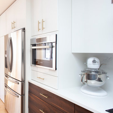
To the right of that is a counter depth fridge and a speed oven which gives some flexibility with cooking and reheating smaller meals instead of having to heat the entire oven. An induction cooktop with its easy to clean surface keeps the space looking clean and tidy. Induction heats very quickly to high temperatures so is also wonderful to cook on. To the right of cooktop is a long stretch of countertop perfect for prep space.
Storage was very important to the homeowners. We took our time discussing where spice pull outs and tray dividers would be located, how the corner storage would be addressed and the location of the other items such as trash and recycling cans. We worked as many drawers as possible into the space, as I always recommend drawers over doors and/or roll outs as they offer the most flexibility and ease of use. Customizing these details is time well spent as having a place for everything and everything in its place, just like Mom said, really is the key to a functional and professionally designed kitchen.
The talls and wall cabinets are white acrylic which combined with the white marble look quartz countertops and full height backsplash keep the room feeling light, bright and airy. The wood toned base cabinets are made of a textured laminate that has the look of wood but is a very easy to maintain product. Brushed gold metal on the hardware, faucet and chandelier add a warm touch and ties into the blond maple flooring. The neighboring breakfast room was also remodeled as part of the project and houses a small coffee station.
Designed by: Susan Klimala, CKBD
Photography by: Kari Firak
For more information on kitchen and bath design ideas go to: www.kitchenstudio-ge.com
 Thyme & Place Design LLC
This medium sized bathroom had ample space to create a luxurious bathroom for this young professional couple with 3 young children. My clients really wanted a place to unplug and relax where they could retreat and recharge.
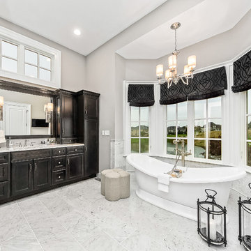
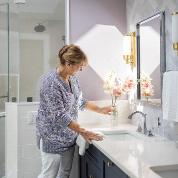
New cabinets were a must with customized interiors to reduce cluttered counter tops and make morning routines easier and more organized. We selected Hale Navy for the painted finish with an upscale recessed panel door. Honey bronze hardware is a nice contrast to the navy paint instead of an expected brushed silver. For storage, a grooming center to organize hair dryer, curling iron and brushes keeps everything in place for morning routines. On the opposite, a pull-out organizer outfitted with trays for smaller personal items keeps everything at the fingertips. I included a pull-out hamper to keep laundry and towels off the floor. Another design detail I like to include is drawers in the sink cabinets. It is much better to have drawers notched for the plumbing when organizing bathroom products instead of filling up a large base cabinet.
The room already had beautiful windows and was bathed in naturel light from an existing skylight. I enhanced the natural lighting with some recessed can lights, a light in the shower as well as sconces around the mirrored medicine cabinets. The best thing about the medicine cabinets is not only the additional storage but when both doors are opened you can see the back of your head. The inside of the cabinet doors are mirrored. Honey Bronze sconces are perfect lighting at the vanity for makeup and shaving.
A larger shower for my very tall client with a built-in bench was a priority for this bathroom. I recommend stream showers whenever designing a bathroom and my client loved the idea of that feature as a surprise for his wife. Steam adds to the wellness and health aspect of any good bathroom design. We were able to access a small closet space just behind the shower a perfect spot for the steam unit. In addition to the steam, a handheld shower is another “standard” item in our shower designs. I like to locate these near a bench so you can sit while you target sore shoulder and back muscles. Another benefit is cleanability of the shower walls and being able to take a quick shower without getting your hair wet. The slide bar is just the thing to accommodate different heights.
For Mrs. a tub for soaking and relaxing were the main ingredients required for this remodel. Here I specified a Bain Ultra freestanding tub complete with air massage, chromatherapy and a heated back rest. The tub filer is floor mounted and adds another element of elegance to the bath. I located the tub in a bay window so the bather can enjoy the beautiful view out of the window. It is also a great way to relax after a round of golf. Either way, both of my clients can enjoy the benefits of this tub.
The tiles selected for the shower and the lower walls of the bathroom are a slightly oversized subway tile in a clean and bright white. The floors are a 12x24 porcelain marble. The shower floor features a flat cut marble pebble tile. Behind the vanity the wall is tiled with Zellage tile in a herringbone pattern. The colors of the tile connect all the colors used in the bath.
The final touches of elegance and luxury to complete our design, the soft lilac paint on the walls, the mix of metal materials on the faucets, cabinet hardware, lighting and yes, an oversized heated towel warmer complete with robe hooks.
This truly is a space for rejuvenation and wellness.
35