
Search results for "Quitting process" in Home Design Ideas

 Vetter Architects
The client’s request was quite common - a typical 2800 sf builder home with 3 bedrooms, 2 baths, living space, and den. However, their desire was for this to be “anything but common.” The result is an innovative update on the production home for the modern era, and serves as a direct counterpoint to the neighborhood and its more conventional suburban housing stock, which focus views to the backyard and seeks to nullify the unique qualities and challenges of topography and the natural environment.
The Terraced House cautiously steps down the site’s steep topography, resulting in a more nuanced approach to site development than cutting and filling that is so common in the builder homes of the area. The compact house opens up in very focused views that capture the natural wooded setting, while masking the sounds and views of the directly adjacent roadway. The main living spaces face this major roadway, effectively flipping the typical orientation of a suburban home, and the main entrance pulls visitors up to the second floor and halfway through the site, providing a sense of procession and privacy absent in the typical suburban home.
Clad in a custom rain screen that reflects the wood of the surrounding landscape - while providing a glimpse into the interior tones that are used. The stepping “wood boxes” rest on a series of concrete walls that organize the site, retain the earth, and - in conjunction with the wood veneer panels - provide a subtle organic texture to the composition.
The interior spaces wrap around an interior knuckle that houses public zones and vertical circulation - allowing more private spaces to exist at the edges of the building. The windows get larger and more frequent as they ascend the building, culminating in the upstairs bedrooms that occupy the site like a tree house - giving views in all directions.
The Terraced House imports urban qualities to the suburban neighborhood and seeks to elevate the typical approach to production home construction, while being more in tune with modern family living patterns.
Overview:
Elm Grove
Size:
2,800 sf,
3 bedrooms, 2 bathrooms
Completion Date:
September 2014
Services:
Architecture, Landscape Architecture
Interior Consultants: Amy Carman Design
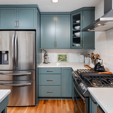
 Reico Kitchen & Bath
Designed by Lauren Hunt of Reico Kitchen & Bath in Charlotte, NC, in collaboration with The Atta Group, this mid-century/transitional kitchen & bar features Merillat Masterpiece cabinets in the Levan shaker door style with a Rainfall finish. Kitchen countertops are Hanstone Strato, complemented by a Bally Butcherblock bar countertop in teak.
“The clients were a dream to work with! We have similar design taste, so it made for a really effortless and smooth design process!” said Hunt.
“Their original kitchen was much smaller, so much of our discussion was centered on making the new space they had functional and efficient. We used quite a few pullouts and drawer accessories to help keep their storage space organized.”
“I was thrilled that they’ve broke away from the whites and gray painted cabinets we’ve been seeing by selecting Masterpiece’s Rainfall paint and incorporating some warmer finishes. I’m really happy with the finished product – we were able to create a design that is sleek and streamlined while still being warm and inviting!”
Photos courtesy of Six Cents Media.

 Janvrin & Co.
Photos: Ashley Ross
I knew it was time to makeover my son's nursery after removing the changing pad and baby toiletries from the changing area. My son has also developed quite the interest in cars, it's beyond toy cars. He loves flipping through car mags with dad and can name almost any model that drives by us on the road or he's sees parked on the street. I really wanted to bring in "some" of his love of four wheel vehicles into his personal space. Especially since we don't do toys in the bedroom.
We took our time and didn't race through the process and both mom and kiddo are champions of this new space. For five simple makeover tips for a smooth transition from the nursery into that more mature space check out our blog post '5 Tips Transition From Nursery to Big Kid Bedroom'.
Find the right local pro for your project
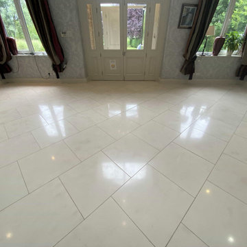
 Tile Doctor Ltd
This job was for a repeat client in Toft near Cambridge who had aa stunning large hallway that was tiled in beautiful pale Limestone. My client had asked me back to work on the floor having previously completed the deep clean and seal of a Terracotta floor previously.
The Limestone tiling in the entrance hall had years of some type of topical sealer applied to it. This caused the stone to look slightly discoloured and from certain lights showed up hundreds of scratches and smudges embedded in the seal. I’ve tried to capture this problem in the photographs on this page, but it was very difficult.
A topical sealer sits on the surface of the tile where it is vulnerable to scratching, hallways are generally high traffic areas and so more likely to see this sort of problem. Ideally an impregnating sealer should have been applied, impregnators work by occupying the pores in the stone thus preventing soiling from becoming ingrained in the stone.
Before starting we protected the woodwork against splashing with blue film, I don’t usually make a great deal of mess, but you can never be too careful when working in someone’s property especially one as beautiful as this.
To strip off the old sealer I began by applying a strong dilution of Tile Doctor Remove and Go to the Limestone tiles. I split the floor into sections and used a 400-grit diamond burnishing pad to work the Tile Doctor Remove and Go into the tiles. The floor was then rinsed off using our high-pressure cleaning system that applies pressurised hot water to the floor whilst simultaneously extracting the soil with its built-in vacuum. The system is quite heavy, so it is built into my van, and I run a large flexible hose to a spinner tool that does the cleaning. It is an expensive tool, but it saves a lot of time and leaves the floor fairly dry afterwards.
The 400-grit pad had released a lot of the sealer but there were quite a few layers to get through, so I changed the burnishing pad to a coarse 200-grit pad and repeated the process. After another rinse and extract I would see it had the desired effect and I was able to carry on building up the finish on the Limestone by apply the 400-grit followed by the 800, 1500 grit pads. It was a large floor and so this took up much of the day so once complete I left for the day so it could dry off overnight.
The next day I finished the polishing process with the application of a 3000-grit burnishing pad which is applied with a little water sprayed onto the tile and really brings up the polish on the stone. This process has the added advantage of leaving the floor dry so not long afterwards I was able to move on to sealing.
For this floor two coats of Tile Doctor Ultra-Seal were applied, it is an impregnating sealer that won’t alter the colour of the tiles leaving a natural look.
My client was much happier with the new finish and has asked for another quotation on some more Terracotta flooring that needs attention. For aftercare I recommend using Tile Doctor stone soap, it’s a special formula that builds on the patina which will help maintain the polished appearance of the Limestone.
Tom Conlon
Cambridge Tile Doctor
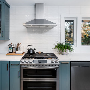 Reico Kitchen & Bath
Designed by Lauren Hunt of Reico Kitchen & Bath in Charlotte, NC, in collaboration with The Atta Group, this mid-century/transitional kitchen & bar features Merillat Masterpiece cabinets in the Levan shaker door style with a Rainfall finish. Kitchen countertops are Hanstone Strato, complemented by a Bally Butcherblock bar countertop in teak.
“The clients were a dream to work with! We have similar design taste, so it made for a really effortless and smooth design process!” said Hunt.
“Their original kitchen was much smaller, so much of our discussion was centered on making the new space they had functional and efficient. We used quite a few pullouts and drawer accessories to help keep their storage space organized.”
“I was thrilled that they’ve broke away from the whites and gray painted cabinets we’ve been seeing by selecting Masterpiece’s Rainfall paint and incorporating some warmer finishes. I’m really happy with the finished product – we were able to create a design that is sleek and streamlined while still being warm and inviting!”
Photos courtesy of Six Cents Media.

 CAP Carpet & Flooring
Hardwood can make quite the statement in any room. This beautiful kitchen features a dark hardwood that instantly draws your attention.
CAP Carpet & Flooring is the leading provider of flooring & area rugs in the Twin Cities. CAP Carpet & Flooring is a locally owned and operated company, and we pride ourselves on helping our customers feel welcome from the moment they walk in the door. We are your neighbors. We work and live in your community and understand your needs. You can expect the very best personal service on every visit to CAP Carpet & Flooring and value and warranties on every flooring purchase. Our design team has worked with homeowners, contractors and builders who expect the best. With over 30 years combined experience in the design industry, Angela, Sandy, Sunnie,Maria, Caryn and Megan will be able to help whether you are in the process of building, remodeling, or re-doing. Our design team prides itself on being well versed and knowledgeable on all the up to date products and trends in the floor covering industry as well as countertops, paint and window treatments. Their passion and knowledge is abundant, and we're confident you'll be nothing short of impressed with their expertise and professionalism. When you love your job, it shows: the enthusiasm and energy our design team has harnessed will bring out the best in your project. Make CAP Carpet & Flooring your first stop when considering any type of home improvement project- we are happy to help you every single step of the way.
 Janvrin & Co.
Photos: Ashley Ross
I knew it was time to makeover my son's nursery after removing the changing pad and baby toiletries from the changing area. My son has also developed quite the interest in cars, it's beyond toy cars. He loves flipping through car mags with dad and can name almost any model that drives by us on the road or he's sees parked on the street. I really wanted to bring in "some" of his love of four wheel vehicles into his personal space. Especially since we don't do toys in the bedroom.
We took our time and didn't race through the process and both mom and kiddo are champions of this new space. For five simple makeover tips for a smooth transition from the nursery into that more mature space check out our blog post '5 Tips Transition From Nursery to Big Kid Bedroom'.
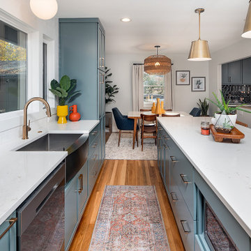 Reico Kitchen & Bath
Designed by Lauren Hunt of Reico Kitchen & Bath in Charlotte, NC, in collaboration with The Atta Group, this mid-century/transitional kitchen & bar features Merillat Masterpiece cabinets in the Levan shaker door style with a Rainfall finish. Kitchen countertops are Hanstone Strato, complemented by a Bally Butcherblock bar countertop in teak.
“The clients were a dream to work with! We have similar design taste, so it made for a really effortless and smooth design process!” said Hunt.
“Their original kitchen was much smaller, so much of our discussion was centered on making the new space they had functional and efficient. We used quite a few pullouts and drawer accessories to help keep their storage space organized.”
“I was thrilled that they’ve broke away from the whites and gray painted cabinets we’ve been seeing by selecting Masterpiece’s Rainfall paint and incorporating some warmer finishes. I’m really happy with the finished product – we were able to create a design that is sleek and streamlined while still being warm and inviting!”
Photos courtesy of Six Cents Media.

 G Family Construction & G Design
Example of a large farmhouse medium tone wood floor and brown floor hallway design in San Francisco with white walls

 Cure Design Group
The furniture was recently purchased so we really needed to get the job done in bedding, color, patterns, and infusing some key pieces/accessories to work in conjunction with the youthful furniture selection.
The inspiration to her design came from a Designers Guild wallpaper that resembled the color of the sky…from there we changed the wall color to a soft gray, added new bedding and pillows, gave the window treatments a neutral texture, changed out overhead lighting and lamps and infused some current accessories.
The change was exactly what was needed! But….we weren’t quite finished. We decided at that point that some extra storage was needed as well as an opportunity to bring that outdoor woodsy feeling into her room. We then changed her nightstand to more of a dresser wrapped in the gloss white and drawers in reclaimed wood.
What a difference!!! But, collectively we still I felt we needed one more change to give her room that “wow” factor. I then decided to change the drama of her existing headboard to one that was spectacular!! And it worked!!!
We are still in the process of changing out her desk, but for the most part we are there!!!
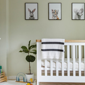
 Steph Hannam Interiors
A gorgeous little boy nursery that can be designed so it can grow up with him. Touches of sage green and oak have been incorporated around the room to add warmth to quite a neutral space.
 Cure Design Group
The furniture was recently purchased so we really needed to get the job done in bedding, color, patterns, and infusing some key pieces/accessories to work in conjunction with the youthful furniture selection.
The inspiration to her design came from a Designers Guild wallpaper that resembled the color of the sky…from there we changed the wall color to a soft gray, added new bedding and pillows, gave the window treatments a neutral texture, changed out overhead lighting and lamps and infused some current accessories.
The change was exactly what was needed! But….we weren’t quite finished. We decided at that point that some extra storage was needed as well as an opportunity to bring that outdoor woodsy feeling into her room. We then changed her nightstand to more of a dresser wrapped in the gloss white and drawers in reclaimed wood.
What a difference!!! But, collectively we still I felt we needed one more change to give her room that “wow” factor. I then decided to change the drama of her existing headboard to one that was spectacular!! And it worked!!!
We are still in the process of changing out her desk, but for the most part we are there!!!
 Janvrin & Co.
Photos: Ashley Ross
I knew it was time to makeover my son's nursery after removing the changing pad and baby toiletries from the changing area. My son has also developed quite the interest in cars, it's beyond toy cars. He loves flipping through car mags with dad and can name almost any model that drives by us on the road or he's sees parked on the street. I really wanted to bring in "some" of his love of four wheel vehicles into his personal space. Especially since we don't do toys in the bedroom.
We took our time and didn't race through the process and both mom and kiddo are champions of this new space. For five simple makeover tips for a smooth transition from the nursery into that more mature space check out our blog post '5 Tips Transition From Nursery to Big Kid Bedroom'.
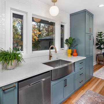 Reico Kitchen & Bath
Designed by Lauren Hunt of Reico Kitchen & Bath in Charlotte, NC, in collaboration with The Atta Group, this mid-century/transitional kitchen & bar features Merillat Masterpiece cabinets in the Levan shaker door style with a Rainfall finish. Kitchen countertops are Hanstone Strato, complemented by a Bally Butcherblock bar countertop in teak.
“The clients were a dream to work with! We have similar design taste, so it made for a really effortless and smooth design process!” said Hunt.
“Their original kitchen was much smaller, so much of our discussion was centered on making the new space they had functional and efficient. We used quite a few pullouts and drawer accessories to help keep their storage space organized.”
“I was thrilled that they’ve broke away from the whites and gray painted cabinets we’ve been seeing by selecting Masterpiece’s Rainfall paint and incorporating some warmer finishes. I’m really happy with the finished product – we were able to create a design that is sleek and streamlined while still being warm and inviting!”
Photos courtesy of Six Cents Media.

 Kathleen Jennison
An Arts & Crafts Bungalow is one of my favorite styles of homes. We have quite a few of them in our Stockton Mid-Town area. And when C&L called us to help them remodel their 1923 American Bungalow, I was beyond thrilled.
As per usual, when we get a new inquiry, we quickly Google the project location while we are talking to you on the phone. My excitement escalated when I saw the Google Earth Image of the sweet Sage Green bungalow in Mid-Town Stockton. "Yes, we would be interested in working with you," I said trying to keep my cool.
But what made it even better was meeting C&L and touring their home, because they are the nicest young couple, eager to make their home period perfect. Unfortunately, it had been slightly molested by some bad house-flippers, and we needed to bring the bathroom back to it "roots."
We knew we had to banish the hideous brown tile and cheap vanity quickly. But C&L complained about the condensation problems and the constant fight with mold. This immediately told me that improper remodeling had occurred and we needed to remedy that right away.
The Before: Frustrations with a Botched Remodel
The bathroom needed to be brought back to period appropriate design with all the functionality of a modern bathroom. We thought of things like marble countertop, white mosaic floor tiles, white subway tile, board and batten molding, and of course a fabulous wallpaper.
This small (and only) bathroom on a tight budget required a little bit of design sleuthing to figure out how we could get the proper look and feel. Our goal was to determine where to splurge and where to economize and how to complete the remodel as quickly as possible because C&L would have to move out while construction was going on.
The Process: Hard Work to Remedy Design and Function
During our initial design study, (which included 2 hours in the owners’ home), we noticed framed images of William Morris Arts and Crafts textile patterns and knew this would be our design inspiration. We presented C&L with three options and they quickly selected the Pimpernel Design Concept.
We had originally selected the Black and Olive colors with a black vanity, mirror, and black and white floor tile. C&L liked it but weren’t quite sure about the black, We went back to the drawing board and decided the William & Co Pimpernel Wallpaper in Bayleaf and Manilla color with a softer gray painted vanity and mirror and white floor tile was more to their liking.
After the Design Concept was approved, we went to work securing the building permit, procuring all the elements, and scheduling our trusted tradesmen to perform the work.
We did uncover some shoddy work by the flippers such as live electrical wires hidden behind the wall, plumbing venting cut-off and buried in the walls (hence the constant dampness), the tub barely balancing on two fence boards across the floor joist, and no insulation on the exterior wall.
All of the previous blunders were fixed and the bathroom put back to its previous glory. We could feel the house thanking us for making it pretty again.
The After Reveal: Cohesive Design Decisions
We selected a simple white subway tile for the tub/shower. This is always classic and in keeping with the style of the house.
We selected a pre-fab vanity and mirror, but they look rich with the quartz countertop. There is much more storage in this small vanity than you would think.
The Transformation: A Period Perfect Refresh
We began the remodel just as the pandemic reared and stay-in-place orders went into effect. As C&L were already moved out and living with relatives, we got the go-ahead from city officials to get the work done (after all, how can you shelter in place without a bathroom?).
All our tradesmen were scheduled to work so that only one crew was on the job site at a time. We stayed on the original schedule with only a one week delay.
The end result is the sweetest little bathroom I've ever seen (and I can't wait to start work on C&L's kitchen next).
Thank you for joining me in this project transformation. I hope this inspired you to think about being creative with your design projects, determining what works best in keeping with the architecture of your space, and carefully assessing how you can have the best life in your home.

 Under the Roof Decorating
Decorating with clocks is another easy way to inject style into a space without spending much money. Here’s a cool wall display I created using clocks I’ve accumulated over time.
At the cottage, I didn’t have enough space to dedicate a whole room as an office, instead I created a drop zone desk in the hallway which can be used by our guests.
Since I had an odd number of clocks (5 of them), I lined up the middle one with the desk and hung two on either side. I displayed the vintage clock in the middle because it was the largest, and also because it was the only one with a yellow background – two great reasons to place it center stage. For a fun contrast, I set my laptop across from an antique chair, and a vintage Royal typewriter facing a modern chair. The overall look is funky eclectic chic.
Did you notice each clock shows a different time? I actually don’t have batteries in any of them. Since the guest bedroom is only a few steps away from the work station, I thought I’d be nice and not let the tic toc of each clock keep friends and family awake at night. On the other hand, if you want to set the time for each clock, make sure to insert the batteries and set the time before you hang them up. Trust me, it’ll save you lots of time and aggravation too as it can be quite a finicky process to re-hang each clock.
UTRdecorating
 Cure Design Group
The furniture was recently purchased so we really needed to get the job done in bedding, color, patterns, and infusing some key pieces/accessories to work in conjunction with the youthful furniture selection.
The inspiration to her design came from a Designers Guild wallpaper that resembled the color of the sky…from there we changed the wall color to a soft gray, added new bedding and pillows, gave the window treatments a neutral texture, changed out overhead lighting and lamps and infused some current accessories.
The change was exactly what was needed! But….we weren’t quite finished. We decided at that point that some extra storage was needed as well as an opportunity to bring that outdoor woodsy feeling into her room. We then changed her nightstand to more of a dresser wrapped in the gloss white and drawers in reclaimed wood.
What a difference!!! But, collectively we still I felt we needed one more change to give her room that “wow” factor. I then decided to change the drama of her existing headboard to one that was spectacular!! And it worked!!!
We are still in the process of changing out her desk, but for the most part we are there!!!
 Cure Design Group
The furniture was recently purchased so we really needed to get the job done in bedding, color, patterns, and infusing some key pieces/accessories to work in conjunction with the youthful furniture selection.
The inspiration to her design came from a Designers Guild wallpaper that resembled the color of the sky…from there we changed the wall color to a soft gray, added new bedding and pillows, gave the window treatments a neutral texture, changed out overhead lighting and lamps and infused some current accessories.
The change was exactly what was needed! But….we weren’t quite finished. We decided at that point that some extra storage was needed as well as an opportunity to bring that outdoor woodsy feeling into her room. We then changed her nightstand to more of a dresser wrapped in the gloss white and drawers in reclaimed wood.
What a difference!!! But, collectively we still I felt we needed one more change to give her room that “wow” factor. I then decided to change the drama of her existing headboard to one that was spectacular!! And it worked!!!
We are still in the process of changing out her desk, but for the most part we are there!!!
 Janvrin & Co.
Photos: Ashley Ross
I knew it was time to makeover my son's nursery after removing the changing pad and baby toiletries from the changing area. My son has also developed quite the interest in cars, it's beyond toy cars. He loves flipping through car mags with dad and can name almost any model that drives by us on the road or he's sees parked on the street. I really wanted to bring in "some" of his love of four wheel vehicles into his personal space. Especially since we don't do toys in the bedroom.
We took our time and didn't race through the process and both mom and kiddo are champions of this new space. For five simple makeover tips for a smooth transition from the nursery into that more mature space check out our blog post '5 Tips Transition From Nursery to Big Kid Bedroom'.
 Vetter Architects
The client’s request was quite common - a typical 2800 sf builder home with 3 bedrooms, 2 baths, living space, and den. However, their desire was for this to be “anything but common.” The result is an innovative update on the production home for the modern era, and serves as a direct counterpoint to the neighborhood and its more conventional suburban housing stock, which focus views to the backyard and seeks to nullify the unique qualities and challenges of topography and the natural environment.
The Terraced House cautiously steps down the site’s steep topography, resulting in a more nuanced approach to site development than cutting and filling that is so common in the builder homes of the area. The compact house opens up in very focused views that capture the natural wooded setting, while masking the sounds and views of the directly adjacent roadway. The main living spaces face this major roadway, effectively flipping the typical orientation of a suburban home, and the main entrance pulls visitors up to the second floor and halfway through the site, providing a sense of procession and privacy absent in the typical suburban home.
Clad in a custom rain screen that reflects the wood of the surrounding landscape - while providing a glimpse into the interior tones that are used. The stepping “wood boxes” rest on a series of concrete walls that organize the site, retain the earth, and - in conjunction with the wood veneer panels - provide a subtle organic texture to the composition.
The interior spaces wrap around an interior knuckle that houses public zones and vertical circulation - allowing more private spaces to exist at the edges of the building. The windows get larger and more frequent as they ascend the building, culminating in the upstairs bedrooms that occupy the site like a tree house - giving views in all directions.
The Terraced House imports urban qualities to the suburban neighborhood and seeks to elevate the typical approach to production home construction, while being more in tune with modern family living patterns.
Overview:
Elm Grove
Size:
2,800 sf,
3 bedrooms, 2 bathrooms
Completion Date:
September 2014
Services:
Architecture, Landscape Architecture
Interior Consultants: Amy Carman Design
11